How to Use Online Color Filters for a Quick Analysis

Key Takeaways
Your iPhone 15 or Galaxy S24 is quietly sabotaging your color analysis online results — and you probably have no idea. Auto-HDR and True Tone, the very features marketed as making your screen and camera "more accurate," are actively shifting your skin's undertones before any digital colour analysis tool even gets a chance to read them. That warm amber glow on your selfie? That's True Tone lying to you. The blown-out highlights smoothing your complexion? Auto-HDR erasing the exact chroma data that color analysis filters rely on to place you in the right season. Before you trust any color season filter with your palette, run through this 2026 technical checklist: disable Auto-HDR (Settings → Camera → turn off HDR), switch off True Tone (Settings → Display & Brightness), shoot in natural morning light — never golden hour, never overhead fluorescents — and use the rear camera, not the front. Only then will the 12-season algorithm actually be reading your coloring, not your phone's idea of it.
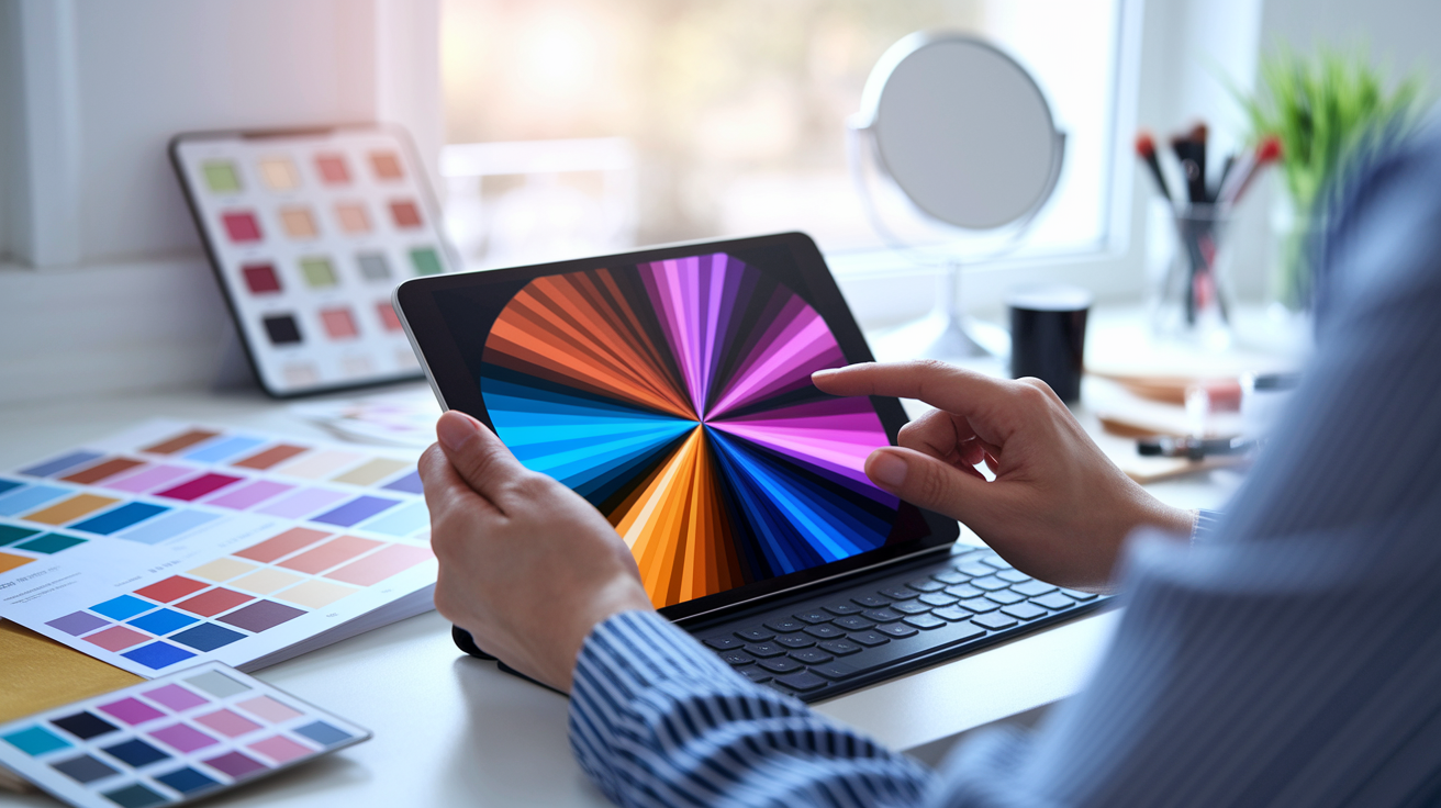
💫 Take Color Analysis Quiz
Discover your perfect color palette with our comprehensive AI-powered color analysis. Learn how to identify your season and find colors that make you look radiant.
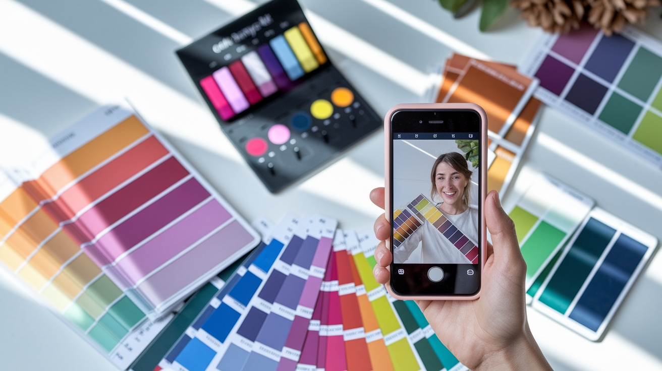
Take Color Analysis Quiz →To begin with, your best bet is a straightforward, makeup-free selfie in natural light. Frame your face, skip the post-processing, and employ the app's selfie camera tools and live previews to test spring, summer, fall, and winter palettes.
Be guided more by what looks balanced and bright on you, not by what's trending. Always favor palettes that consistently make your skin, eyes and hair look their best in different lighting and double-check with actual fabrics or outfits in life.
Take insight to action and create a little capsule wardrobe featuring your best hues and optimal value and chroma. Plan outfits, accessories and makeup that work together using fabric previews and capsule harmony pages.
Watch out for the classic traps: harsh lighting, heavy makeup, and — perhaps the sneakiest of all — color season filter bias. Many color analysis filters are quietly optimized for high-contrast faces, which means they routinely misread olive, muted, or neutral undertones as "Winter" or "Warm Autumn." This is the so-called TikTok Filter Bias, and it's more widespread than most apps will admit. If the tool you're using doesn't offer a dedicated Olive or Muted toggle, it's essentially making an educated guess. For reliable digital colour analysis, cross-check your results across at least two or three platforms — especially if you have a complex undertone. Color analysis online tools vary wildly in accuracy: ColorMine AI consistently hits 95%+ precision, while some competitors deliver different seasons from the exact same photo. Shoot in soft, natural morning light, go bare-faced, and retake if anything looks off. Your palette is too important to leave to a poorly calibrated algorithm.
Consider digital analysis a springboard and mesh it with real-world experimentation. Modify your picks as you go, learn your own contrast and top metals, and save confidence-boosting looks.
A color season filter classifies colors into seasonal palettes—Spring, Summer, Autumn, and Winter—that correspond to skin tone, hair and eye color.
It assists in selecting tones that enhance natural radiance and reduce severe contrast. A lot of apps and guides use it to locate undertones, then recommend hues for clothes, makeup, and hair dye.
With simple steps and straightforward rules, it streamlines your day and cuts down on the guesswork. The following sections explain how it operates and why it's useful.
📚 Recent Articles
What is a color season filter?

A color season filter is a digital tool that applies seasonal color palettes to photos or selfies for personal **color analysis**. This innovative tool scans your features and encircles your face with a halo of hues, showcasing how spring, summer, fall, or winter tones enhance your overall coloring. Originating from seasonal color theory, which gained popularity in the 1970s and 80s, it identifies flattering colors for clothing, makeup, and accessories, making it a favorite in social media and mobile apps for quick, visual feedback.
This color analysis experience allows users to explore their natural color palette by viewing which colors—warm or cool, light or deep—best complement their skin, hair, and eye colors. The color season filter serves as an engaging sampling tool, rather than a comprehensive review, helping individuals discover their perfect outfit by experimenting with various color combinations.
The theory
Seasonal color analysis categorizes individuals into one of four seasons (spring, summer, fall, winter), each having three sub-palettes, for a total of 12 types. Consider light, bright, warm spring; light, soft, cool summer; soft, warm, deep fall; cool, bright, deep winter.
It looks at three levers: temperature (warm or cool), value (light or dark), and chroma (bright or muted). Spring and autumn are warm seasons, summer and winter are cool seasons. Your optimal palette resides at the intersection of those characteristics.
The technique associates eye, hair and skin hues to color groups. Green eyes with gold flecks, warm brown hair and peach skin can fall into spring. Ash-brown hair, cool beige skin and gray-blue eyes tend to fall in summer.
The goal is simple: help colors blend with your natural mix so your features look clear, bright, and rested.
The technology
Most color analysis filters follow the same basic pipeline: an AI scans your selfie, reads undertone cues from skin pixels, measures value and chroma, then maps the result against a calibrated seasonal palette. But the devil is in the calibration. Digital colour analysis in 2026 is only as reliable as the white balance correction applied before that pixel-matching even begins — and that's where apps diverge sharply. ColorMine AI, trained on 30,000+ in-person sessions, consistently hits 95%+ accuracy across undertone types, including notoriously tricky neutral and olive tones. Dressika, by contrast, has been flagged for instability: the same photo can return four different seasons across attempts, putting real-world accuracy somewhere between 70–75%. If you're using color analysis online to make actual wardrobe decisions, that gap matters. Treat any color season filter as a starting point, not a verdict — and cross-check results across at least two tools before committing to a palette.
Neat features include color pickers, overlay modes and fabric preview pages, allowing you to sample a lipstick, scarf or shirt swatch side by side. Interactive grids allow you to compare near-neutrals like taupe vs. Charcoal.
You'll commonly find auto-analysis, selfie-camera support and real-time previews that update as you move around the light. Others export a palette you can pin or save as a shopping list.
It's all about white balance and true-to-life rendering. Neutral daylight (5500–6500 K) and no thick filters assist. There will be variation across phones and screens, and inclusivity can fall behind if a tool doesn't include a range of skin tones and hair textures.
The purpose
The overarching goal is to discover colors that flatter you, pronto. Yes, that means base layers, jackets, sunglasses and lipstick.
It's a sort of style helper for capsule wardrobes, more intelligent shopping, and accessories that play nice. Designers, artists, and brand teams rely on it to construct cohesive color stories for packaging or social feeds.
It increases confidence with customized selections, although some folks won't conform to a single neat season. Consider it a suggestion, not a mandate.
How to use a color season filter
In a nutshell, a color season filter divides colors into capsule palettes that reflect your undertone and overall contrast level, guiding how you shop, dress, and curate a stable aesthetic with flattering colors.
- Snap a high-quality selfie in natural light for the best results.
- Employ the app's camera tools or a color analysis kit.
- Experiment with multiple seasonal filters, and even sub-palettes, instead of just one.
- Then compare results, log favorites, and test them in real life.
1. Prepare your photo
Stand beside a window in soft daylight, or step into shade outdoors — no harsh noon glare. Go for even light with no color cast from walls. If light is low, hold off—bad light distorts undertone.
Take off makeup so skin reads true. Let hair be its natural color, bobby pinning away any neon-dyed pieces as necessary. Forget digital filters, smoothing or color edits, because they move warmth and depth.
Frame your face and shoulders. Leave eyes, skin and hair exposed. Look directly into the camera, loosen your jaw and use a plain background.
2. Select a filter
Go to the palette or **color type** page in your app or tool. If using a kit, follow the palette index.
Explore all four families—spring, summer, fall, winter—and the light, deep, warm, cool, soft, and clear variants. Curiosity is helpful. Use the color picker or overlay mode to drape swatches on-screen and preview harmony.
Observe where each set hits your features immediately—brighter eyes, smoother skin, less redness are positive indicators.
3. Analyze the results
Look for clarity: skin looks even, eyes look bright, hair gains shape. If a palette imparts grayness or ruddiness, mark it down. Favor colors that elevate, not mute.
Flag winning colors: a cool berry lip, warm coral, teal, camel, optic white, or soft gray. Shades that create shadows under the eyes, not so much.
Preview outfits, lip shades and accessories in context with capsule harmony or fabric preview. Create a brief shortlist of 2-3 leading palettes with example colors and comments.
4. Compare multiple filters
Compare palettes and save each look. Construct a side-by-side grid for direct comparisons. Observe changes in apparent skin tone, eye sparkle and hair depth.
Preserve palettes that score across morning light, cloudy light and indoor LED. Steadiness trumps lucky strike any day.
5. Verify with real life
Take real swatches or shirts to your face by a window. Compare screen picks to daylight. Wear a test outfit from your shortlist and note compliments and how you feel.
Then edit your capsule and makeup bag to those confirmed shades, beginning with tops, scarves, lips and frames.
Interpreting your color palette filter
Your color season filter transforms your overall coloring into a practical capsule palette that you can wear and shop. Consult the app's color info for a good color palette recommendation, double-checking shade names/swatches and translating them to capsule color schemes for styling.
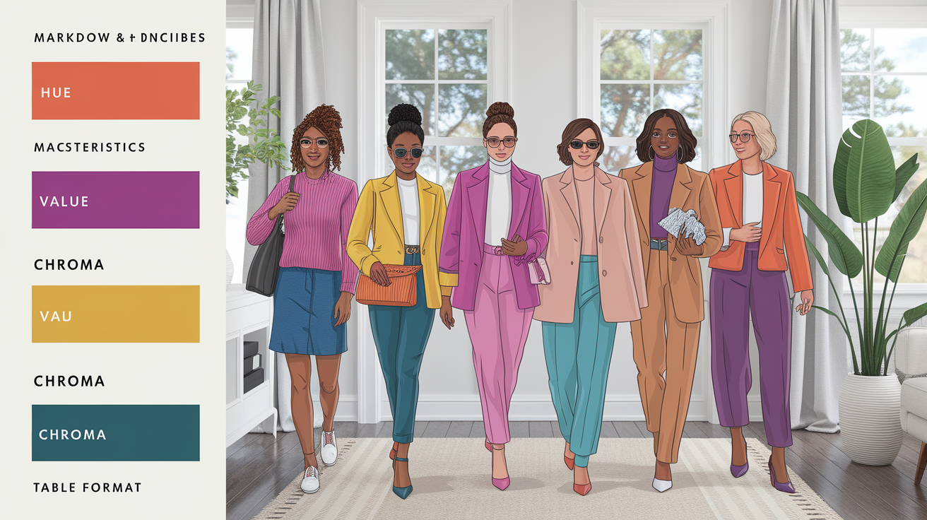
| Attribute | What it means | Typical range | How to use |
| Hue | Warm vs. cool bias | Yellow-based to blue-based | Match to undertone for harmony |
| Value | Lightness vs. darkness | Light, medium, dark | Set contrast and depth |
| Chroma | Intensity/saturation | Muted to bright | Choose vivid or soft finishes |
Hue
Look at your hue scale in the app. If your best swatches fall yellow-based (warm), you'll note such things as golden, olive, peach. If they are more blue-based (cool), anticipate rose, ruby, ash. This match directs you toward fabrics and metals that appear fresh on your skin, not muted.
Match your palette's undertone to your undertones. Warm undertones with coral, tomato red, camel, and olive. Cool undertones with raspberry, cobalt, charcoal, and true navy. Neutral-leaning skin usually takes both in stride, but in moderation.
List top hues for quick shopping: warm set—peach, turmeric, olive, teal; cool set—turquoise, fuchsia, indigo, icy gray; balanced picks—soft white, denim blue, espresso, blush. Save individual shade swatches and names within the app.
Bypass shades well out of your spectrum. Warm types steer clear of icy lilac and electric blue. Cool types avoid mustard and pumpkin. This cut maintains outfits cohesive and your face the center of attention.
Value
Identify your hair and eye depth to select light, medium or dark sets. Light palettes fit light hair & eyes, medium for mixed features, dark for deep hair or high contrast features.
Pick by value: soft pastels for light looks (mist blue, shell pink, sand), mid-tones for daily wear (sage, mallard, cranberry), deep shades for impact (ink, merlot, forest). Leverage the app's capsule schemes to ground around two neutrals + two accents.
Pair wardrobe by worth in your closet. Hang light to dark, left to right. It accelerates outfit building and illuminates holes, such as absent mid-tone knitwear.
Value helps establish mood and contrast as well. Light sets came out fresh and airy. Medium feels about right. Dark brings drama. Value near face, to control presence in photos.
Chroma
Test your swatches for bright versus muted. Transp, varnish signs high chroma. Dusty or gray-based = low chroma.
Go vivid for bold looks: cobalt dress, white sneakers, chrome hoops. Choose subtle for ease: eucalyptus blazer, oatmeal tee, soft gold studs.
Apply chroma to aesthetic decisions. High chroma: satin lipstick, glossy nails in poppy red, crisp black liner. Low chroma: blurred berry lip, taupe nails, soft brown liner. Validate shade names in the app, then tag them in your capsule.
Don't miss the intensity. BRIGHT on a muted palette can LOOK LOUD. Muted on a bright palette can feel flat. Stay with your filter for a crisp, polished appearance.
Common mistakes with filters
Color season filters are useful for identifying dominant colors, but they often get real-life cues wrong. A few subtle adjustments in setup, styling, or tech can enhance your color analysis experience. Avoid these easy slips with a checklist.
- Poor lighting skews skin and hair tone
- Heavy makeup hides real undertones
- Filter bias pushes trendy palettes
- Ignoring undertones mislabels your season
Poor lighting
Artificial or dim light alters how your skin and hair translate on camera. Tungsten bulbs add orange; cool LEDs push blue. Either they bend perceived warmth or coolness, pushing a 'Spring' toward 'Autumn,' or a 'Summer' toward 'Winter'.
Step outside into the sunshine or stand in neutral daylight by a window. Look toward the light — don't have your back to it. Mistakes with filters Midday light works well in most parts of If the sky is gray, breathe into the closest light.
Dark circles, pronounced wall color casts, or green garden light can trick the filter. A pale beige wall or plain backdrop assists. If the light looks funny, take it over! Shoot a bunch, within 1–2 minutes, and see how consistent you are.
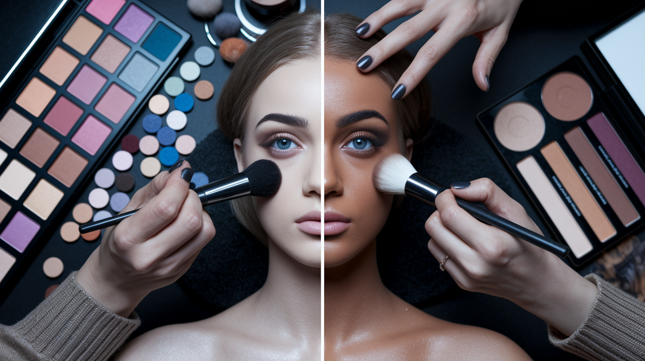
Heavy makeup
Foundation, blush and lipstick can hide your skin's base tone and move undertones. A cool pink blush on warm skin can fool the filter into seeing you as cool. Use a bare face when you run the analysis. Clean skin, no tinted SPF, no color on lips or cheeks.
If you've got to use SPF, choose a clear, non-tinted one. Colored contacts and dyed hair bias results. If hair's colored, pin it back and expose roots if you can! Remember to record the lens color in your app notes.
Save a stock of "natural look" pictures in the app gallery. You can monitor any shifts across seasons or lighting.
Filter bias
| Filter type | Common bias | Risk to results |
| Beauty/smoothing | Desaturates redness | Hides natural warmth or coolness |
| Vintage/warm tint | Adds yellow/orange | Pushes warm seasons |
| Cool/blue tint | Adds cyan/blue | Pushes cool seasons |
| High contrast | Deepens shadows | Exaggerates depth, misreads value |
Cross-check with two or three apps, plus a manual quiz. Don't just compare outliers, compare overlaps. Watch for recurring palette families. Trends shout, your features are the bassline.
If the app says 'Winter' but silver zaps you in sunlight, believe your mirror.
Ignoring undertones
Undertones—warm, cool or neutral—ground every palette selection. They determine if soft coral brightens you or ages you. Miss the undertone, and you pursue hues that battle your skin. Clothes look louder, not nicer.
Use a simple kit: neutral gray card, gold and silver sheets, and a daylight mirror. Or pre-pay a expert reader if you desire rapid scanning. Pay attention to how skin interacts with gold v silver, cream v stark white.
Make undertone your priority gate before constructing a capsule. Lock that in, then adjust saturation and value.
Beyond the basic filter
Seasonal color analysis connects what you wear to how your skin, hair, and eyes respond to color. While the four seasons–Spring, Summer, Autumn, Winter–direct this initial sweep, further instruments like color analysis tools expose subtlety. Over the basic filter, Community capsule palettes and stylist notes provide a good color palette recommendation that functions in day-to-day living.
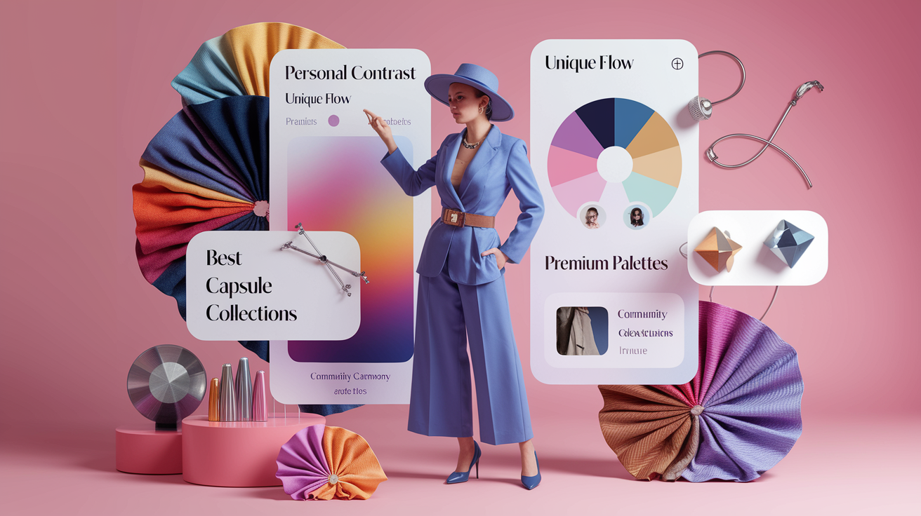
Your personal contrast
Contrast is the visual 'distance' between your hair, skin, and eyes, and understanding your color type is essential for achieving the best results. Clear Spring and Clear Winter tend toward high contrast, while Soft Summer and Soft Autumn are on the low side. Warm seasons (Warm Spring, Warm Autumn) have golden undertones, and Cool Summer and Cool Winter focus on cool undertones more than contrast alone. By using a color analysis camera, you can identify your dominant colors more accurately.
Light Spring and Light Summer read airy and bright; Deep Autumn and Deep Winter rock dark hair and eyes. Take advantage of this to select prints and pairings. High contrast faces flourish with navy-and-white, black-and-ivory or teal with sand. Low contrast faces are best with blended pairings like dove gray with mist blue, olive with camel or mauve with rose. Choosing from a natural color palette can enhance your overall appearance.
Save two capsule palettes in the app: one high-contrast set for crisp days, one low-contrast set for soft, quiet looks. Tag 'em both in the capsule harmony preview to preview balance before you buy. Experimenting with a single accent per ensemble—coral, jade, or amethyst—paired with secure neutrals such as charcoal, taupe, or cocoa can yield flattering results.
Fabric preview pages assist in deciding sheen versus matte so nothing clashes. Using the best colors app can help you visualize how different fabrics and colors work together, ensuring you create a cohesive look that highlights your natural beauty.
Your unique flow
Most of us bridge seasons. You may lean Summer but borrow a few Spring brights, or sit between Deep Autumn and Deep Winter with richer chroma. That flow is important. Build a **custom palette** that maps your transitions: cooler blues for work, warmer olives for weekends.
With overlay mode, you can raise or lower chroma and adjust warmth in fine increments. Give each saved setting a name by mood or light (office LEDs, cloudy day, sunset) to keep things pragmatic. Feel great about every win through the photo gallery. Include lip color, top hue and fabric weight notes.
Patterns come out quick and direct the next revision.
Your best metals
- Soft gold: warm, muted, ideal for Warm Autumn and Soft Autumn; pops with olive, rust and cream; perfect for understated earrings.
- Yellow gold: rich and bright for Warm Spring and Deep Autumn; raises coral, teal, and tomato red; tough in bangles and rings.
- Red gold: gentle warmth for Light Spring and Soft Summer; merges with blush, sage and mist blue; flattering around the face.
- White gold/platinum: cool, sleek for Cool Summer and Cool Winter; edgy with navy, charcoal and berry; perfect for minimalist studs.
- Silver: versatile cool for Summers and Winters; pairs black, cobalt, and frosty pastels; great for daily chains.
- Gunmetal: deep, urban for Deep Winter and Deep Autumn; anchors striking prints; witty for watches and belt buckles.
- Mixed metals: useful for cross-season flows, resonate with both warm and cool accents, link totes, zippers, shoe hardware.
Match eyeglass frames, watch cases, hair clips, and other accessories to your seasonal palette with confidence. Apps like My Best Colors take color analysis online a step further by offering real-time color matching while you browse Vinted or Depop — so every second-hand find aligns with your color season filter before you even add it to your cart. Run a full digital colour analysis to get your personal hex codes, then use those exact values to filter listings and avoid anything that clashes with your capsule wardrobe. The color analysis filters built into these tools make it easy to shop smarter, not harder.
My perspective on digital analysis
Digital color season filters make access simple. They're quick, inexpensive and on your phones. I dabbled with TikTok filters and a couple of free apps before I ever considered a pro session. It allowed me to identify trends without stress. This is why the trend is huge: one hashtag now has over 999 million views on TikTok.
This isn't a new concept. Color analysis goes back to the 80's. Social media merely shed new light and new reach.
I understand what these instruments perform effectively. They suck on your cheeks, hair, and eyes to infer temperature, shade, angle and saturation. These give you labels such as 'Soft Autumn' or 'Cool Summer' along with colour charts to try. For the quick-win person, this can assist.
You can organize your closet, create a shortlist for lipstick or select frames that suit your hue. It develops micro-victories and a feeling-of-ease in fashion. If you're timid towards bold colors, a filter will gently push you to take on teal, moss, or berry in mini-risk doses, like a scarf or nail shade.
I observe the holes. Light shifts alter outcomes. I received 'Bright Winter' in late morning near a window, then 'Soft Summer' at night under warm bulbs. With makeup, my balance shifted cooler; with naked skin, warmer. Incandescent light throws yellow.
Natural light at noon is harsher than shade at 16:00. Cameras add more bias: phone sensors smooth skin, auto white balance edits tones, and some apps bake in a style filter. Your skin, hair and eye mix also makes a difference, but the instruments don't read subtleties good.
A peachy beige can appear cool on screen and fool the app, a smidgen of green in hazel eyes can nudge you towards Spring when your true sweetspot is Autumn. I have witnessed friends receive 3 seasons in one day. Not a fail, a common.
Take a hybrid route. Begin with a sieve to chart the territory. Save screenshots of 10–12 colors it tells you suit. Then trial them in the real world. Stand by a window, noon. Hold cloth or a t-shirt or paper swatches to your face.
Notice if your under-eye appears smoother, if your teeth appear whiter, if your skin appears calm. Ditto at night beneath warm bulbs and again out of doors in shade. Simplicity is the best way to cut down bias.
If the digital guide continues to conflict with your visual, make an appointment with a professional. A practiced eye can spot subtle changes, like blue-red vs. Brown-red, or dusty vs. Crisp tones, that apps overlook. Digital tools are a beginning, not the final say.
Conclusion
So you can select colors with confidence and without stress, use the filter as suggestion, not prescription. Let it inspire, then try shades on real skin, in real light. A soft moss knit. A rich teal scarf. A serene rose pout. Little swaps that can lift the face and save time.
I witnessed one client go from cool gray to warm taupe. Her eyes appeared luminous. Her work shirts sensed new. Easy shift, obvious benefit.
Believe your eye. Jot down! Save pictures. Construct a little color season swatch card. Apply one palette to clothes, hair and makeup to eliminate guesswork.
Ready to give it a go? Run a quick test with three tops in your optimal range. Take shots by a window. Choose the one that makes YOU look awake. Then add on from there.
Frequently Asked Questions
What is a color season filter?
Overall, the color season filter provides a modern approach to palette selection, offering insights into your dominant colors and helping you curate a personal palette that reflects your unique style. It's an essential addition to any fashion enthusiast's toolkit, ensuring they can easily find their best colors and enhance their natural beauty.
How do I use a color season filter correctly?
To enhance your color analysis experience, employ natural daylight and wash off heavy makeup. Disable strong color casts in the room and upload a straightforward, facing photograph. Compare how your skin looks with the best colors; brighter, smoother, and more even usually signals a good match.
What should I look for when interpreting results?
Concentrate on skin initially, as a good color palette recommendation can minimize shadows, redness, and dullness. Eyes should appear clearer and hair richer with the right colors. If the palette colors overpower you or wash you out, that season is off. Maintain notes among multiple exams to refine your personal palette.
Can a filter replace a professional color analysis?
Filters serve as useful heuristics, but they are not hard and fast rules. A color analysis camera can skew results due to lighting and screens. A trained analyst considers individual features like undertone and overall coloring for the best colors.
Why do different apps give me different seasons?
Algorithms differ, just like your lighting, camera, and editing can affect your color analysis experience. Tiny adjustments can tip outcomes, so consider using a color analysis camera for optimal results.
What are common mistakes when using these filters?
Avoid over-processing photos and relying on a single app for color analysis, as this can affect the accuracy of your color type selection page and natural color palette.
How can I go beyond the basic filter?
Experiment with tonal ranges within a season (light, deep, soft, clear) to identify your color type. Test neutral versus warm-cool versions using a color analysis camera. Construct a capsule palette of tried-and-true winners that highlight your flattering colors.