How to Use AI for a Free Personal Color Analysis

Key Takeaways
- Hardware Check first: Before you run any free AI color analysis or pick a single hex code, disable True Tone and Night Shift on your screen — both shift warm/cool balance and silently sabotage your results. Set brightness to maximum, shoot your selfie in north-facing daylight, and only then let color analysis AI free tools like ColorMine AI do their job. That one step is the difference between a palette that genuinely flatters you and one that looks right on screen but wrong in real life. Once your display is calibrated and your photo is clean, AI free color analysis can map your undertones, assign your season, and hand you a personalized palette — all in under 60 seconds, no stylist fee required.
🎨 Take Your Color Analysis Quiz
Ready to discover your complete color palette? Take our comprehensive color analysis quiz to identify your seasonal type and get personalized color recommendations that perfectly complement your natural features.
Take Color Analysis Quiz →- AI tools such as ChatGPT look at photos, hex codes and attributes rapidly and uniformly, eliminating bias and guesswork. Let AI give you quick suggestions, then verify with how colors appear on you in natural sunshine.
- With perks such as personalized palettes, capsule wardrobes, and makeup recommendations based on hair, eye, skin tones, and light. Begin by creating a core palette of 20-30 colors and a 10-color capsule for everyday wear.
- There are limitations when photos are badly lighted, filtered or with heavy makeup and when features are elaborate or distinctive. Shoot in bright daylight, use a neutral background and include hex codes for better results.
- A useful workflow begins with a quality image, sampling hex codes, and writing an explicit prompt that lays out objectives and tastes. Follow up with questions, cross-season option-comparisons, and save the final palette for shopping.
- Use your findings by trying on colors with your existing closet or cosmetics, observing what shades complement your natural coloring. Play with the subtle types beyond the four seasons to make your style your own and gain confidence.
Why spend $300 and wait four weeks for a human stylist when free AI color analysis delivers 95%+ professional-grade accuracy in under 60 seconds? In 2026, ai color analysis free tools like ColorMine AI aren't a shortcut — they're the insider's secret that seasoned stylists don't advertise. Whether you're exploring a ChatGPT personal color palette test, following a ChatGPT color analysis tutorial for beginners, or diving into dedicated ChatGPT/AI tools built specifically for seasonal draping, the landscape has shifted dramatically. Knowing how to do personal color analysis from photo used to require a professional appointment; now, color analysis ai free platforms trained on 30,000+ real sessions put that same precision directly in your hands — no signup, no ads, no catch.
Why spend $300 and wait four weeks for a human stylist when free AI color analysis delivers 95%+ professional-grade accuracy in under 60 seconds? In 2026, ai color analysis free tools like ColorMine AI aren't a shortcut — they're the insider's secret that seasoned stylists don't advertise. Whether you're exploring a ChatGPT personal color palette test, following a ChatGPT color analysis tutorial for beginners, or diving into dedicated ChatGPT/AI tools built specifically for seasonal draping, the landscape has shifted dramatically. Knowing how to do personal color analysis from photo used to require a professional appointment; now, color analysis ai free platforms trained on 30,000+ real sessions put that same precision directly in your hands — no signup, no ads, no catch.
It aids aligning colors with brand objectives, flags low contrast pairs for improved accessibility, and recommends hex codes with WCAG ambitions.
Teams use it to test UI themes, plan seasonal campaigns, and refine product photos.
To demonstrate practical application, I provide actionable tips, prompts, and sanity checks that accelerate work and maintain designs coherent and reader-friendly.
📚 Recent Articles
What is color analysis?
Color analysis is the process of reading colors, shades, and undertones to identify the most flattering color palette for a person or object. It examines the interplay of hue, value, and chroma with skin tone, hair color, and eye color, then pairs it with fabric swatches and color codes that you can utilize in the physical world. The aim is simple: choose colors that lift your face, sharpen your features, and support your style without guesswork.
Seasonal color analysis, or personal color analysis, categorizes individuals into one of four seasons—Winter, Spring, Summer, Autumn—according to their natural coloring. Winters and Summers are members of the cool camp, with blue or gray undertones. Springs and Autumns are warm, with Spring skewing clear and bright with yellow undertones, and Autumn reading golden, rich, and earthy.
A lot of systems dive deeper, including subtypes such as Copper Spring (a warmer, more saturated Spring) or Soft Summer (cool but muted). These subtypes assist when you're feel "in between." For example, olive skin, dark hair and cool eyes might place you in Deep Winter, peach skin, strawberry hair and light eyes – Light Spring. The test is how your face reacts: right colors make your skin look even, eyes bright, and shadows softer; off colors can dull the skin or pull out redness.
This work matters throughout fashion, art, design, and even psychology. In fashion and cosmetics, it's a time saver and a waste reducer. You discover that charcoal may trump black for Summer, or that a Spring bounces in coral but fades in dusty mauve. Understanding these aspects can help in selecting flattering makeup shades and clothing.
In branding and product design, palette decisions can effectively shape mood and trust — cool blues can signify calm and tech, while warm terracottas can feel grounded and human. So much, in fact, that when it comes to interiors, a cool gray wall will mute a warm Autumn complexion in Zoom calls, but a soft cream backdrop can flatter. Color nudges mood and focus, so choosing with purpose pays.
Tools make this feasible. Begin with season-labeled swatches and palettes, and utilize HEX and RGB codes to match a shirt, lipstick, or website theme. Build a tight core set: two to three neutrals, three accent colors, and one signature color that always works (maybe teal for Winter, camel for Autumn). Using a color wheel can assist in visualizing these combinations effectively.
Test in daylight by a window, dangle fabric beneath your chin, or take a fast quiz. You can employ tech—ChatGPT can scan your notes, cross-reference traits, and recommend probable seasons with image-safe prompts, though a skilled pro can calibrate tricky calls.
The technique, which took root in the '80s, is making a comeback — this time with improved instruments and more versatile, inclusive color tones. The goal stays steady: learn what to wear more, what to skip, and why.
Why use AI for your analysis?

AI color analysis, with ChatGPT-powered workflows, provides quick, data-driven verification of palettes, skin tones, and undertones. It uses pattern recognition to read pixels, compare hue, value and chroma and then map traits to seasonal or tonal systems.
It analyzes face, hair and eyes, then compares those signals to extensive reference sets to recommend palettes that suit real-world lighting and material contexts. Although the method is still novel and experimental, it provides a practical baseline when you desire quickness, breadth, and reliability.
The benefits
- Impartial photo scan to analyze your skin, hair, eyes and likely undertone, then associate to a color season or tonal family — no guesswork, no flattery, just data.
- Instant ideas: custom palettes, capsule palettes for travel or work, and makeup picks (lip, blush, foundation range) that suit your mapped undertone — delivered in seconds, not weeks.
- Checks many attributes at once: eye flecks, hair depth, skin surface tone vs. undertone, and lighting clues from shadows and white balance — the kind of detail a rushed in-person session often misses.
- AR Mirror virtual draping — one of the biggest leaps in 2026 — lets you see how each seasonal palette actually looks on your face in real time, before committing to a single purchase.
- Works at scale: process tens or hundreds of images, compare results, and spot patterns across time or devices — useful whether you're a curious individual or a stylist managing multiple clients.
- Reduces human bias in initial triaging, providing consistent results across comparable inputs — a genuine advantage over subjective in-person draping.
- Budget-friendly, but know what you're getting: tools like ColorMine AI deliver genuinely free AI color analysis (95%+ accuracy, 12-season system, zero signup) and set the gold standard for free color analysis AI users. ChatGPT/AI tools like GPT-4o work well as a quick chatgpt personal color palette test, but lack the specialized training of dedicated apps. If you want a full Pro report, expect to pay $9.99–$14.99 — still a fraction of the $100+ a human stylist charges.
- Practical examples: upload a daylight selfie to run a free AI color analysis, get soft summer vs. cool winter guidance in under 60 seconds, then feed wardrobe pictures to receive keep/alter lists and exact hex codes you can take straight to the store.
The limitations
- Mixed lighting, heavy makeup, or filters can seriously skew your results — these distort pixel data and push the AI toward a completely wrong color palette. The classic culprit? A warm yellow cast from indoor bulbs that fools even the best free color analysis AI into reading your undertone as warmer than it actually is.
- AI can miss distinctive textures, subtle blended nuances, or unconventional color palettes that a trained eye catches instantly — especially in complex cases like muted or soft seasons.
- Algorithms don't truly "perceive" metamerism, contextual color shifts, or cultural color cues the way humans do. Human color vision is layered and deeply contextual — no model fully replicates that yet.
- Watch out for hallucinated hex codes. Some ChatGPT/AI tools confidently generate specific hex values that don't correspond to any real seasonal palette standard — always cross-check against a verified palette library.
- Olive undertones are a notorious blind spot. AI frequently misidentifies olive skin as "Warm Autumn" when it's actually closer to "Cool Winter" or "Deep Winter." If you have olive undertones and your free AI color analysis result feels off, this is almost certainly why. Olive reads as warm on camera, but its cool blue-green base tells a different story in person.
- Some users find the recommendations too generic — broad directional guidance rather than the precise, personalized insight you'd get from a seasoned color consultant doing physical draping.
- Chat-based tools like those used in a ChatGPT color analysis tutorial for beginners are only as good as your prompt. Vague descriptions, low-resolution images, or heavily edited photos will degrade accuracy significantly. For the best results when learning how to do personal color analysis from photo, always use a clean, unfiltered shot taken in natural north-facing daylight.
AI may analyze your photos, or sample your skin, hair and eye colors, then recommend Deep Autumn or Cool Summer. It correlates your values with big data and gives you ranges you can test with fabric drapes or sample swatches.
I know a lot of people like this fast triage, particularly for capsule planning and online shopping, but it's not the final answer.
Yet color lives on people, not on screens. Human elements—individual style, culture, and subjective experience—determine what seems appropriate. Use AI as direction, then check it against natural light tests, actual fabric, and input from a trained professional whenever you can.
How to perform your AI color analysis
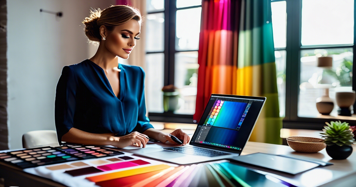
Use AI to read your natural coloring and map it to one of the four classic seasonal color palettes—Winter, Spring, Summer, or Autumn—so you can select clothing, makeup, and accessories that flatter your skin tone and hair color. The goal is simple: extract accurate color data, craft a clear prompt, then refine the output into a useful, personalized fashion advice guide.
- Take a photo in ample natural light.
- Pick hex codes from skin, hair, and eyes.
- Plug those codes and notes into ChatGPT with your objectives.
- Test and iterate until the palette and advice resonate. Keep your palette for shopping.
1. The photograph
Shoot a selfie in natural daylight near a window, but not in harsh noon sun. Shut off indoor lights to avoid warm or cool casts. Forget filters.
With hair, eyes and bare skin exposed. No cakey foundation, or contour or colored contacts. No bold frames or shiny jewelry.
Pull up in front of a blank, light background and stop any color bounce. White, light gray or beige is a good choice.
If possible, shoot front, slight left and right angles. A close-up of your face + 1 mid-shot provides the AI with more information.
2. The hex codes
Take a sample of three spots on your cheek, jaw, and forehead — plus your iris and natural hair — using any color picker or AI tool. Copy the hex codes (e.g. Skin #D8B6A4, eye #5A6C74, hair #4A2F24).
Make a tiny table for clarity, even if it's just text:
- Skin: #D8B6A4
- Eyes: #5A6C74
- Hair: #4A2F24
Be specific. Steer clear of highlights and shadows. Try some mid-tones. Right codes make for stronger seasonal calls, more precise palette selections.
Note undertones you observe: golden, peach, olive, cool pink, or neutral. See if clear brights flatter you more than muted — that hint divides Winter vs. Summer or Spring vs. Autumn.
3. The prompt
For a precise ChatGPT color analysis tutorial for beginners, skip vague descriptions and go straight to a structured prompt. Upload a clear, natural-light selfie and use this cheat sheet: "Analyze this selfie for warm, cool, or neutral undertones using the 12-season system. Compare results to professional draping standards, identify my dominant season, and ignore any compression artifacts or uneven lighting. List the hex codes of my most flattering palette shades and explain the reasoning behind each recommendation." This approach turns ChatGPT/AI tools into a surprisingly capable free color analysis AI — especially when your photo is taken near a north-facing window with no filters applied.
Ask for outputs you can use: a seasonal type (Winter/Spring/Summer/Autumn), a palette of 12–24 colors, plus makeup shades and outfit combos.
State preferences or limits: avoid neon, include workwear basics, focus on daily wear or a special event.
Add context: "I shop online," "indoor office illumination," or 'wedding guest evening light.' ChatGPT can customize hex lists and shade intensity to the context.
4. The follow-up
Review the initial attempt and request a more detailed explanation. Try: "Compare Winter vs. Summer for my codes," or "Show muted vs. Clear options.
Request alternates: "Give me a Soft Summer capsule and an Autumn contrast to test.
Request product or outfit picks related to the palette, complete with hex-linked swatches and fabric types.
Preserve or obtain the personalized palette and codes for future acquisitions. Employ it to suss out your clothes and makeup and look and feel your best.
Interpreting your AI results
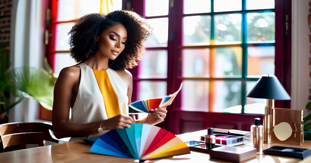
Reference the AI color palette as a guide, not a gospel. It directs you toward colors that might fit your skin tone, hair color, and eye color, but life will validate what will really work. Consider each outcome as a robust baseline needing your eyes, mirror, and personal color palette.
Compare the palette with your natural coloring
Stand in the sunshine by a window. Wear a solid top that won't reflect color onto your face. Compare the recommended swatches against your cheek, then against your eyes and hair. Watch for lift: clearer eyes, even skin, fewer shadows.
If the AI named you Autumn, you might look great with warmth with camel and olive. Still, it may overlook your subset — like Soft Autumn, which requires gentler, lower-contrast tones. Others tagged Spring or Autumn later discover a tighter match, like Copper Spring, produces crisper resonance.
If teal or slate washes out your complexion, remember it, even if the chart labeled them "best." Harmony appears as proportion, not as sound.
Check colors against your wardrobe and makeup
Extract five you wear a ton and five you steer away from. Compare them against the AI selections. Do the 'keepers' align, or do they battle the chart?
Try a quick test: one lip shade, one scarf, one shirt. Check to see if rust, burnt orange, or terracotta warm you up or make you wash out. For a lot of people, vibrant, deep colors such as purple or cobalt blue draw more attention than the instrument indicates.
If a color makes your skin look gray or your eyes look dull, relegate it to the 'accent only' pile or ditch it. Just be sure to maintain a photo log under the same light to compare results in an even-handed manner.
Look for patterns in tones, accents, and undertones
Circle the main ideas in the AI output: warm vs cool, muted vs clear, light vs deep. Notice the base colors that continue to emerge, the highlight colors that provide pop, and the undertones (golden, olive, rosy) that guide you.
AI nails the wide season—let's say Autumn—but can be fuzzy on subsets such as Soft Autumn. Track misses: maybe clear teal and slate flop, while walnut, espresso, and amber green win.
Pattern spotting trumps random guesses.
Try new shades and styles with intent
Run small experiments before large purchases. Try scarves, nail polish, or a cheap t-shirt in 2-3 recommended colors. Blend one 'safe' color with one 'stretch' color.
If earth tones come off flat, reach for the deeper versions or cooler neighbors. If cobalt or purple ignites you, ground them with neutrals that echo your undertone. Save what gets worn again and again and ooh-ed and aaah-ed over.
Beyond the four seasons
Contemporary AI goes beyond the traditional four seasons of colour analysis. It scans nuance in undertone, depth, and clarity, allowing it to find options that feel more specific and actionable. By measuring skin's overtone and undertone, eye pattern and rim contrast, and hair depth, it determines your position on a broader spectrum. Instead of just four, there are now 12 seasons on that map. Each principal season—Winter, Spring, Summer, Autumn—fractures into triplets, providing a more refined sense of what operates on you day to day.
The sub-seasons reveal how depth and chroma change your optimum choices. For instance, Summer may be Light, True, or Soft, while Autumn can be Soft, True, or Dark. Winter can be Dark, True, or Bright, and Spring may be Bright, True, or Light. This additional dimension is helpful because authentic faces are not one-dimensional, and understanding your personal color palette can enhance your overall appearance.
Color analysis sub sections examine the depth of color of each person, so you get closer to shades that complement your contrast & radiance. For example, Soft Autumn leans warm and muted, echoing late summer haze and early fall leaves: olive, camel, dusty teal, and warm taupe bring calm balance. Light Summer is cool and airy, so soft blues such as sky, powder and periwinkle float the face without hard edges.
Deep Autumn has a lot of weight in hair and eyes, therefore warm purples – aubergine and warm plum can seem luxurious and rooted. AI activated, when you don't perceive an ideal match. Others hear apps aren't 100% specific, and that's okay. Faces can mix traits: warm skin with cool eye whites, or low-contrast skin with dark hair.
AI can test edge cases by scoring undertone (warm, cool or neutral), depth (light to dark) and chroma (soft to bright). It can then experiment with hybrid or "close by" palettes, such as Soft Autumn with some True Autumn touches, or Bright Spring with a splash of Light Spring for work attire.
With all that said, personal taste still matters in choosing your color palette. You might adore cobalt even while reading Soft Autumn. AI can build custom capsule palettes to bridge gaps: pick five to eight base colors, two accents, and one pop shade that suits your goals.
Imagine a travel collection in neutral linen, moss and clay with dusty rose as a gentle accent and aubergine for evening. Or a Bright Winter work with charcoal, inky navy, optic white and cyan and a pop of fuchsia. You can sample trending schemes—quiet luxury neutrals, coastal blues or earth greens—and have AI remap them to your season so trends still flatter.
The future of AI styling

AI-powered color analysis is evolving fast — and the next wave is already here. Tools offering free AI color analysis are moving beyond static uploads: real-time scanning now reads a live selfie, adjusting for shifting light, skin undertones and fabric texture on the fly. AR overlays let you drape shades directly onto your face, hair and outfit before you spend a penny — whether that's a muted olive bomber or a bold coral lip. But the real game-changer for 2026? Palette sync. Platforms like Vinted and Depop are integrating AI free color analysis data so your seasonal results automatically filter second-hand listings to only show pieces that genuinely suit you — no more scrolling past a hundred wrong-season finds. Meanwhile, smart mirrors in high-end hotels are pulling personal color profiles via QR code, so guests can do a quick personal color analysis from photo check right in their room. The line between ChatGPT/AI tools and your wardrobe is disappearing — and it's doing so for free.
Shopping apps will plug this in at checkout and flag near-match tones, cross-size fits and better pairings from your closet. This is important for budgets and the planet. When you can try on a warm taupe coat in seconds, you eliminate guesswork, returns and waste. Less bad buys, less carbon from shipping and overstock!
Personalization will get sharper as models learn your patterns. It will learn what you retain, return, enjoy and overlook. It will monitor climate, season and local light. After a while, it won't say "deep autumn" either.
It'll discover that you shine brightest in deep autumns with soft contrast, golden metal, and low-sheen fabrics. It will observe that you eschew harsh black, but do well with pine, mulberry and ivory. A number of users already say AI findings are on par with pro analyses, which points to precision improvements.
That said, the optimal route combines human artistry and AI rapidity. A stylist can interpret mood, body language, and life context. AI can experiment with ten palettes in a minute. Used in combination, they increase the hit rate and maintain the humanity.
Access will broaden as color tools come bundled with fashion, beauty and design platforms as a default feature. Anticipate embedded assays at phone cameras and makeup counters and smart mirrors. For those who can't fork over $500 for a pro analysis, a free or low-cost app is a decent begin.
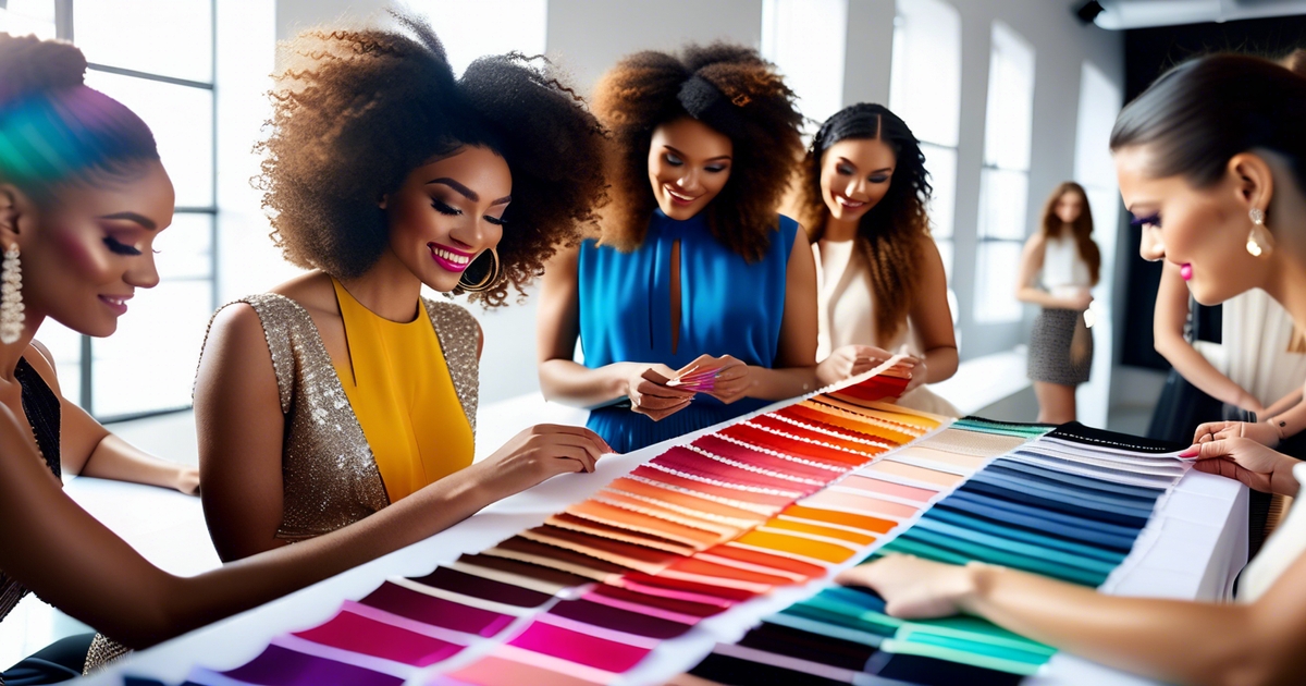
This transition opens new doors in areas with limited stylists. You get advice tailored to your skin tone, culture and budget – no flight or waitlist required. Communities will form around common palettes and live styling workshops.
Users will share side-by-side tests and vote on shade tweaks, and co-construct capsule lists. Brands could even host ethical swaps, where you score better fit in your local community rather than purchasing new. This is where AI can change habits: fewer impulse buys, more long-wear pieces, and clearer fit notes.
Ok, sure, some positions will transition, and some stylists will be supplanted. Most will employ AI to provide more clients, and faster, with superior evidence. The question is balance, not takeover.
Conclusion
To sum it all up, AI color checks help style feel less abstract and more concrete. A mere glance can identify hues that bring out your hair, eyes and skin. You save times. You leap-frog guessing. You see actual victories. Consider soft teal for cool skin. Go rich olive for warm tones. Test a matte rose lip, then a coral one. Snap pix in sunlight. Keep tabs on what ignites more flame.
To stay savvy, mix AI advice with your instinct. Try a minor tweak, such as a new tee or scarf. Check it out in sun and shade. Narrow down a short list that suits your life, climate and budget.
Prepared to check your hues. Run one AI check today, two colors this week — see what sticks.
Frequently Asked Questions
Can ChatGPT do a reliable color analysis from photos?
Modern ChatGPT/AI tools like GPT-4o can analyze images directly — upload a clear daylight selfie and ask for a chatgpt personal color palette test or a full chatgpt color analysis tutorial for beginners. That said, for precise skin-tone mapping and undertone detection, a dedicated solution delivers noticeably sharper results. ColorMine AI offers free ai color analysis with 95%+ accuracy, trained on 30,000+ professional draping sessions — making it the go-to choice for anyone searching for color analysis ai free or how to do personal color analysis from photo. Run your photo through ColorMine first, then bring the results back into ChatGPT for styling advice and wardrobe planning.
What is AI color analysis, and how does it work?
AI color analysis utilizes algorithms to evaluate your skin tone, hair color, and eye color. It matches pixel information and undertones to create a personalized color palette that produces colors adding contrast and warmth to flatter your features.
Why use AI instead of a traditional seasonal method?
AI is not limited to the four seasons; it considers various factors like contrast level, chroma, and undertone for detailed colour analysis. This results in more accurate color palettes and edge cases, making it faster and consistent.
How do I get accurate AI color analysis results?
Utilize natural, indirect daylight for your colour analysis. Remove makeup if possible to avoid color casts from bright clothing or walls. Post a high-res photo for a detailed colour analysis, as repetitive inputs increase precision.
How should I interpret warm vs. cool recommendations?
Warm suits typically feature golden, peach, or olive undertones, while cool suits showcase pink, rosy, or blue undertones. For those with a neutral skin tone, many seasonal color palettes can be flattering, emphasizing the importance of value (light–dark) and chroma (soft–bright) alongside temperature.
What if my AI results conflict with what I like to wear?
Use results from your detailed colour analysis as advice, not law. Save your top picks from your personal color palette. Employ your palette close to the face for punch—tops, scarves, lipstick.
How will AI styling evolve in the future?
Anticipate improved image analysis, real-time try-ons, and linked shopping with personalized color palettes. Models will adjust to various skin tones and lighting, enhancing confidence through detailed colour analysis and honest data treatment.