The Ultimate Guide to Warm Color Palettes for Your Home & Designs

Key Takeaways
Warm tones have moved well beyond feel-good theory — in 2026, a well-built warm palette is a practical design tool. While 2024 left many rooms drowning in rust and overcooked terracotta, the new wave is smarter: think buttercream, honey, and rich burgundy anchored by earthy neutrals like Universal Khaki. These warm warm hues don't just look good — they actively fight blue-light fatigue in home offices, with warm whites like Pantone's Cloud Dancer reflecting natural light to make spaces feel larger and calmer. The real insider move? Match your warm hue to your bulbs. CRI 95+ LEDs at 2200–2700K are the only way to keep bold warm warm red tones from shifting orange under artificial light — and the difference between a room that glows and one that just looks muddy. Whether you're layering warm tones like warm terracotta with bronze wood accents or testing a warm warm red complement against a greige base, lighting is the variable most DIYers get wrong first. This is the ultimate guide to warm color palettes for your home designs — built for people who've seen too many beautiful paint chips turn into regrettable walls.
💫 Discover Your Complete Color Palette
Ready to discover all the colors that make you look radiant? Our comprehensive color analysis will reveal your complete personal palette - perfect for hair, makeup, and wardrobe decisions.
Take Color Analysis Quiz →Begin your palette by defining the feeling you desire, then choose a hero warm color and offset it with gentle neutrals. Toss in a little cool contrast and texture to keep things dynamic and cozy.
Use the 60-30-10 rule to organize your colors for balance and simplicity. Try shades under your real lighting to prevent overwhelming intensity and unexpected color shifts.
Honor cultural significance of warm tones so your designs communicate internationally. Take palettes for international branding and products and investigate local associations and symbolism.
Dive into curated palettes such as Sunset Glow, Autumnal Earth, Spiced Terracotta, and Golden Harvest to establish unique moods. Combine with natural materials and layered finishes to enhance warmth and personality.
For digital work, make sure to optimize warm palettes for accessibility and consistency on screen and in print. Verify contrast, test across devices, and maintain brand tones to increase recognition.
A warm tones color palette consists of colors such as terracotta, ochre, sienna, rust, and soft peach that skew red/orange/yellow on the color wheel.
These colors add depth, cosy mood and work wonderfully in interiors, branding and photography. When used in 60–80% of a scheme, they pair with cool accents such as slate grey or sage for equilibrium.
To keep skin tones natural, select subdued warms. The following sections demonstrate actual combos and applications scenarios.
📚 Recent Articles
The psychology of warm tones
The psychology of warm color palettes—reds, oranges, yellows, pinks, and browns—indicate heat and proximity, creating a cozy living room atmosphere that fosters connection. These vibrant colors can draw people closer, round sharp corners, and make time seem to stretch.
Warm colors are the most stimulating on the color wheel. They wake up the senses and direct mood on demand. Deep reds and crimson can add ferocity to a scene, handy in posters, stage sets or brand headers where bold impact fares.
Golden yellow alludes to sunshine and happiness, so it elevates hallways, tiny kitchens, and work nooks, particularly during the darker months. For calm, lean into peach, sand and muted terracotta. These snuggle tones encourage silence — perfect for bedrooms and reading nooks!
Brown warms a room, providing a foundation that feels solid and reliable – imagine walnut floors, or leather chairs, or clay tiles that root vibrant pops without muting them. Pink adds warmth and love. Blush paint in a nursery, salmon textiles in a lounge or rose packaging all can signal softness and nurture.
In retail, a coral focal wall can amplify warmth while maintaining flow lively. In storytelling, warm palettes frame the human moments–celebration, hospitality, union–so messages feel more personal and generous.
Evoking emotion
Warm tones are the most stimulating on the color wheel. They wake up the senses and direct mood on demand. Deep reds and crimson can add ferocity to a scene, handy in posters, stage sets or brand headers where bold impact fares.
Golden yellow alludes to sunshine and happiness, so it elevates hallways, tiny kitchens, and work nooks, particularly during the darker months. For calm, lean into peach, sand and muted terracotta. These snuggle tones encourage silence — perfect for bedrooms and reading nooks!
Brown warms a room, providing a foundation that feels solid and reliable – imagine walnut floors, or leather chairs, or clay tiles that root vibrant pops without muting them. Pink adds warmth and love. Blush paint in a nursery, salmon textiles in a lounge or rose packaging all can signal softness and nurture.
In retail, a coral focal wall can amplify warmth while maintaining flow lively. In storytelling, warm palettes frame the human moments–celebration, hospitality, union–so messages feel more personal and generous.
Cultural meaning
There are cultural meanings to warm colors–luck, celebration, mourning or spirituality–so context is important. For instance, in certain regions of Africa, certain warm tones emerge in funerary ceremonies. In France, some colors might be masculine.
In most Asian festivals, bright red signifies wealth and togetherness. Designers with global audiences gain from testing palettes with local partners and adjusting saturation or pairings to suit norms. If you're planning events or clothing, leverage culturally relevant colors to gain trust.
A saffron robe in a temple requires a delicate sense of tone and placement. Packaging and branding benefit from flexible systems: one core warm palette, multiple regional variants with adjusted brightness, contrast, and symbols.
| Color | Common associations (selected regions) | Notes |
|---|---|---|
| Red | Prosperity, celebration (East Asia); mourning in some Africa contexts; passion globally | High arousal; use with balance |
| Orange | Harvest, joy (varied); spiritual robes (South Asia) | Friendly, social, can skew playful |
| Yellow | Royalty (some Southeast Asia); caution in signage; warmth and optimism globally | Bright yellow uplifts and energizes |
Historical context
Warm colors have a long history in art and design, particularly in creating a cozy living room atmosphere. Renaissance painters utilized warm red lakes and gold leaf to draw attention to sacred figures, imparting both a glow and stature. Classic interiors often embraced earthy tones like earthy reds, ochres, and browns for luxury and warmth, using wood tones and leather to anchor the space and indicate stability.
Mediterranean homes relied on a warm color palette, featuring terra cotta and sun-baked walls, which are both practical in the heat and visually warm come dusk.
Fashion trends often return to warm hues like rust, camel, and saffron when we yearn for tactility and heritage.
Architecture bounces between cool minimalism and warm things like brick, brass, and oiled wood. Contemporary rooms mix golden LEDs with amber fabrics to sculpt mood in the evening. Retail employs warm zones near entries to beckon, then steps into cooler accents for attention.
The through line remains clear: warm color palettes evoke happiness, excitement, or nostalgia, and when harmonized with browns and soft pinks, they create a soothing atmosphere that balances energy with rest.
How to create a warm tones color palette
Warm tone theory emphasizes the use of a warm color palette focused on reds, oranges, and yellows, created by neutrals that share warm undertones. First, identify the mood, then build a cozy color scheme that balances depth with light and contrast. Instead of evaluating colors individually, utilize a color wheel or digital tools to compare hues side by side, ensuring the scheme remains cohesive across surfaces and light.
1. Define your feeling
Start with the feeling you want to live with: cozy retreat, vibrant energy, or serene escape. Sketch a brief list of adjectives—calm, bright, intimate, grounded—and keep it in front of you as you select hues.
Map words to shades so selections remain truthful. Deep reds shout passion and intimacy, soft oranges are comforting, golden yellows imply optimism and daylight. Vibrant orange and yellow together can give a boost of warmth and optimism, while muted golds and soft creams provide rich but subtle contrast.
Link mood to purpose. Even a reading nook can lean into terracotta and caramel for calm focus. One kitchen might opt for honey yellow with wheat neutrals for a vibrant jumpstart. For contrast, consider gradients, from rich #C85A3D to airy #F9E1A0, so the area fades seamlessly from day to night.
2. Select a hero color
Choose one primary warm color that expresses that main feeling—fiery red for energy, bright yellow for optimism, deep orange for earthy warmth. Use it where eyes land first: an accent wall, a sofa, a brand mark.
Then build a cast around it: softer tints for air, deeper shades for anchor, and warm neutrals to knit it all together.
3. Layer with neutrals
Warm palettes require air. Throw in some beige, tan, oatmeal or creamy white to stabilize energetic colors. Check undertones: whites and grays can run warm or cool, and a cool gray will dull warm reds fast.
Pull together a neutral shortlist that compliments your hero hue—almond, sand, mushroom, or a pink or yellow-biased greige. Add depth without noise with textured neutrals in rugs, curtains, and knits.
Skip the messy sample pots — they smear, dry unevenly, and cost you $15–20 a pop for a result you can barely trust. Instead, grab peel-and-stick swatches like Samplize (around $6–9 each) and press them directly onto your wall. You'll see exactly how each warm hue behaves in your actual light — morning sun, afternoon glare, and evening LED all included. This is the kind of move covered in the ultimate guide to warm color palettes for your home designs: test your warm palette under every lighting condition before you commit to a single drop of paint. Peel, reposition, compare — no damage, no drama.
4. Introduce a contrast
A lil' cool accent sharpens warmth! Experiment with blue or green at 10% or below—imagine a teal vase, sage art frame or slate lamp base.
Take highlight trim, shelves, or a niche so the cool note leads the eye without disrupting harmony. Utilize a color wheel to select complements crisply and steer clear of clashes.
5. Integrate texture
Warm colors seem richer to the tactile sense. Combine oak, rattan, wool, velvet, and clay with terracotta, coral, and saffron to introduce a grounded sense of warmth.
Textured neutrals—linen drapes, boucle throws, jute rugs—enhance warmth and diffuse glare. Mix finishes for dimension. Matte walls, satin wood and plush upholstery keep warm tones reading layered, not flat.
Hold samples up next to each other, not separately, to maintain cohesion through light changes and adjacent colors. Mix soft pinks with deep purples for an elegant entrance, accented with dusty golds and soft creams for understated luxe that still shines.
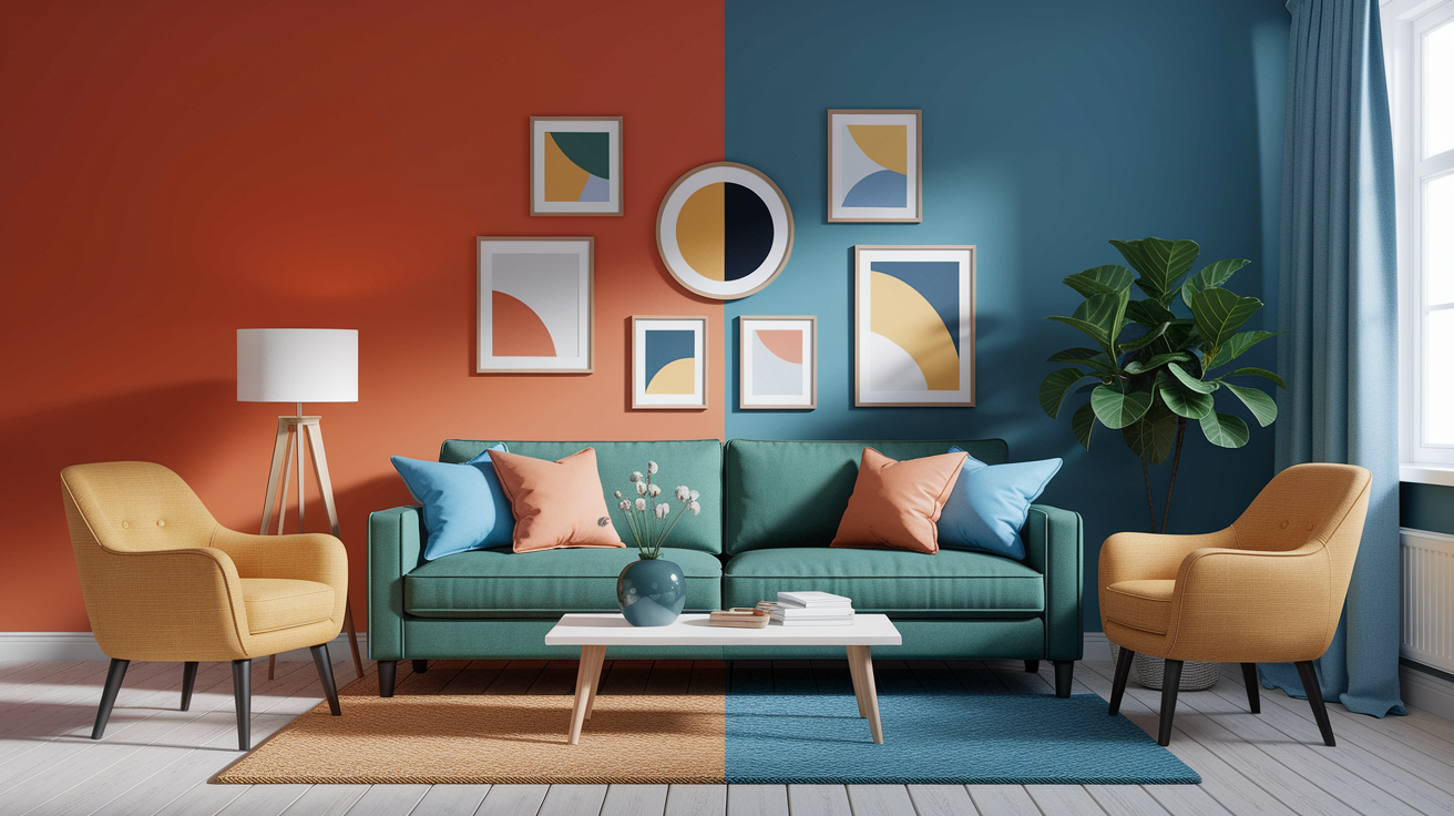
Balancing warmth with coolness
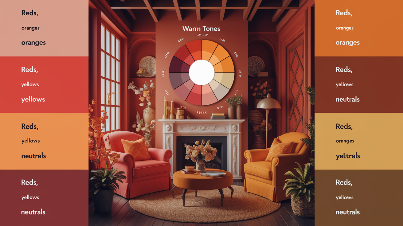
Warm palettes are inviting, but too many warm tones can become heavy or stifling. Cool tones soothe, but used in isolation they can come across as chilly or distant. Balance comes from color temperature: warm reds, oranges, and yellows carry energy; cool greens, blues, and magentas soothe.
On a color wheel, divide the circle into warm and cool halves to pair. Temperature is comparative; a red close to magenta appears cooler than the same red adjacent to orange. Whites move too — cream pulls warm, bright white with blue undertone feels cool. Black, too, sits neutral and can steady either side.
The 60-30-10 rule
Split this ratio between a dominant warm base (60%), a secondary tone (30%), and a high-contrast accent (10%). This easy equilibrium maintains rooms airy and prevents that closed-in sensation that can occur with wall-to-wall warm hues.
Apply it to walls, art, and logos. Example: 60% soft terracotta walls, 30% sand upholstery, 10% teal accents. For branding, 60% warm coral, 30% muted clay, 10% navy for buttons or headlines.
A quick chart you can sketch: Column A (60%): warm base—terracotta, ochre, cinnamon. Column B (30%): supporting warm—caramel, rust, apricot. Column C (10%): cool accent—teal, sage, indigo. Make sure your 10% has obvious value/temperature contrast so it 'pops' without conflicting.
Monitor undertones. Cooler navy will cool a warm coral more than green-leaning teal.
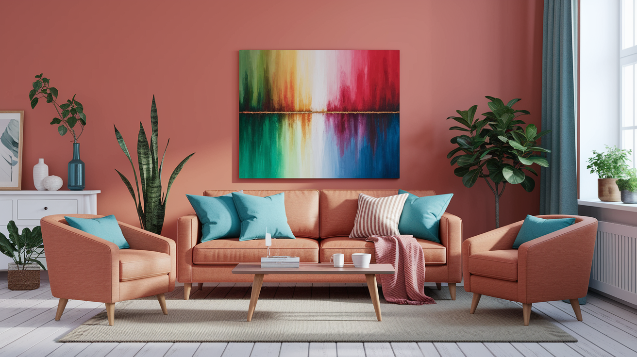
Cool accent strategy
Begin early. Teal, navy, sage, or steel blue accents in pillows, art, lamps, vases, or even a single chair works as well. They slash warmth, introduce air, and prevent the tableau from becoming thick.
Offset warmth with cool accents to pop a focal point or draw the eye along architectural lines—window trim in slate blue, a bookshelf back in deep sea, or a kitchen island in ink blue complementing warm oak. These accents border the hot pitch and provide dimension.
Match saturation. Instead of neon teal, balance out that warmth with a cool color — like muted rust paired with dusty sage. If your oranges are bright, a bold cobalt can stand up. Play gloss levels, too – matte cool touches meld, high-gloss pops crisper.
Don't forget the sense flip. A mid-blue appears cooler next to orange than beside magenta, so put swatches together and test, not by themselves.
Neutral bridges
Neutrals connect warm and cool so that shifts come across as fluid instead of harsh. Soft grays, taupes, and muted beige sit between tones and break up harsh jumps.
I like to use them in big anchors—floors, walls, sofas—then put color on top. I think oak floors (warm) + a cool gray sofa and rust pillows FEEL steady. A warm white wall with a cool white trim can balance if undertones are clear.
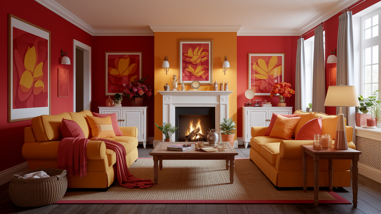
Versatile picks: warm gray (greige), Universal Khaki, Warm Greige (yellow-based grays), light taupe, stone, oatmeal, mushroom, warm white (with yellow or red undertone), crisp cool white (blue undertone), and true black for grounding. For open-plan spaces where pure warm tones like warm terracotta or bold warm warm red can feel like living inside a kiln, Universal Khaki and Warm Greige offer the perfect middle ground — they carry warm tones warm enough to feel inviting, yet stay grounded and airy. Black, while neutral, provides weight and helps warm-cool combos feel deliberate rather than accidental.
Exploring warm and cozy color palettes
Warm tones–reds, oranges, yellows, and their minglings–draw us in and establish a soothing, human atmosphere. They can invigorate, attract attention, and ignite nostalgia. Used judiciously, they bring richness, make rooms feel snug, and work for interiors as well as brand work.
Aim for balance: many designers follow an 80/20 rule, using 80% warm colors and 20% cool notes so the scheme feels lively, not loud. Even a single cool neutral can stabilize an otherwise warm scheme.
Sunset glow
Palette swatches and hex codes:
- Ember Red #C73A2B
- Marigold #F5A623
- Burnt Saffron #E07A2D
- Golden Hour #F2C14E
- Soft Sand (neutral) #E9DFD3
This palette has a bold, cinematic lean. Perfect for rooms or layouts that crave care and heat, such as a living room that welcomes visitors or a conference hero banner. Combine with matts textures, gentle weaves and flat paint to keep it mellow.
Add a cool touch—pale gray (#D9E0E6) or a soft blue throw—to keep balance.
Bedroom: marigold throw, ember red cushion set, sand walls
Living room: burnt saffron rug, oak table, linen sofa in sand
Event design: golden hour lighting gels, marigold florals, sand signage with ember accents
Autumnal earth
Swatches:
- Burnt Orange #CC6A2C
- Rust #B55239
- Deep Bark #4A2F2B
- Toasted Ochre #D09950
- Warm Cream #F4E9DA
Think cabin coziness and languid nights. These muted notes feel rooted, like a harvest table or a worn leather chair. Introduce wood, rough linen, jute and clay to create a tactile, sincere blend.
For the living rooms, ground with deep bark on a media wall and soften with warm cream curtains. Dining rooms come alive with rust upholstered chairs, toasted ochre table linens and candles.
Boutique interiors can layer burnt orange signage with natural wood shelving to encourage browsing.
Spiced terracotta
Swatches:
- Terracotta #C76849
- Clay #BA6A54
- Sienna #A4573B
- Muted Sage #9CB299
- Golden Wheat #E6C76E
This palette tips its hat to sun-baked walls and hand-thrown pots, warm but subdued. It glows when you seek dimensionality without shine, and matches beautifully with beige and cream for warm, snuggly foundation.
Accent walls: terracotta or clay in matte finish
Pottery: sienna glazes with wheat detailing
Textiles: terracotta stripe, sage edge piping, cream base
Counter warm with muted sage or a cool gray stone to keep the room crisp.
Golden harvest
Swatches:
- Honey #D9A441
- Sunbeam #F2D06B
- Soft Beige #EDE2CF
- Light Oak #C9A476
- Cloud White #F8F6F2
Fresh, simple and inspiring. Great for kitchens or breakfast rooms where light is essential. Use white cabinets and light oak stools to keep air flow, then layer honey hardware or sunbeam tiles for some pop.
In a close-quartered room that requires some joy, a sunbeam backsplash paired with soft beige walls infuses warmth without closing in. This scheme holds in brand layouts that desire optimistic oomph and clear eye direction.
Common mistakes to avoid
Warm color palettes create a cozy living room atmosphere, but they can quickly slide into heavy or clashy tones. Double-check these blunders before your room gets styled or paint dries.
Overwhelming saturation
Too many high-chroma reds and oranges and golds send the eye careening in every direction. Save the punch for an accent wall, a couch throw, a pottery vase, or a lip color. The rest can retreat so the spotlight gets its turn.
Combine daring paprika or terracotta with gentle neutrals–warm gray, sand, ecru or mushroom–to mitigate glare and ease visual fatigue. In clothes, a rich rust skirt with an oatmeal top maintains equilibrium, whereas head-to-toe rust can feel blaring.
Within one family, mix tints and shades: burnt sienna with pale peach, brick with shell pink, cinnamon with camel. That range brings richness. Don't make one flat intensity across big surfaces.
Test, always. Tape paint swatches on two walls, look at them at 09:00, 13:00, and 19:00. Drape some fabric samples around your sofa and under a lamp. For clothing, drape scarves or shirts near your face – if your skin appears gray or sallow, the color is too harsh or too close to your skin tone.
Ignoring light
Light shifts warm tones more than you think — and if you're not accounting for every source, your carefully curated warm palette will betray you. Direct sun can bleach soft coral into screaming orange by noon. Cool LED bulbs drain the soul out of warm beige, leaving it looking like a sad hospital wall. But here's the trap most people miss: the Metamerism Trap. That bold warm red or rich terracotta you fell in love with on the swatch? Under cheap LEDs or behind modern low-E glass coatings, it can shift into something sickly, muddy, or worse — greenish from the street. Those eco-friendly window coatings are excellent for energy bills and genuinely terrible for color accuracy if you haven't planned around them. Upgrade to low-E windows before committing to warm warm red or terracotta walls, and you'll gain 15–20% more natural light for true color rendering. As for artificial lighting — CRI 95+ bulbs with Adaptive Warmth are no longer optional. They're the baseline. 2026 smart bulbs like Philips Hue Warm Glow (set to 2200K) are specifically engineered to preserve the organic depth of warm hues — warm reds, terracottas, and amber tones — without the muddy collapse that cheaper LEDs cause. Sketch out every light source in the room: windows and their orientation, lamps, overhead fixtures. Note their color temperature. Then test your warm tones warm palette samples under all of them — morning light, evening light, and artificial — before you commit a single drop of paint to the wall.
Shift selections throughout the day. If a room gets strong afternoon sun, choose a less saturated paint or a matte finish to mellow glare. In alleys or little baths, use lighter warms such as buff, pale apricot or buttercream, to prevent the area from feeling congested.
This goes for your wardrobe as well. Colors that flatter at noon can appear off under evening LEDs. Inspect your outfits near a window and beneath indoor lighting.
Consider your natural hair color and skin tone: auburn hair might glow in brick red, while the same red can overpower cool, fair skin. Know your own palette, and you'll sidestep a life of trial-and-error.
Forgetting texture
Warm colors require texture to live. Woven rugs, raw wood, linen drapes, clay pots or velvet pillows provide touch and shadow that keep flat paint from looking flat.
Bid adieu to all-smooth – a glossy terracotta wall next to sleek leather can read austere. Play matte against nubby and plush to enliven the scheme.
For wear, texture is important. A ribbed knit in cinnamon is gentler on the eye than a slick satin in the same color, which can feel harsh or unflattering — particularly if it matches your skin tone a little too much.
Quick checklist: walls (matte or limewash), floors (natural fibers), big pieces (wood grain, boucle), accents (ceramic, aged brass), clothes (knit, suede, denim).
Weave in a cool accent–slate, indigo or sage–to break monotony and to steer clear of any clashes with your surroundings–gray cityscapes or lush green parks.
Warm tones in the digital age
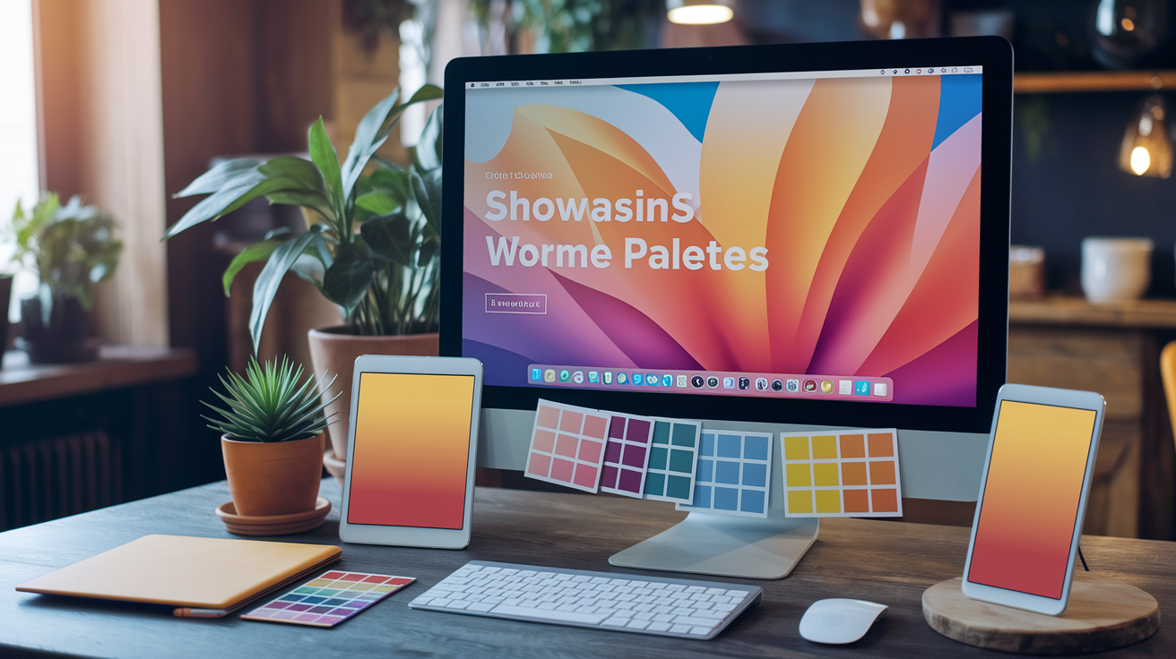
Warm color palettes carry centuries of history—ochres and umbers on cave walls, fiery reds in Indian textiles—but in 2026 their most compelling application is decidedly modern: the home office. As screens dominate our days, designers are leaning into warm tones precisely because they counteract blue-light glare and the creeping exhaustion that sets in by mid-afternoon. A wall painted in rich terracotta or amber doesn't just look inviting on a video call—it actively reduces visual fatigue, keeping your eyes comfortable and your focus sharp well past 4 PM. This is what experts now call "Digital Warmth": the deliberate use of warm tones like warm amber, burnt caramel, and Pantone's Cloud Dancer to soften the harshness of LED monitors and fluorescent overheads. Where cool grays once dominated home offices, warm warm neutrals are taking over—because a space that feels human keeps you productive without the headache.
Screen vs. print
Digital screens project heat. Oranges and reds tend to appear brighter on backlit screens than they do on paper, and muted browns can become flat when converted for print. Anticipate these transitions well in advance.
Maintain a master palette in RGB for screens, then assemble a print set in CMYK that retains mood, not just digits. Matching intent with color profiles is crucial. SRGB is what the bulk of web situations use. Display P3 has a wider gamut on newer devices.
For print, work in CMYK with your printer's correct ICC profile, and soft-proof to pick up banding or dull shifts before ink kisses paper. A/B check key UI states — hover, active, alert — on both mediums so warnings stay clear.
Remember that the same warm tone can seem refreshing in spring or cosy in winter marketing. This seasonal swing is stronger in print where light is reflected, not transmitted.
| Color name | RGB (screen) | CMYK (print) |
|---|---|---|
| Terracotta | 204, 102, 76 | 10, 65, 55, 10 |
| Soft brown | 153, 102, 85 | 25, 60, 55, 25 |
| Raspberry red | 186, 46, 64 | 15, 90, 60, 10 |
| Warm orange | 242, 141, 53 | 0, 55, 85, 0 |
| Ochre | 204, 136, 34 | 10, 40, 95, 15 |
Accessibility matters
Warm-on-warm can smear quick. Aim for at least 4.5:1 contrast for body text and 3:1 for large text. Combine amber buttons with umber text, or raspberry tags with off-white backgrounds.
Forget twins. Burnt orange on terracotta or suave brown on tan might blend together for color blind users. Provide shape and weight and obvious labels so that meaning is not color-only.
Try them with handy palette utilities such as Contrast Checker, Stark, or Color Oracle. Verify light and dark modes, hover and disabled conditions, and focus rings.
Make calls-to-action warm but still readable. In small doses—icons, highlights, badges—they bring energy without glare or fatigue.
Brand perception
Warm colors shout accessibility, vitality and vibrancy. Red announces energy and swift response. Terracotta and warm neutrals seem earthy, even rustic or Mediterranean, which could help counterbalance tech with a human voice.
Match tone to values and audience. A health app could have peach and clay accents for care and calm. An events brand might choose punchy coral for celebration.
In 2026, the warm palette story is being written by bold warm warm red tones like Burgundy and the sun-baked richness of Terracotta—a power duo that brings both elegance and organic depth to any interior. Warm tones warm every corner of a space, from accent walls to soft furnishings, while Cloud Dancer, Pantone's warm white of the moment, reigns supreme in small spaces—reflecting natural light to make rooms feel brighter and more expansive. Digital brands tapping into warm warm hues this season will resonate with audiences craving that same grounded, cozy comfort at home.
Be consistent across touchpoints—app UI, emails, ads, packaging—so users get the same vibe everywhere. Follow click-throughs and dwell time and survey terms like 'friendly' or 'trusting.' Adjust saturation and contrast instead of changing the hue family.
Conclusion
Warm tones aren't just nice to look at. They make mood, form flow, direct the eye. A soft terracotta wall can soothe a lobby. A coral button can raise a sign up rate. That clay mug with gold trim actually brings a shelf to life. Little steps make a difference.
To construct thoughtfully, try it out on actual screens and in actual light. Pair rust with soft gray. Place peach by cool navy. Use legible typography. See Watch contrast on mobile. Repair eye-straining spots.
Style comes and goes, but warmth stays close to people. Begin tinier, discover speedily, and retain what works. Have a space, site or brand in mind? Post one or two pics, and YOUR #1 goal! So, let's draw a warm tones color palette.
Frequently Asked Questions
What are warm tones in color palettes?
Warm tones, such as warm reds, oranges, yellows, and earthy tones like terracotta and camel, create a cozy living room atmosphere. They seem vibrant and welcoming, perfect for injecting visual heat into your decor and designs.
How do I build a warm tones color palette from scratch?
Begin with a bold warm color, such as warm red. Complement this with two supporting shades in a warm color palette, one lighter and one darker. Add a neutral like beige for balance, then top off with an accent color for contrast.
How do I balance warm and cool colors?
Apply the 60-30-10 rule to create a cozy living room. Keep warm color palettes at 60%, sprinkle in 30% neutrals, and add 10% cool accents like teal or navy to maintain a vibrant color scheme.
Which warm colors feel cozy rather than loud?
Choose muted, low-saturation tones like burnt orange, ochre, and rust, paired with warm neutrals such as sand or mushroom. This warm color palette creates a cozy atmosphere, establishing a peaceful, comfortable vibe without visual clutter.
What mistakes should I avoid with warm palettes?
Don't overdo it with contrasting colors or too many close shades. Avoid using a warm red for large areas. Always check text color contrast and test your color scheme in different lighting and on multiple screens to prevent color shifting.
Are warm tones accessible for digital interfaces?
Yep, as long as there's contrast in your cozy living room. Opt for warm color palettes with dark text or warm accents on neutrals to create a soothing atmosphere. Shoot for WCAG AA contrast ratios to enhance your warm backdrop.
How do warm tones influence user behavior?
Warm tones like warm reds, yellows, and oranges can raise attention and a sense of urgency, creating a cozy living room atmosphere. They increase accessibility and foster emotional bonding without compromising legibility or believability.