Dark Winter vs. Dark Autumn: What's the Difference?

Key Takeaways
Still torn between dark autumn vs dark winter? You're not alone — and if you've been going back and forth for years, there's a good chance you're caught in the classic Olive Skin Trap. Deep olive undertones fool even seasoned stylists into misreading a cool dark winter as a warm dark autumn, and in 2026, that confusion is quietly draining your wardrobe budget one wrong purchase at a time. Here's the sharpest way to cut through the noise: hold a true black fabric next to a rich espresso brown under natural daylight. If black makes your face look alive and defined, you're almost certainly dark winter — cool, high-contrast, built for saturated jewel tones and icy accents. If espresso feels like it belongs on your skin, welcome to dark autumn, where the deep autumn color palette of burnt sienna, olive green and terracotta does the heavy lifting. The dark autumn vs dark winter color palette split comes down to one non-negotiable: undertone temperature. Dark winter and dark autumn both live in deep, rich territory, but dark winter vs dark autumn diverges sharply — cool-to-neutral-cool versus neutral-to-warm. Ring lights lie, phone cameras lie, and most online quizzes are built for lighter seasons. For anyone navigating the dark winter or dark autumn question with olive skin, the only reliable answer comes from precision-dyed drapes in real daylight — everything else is an expensive guess.
💫 Discover Your Complete Color Palette
Ready to discover all the colors that make you look radiant? Our comprehensive color analysis will reveal your complete personal palette - perfect for hair, makeup, and wardrobe decisions.
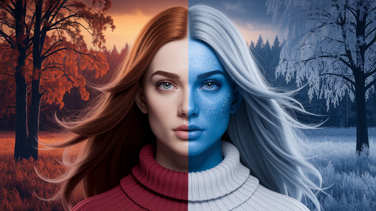
Take Color Analysis Quiz →Dark autumn vs dark winter comes down to one core split: warmth versus cool depth. Dark autumn runs warm, earthy, and brown-rooted — think burnt sienna, olive, and tobacco. Dark winter is cool, high-contrast, and black-anchored — deep navy, icy plum, and crisp burgundy. If your coloring reads medium contrast with a muted, golden quality, dark autumn fits. If you carry sharp contrast with a cool or neutral-cool undertone, dark winter is your season. The dark autumn vs dark winter color palette debate gets especially tricky with olive skin — deep olive undertones mimic warmth, but true dark winter olive reads cool and high-contrast. Test it simply: hold cool silver jewelry near your face in natural light. If it sharpens your features, you're dark winter regardless of the olive. If it washes you out and gold glows instead, trust dark autumn. The deep autumn color palette vs deep winter difference isn't subtle once you see it — earthy warmth versus saturated cool clarity. Don't guess; drape and compare.
Dark autumn vs dark winter comes down to one core split: warmth versus cool depth. Dark autumn runs warm, earthy, and brown-rooted — think burnt sienna, olive, and tobacco. Dark winter is cool, high-contrast, and black-anchored — deep navy, icy plum, and crisp burgundy. If your coloring reads medium contrast with a muted, golden quality, dark autumn fits. If you carry sharp contrast with a cool or neutral-cool undertone, dark winter is your season. The dark autumn vs dark winter color palette debate gets especially tricky with olive skin — deep olive undertones mimic warmth, but true dark winter olive reads cool and high-contrast. Test it simply: hold cool silver jewelry near your face in natural light. If it sharpens your features, you're dark winter regardless of the olive. If it washes you out and gold glows instead, trust dark autumn. The deep autumn color palette vs deep winter difference isn't subtle once you see it — earthy warmth versus saturated cool clarity. Don't guess; drape and compare.
Test undertone with quick tests in natural light like vein color and gold vs silver jewelry. Get your undertones correct before you start experimenting with brights or neutrals.
Frame your foundation with season-right neutrals for simple mixing and matching. Autumn is alive with warm browns, camel, olive and cream while winter dazzles in black, pure white, charcoal and cool grays.
DIY it – try the fabric, jewelry, and lipstick tests and capture results with photos for easy comparison. Try both palettes — see which colors make your skin, your eyes, your entire being glow.
Because, as you point out, texture, lighting, and emotional fit are what really make colors in real life work. While you're selecting fabrics and settings, keep in mind what complements your palette and how you want to feel and be perceived.
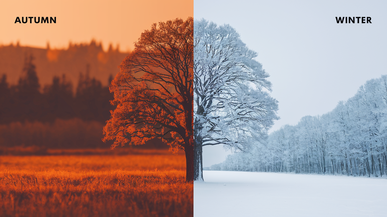
Autumn leans warm with earthy reds, burnt orange, olive, mustard and rich browns.
Winter feels cool and crisp with icy blues, emerald, burgundy, stark black and pure white.
Skin undertones often guide choice: warm suits autumn, cool suits winter.
In color theory, both use contrast but at different levels and temperatures.
The following portions dissect selections, combinations and practical applications.
📚 Recent Articles
The core of deep seasons
Deep Autumn and Deep Winter occupy the darkest portion of the scale in the **color season** spectrum. Both rely on deep, saturated colors that maintain their form even in dim light. These palettes remain vibrant on-screen or in a shadowy coffeehouse, showcasing gravitas, richness, and a dramatic flair that befits individuals of intense inherent contrast.
Deep seasons are about depth first. Colors have layers: think ink navy, bitter chocolate, plum, forest, and garnet. They read as deep, not dazzling. This depth combines with saturation, so the colors don't bleed when positioned next to bold elements, making the deep winter palette particularly striking.
On real looks, a deep teal coat paired with oxblood boots, or a charcoal tie with a wine shirt, demonstrates how saturation and depth combine to form a strong silhouette around the face. The deep winter characteristics are evident in these choices, showcasing the power of color.
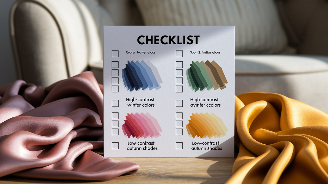
Undertone determines lane. Deep Winter is cool, while Deep Autumn is warm. Deep Winters flourish in blue-based shades such as true red, blackberry, pine green (cool base), cobalt, and ice pink. Neutrals skew crisp: black, white, cool charcoal, and steel gray, which are essential for a professional color analysis.
Deep Autumns carry heat with shades like golden-brown, burnt orange, olive, and bronze. Espresso, warm navy, camel, and deep olive are their best neutrals. The same green splits by undertone: pine (cool) for Deep Winter, and olive (warm) for Deep Autumn, highlighting the **dark winter** colours.
Several deep seasoners display a dramatic balance in hair, eyes, and skin—dark hair, bright eyes, and skin that can take contrast. Others have a nearly magnetic depth in an iris or strand of hair that appears inky beneath the sun, riding bold colors without losing them, a hallmark of deep winter individuals.
This is the reason saturated hues close to the face do so much good. A deep seasons scarf—berry or forest or bronze earring—can frame the features cleanly, enhancing one's natural beauty.
Dark and Deep are the same here. Both indicate the most bountiful, richest conclusion of Autumn and Winter. Both of these seasons are common, combining to cover around 20–24% of the population globally, with both frequently observed in North America.
A practical tip: test neutrals. Deep Winter pulls off black and optic white effortlessly. The contrast can cut like a knife to bone. Deep Autumn usually wears black better than any other warm season but is stunning in warm navy, espresso, or deep olive close to the face, showcasing the deep winter colors.
For color pops, Deep Winter grabs for fuchsia, ruby, and electric blue. Deep Autumn for paprika, rust, goldenrod, and peacock teal. Keep prints dense and grounded: high-contrast geometrics for Deep Winter, earthy florals or tribal repeats for Deep Autumn.
Key differences in autumn vs winter color palette
Autumn, characterized by warm, earthy colors, transitions into the cooler winter season, where deep winter palettes shine with high contrast and dark shades that enhance natural beauty.
1. The undertone
Winter palettes feature crisp, cool undertones, with blues and greens or blacks and whites, like snow, charcoal, or icy waters. Winter palettes carry blue, pink, or black undertones which provide cool sharpness, think snow white, ink black, icy magenta and cobalt.
Undertone fuels seasonal color analysis far more than brightness or saturation. It determines whether a color illuminates your skin and makes it glow or fades it.
Start by checking your undertone — and do it only in natural daylight, never under ring lights or LED bulbs. Artificial lighting cools the skin's appearance and routinely pushes people toward a false Dark Winter result when they may actually be Dark Autumn. Look at the veins on your inner wrist: green tones point warm, blue or violet point cool, and a mix suggests neutral. Next, hold gold and silver jewelry close to your face in that same natural light. If silver instantly sharpens your features and brightens your eyes, you're leaning cool — a strong signal for dark winter vs dark autumn territory. If gold adds warmth without washing you out, the dark autumn color palette is more likely your match. This simple test matters especially for olive skin, where the dark autumn vs dark winter distinction is notoriously easy to get wrong: deep olive undertones read warm, yet some olive complexions carry the cool-neutral depth that defines dark winter. While AI color apps have become widely accessible, they consistently struggle with deep seasons — the nuance between a deep autumn color palette vs deep winter is simply too subtle for an algorithm to catch reliably. If you're serious about resolving the dark autumn or dark winter question once and for all, an in-person consultation using precision-dyed drapes in natural daylight remains the only method that delivers a definitive answer.
2. The energy
Autumn has a cozy grounded ease. Colors feel lived-in: rust, olive, pumpkin, and oat. They mix and fall, gentle on their margins.
Winter comes across as bold and charged. Black with white, icy fuchsia, crystal red and electric blue feel crisp, like a clear morning after snow.
Choose fall when you want a gentle, approachable twist that murmurs. Pick winter when you crave drama that owns the room. Match the palette's vibe to the narrative you wanna spin each day.
3. The neutrals
Construct autumn with warm browns, camel, olive and creamy beige. Forget stark white and cool grays, they battle the warmth.
Winter demands true black, pure white, charcoal and cool grays. Stay away from warm beiges and browns – they look dusty on cool skin.
Opt for season-right neutrals as the base—coats, pants, knits—so prints and accents blend effortlessly. Keep a quick chart in your closet for easy selects.
4. The brights
Autumn brights are rich but muted: brick red, burnt orange, mustard, deep pine. They shimmer, not shine.
Winter brights are clean and high-impact: icy magenta, vibrant pink, cobalt, emerald. They slice through and bypass.
Wearing the other's season's brights can clash with your natural coloring and wash you out. Experiment with swatches by your face in daylight and pay attention to which one evens skin tone and makes your eyes pop.
5. The contrast
Autumn is characterized by medium contrast, with colors melding for harmony. In contrast, the winter season loves high contrast, combining very light with very dark shades. High contrast types—dark hair, fair or deep skin, bright eyes—generally wear winter best, especially those who identify as deep winter individuals. Softer, more blended features often sing in autumn's harmony, particularly within the deep autumn color palette.
Both **Dark Autumn** and Dark Winter occupy a unique space between True Autumn and True Winter. The distinction lies in their darkness, with Dark Autumn leaning on True Autumn while incorporating a hint of **winter clarity**, whereas Dark Winter showcases icy colors—pure pigment with a touch of white, reflecting the deep winter palette.
They're often confused with one another, yet their makeup choices differ significantly. Most individuals shine in deep, rich tones—like pomegranate lips and smoked berry-rose cheeks—matched to their true color season. The right colors from either the dark winter colours side or the autumn category appear effortless and exact, enhancing their natural beauty.
Colors fall into one palette or the other, emphasizing the importance of professional color analysis for understanding personal style. The right selection not only complements individual complexions but also aligns with seasonal analysis, ensuring that each choice feels comfortable and true to one's natural appearance.
| Season | Main traits | Undertones | Representative colors |
|---|---|---|---|
| Autumn | Warm, earthy, medium contrast | Golden, yellow, brown | Rust, olive, camel, mustard, moss |
| Winter | Cool, crisp, high contrast | Blue, pink, black | Black, pure white, cobalt, icy magenta, emerald |
A practical winter vs autumn color analysis
Seasonal color analysis contrasts the warm, muted colors of autumn with the cooler, high-contrast shades of winter, helping identify your true color season and which deep winter palette naturally enhances your appearance.
- Set up: Stand near a window with indirect daylight. Use a plain, light wall. Strip away the caked-on mascara, the tinted moisturizer and the color contacts. Tie hair back if it contributes strong color. A distinct undertone counts.
- Baseline check: Look at your skin—do you see peachy warmth or rosy coolness? Observe eye brightness, lip shade and any flushing. This frames what you try next.
- Drape test: Rotate through both palettes—autumn (warm, earthy) and winter (cool, crisp). Observe the way each tone shifts your skin, eyes and feature-definition.
- Lip test: Try two to three lip colors from each season. Check bright, even and teeth color shifting. A right shade brightens the entire complexion immediately.
- Jewelry test: Compare gold vs silver near your face. Little things do. The right metal looks sleek and polished, not gaudy.
- Take pictures in identical, direct light. Do something like a side-by-side collage, or a table with columns for color, effect on skin, eyes and vibe. Patterns will leap out.
- Decide: If warm, muted hues win, you lean autumn. If cool, saturated hues prevail, you tip winter. If mixed, observe situations (indoor vs outdoor) and the most consistent victors.
The fabric test
Hold large swatches or scarves near your face: autumn options like olive, camel, rust, mustard, teal, winter options like true red, cobalt, icy pink, emerald, stark white. Observe alterations in the skin texture and eye whites.
Autumnal fabrics should impart a soft, sun-warmed glow. Freckles are darling and skin appears even. Winter fabrics should sharpen lines, brighten the eye whites, and make lip color pop without makeup.
If a color makes your skin look dull or sallow, note it. If it fills fine lines or tames redness, note that as well. Jot down quick notes per color. Then, later, convert winners into a core wardrobe list.
The jewelry test
Position gold on one side of your face and silver on the other. Switch sides to counteract prejudice. Gold tends to flatter autumn skin as it reflects that same warmth and depth.
Silver tends to flatter winter skin, providing clarity and crisp contrast. If you like mixed metals and both look alright, you may be near neutral or have blended characteristics. Take it as a fast filter prior to purchasing frames, watch bands, or hair clips.
The lipstick test
Start with dark autumn shades — Burnt Terracotta, Spiced Cider, warm brick — then switch to dark winter vs dark autumn color palette picks like Icy Blackberry, Saturated Oxblood, or cool plum. Watch how your skin reacts: the right season makes your complexion glow and your teeth look noticeably whiter. Before spending $40 on a lipstick, use the free Smart Mirror at beauty counters to test both the dark autumn and dark winter color palette side by side in natural-equivalent light.
Avoid colors that add gray to your skin or pull harshly orange or blue. They can add years quick. Save images and color names. Create a go-to arsenal for daywear and special occasions.
Beyond the swatch
Color analysis isn't just hue strips; it involves understanding the profound color spectrum of your true color season. Knowing you're a Deep Winter or Deep Autumn can guide your choices in clothing, makeup, and accessories that enhance your natural beauty and create a harmonious appearance.
Texture and material
Autumn (prefer): matte leather, suede, tweed, melton wool, corduroy, brushed cotton, flannel, chunky knits, raw silk, linen-blends, felt.
Winter (prefer): silk, satin, taffeta, velvet with a tight pile, crisp cotton poplin, fine merino, cashmere, polished leather, gabardine, technical nylon, smooth jersey.
These textures add to the effect of piercing Winter clarity and contrast. Think ink black satin, a cobalt silk blouse or optic white poplin. In addition to the swatch, the crisp light bounce makes cool, deep shades sing vibrant without static.
Fall draws its power from texture that throws light askew. Suede in rust, tweed in moss, or a heathered camel knit to soften edges. These weaves and naps recall forest, dirt, and smoke.
The right texture can rescue a borderline shade. A Deep Autumn, for example, might rock burgundy better in pebbled leather than shiny satin. A Deep Winter, for example, might elevate a dark teal in silk rather than mohair.
Maintain a private materials list for every palette. It accelerates shopping, minimizes returns and maintains outfits crisp.
Light and environment
Autumn colors live for soft, warm light like late-day sun or lamplight. Burnt orange, olive and espresso seem even richer under a warm bulb or cloudy sky.
Winter colors burst in neon, cool or artificial lighting—imagine LED office lighting, clear winter sun or city glow at night. Blackberry, true red and ink navy keep it crisp.
Try outfits on at home, outside and in work lighting. If camel appears drab under LEDs, it could be Deep Winter traits are in conflict — many Deep Winters cannot wear camel, tan, beige or khaki. If optic white blinds a look at noon, that points to Deep Autumn–most Deep Autumns can't carry off optic white.
Daylight changes according to season and latitude. Recheck key pieces each change of season to confirm they still flatter skin and eye tone.
Emotional resonance
Fall always seems warm and nostalgic and earthy to me. Comforting tones resonate spice, wood and timeworn soil.
Winter tilts assured, streamlined and audacious. Clean lines and high contrast communicate proper, crystal-clear SIGNAL.
Pick the palette that fits mood and pace of life. If gray washes you out and makes your skin ashy, you probably lean Deep Autumn, one of the three Autumn types whose best colors are muted by brown or gray.
If magenta lights you up more than rust, Deep Winter's cool vibrance might be home. The magenta–rust test is simple: hold each near the face in neutral light and gauge clarity, eye brightness, and skin evenness.
Deep Winters wear deep, cool, rich shades, with just a sprinkle of autumnal depth. Deep Autumns require warmed, muted colors with softened saturation.
Neutrals tell the story: which set—charcoal, black, stark white vs. Espresso, camel, cream—syncs with your features and energy?
Common mistakes to avoid
Color seasons assist you in selecting shades that complement your skin, eye, and hair color, especially when identifying your true color season. For instance, dark winter colors are cool, clear, and high-contrast, while deep autumn palettes feature warm, muted tones. Your aim is balance, as slipups occur when these guidelines become fuzzy or context is overlooked.
Create a checklist to stay on track
- Confirm undertone: cool, warm, or neutral. Cool skin typically goes well with winter's blue-based reds and jewel tones. Warm skin favors autumn's golden browns and olive greens. If you're cool-toned, steer clear of yellow-based colors that can make your face appear drab.
- Check depth and clarity: autumn reads soft and earthy. Winter reads crisp and bold. If Soft Autumn, avoid icy pastels and choose muted, warm versions such as dusty rose versus ice pink.
- Match contrast level: compare hair, skin, and eye contrast. high contrast = winter black-white low contrast = autumn camel-on-olive.
- Test fabric and light: try colors by a window at midday. Harsh LED lights can fool you and natural light lets you see the true undertones.
- Fit the body: know your body shape and key lines. Bad fit masks great color and pulls down swag — opt for silhouettes that reflect your form.
- Dress for setting: location, time, and season matter. Evening or indoor low light tends to make clearer colors look better. Daytime can do softer colors.
Do not mix high-contrast winter with low-contrast autumn in one outfit
Winter needs clear edges: think cobalt with stark white, or black with fuchsia. Autumn needs gentle blends: rust with olive, or chocolate with moss. Mixing them dilutes both.
Black coat (winter) over sage dress (autumn) competes for attention. Exchange black for deep espresso to maintain warmth. If you dig edge, go for metal hardware (silver for winter, antique gold for fall) vs. Clashing colours.
Build outfits in one system: winter equals cool base + cool accent + sharp contrast. Autumn equals warm base + warm accent + soft contrast.
Don't ignore fabric texture and lighting
Texture alters the way a color reads. A matte wool in terracotta feels soft and autumnal, whereas a glossy satin in the same color can feel too bright. Winter colors love slick, crisp weaves—poplin, polished leather—because they keep colors pure.
Autumn colors glow in textured knits, suede, tweed. Verify colors in daylight and at night. Office LEDs can add green, street lamps orange. Adjust with undertones: swap bright orange for terracotta or burnt sienna to keep balance.
Keep the process simple and practical
Pick your season, then set guardrails: hue (cool or warm), value (light or dark), and chroma (soft or clear). Construct a tiny palette for now—5 to 8 colors that complement skin, eyes and hair.
Rotate by season: richer tones in winter, lighter ones in spring. Steer clear of brash shades out of your palette, they overwhelm quick. Mind silhouette too: a great color in the wrong cut still falls flat.
Building your signature style
Start with your color season, but construct with your life in mind. Autumn and Winter palettes sit on the deeper side of the spectrum: Autumn leans warm and toasted, while the dark winter colors run cool and shaded. Both sound luxurious, but they communicate a different vibe.
These toasted colors–rust, olive, camel–feel warm and grounded. Shaded hues—ink, charcoal, burgundy—denote punch and drama. Knowing which mood best flatters your skin tone, hair and eyes provides you with a strong foundation, but your personality and daily needs dictate how you apply it.
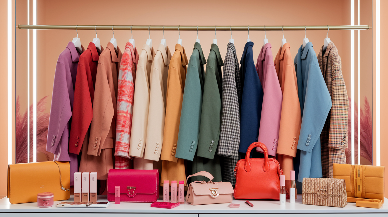
Cultivate a capsule around your best season to make outfits quick and cohesive. For Autumn, think camel coat, rust knit, olive trousers, cream blouse, and tan boots. For Winter, go for a navy coat, charcoal suit, crisp white shirt, black boots, and a vibrant blue-red knit.
Maintain silhouettes that flatter your body type so color and fit go hand-in-hand. This blend cuts decision exhaustion and boosts confidence as the majority of items click automatically.
Invest in key pieces in your most flattering shades where impact is highest. Outerwear drives first impressions, so pick your best neutral: Autumn—camel, espresso, deep olive. For the dark winter, choose ink, jet black, or deep graphite.
Accessories frame the face–scarves in warm spice for Autumn or icy jewel tones for Winter brighten skin. Bags and belts in sumptuous browns complement Autumn; sleek black or deep navy base Winter ensembles.
Makeup is small but vital: Autumn thrives on warm bronzes, terracotta lip, soft brown liner. Winter shines with cool berry lip, black or deep plum liner, clean highlight. Maintain that 1 signature piece–a burgundy tote for Winter or a cognac belt for Fall–to pull it together.
Employ color theory to maintain freshness in your looks. Within one palette, play with variations of light, dark, and chroma. Try complementary pairs with care: an Autumn olive jacket with a muted red-brown scarf, or a Winter cobalt sweater with a soft orange-brown bag kept small and away from the face.
Monochrome works: layered olives for Autumn, stacked charcoals for Winter. If you straddle seasons, mix with purpose. Deep winter individuals often wear Deep Autumn beautifully with a warm face-framing piece offset by cool anchors—black coat, burgundy lip, rust skirt. The common depth and richness maintain balance.
Refresh with every life season. As hair goes lighter or silver, or jobs and climates change, tweak depth and contrast. Swap warm camel for deeper espresso if you need more polish, or stark black for inky navy if high contrast feels harsh.
Test small: one scarf, one lipstick, one knit. Hold on to what gets worn again and again — lose the rest.
Conclusion
To hit the right palette, believe the hints. Skin looks bright in cool blue or clear white. Lean winter. Skin that appears rich in warm olive or soft camel? Leans autumn. Light test assist too. Winter serenades in bright light and high contrast. Autumn glows in soft light and low contrast.
Begin with small pieces to create outfits. A navy coat for winter A bag of chestnuts for fall. Test one switch at a time. Notice how your skin, teeth and eyes respond. Maintain notes. Snap quick pics in day light3.
To keep it loose, blend along the edges. We can borrow deep teal from soft winter. Here deep autumn can give ink blue a try.
For growth to continue, try your top three shades this week. Post a look, receive reactions, adjust.
Frequently Asked Questions
What is the main difference between autumn and winter color palettes?
Autumn palettes are warm, rich, and muted, featuring earthy colors like rust, olive, and mustard, while winter palettes, particularly the deep winter palette, are cool, high-contrast, and clear with vibrant shades like frosty blue and rich red.
How do I know if I'm deep autumn or deep winter?
Examine undertone and contrast for your true color season. Deep Autumn individuals have warm undertones suited for earthy colors, while Deep Winter individuals possess cool undertones that align with dark winter colors and bold contrast. Try gold vs. silver as well as soft brown vs. black near your face.
Can I mix autumn and winter colors in one outfit?
Yes, if you even out undertones and contrast levels. Keep one color season, like deep winter, as the base and highlight with accents from dark autumn. Neutral bridges like chocolate brown or cream bring it all into harmony.
What are common mistakes when comparing autumn vs. winter palettes?
Mixing undertones can lead to confusion, especially when identifying your true color season. Avoid black for warm skin tones and overly muted shades for cool, high-contrast individuals; instead, explore the vibrant shades of the deep winter palette in natural light.
Which neutrals work best for each season?
During the autumn season, individuals can embrace warm neutrals such as camel and chocolate brown, while in winter, cooler shades like black and navy enhance their natural beauty, reflecting the deep winter palette.
How can I do a quick at-home color analysis?
Use a mirror and sunlight to experiment with silver vs. gold, black vs. brown, and white vs. cream. Observe the skin clarity and eye brightness, as the right deep winter palette makes your features pop and glow.
What is "beyond the swatch" in seasonal color analysis?
Fall glows in textured, matte materials, while the winter season shines in sleek, high-contrast finishes. To achieve a natural appearance, style lines, patterns, and makeup choices must align with the deep winter palette's contrast and clarity.