Warm Colors vs. Cool Colors: The Ultimate Guide to Color Temperature

Key Takeaways
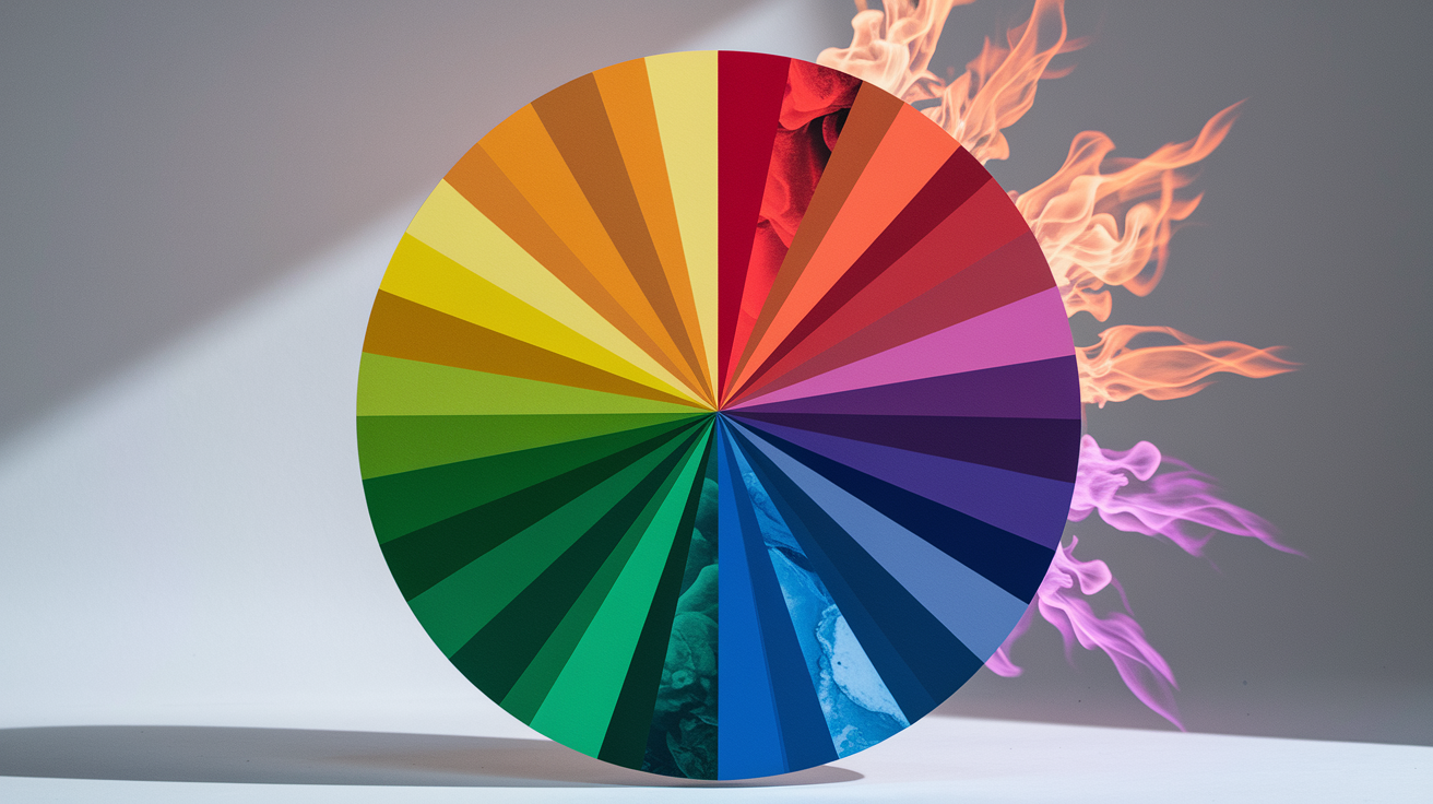
Warm colors — red, orange, and yellow — occupy the right side of the color wheel and physically reach your eye first. That's not poetic license: warm colors carry wavelengths between 620–750 nm, while cool colors — green, blue, and violet — register at 380–620 nm. The shorter the wavelength, the less visual "punch" it delivers on first contact. This is the core physics behind every warm colors definition color theory has ever produced, and it hasn't changed. What has changed is how designers weaponize it. The cool vs warm colors debate used to be about mood boards; now it's about metamerism — the reason your carefully chosen warm yellow reads as a sickly green the moment you switch off the daylight and flip on a 3000K LED. If you're building a warm to cool color scheme for a north-facing room, understanding wavelength isn't academic: it's the difference between a space that feels alive at 9 p.m. and one that looks like a waiting room. Hot colors vs cool colors isn't just a stylistic preference — it's a physiological response baked into how the human eye processes light energy. And with warm and cool colors both shifting dramatically under artificial lighting, testing your palette under your actual bulbs isn't optional anymore. Millennial Gray had a good run. Warm Minimalism buried it.
🌡️ Unlock Your Color Temperature Mastery
Discover how warm and cool colors can transform your space, brand, and style. Our expert analysis reveals the science behind color temperature and how to use it effectively.
Take Color Analysis Quiz →Use warm colors to make cozy, intimate spaces, and emphasize focal points. They visually come forward. Pick cool colors to make rooms feel open and airy because they actually recede visually.
Pair color temperature with the feeling you wish to inspire. Go warm for energy and sociability, cool for relaxation, focus, or quiet reflection.
Think about cultural context as color meaning shifts across world. Check research associations prior to selecting palettes for international projects or heterogeneous audiences.
Skip the $10 sample pots — they're a classic rookie mistake. Instead, grab peel-and-stick samples (Samplize-style swatches run about $6) and stick them directly on your wall. This is the only reliable way to see how hot colors vs cool colors actually behave in your specific space. Why does this matter so much? Metamerism. That gorgeous warm yellow you loved in the store can turn into a sickly, muddy green under cheap LEDs with a low CRI rating. Warm neutrals are especially vulnerable to this color shift — they look completely different under a 3000K warm bulb versus a 5000K daylight bulb. Test your swatches at multiple times of day: morning light, afternoon sun, and evening artificial light. Only then will you know whether you're truly getting the warm, inviting tone you're after — or accidentally inviting an undertone disaster into your home.
📚 Recent Articles
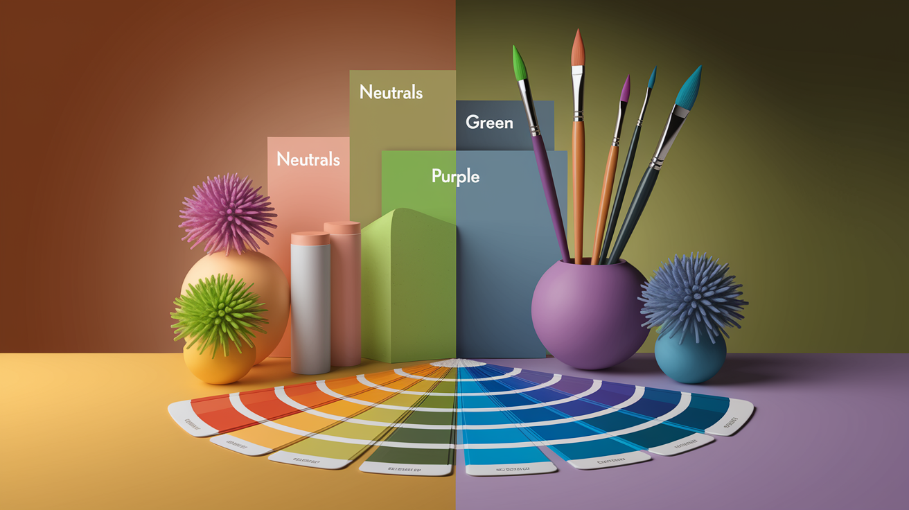
Mix warm and cool colors with neutrals to keep your palette balanced and versatile. Employ the undertones of greens, purples and neutrals to dial in mood in the home, your brand, your wardrobe.
Warm vs cool colors is the color theory divide between hues associated with heat and action (reds, oranges, yellows) and those associated with calm and distance (blues, greens, purples).
Designers rely on warm tones to attract attention and foster intimacy, and cool tones to help establish equilibrium, openness, and relaxation. Branding: warm palettes stimulate action and appetite, while cool palettes communicate trust and clear thinking.
To frame the central concepts, what follows dissects applications, blends, and advice.
What defines warm and cool colors?
Warm colors like red, oranges, and yellows sit on the right side of the color wheel, while cool colors such as greens, blues, and violets occupy the left. This warm-cool divide influences mood, space, and interior design choices across various mediums, including print and digital, guiding important design decisions in home decor projects.
1. The color wheel divide
The wheel gives a clean split: warm on the right half, cool on the left. Primary and secondary colors lie on both sides, which is what allows us to encounter warm and cool editions within a single hue family. A red‑yellow leans warm; a green-yellow reads cool. Try colors next to one another, not alone, to detect these shifts.
Warm and cool examples by position:
- Warm (right side): red, scarlet, vermilion, orange, amber, yellow, ochre
- Cool (left side): green, teal, cyan, blue, indigo, violet, magenta
Use the wheel as a guide when selecting palettes. If you want energy, move clockwise toward red and orange. If you want calm, trace back counterclockwise toward blue and green. Whites, grays, beiges—they all have undertones, so put them up next to your palette, because a blue‑gray will cool a scheme and a taupe will warm it.
2. The psychological temperature
Warm colors frequently indicate warmth, happiness, and activity. They can ignite appetite, evoke sunshine, and advance a composition. Cool colors tend toward comfort, relaxation and cleanliness. They suggest water, shadow and open air.
Context is key. On a brand page, a warm call‑to‑action can pull focus, while cool body backgrounds lower visual noise. In healthcare spaces, cooler schemes might lower stress but warm accents prevent the place from feeling sterile. Select temperature by the sensation you wish to induce, not by convention.
3. The perception of space
Warm colors come forward; they bring walls closer and rooms are cozy. They assist big, empty rooms feel inhabited.
Cool shades recede; they visually expand cramped spaces and drop temperatures in congested environments. A cozy studio gets breathing space with cool walls and soft, cool neutrals.
Pair color with role. Social zones can take warmer schemes; focus zones thrive with cooler backgrounds and warm pops. Lightness, contrast and surrounding colors will change the read. So test on location and contrast at various times of day.
4. The cultural context
Color significance changes between cultures and eras, even as the warm/cool concept directed artists for generations. Warm can indicate fortune or caution. Cool can imply faith or bereavement, according to location and custom.
For global work, try palettes with local teams, watch holidays and symbols, and adjust undertones. Hold the emotional aim constant, but adjust the color so communications come across with precision and kindness.
The psychology of color temperature
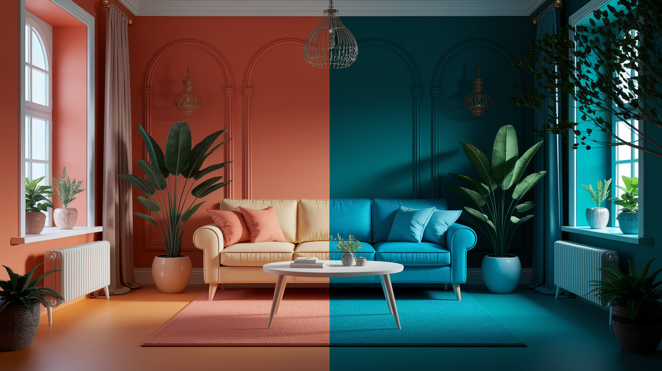
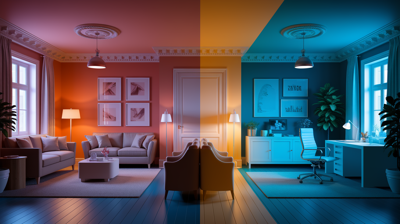
Color temperature shapes how we feel and behave in a space far more than most people realize. A static warm white at 3000K or a flat cool white at 6500K is a relic of outdated lighting design — today's High-CRI (95+) smart bulbs, available for as little as $15–$25, let you run a full circadian lighting cycle that shifts from a golden 2000K at sunrise through a crisp 6500K at midday and back down again by evening. If your warm to cool color scheme isn't supported by a dynamic Kelvin shift throughout the day, you're leaving the most powerful design lever untouched. Understanding why this matters comes down to physics: warm colors — reds, oranges, yellows — occupy the longer end of the visible spectrum (620–750 nm), while cool blues and violets sit at the shorter, higher-energy end (380–500 nm). When you explain the difference in wavelengths of the warm colors compared to cool colors, you immediately see why a 2700K bulb floods a room with long-wavelength light that amplifies terracotta walls, while a 5000K source shifts the same space toward the cool end. Circadian smart lighting bridges cool vs warm colors dynamically, ensuring your interior reads exactly as intended at every hour — something no fixed bulb can achieve.
Emotional responses
Warm colors—reds, oranges, ambers—tend to read happy, lively, and passionate because they resonate with firelight and sunsets. In warm white light around 3000 K, these vibrant colors appear deeper and more immediate, creating a cozy atmosphere that elevates moods and ignites social energy. On the other hand, cool colors—blues, teals, violets—signal calmness and openness, especially under cooler, brighter light closer to 6500 K, where blues feel crisp and expansive, allowing users to experience mental clarity and emotional relief.
Light engages more than just the eyes. The blue-rich light excites intrinsically photosensitive retinal ganglion cells (ipRGCs), triggering a brain region called the suprachiasmatic nucleus. This pathway can modulate alertness and connects to mood circuits involving the amygdala and hypothalamus, influencing our interior decor choices.
That’s why a cool, bright morning scene feels mentally crisp, while a warm, dim evening scene blurs edges. To achieve emotional tones in your home decor projects, start with hue and then adjust brightness and saturation. Soft, low-saturation warm palettes create a welcoming feel, while saturated cool accents can instill stable confidence, leading to balanced mixes that reflect nuanced brand voices.
Personality plays a significant role as well—extroverts may prefer a higher level of stimulation through vibrant colors, while introverts might gravitate toward softer contrasts in their interior design choices. Understanding color psychology can enhance the overall ambiance of your spaces.
Incorporating these elements into your designs not only beautifies your environment but also creates a harmonious blend of energy and tranquility, making your home a true reflection of your personality and preferences.
Physical sensations
Warm colors can imply warmth and comfort. A terracotta wall beneath 3000 K feels cozy, perfect for a dining nook or café corner. They might even feel the air to be warmer, a known warm appraisal effect.
Cool colors feel fresh. A 6500 K-lit pale blue hallway not only feels brighter, but "cooler," which can dissipate the sense of boxy claustrophobia in compact areas.
Leverage temperature toward comfort. Warmer schemes work well in living rooms and lounges, where staying a bit longer comes naturally. Cooler schemes help bedrooms feel airy and assist wind-down before sleep when brightness is kept low.
Mind the trio—hue, brightness, saturation. Each shifts autonomic responses in different ways, so little tweaks can alter heart rate, tension, and general comfort.
Behavioral influence
There's a psychology of color temperature, with warm palettes nudging action and talk. Consider restaurant seat turnover, retail endcaps, or a call-to-donate banner using a warm accent to expedite decision.
Cool palettes encourage concentration, thought, and extended work. Libraries, study apps, and clinics rely on blues and greens to communicate reliability and nurture. The tone is deliberate and exact.
Design with intent: choose warmer entry zones to spark greeting and flow, cooler task areas for steady work, and adjust light intensity to fit time of day. Brands can steer behavior by combining warm urgency cues with cool trust grounds, then experimenting with saturation among audiences, as things like introversion vs. Extraversion alter reactions.
Exploring the warm color spectrum
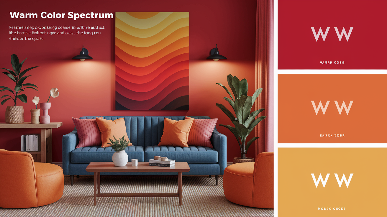
Warm colors, which fall on the red–orange–yellow side of the wheel, create a cozy atmosphere associated with heat, illumination, and humanity. These vibrant colors tend to energize and uplift, attracting attention and assisting you in discovering your personal style. Trying out warm palettes is an easy method to figure out what 'seems right' in your interior decor.
Although categorized as "warm," research indicates that warmth moves with luminance and context. Experiments with seven‑point warmth scales in CIELAB space reveal it to be more of a sliding scale than firmly anchored, showcasing the beautiful color mixes available.
- Reds, oranges, and yellows will breathe life into a room even at a low saturation.
- Since warm hues tend to move forward, things painted warm seem to come out at you.
- Practical uses: 1. Decor: terracotta walls, mustard textiles, and brass lamps add glow without glare. A red runner guides flow in long halls. Saffron tiles warm cool stone floors. 2. Art: cadmium red for focal drama. Transparent orange glazes for skin warmth. Naples yellow to lift dull greens. Warm underpainting to add depth. 3. Branding: fast-food reds to spark appetite. Sunny yellows for friendly tech. Orange for approachable outdoor gear. Muted rust for heritage labels.
Pursuing combinations—split complements, analogous runs, or warm–cool splits—is a fun way to explore what suits your voice. Newton's 1666 color wheel still aids in charting these selections, allowing for a deeper understanding of color mixing in design.
The energy of reds
Red attracts attention quickly. It indicates immediate action, speed and warmth. In design, it pops on screens and in print, bordering headlines or call‑to‑action zones.
Use red to signify passion, sport or celebration. Deep crimson feels formal and rich, bright scarlet reads bold and modern. Red hues in dining can stimulate appetite and ignite conversation—imagine brick walls, paprika upholstery or cranberry tableware.
Maintain equilibrium. Balance red with cool blues, soft grays or off‑white to anchor the tone. Matte finishes or bouclé fabrics drop the volume without losing impact.
The joy of yellows
Yellow brings warm cheer and sunshine signals. As it suggests concepts, study and fun. In gloomy rooms, a gentle butter or wheat yellow can reflect light and lighten spirits.
Small hits go far: ochre pillows, a sunflower print, or lemon tile grout can wake a neutral room. For harmony, offset yellow with deep violet, slate blue, or olive so it doesn't glare. If the space is bright, de-saturate a step to protect the eyeballs.
The comfort of oranges
Orange feels approachable and inviting, right at the center of the warm color spectrum — halfway between red's hot intensity and yellow's sunshine. It works in living rooms, coffee shops and hallways where you desire comfort and conversation.
For a more earthy grounding it, mix burnt orange with clay, sand or cocoa. Bring in calm texture with linen, wood or rattan.
Even a narrow stripe–tangerine piping, amber bottle, or copper bucket–can jazz a subdued palette without dominating it.
Their advancing quality
Warm colors come forward so they push things out and close in the visual space. Use this to mark focal points: a red door, a marigold header, a coral stage backdrop.
In big rooms, a warm end wall 'depth' brings in and makes the zone cozier. For crisp contrast, allow a warm subject to sit on a cool field–teal, navy or pine–so the eye hits where you want it to.
Try with different brightness, as warmth moves around a bit with light and background.
Exploring the cool color spectrum
Cool colors, including vibrant blues and greens, run through purples, creating a calm and balanced atmosphere in interior decor. These hues tend to read as sophisticated and soothing, enhancing the cozy atmosphere of any space. While they recede in our vision, making them ideal for creating a sense of space and quiet, the perception of cool colors remains personal and cultural.
- Restful bedrooms: Light blue-gray walls (around 60–70% lightness in CIELAB) soften edges, while navy bedding grounds the room. Mix it up with a sand-colored throw and wooden stool to warm it up. Sheer white curtains maintain the airiness, and a plant brings a little jolt of green.
- Spas: Pale seafoam tiles, matte white fixtures, and dim, even light cut visual noise. Add towels in dusty teal and one eucalyptus stem. The palette pushes the mind in the direction of languid step and deep breath.
- Offices: Desaturated blue-green on the far wall can ease eye strain and make depth. Combine with crisp white desks, gentle gray chairs, and a cozy wood floor. A small coral or brass accent keeps the space from feeling chilly.
The calm of blues
Blue signifies trust, order, and calm. Its many associate with sky and water, so it can stabilize mood and relax the room's pulse. Employ soft blues in bedrooms and baths to redirect attention within. Powder blue walls, white tile and brushed steel fixtures come off fresh without cold.
Pale blues extend a room by suggesting depth. Think mist, horizon and crystal pools. Mix in warm accents—terracotta, tan leather or oat linens—to keep the environment gentle and human.
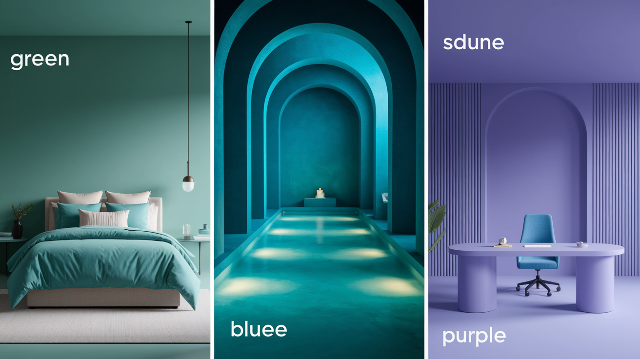
The balance of greens
Green rests on nature, health and renewal. It straddles warm and cool, so it's a great team player in both homes and public spaces. For harmony, select mid-tone sage for walls and leave trim off-white. It soothes but does not stupefy.
Pair greens with warm woods or with slate and steel. Both routes fall into place. The first feels cozy, the second crisp. Plants = color. A rubber plant, mossy art print or olive throw can elevate a low room, low cost, high impact.
The mystery of purples
Purple holds opulence, profundity and a hint of mystery. It can drive creative work, but still calm when it's pale and pristine. Try pairings: violet with navy for cool poise, or plum with brick red for richer heat.
Deep eggplant in a dining room creates drama and a quiet glow. On the other end, lilac or mauve in a nursery feels soft, dreamy and light on the eyes.
Their receding quality
Cool colors recede, so spaces feel bigger and quieter. Try pale blue walls in tight halls to faux-extend, or a green-gray background behind shelving to enhance dimensionality.
In art or layouts, thrust a blue background to construct space, then advance a warm subject for snap and concentration. Maintain test shading—CIELAB provides more regular increments, while MacLeod–Boynton helps explore the S-cone axis—to adjust spacing, mood, and definition.
Observe that some people find cool schemes calming, but others interpret them boring.
Beyond the binary: versatile colors
Warm and cool colors are useful tags, but plenty of the spectrum straddle them. Neutrals, vibrant colors like green and purple all shift with the light, surrounding colors and undertones. This freedom allows you to construct beautiful color mixes that are dynamic, sense harmonious, and conform to how humans truly perceive color—a dance between the eyes, the brain, and culture.
The role of neutrals
Neutrals ground mixed palettes. White, black, gray and beige can chill a hot scheme or warm a stark one. They lend calm because the eye reads them as rest, which counts when bright pops conduct the narrative.
Not as a binary, but as a jumping off point: neutrals, as a backdrop, makes saturated colors pop without visual noise. A subtle gray wall allows coral pillows to sing. A cozy beige rug can anchor a slate blue sofa.
Studies connect warm hues to coziness and cool ones to calm, and neutrals let you turn either vibe up or down. We all read colors personally, too—some of us can 'feel' them as 'heavy' or 'light'—so neutrals tend to be buffers across those responses.
Choose neutrals by undertone. Warm neutrals (yellow, red or brown tinges) bring relaxation in harsh lighting. Cool neutrals (a touch of blue or green) crisp spaces in warm light. Test BIG swatches — our brains read color in passes, and context alters the ultimate perception.
- Soft white — often warm (yellow) or cool (blue)
- Charcoal gray — cool (blue/green)
- Greige — warm (yellow/brown) or balanced (violet)
- Ivory — warm (yellow)
- Jet black — can skew cool (blue) or warm (brown)
The green and purple exception
Green and purple are swing colors. Their undertones determine the warmth. Cultures label and categorize these uniquely, and certain research points toward commonalities, but everyone's internal palette is distinct.
Warm greens lean yellow: olive, chartreuse, moss. They feel natural, earthy, and go great with terracotta or brass. Cool greens lean blue: pine, emerald, teal. They read crisp and calm alongside slate or steel.
Purples divide the same. Red‑based purples—plum, magenta, mulberry—bring warmth and vitality. Blue‑based purples—violet, periwinkle, indigo—cool a room and imply distance. Some viewers find purples 'heavy', others 'light' — which is fine.
Picture swatches in a row: chartreuse → emerald → teal; mulberry → royal purple → violet. Slide toward yellow to warm, toward blue to cool. Just mix teeny specks of yellow or blue into test paint or digital sliders, and see the shift.
The impact of lighting
Light redraws heat. Morning light is cool, late sun is warm. LED bulbs span from approximately 2700 K (warm) to 5000 K+ (cool). Warm light enhances reds and golds, cool light energizes blues and greens.
Test samples on every wall, check at dawn, noon and night. Notice how fabric, wood and metal bounce color back. Our brain mashes these messages together with memory and context, which is why a 'soothing' blue can seem sterile next to shiny tiles.
Warm lamps can soften cool schemes, or cool task lights crisp warm rooms. Tint to soften the intensity, layer sheers to diffuse glare, and highlight accents where they can illuminate.
How to use color temperature
Color temperature establishes mood and utility in interior decor. Warm colors, like red and orange, tend to feel close and punchy, while cool colors such as blue and green create a calm atmosphere. These warm and cool color schemes sit on opposite sides of the color wheel, influencing design choices.
In your home
Warm colors fit social areas beautifully. In living rooms or kitchens, soft terracotta on a feature wall or ochre stools around a counter increase vibrancy and warmth, creating a cozy atmosphere. Candlelight and warm bulbs (~2700 K) enhance the effect, making wood grain deeper and skin tones look vibrant. To achieve a stunning interior decor, consider incorporating these warm hues.
Cool hues soothe in intimate areas, providing a calming effect. Blue-gray linens and a pale sage wall in the bedrooms slow the mind down, promoting relaxation. Bathrooms appear clean with light aqua tiles and crisp white grout, combined with cooler bulbs (4000–5000 K) for a refreshing ambiance. This combination of colors highlights the principles of color psychology.
Balance both to suit what a room does. Your research might suggest a cool wall for focus, then a warm rug to keep the space from feeling flat. Hallways can maintain a neutral base, then trend warmer or cooler as they direct toward rooms of differing tasks, showcasing various color possibilities.
Light exposure and room size play a decisive role in color selection. North-facing rooms naturally lean cool, so a warm paint palette prevents them from feeling cold and unwelcoming. Small spaces thrive with light, cool hues that visually recede and open up the room, while large, sun-drenched interiors can handle deeper, richer warm tones without becoming overwhelming. When exploring warm and cool colors latest design approaches, understanding LRV (Light Reflectance Value) is essential. Pro-Tip: Opting for warm light neutrals with an LRV above 70 in south-facing rooms is more than an aesthetic decision — it's a practical energy strategy. Higher-LRV warm tones reflect more sunlight back into the space, which can reduce air conditioning costs by 10–20% compared to darker shades. Pair them with cool accents to maintain visual balance without sacrificing efficiency.
In your brand
Warm brand palettes push forward movement and friendliness. They work for food and retail and events and causes that want hype or immediate action. The message reads personal and immediate.
Cool palettes communicate trust and clarity. Finance, health and tech tend to lean on blues and greens to communicate reliability and nurture. The tone is deliberate and exact.
Align feeling to readers and conventions. A wellness startup, for instance, could combine a cool base for authority with a warm accent for friendliness. B2B firms start cool, then overlay soft warm notes for warmth in customer touchpoints.
- Warm brand examples: red (excitement, urgency), orange (optimism, friendliness), yellow (clarity, joy).
- Cool brand examples: blue (trust, calm), green (balance, growth), purple (creativity, wisdom).
In your wardrobe
Warm pieces exude confidence and a welcoming aura. A rust blazer, a coral scarf or a sand-toned shoe can elevate a neutral outfit and attract people.
Cool pieces sound polished and composed. Navy suits, charcoal coats, ink-blue dresses imply composure and silent strength.
Blend for variety and seasons. Think of it along the lines of color temperature — pair a cobalt shirt with a tan belt, or an olive jacket with a brick tee. In heat, rely on cool bases with tiny warm accents. In cold months, reverse the ratio.
Approach color analysis as a suggestion, not a mandate. Hold fabric to your face in sunlight. If your skin appears fresher with blue-based shades, you probably tilt cool; if gold or tomato red looks flattering on you, you may lean warm.
To adjust, tweak one step on the wheel: to cool a red, add a touch of the next cooler neighbor (red-violet) if more blue fails; to warm a green, try a little yellow-green if more yellow muddies it.
Painters use this logic to construct depth: cool colors recede, warm advance. That same concept assists outfits and photos read three dimensional.
Conclusion
Warm and cool colors influence mood, pace and attention. Reds and golds ignite intimacy and daring. Blues and greens relieve tension and relax the mind. Neutrals bridge the gap with calm and scope. A soft clay wall can make a little café feel cozy. A pale teal logo can come across crisp on a phone screen. Even a muted violet can link a room of wood and stone.
To choose wisely, begin with the end in mind. Want heat and drive? Lean warm. Need calm and space? Lean cool. Mix light with dark to balance weight. Try it out on actual screens and actual lighting. Pass your selections along to your team or clients. Got a color scheme, or a hard decision? Dangle it, and we'll construct it.
Frequently Asked Questions
What are warm and cool colors?
Warm colors, which include vibrant shades like red, orange, and yellow, fall on the warm spectrum of the color wheel, while cooler colors such as blue, green, and violet provide a refreshing calmness. Each group significantly influences mood and perception in interior design and art.
How do warm and cool colors affect mood?
Warm colors, like a vibrant yellow range, tend to be exciting, comforting, and intimate, while cool colors, such as cool blue and green tones, inspire calm, focus, and spaciousness. Use warm tones to invigorate a room or brand, while employing cooler colors to relax users or enhance readability.
Which colors are considered "in-between" or versatile?
Some hues are flexible: teal, turquoise, and blue-green can feel like vibrant colors or cool colors. Neutrals like gray, beige, and taupe shift with natural light and adjacent colors. Even purples, which can lean warm (red-violet) or cool (blue-violet), showcase beautiful color mixes.
How can I choose warm vs. cool colors for a room?
Begin with your objective. For cozy, social spaces, use warm colors to create a vibrant atmosphere. For bedrooms or offices, opt for cooler colors. Verify natural and artificial lighting, and sample swatches on walls to see how they interact with the shades throughout the day. Balance with neutral colors for harmony.
Do warm and cool colors impact readability and contrast?
Absolutely. A warm-to-cool color scheme with strategic warm accents naturally boosts visual contrast and creates a sense of depth and comfort. From a warm colors definition color theory perspective, long-wavelength hues like red and orange are "advancing" colors — they appear to move toward the viewer, which makes them powerful tools for UI/UX hierarchy, not just aesthetic choices. Under WCAG 3.0 (APCA) guidelines, perceived lightness matters far more than a raw contrast ratio: a warm amber on a cool deep-blue background can pass APCA thresholds while a technically "high-contrast" cool-on-cool pairing may fail. When comparing hot colors vs cool colors in interface design, warm tones on light cool backgrounds tend to draw the eye first, guiding user attention intuitively. Always validate your palette with an APCA-compliant contrast checker for both digital and print — vibrant colors that look striking on screen can lose legibility in print if perceived lightness isn't accounted for.
Can lighting change how color temperature looks?
Definitely. Daylight is a neutral color that leans towards cool colors. Warm bulbs (~2700–3000 K) create a warm atmosphere, while cool bulbs (4000–5000 K) enhance the coolness of colors.
What's the best way to build a warm–cool color palette?
Choose a primary color temperature depending on function to create a cozy atmosphere. Throw in a couple of complementary colors for fun. Use neutral colors to unify your interior decor, maintaining a consistent saturation for a balanced look that fits the brand.