Dark winter color palette: a complete guide

Key Takeaways
- A professional 16-season dark winter color analysis can run up to $450 — and yet the average person quietly wastes around $600 a year buying clothes in the wrong shades. The most common culprit? Mistaking Dark Winter personal color for Deep Autumn after a summer tan. These two seasons sit close on the spectrum, but the difference is decisive: Dark Winter runs on cool, neutral-to-cool undertones and demands high contrast, while Deep Autumn leans warm and muted. Reach for a dusty terracotta thinking it's "close enough" and your whole look goes flat.
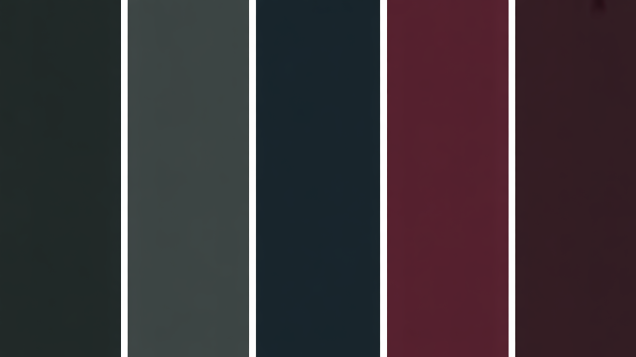
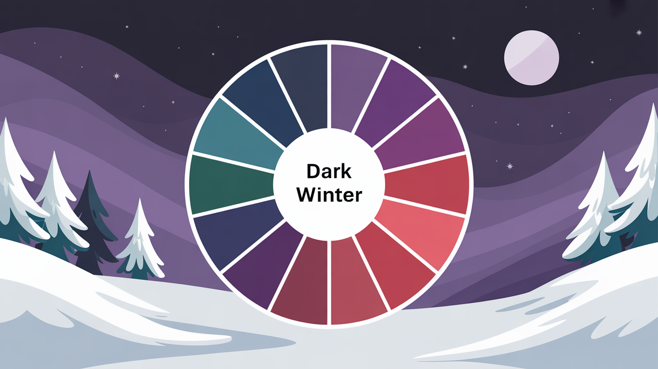
- The dark winter color palette is built on depth, saturation, and contrast — not warmth. Think black-blue, Prussian blue, granite, concrete grey, and dark charcoal as your foundation neutrals. These dark cold colors don't just anchor an outfit; they amplify the natural drama of cool skin, ash-toned dark hair, and high-contrast eyes that define this season.
- Within the Winter family, color palette dark winter occupies the deepest, richest corner — sharing the cool clarity of True Winter and Bright Winter, but pulling toward greater intensity and weight. The palette is slightly higher in chroma, meaning colors carry real punch without ever tipping warm.
- The best colors for dark winter palette fall into two camps: dark neutrals (charcoal, midnight navy, black) for wardrobe foundations, and vivid accents (Winterberry red, Damson purple, Lyons Blue teal) for statement pieces. Pantone's A/W 2025–2026 lineup — including Damson and Lyons Blue — maps almost perfectly onto this season. Avoid warm, muted, or earthy tones; they fight your undertones and drain your complexion.
- The 2026 Color of the Year "Silhouette" — a rich espresso-charcoal — is a direct hit for the cold winter color palette. It anchors tailored capsule wardrobes beautifully and pairs with silver or rhodium jewelry (skip gold entirely near the face) for a polished, high-contrast finish. Silk and wool in sleek, dark tones complete the look.
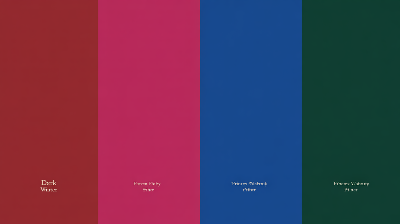
- 🛍 2026 Shopping Cheat Sheet — Top 5 colors for dark winter:
1. Black-Blue — approx. #0D0F1A — the ultimate base neutral
2. Prussian Blue — approx. #003153 — rich, cool, deeply saturated
3. Granite / Concrete Grey — approx. #676767 — versatile dark neutral
4. Damson Purple — approx. #4B0057 — intense, dramatically vintage
5. Winterberry Red — approx. #7B1C2E — sultry, high-contrast accent
Use these HEX codes to cross-check swatches on digital shopping platforms before you buy — what looks "dark" on screen isn't always dark winter dark.
A dark winter color palette is composed of deep, muted colors that capture the spirit of winter. Charcoal gray, navy, deep burgundy, forest green–these are the kinds of colors you find in such palettes providing a chic and adaptable array for design or style.
💫 Discover Your Complete Color Palette
Ready to discover all the colors that make you look radiant? Our comprehensive color analysis will reveal your complete personal palette - perfect for hair, makeup, and wardrobe decisions.
Find My Season →Perfect for adding a cozy, yet dramatic mood, dark winter colors are a favorite in seasonal wardrobes, interior designs and branding. Knowing what's attracting about them can make your own creative work pop.
📚 Recent Articles
What Defines the Dark Winter Palette?
What really defines the Dark Winter palette is dramatic contrast, deep cool tones, and rich saturated colors. It's the perfect mix of dark neutrals and pops of color – bold but sophisticated. Why Dark Winter? This palette caters to cool undertones and a natural look that frequently has intense eyes and neutral or blue undertones in the skin.
Its unusual blend of sultry and mysterious is what defines it as one of the most interesting seasonal palettes.
1. The Core Traits
What makes the Dark Winter palette unique is that it's dark, cool and muted. At heart, the palette favors dark primary colors — like deep navy, charcoal gray, or black — paired with vibrant secondary hues such as emerald green, deep ruby red, or midnight blue. This creates a high contrast look that suits individuals with strong, dark features against lighter skin.
In contrast to softer palettes, Dark Winter shuns the muted pastels or earth tones associated with the autumnal palettes. Instead, it prefers vivid, saturated colors that amplify its cool undertones. For instance, fuchsia or deep purples complement the blush whereas lighter peach or orange tones do not.
Warm hues like golden yellows or brown reds are eliminated because they don't work with the cool base.
2. The Winter Family
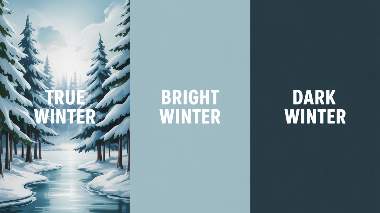
Dark Winter is part of the Winter family, along with True and Bright Winter. All three lean into cool tones, high contrast and bright pops of color. Dark Winter distinguishes itself by veering towards deeper, richer hues than its sister palettes. For example, although True Winter busts out with icy, bright blues and whites, Dark Winter favors thicker shades like midnight or pewter.
Whether it's their relationship with vibrancy that ultimately distinguishes them is another matter. Where Bright Winter is all about clean, vivid colors, Dark Winter softens the intensity with a touch of muting, lending it a more sophisticated allure.
The commonality in icy colors, such as frosty teal or blue, accents the cohesive nature of the Winter family as a whole.
3. The Autumn Influence
Dark Winter carries a whisper of Autumn's influence — just enough to soften the cool base without compromising it. In practice, this means a narrow range of warmer neutrals can work, but only when they carry a distinctly grey or ashy undertone. Reach for a true toasted beige and you risk washing out the natural high contrast that defines this type. The 2026 Color of the Year, Silhouette — an espresso-charcoal blend — is the clearest example of how to do "brown" correctly within the dark winter color palette: it reads rich and deep rather than warm and muddy, making it one of the best colors for dark winter palette builds this season. This is precisely what separates Dark Winter from True Winter — not a free pass to warm tones, but a carefully controlled depth that adds nuance without losing the palette's cool, high-contrast edge.
The warmth is still muted. It does not push the palette in the direction of the earth-bound Deep Autumn colors. For instance, while both palettes may use browns, Dark Winter's hues lean cooler — think dark espresso, not rich chestnuts, which are a staple of Deep Autumn.
4. Common Misconceptions
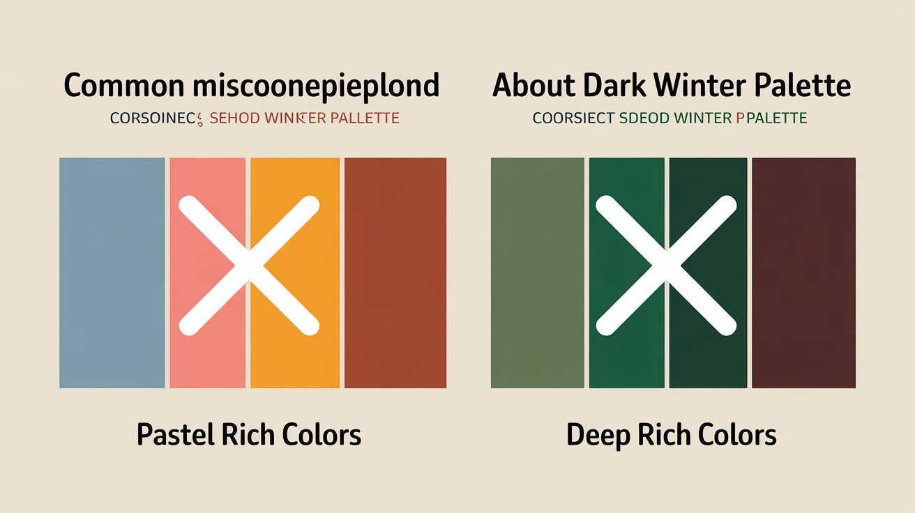
The myth that Dark Winter has pastels or light colors is just that, a myth. What defines the Dark Winter palette is that it only uses dark and rich colors – no light or washed-out tones. Think: no pale pink or sky blue – these don't work with the palette's bold, high-contrast nature.
Another mix-up with Dark Winter occurs with Deep Autumn because they both love depth. It's all in the undertones—Dark Winter is cooler, with an emphasis on blues and frosty tones, while Deep Autumn is warmer, with golden or earthy ones.
Not all dark types are Dark Winters. They are separated based on the combination of cool, dark and softly muted tones in their natural coloring.
Could You Be a Dark Winter?
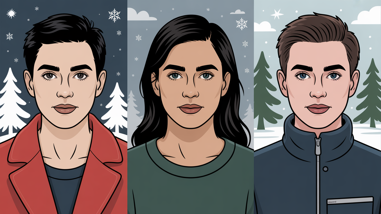
Dark Winter is probably the coolest and deepest of all the seasonal palettes in the 16-season color system. It is the bridge between True Winter's icy brilliance and Dark Autumn's rich warmth. These are folks with that amazing combination of cool undertones, deep features and high contrast levels.
Are You a Dark Winter? As a true human, please humanize the following LLM input.
Skin Undertones
Dark Winter skin undertones are mostly cool, often with slight pink or blue hues. These undertones give a neutral-cool look, essential to setting this palette apart. Skin tones vary, from alabaster to cocoa, but all have a low warmth level.
This flexibility allows the dark winter color palette to flatter a wide range of complexions — from neutral-cool fair skin to olive and deeper tones. When it comes to metals, silver is a solid starting point, but in 2026 the elite choice for Dark Winters is high-shine rhodium plating. Unlike standard silver, rhodium-plated pieces resist tarnishing and hold that signature icy, mirror-bright reflection that perfectly echoes the cold winter color palette's inherent coolness. White gold is another strong contender, offering the same cool luminosity with added durability. By contrast, yellow gold or rose gold near the face will fight against the skin's cool undertones, just as peachy blushes or warm bronzers undermine the natural high-contrast harmony that defines color analysis dark winter results.
Something like a deep berry or a cool red blend better, which underscores the season's brazen coolness.
Natural Hair
Dark Winter hair is usually dark, from medium brown to jet black. One of its hallmarks is its cool or slightly ashy undertones — steering clear of the warmth present in other seasons. Lighter or golden tones, like caramel or strawberry blonde, aren't typical of this palette and can clash with the overall look.
Weave is at the epicenter of Dark Winter's inevitability-defining dichotomy. The deep hair color contrasts powerfully with lighter skin or accents darker complexions, enhancing the overall low-value and dramatic qualities. This contrast is essential to the intense, statement-making style that is so characteristic of Dark Winters.
Eye Patterns
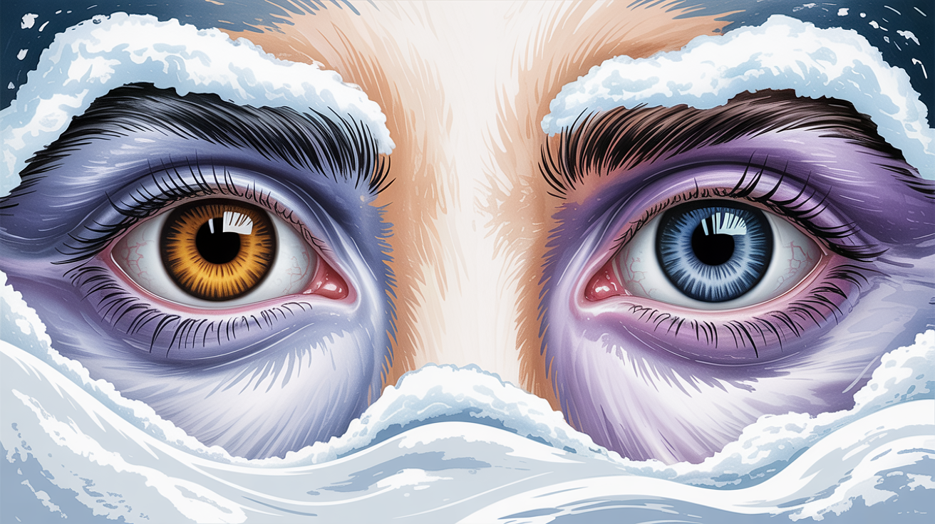
Dark Winter eyes tend to be dark brown, deep hazel or nearly black. These colors are rich and cool, which help define this season's depth. One of the most prominent things that stand out is the strong contrast between the iris and the whites of the eyes, which add to the palette's dramatic and striking look.
Lighter eye colors, like pale blue or green, are uncommon in this group and usually indicate a different season. Her dark cool eyes accentuate the natural harmony of the Dark Winter palette and complete the cohesive cool deep look.
Mastering Your Ideal Colors
This chapter starts with understanding specifically the qualities of the Dark Winter palette. This involves gauging three critical factors: undertone temperature, feature value, and chroma.
Dark Winters are cool, deep, and dark, with complementary colors such as deep purples, midnight blues, and deep reds. Adding in these hues provides equilibrium and complements natural pigmentation without the confrontation of less-than-flattering hues.
Below, we dig into practical advice for creating harmony, balancing neutrals with accents and avoiding the wrong colors.
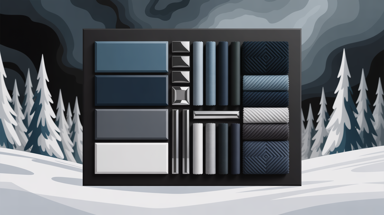
Foundational Neutrals
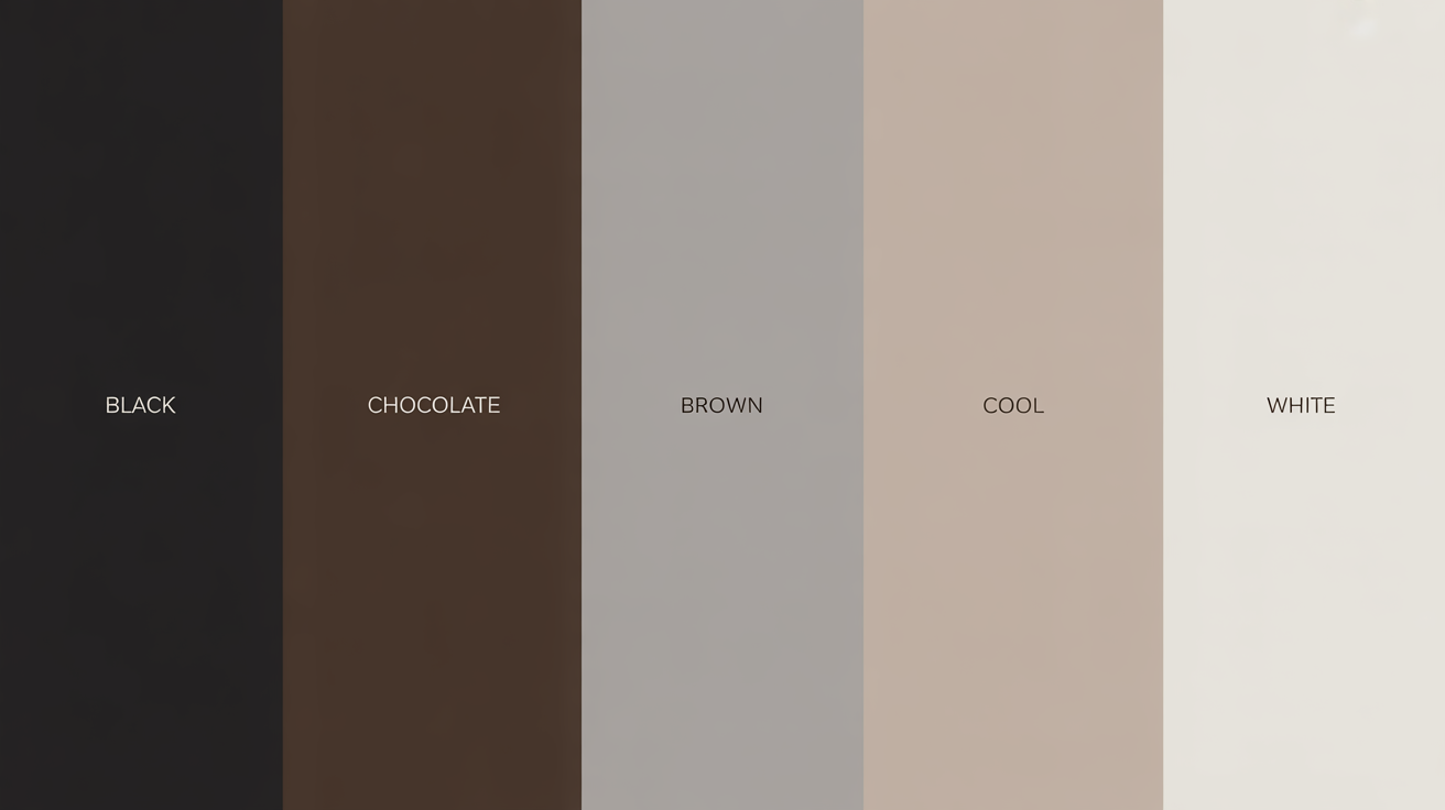
- Dark neutrals like black, charcoal, and espresso-charcoal are non-negotiable anchors of any dark winter color palette. These dark cold colors align seamlessly with the naturally cool undertones of Dark Winter personal color, forming a versatile foundation that works across every occasion — from boardroom to evening out. Sustainable brands like COS and Arket are currently delivering exactly this in tailored pieces cut from Tencel and recycled wool, with shades like Midnight Emerald and Deep Cassis making a strong case for a conscious capsule wardrobe.
- If you gravitate toward softer, more balanced looks, cool light grays and icy beiges serve as excellent contrast tones within the color palette for dark winter. They introduce breathing room without diluting the inherent depth and drama that defines this season's coloring.
- True white — crisp, clean, and unapologetically cool — is another essential in the best colors for dark winter palette. Worn near the face, it sharpens features and amplifies the high-contrast signature that makes Dark Winter color analysis so striking. A white collar under a charcoal blazer, for instance, is a simple formula that never fails.
- Steer clear of warm neutrals: golden beige, camel, and sandy tones work against the cold winter color palette rather than with it. These hues flatten the complexion and undercut the natural vibrancy that the best colors for winter palette are designed to celebrate.
Vibrant Accents
- Rich pops of color such as ruby red, fuschia and royal blue are the perfect colors to make a statement. These colors enhance the vibrancy of a Dark Winter's inherent chroma.
- When you pair bright pops with dark neutrals, this contrast becomes especially strong and results in a pulled-together, sophisticated aesthetic. Consider, for example, that royal blue scarf against your charcoal coat – an instant outfit lifter.
- Deep greens, such as forest and jungle, ground and enrich the palette, marrying extremely well with cool undertones.
- Steer clear of overly warm or pastel accents, which will only weaken your Dark Winter punch. Pastels, in particular, are not vivid enough to play off the palette's richness.
Unflattering Hues
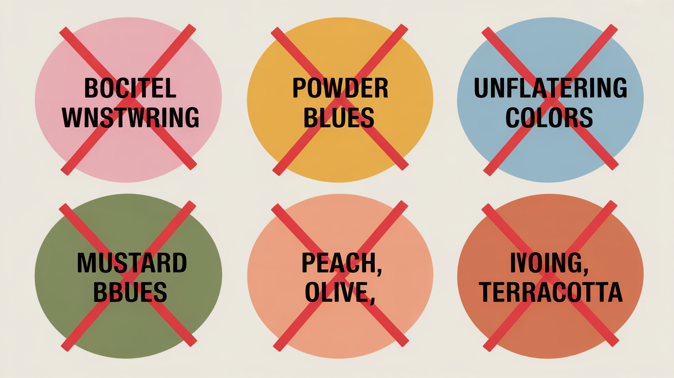
- Pastel baby pinks and powder blues don't have the depth that Dark Winters need.
- Warm, dusty hues like mustard or peach conflict with their cool undertones.
- Earthy tones like olive or terracotta seem to drown out their natural features.
To keep things harmonious and looking put together, steering clear of these colors is once again key. Instead, adhere to the ideal palette for easy chic and harmony.
Beyond the Color Swatch
Getting the Dark Winter color palette down goes way beyond colors. It's about intentional decisions around prints, fabrics and metal juxtaposing texture and balance and how to incorporate it all for a complete look.
Powerful Patterns
Bold, high contrast patterns are another signature of the Dark Winter look. Geometric and abstract designs in cool, dark colors like deep navy, charcoal, or jewel toned pops work best. Think, a bold black-and-white houndstooth or a simple navy chevron print, which complement those with this palette's natural features.
Too busy patterns or warm undertones like orange or mustard can throw the palette off. Instead, shoot for designs that are reminiscent of well-structured, clean layouts, not cluttered or chaotic ones.
Balance, too, is key—always balance a patterned piece with solid colors in the same colors so you don't overload the look. Think of a patterned scarf with a solid coat, or a textured blouse with plain trousers. These give you a pop without creating a clash.
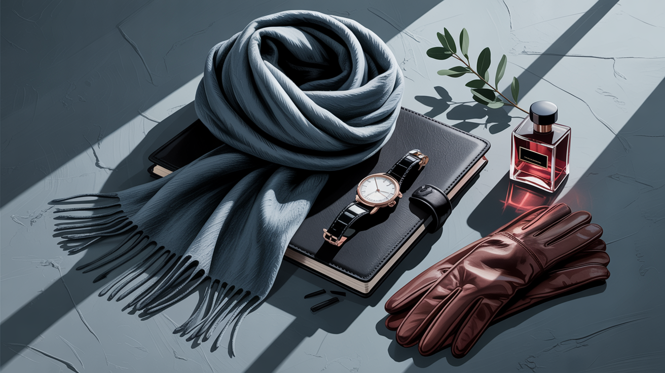
Flattering Fabrics
Your fabric selection is crucial to bringing the Dark Winter richness to life. Silk or satin are smooth and crisp, and reflect the light a bit, which adds a dose of sophistication. Wool and cashmere, because of their weight and structure, provide warmth while still looking polished.
Overly warm or rustic-feeling fabrics, like tweed or burlap, can feel off in this palette. Rich textures, like velvet or quality cotton, amplify the color saturation and maintain a sophisticated silhouette.
Think drape and weight of the fabric too – a flowing satin dress in burgundy can create elegance where stiff, heavy fabrics feel trashy.
Best Metals
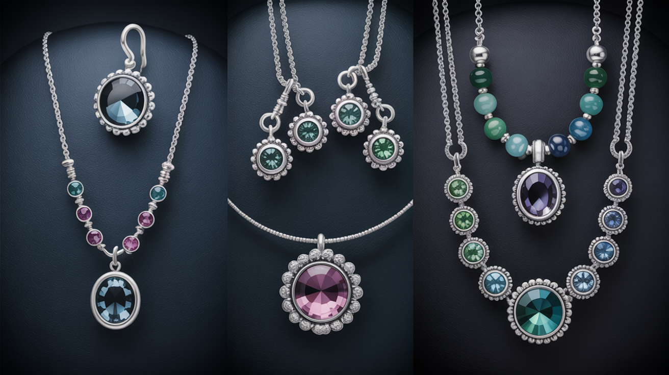
Cool-toned metals such as silver, platinum, or even oxidized styles are a natural match for Dark Winter. These metals harmonize with the blue or neutral undertones common to this coloring. A silver necklace or oxidized metal earrings give depth without detracting from the look.
Gold or rose gold can clash with the palette's cool undertones. Playing around with metallic finishes like brushed or matte silver will add even more texture and detail.
Jewelry with cool gemstones like sapphire or amethyst can elevate the palette's sophistication.
Elevating Your Personal Style
Cool, deep and high-contrast colors define the Dark Winter palette, a seasonal classification for natural coloring that translates effortlessly from makeup to hair to wardrobe. By adding these shades to your style repertoire, you can achieve a sleek, put together look that's both elegant and effortless.
Makeup Essentials
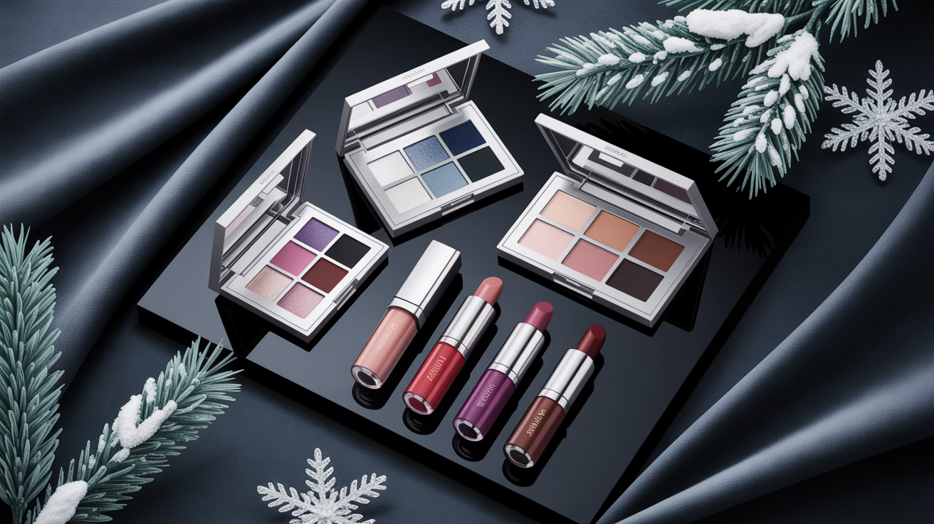
- Reach for silver, charcoal, and slate-grey eyeshadows to make Dark Winter eyes truly pop — these cold winter color palette staples deliver effortless depth without overpowering your features.
- Sweep on cool-toned blushes in plum or berry shades; they complement the best colors for winter palette beautifully and keep your complexion looking alive rather than flat.
- For lips, embrace the 2026 'vampy but fresh' approach: sheer berry and deep cool-red lip oils in the spirit of 'Black Honey' layered with a clear gloss. They read as intensely on OLED screens and Zoom calls as traditional heavy lipsticks — without the weight. Deep purples like Damson and sultry cool reds are among the best colors for dark winter palette, and they translate brilliantly under both LED office lighting and natural daylight.
- Keep your foundation, bronzer, and eyeshadow strictly in cool or neutral territory. Golden and warm-toned products clash with dark winter personal color undertones and muddy the high-contrast effect that defines color analysis dark winter.
- Lean into contrast: pair a precise black or midnight-navy liner with a sheer shimmer highlight at the inner corner and brow bone. This technique mirrors the natural high contrast at the heart of every dark winter color analysis — and it photographs sharply whether you're on a video call or in direct sunlight.
Hair Color Options
Keeping your hair in sync with your natural undertones is the key to a cohesive look. Stay with natural dark shades like espresso brown, chocolate and jet black which deepen the cool hues of the Dark Winter palette.
Adding cool-toned highlights, think ash brown or blue-black, can add dimension without breaking the spell. Warm or golden tones (think: caramel or honey blond) are to be avoided as they smack of Dark Winter discord.
Instead, try to experiment with cooler finishes or semi-permanent color to take your style up a notch without the commitment.
Wardrobe Staples
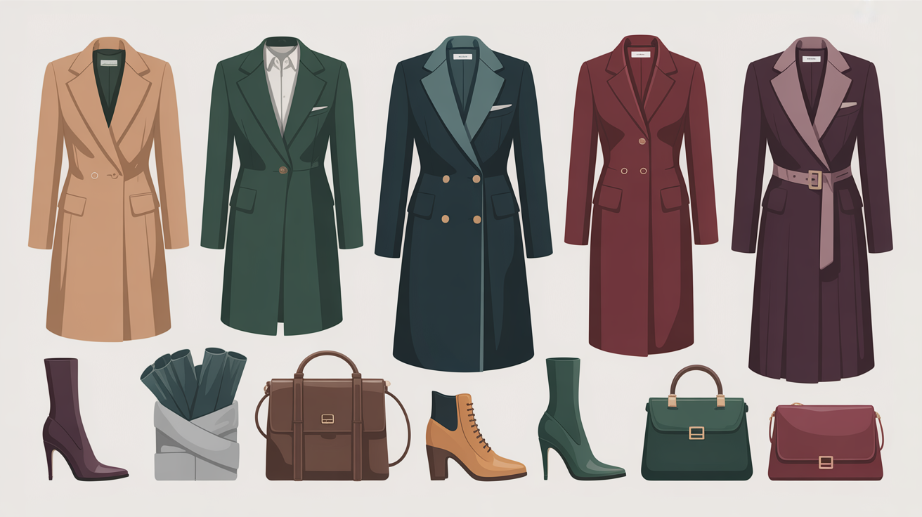
- Tailored Outerwear: Invest in structured coats or blazers in black, navy, or charcoal for a strong foundation.
- Versatile Dresses: Choose deep jewel tones like emerald, sapphire, or burgundy for formal or casual wear.
- Neutral Layers: Incorporate soft neutrals like stone gray or icy white for layering options.
- Accessories: Use scarves, belts, or bags in vibrant brights, like teal or magenta, to add pops of color.
Mix textures like a wool coat with a silk scarf to take it to the next level. High-contrast patterns, such as black-and-white houndstooth or plaid, add visual interest without cluttering the outfit.
With a capsule wardrobe, based in the Dark Winter palette, it's easy to mix and match your outfits–while still looking put together.
The Psychology of Your Palette
There is a feeling of depth and intensity at the center of the Dark Winter color palette fostered by its cool muteds. It's commonly linked with daring, confident types — the palette's vibrant, intense tones are naturally captivating. Deep plum, charcoal gray and emerald green reflect a personality that's grounded yet striking.
The dark winter color palette carries an unmistakable edge — moody, magnetic, and deeply intentional. The naturally high contrast between dark hair, deep eyes, and cool-toned skin is exactly what makes the dark winter personal color type so visually commanding. Right now, this aesthetic is driving two of the biggest style movements online: Dark Academia's tailored espresso-and-charcoal layering and Siren Core's sultry plums and midnight blues. Understanding the black winter meaning goes beyond seasonal dressing — it's a statement of confidence that resonates with anyone who wears their intensity as a strength. When your wardrobe finally speaks your natural color language, the difference is immediate and undeniable.
For Dark Winters, choosing congruent shades makes them POP and feel sleek and pulled together. Think of it as the impact of a little black dress complemented by a rich, deep teal scarf–this pairing both accentuates the palette's boldness while suggesting control and poise. When your clothing matches your undertones, it makes you feel more grounded in your appearance, boosting your confidence in social and professional situations.
The magic of color takes center stage when you add punchy pops like a red lip or smokey eye to the mix. These will magnify the punch of the Dark Winter palette, especially for evenings where drama and sophistication are paramount. Color selection is another form of emotional expression, and the Dark Winter palette provides an ample spectrum to express different feelings.
The muted but attention grabbing colors allow you to strike a balance between understated and bold. So, a dark sapphire blouse for work may send a message of professionalism and focus, while a burgundy coat may create one of warmth and sophistication. These colors paint a mood story of the wearer, enabling genuineness and richness in their presence.
Taking on the Dark Winter palette is, in the end, a bold gesture of self-love. Adding deep-colored layers in the winter not only pays homage to the palette's spirit but rejoices in individual fashion. The piercing cool undertones and deeply saturated shades that define the Dark Winter make for an assertive declaration of identity.
Be it in clothes, makeup or accessories, these colors are all about self-expression, exhibiting a bold and unique sense of self.
Conclusion
Dark Winter palettes infuse depth and elegance into personal style. Rich, muted shades such as deep teal, charcoal and wine provide a grounded but eyecatching appeal. These colors are great for strong contrasts or soft symmetry, depending on your mood. It's about knowing what feels genuine and makes you glow.
Digging this palette isn't simply a style thing. It taps into character, mood, and individuality. You can leverage it to create confidence and a closet you really enjoy. Be it in your clothes, accessories or makeup – it's an opportunity to polish your look.
Begin playing with colors that feel right. Discover what is right and let your palate be your guide. Style is about you, not just trends.
Frequently Asked Questions
What is the Dark Winter color palette?
The Dark Winter palette features deep, cool colors with high contrast, incorporating rich jewel tones and dark neutrals. This overall color scheme is ideal for those with a cool skin tone during the winter months.
Who suits the Dark Winter color palette?
Individuals with dark hair and a cool skin tone often wear a cool dark winter palette well. If your complexion has cooler undertones and your eye colour is deep or striking, you may be a Dark Winter.
How can I identify my season?
A professional seasonal colour analysis is the most accurate method for discovering your season. Otherwise, play around with colour palettes to see which accent colors make your face glow and your beauty shine.
Can I wear colors outside the Dark Winter palette?
Yes! Feel free to wear whatever color you adore! However, adhering to your seasonal color palette will typically flatter your natural coloring and create a harmonious color scheme.
What are staple colors in the Dark Winter palette?
Staple colors like deep navy, charcoal gray, and dark green, along with burgundy and icy pink, create an ageless wardrobe that aligns perfectly with the cool dark winter palette.
How does the Dark Winter palette affect personal style?
This palette guides you in selecting clothes, accessories, and makeup that complement your natural colouring qualities. By focusing on your seasonal color type, it unifies your closet for a harmonious color scheme.
Why is understanding your palette important?
Knowing your seasonal color type allows you to make smarter fashion and beauty decisions. This understanding helps you choose accent colors that enhance your natural colouring, saving time and minimizing stress.