The Best Soothing & Calming Color Combinations

Key Takeaways
Here's what most interior guides won't tell you: that serene calm color palette you've been eyeing might shift to a sickly, washed-out green the moment you flip on a modern LED bulb. Welcome to metamerism — the phenomenon where a color looks completely different depending on the light source's CRI (Color Rendering Index). In 2026, choosing calm color combinations isn't just about picking a pretty swatch; it's about syncing your environment with your nervous system. Cold grays are out. The new wave of calming color combos leans into muted teals, soft nature-rooted blues, and warm earthy greiges — shades that hold their serenity even under high-CRI LED lighting (aim for CRI 90+). Before committing to any calm color hex codes, test your samples under the actual bulbs in your space: what reads as a tranquil sage at noon can turn muddy and anxious by evening. Muted tones and deliberate contrasts genuinely ease the nervous system — steadying breathing, sharpening focus, and building a sense of safety — but only when the color behaves consistently across your lighting conditions. Use color psychology alongside a CRI-aware testing process to build calm color combos that perform as beautifully at 10 PM as they do at midday.
💫 Build Your Perfect Color Palette
Ready to create a personalized color palette that works perfectly with your style? Our comprehensive guide will help you build a wardrobe palette that enhances your natural features and fits your lifestyle.
Build My Palette →Begin with low-saturation colors — soft blues, sages, greiges and warm grays — to form a calming foundation. Use a few accents in soothing shades to maintain equilibrium and prevent overstimulation.
Let light lead your palette because natural, diffused light intensifies calm. Try samples at various times of the day and select warm or cool bulbs to complement your selected shades.
Think about cultural significance of color as well because white, cream or blue may indicate different feelings from region to region. When in doubt, combine universally soothing neutrals with nature-inspired hues for widespread appeal.
Experiment with tried and true palettes with hex codes to simplify execution, like sage and cream, dusty blue and white, terracotta and beige, lavender and heather grey, or sea salt and charcoal. Map out where you want each color to go on walls, textiles and accents to maintain your scheme cohesive.
Bring calm by room and platform with airy neutrals and earth-friendly textures in living spaces, layered muted hues in bedrooms, and crisp, cool contrast for screens. Make a basic mood board and room-by-room plan to keep you consistent.
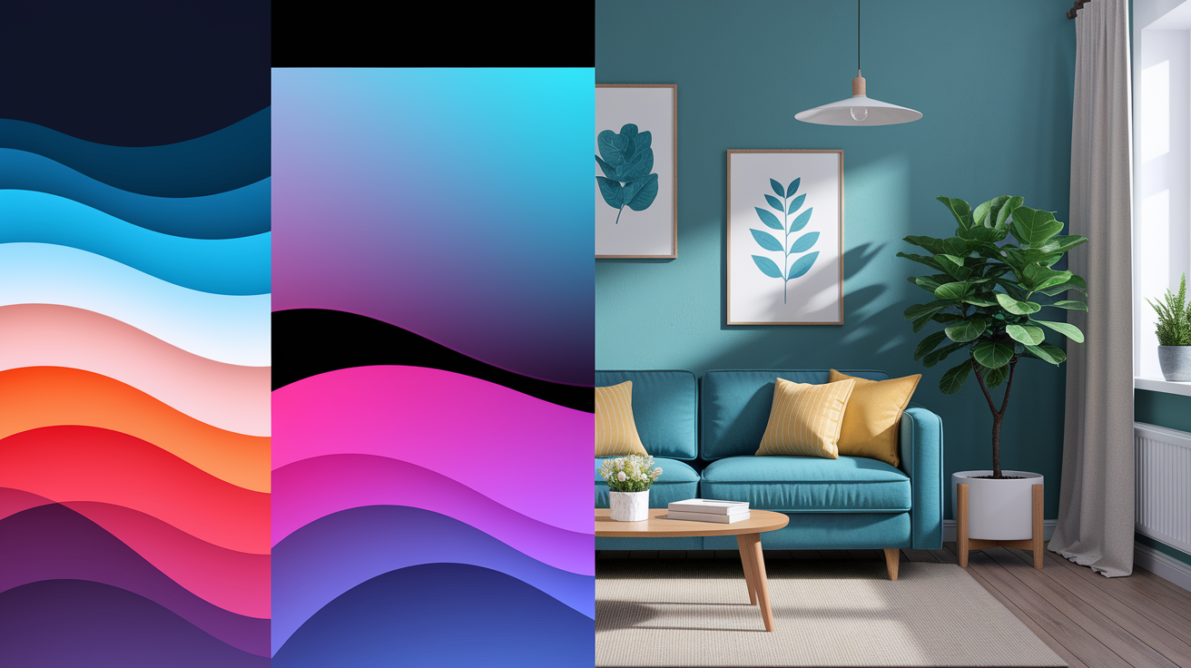
Calming color combinations include soft sage and warm white, muted blue and cool gray, and pale lavender and sand beige, to de-stress and stabilize mood.
When deployed in living rooms, bedrooms and wellness spaces, they whittle down visual noise and assist concentration. Designers will often pair the low saturation hues with matte textures and natural light to offset the calm.
To plan a palate, test light through the day, note room size and select two primary colors plus one accent.
📚 Recent Articles
The science of calm
Color acts on the nervous system and the mind simultaneously. Some duos—soft blues and warm whites, sages and beige—actually can slow heart rate, steady breathing and signal the brain to relax. This isn't style trivia; colors can influence stress, sleep quality and concentration.
The correct palette allows a room to function like a gentle shepherd, making the hard corners of everyday life a little gentler and constructing a solid foundation for wellness.
Your brain on color
Soft blue and sage green both reduce arousal. Research associates them with slower heart rate, decreased muscle tension and more relaxed stress response. Blue is so closely associated with sleep and calm that it helps the brain interpret the space as safe and slow.
Hue significance counts. Blue frequently indicates reliability and peace. Green and earth tones—beige, clay, olive—feel grounded, resonating with natural landscapes that relax the body. Blue and green boost creative performance and positive wellness for a lot of people.
Brilliant colors arouse the system. A bold red wall can spike alertness and expend focus after a while; muted variations on the same shade absorb some of the strain. If you want calm and deep work, choose low-saturation colors with light-to-medium value.
| Palette | Calm Color Hex Codes | Psychological Benefits | 2026 Smart Lighting Sync |
|---|---|---|---|
| Soft Blue + Warm White | #AFC7E2, #F5F1EA | Builds trust, reduces stress, supports wind-down — one of the best color combinations for relaxation in any room | Pair with circadian-syncing bulbs (2700K evening / 5000K morning) to reinforce the calming effect of these cool calm color combos |
| Muted Teal + Creamy Neutral | #5F9EA0, #F2EDE4 | Serene and livable — this calm color palette anchors biophilic interiors while keeping spaces airy and grounded in nature | Sync with tunable white LEDs; teal walls absorb warm 3000K light beautifully, deepening the calm background color at dusk |
| Sage Green + Beige | #9CB59B, #D9CCBA | Steady focus, gentle grounding, strong nature connection — a go-to calm color combo for home offices and living spaces | Works well with full-spectrum daylight bulbs; green tones stay true under 4000K, supporting alertness without visual tension |
| Lavender Gray + Cream | #C6C1D2, #F3EFE6 | Promotes quiet mood and gentle sleep cues — ideal calm background colors for bedrooms seeking a soft, hushed atmosphere | Combine with dimmable warm-white strips (2200K) for a gradual sleep-onset ritual; lavender gray softens under amber light |
| Dusty Rose + Warm Greige | #CFA5A5, #96897B | Radiates warmth and safety — these calming color combos ease social tension and add tactile depth to living areas | Pair with rose-tinted smart bulbs at 2700K; warm greige (#96897B) reads richer under incandescent-spectrum light, enhancing coziness |
| Silhouette AF-655 + Plum Accent | #5C4B51, #7B5EA7 | Sophisticated dark calm — Benjamin Moore's 2026 direction blends burnt umber and charcoal for moody, grounded serenity | Use Matter-enabled RGBW bulbs at 2200K amber; deep calm color hex codes like #5C4B51 absorb light, so warm point sources prevent the space from feeling heavy |
Our eyes can differentiate approximately 10 million colors, so even minor variations—cooler blue versus warmer blue—alter the room's sensation on your body.
Light and mood
Natural light renders the soft neutrals and gentle blues clean, open and slow. A north-facing room with sky-colored walls remains serene through the day, while beige floors provide warmth without clamoring.
Accent bright colors, not fields. A saffron throw or coral vase gives lift without shattering the silence.
Warm light (2700–3000 K) with beige, terracotta or dusty rose reads cozy and restful. Cool light (4000–5000 K) blues and sages feel fresh and clear. For snooze signals, keep lights warm and low the last hour—the brain interprets the environment as winding-down time. Lavender scents introduce an additional calm layer without changing hues.
- Lighting check.
- Match color temperature to palette: warm light for earth tones; neutral-cool for blue–green schemes, 3000–4000 K.
- Use dimmers to transition between work and rest modes.
- Prefer matte to reduce glare; calm loves a low shine.
- Mix layers: ceiling, wall wash, and a soft lamp near seating.
Cultural perception
Color connotations vary by culture and context, so experiment prior to dipping. White or cream may represent peace and purity somewhere, and white is mourning somewhere else. Blue generally feels safe in most quarters, but its religious or civic association can alter its shade.
Design with local cues in mind. Ask how a color reads in that community, then adjust saturation and pairings accordingly. Nature works as common ground: parks, plants, and sky tones calm most of us, so earth tones and greens are widely accepted.
- Calming combo's & culture notes
- Blue + White: trust, clarity; linked to sleep and sky.
- Sage + Beige: nature, stability; echoes parks and gardens.
- Cream + Soft Gray: quiet order; watch for mourning links with white.
- Lavender + Stone: soft ease; scent pairing can deepen calm.
- Olive + Sand: grounded, timeless; reads warm in many regions.
Our favorite calming color combinations
A serene palette establishes ambiance, brightness and spirit. Here are six balanced pairs with hex codes, where they work best, and tiny adjustments that keep 'em flexible. Give 'em a whirl, mix 'em up, and record what works for your light and lifestyle.
A simple visual chart helps: make a grid, note each pair with swatches and hex codes, then add accents you like.
1. Soft sage and cream
Sage green (#68855C) + cream (#FFFDD0) delivers a nature-inspired hush that suits bedrooms and living rooms where you desire grounded, low-profile relaxation. It recalls leaves at twilight–mellow, not muted–so it soothes without seeming insipid.
Use oak, ash or walnut to warm it, and subtle gold for a quiet lift. Accent with butter beige (muted yellow-beige), pale mushroom or a washed turquoise blue-green for just a touch of contrast–still calm.
For styling: linen drapes, woven baskets, matte ceramic lamps, and a textured wool rug round out the look.
2. Dusty blue and white
Mix dusty blue (#76B4BD) with crisp white (#F8F8FF) for an airy vibe. Cool blues are popular in chromotherapy stress relief, and the tinge of green in this blue nudges it in that soft, fey, faded-turquoise direction.
Wonderful in bedrooms and offices where concentration counts. Stick with understated patterns—thin stripes, tiny checks, or tone-on-tone botanicals.
Light wood and silver or brushed steel add balance. A navy throw, glass vases and cotton percale sheets add depth without noise.
3. Greige and muted wood
Greige had its moment — but let's be honest, the flat, cool-toned "Millennial Gray" wave left a lot of rooms feeling clinical rather than calm. The backlash is real, and designers have taken note. The new direction in calm color combinations leans into Warm Minimalism: think earthy mushroom tones, Universal Khaki, and Benjamin Moore's Silhouette AF-655 — a rich blend of burnt umber and soft charcoal that feels grounded rather than sterile. These warm greiges layer beautifully with muted creams and dusty sage greens, building spaces that feel lived-in and genuinely restful. When warmth replaces starkness, neutrals stop feeling like a design compromise and start feeling like an intentional, soothing choice.
Go with muted wood grains—white oak, beech, or birch—for a sophisticated, natural warmth. These neutrals ring of beige, brown and taupe – all things that the majority read as timeless and grounding.
Think low-gloss metal, tactile fabrics and minimal art. It reads neutral and inviting, not chilly.
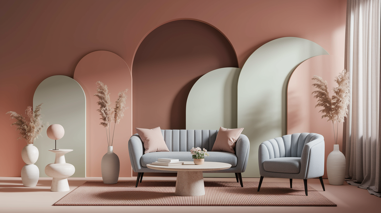
4. Terracotta and beige
Terracotta with beige adds earthy fall ease and a hushed radiance, perfect for living spaces. It reflects clay, sand and sun-washed walls, offering reassurance without heaviness.
Mix in soft peach, muted clay or a hint of the deep red for depth. Consider kilim rugs, nubby cushions, matte pottery and warm wood frames.
This palette pairs nicely with buttery neutrals and toasty browns, which frequently represent **calmness and tranquility** across cultures.
5. Lavender and heather grey
Lavender (#B5A9BE) and heather grey feel soft and poised, soothing enough for slumber or meditation. Pair with pale blush or soft white to soften edges and lighten shadows.
Layer knits, brushed cotton and low-pile rugs so the room feels quiet to the touch as well as the eye.
6. Sea salt and charcoal
Sea salt – a soft minty green – against charcoal nails modern calm. Bathrooms and home offices thrive on its crispness, throw in some cool whites or soft blues to keep it airy.
Accented with glass, brushed metal and pale stone. A weathered turquoise towel set or a skinny navy line anchors the plan, winking to how blues and greens bolster calm in color therapy.
Beyond the hue
Tranquility is about more than choosing a calming **color palette**. Saturation, texture, and light transform not only how a color scheme feels but also influence our thoughts and behaviors, enhancing the effectiveness of a space in supporting goals like concentration and inspiration.
Saturation matters
Because low-saturation colors have less visual noise, they read quiet. Soft greens, gentle grays, and smoky blues calm the eye, reducing excitation. The high-saturation colors ignite action and excitement. That might be handy for spurts of activity, but not for sleep.
Blues frequently communicate reliability and expertise, which is why numerous sleep companies rely on baby blues. Green is associated with tranquility and can even enhance creativity in certain research — particularly nature-inspired greens.
For a soothing base, pick pastels or desaturated tones: blue-gray, sage, mushroom beige, warm putty, dusty rose. Warm undertones and earthy notes bring coziness without weight. Notes of green and gray provide an almost-meditative backdrop.
Imagine a float to before and after. Before: cobalt, cherry red, crisp white, jet black. After: slate blue, clay, muted olive, off-white. The second pair reduces contrast, mellows edges and somehow feels more breathable.
Another swap: neon mint to soft sage; hot pink to blush; stark white to warm ivory. Same color family, mellower saturation.
Add some snap if you want character. Use one tiny saturated accent—like a coral vase or a navy throw—on a big calm foundation. Shoot for about 80-90% muted, 10-20% saturated. This maintains interest without disturbing the peaceful mood.
The role of texture
Soothing fabrics extend peace. Linen breathes and filters light, cotton hums fresh and pure, velvet provides a silent richness that complements a subdued color scheme. Texture, instead, decelerates the eye, which makes colors feel more anchored.
Mix serene shades with organic elements. Pale oak adjacent to sage walls warms it, rattan with sandy beige lightens it, matte pottery in warm gray grounds the palette. These ties to nature push our minds in the direction of rest.
Just layer over blankets for a cozy vibe. A wool rug beneath a linen sofa, followed by a knit throw and nubby cushion. More than three layers are usually unnecessary. Go easy on patterns and keep them low-contrast so the palette remains a calm one.
Good texture partners include:
- Linen, cotton, wool, cashmere
- Velvet in muted jewel tones
- Raw wood, cork, rattan, bamboo
- Matte ceramics, unglazed stone
- Low-VOC clay-based paints — in 2026, texture goes beyond touch: the light-absorbing matte finish of sustainable clay actively reduces visual noise, helping counter digital fatigue and reinforcing a truly calm color palette throughout the space
Dark colors can still calm when textures are soft. A ton of folks interpreted dark rooms as dramatic (65%) and chic (56%). Combine charcoal with cozy wool and it's cocooning, not austere.
The power of light
Light has the ability to transform any palette from muted to intense. Soft colors look good in natural light but direct beams can blanch out pastels. Daylight, diffused through sheers, makes the colors even and restful.
Natural light has color temperature. Warm white (around 2700–3000 K) enriches terracotta and suits bedrooms. Neutral white (~3500–4000 K) keeps blues and greens lucid in concentration areas. Cooler light can feel clinical and increase alertness, which aids tasks but not sleep.
Sample patches on every wall. See them at different times, sunrise, midday, dusk, and night with lamps on. Observe how blue appears next to a window as opposed to in a hallway.
Blues associated with sleep can skew gray in dim lighting, pink might seem more hopeful to certain women under incandescent bulbs. Black trim becomes elegant with directed, dimmable illumination.
Quick checklist beyond color:
- Saturation: mostly muted; small, intentional accents
- Undertone: lean warm or earthy for comfort
- Texture: soft, layered, low-gloss finishes
- Materials: natural wood, stone, textiles
- Light: daylight + dimmable warm lamps
- Contrast: gentle shifts, not stark jumps
- Purpose: sleep? focus? add blues/greens for calm and creativity
- Culture and mood: adjust for meanings and personal ties
Calming colors in your space
Go for balance before fashion. **Calming colors**—subtle greens, soft neutrals, and monochrome blues—reduce visual static, soothe the mind, and render rooms invitingly secure. Room by room, select two primary tones and one accent, apply color first at eye level, then spread it on walls, fabrics and woods.
If you want deep calm in your space, use continuity on all four walls, because it eliminates contrast and quiets the eye.
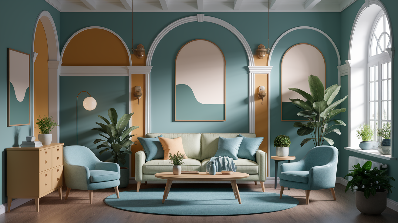
The living room
Begin with sage green and cream for an inviting foundation. The green pays tribute to nature and the cream maintains an airy feel. If the room receives intense sun, choose cool, dusty tones to counteract glare.
For drab rooms, warm neutrals like soft beige or golden yellow provide a subtle glow that seems cozy without going screaming. Use accents to direct attention. Soft blue pillows or a muted peach throw pacify the room without commandeering attention.
A monochromatic blue palette—navy rug, sky-blue pillows, pale blue art—remains soothing because the tones are connected. Natural wood anchors the concept. Oak or ash coffee tables bring warmth and equilibrium. Walnut frames add depth. Keep metals flat and hush.
Try: a cream sofa, sage walls, soft blue linen pillows, a pale oak media unit, textured wool rug in oatmeal, sheer ivory curtains, and a single aubergine ceramic vase for a restful, self-care corner.
The bedroom
Select soothing duos such as misty lavender paired with powder blue for a gentle, ethereal ambiance. Both are cool and low-chroma so they just sort of slow the room down. Aubergine can feel restful as well when used on one wall or in bed linens – it envelops without closing in.
Layer textures in soft neutrals: linen duvet in warm white, knitted throw in mushroom, clay-toned lampshades. Keep bright colors out of sight lines, stash them in the closet to preserve the pacifying palette at night.
Make a quick color chart: walls in pale gray-blue, to bedding in warm white and lavender, decor in brushed wood, matte ceramic and a slim line of aubergine on a cushion.
The home office
Choose timeless gray paired with gentle mint to increase concentration while reducing anxiety. Cool whites on trim and shelving cut clutter and bounce light back onto the desk. If you hunger for more diversity, throw in a faint slate-blue notebook stack or a muted clay cup—subtle doses, not a full blown accent wall, to keep your focus.
- Classic gray + soft mint + cool white
- Pale sage + sand beige + graphite accents
- Monochromatic blues (ink, denim, sky) + crisp white
- Warm greige + powder blue + matte black hardware
Baths or nooks, soft-toned greens make a spa pause. Go with the same shade on all four walls for continuity and heighten the calming effect.
Digital versus physical calm
Color has a profound effect on the mind — but it behaves very differently on a glowing screen than on a painted wall. Screens render color through RGB light emission, which means blue hues, greens, and purples shift dramatically depending on display brightness, ambient lighting, and — critically — whether blue-light filters like Night Shift are active. If you rely on a calm color palette of soft blues and teals for a smartwatch UI or app interface, be aware: with blue-light filtering on 24/7 (a reality for most heavy screen users), those carefully chosen calm color hex codes can drift toward muted, washed-out greens, undermining the intended effect entirely. For calm background colors on digital interfaces, consider anchoring your calm color codes around hues that remain stable under filter conditions — for example, #E0F7FA (a pale aqua) or #E8F5E9 (a whisper green) retain their visual coolness even when warm filters are applied, making them among the best color for relaxation in screen-based environments. Are there smartwatch colors that provide a cooling effect visually? Yes — pale aquas and ice blues in the #B2EBF2–#E0F7FA range are proven to lower perceived body temperature during stress responses, making them ideal calm color combos for wearable UIs. Meanwhile, a physical calm color palette for website design or interior use — think warm greiges, soft sage, and muted teal — responds to natural light in a way no screen can replicate, shifting organically through the day and grounding the space with biophilic calm. Energetic and varied color accents with soft, flowing forms, balanced by traditional calming blue shades, work beautifully in layered interior schemes, but require careful translation when adapted for digital use. Always validate your calming color combos across both filtered and unfiltered displays before committing to a final palette.
Consistency across platforms is important—a brand's soft blue should register as the same shade on an app, a website and a printed card, even if the codes vary. It depends on the individual. Some unwind with digital command, others require the silence of physical calm. Natural light boosts mood whereas excess screen time can strain both eyes and mind.
| Use | Digital (RGB) | Physical (paint/textile) |
|---|---|---|
| Calm blue mix | #93B7E3 + #F2F4F7 | soft sky blue + off‑white |
| Green blend | #7FBF90 + #E8F3EA | sage green + pale mint |
| Warm neutral | #C4B199 + #2B2B2B | beige + dark charcoal |
| Gentle purple | #AFA7D9 + #F7F5FB | lavender + warm white |
On screen
Aspire to calm not at the expense of contrast. Soft blue with warm gray frequently feels tender but crisp, as green accents direct attention without pressure. High contrast for text is non‑negotiable — at least a minimum WCAG contrast ratio makes reading easy and eye strain low.
Experiment with a foundation of cool slate (#2E3440), a soft blue tabletop (#E6EEF7) and a tranquil accent green (#78BFA3). Blues are universally associated with calm and confidence and greens add a fresh, energetic vibe. Purple can be used to calm alerts if they're kept desaturated.
Try palettes in light and dark mode. Test bright daylight and dim rooms. Toggle display True Tone/Night Shift off and on. See how RGB blues skew toward cyan and purples lose red.
Best practices:
- Use limited hues: one base, one neutral, one accent
- Keep saturation low; prefer tints and shades
- Reserve accent color for actions and feedback
- Add generous spacing; color rests when layout breathes
- Provide themes and personal controls to honor preference
- Document color tokens to keep cross‑platform parity
In your home
Start with a calm anchor on large surfaces: soft blue walls or warm beige, then layer textiles in sage, sand, and off‑white. Blues tend to soothe, greens provide freshness and browns bring a warmth that screens cannot replicate.
Light makes all the difference. Morning sun cools a blue room; warm lamps – at 2 700 K – deepen beige and brown. Try paint swatches on every wall and look at them at noon and at night. Daylight enhances well‑being. Dim rooms call for less heavy tints to escape gloom.
Mix old and new. Retain a walnut table, throw on moss green cushions, a pale blue blanket and linen rug. Extract a shade from artwork to tie the room or incorporate matte finishes to minimize glare.
Assemble a mood board with paint chips, fabric scraps and photos. Put them by the room light. Edit down to 3 main colors and one accent, then sample in 1 m² patches before you commit.
The unsung heroes of calm
Warm grays, muted browns and off-whites are the unsung heroes of calm, they often lurk in the background but they silently anchor a room or a screen. They're the unsung heroes of calm, the anchor that allows soft blues, muted purples, and warm neutrals to shine. When used skillfully, these tones provide a quiet foundation, create dimension, and instill a subtle sort of sophistication.
They are the unsung heroes of calm – they hold the loud notes, and they make color feel trustworthy and solid and comfortable to live with. You can experiment with them in increments—headboards, accent pillows, a 30 cm paint swatch on a wall—and construct a palette that reads tranquil, not lifeless.
Warm grays
Warm gray offers a gentle, grounded foundation that slices luminosity and tension. It's great for contemporary spaces with crisp edges and can outline classic surfaces such as linen, rattan or matte stone without overshadowing. On brand pages or dashboards, warm gray backs up calm professionalism and assists charts or calls to action read clear and steady.
Pair it with blush pink (#EECBD3) or sage green (#9FB49F) to maintain tranquility. Add cool, dusty hues–such as a misty blue (#A9BACF)–for silent contrast. For that sea-inspired, monochrome blue moment, a warm gray background allows those layered blues to exhale and remain calm.
Try it in both minimal and classic schemes: warm gray walls with cream trim and soft gold accents, or a web UI with off-white cards on warm gray canvas, then soft blues for links and muted purples for elegant highlights.
Recommended warm grays with hex codes:
- #F0EFEC (light, airy base)
- #D8D3CC (linen gray, cozy)
- #BDB6AE (mid-tone, stable)
- #9C958D (anchor gray, grounded)
Muted browns
Muted browns add earthy warmth and grounded calm that feels timeless. They reflect neutral earth tones to convey steadiness, to make rooms and interfaces feel confident and collected.
Mix with luscious neutrals (#F5EFE6) or gentle greens (#A8B9A0) for tranquility. Sprinkle in warm golds (#C9A770) and earthy beige (#D8C7AE) to maintain coziness. Muted purples (#B7A6C9) complement well, giving a soft, artistic flair.
Muted browns can be used in oak floors, clay paint on a single wall or a walnut console. In digital, go for a soft brown nav bar, off-white content area, and calm blue accents for trust.
Sample muted brown palette:
- #CBB7A2 (soft taupe)
- #A9917A (warm walnut)
- #8A7663 (earth brown)
- #6E5B4E (deep mocha)
Off-whites
Off-whites shine without glare, which helps keep concentration sharp and anxiety low. They act as a neutral canvas for both digital and physical design, allowing color shine through true and soft.
Pair off-whites with pastel blues (#BCD7E8) or soft beige (#E8DFD3) for a welcoming vibe. Add a grounding base of creams, greens (#A7BFA4), and soft golds (#D8C497) to achieve a calm, serene blend that still breathes life.
They grace hero sections, backgrounds, gallery walls, and bedding layers. Pair with warm browns for a cozy home feel or with cool, dusty tones for a quiet, relaxed workspace.
Popular off-whites:
- #FAF7F2 (cream white)
- #F2EFEA (soft bone)
- #ECE7DF (warm chalk)
- #E6E1D8 (taupe-leaning white)
Conclusion
Stop overthinking it — grab a $7 sample, stick it on the wall, and let the room tell you what it needs. Soft blues paired with warm gray dissolve the tension of long screen-heavy days. Sage with cream opens up a tight space without a single structural change. Dusty rose with sand catches soft light in a way that feels genuinely restorative. These calm color combinations translate seamlessly across paint, fabric, and digital interfaces — making them a go-to calm color palette for website projects and physical interiors alike. Test your chosen shades at noon and again at dusk, because the same hue can read completely differently under natural versus artificial light. Layer textures deliberately: smooth surfaces against chunky knit or raw wood add tactile depth that amplifies the visual calm. And don't underestimate the biophilic boost of a Sansevieria in the corner — it's a 2-in-1 air and visual detox that anchors any calming color combo with living, breathing contrast. Add a linen throw, a low-hum fan, and a hint of cedar, and the whole space shifts into a register that no hex code alone can manufacture.
To take it further, select a combination, test out two swatches, and live with them for a week. Let us know what shifts for you, and request edits if you require them.
Frequently Asked Questions
What colors are proven to be most calming?
Soft blues, muted greens, gentle grays, and warm neutrals create a calming color palette that is most calming. Research associates these soothing hues with decreased heart rate and stress, echoing nature—sky, water, leaves—allowing your brain to chill out. Opt for low-saturation, mid-to-light shades for maximum benefit.
How do I combine calming colors without clashing?
Select a single anchor color, a supporting color, and a neutral to create a calming color palette. Keep saturation to a minimum and aim for a harmonious color combination with a 60/30/10 balance, ensuring a smooth, tranquil web color scheme.
Do calming colors work the same on screens and walls?
Not really. Screens shine, so colors appear brighter and cooler. A calming color palette is a trick because it soaks up light and shifts with your room lighting. There is no substitution for trying out digital color palettes in physical samples. Modify brightness and warmth across each material to keep it calm.
Can accent colors still feel calming?
Yes. Opt for a calming color palette with soft accents such as dusty rose, taupe, sage, or misty lavender. Maintain a peaceful color combination that is sparing and low-chroma. Use these soothing hues in fabrics, paintings, or decorations while avoiding vibrant shades that may cause visual headaches.
What finishes and textures support a calming palette?
Matte and eggshell finishes cut down on glare and visual noise, while a calming color palette enhances the overall aesthetic. Natural textures — linen, wool, wood, clay — bring warmth and depth, complemented by a harmonious color combination. Soft, curving shapes and plush fabrics soothe, making this tranquil web color scheme ideal for creating a serene atmosphere.
How do lighting and color temperature affect calm?
Warm-white light (2,700–3,000 K) feels cozy and restful, creating a calming color palette for your space. Cool-white light (4,000–5,000 K) comes across as crisp but less comforting, making it essential to layer ambient, task, and accent lighting to achieve a tranquil web color scheme.
What if my space is small or dark—will calming colors look dull?
Select a calming color palette with soft, airy hues that include light blue or warm gray. Enhance reflectance using soft whites on ceilings and trim. Incorporate mirrors and light, textured fabrics. Remember, while patterns can add vibrancy, they should be minimized to avoid visual clutter in your serene web design.