The Best Colors for Red Undertone Skin: A Complete Guide

Key Takeaways
Here's the insight that changes everything: red undertone skin is not rosacea — and mixing up the two will derail every color decision you make. Rosacea is surface-level inflammation that flushes, flares, and responds directly to green-primed foundations. A genuine red undertone, on the other hand, is a cool-rosy base built into your skin's very structure — it doesn't budge whether you're sun-kissed, pale skin with red undertones, or anywhere in between. The difference matters more than ever in 2026, when 4K webcams and cool-white office LEDs broadcast every color mismatch in unforgiving detail. Get it wrong, and no amount of concealer will save your Zoom presence. Get it right, and everything — from your wardrobe to your foundation — clicks into place. Speaking of foundations: the best colors for red undertone skin lean cool and pink-based, never warm or golden. And when it comes to color correcting, green is the 2026 standard — not blue. Green sits directly opposite red on the color wheel, making it the only corrector that genuinely neutralizes red undertones in skin, whether they stem from rosacea, broken capillaries, or a naturally reddish skin tone. Blue correctors, by contrast, are built to cancel yellow and orange — useful for warming foundations that oxidize, but irrelevant for skin with red undertones. The rule is simple: dab a mint-green corrector on pale skin with red undertones, a standard green on medium red undertones skin, blend thoroughly, then layer your skin-tone concealer on top. As for identifying your red skin undertone in the first place — the old vein test is roughly 80% reliable and wildly dependent on your lighting. AI spectrophotometer apps now map reddish undertone skin with far greater precision, and free virtual try-on tools give you a solid starting point before you invest in a professional session. Knowing your exact red undertone isn't a beauty bonus anymore — it's the baseline for every smart color choice you make.
💫 Discover Your Complete Color Palette
Ready to discover all the colors that make you look radiant? Our comprehensive color analysis will reveal your complete personal palette - perfect for hair, makeup, and wardrobe decisions.
Take Color Analysis Quiz →Don't EVER assume red undertones are warm. Color theory will allow you to experiment with cool, neutral, and warm shades so your reds, berries and magentas come across as harmonious —not harsh.
Aim for greens, teals, cool blue, jewel colors, and cool neutrals such as soft white and gray, and cautiously test oranges and acid yellows in natural light.
Construct ensembles with complementary, analogous or monochromatic color schemes. Try teal with berry, violet with magenta or layered reds from blush to crimson and then ground the look with simple neutrals.
Link colors to your skin depth for the ultimate glow. Bonus tip! Light skin adores the icy pastels, medium skin sparkles in emerald and burgundy, while deep skin glows in bold red, purples and blues.
Try smart before you buy. Use the vein, jewelry and white paper tests in natural daylight, photograph colors in various lighting as they can drastically change, and always keep notes on the tones that consistently look good on you.
Colors for red undertones work best when they cool the warmth and balance the skin. Think soft neutrals — taupe, stone and cool beige — for everyday wear.
Blues with gray notes, forest green and deep teal flatter without clash. True white knocks cream into a cocked hat, and silver eclipses gold for accessories.
When it comes to makeup for red undertone skin, neutrals are your safest anchor — think neutral-pink foundations, rosy-brown blush, and deep berry lips. But here's the warning nobody at the beauty counter will give you: foundation oxidation is the silent enemy of reddish skin tone. That shade that looked flawless under Sephora's flattering store lighting? Give it two hours on skin with red undertones and it can shift orange or peachy in a way that clashes spectacularly with your natural flush. Don't trust the store lighting — it's engineered to make everything look good, and it's lying to you. Always test foundations on your jawline in natural daylight and check back after a couple of hours before committing. For pale skin with red undertones, look specifically for foundations labeled cool or pink-based, and if oxidation is still an issue, mix in a single drop of blue corrector to cool the formula down before it sets. Beyond foundation, blue-tinted primers are gaining serious traction as a tool for red undertones in skin — they brighten the complexion without the muddy, flat effect that green correctors can sometimes leave on fair skin. Green correctors remain the gold standard for spot-neutralizing active redness (acne, rosacea, broken capillaries), but a blue primer worn underneath your base is what keeps the whole look from warming up and fighting against your red skin undertone throughout the day. Build your wardrobe and makeup kit from these corrected neutrals as your foundation, and layer with intention.
📚 Recent Articles
What are red undertones
Red undertone skin is a structural quality of your complexion — the pink, rosy, or reddish cast that lives beneath the surface and shapes how every color reads against you. This is fundamentally different from rosacea or a temporary flush, which sit on top of the skin and respond to green color-correcting primers. If you have reddish skin tone from rosacea, a green primer neutralizes that surface inflammation before foundation goes on. But if you have a genuine red skin undertone — a cool, blue-red base baked into your complexion — green primer won't do much for you. What's actually changing the game in 2026 is the shift toward blue mixing pigments: one or two drops blended into a foundation that's pulling too orange will bring it into alignment with pale skin with red undertones far more precisely than any corrector. And no, having flushed cheeks doesn't automatically make you a Cool Summer. Skin with red undertones needs to be identified in natural light, ideally by checking your veins (blue-green reads as cool) or using an AI spectrophotometer scan — not diagnosed by a bad lighting situation in a department store. Once you know you're working with red undertones in skin, every decision in clothing, makeup, and accessories becomes sharper: the best colors for red undertone skin lean cool — cherry, cranberry, true blue-red — while warm oranges and brick tones actively fight your complexion and make it look ruddy. Getting this distinction right is the foundation of everything else.
Being able to see them clearly actually aids in constructing a palette that feels balanced and has a natural glow. In color theory, undertones reside under a color's mass tone, so they appear in paint, lipstick, and foundation, as well as on skin.
Skin tone vs undertone
Its undertone is the consistent color beneath it—typically red, yellow, olive, or neutral—that doesn't really alter with sun or fade. Even if your skin darkens in summer by 2–3 shades, your undertone remains.
That's why your **best lipstick** still works across seasons, while your foundation depth shifts. Match to undertone not just tone! Two women can have a medium skin tone and wear the same red dress and look completely different.
One with red undertones might shine in blue-red lipstick, whereas one with golden undertones may get better results from tomato red. Olive skin frequently blends green and red undertones – a combination that can cause certain pinks to gray and certain beiges to turn drab—and pure white, when held up against your complexion, helps you detect it quickly.
To verify, hold your bare skin or a product swatch up next to a neutral white background or color wheel. If you see a pinkish cast alongside white, you probably have red undertones. Try in daylight and in indoor light; both reveal some of the story.
The warmth myth
Not all red undertones share the same temperature. Some lean distinctly cool — think raspberry, rose, or flushed pink — while others read neutral when that redness sits quietly beneath beige or olive. Skin with red undertones doesn't fit neatly into a single box, which is exactly why the r/coloranalysis community has largely moved past rigid "Summer" and "Winter" seasonal labels. The shift is toward tonal analysis: a more precise framework that maps temperature on a spectrum rather than forcing rosy complexions into four predefined seasons. For pale skin with red undertones especially, tonal analysis reveals nuances that seasonal charts simply miss — because red undertones in skin converse with every adjacent color, and that conversation changes depending on whether your red reads warm, cool, or somewhere in between.
High-intensity, cool reds can sharpen with blue-based shades, muted, earthy notes may sit better with soft, low-intensity reds. Incandescents can cozy up those red undertones; certain fluorescents can drive them cooler or flatter, etc. Test colors in daylight and nighttime to prevent surprises.
Don't think red undertones just go with warm palettes. Use a color wheel: blue-reds (cool) flatter cool-leaning reds; orange-reds (warm) will flatter warm-leaning reds; muted brick or rose-brown to bridge neutral.
Choose the appropriate red by testing against a pure swatch of red and a white card. If skin looks fresher and even, you found a match.
Celebrating redness
It's time to embrace red undertones as a feature, not a flaw. Try to emphasize, not mask. In beauty, think blue-red lipstick, soft berry blush or neutral rose-brown eyes.
In clothes, lean into complementary or analogous colors: teal or forest green can make rosy skin pop, while burgundy, rose, and soft mauve echo the undertone for a seamless look. Olive skin with green and red undertones: Deep teal, muted plum or warm rose-beige all balance the push-pull without turning ashy.
In design/paint, test your shade against a neutral wall or fan deck — a "white" with red undertones can tint pink in tight corners. Knowing the red undertones is important in art and design and beauty — because it informs decisions that stand the test of skin tone and light.
It helps you select foundation that won't oxidize oddly, lipstick that stays true, and paint that appears the same at noon and at dusk.
Your best colors for red undertones
So, the fastest road to peace begins with cool bases. Blue- and pink-based colors work against red undertones, while yellow-rich shades battle them. Choose the **best colors** for your unique complexion, then customize for your skin tone, hair color, and style.
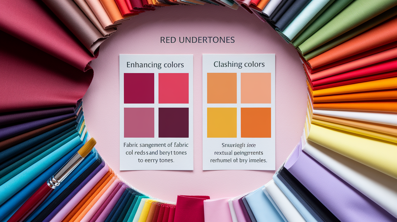
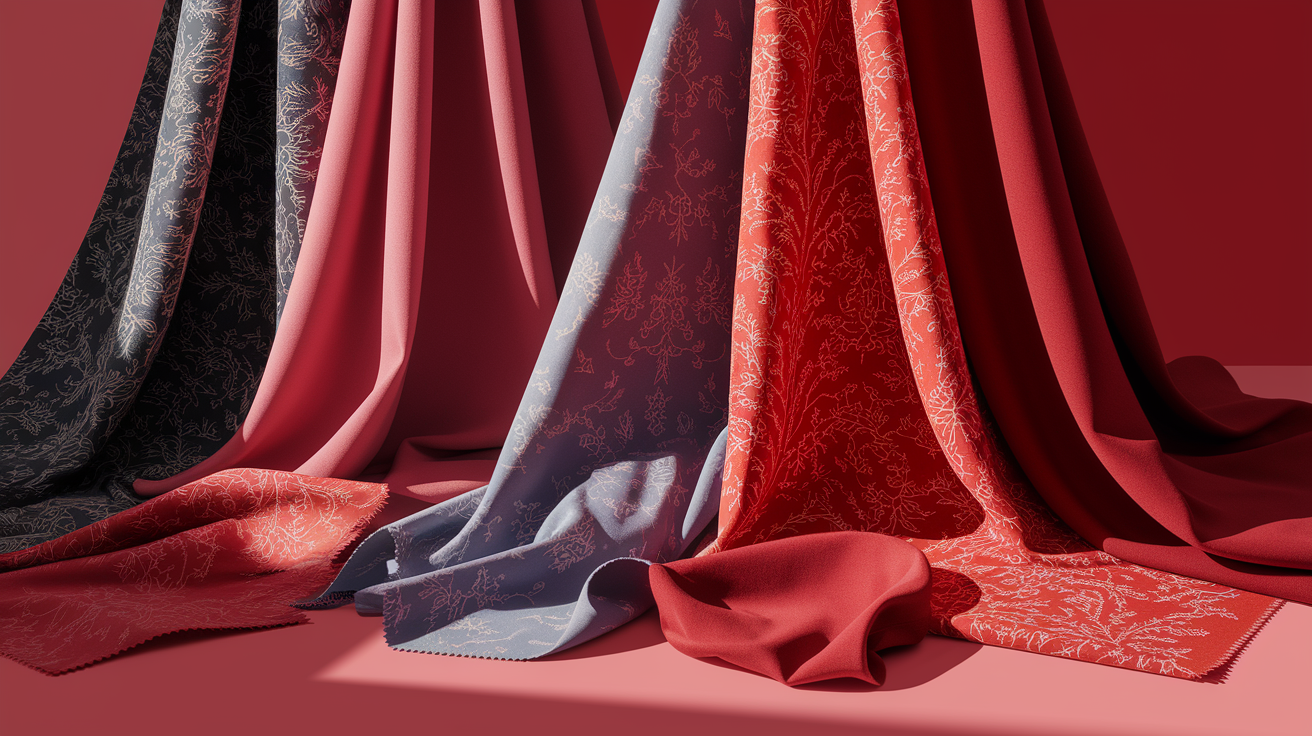
* Best enhancers: navy, cobalt, teal, dark emerald, violet, berry, rose, raspberry, true red, mint, light coral, dusty rose, marsala, chocolate brown
* Best balancers: cool gray, soft white, cool taupe, charcoal, turquoise, cool blues
* Best specific reds: blue-red, cherry, cranberry, wine, berry tones
* Colors to limit: acid yellow, mustard, orange-based red, warm gold, pumpkin, some warm browns
1. Complementary colors
Green and teal sit opposite red on the color wheel, so they create crisp contrast. Dark emerald, teal, and turquoise elevate red undertones without letting the skin look ruddy. Cool blues—navy, cobalt, slate—pair nicely, particularly for work wear or evening ensembles.
Use a color wheel to get specific. If your red reads cool, select greens with a blue cast (teal, pine). If your red is brighter, experiment with clearer turquoise or cobalt.
Complementary quick-reference table:
* Red undertone (cool) — Pair with: teal, pine, navy
* Red undertone (neutral) — Pair with: emerald, cobalt, turquoise
* Red undertone (fair depth) — Pair with: mint, sea green, soft navy
* Red undertone (deep depth) — Pair with: dark emerald, peacock, ink blue
2. Analogous colors
Pinks, magentas and purples sit adjacent to red and meld effortlessly. Consider violet, berry, raspberry and classic rose—each has a blue or pink base that compliments red undertones.
Build with three neighbors: red + berry + violet for outfits or makeup. One shade is always dominant, one is supportive, and one is used as an accent.
The blend seems subtle but lush. It frames the face, subdues sallowness and keeps warmth in check. Experiment with lilac knit, raspberry lip, and wine shoe, then interchange shades until it hits.
3. Monochromatic colors
Head-to-toe red works when you mix up shade and texture. Go from blush to cherry to deep crimson, and combine matte wool, silk satin and suede for dimension.
Try as many reds as you can in daylight to identify your blue-red sweet spot – step back 1-2 meters to judge. Anchor with cool neutrals—soft white, gray bag or silver jewelry—to keep it slick.
4. Neutral colors
Cool neutrals ground the foundation. Soft white, gray, charcoal and cool taupe keep their form but don't add heat. Warm beiges can accentuate redness, so use cautiously.
Things like cobalt scarf, teal liner or berry lip are so definitely doable and they're a nice contrast to your red hair! For nails and makeup, choose cool nudes, rose-mauve or soft gray so your skin's red undertone can breathe.
5. Colors to reconsider
Orange-based reds, acid yellow, mustard, pumpkin and some warm browns can clash. Bright orange and heavy gold can make skin look ruddy!
Try in natural light, by a window, and mark standouts. Keep a humble list of those "no-go" shades you've tried more than once.
How to find your undertone
Undertone is the consistent color under your skin tone. It doesn't shift with sun or season. It sits in three main groups: cool (pink, red, or bluish), warm (yellow, peachy, or golden), and neutral (a mix of both). Most people fall one way but others have a mixture.
For red undertones, seek tests that provide consistent outcomes in natural light.
1. Work in natural light. Stand by a window, noon if possible. Indoor bulbs skew warm and can mute pink or amplify yellow. Steer clear of tinted glass. Consider the weather as well, because strong sun can bleach out color hints.
2. Run three checks: White Paper Test, Jewelry Test, and Vein Test. Each isolates a clue: surface cast, reflective contrast, and vascular hue.
3. Experiment with a foundation swatch test. Stripe one warm shade and one cool shade on the jaw. The one that blends clean with no gray cast indicates your undertone. Keep the stripes 1–2 cm apart to compare edges.
4. Record your results. Record what you see from each test and time of day. An easy grid develops a clear profile and cuts down on the guesswork.
5. Remember olive skin. It has warm and neutral with an olive's distinct green tinge. Olive can mask pink, so trust all tests, not one.
6. Distinguish between tone and undertone. Tone varies, undertone remains. This saves you from chasing seasonal shifts.
The vein test
Check veins on the inside of your wrist or forearm in daylight near a window. Keep your arm steady and focus on the main color, not the skin surrounding it.
Blue or purple veins indicate that you have **cool undertones**. Greenish veins suggest warm or olive.
Red undertones can appear blended or subdued, thus this experiment by itself can be ambiguous. If your veins appear both blue and green, take note of the possible neutral or olive.
Match both wrists. If they don't, recheck at a different time of day.
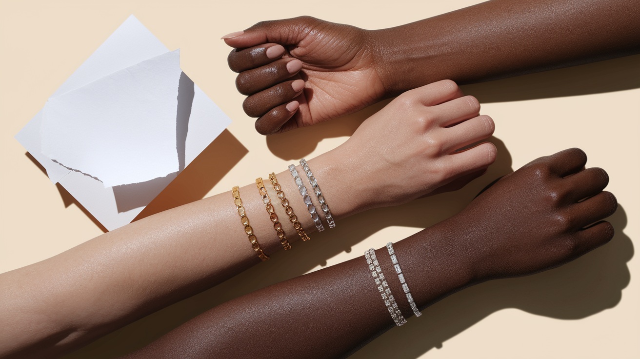
The jewelry test
Try silver and gold pieces of roughly equal size side by side. Direct your attention to your face, not the jewelry, and observe how your skin responds.
Silver has long been the go-to metal for cool or red undertone skin — it echoes the blue-pink base without clashing. Gold works beautifully on warm complexions, but if you're dealing with a reddish skin tone or a neutral-red profile, rose gold is the metal worth reaching for in 2026. It's emerged as the ultimate bridge metal: unlike pure gold, rose gold balances warm and cool tones in a way that genuinely flatters skin with red undertones rather than amplifying them. Figuring out the best colors for pale skin with red undertones extends beyond clothing — your jewelry choices carry just as much weight. Try pairing a rose gold necklace with a deep cherry red or burgundy top for a high-contrast combination that reads beautifully on screen without washing you out. If you've always instinctively reached for silver, that habit is telling you something real about your undertone — but don't be afraid to experiment with rose gold as a softer, more versatile alternative that bridges the gap between cool and warm.
Observe which metal makes your skin appear even, clear and bright instead of gray or sallow. Use this outcome to validate, not determine solo.
The white test
Hold some white paper or a white cotton tee to your face in daylight. Step away from colored walls to avoid bounce.
If your skin reads rosy, pinkish, or a little red, that favors cool or red undertones. If it turns sallow or yellow, you probably lean warm. Steer clear of off‑white or cream, they warm the scene and can mask pink.
Repeat on another day and record the outcome. Cross-reference with your vein/jewelry checks for a solid determination.
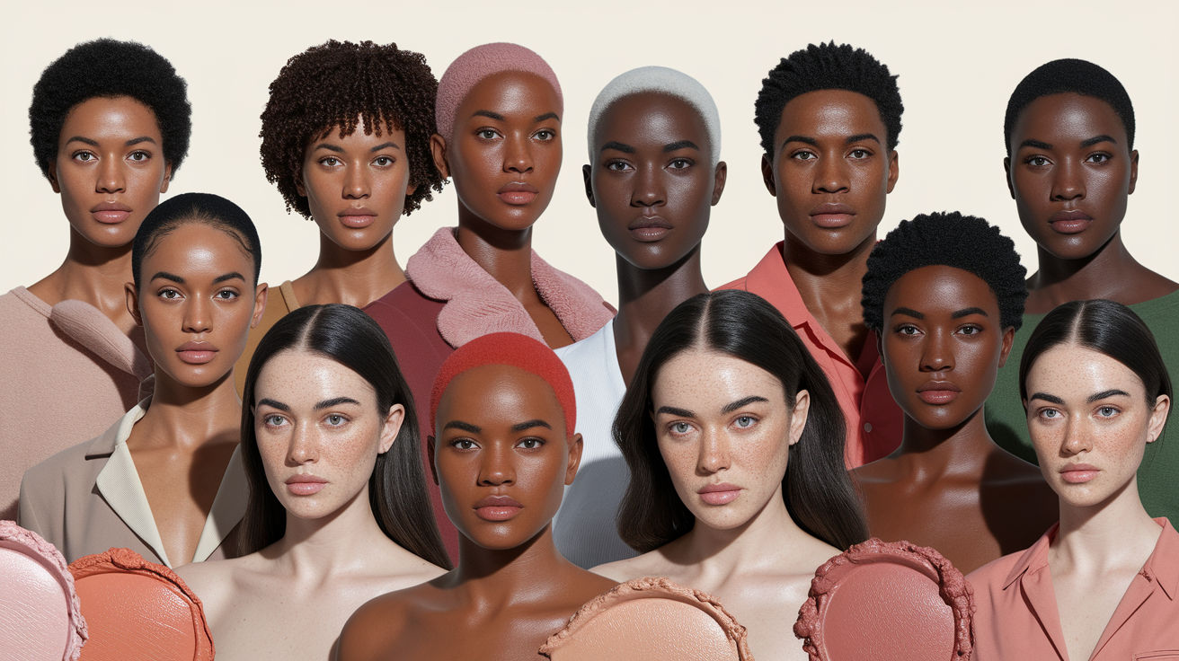
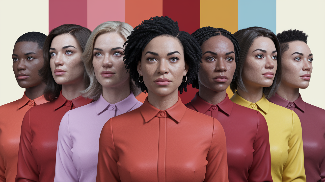
Colors by skin depth
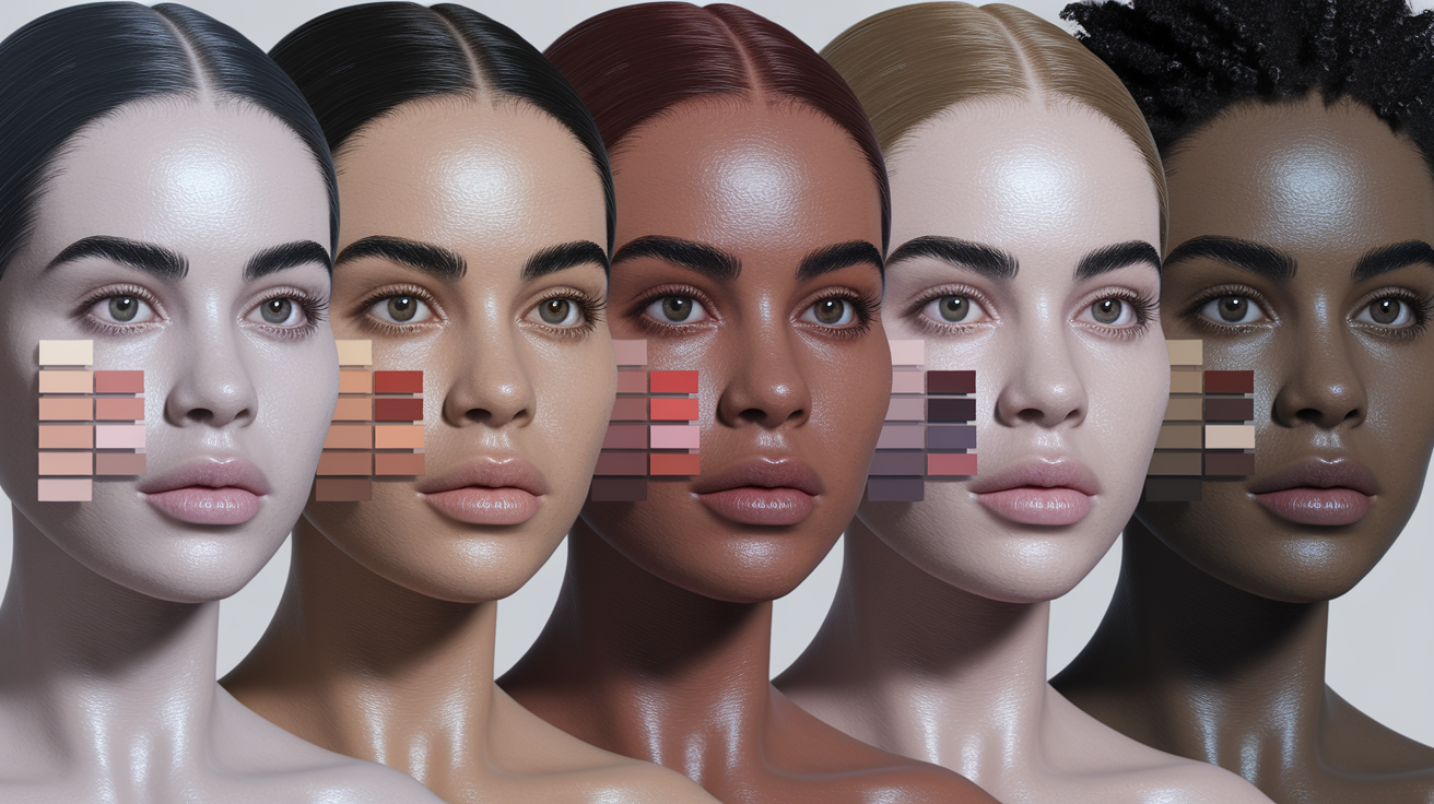
Skin depth shifts how red undertones read, so the same red can either glow or glare based on how light or deep your complexion is. Begin by cross-referencing undertone—warm, cool, or neutral—by the way pigments play on skin, then add hair and eye color to add nuance.
Build a custom chart from the table, then test swatches near daylight (10:00–14:00) to see balance and brightness.
| Skin depth | Works best | Use with care | Neutrals that help |
|---|---|---|---|
| Fair–Light | Icy blue, lavender, soft pink, mint, lilac | Bright orange, neon red | Soft white, dove gray, oyster white |
| Medium–Tan | Emerald, cobalt, berry, mint, moss, primrose yellow | Fiery orange, highlighter pink | Warm beige, warm gray, cream, sage |
| Deep–Dark | True red, magenta, deep purple, bold blue | Ashy taupe, dusty beige | Chocolate brown, old gold, copper, bronze |
Fair to light skin
Cool pastels soothe surface redness and swiff the face fresh. Icy blues, lavender, soft pinks and mint eject heat, while lilac and periwinkle bring airy lift without ruckus. Cool undertones that veer blue often shine in soft white, periwinkle, peacock accents and true red kept muted, plus dusty rose and lilac for blush.
Stay away from severe, b**right red**s or oranges that can swamp pale skin. If you're in the market for red, take your pick — classic rose or a raspberry stain, tapped and smudged. Soft white and dove gray are forgiving, oyster white trumps stark optic white in proximity to the face.
For cosmetics, go sheer. Shades to fall for: blush in petal pink or dusty rose, lipstick in balm-like rose, watermelon tint or sheer coral. The target is a natural rosy flush, not a saturated slab.
Medium to tan skin
Rich jewel tones sit well on this depth because they correspond with the weight of the skin. Emerald, cobalt blue and berry provide clarity. Maroon, burgundy and brick red provide depth without going into orange.
Neutrals with a blue or warm lean do well in peach, light olive, soft lime, moss, french blue, sage, cream, warm gray, aubergine, old gold. Counter heat with warm beige, primrose yellow and muted coral. They resonate warmth while holding red undertones firm.
Gold touches—earrings, thin chains, bronzy sunnies—complete the look and compliment freckles or sun-kissed edges. If you're cool-toned with medium–brown skin, note classics: navy, cobalt, traditional rose, mint, violet, raspberry, dark emerald, evergreen. These remain crisp.
Deep to dark skin
High-saturation shades adore this depth. Vibrant reds, deep purples and bold blues, magenta and sapphire read clean and bright against red undertones. Chocolate brown, wine red and cobalt frame the face in sharp contrast.
Metallics add warmth: copper, bronze, and old gold highlight cheekbones and eyes. No dull, ashy tones—flat taupe or gray-beige can subdue natural radiance.
Cool undertones that veer blue can lean into chocolate brown, dusty rose, marsala, cassis, soft white, true red, peacock and periwinkle colors. Warm undertones from ivory to deep brown usually bloom beautifully with hot pink, true red, violet, azure, emerald, ice pink, acid yellow and light grey marl.
Create a personal color chart: list undertone, note hair and eye color, swatch five shades per row by depth, and log which shades brighten, dull, or redden the face. Update each season as tan fades.
Beyond the color swatch
Color acts in layers, where the best colors for your skin tone can enhance your overall complexion. Red undertones in skin—cool, neutral, or warm—intersect with color in kinetic ways, so experiment with different shades of red polish to find the perfect red that complements your unique complexion.
Fabric and texture
Silk, satin and polished cotton reflect light which can make the red undertones appear vibrant and even. A blue-green satin blouse, for instance, can bounce a cool cast that counteracts skin's warmth and diminishes surface redness.
Fine viscose and Tencel drape beautifully and hold color crisp and true on camera — and for reddish undertone skin, fabric choice matters more than most people realize. Matte textures mute unwanted reflection and keep the focus on your face rather than amplifying surface redness. If you want to dial down the pink, reach for brushed cotton, crepe or sueded finishes in cool navies, forest green or charcoal — these absorb light and soften contrast at the face. When it comes to sustainable options, Tencel (lyocell) is the clear frontrunner for 2026: it holds cool-toned dyes like cherry and berry red with exceptional vibrancy, retaining up to 95% color depth even after repeated washing. Recycled silk, while eco-conscious, tends to warp cool pigments over time and is best avoided if you're investing in a signature cool-red piece. For longevity, handwash Tencel garments in cold water and your color stays as sharp as day one.
Layer textures within a single color family to add depth, without visual noise. Skip the swatch and go straight for the dash–try a matte navy tee layered beneath a glossy midnight blazer, then a knit scarf in slate. Same color swatch lane, different playground.
Wool and linen change saturation: wool often deepens color and reads richer; linen diffuses dye and looks airier, sometimes showing the undertone more than the mass tone.
The role of light
Verify color in daylight initially. When you're standing by a window on a natural mid-day sun and hold the fabric up to your face, natural light is the most truthful in terms of undertone match.
Colors shift under bulbs: yellow incandescent light warms and can push reds and oranges louder, while green fluorescent light cools and can gray out pinks and violets. LED can be different, so pay attention to the bulb temperature.
Snap rapid-fire shots in each situation, daylight, office fluorescents, evening lamps and contrast. You begin to notice that the identical teal looks bluer in one room and greener in another.
If you dress for evening, add a touch more contrast: a cooler lip or a crisper shirt collar in blue, since warm indoor light will warm everything. For day, softer matte textures can suffice.
Print and pattern
Go for prints with cool or jewel-toned grounds—ink, emerald, plum—to balance red undertones when you're still rocking color. Sometimes, a floral with a deep navy field calms the overall read.
Patterns disrupt large expanses of a single color, so any redness doesn't reverberate throughout the outfit. Plaids, stripes or ditsy motifs distribute contrast and tamp down punch.
Color blocking puts the best hue by your face: place teal, cobalt, or berry near the neckline, and keep warmer or bright blocks away from the chin. Mix scales for balance: a small polka dot shirt under a large-check jacket keeps movement without chaos.
Recall, colors show undertone when adjacent to pure samples or color wheel, and they shift when viewed solo versus in combo. Employ both tests. No hard rules, only what flatters you.
The psychology of your colors
Color decisions influence your mood, your image and how your red undertones translate in person and on camera. While research is still underway, studies hint at colors' ability to cause physiological reactions.
Red is stimulating—associated with passion, ambition and courage—but the 'incorrect' red near a warm-red complexion can accentuate flush or redness. Blue tends to read calm and trustworthy. Green is one of the world's favorite colours, and people react very positively to it.
White denotes clarity and attention. Brown can seem reliable and stable but drab, lighter browns come across honest and down to earth. Yellow lifts in little touches. As Goethe observed in "Theory of Colours," colors are symbolic, and it's your job to make them work for you.
Projecting confidence
Lean into your best reds — blue-red for cool-leaning red undertones, tomato or rust for warm-leaning ones, and soft brick for neutral. Pair them with friendly allies: navy, charcoal, soft white, olive, and cool pinks that don't fight your natural warmth.
For high-stakes moments, choose bold, saturated hues with clean edges: crimson dress, oxblood blazer, or a deep cherry tie. Strong chroma reads decisive on stage and in bright light, while mid-depth saturation suits daylight or office environments.
Your signature color becomes shorthand for you. Perhaps it's a bold raspberry lip or a garnet shirtdress that never fails. When you say it again and again, people associate that color with you, which establishes low-key power.
Use color to direct the eye. A red scarf around your face accentuates expression. A merlot belt or shoe highlights line and posture. Use high-contrast details where you want focus, and mute the rest.
Creating harmony
Construct ensembles with color schemes that complement, not clash. Start with one hero red, then add nearby tones: burgundy with plum and navy, or tomato with terracotta and cream. The look is balanced, not busy.
Pair makeup and accessories to the outfit's temperature. Blue-red lip with cool reds, coral blush to **warm red**s. Jewelry matters too: silver cools, gold warms, rose gold bridges both.
Analogous or neutral tones soothe the frame. Olive, taupe, sand, soft gray, and off-white all back up red undertones without clatter. White says clean intent, stone or ecru feels softer.
Stay away from clashes that jack up the redness. Neon yellows or sharp limes too close to the face can jar. If you're delirious for yellow, keep it petite—belt, nails, trim.
Making a statement
Go vivid when you want presence: scarlet dress, magenta shirt, or a red-and-ink-blue combo. Blue reads calm, red reads passion—the combination feels vibrant but not overwhelming.
A statement piece does the heavy lift. Red lipstick with crisp liner, a lacquered clutch or bold cuff sets the tone minus the heat-stroke.
Try fresh pairs: cherry with forest green, rust with sky blue, burgundy with blush, even red with soft lavender. Green tends to land well and complement a lot of red undertones.
Counteract the punch with neutrals. Anchor hot reds with navy, charcoal, cocoa or soft white. Light brown brings stability, dark brown can feel oppressive. Employ with purpose.
Conclusion
To wear red undertones, believe your eye, then try in actual light. Skin tells the truth quick. A soft blue tee can cool a warm flush. Moss green scarf to calm the heat. A deep plum lip can anchor a brash cheek. Little switches, BIG scores.
For your core, begin with navy, charcoal, cool white and soft taupe. Accent one daring jewel tone, like teal or ruby. Throw in texture, like linen or knit, to soften intense shades. For evenings, try wine, forest or ink blue. To work, lean on steel gray or stone.
Ready to secure your palette! Store away the brief list, conduct a mirror test by a window, and select two colors to wear this week.
Frequently Asked Questions
What are red undertones?
Red undertones indicate that your skin possesses a warm, pink-to-red tint underneath, which can be especially prominent in light skin tones. This aspect influences your overall complexion and determines the best colors that work well on you, enhancing or emphasizing redness.
What colors look best with red undertones?
Choose cool, balanced shades like sapphire, emerald, and teal, as well as crisp white. Soft rose, blush, and cool taupe flatter light skin tones, while avoiding fiery oranges that intensify the red vibe.
How can I tell if I have red undertones?
Check your skin in natural daylight — specifically along the jawline, where your true red skin undertone shows through without the influence of blush or flush. Blushing easily and having rosy cheeks after a workout are surface traits caused by close-to-skin capillaries, not your permanent undertone. Skin with red undertones is structurally neutral-to-cool: if your veins read blue-green and silver jewelry sits more harmoniously against your wrist than gold, that's a reliable signal. Pale skin with red undertones especially benefits from this jawline test in daylight, since artificial lighting can mask the cool-pink base that defines a true reddish skin tone. Understanding this distinction matters — because the color choices that flatter a red undertone are built around cool, blue-based hues, not the warm-leaning palette often mistakenly recommended for "rosy" complexions.
Do makeup colors change with skin depth and red undertones?
Yes. For fair skin tones, experiment with cool pinks and soft mauves. For medium skin tones, try berry, cool coral, and taupe. For deep skin tones, opt for plum, wine, and rich jewel tones, sticking to neutral or cool bases to counteract it.
What clothing colors reduce the look of redness?
Try cool neutrals: charcoal, slate, cool beige, and navy. Jewel tones like emerald and amethyst come to the rescue. No hot reds and neon oranges around your face. Opt for matte fabrics as opposed to shiny ones, which increase contrast.
How do I go beyond color swatches to test accuracy?
Try it on in natural light, pulling your hair back. Put on a block of color around your face and have someone snap a picture. Contrast photos between days to see how the best colors enhance your overall complexion and eye brightness. Take what makes your skin tone look calmer.
How does color psychology help people with red undertones?
Cool blues and greens indicate calm and professionalism, while jewel tones are confident without emphasizing redness. Soft neutrals, especially for different skin tones, seem accessible, boosting how you feel and how people perceive your unique complexion.