Summer vs Autumn Palette Differences

If you've ever held a dusty rose swatch next to a muted terracotta and thought, both of these look like me, you're not alone. The summer vs autumn color palette comparison is one of the most searched and most genuinely difficult distinctions in the entire 12-season color analysis system.
Soft Summer and Soft Autumn are the two most muted seasons in the system — and also among the most commonly identified in analysis results. That overlap in muted, low-saturation tones is precisely why so many people find themselves wavering between the two.
This guide makes the distinction concrete. You'll learn:
- The exact chromatic features that separate Summer from Autumn palettes at a technical level
- Which colors belong exclusively to each season — and where the boundaries blur
- How undertone temperature and value depth function as the two primary sorting criteria
- Practical self-assessment methods you can use without a professional drape session
Whether you already suspect you're one or the other, or you're starting from zero, the goal here is precision — not another vague promise to "wear your best colors." By the end, you'll understand why these two palettes look similar on a mood board yet produce genuinely different results on a face.
Why Soft Summer and Soft Autumn Are So Easy to Confuse
The frustration is legitimate. Soft Summer and Soft Autumn are two of the most commonly identified seasons in color analysis — and they're also the two most muted seasons in the entire 12-season framework. When every color in both palettes has been dialed back in saturation, the differences between them shrink considerably on a screen, on a Pinterest board, or under store lighting.
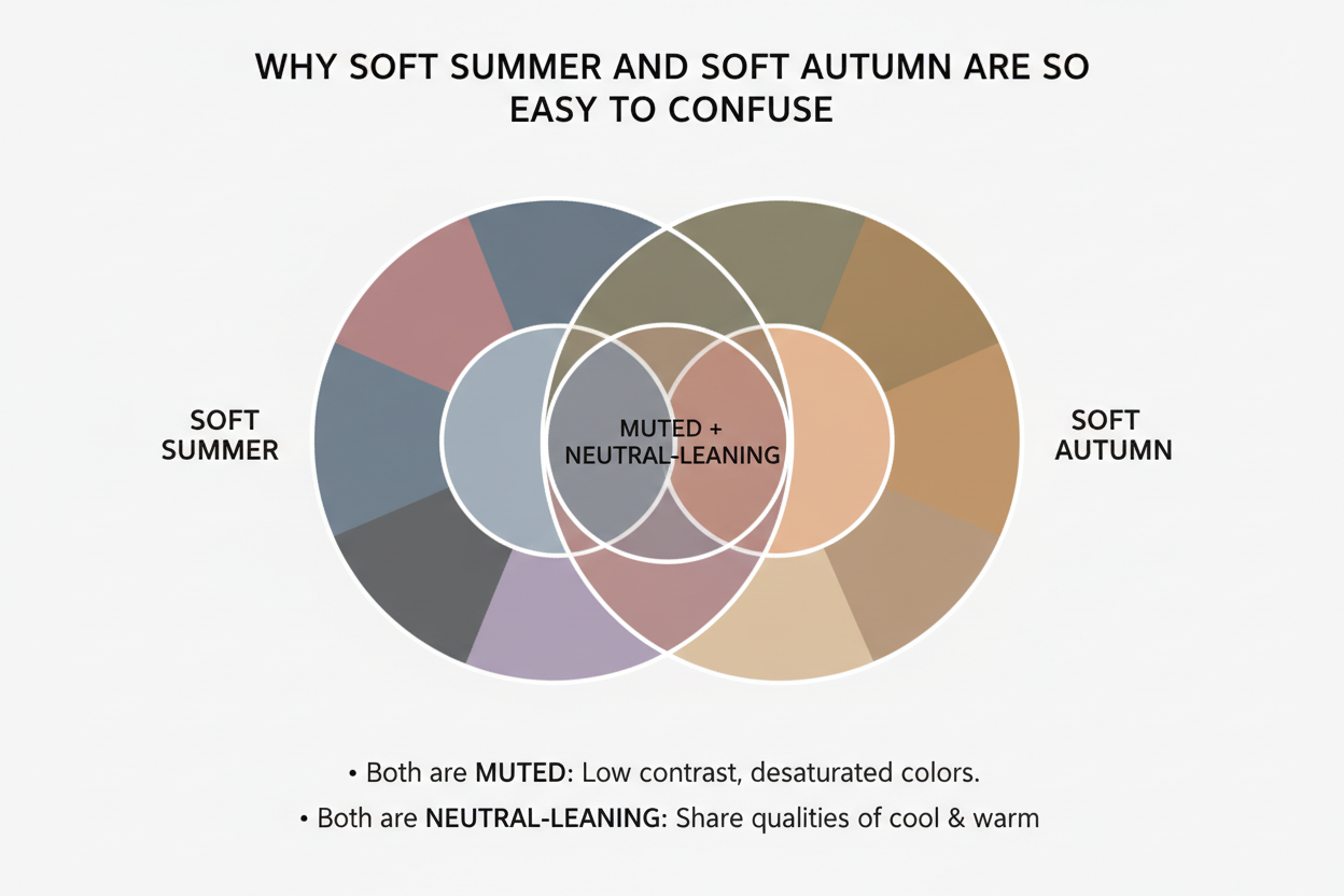
The confusion gets worse because the colors that appear in both palettes — dusty pinks, soft taupes, faded greens — look nearly identical in isolation. It's only when those colors are held up to your actual face that anything separates them. A dusty rose can make one person look luminous and another look tired, depending entirely on whether their undertone leans cool-neutral or warm-neutral.
If you've been going back and forth between these two seasons, that's not a failure of self-knowledge. These are genuinely adjacent palettes that require chromatic precision to separate — not gut feeling.
→ Take the color analysis quiz to find out whether you're Soft Summer or Soft Autumn
The Chromatic Features That Actually Separate the Two Palettes
The most reliable way to distinguish summer from autumn is to move past swatches and reason from chromatic features directly. Two variables do most of the diagnostic work:
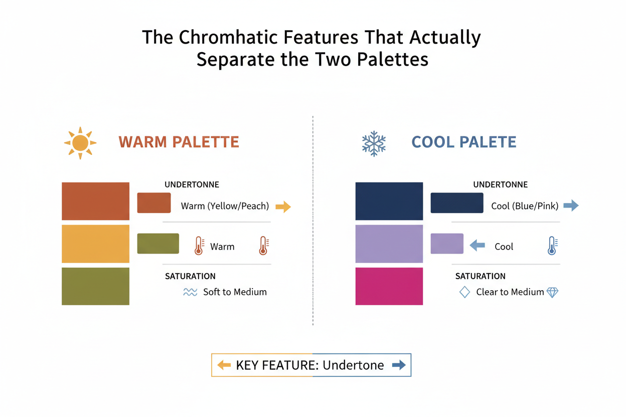
- Undertone temperature — whether your coloring reads as cool-neutral or warm-neutral
- Depth and value — whether your overall contrast level reads as light or medium-to-deep
Both seasons are muted. Both avoid high saturation. Neither works with pure, bright, or icy tones. But within that shared softness, they pull in opposite directions — Summer toward cool and light, Autumn toward warm and deeper.
Everything else — the specific hues, the neutrals that work, the metals that flatter — follows from these two variables.
Undertone Temperature: Cool-Neutral vs Warm-Neutral
Neither Soft Summer nor Soft Autumn is purely cool or purely warm. That nuance matters. Both sit close to the neutral center of the temperature spectrum, which is exactly why they overlap visually.
The distinction is directional:
- Soft Summer leans cool-neutral. There's a subtle blue-pink quality to the undertone. Colors with even a slight warm or yellow cast can make the complexion look off — sallow, or faintly muddy.
- Soft Autumn leans warm-neutral. There's a subtle golden or yellow-beige quality to the undertone. Colors with a cool or blue-pink cast can make the complexion look dull or washed out.
The practical test: hold a soft, muted dusty pink next to a soft, muted terracotta. One of them will make your skin look more even, your eyes clearer, your lip color more defined. That response — not which color you prefer — tells you which temperature direction your coloring belongs to.
Depth and Value: Why Summer Reads Lighter Than Autumn
The second variable is value — how light or deep the overall palette runs.
- Soft Summer sits at a lighter value range. The colors tend to be pale and slightly ethereal — not bright, not heavily saturated, but not deep either. Airy, low-contrast tones.
- Soft Autumn operates at a medium-to-deeper value range. The earthier quality of Autumn colors carries more visual weight. Soft Autumn can wear richer, more grounded hues — muted terracotta, warm olive, caramel — that would overwhelm a Soft Summer.
This depth difference explains why Soft Autumn can anchor earth tones that Soft Summer cannot. Even when both seasons use the same hue (sage green, say), the Autumn version is slightly richer and heavier, the Summer version slightly greyer and lighter.
Soft Summer Palette: Key Color Characteristics
Soft Summer lives at the overlap of cool, muted, and light. The palette avoids sharp brights and heavy earth tones equally.
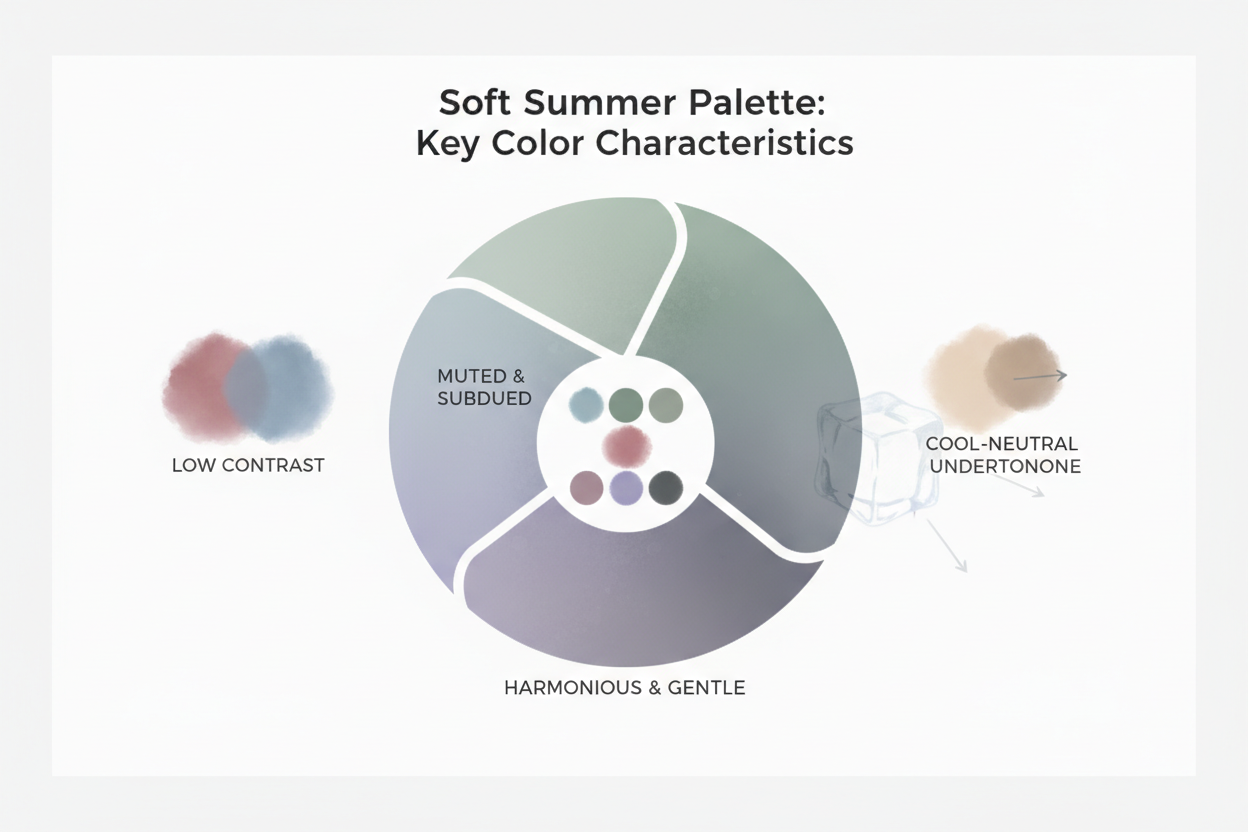
Core chromatic qualities:
- Temperature: cool-neutral with a subtle blue-pink cast
- Saturation: low — all colors are significantly desaturated
- Value: light to medium-light; nothing too deep or heavy
- Overall effect: soft, understated, gently ethereal
Signature Soft Summer colors include:
- Dusty mauve and dusty rose
- Soft blue-grey and slate
- Muted lavender
- Cool-toned soft teal
- Greyed lilac
- Soft denim blue
- Blush pink (greyed, not warm)
- Taupe with a cool grey base
- Rose-brown
What Soft Summer avoids: warm oranges, golden yellows, rich terracottas, earthy browns with red undertones, anything with a yellow-based cast. High contrast combinations also tend to overwhelm what is naturally a subtle palette.
On the right person, the best Soft Summer colors do something specific: the skin looks even and slightly luminous, and the colors sit quietly around the face rather than competing with it.
Soft Autumn Palette: Key Color Characteristics
Soft Autumn shares the low-saturation quality of Soft Summer, but everything shifts warmer and slightly deeper. Where Summer feels cool and light, Autumn feels grounded and earthy.
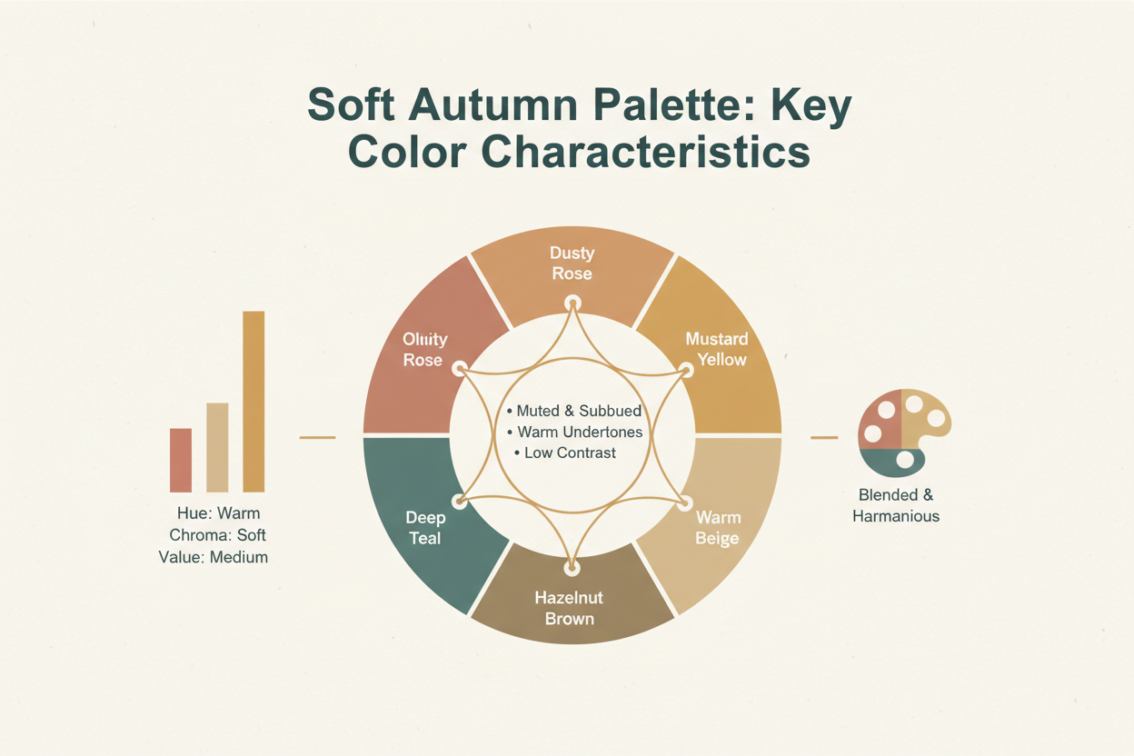
Core chromatic qualities:
- Temperature: warm-neutral with a subtle golden or yellow-beige cast
- Saturation: low — equally muted to Soft Summer, but in warmer hues
- Value: medium to medium-deep; colors carry more visual weight than Summer's
- Overall effect: soft, earthy, quietly rich
Signature Soft Autumn colors include:
- Muted terracotta
- Warm olive and sage (with a yellow-green base)
- Caramel and warm camel
- Soft rust
- Muted gold and antique gold
- Warm mushroom and latte
- Dusty peach
- Warm teal (with a yellow-green, not blue, base)
- Bittersweet chocolate (muted)
What Soft Autumn avoids: cool pinks, blue-based greys, lavender, icy or clear colors, and anything with a distinctly cool or blue undertone. High-contrast combinations can also feel harsh against Soft Autumn coloring.
→ Ready to find out which palette describes you? Start the quiz here
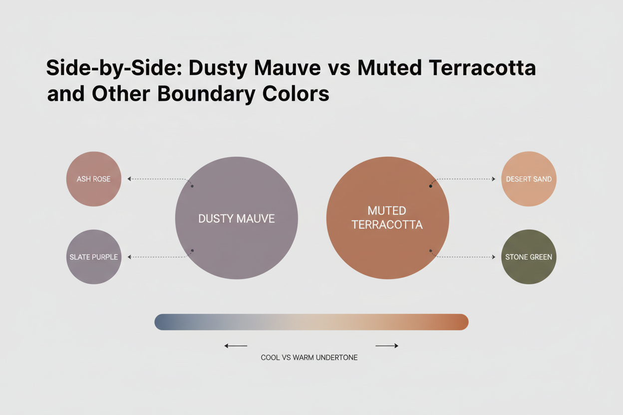
Side-by-Side: Dusty Mauve vs Muted Terracotta and Other Boundary Colors
The clearest way to see where these two palettes diverge is to look at the colors they share a neighborhood with — the boundary zone where confusion is highest.
| Color Category | Soft Summer Version | Soft Autumn Version |
|---|---|---|
| Pink-adjacent | Dusty mauve (cool, greyed) | Dusty peach (warm, golden-tinted) |
| Earth neutral | Cool taupe (grey-pink base) | Warm mushroom (yellow-beige base) |
| Green | Greyed sage (blue-green base) | Warm sage (yellow-green base) |
| Brown neutral | Rose-brown (cool-toned) | Caramel brown (warm-toned) |
| Statement warm tone | — | Muted terracotta |
| Statement cool tone | Dusty mauve | — |
| Teal | Cool teal (blue-dominant) | Warm teal (green-dominant) |
| Beige | Grey-beige (cool, barely warm) | Yellow-beige (warm, golden cast) |
The diagnostic pair — dusty mauve for Summer, muted terracotta for Autumn — shows the temperature shift most plainly. Both colors are muted and relatively soft. But one pulls toward pink-grey, and the other toward orange-brown. One of those directions will work with your face. The other will fight it.
Beiges and soft neutrals are another high-confusion zone. A warm-beige linen top and a grey-beige linen top can look nearly identical on the hanger. Against your face, the difference becomes obvious: one evens out your skin, and the other introduces a cast that wasn't there before.
How to Test Which Palette Suits You Using Chromatic Self-Assessment
You don't need a professional draping session to make a useful first assessment — but you do need to reason from chromatic features rather than just looking at swatches in isolation.
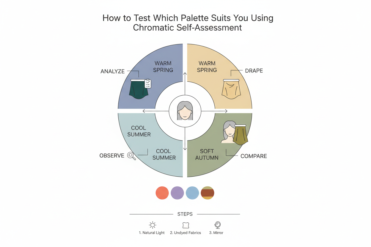
Step 1: Assess your undertone direction
In natural daylight, examine your inner wrist and jaw. Ask:
- Do the visible veins look blue-purple? → Points toward cool-neutral
- Do they look green or olive? → Points toward warm-neutral
- Does your skin look most even in the sun against cool, blue-toned backgrounds, or warm, golden ones?
Step 2: Test temperature with two fabrics
Hold a clearly cool-muted fabric (dusty mauve, soft blue-grey) and a clearly warm-muted fabric (muted terracotta, warm camel) close to your face in natural light. Look for:
- Which evens out your skin tone?
- Which makes your eyes appear clearer?
- Which makes the area around your mouth and nose look more defined, rather than drawing attention to discoloration?
Step 3: Assess your depth level
Compare yourself against a light, pale color and a medium-deep earthy color (like chocolate or rust). Do the lighter colors feel balanced, or do they wash you out? Does the deeper palette feel rich, or does it overwhelm?
- If light colors feel naturally harmonious → Soft Summer range
- If medium-depth earth tones feel harmonious → Soft Autumn range
Step 4: Check the boundary colors
Use the table above. Test dusty mauve against muted terracotta, and cool taupe against warm mushroom. The color that disappears into your face — rather than creating contrast with it — belongs to your season.
Common Mistakes When Choosing Between Summer and Autumn Palettes
Misidentification between these two seasons is common, and the reasons tend to repeat.
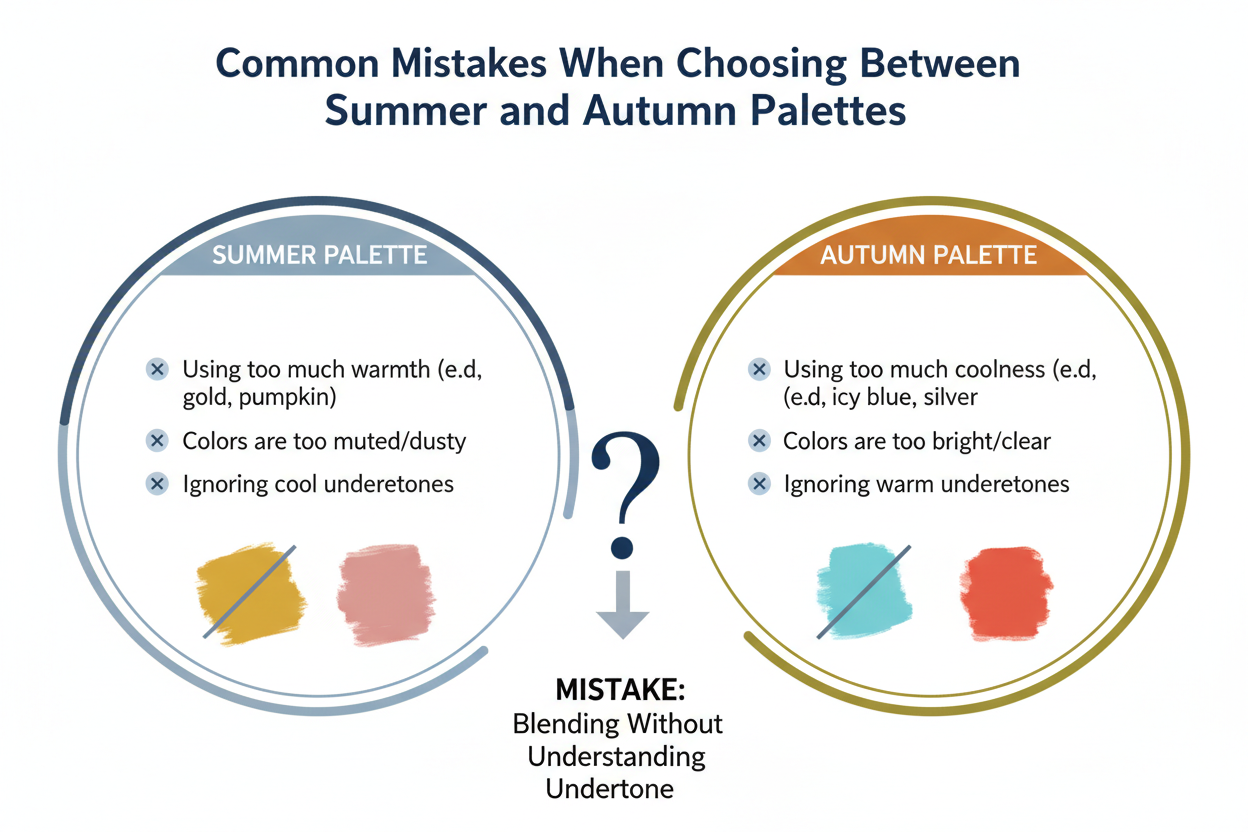
Mistake 1: Choosing based on which colors you prefer, not which colors work
Preference and harmony aren't the same thing. You might love terracotta conceptually while it actually adds an unwanted yellow cast to your complexion. Work from the mirror, not the mood board.
Mistake 2: Testing under artificial or mixed lighting
Both palettes are subtle. Artificial lighting — especially the warm yellow glow common in retail environments — compresses the temperature difference between cool-muted and warm-muted colors. Always check in natural daylight.
Mistake 3: Relying on swatch images on screens
Screen calibration, photography conditions, and image processing all change how colors look. Soft Summer swatches can read warm on a yellow-calibrated monitor; Soft Autumn swatches can read cool on a blue-tinted one. Reasoning about temperature direction and depth is more reliable than trying to pixel-match.
Mistake 4: Concluding you're Soft Autumn because you like earth tones
Soft Summer can wear some earthy colors — warm-leaning taupes, dusty pinks with a faint peachy cast — without being Soft Autumn. The real question is whether your coloring needs that warmth to look harmonious, or just tolerates it.
Mistake 5: Confusing how common both seasons are with certainty
Soft Summer and Soft Autumn are two of the most frequently identified seasons, so many people assume one of them must be right for them. That's a reasonable starting point, but it shouldn't push you toward a forced fit. The chromatic test determines which season applies — not the odds.
People Also Ask
What is the difference between Soft Summer and Soft Autumn color palettes?
Both Soft Summer and Soft Autumn are the most muted seasons in the 12-season color analysis system — every color in each palette has been significantly desaturated. The core difference comes down to two things: undertone temperature and depth.
- Soft Summer leans cool-neutral, with a subtle blue-pink cast. Its palette runs lighter in value — dusty mauve, greyed lavender, soft blue-grey, cool taupe.
- Soft Autumn leans warm-neutral, with a subtle golden or yellow-beige cast. Its palette sits at a medium-to-deeper value — muted terracotta, warm olive, caramel, dusty peach.
Both seasons avoid high saturation and sharp contrast. The difference is which temperature direction — cool or warm — actually harmonizes with a person's natural coloring when colors are held close to the face in natural light.
Can you be both Soft Summer and Soft Autumn in color analysis?
Technically, no. Color analysis assigns one primary season. But because Soft Summer and Soft Autumn sit close together near the neutral center of the temperature spectrum, telling them apart is genuinely hard. That's not a flaw in the system. Both seasons share the same dominant quality — low saturation — and differ mainly in temperature direction and depth.
Some people land very close to the border. In practice that means:
- A narrow range of warm-muted colors may work for a Soft Summer
- A narrow range of cool-muted colors may work for a Soft Autumn
But one palette will consistently do more: skin looks even, eyes look clear, the face isn't overwhelmed. That's your season. Not both equally.
What colors does a Soft Autumn wear that a Soft Summer cannot?
Soft Autumn's warm-neutral palette runs deeper and earthier than Soft Summer's, which means it opens up golden and orange-adjacent tones that would look muddy or jaundiced on a cooler complexion.
Colors that work for Soft Autumn but not Soft Summer:
- Muted terracotta — the signature warm-orange earth tone
- Warm olive and yellow-green sage — too golden for Soft Summer's cooler sage
- Caramel and warm camel — yellow-beige neutrals that read as warm, not nude
- Soft rust — warm red-orange, too warm for Summer
- Antique gold and muted gold — yellow-based metallics
- Dusty peach — peachy-pink with a golden cast
- Warm mushroom — yellow-beige, not grey-beige
Soft Summer can handle dusty pinks, grey-based taupes, and cool sages. Once those tones tip toward golden, orange, or yellow-based warmth, they're out of Summer's range.
How do I know if I am a Summer or Autumn season in color analysis?
The most reliable method is to test muted fabrics or color swatches held close to your face in natural daylight. Look for these responses:
- Undertone check: Do your veins appear blue-purple (cool-neutral → Summer) or green-olive (warm-neutral → Autumn)?
- Temperature test: Hold a cool-muted tone (dusty mauve, slate blue) and a warm-muted tone (terracotta, warm camel) near your face. Which one makes your skin look more even and your features more defined?
- Depth check: Do light, pale muted colors feel naturally balanced on you, or do medium-depth earth tones feel more harmonious? Lighter → Summer; medium-deeper → Autumn.
- Boundary color test: Compare cool taupe against warm mushroom, and dusty mauve against dusty peach. The color that blends with your face without creating an unwanted cast points to your season.
Avoid doing this under artificial or store lighting, which tends to compress the temperature differences between the two palettes.
Is dusty mauve a Summer or Autumn color?
Dusty mauve is a Soft Summer color. It falls in the cool-pink-grey zone: desaturated, mid-value, with a blue-pink base rather than orange-brown. That cool, greyed quality fits Soft Summer's cool-neutral temperature direction.
Soft Autumn's equivalent shifts toward dusty peach or warm terracotta-pink — still muted, but with a golden cast instead of a cool one.
If dusty mauve genuinely flatters you — evening your skin and adding soft clarity to your features — that points toward Soft Summer. If it reads flat or cool against your complexion and warmer muted pinks feel more natural, Soft Autumn is probably the better fit.
FAQ
What is the main difference between the summer and autumn color palette in the 12-season system?
In the 12-season system, both Soft Summer and Soft Autumn are defined by extreme mutedness — every color in each palette is heavily desaturated. What separates them is undertone temperature and depth.
- Soft Summer is cool-neutral, running lighter in value, with a blue-pink base (greyed lavender, dusty mauve, cool taupe).
- Soft Autumn is warm-neutral, sitting at a medium-to-deeper value, with a golden or yellow-brown base (muted terracotta, warm olive, caramel).
Neither palette tolerates high saturation or strong contrast. The dividing line is the direction of warmth — cool or warm — and how that temperature plays against a person's natural coloring.
Why are Soft Summer and Soft Autumn so commonly confused?
Soft Summer and Soft Autumn are two of the most frequently identified seasons in color analysis, which means more people run into this exact confusion. A few things make it genuinely hard to tell them apart:
- Both are defined by low saturation, so neither palette announces itself through vivid color.
- Both sit close to the neutral center of the warm-cool spectrum — neither is strongly cool nor strongly warm.
- Boundary colors like cool taupe (Summer) and warm mushroom (Autumn) look nearly identical on a swatch but behave differently against skin.
- Artificial lighting flattens the temperature differences that natural daylight would reveal.
This isn't a flaw in the system. It reflects how close these two palettes actually are on almost every dimension except the direction of their temperature.
Can someone with warm undertones wear Soft Summer colors?
Not optimally. Soft Summer is built for cool-neutral undertones — its colors carry a subtle blue-pink cast. On someone with distinctly warm undertones, that mismatch tends to show up as:
- Skin looking sallow, ruddy, or flat
- Features washing out instead of coming forward softly
- The color pulling attention away from the face
If you have warm-neutral undertones, Soft Autumn is the closer fit. Its muted, golden-based tones work with that warmth rather than against it. Because both seasons sit near neutral on the spectrum, a Soft Autumn can sometimes tolerate a few cooler muted shades — but if something feels off, the warm-neutral palette is usually why.
What are the signature colors that distinguish Soft Autumn from Soft Summer?
Soft Autumn's warm-neutral, medium-depth palette includes colors with no equivalent in Soft Summer:
- Muted terracotta — warm orange-brown earth tone
- Warm olive and yellow-green sage — too golden for Summer's cooler sage
- Caramel and warm camel — yellow-beige neutrals
- Dusty peach — warm peachy-pink with a golden cast
- Soft rust — warm red-orange
- Antique or muted gold — yellow-based metallic tones
- Warm mushroom — yellow-beige rather than grey-beige
Soft Summer's equivalents all shift cooler: grey-based taupe instead of warm mushroom, dusty mauve instead of dusty peach, cool sage instead of warm olive. Once a muted color tips toward golden or orange warmth, it moves out of Summer's range and into Autumn's.
Do current fashion trends favor Soft Summer or Soft Autumn palettes?
Both, honestly. The broader shift toward muted, understated dressing has put both palettes in a good position — desaturated neutrals, blush-adjacent tones, warm beiges, and mauves have been showing up across multiple seasons now.
Where specific trend colors land:
- Soft muted neutrals and beiges — closer to Soft Autumn's camel and mushroom range
- Mauves and dusty pinks — Soft Summer territory
- Soft blues and blue-greys — Soft Summer
- Warm sage and olive — Soft Autumn
Neither palette has a clear advantage right now. Both do well in a moment that's favoring low-saturation, quiet dressing over anything bright or high-contrast.
Is Soft Summer or Soft Autumn more common among people seeking color analysis?
Both come up constantly in professional and self-directed color analysis. That's not a coincidence — muted, neutral-leaning coloring is just genuinely common. A lot of people have low-contrast features with undertones that don't pull strongly warm or cool in either direction. That ambiguity is exactly why Soft Summer and Soft Autumn are also the two seasons most likely to get mixed up before someone takes a closer look at temperature and depth.
How does depth (light vs deep) differ between the summer and autumn color palette?
Depth is a reliable secondary differentiator between the two palettes:
- Soft Summer runs lighter overall. The palette is built around pale-to-medium muted tones, and deep or rich colors tend to overwhelm its naturally lighter, lower-contrast features.
- Soft Autumn sits at medium-to-deeper value. It can handle more depth — richer earth tones, deeper warm neutrals — without losing harmony. Purely light or pale colors often look washed out.
In practice: if muted light tones feel balanced and flattering, Summer is the more likely fit. If medium-depth earthy tones feel more natural and the lighter end of the palette falls flat, Autumn is the stronger candidate.
Not sure which depth level suits your coloring? Take the color analysis quiz to find out.