How to Wear Autumnal Green: The Trendiest Color of the Season

Key Takeaways
- Fall green colors occupy a spectrum that runs from dusty olive and reseda through moss and forest to jewel-toned emerald — all richer, more grounded and more complex than anything you'd reach for in spring. Autumnal green tones pair naturally with pumpkin orange, burgundy, cocoa brown, burnished gold and navy, making seasonal outfit-building almost effortless.
- ⚠️ Lighting Warning — the detail most people skip: Fall green color shifts dramatically depending on the bulb above you. Under warm 2700K LEDs, olive and moss read amber-brown; under cool 5000K daylight bulbs they snap back to true green. Before committing to any greens for your autumn palette — whether sage, hunter or #009b77 emerald green (rgb(0, 155, 119) emerald) — hold the swatch or garment in natural midday light first. AI color analysis apps like Dressika and Vivaldi Color Lab are genuinely useful for digital draping, but they consistently misread autumn palettes when photos are taken under artificial lighting. Always shoot your selfie outdoors for a reliable autumn greens color analysis result.
- Earthy fall green shades — olive, avocado, moss — anchor any palette and let bolder accent colors breathe. Layer them in matte, textured fabrics like corduroy to keep the tone stable across mixed lighting environments; satin finishes amplify unwanted color shifts under LEDs.
- Is dark green a fall color? Absolutely. Deep hunter and jewel-toned emerald bring drama and polish to both interiors and wardrobes. Ground them with warm woods, copper hardware and chunky-knit textiles for a look that reads unmistakably autumnal.
- Is mint green a fall color? Only with careful handling — its cool, bright quality sits outside the classic greens for autumn palette. If your personal color season leans cool-light, a muted mint can work; otherwise, reach for sage instead. Speaking of which: is green a fall color in general? Yes — provided the tone carries enough warmth or depth. Kelly green is the edge case worth knowing: what color season is kelly green? Its high saturation and cool-leaning brightness place it firmly in spring and summer territory, not autumn.
- Muted fall green color choices like sage add quiet cohesion to a palette without competing for attention. Pair sage with warm cream, terracotta or dusty rose and you get a combination that feels both current and seasonally grounded. Avoid flat, plain-matte finishes on sage — layer gold jewelry or a warm-toned scarf to prevent the "hospital scrub" effect.
- Build your autumn greens color analysis mini-palette with intention: one earthy tone (olive or moss), one deep tone (forest or hunter), one jewel tone (#009b77 emerald green / rgb(0, 155, 119) emerald). Add a warm neutral and one bold accent. Always finalize your choices in natural daylight — note the hex codes, then cross-check with a free digital draping tool like Vivaldi or Dressika before you buy.
💫 Find Your Color Palette
Ready to discover which greens and fall colors look stunning on you? Our comprehensive color analysis reveals your personal palette with colors that enhance your natural beauty.
Find My Color Palette →With emerald silk commanding a 15% price premium thanks to dye scarcity, savvy dressers are already pivoting — and if you're still asking is green a fall color, consider this your survival guide to autumn's most underrated palette. Fall green colors span a rich continuum: from the golden-tinged warmth of olive and the earthy depth of moss to the quietly commanding presence of deep pine — the shade quietly replacing black in office capsule wardrobes. Autumnal green isn't a single hue; it's a whole ecosystem of tones that thrive precisely when the temperature drops and the light turns amber.
In most areas, oaks, pines, cedars, and hollies keep their leaves or needles green as the surrounding maples and birches become red and gold. Parks and trails reveal contrasts that make greens feel richer.
Whether you're planning palettes, outfits or photos, these greens go beautifully with rust, amber and cream. The following parts detail tones and applications.
📚 Recent Articles
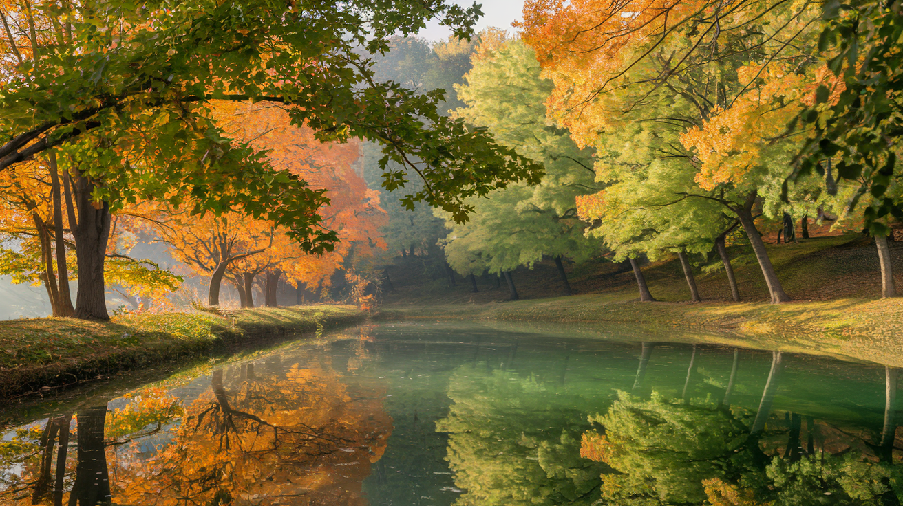
The spectrum of fall green colors
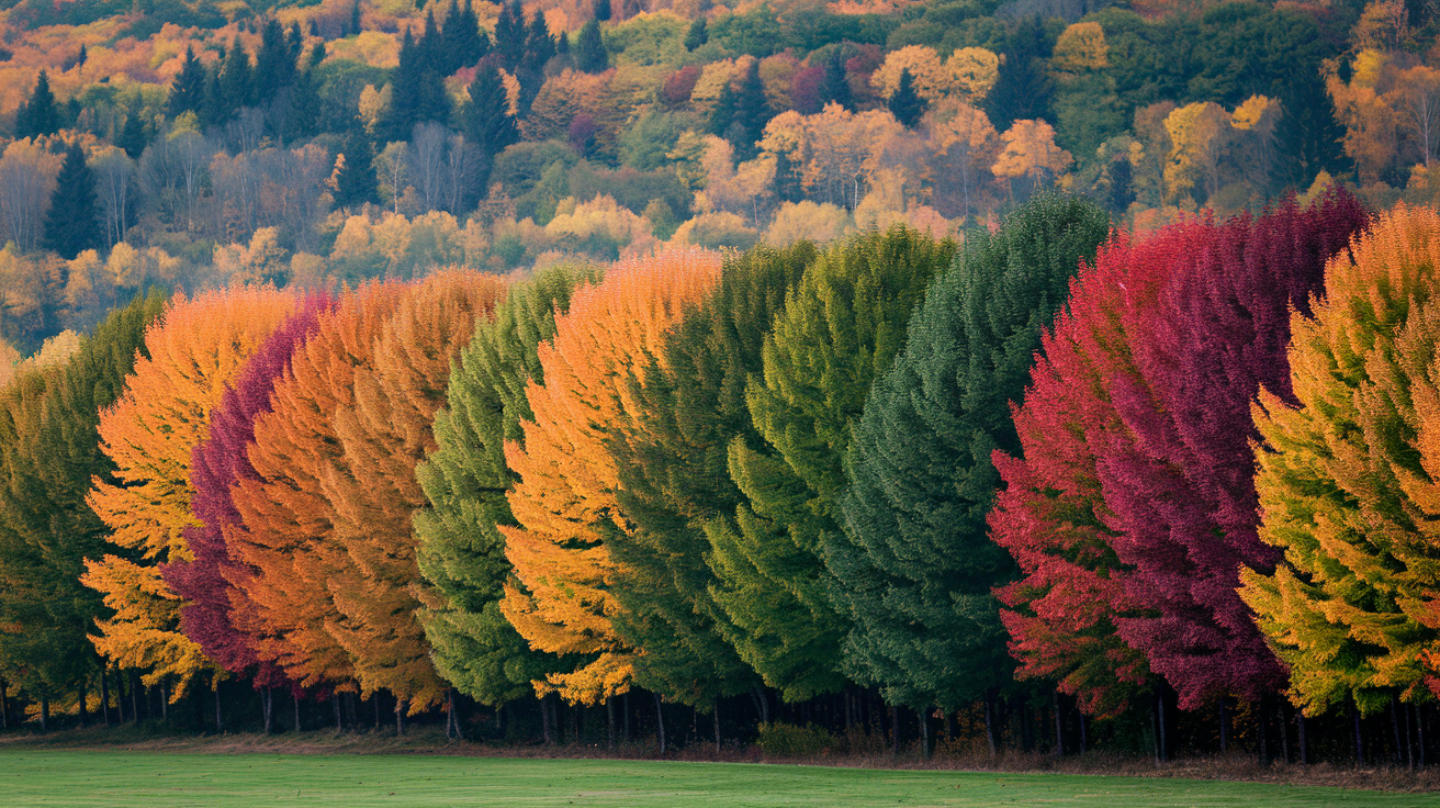
Fall greens range from warm, subdued olive to rich emerald and moss. Green still dominates early in the season, but later, chlorophyll disappears and carotenoids emerge in yellow, orange and brown. Evergreen pines, spruces and cedars stand firm, framing the transition of our deciduous friends.
The spectrum stretches from light, ethereal greens to deep, saturated hues, and warm greens ground the traditional fall palette alongside rust reds, pumpkin orange, muted yellows, burgundy and cocoa brown.
- Essential fall green colors with codes — and what to watch out for:
- Olive Green — Pantone 5743 C, RGB(68, 74, 54), Hex #444A36. Online shopping trap alert: this autumnal green is notorious for arriving with cool, grey undertones that clash badly with warm skin. Always request fabric swatches or check seller photos in natural daylight before buying. Also check the fiber content label — synthetic blends cause olive to fade and shift toward murky khaki after washing.
- Moss Green — Pantone 7746 C, RGB(58, 84, 57), Hex #3A5439. A deep, earthy fall green color that anchors autumn greens color analysis palettes beautifully. Natural fibers like wool and cotton hold this tone best.
- Sage – Pantone 5615 C, RGB(124, 133, 120), Hex #7C8578. Is mint green a fall color? Not quite — but sage absolutely is. It sits in the greens for autumn palette as a muted, warm-leaning neutral. Pair with gold hardware and textured fabrics like corduroy to avoid a flat, clinical look.
- Hunter Green — Pantone 3435 C, RGB(0, 61, 45), Hex #003D2D. Is dark green a fall color? Hunter green proves it unequivocally. Rich, forest-deep, and grounding — a staple of any autumn wardrobe.
- Emerald — Pantone Emerald 17-5641, rgb(0, 155, 119) emerald, Hex #009b77 emerald green. Vivid and jewel-toned, this shade sits at the intersection of is green a fall color debates — and for warm, deep autumn types it delivers. Note: satin finishes amplify color shift under LED lighting due to metamerism, so use a digital draping app like Vivaldi Color Lab or Dressika in natural daylight to confirm how this emerald reads on your skin tone before purchasing. What color season is kelly green? It leans cool-bright, making it a better fit for springs and summers — whereas this deeper #009b77 emerald reads far more autumnal.
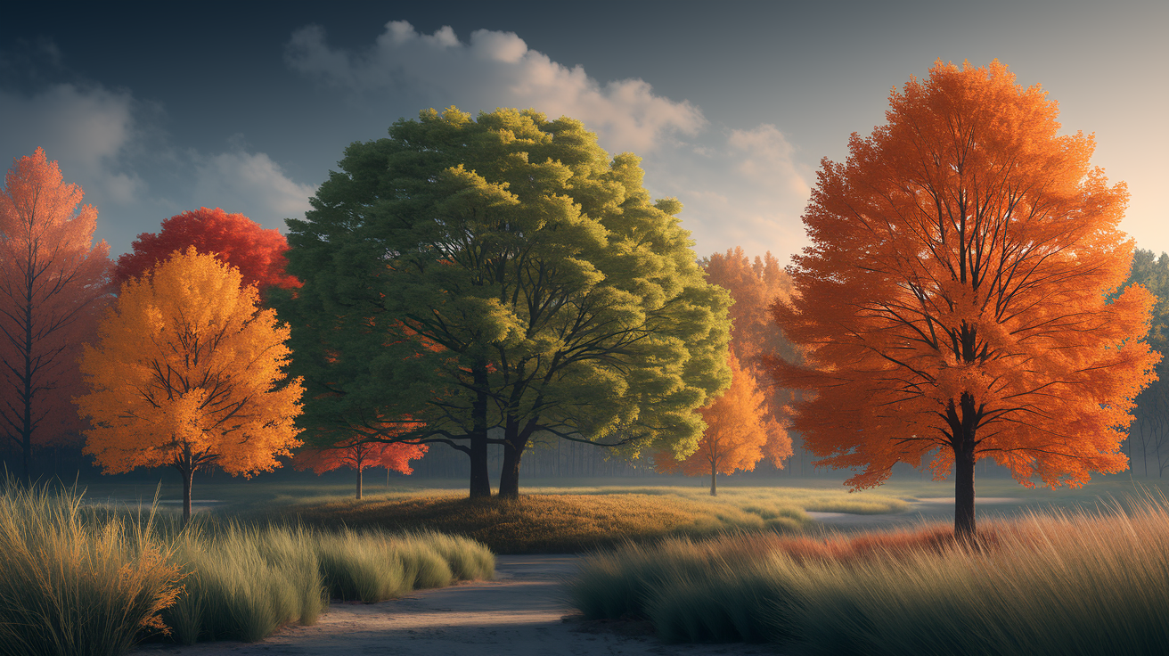
1. Earthy greens
Olive, reseda green and avocado are at the warm end of the fall spectrum. They hung brown and sun-baked, like fields after harvest. They provide the gentle background that allows rusty reds and muted yellows to glow without harsh contrast, like sourwood turning brilliant colors while surrounding leaves remain green in late summer, early fall.
Use earthy greens as base tones in neutral palettes: olive walls with cocoa brown wood, reseda textiles with pumpkin accents, avocado ceramic next to brass. The effect is snuggly and serene, and it rests well in both bold and low light.
For print work, use these CMYK starting points: Olive at 50/35/80/60, Reseda Green at 45/28/45/20, and Avocado at 55/35/80/25. Always proof them on the actual stock before approving a large run.
2. Deep greens
Hunter, forest and dark moss round out fall's drama side. They reverberate like evergreens that maintain luster throughout the year, heightening contrast as broadleaf deciduous trees transition to orange and burgundy.
Pair deep greens with jewel tones and rich browns: hunter with garnet, forest with teal and cocoa, dark moss with brass and walnut. For punch, use them on one wall, a velvet chair, a wool coat or ceramic vase.
For events and weddings, faves are hunter green, forest green, dark moss, oxblood, antique gold and cream, with navy as a reliable anchor.
3. Muted greens
Sage, Cambridge blue and ash gray sit low in saturation and high in wearability — they slip into fall green color schemes without fighting for attention. That said, sage comes with a caveat worth knowing: under the cool-toned LED lighting that dominates modern interiors in 2026, it can read flat and clinical — think hospital scrubs rather than autumn forest. The fix is texture. Pair sage with corduroy, brushed wool or suede, and the warmth of the fabric grounds the hue back into autumnal green territory. Satin, by contrast, amplifies the color shift under artificial light, so if you're shopping online, use a digital draping app like Vivaldi or Dressika to preview how sage actually lands on your skin tone — and always photograph yourself in natural daylight for the most accurate read. As for the question of is mint green a fall color — the short answer is no. Mint runs cool and bright, pulling toward spring palettes rather than the muted, earthy greens for autumn palette dressing. Sage earns its place in the fall lineup precisely because it carries that dusty, warm undertone that mint lacks entirely.
They span warm and cool palettes, so they pair next to pumpkin or plum, but with navy and pewter. Go for them in subtle fashion—stationery, table linens, knitwear or matte paint.
Early fall leans greener, as the weeks go by their hushed hue underpins peeks of yellows and oranges.
4. Jewel-toned greens
Emerald, emerald turquoise and fern green add bright, pure energy. They go perfectly with gold, burgundy and navy for a high-contrast, season-ready mix that still pays homage to nature.
Use them as accents–a silk scarf, glassware, typographic knock-outs, or foliage in floral arrangements.
Hex quick list: Emerald #009B77, Emerald Turquoise #00A88F, Fern Green #4F7942.
The psychology of autumn green
At a still crossroads sits autumn green. It connects the verdant vigor of summer and the cozy drift of gold, rust and plum. It steadies the eye and the mind as the world changes gears beneath shorter days and cooler air.
Green frequently indicates equilibrium, rejuvenation and tranquility due to the fact that we come to associate it with development and firm earth. In fall, that link serves a specific job: it helps us adjust to change. As days get shorter and colder, the brain follows new cues.
The dramatic fall of green and emergence of fiery reds and oranges catches the eye, but a vine of green–moss on rock, pine needles, late-season leaves–homes the composition. Studies imply that engaging with natural beauty can decrease self-focused cognition and increase altruistic behaviors. Most of us experience this during a walk in the park or a hike on a wooded trail — the mind quiets, the breath balances, stress recedes.
Nature associates green with life and steadfastness, and autumn heightens this by way of contrast. The impact of this transition from green to the fiery colors is dramatic as if a spotlight turned on. That punch of contrast sparks awe and intrigue, which is partially why fall frequently feels vibrant even as vegetation slows down.
The same contrast sparks memories: school routines, family trips, first chills in the air. These signals tend to emit the warmth of comfort, nostalgia, and the excitement of the upcoming holidays. In this manner, autumn green is like the gentle bass line underneath sparkling notes, providing emotional resonance without dominating it.
In seasonal color analysis, autumn greens—think olive, moss, lichen, forest—construct resonance because they mirror earth hues seen in bark, soil and stone. They sit low in saturation and lean warm, so they meld well with ochre, terracotta and auburn. This blend keeps the eye calm as the colors have common undertones.
If your palette leans cool, introduce deep pine or blue-green to maintain equilibrium while still tipping a hat to the season. The aim is cohesion: colors that look like they belong to the same light and air.
To apply green to rest and recovery, put it where the eye falls first. A moss throw on a sofa, olive ceramics on a table, or a sprig of eucalyptus by a sink can establish a soothing signal. In ensembles, test a forest jacket-sand pants combination, or an olive scarf with a cream knit.
Outside, carve out a slow walk beneath transforming trees. The former is meditative, and the latter is a jolting reminder from fall's fading green to fire hues that re-grounds attention.
The science behind persistent green
Certain leaves remain in vivid colors well into the autumn palette because of persistent chlorophyll. That emerald green anchors the broader color scheme, providing a foil that deepens golds, reds, and russets throughout the temperate zones. Weather dictates the rhythm; moisture and mild days can suspend greens longer, while early cold or drought accelerate it. These tips aid in distinguishing species when forests change color.
Chlorophyll's role
Chlorophyll is the dominant pigment of summer's deep greens, and it still reigned supreme in early fall when trees were still producing it for photosynthesis. As daytime temperatures fall and nights cool, the manufacturing of chlorophyll decelerates. This process leads to the creation of stunning color combinations, as leaves burn through cached chlorophyll, causing vibrant greens to fade before yielding to the rich hues of autumn color palettes.
Decomposition begins as plants reabsorb nitrogen and magnesium from chlorophyll molecules. Enzymes degrade them in the chloroplasts, and the pigment reservoir dwindles. As the chlorophyll thins, vivid colors like yellow carotenoids and orange xanthophylls — which were there all along — shine through, contributing to the true autumn color palette.
If breakdown is slow, greens persist and mix with yellow, creating shades like olive green and chartreuse. A warm, bright late summer can generate bigger chlorophyll reserves, postponing the fade. Drought stress or an abrupt frost can wreck leaf machinery, triggering a quick drop and muted greens that jump straight to brown.
| Stage | Leaf appearance | Process | Notes |
|---|---|---|---|
| Early fall | Deep green | Chlorophyll made, slow decline starts | Long days just ended |
| Mid-fall (onset) | Green with yellow cast | Reabsorption of nutrients | Carotenoids show |
| Mid to late fall | Patchy olive, yellow | Chlorophyll pool low | Species patterns clear |
| Late fall | Yellow/orange or bare | Pigment nearly gone; leaf drop | Deciduous finish |
Evergreen influence
Evergreen conifers retain photosynthetic leaves throughout the year. Their needles, which are engineered to withstand freeze, wind and low sun, remain green while surrounding deciduous trees turn. That habitual green provides form and dimension to fall landscapes, outlining explosions of maple red or birch gold.
Not all needle trees are evergreen. Tamarack (larch) is deciduous – it drops golden needles each fall, a good reminder that "conifer" and "evergreen" are not synonymous. Both evergreen and deciduous paths carry trade-offs: evergreens spend energy to maintain foliage but restart growth fast in spring; deciduous trees drop to prevent winter damage, then reconstruct in spring.
Studies in Mediterranean oak woodlands demonstrate that evergreenness can pay off under nutrient poor or drought-prone conditions. For palettes, imagine pine green adjacent to warm ochre, or deep Pakistan green against soft tan and muted rust.
Climate impact
Temperature, light, and water guide fall greens. Short days prompt slower chlorophyll synthesis, and cool nights put the brakes on leaf chemistry. Together they mute green intensity.
A mild, sunny summer with consistent rain typically produces brighter, more persistent fall greens. Severe drought accelerates senescence and can bleach leaves. An early hard frost will stop this process and brown the foliage quickly.
Track local patterns: note summer rainfall totals, late-season heat waves, and first cool nights near 5–10°C. Observe slopes and valleys – cold air settles in low areas, giving you earlier fading greens than on ridges.
How to use fall green
Fall green grounds a color palette and ties the season's warmth together. Begin with emerald green, then pile on earth tones, brass or gold touches, and tiny smashes of pumpkin orange for tempo. This maintains a cohesive look while allowing for personal flair.
- Balanced palette starters: olive + cacao brown + beige + rust
- High-contrast pairings: emerald + burgundy + ivory
- Soft neutrals: sage + taupe + warm gray
- Vibrant accents: pine + mustard + brick red
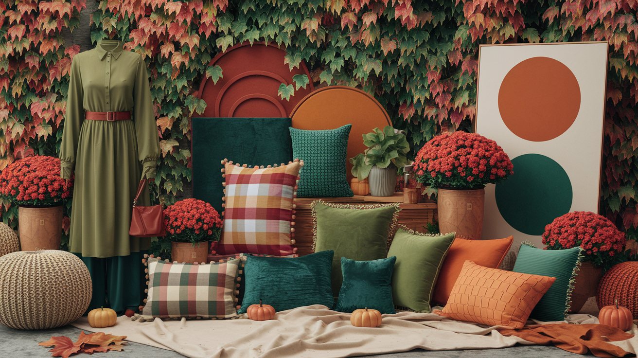
In fashion
Pair deep or muted greens with camel, burgundy and burnt orange for looks that feel grounded but not drab. A dark olive coat pairs beautifully with a camel scarf and burgundy loafers. A forest-green polo knit with burnt-orange trousers provides color without racket.
Throw on a skinny gold belt or jewelry to really lift the look. Emerald and olive Labor across a closet. Emerald dresses step from day to evening with a shoe switch. Olive chinos, skirts, and utility jackets mingle with beige, brown, and cream on repeat.
They play nice with texture – corduroy, wool, suede. Green accents keep neutral sets alive. Go for an emerald satchel over a cream sweater and denim. Olive boots with a black dress. A pine beanie or moss scarf changes the entire vibe.
Trending fall greens with chip cues:
- Olive (Pantone 5743 C)
- Moss (Pantone 5747 C)
- Forest (Pantone 5535 C)
- Emerald (Pantone 7724 C)
- Pine (Pantone 560 C)
In home decor
Earthy, muted greens make rooms feel calm and lived-in. Walls in sage diffuse light; a moss throw heats a sofa. Begin with green as your base to maintain a clean line throughout the space.
Co-mingle green with wood tones, copper and ivory for a crisp fall color scheme. Brass or gold frames provide a subtle sparkle. Brown and beige keep it cozy and liveable.
Small swaps go far: green dinnerware on an ivory tablecloth, taper candles in pine holders, linen napkins in olive. Tuck in white roses for a crisp note and scent! Pile a couple of books–with green spines of course, they're so warm!
Popular green paints:
- Sage: Farrow & Ball "Vert de Terre"
- Olive: Benjamin Moore "Dark Olive"
- Moss: Sherwin-Williams "Oakmoss"
- Deep Pine: Behr "Pine Mountain"
In visual arts
Use a variety of fall green to capture the blend you see outside. Layer light sage under darker pine. Glaze with warm neutrals to imply depth. Jewel tones embrace earth tones—for eye-popping landscapes and screens that sigh.
Green is a sultry backdrop for sizzling colors. A mossy ground makes reds and ambers pop – no glare.
Reference palette:
- Sage lands around
#A8BFA1, or roughly CMYK 22/0/16/25, when you want the gentlest version of autumn green. - Olive sits near
#6B7B4D, or CMYK 13/0/37/52, for a grounded everyday neutral. - Moss
- Emerald sharpens the palette at
#007F5F, about CMYK 100/0/25/50. - Pine brings the deepest note at
#1E3A34, or CMYK 48/0/13/77.
The forgotten fall greens
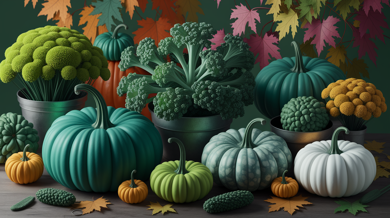
Fall green colors are more than just muted olives and pine. The season contains sharp, vibrant greens that complement rust and gold rather than compete with it. These greens can be found in both landscapes and the foods we cultivate and consume, contributing to stunning color combinations.
Acid green blazes to life when sunlight catches rain-soaked moss on stone, or lichen slowly claims weathered bark — raw, electric, almost neon. In 2026, this energy has evolved into what trend forecasters are calling Digital Green, a Neon-Autumn accent that bridges the organic world with the pulse of the digital city. It anchors tech-wear layering effortlessly over warm browns and muted creams, proving that fall green colors don't have to be mellow to feel seasonal. Electric lime surfaces in late chard stems and the vivid ribs of young Tat Soi, a spoon-shaped leaf long cultivated in China — and its high-vis clarity makes it one of the boldest fall green color choices available. It cuts sharply against deep maroons, navy, and charcoal. If you've ever asked what color season is kelly green, the answer lands somewhere between bright spring and this exact neon-autumn frequency — high-chroma, warm-leaning, and undeniably alive in a fall palette.
Grassy greens remain vibrant in crisp air, from baby rye grass to fennel fronds. They bridge warm and cool palettes and prevent a scene from feeling stale. These greens are great to use for a crisp fall palette, enhancing the overall color scheme of any autumn-themed decor.
Sprinkle acid green pops in fabrics, tableware, or typography on stationery to break up dense colors. Make electric lime pop out of glassware, ceramic glazes, or a scarf that whisks off a black coat. Lean on grassy mid-greens for base layers–paint samples, wall art, or packaging–and then let rust, ochre, and plum sit around them. Little goes a long way, so consider 10–20% pops of accents against earthy tones, creating a balanced color palette.
Late-season greens give you more colors than you think. Imagine chartreuse from wilted hydrangea heads, celery-leaf from leek leaves, pea-leaf from young clover, sage-dusted herbs, emerald from resilient ivy, celery-ice from kohlrabi skins, and sea-glass mint from eucalyptus, all contributing to a rich autumn palette.
Fall vegetables and greens add their own map: Tat Soi (ink-dark leaves with lime ribs), Stem Lettuce, and Celtuce (pale jade stems, grown for centuries in China), radicchio (cool greens edged with wine red), chard (lime to acid stems), and classic lettuce and kale in many tones. These colors persist through the cool months and appear bright in low light, showcasing the versatility of seasonal color analysis.
Growers can revive these forgotten greens with a few simple moves. Start seeds inside in September, then plant out in October when the heat drops. Harvest a few leaves at a time so plants continue to gift throughout the season, enriching your autumn greens color scheme.
Tat Soi remains petite and sugary in chill. Celtuce provides both crisp stems and tender leaves. Lettuce and kale remain my go-to's, for starters. A bed of spring mixed greens will lift mood when winter browns take over, and we all know how a daily serving of leafy greens helps health and energy.
A consistent variety of greens contributes vital vitamins and minerals, and keeps the plate vibrant, which makes the habit adhere, ensuring that your meals are not only nutritious but visually appealing with a stunning color scheme.
Finding your personal green
Fall greens, part of stunning autumn palettes, lurk in the balance between earthy calm and cool depth. The right color combination lifts your complexion and brightens your eyes, connecting your gaze to the season.
Guide readers through a basic color analysis to identify which fall greens suit their skin tone or style.
Start with undertone. If gold jewelry looks natural on you and your veins read green, you likely lean warm. Warm undertones pair well with earthy greens: olive green, moss green, and chartreuse-olive. If silver jewelry sits better and your veins read blue, you likely lean cool, favoring blue-based greens like emerald green and spruce. If both metals look fine, you may be neutral; try muted greens like sage or dusty juniper.
Check contrast too. If you have high contrast (deep hair, light skin, bright eyes), rich greens such as hunter green or bottle green hold their own. Low contrast (soft hair, soft skin, soft eyes) tends to shine in soft greens like sage or laurel. Hair and eye color matter: red or copper hair glows with olive; black hair and dark eyes work with deep pine; blue or gray eyes pop with teal-leaning greens.
Some shades—olive and sage—often flatter many people and cross seasons, making them versatile choices for a seasonal color analysis. This is especially useful if you want a small, hard-working wardrobe that incorporates stunning color combinations.
Recommend testing different green shades against a neutral background to find favorites.
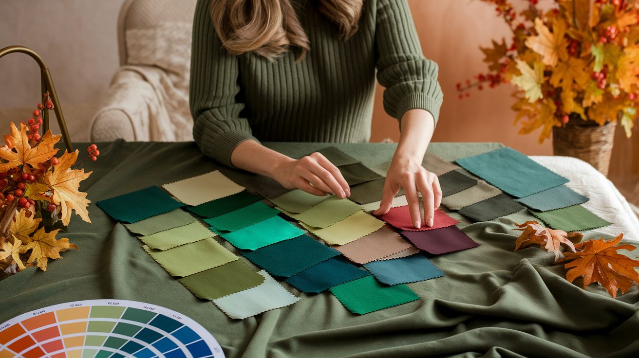
Stand next to a window with gentle daylight. Or wear a solid top, or scarf in questions, over a white / gray / beige shirt. Mirror your thoughts. Put swatches – tees, scarves, paper samples – next to your face.
If your skin appears even, eyes pop and any shadows are soft, it's a good green. If your skin turns sallow or blotchy, it probably clashes. Test at least three depths: light (sage), mid (olive), dark (hunter). Switch from a.m. To late day to witness transitions.
Notice how each shade feels. Confidence is a data point as well. Some greens have comfy fall signals that might fit your vibe.
Encourage creating a personalized autumn palette with selected greens and complementary colors.
When selecting a fall color palette, choose two to three core greens: for warm sets, consider olive green, moss green, and chartreuse-olive; for cool sets, opt for hunter, pine, and teal-forest; and for a neutral palette, include sage, laurel, and bottle green. To enhance your color combinations, add complements like rust, copper, camel, and cream for warmth, or charcoal, navy, cool gray, and winter white for cooler sets.
Mix-mate your greens — use one green as your foundation (coat or pants), one as a middle layer (knit or shirt), and one as an accent (scarf, bag). Lighter greens like mint or sage feel fresh in spring, while darker greens – like moss or hunter – feel right as days cool.
Incorporate various textures — wool, suede, and matte cotton — to ensure your greens don't appear flat and create a stunning color scheme that reflects the essence of autumn.
Offer tips for using virtual color analysis tools to visualize fall green combinations.
Post a good, daylight picture to a color app or online draping tool. Establish a neutral background in the tool and sample greens of light, mid and dark values. Switch hot and cold.
Save side-by-sides to see how skin tone shifts with each green. Use palette generators to pair greens with rust or navy or cream and construct outfits. Then try your top three out in real life, as screens can distort color.
Anticipate experimentation, it's the only way to discover the shadow that suits you.
Conclusion
Fall speaks slow to change, but green still clings. Forest moss remains soft beneath foot. Olive leaves hold a subtle lustre. Pine needles sliced sharp lines. These colors anchor the eye. They settle the mind. They connect warm reds and golds with cool air and short days.
To test a hue, lay a swatch by a warm light at twilight. Test sage on a throw, olive on a mug, moss on a scarf. Notice how every green dances with wood, clay, wool and stone. It only takes a tiny little swap to make a difference in a room or a walk.
To post your take, leave a comment with your fall green of choice. Or snap a photo with the specific shade name and where you found it.
Frequently Asked Questions
What are fall green colors?
Fall green colors like olive green, moss green, and evergreen create a stunning color palette that harmonizes beautifully with browns, rusts, and golds, enhancing an even more vibrant autumn color palette.
Why do some trees stay green in autumn?
Evergreens retain their needles all year long, showcasing a stunning color palette that includes deep green hues. Their waxy coatings and antifreeze-like compounds insulate cells, while some deciduous trees hold onto vivid colors longer, influenced by their species and sunshine exposure.
What emotions do autumn greens evoke?
Fall green colors, such as olive and sage, evoke peace, balance, and refreshment. These earthy hues, part of the autumn color palettes, provide a calming presence as the seasons shift.
How can I use fall green in home decor?
Apply olive or sage from your favorite fall color palettes to accent walls, throws, or rugs. Spruce it up with plants, mossy textures, and wood accents. Pair with warm neutrals, terracotta, and brass for depth in your color scheme.
What is the science behind persistent green leaves?
Leaves appear in stunning shades of green whenever chlorophyll is still active. As cooler nights and shorter days set in, the chlorophyll fades, revealing vibrant yellows and reds, creating beautiful autumn color palettes that reflect the changing season.
Which overlooked fall greens should I consider?
How about lichen green, bay leaf, pistachio, and seaweed? These muted hues seem crisp and contemporary, layering beautifully with charcoal, cream, and copper, creating a stunning color scheme that adds quiet complexity without dominating a space.
How do I find my best personal green?
Try swatches in natural light to see how the color palette interacts with your skin tone and current decor. Cooler greens, like emerald green, complement bright whites and grays, while warmer greens pair beautifully with creams and wood. Begin with little stuff, then work your way up.