Professional Color Palettes for Your Next Presentation

Key Takeaways
- Choose colors with intention — every hue sends a signal. Blue builds trust, red drives urgency, green soothes, and orange energizes. Lock in your professional color palettes for your next presentation early and apply them consistently across every slide so your message lands with force.
- Optimize for hybrid meetings — screen-sharing compression in Zoom and Teams flattens subtle tones and kills low-contrast combos. Use bright colors as accent colors on dark or white backgrounds, and test high-contrast pairings like #06BEE1 on #03256C before your call goes live. What looks sharp on your monitor can turn muddy the moment you hit "Share Screen."
- When you powerpoint colors customize colors, go straight to Design → Variants → Colors → Customize Colors and paste your hex codes into Accent 1–6. Saving the custom palette auto-applies it to every chart, shape, and SmartArt in the deck — no manual recoloring needed.
- Use colors accent colors to emphasize the moments that matter. Limit yourself to colors 2-3 accent colors per deck: one for key data points, one for calls to action, and one for supporting highlights. More than that and nothing stands out — the colors accent colors lose their punch entirely.
- Prioritize accessibility from the start. Run your palette through Coolors' free colorblindness simulator before committing. Avoid red–green and blue–purple pairings, and make sure every text-background combo clears WCAG contrast thresholds. Venngage's free generator produces WCAG-compliant palettes you can export directly into PowerPoint.
- Ground your palette in color theory. Start with complementary, analogous, or triadic harmonies, then apply the 60-30-10 rule: 60% dominant base, 30% secondary, 10% for colors accent colors click colors that draw the eye exactly where you need it. The colors beneath theme colors in PowerPoint's panel are your foundation — build up from there.
- Think globally before you present. Color carries cultural weight — white signals mourning in some markets, red means luck in others. Default to neutral bases and swap out accent colors click colors for region-specific versions when presenting to international teams.
- Let your palette carry the narrative. Deep navy and charcoal (#121212 over pure black for OLED screens) project authority. Vibrant gradients signal innovation. Soft blues and greens calm a room. Bold reds and oranges inject energy — but reserve those bright colors accent colors for the moments where you need the audience to act.
💫 Build Your Perfect Color Palette
Ready to craft professional color palettes for your next presentation? Our palette builder helps you find the exact colors that work for slides, branding, and every design project you tackle.
Build My Palette →A PowerPoint color palette isn't just a design preference — it's the difference between a pitch that lands and one that gets lost in compression artifacts on a Teams call or washes out on a 4K laser projector. If you're still picking colors by gut feel, you're leaving credibility on the table. The right professional color palettes for your next presentation do three things at once: they reinforce your brand, hit a 4.5:1 contrast ratio (now a hard requirement in corporate and government accessibility mandates), and hold up under every display condition your audience throws at them. When you customize colors in PowerPoint — Design → Variants → Colors → Customize Colors — you're not just tweaking aesthetics. You're controlling exactly which accent colors appear across every chart, shape, and callout in your deck. Use 2–3 accent colors to emphasize what matters, keep everything else neutral, and your audience will always know where to look.
A PowerPoint color palette isn't just a design preference — it's the difference between a pitch that lands and one that gets lost in compression artifacts on a Teams call or washes out on a 4K laser projector. If you're still picking colors by gut feel, you're leaving credibility on the table. The right professional color palettes for your next presentation do three things at once: they reinforce your brand, hit a 4.5:1 contrast ratio (now a hard requirement in corporate and government accessibility mandates), and hold up under every display condition your audience throws at them. When you customize colors in PowerPoint — Design → Variants → Colors → Customize Colors — you're not just tweaking aesthetics. You're controlling exactly which accent colors appear across every chart, shape, and callout in your deck. Use 2–3 accent colors to emphasize what matters, keep everything else neutral, and your audience will always know where to look.
The nice ones have 1–2 main colors, 2–3 accents and neutral grays or off-whites. High contrast ratios enable accessibility. Hex codes and RGB values make reuse across tools easy.
Up next, discover ready-to-use palettes, advice to craft your own, and rapid PowerPoint how-to.
📚 Recent Articles
The psychology of presentation colours

Color influences mood, attention, and memory in presentations. The right color scheme guides how the audience feels, what they notice first, and what they remember. Map your color palette to your message: blue for trust, red for urgency, and green for calm. Employ color theory to maintain harmony, create sharp contrasts, and lead the eye effortlessly.
Emotional impact
Colors cue the body. Reds and oranges can ignite the autonomic nervous system, elevating heart rate and arousal. Blues, purples, and greens tend to relax it, which is useful when you need reflective concentration or comfort. When selecting a presentation color scheme, match tone to task: blue for data credibility, orange for a call to action, and green for wellness or sustainability.
Steer clear of brutal clashes that scream louder than your tale. Red and green are close in wavelength and tend to irritate, especially on projectors. Bold colors go best with lots of white space. Stick with 2–3 principal colors — not five or six — and let one be the dominant. Aim for a 60/30/10 balance: one dominant, one support, and one accent color. Utilizing a reliable powerpoint color palette can enhance your overall design.
Choose a consistent palette throughout all your slides so the tone remains constant. If your deck opens calm, don't close with sudden neon. Keep headings, body text, and charts consistent with the same roles and weights, ensuring a cohesive presentation design.
Accentuate where it counts. One orange dot on a blue chart can summon the main point! Use the accent for links, numbers, or takeaways — not every bar and line. This approach will help maintain clarity and focus in your presentations.
Cultural meaning
Color is not interpreted the same everywhere. For instance, a powerpoint color scheme featuring blue often indicates confidence and reliability globally, making it a secure foundation for business presentations. While reds and oranges may exude energy or warmth, the meaning of red can vary significantly; it may signify warning in one context and celebration in another. Greens typically imply nature and security, but in finance, they denote gain.
Personal history informs responses to colors, so it's essential to experiment with sample viewers when the stakes are high. When your audience spans regions, consider adjusting the presentation color scheme to mitigate risk. Moving a bold color towards a neutral tone or using it in accents can be effective. If uncertain, maintaining a neutral base allows colors to stand out in data highlights.
For global teams, relying on grays, off-whites, navy, and soft greens is advisable. Use bright colors judiciously to avoid sending mixed signals.
- Consult reliable cultural colour guides from design organizations and scholarly sources.
- Review brand guidelines of local partners or clients.
- Ask a regional peer to flag risky hues.
- Pilot two palette options with a small, mixed audience.
Accessibility first
High contrast makes it easier for all of us to read with less fatigue. Dark text on a light coloured background—or vice versa—should clear contrast checks. Stay away from red-green and blue-purple pairs — they blur for many people and can obscure meaning on charts.
Before you lock the deck, run your palette through a color blindness simulator. See line graphs, map keys and status badges. If colours do, then use shape or pattern or labels to double-code meaning.
Checklist:
- Maintain a contrast ratio of at least 4.5:1 for all text — this is the WCAG 2.1 baseline for professional color palettes for your next presentation.
- Avoid pure black (#000000) on OLED screens: it creates an "infinite black" effect that causes eye strain. Use deep charcoal (#121212) as your background instead.
- Skip red-green and blue-purple as sole differentiators — add patterns, icons, or labels to reinforce meaning beyond color alone.
- When you powerpoint colors customize colors, test your bright colors accent colors under hybrid meeting compression (Zoom and Teams both flatten subtle gradients into muddy blocks — high-contrast combos like #06BEE1 on #03256C hold up far better).
- Use colors accent colors to emphasize key data points: 2–3 accent colors colors 2-3 accent colors is the sweet spot — more than that and hierarchy collapses under screen-share compression.
- Check your colors beneath theme colors in the Customize Colors panel to ensure accent colors click colors register correctly across charts and shapes after saving.
- Run your palette through Coolors.co colorblind simulation before finalizing — then test on both a 4K projector and a laptop screen to catch any visibility issues early.
Principles of a great powerpoint colour palette

A strong color scheme serves two jobs: make content easy to read and build a steady visual rhythm. Begin with color theory, then commit to a compact presentation color palette that pulls double-duty throughout slides. Use the Slide Master and new theme colors so each chart, shape, and text box remains in sync.
Understanding contrast
High contrast text and data are non-negotiable for effective presentations. Pair a dark charcoal (#222) on a soft white (#F7F7F7) or off-white on deep navy (#0A2342) to enhance your presentation color scheme. Remember, thin lines require more contrast than bold headlines, and small labels on charts should be near-black or pure white to maintain clarity.
Avoid near-twins like teal on blue, gray on charcoal, or red on maroon, as these combinations may fail on a projector. To ensure your powerpoint color schemes are effective, test hues by taking a screenshot and desaturating it.
Rooms change the game. Brilliant projectors bleach out light text–so do light backgrounds with dark text. On self‑view screens, dark backgrounds with light text minimizes glare. Always take a step 5 meters back and test legibility.
Use contrast as a guide in your powerpoint presentations. A bold accent against muted backgrounds draws attention to key elements, while lighter tints can subdue less important items.
Choosing harmonies
Utilize the color wheel to choose a base, then explore complementary (blue–orange), analogous (blue–teal–green), or triadic (blue–red–yellow) sets within your presentation color scheme. Complementary colors provide a punch, while analogous combinations feel calm, and triadic arrangements add energy without chaos when you mute two of the three colors. Blend warm and cool colors effectively; warm colors like reds and oranges attract emphasis, making them ideal for calls to action and highlights, while cool colors such as blues and greens work well for backgrounds and data bars in your powerpoint presentations.
Limit your color palette to three or four colors to maintain clarity and hierarchy. An effective powerpoint color scheme might include a monochrome set—one hue with varying tints and shades—which can give a contemporary feel. For instance, deep blue can be used for headers, mid blue for shapes, and pale blue for backgrounds, complemented by a neutral gray to ground charts.
Typography and color are deeply intertwined in presentation design. A clean sans-serif font paired with a high-contrast color significantly boosts scan speed and audience retention. One critical pitfall to avoid: pure red (#FF0000) text. On modern high-refresh-rate monitors, pure red literally appears to vibrate — an optical effect that makes viewers instinctively look away rather than engage with your content. Swap it for a muted alternative like #D32F2F, which reads as authoritative without the visual noise. When you use colors accent colors emphasize key messages, red-family tones work best as brief highlights on dark backgrounds, never as body text. Beyond red, lean into color psychology with intention: blue builds trust, green signals growth, orange feels approachable, and purple carries a premium edge. Keep cultural context in mind too — the same hue can carry opposite meanings across regions. Start with clarity, then layer meaning.
Incorporating the right color scheme is essential for effective communication in your presentations. The thoughtful application of color combinations not only enhances visual appeal but also supports the overall message of your slideshow. By understanding the impact of different colors, you can create a soothing color scheme that resonates with your audience and reinforces your content.
The 60-30-10 rule
Allocate 60% to the dominant color, which is usually a neutral or a soft brand color, 30% to a secondary colour, and 10% to a bright accent. This maintains equilibrium and prevents color craziness in backgrounds and charts.
Use 60 for backgrounds and large areas, 30 for shapes, section headers, and big chart series, and 10 for key numbers, links and callouts. Lock those down in your Slide Master and use PowerPoint themes – curated theme colors travel with your presentation, wherever it's opened.
| Role | Color | Use case |
|---|---|---|
| Dominant | Navy | Backgrounds, large shapes, title bars |
| Secondary | Light gray | Body areas, gridlines, table fills |
| Accent | Coral | Data highlights, buttons, key metrics |
How to create your custom colour combination for presentation

Figure out the purpose of the deck and its audience. PowerPoint color palette is a collection of colors for backgrounds, text, accents, hyperlinks, and so on. You can set 1-50 custom colors, whereas the 50 colors beneath Theme Colors are auto tints and shades.
Via PowerPoint's toolbar or external tools, try on sample slides, save color codes for future or team handoff.
1. Find inspiration
Explore favorite design pages and gallery sites showcasing color palettes that emphasize contrast, balance, and mood. Brand guidelines are essential, especially when you want a consistent presentation color scheme worldwide. Nature-inspired colors work well for grounded hues: olive with sand, deep sky with charcoal, and coral with slate.
Investigate what makes great PowerPoint presentations effective. Notice how they often combine a dark background with stark white text or utilize a single bright color to draw attention to graphs and CTAs.
Gather swatches or construct a basic mood board. Screenshot color chips, add hex codes, and rank options by tone: calm, bold, formal, friendly. Define two or three palettes with roles. For example: navy for titles, off-white for background, teal for accents, rust for data highlights.
2. Build the theme
Open Design > Variants > Colors > Customize Colors. Establish primary, secondary and accent colors. Click More Colors to venture into over 16 million choices. Your selections appear in Recent Colors for speedy reapplication.
Map Background, Text/Background, Accent 1–6, Hyperlink, Followed Hyperlink so the theme reacts across layouts. Map roles: Background (95% light or 10% dark), Text (high-contrast neutral), Accents (1-3 brights), Links (prominent but legible). Save the scheme under an obvious name for reuse.
Create a small table offline that associates each hex/RGB with its usage, e.g., #0B2545 = Titles, #F6F7F9 = Background.
3. Apply the theme
Go to View > Slide Master, and set the custom colours, so all layouts inherit them. This locks consistency.
Spruce up old slides. Swap manual fills for theme colors. Check shapes, SmartArt and icons. Custom Presentations: How to design your personalized colour scheme. Fix series to Accent 1–3, no too many brights. Preview the deck from end to end and address any clashes or low contrast.
4. Modify the theme
Adjust colors to improve readability or follow brand guidelines. The Color Picker assists in tweaking hue, saturation, and brightness.
If your content focus changes, switch an accent from warm to cool. Save new versions with obvious names and dates to monitor changes.
5. Remove the theme
If it no longer fits, reset to default colors or undo custom schemes in Slide Master. Make sure each slide changes.
Save old palettes, jot hex/RGB for future use. You can edit the file's XML: each PowerPoint file is a Zip with a special extension, so advanced users can modify color XML to save and reuse themes across decks. Otherwise, save the scheme with PowerPoint's "Colors" > "Customize Colors.
Colour schemes that tell a story

Color schemes narrate. Match your palette to the plot of your slides: steady for status updates, vivid for launches, gentle for care topics. Use progressions—such as light-to-dark gradients—to indicate growth or transformation across groups.
Keep accessibility in mind: around 1 in 12 men and 1 in 200 women have color vision deficiency, so avoid red–green reliance and test contrast. Create color schemes with a narrative. Construct palettes with one foundation, one supporting and one popping accent colors to direct attention.
Consider these storytelling-ready schemes:
- Black and gold — a timeless duo for luxury brands and formal decks: unbeatable contrast, instant authority.
- Blue with a warm coral accent — pairing trust with energy breaks monotony and keeps audiences engaged far longer than flat blue schemes.
- Grayscale with 15–30% saturation steps — the go-to for scientific figures and data-heavy slides where clarity beats color.
- Energy palette with 2–3 accent colors: #06BEE1, #1768AC, #2541B2, #03256C — one of the strongest professional color palettes for your next presentation. These bright colors accent colors that emphasize key data points, and they hold up beautifully on both 4K laser projectors and LED walls. To apply them, open PowerPoint colors, customize colors under Design → Variants → Colors, paste each hex into Accent 1–4, and save — your charts and shapes update instantly.
- Contemporary monochrome with two close hues (not tints or tones) — crisp, modern, and impossible to get wrong.
- Single hero color anchored by neutrals — endlessly versatile and easy to align with any brand system.
For authority
Work with high-contrast pairs such cool greys and a sharp yellow accent to signal clarity and control. Deep blues or blacks lend reliability and sobriety. Blue commands trust but balance it out with a complementary accent to avoid a one-dimensional, boring deck.
Minimal accents keep one standout color rising above two restrained tones to build visual hierarchy and avoid noise. For important figures, save bold yellows, oranges, or reds (CVD-safe with dark outlines) to state authority.
Make sure grayscale charts differ by 15–30% saturation so each series stands out.
For innovation
Alive, offbeat combos—lime with midnight blue, magenta with teal or a neon rainbow—whisper innovation. Gradients that move from cool to warm can mark phases: concept, prototype, launch. The shift itself shows momentum.
Match surprising hues that bang through contrast tests, like cobalt and citrus, or violet and electric green. This disrupts stale slide conventions without damaging readability.
Use energetic accents to point at novel ideas: a neon line on a calm background, a hot pink dot on a navy chart. Keep backgrounds cleaner, then let motion or hue shifts do the fresh vignette.
For calmness
Choose soft palettes: pastel blues, sea-glass greens, or a gentle monochrome in blue. These reduce eye strain and suit health, wellness or educational material.
Narrative colour schemes should have light backgrounds, medium text, mild contrast, and minimal accents. Restrict vibrant or aggressive colors so charts and icons appear calm, not strident.
Apply a modern monotone twist: two close cousins—like blue and blue-green—that aren't tints/tones. It still feels cohesive but not boring. Pop a little coral or gentle gold accent for headings so navigation remains crisp.
For energy
Pick bold mixes: orange burst, red with black, or clean primaries. Orange frequently works as a default because it sounds energetic and grabs attention quickly.
Utilize high-saturation hues to ignite action, but moor them with deep neutrals. Combine vibrant backgrounds with crisp white or black text for punchy reading.
Reserve the brightest colors for CTAs and totals or deadlines. A single-minded colour scheme with clever neutrals keeps the deck flexible and on-brand without clutter.
Aligning palettes with brand identity

Color is a rapid signal of your identity and values. A crisp, on-brand palette not only makes slides look polished, but makes them clear and credible across rooms, screens, and cultures.
For starters, align your PowerPoint palette with your brand colors. Or use the actual HEX, RGB or CMYK codes from your brand guide. If your guide has Pantone, convert those with a trusted converter and test on projector and laptop screen. Colors change subtly in different light, so verify legibility for body copy, captions and charts.
Save your custom Theme Colors in PowerPoint so the same set loads for every deck, not just one file. Match palettes to your brand: utilize the same codes and combos found in your brand guide. If your brand couples navy with teal and off-white, stick with those three.
Drop those values in under Design > Colors > Customize Colors, name 'em "Brand Core," and share the theme file (.thmx) with your team. Our theme colors are specifically curated to co-ordinate well together and stand up to a variety of spaces, so they make decisions easy all while staying on-brand.
This comes in handy when you hand off slides to partners or speakers who are editing on other machines. Use branded accent colors intentionally. Use your accent on logos, headers, important numbers, and information you need to pop.
Follow the 60-30-10 rule to keep balance: 60% dominant brand color for backgrounds or big shapes, 30% secondary for content areas or charts, and 10% accent for highlights and calls to action. For instance, a healthcare brand might choose soft blue (60%) for trust and calm, slate gray (30%) for text and lines, and coral (10%) to flag insights.
No more than four colors—too many tints, too much clutter and less credibility. Make sure your scheme is consistent with your ethos. Consider color psychology. Blue is prevalent in business because it communicates reliability and tranquility.
Green might indicate growth or sustainability. Yellow reads as energy but burns eyes at small sizes. Contrast with dark copy. High-contrast pairs (navy/white, charcoal/mint) aid accessibility, which is considerate of a worldwide audience.
If your brand is bold and young, you'd perhaps lean towards brighter accents and rounded shapes. If it's premium and sober, low saturation and wide spacing. Cross-reference with color-blind safe pairs and pattern your data series so meaning persists without color.
Common colour mistakes to avoid
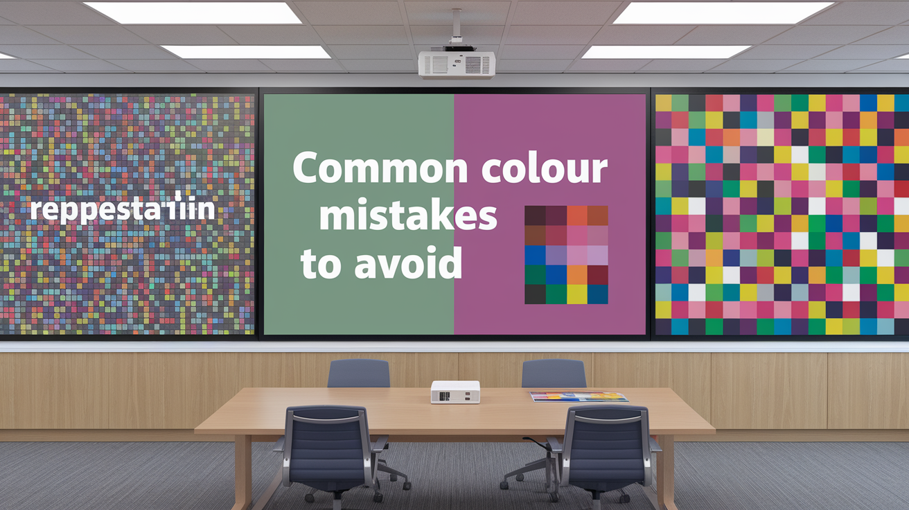
Color decisions significantly influence how audiences read, feel, and recall your message. The goal is simple: utilize a calming presentation color scheme to make ideas clear and easy to follow across screens, projectors, and print.
Avoid low-contrast color combinations that reduce readability of text and visuals.
Low contrast means text bleeds into the slide. White on pale yellow, navy on black, or red text on dark gray all make the eye strain too much. Use bold contrast such as charcoal on white or white on deep blue.
For charts, retain labels as dark on light backgrounds, and test at 100% zoom from 2–3 meters away on a wall. Red text, in particular, is dangerous — thin red lines or small red type tends to blur on projectors.
When in doubt — check contrast ratios, and ramp up weight/size/background tint to enhance clarity.
Refrain from using too many colors, which can make your slides look chaotic and unprofessional.
Too many colours distract from your point. Stick with 2–3 base colours and 5–6 tones. Use one lead colour for headings, one for highlights and a neutral base for text and backgrounds.
This maintains a consistent beat slide to slide. Mind quantity and contrast: a small dose of a vivid accent stands out more than spreading bright tones everywhere.
Respect the brand. If your company uses teal and gray, construct your palette from that instead of blasting in random colours. Reliable colour creates trust and a sharp visual imprint.
Steer clear of color pairings that are inaccessible to those with color vision deficiencies.
Approximately 7% of males and 1% of females are colorblind to some degree. Red–green is a common problem and that combo can cause eye strain.
Don't use red and green as the sole manner in which to indicate good vs. Bad or on/off. Match colour with shape, symbol or pattern. Try blue with orange or teal with warm gray for safer contrast.
For text and background, ditch combos such as green on red or red on black. If you crave warmth, mix warms with other warms and browns; for cool schemes, cools with grays.
Try slides in a colour-blind simulator and print a grayscal proof.
Do not ignore the presentation environment; adjust your palette for projectors, screens, or print as needed.
Projectors bleach out subtle shades – increase contrast and abandon fine, wispy lines. Avoid common colour mistakes. Large LED screens can oversaturate reds – tone them down.
For print, colors move—your CMYK versions may need darker tints to be legible. Build two theme variants: one for dark rooms with light text on dark backgrounds, one for bright rooms with dark text on light backgrounds.
Use color to group like information so people scan faster: one accent for actions, another for data highlights, a third for alerts. Make legend colors big and consistent between slides.
Conclusion
To choose a bold PowerPoint color palette, rely on straightforward guidelines and actual applications. Make text readable on all slides. One base colour, one accent, calm neutrudes. Try it out on a big screen in a light room. Switch shades if the contrast doesn't work.
Consider one brief example. A health startup employs navy for headers, mint for points, white for body. Charts have mint bars on a light gray grid. Links appear in cobalt. Simple, clean, easy on the eyes.
Make your draft set share a small group. Ask one question: Can you read every word at 3 meters? If not, correct it quickly.
Ready to put your slide colors together. Grab three shades you love, check contrast at 4.5:1, and try them on your next deck.
Frequently Asked Questions
What makes a great PowerPoint color palette?
A good presentation color palette is minimalist, legible, and uniform. Pick 1-2 main colors and 2-3 accent colors. Ensure your text contrasts well by trying them on both light and dark backgrounds for effective presentation design.
How do presentation colors influence audience emotions?
Colors ignite associations in presentations; for instance, blue creates confidence while green feels calming. Using a professional color scheme can tone down your message, employing saturation and contrast to adjust intensity without overwhelming viewers.
How can I create a custom color combination in PowerPoint?
Begin with your main brand color to establish a strong foundation for your PowerPoint presentation. Add complementary or analogous colors from a reliable PowerPoint color palette. Utilize PowerPoint's Eyedropper and new theme colors to ensure consistency across slides and teams, while also verifying contrast online.
What color schemes work best for storytelling?
Employ presentation color schemes that reflect your story arc. Start with neutral colors! Add bright colors as accent colors to emphasize turning points. Use warm colors for agitation and cool colors for analysis.
How do I align my palette with brand identity?
Utilize colors from your brand book by applying the actual HEX or RGB values. Incorporate the main color into headings and significant visuals, while using a professional color scheme for secondary colors in charts and icons, ensuring good color palettes for spacing and contrast.
What are common color mistakes to avoid?
Avoid using low contrast and too many colors in your PowerPoint presentations; mismatched tones can detract from your presentation design. Instead, opt for a reliable PowerPoint color palette, ensuring dark text on light backgrounds or vice versa.
How do I ensure accessibility in my slides?
Don't guess your contrast — use the tools the pros use. For accessible presentations, maintain a minimum contrast ratio of 4.5:1 for body text when building your PowerPoint color palette. Pair color-coded labels or icons with text so your message lands even without color. To nail WCAG compliance fast, run your professional color palettes for your next presentation through free tools like Coolors.co (which simulates colorblindness in real time) or Venngage's Accessible Color Palette Generator — both produce WCAG-compliant results you can import directly into your slides.