How Lighting Changes Color Analysis Results

You sit down to take a color season quiz, hold a few fabric swatches up to your face, or scroll through an at-home analysis guide — and something feels off. The result changes depending on where you're standing, which room you're in, or what time of day it is. That's not a flaw in the system. That's physics.
Color is not a fixed property of an object. What your eyes register as color is actually the product of light being absorbed, reflected, or transmitted by a surface — which means the quality and type of light hitting your skin, hair, and eyes directly shapes what a color analyst (or a camera, or your own mirror) reads back. The same principle that makes a paint chip look completely different under store fluorescents than it does on your living room wall applies just as powerfully to your face.
This matters enormously for color season analysis because the entire system depends on accurately reading three things:
- Undertone — whether your skin leans warm, cool, or neutral
- Value — how light or deep your overall coloring is
- Chroma — how muted or vivid your natural coloring appears
Artificial light can suppress or exaggerate every single one of these traits. Warm-toned bulbs push skin toward yellow and orange, making cool-season people appear warmer than they are. Dim lighting flattens contrast and can compress a high-contrast Deep Winter into something that reads closer to a Soft Autumn. Cool fluorescent light strips warmth from a Spring's complexion entirely.
The result? People are mistyped — not because the color season framework is broken, but because the lighting conditions were never controlled in the first place.
This guide will show you exactly how lighting changes your color season result, why different light sources create different readings, and what practical steps you can take before your next analysis to make sure the environment is working with you, not against you. By the end, you'll know how to find neutral light in any home, which conditions to avoid, and when it's worth retaking a quiz or revisiting a draping session entirely.
Why Color Never Looks the Same Twice
Here's the foundational truth behind every frustrating color-analysis contradiction you've ever experienced: color is not a fixed property of your skin, hair, or eyes. What you — or an analyst, a camera, or a mirror — perceives as color is the result of light being absorbed, reflected, and transmitted by a surface. Change the light, and you change what the surface appears to be.
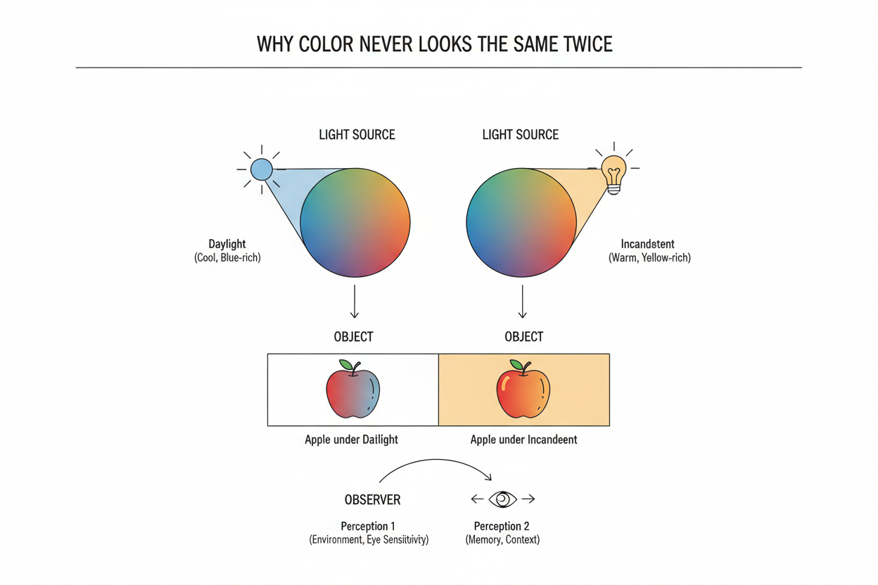
This isn't a quirk of human perception. It's the underlying physics of color itself. The same green paint on two sides of a wall can look like two entirely different shades depending on which one the sun is hitting directly. The same principle applies to your face with equal force.
For color season analysis, this creates a specific and underappreciated problem. The system works by reading three distinct qualities of your natural coloring:
- Undertone — whether your skin leans warm (yellow, peachy, golden) or cool (pink, blue, rosy), or sits neutral
- Value — how light or deep your overall coloring is
- Chroma — how muted and soft, or clear and vivid, your coloring appears
All three are properties of reflected light. Under the wrong light source, your undertone can shift, your value can compress, and your chroma can flatten or intensify. A cool-toned Summer can read as a warm Autumn. A high-contrast Winter can look like a muted Deep Autumn. The coloring itself hasn't changed — the lighting has simply misrepresented it.
Understanding why this happens, and what to do about it, starts with identifying the specific variables in any light source that cause these distortions.
Not sure what season you actually are? If you've only ever assessed your coloring under artificial or mixed light, your result may not reflect your true palette. [Take the color season quiz under controlled conditions →]
The Three Lighting Variables That Skew a Color Season Reading
Every light source — natural or artificial — can be described along three dimensions, each of which independently distorts how your coloring reads during an analysis.
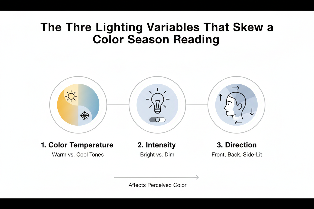
1. Color temperature — measured in Kelvin (K), this determines whether a light source casts a warm or cool tone. Lower Kelvin values (2700K–3000K) produce warm, amber-yellow light. Higher values (5000K–6500K) produce cool, blue-white light. Most homes contain a mixture of both, often in the same room.
2. Intensity — how bright or dim the light source is. Dim light makes colors look darker and flatter than they are. Very bright light pumps up saturation. Neither extreme shows your coloring accurately.
3. Source type — whether the light comes from the sun, an incandescent bulb, a fluorescent tube, an LED, or some combination. Each source has a different spectral makeup, meaning it puts out more energy at some wavelengths than others. That uneven output is what makes colors shift in ways that feel hard to pin down.
Of the three, color temperature is the most dangerous for color season purposes — because it works on you without your noticing. You don't consciously register that a room is bathed in amber light. You just see your skin looking warmer than it actually is. The next two subsections get into how temperature and intensity each produce specific, season-level misreadings.
Color Temperature: Warm vs. Cool Light and Your Undertone
Color temperature is the single biggest reason so many at-home color season results are wrong.
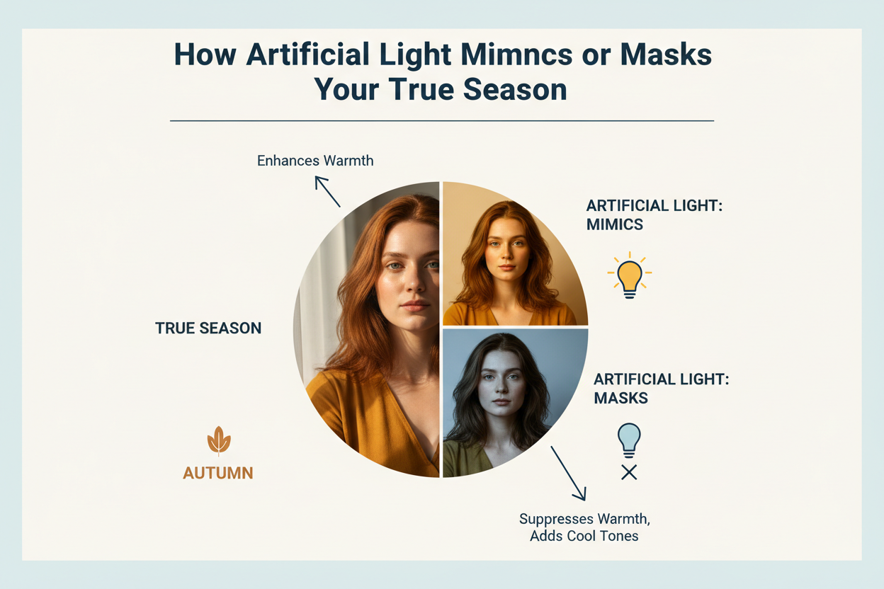
Warm light — roughly 2700K–3000K, the range from most traditional incandescent bulbs and many "soft white" LEDs — amplifies yellow and orange wavelengths across every surface in a room. When it hits your skin, it adds a golden cast regardless of your actual undertone. A cool-toned True Summer, whose natural coloring is ashy and rose-based, can look peachy and warm under a 2700K bulb. The analyst — or the person squinting at their bathroom mirror — reads warmth that isn't there, and the result tilts toward Autumn or Spring.
Cool light — roughly 5000K–6500K, from most fluorescent tubes, "daylight" LED bulbs, and a lot of commercial lighting — amplifies blue and grey wavelengths. Under it, warm undertones can look neutralized or even slightly cool. A Warm Spring, whose coloring should read golden and clear, may come across as muted and ashy under cool fluorescent light, pulling the result toward Summer.
Here's the practical problem: if you don't know the Kelvin rating of the bulbs in the room where you analyzed your colors, your undertone reading may be off. LED bulb packaging usually lists the Kelvin rating. If you have to use artificial light, look for something between 4000K and 5000K — that range sits closest to neutral and is least likely to push your results warm or cool.
Intensity and Saturation: How Dim or Bright Light Flattens Your Contrast
Color temperature distorts undertone. Intensity distorts something different: value and chroma — the two qualities that separate high-contrast seasons from low-contrast ones.
The relationship is direct. Dim light makes surfaces reflect darker, less saturated versions of their actual color. Bright light does the opposite. For color season analysis, that matters:
- A Deep Autumn assessed in a poorly lit room may appear so muted and low-contrast that they read as a Soft Summer or Soft Autumn — their depth suppressed, their warmth invisible
- A True Winter analyzed under harsh, overexposed light may appear higher-contrast than they naturally are, pushing toward a reading that overstates their intensity
- A Light Spring in dim conditions may lose the brightness that defines their season and read as a cooler, lower-chroma type
The contrast distinction between a Soft Autumn and a Deep Autumn, or between a Light Summer and a True Summer, is subtle enough that lighting intensity alone can erase it. If you've felt like you sit on the border between two adjacent seasons, there's a real chance the lighting conditions compressed the contrast information that would have settled the question.
Accurate color season assessment needs light that is both spectrally neutral and adequately bright — not dim, not glaring, just consistent and clear.
How Artificial Light Mimics or Masks Your True Season
The same distortion that makes a paint color look completely different on a store chip versus in your living room acts directly on your face during a color analysis. What reads as accurate in one environment can be misleading in another — not because of anything you did wrong, but because artificial light sources are not spectrally complete.
Here is how common household and office light environments translate into specific season misreadings:
| Light Source | Typical Color Temp | Effect on Skin | Likely Misread Direction |
|---|---|---|---|
| Warm incandescent bulb | 2700K | Adds yellow-orange cast | Cool seasons read as warm; Springs and Autumns appear more golden |
| Soft white LED | 2700K–3000K | Similar warm cast, often stronger than incandescent | Summers and Winters may read as Springs or Autumns |
| Cool white fluorescent | 4000K–5000K | Flattens warmth, adds grey-blue tone | Warm seasons appear cooler; Springs may read as Summers |
| Harsh daylight fluorescent | 5500K–6500K | Strips warmth, amplifies contrast | Autumns may read as cooler-toned; Winters appear harsher |
| Candlelight / warm accent lamp | ~1800K–2200K | Heavy amber cast | Almost every season reads warm; reliable analysis is nearly impossible |
| Mixed light (multiple sources) | Variable | Competing casts create unpredictable undertone shifts | Results are effectively random |
Mixed lighting is the most deceptive scenario. A warm overhead fixture combined with a cool task lamp, or artificial light mixing with window light of a different temperature, creates a problem your eyes quietly paper over. You adapt and perceive the room as roughly neutral. But a camera — or anyone carefully reading your undertone — will pick up the competing casts as interference that obscures what's actually there.
For self-analysis, this has a real practical consequence. If you're photographing yourself to assess your coloring, or holding swatches up in a bathroom mirror, the light in that space isn't just a backdrop. It's actively shaping the result you get.
Natural Daylight as the Baseline Standard for Color Analysis
Professional color analysts work under one condition whenever possible: indirect natural daylight. The reason isn't aesthetic preference — it's spectral completeness.
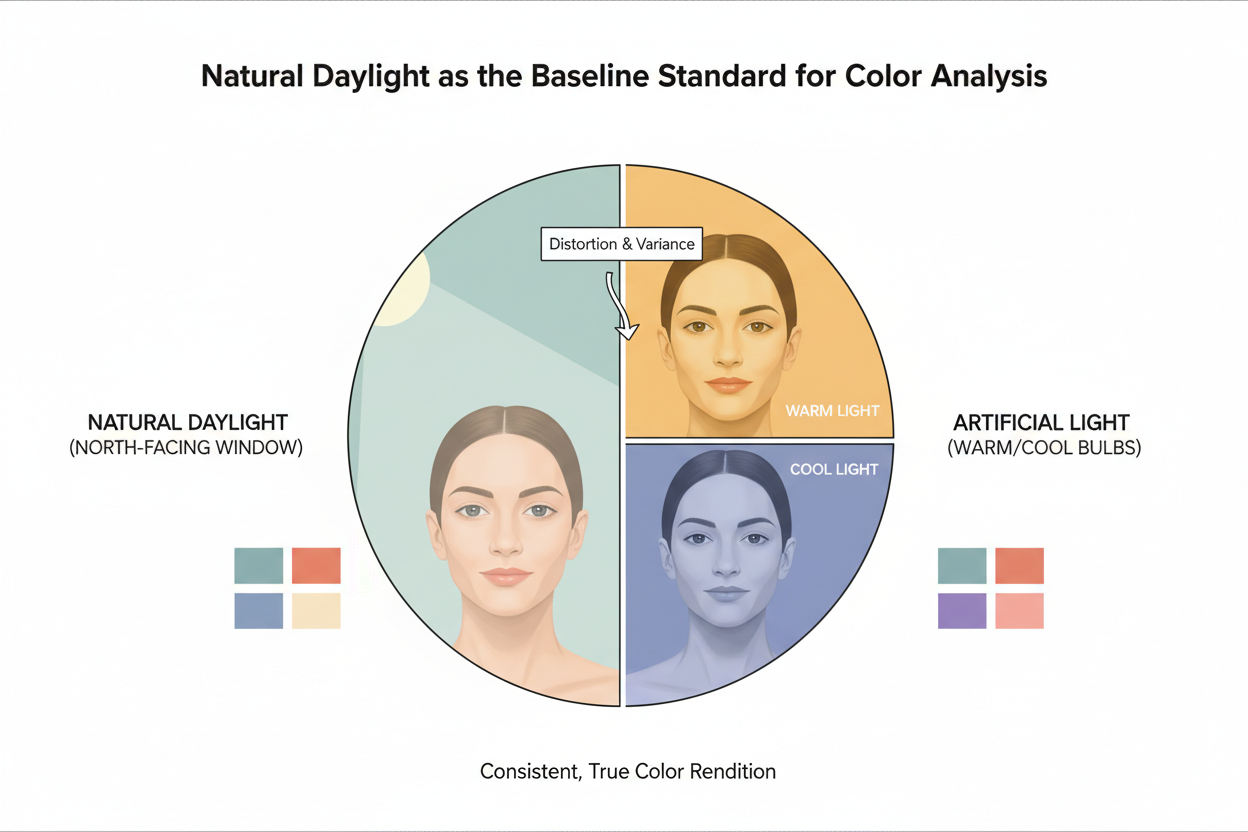
Sunlight contains the full visible spectrum. It doesn't suppress or amplify any particular band of color, which means it doesn't systematically distort warm or cool undertones, flatten contrast, or cast a colorcast your eye quietly compensates for. It's the closest thing to a neutral light source the human visual system has.
A simple paint demonstration shows this clearly: two walls painted the same shade of green, one in shadow and one in direct sun, look noticeably different. The sunlit wall shows what the paint actually is. The same principle applies to skin under natural versus artificial light.
The key qualifier is indirect daylight. Direct sunlight introduces its own problems:
- Glare overexposes the skin, washing out value distinctions
- Strong directional shadow creates artificial contrast across facial features
- The sun's angle shifts the apparent warmth of the light noticeably, especially early morning and late afternoon
The target is indirect daylight from a north-facing window on an overcast or partly cloudy day, or the soft diffused light from an east-facing window in the mid-morning before the sun climbs high enough to cast directional warmth.
Under that kind of light, your actual undertone is visible without amplification or suppression. Your value reads accurately. Your chroma — how clear or muted your coloring is — shows up as it genuinely is.
Ready to assess your season under the right conditions? Once you've found your neutral-light spot, the quiz takes only a few minutes. [Start your color season quiz →]
Seasonal and Geographic Daylight Shifts That Affect At-Home Analysis
Natural daylight is the reference standard, but it is not constant. The quality, angle, intensity, and duration of daylight shift with the seasons and with latitude — and those shifts are large enough to meaningfully affect a color season analysis done at home.
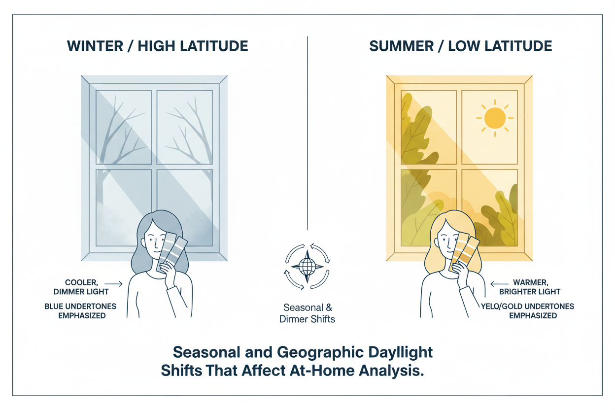
In northern latitudes, winter daylight arrives at a low angle, travels through more atmosphere, and carries a noticeably warmer, more amber cast than summer daylight. In regions with long overcast winters — northern Europe, the Pacific Northwest, the Great Lakes — usable natural light may be available for only a few hours midday, and even then it is dim and diffused enough to reduce color saturation.
What this means in practice:
- A self-analysis done in January in a northern city under low winter light may suppress warmth and chroma, nudging a warm-season type toward a cooler or more muted reading
- The same person repeating the analysis in July near a bright window may find their coloring reads dramatically differently — not because their season changed, but because the light did
- Overcast summer light is actually close to ideal: diffused, full-spectrum, and free of directional glare. Overcast winter light is another story — often too dim to reveal contrast accurately
If you did a color season quiz or draping session during winter months, especially at high latitude or in a frequently overcast location, the light conditions may have introduced a consistent bias toward cooler, more muted, or lower-contrast readings. This is one of the most underappreciated reasons for inconsistent at-home results.
The fix is not to wait for summer. It is to use the lighting setup protocol below to replicate neutral-spectrum conditions regardless of season.
How to Set Up the Right Lighting Conditions Before You Analyze Your Colors
You don't need specialized equipment to control your lighting before a color analysis. You need to understand which variables to eliminate and then make a few simple adjustments. It's one of the highest-impact, lowest-cost things you can do for accuracy.
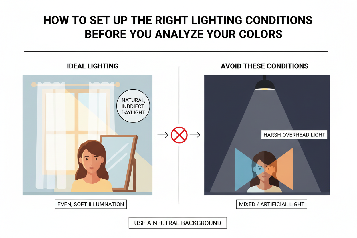
Step 1: Choose the right window
- Best: North-facing, on an overcast or lightly cloudy day. Even, diffused, full-spectrum light with no direct sun and no warm afternoon cast.
- Acceptable: East-facing, mid-morning (roughly 9 a.m. to 11 a.m.), before the sun gains altitude or warmth.
- Avoid: South- or west-facing windows in the afternoon. These add a strong golden cast that will make your undertone read warmer than it is.
Step 2: Turn off all artificial lights in the room
Mixed light sources are the enemy of accurate analysis. Even a single warm overhead bulb can introduce enough amber to shift your undertone reading. Before you start, turn off everything: overhead fixtures, lamps, task lighting.
Step 3: Remove colored backgrounds
Brightly colored walls, curtains, or surfaces near your face reflect their color back onto your skin. A terracotta wall casts warmth; a blue wall casts cool. Position yourself so the background is white, off-white, or grey.
Step 4: Check the time of day
Analyze between 10 a.m. and 2 p.m. The sun is high enough to give you adequate brightness, but the afternoon color shift hasn't set in yet. Early morning and evening light both carry warm, reddish-orange color temperature that will throw off your reading.
Step 5: Wear no makeup and no clothing near your face
Makeup changes how your undertone reads. Clothing with strong color near the neckline reflects onto your jawline and neck. Use a white, grey, or neutral drape if you have one.
Step 6: Use a mirror, not your phone camera
Phone cameras apply automatic white balancing that compensates for color casts, which means they hide the very thing you're trying to account for. A mirror under controlled natural light gives you an unmediated view.
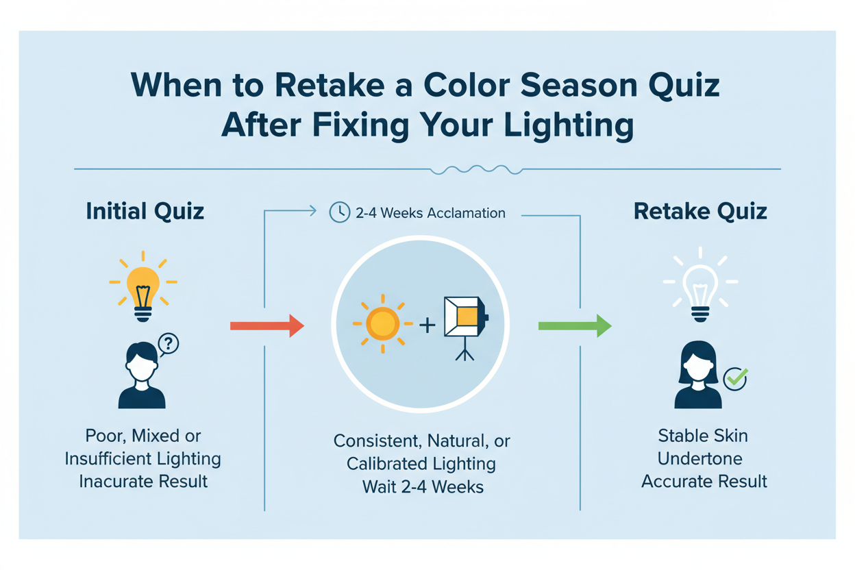
When to Retake a Color Season Quiz After Fixing Your Lighting
If any of the following were true when you last assessed your colors, the result is worth revisiting under corrected conditions:
- You analyzed your coloring under a warm incandescent or soft-white LED bulb
- You were in a room with fluorescent overhead lighting
- You used a bathroom mirror with built-in lighting
- You analyzed yourself in the evening or at night
- You were in a north-latitude location during winter with limited daylight
- You had colored walls, curtains, or surfaces near your face
- Multiple light sources were on at the same time
Correcting these conditions costs nothing. Better lighting is the single most impactful change you can make before investing in swatches, drapes, or a professional consultation — and it's the step most likely to produce a result that actually holds up.
A result from poor lighting isn't necessarily wrong, but it isn't trustworthy either. It may have landed on your true season by chance, or it may have skewed one of the three critical readings — undertone, value, or chroma — just enough to push you toward the wrong palette.
Once you have a neutral-light environment set up, you're in a position to get a result you can actually use.
The Window Test: Finding Neutral Light in Any Home
You don't need to know which direction your windows face. Use this test instead.
The protocol:
- On an overcast or lightly cloudy day, move through each room between 10 a.m. and 2 p.m.
- In each room, stand near the window and hold a piece of plain white paper at arm's length in front of your face
- Look at the paper. If it reads faintly yellow or orange, that window has a warm cast. If it reads faintly blue or grey, the cast is cool. The window where the paper looks closest to true white is your best spot
- Confirm by checking your inner wrist under each window — your veins should look their normal color (blue-green for most people), not washed out or yellowed
- Once you've found the best window, note the time and conditions so you can replicate it
The whole thing takes under five minutes. It works regardless of window orientation, season, or surrounding surfaces, because you're using your own perception of a neutral reference to cut through the cast rather than trying to calculate it.
Once you've found your spot, that's where your analysis belongs.
People Also Ask
Can lighting affect your color season result?
Yes — and more than most people expect. Color season analysis reads three qualities of your coloring: undertone, value, and chroma. All three are properties of reflected light, not fixed traits, so whatever light source is present during your analysis directly shapes what those qualities look like.
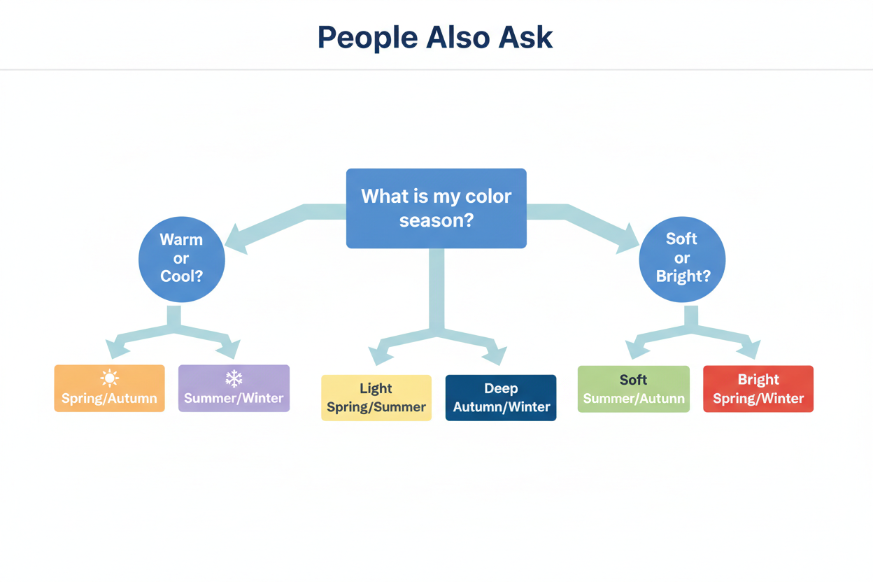
A warm bulb adds a yellow-amber cast to everything in the room, including your skin. That can make a cool-toned person read as warm and push their result toward Spring or Autumn. Cool fluorescent light does the opposite, stripping out apparent warmth and nudging results toward Summer or Winter. Dim conditions suppress contrast, so deep or high-chroma coloring reads softer and more muted than it actually is.
Wrong lighting doesn't just skew your result a little. It can put you in an entirely different season.
What is the best lighting for color analysis at home?
The most reliable option is indirect natural daylight — soft, diffused light from a north-facing window on an overcast or partly cloudy day, or an east-facing window in the mid-morning before the sun gets high.
A few conditions matter:
- No direct sunlight — it creates glare and directional shadows that throw off contrast readings
- All artificial lights off — even one warm overhead bulb adds a color cast
- No colored walls or surfaces near your face — they reflect their hue back onto your skin
- Time of day: somewhere between 10 a.m. and 2 p.m., when there's enough brightness but the light hasn't shifted warm yet
If natural light isn't an option, a bulb rated between 4000K and 5000K (sometimes labeled "neutral white" or "cool white") is the closest substitute. Avoid "soft white" bulbs, which run too warm, and "daylight" bulbs at 6500K, which run too cool.
Why do I look different colors in different lighting?
Color isn't a fixed property of a surface. It's the result of specific wavelengths of light being absorbed and reflected. Change the light source, and you change which wavelengths are available, which changes what you see.
Every light source has a different spectral makeup. A warm incandescent bulb pushes more energy into the yellow-orange range. A cool fluorescent tube pushes more into blue-grey. Your skin, hair, and eyes interact with whatever wavelengths are actually present. The same person can look peachy and golden under a household lamp and ashy and flat under office fluorescents — and nothing about their actual coloring changed.
It's the same reason a paint chip looks completely different in the store versus on your wall at home. Same surface, different light.
Does natural light give the most accurate color analysis?
For most purposes, yes. Natural daylight — particularly indirect, diffused daylight — is spectrally complete, meaning it contains the full visible spectrum without suppressing or amplifying any particular range. That makes it the closest thing to a truly neutral light source.
That said, not all natural light is equal:
- Overcast mid-day daylight is ideal: even, full-spectrum, no directional shadow
- Direct sunlight introduces glare and overexposure that flattens value distinctions
- Low-angle winter daylight (especially in northern latitudes) has a warmer, amber cast that can skew undertone readings
- Early morning or late afternoon light is noticeably warm and unreliable for undertone assessment
Professional analysts use natural light as their baseline, but the quality of that light matters as much as the source itself.
Can you do color analysis indoors with artificial light?
Yes, but bulb type matters a lot. Most household bulbs introduce a warm or cool cast that skews undertone readings — which is the one variable you really can't afford to get wrong in color season analysis.
If you're working indoors:
- Use bulbs rated 4000K–5000K — this neutral range avoids warm and cool bias
- Avoid soft white or warm white bulbs (2700K–3000K) — they add a golden cast your eyes adapt to without noticing, but it still affects the reading
- Avoid harsh cool daylight bulbs at 6500K — they strip warmth and can make warm-season coloring look neutral or cool
- Use a single light source — mixed sources create competing casts and unpredictable results
- Position the light to illuminate your face evenly without harsh shadows
The right Kelvin rating can produce reliable results indoors. A standard warm household bulb, or mixed sources, probably can't.
FAQ
What type of lighting is best for doing a color season analysis at home?
Indirect natural daylight is the gold standard. Position yourself near a north- or east-facing window during mid-morning to early afternoon, when the light is bright but the sun isn't hitting your face directly. Turn off artificial lights and step away from any strongly colored walls that might cast their hue onto your skin.
If daylight isn't available, use a bulb rated between 4000K and 5000K (labeled "neutral white" or "cool white"). That range avoids the warm amber of standard household bulbs and the harsh blue of high-kelvin daylight bulbs, giving you the most neutral artificial baseline you can get at home.
Can the wrong lighting make me look like a different color season?
Yes — and the shift can be dramatic enough to land you in a completely different season. Artificial light changes how colors appear on every surface it touches, including your skin and hair. A warm bulb adds a yellow-amber cast that makes cool undertones read as warm, which can push a Summer or Winter result toward Spring or Autumn. A cool fluorescent does the opposite.
Color season analysis depends on reading undertone, value, and chroma together. Distort even one of those variables with the wrong light source and the whole result can cascade. The error won't look like an error — it will look like a genuine answer.
Why does my skin undertone look different in the morning versus the evening?
Light changes throughout the day, and so does the color it casts on your skin. Morning and late afternoon sunlight travels at a low angle through more atmosphere, which filters out shorter wavelengths and produces a warmer, more amber-toned light. That warmth can make a cool or neutral undertone read as peachy or golden.
Midday light is more balanced. Evening indoor light — usually incandescent or soft-white LEDs — pushes things warmer again. Your undertone hasn't changed; the light source reflecting off your skin has.
Does overcast daylight work for color analysis or do I need direct sunlight?
Overcast daylight is actually better than direct sunlight for color analysis. A uniformly cloudy sky acts as a giant diffuser, scattering light evenly and cutting out the harsh shadows and glare that come with direct sun. Those shadows can deepen contrast artificially and make value distinctions harder to read.
Direct sunlight also tends to overexpose lighter areas of the face, washing out subtle warm or cool tones. Soft, diffused light preserves the full visible spectrum without those distortions — which makes an overcast day one of the most reliable conditions you can work in.
How do fluorescent office lights affect how my coloring reads?
Standard fluorescent tubes put out a cool, slightly greenish or blue-grey light that suppresses the yellow and red wavelengths your skin reflects. Warm undertones tend to get muted or disappear entirely, so skin reads more neutral or cool than it actually is. A Spring or Autumn coloring can easily pass for Summer or Winter under these conditions.
Older fluorescent lights make this worse. They don't produce continuous, full-spectrum light the way daylight does — there are gaps in their spectral output where certain hues are simply absent. If you've ever looked washed out or strangely grey under office lighting, that's why. It's not your skin; it's the light missing the wavelengths that would show your undertone clearly.
Should I retake a color season quiz if I took it under artificial lighting?
Yes, if you have any reason to doubt the light you were working under. Warm household bulbs, mixed light sources, or a device screen as your main reference can all throw off undertone readings — which is what the quiz is actually measuring.
Retaking it under indirect natural daylight, or a neutral 4000K–5000K bulb with everything else off, takes a few minutes. It's not starting over. It's just removing something that was getting in the way.
Does seasonal daylight change in winter affect color analysis accuracy?
It can, especially at higher latitudes where winter light arrives at a low angle, lasts fewer hours, and runs warmer and more amber than summer midday light. Months of heavy overcast make things worse — the light gets dimmer and contrast becomes harder to read.
The practical result: a winter analysis done by lamplight or in low-angle morning sun is more likely to distort your undertone reading than the same analysis on a bright summer afternoon. If you're doing this in winter, work near a window during late morning when the light is at its clearest, and consider checking your result again when conditions improve. Taking a color season quiz in the best light you can find will always beat one done under unchecked artificial lighting, whatever the season.