Exploring the Deep Summer Color Palette: A Complete Guide

Key Takeaways
- The deep summer color palette blends cool undertones with medium-to-deep value for a sophisticated, understated look. Lean into muted, shaded summer hues — smoky teals, dusty plums, inky navies — rather than brights or pastels. This is what keeps your outfits and makeup cohesive without any extra effort.
- 2026 Shopping Cheat Sheet — Deep Summer HEX Codes: Paste these into online store color filters for a precise palette match: Navy
#001F3F, Teal#008080, Plum#4B0082, Charcoal#36454F, Dusty Rose#C4A0A0, Blue Spruce#2E5E4E, and the 2026 Color of the Year Silhouette (espresso-charcoal) — a cool brown that slots seamlessly into the dark summer color palette. Bookmark the list for quick access while shopping on ASOS, Zara, or H&M. - Your undertone drives every choice you make. If silver jewelry flatters you more than gold, that confirms cool or neutral-cool undertones — apply the same logic to your clothing, foundation, and lipstick when building a deep summer palette.
- Value and chroma are your calibration tools. Aim for medium-to-deep lightness and low-to-medium saturation — smoky and dusty, never neon or warm. This is the defining characteristic that separates deep summer color analysis from adjacent seasons like Soft Autumn or Dark Winter.
- Build your wardrobe on cool neutrals first — charcoal, navy, pewter — then layer in deep summer colors like teal, plum, and berry as accents. Carry a color swatch or save your HEX codes on your phone to verify matches in-store and avoid warm impostors under misleading LED lighting.
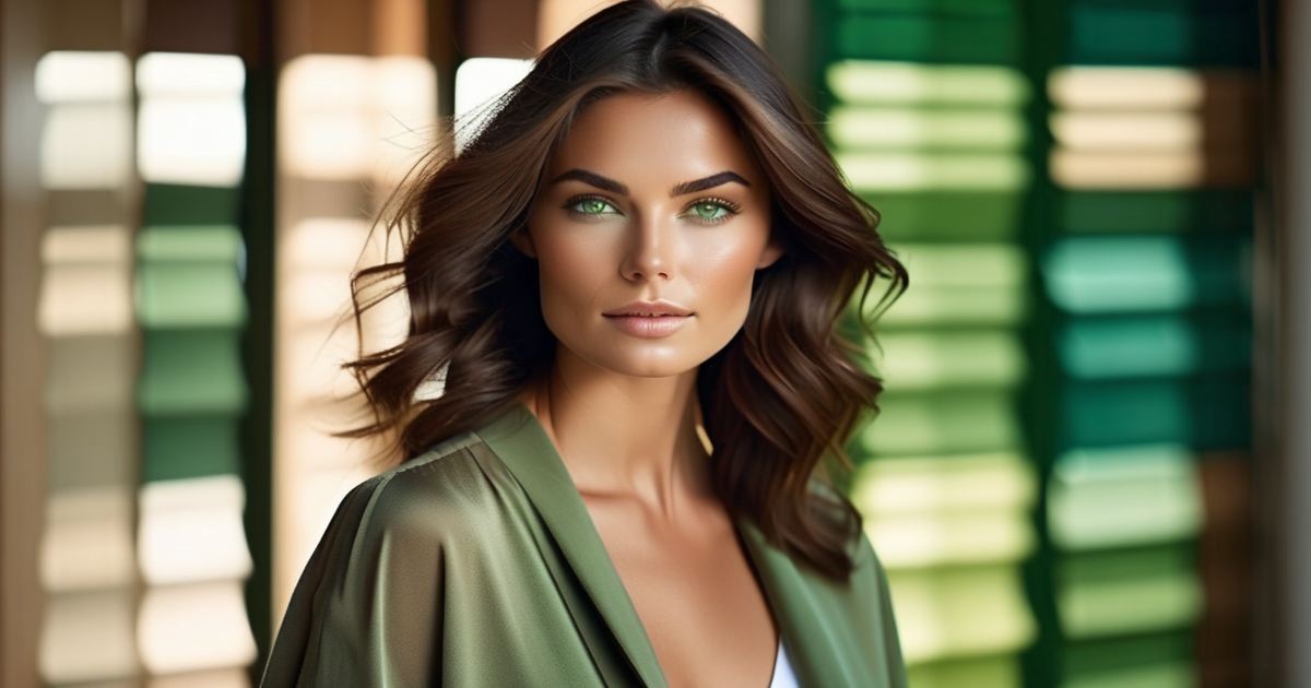
- Classic deep summer celebrities tend to share the same physical blueprint: ash-brown to soft-black hair, cool beige to rosy-olive skin, and grey-toned eyes. If that sounds like you, cross-check with an online deep summer color analysis quiz and compare results against physical swatches for confirmation. The deep soft summer sub-type follows similar rules but with slightly softer chroma — a free drape test can help you distinguish between the two.
- Keep your styling consistent across clothing, makeup, and jewelry. Silver-toned metals and cool accent stones — amethyst, sapphire, grey moonstone — reinforce the shaded summer color palette without overpowering it. For evenings, a thin layer of shimmer on the lids adds dimension while keeping the cool, muted character of the deep soft summer color palette intact.
🌸 Discover Your Seasonal Color Analysis
Ready to discover your seasonal color type? Take our comprehensive seasonal color analysis to identify whether you're a Deep Summer or another seasonal type. Get personalized color recommendations that enhance your natural beauty.
Take Seasonal Color Analysis →If you've spent years reaching for black and wondering why you always look slightly off — there's a good chance you've been misread as a Winter. The deep summer color palette is one of the most misdiagnosed in color analysis, and in 2026, that mistake is costing people real money. Professional AI-driven deep summer color analysis now runs $25–$45 through apps, compared to $200+ for in-person consultations — so there's no excuse to keep dressing for the wrong season. The dark summer color palette thrives on cool, muted depth: think inky navy over harsh black, charcoal over stark white, and rich teal over electric blue. If those shades make your skin look alive rather than washed out, you're likely working with a deep summer palette — and that's a serious style advantage once you know how to use it.
If you've spent years reaching for black and wondering why you always look slightly off — there's a good chance you've been misread as a Winter. The deep summer color palette is one of the most misdiagnosed in color analysis, and in 2026, that mistake is costing people real money. Professional AI-driven deep summer color analysis now runs $25–$45 through apps, compared to $200+ for in-person consultations — so there's no excuse to keep dressing for the wrong season. The dark summer color palette thrives on cool, muted depth: think inky navy over harsh black, charcoal over stark white, and rich teal over electric blue. If those shades make your skin look alive rather than washed out, you're likely working with a deep summer palette — and that's a serious style advantage once you know how to use it.
Skin requires consistent SPF, hydration breaks are important, and breathable garments make a HUGE difference. Food keeps for less and plans move to early mornings or late nights.
So, easy does it, stay cool and enjoy it!
📚 Recent Articles
What is the deep summer profile?
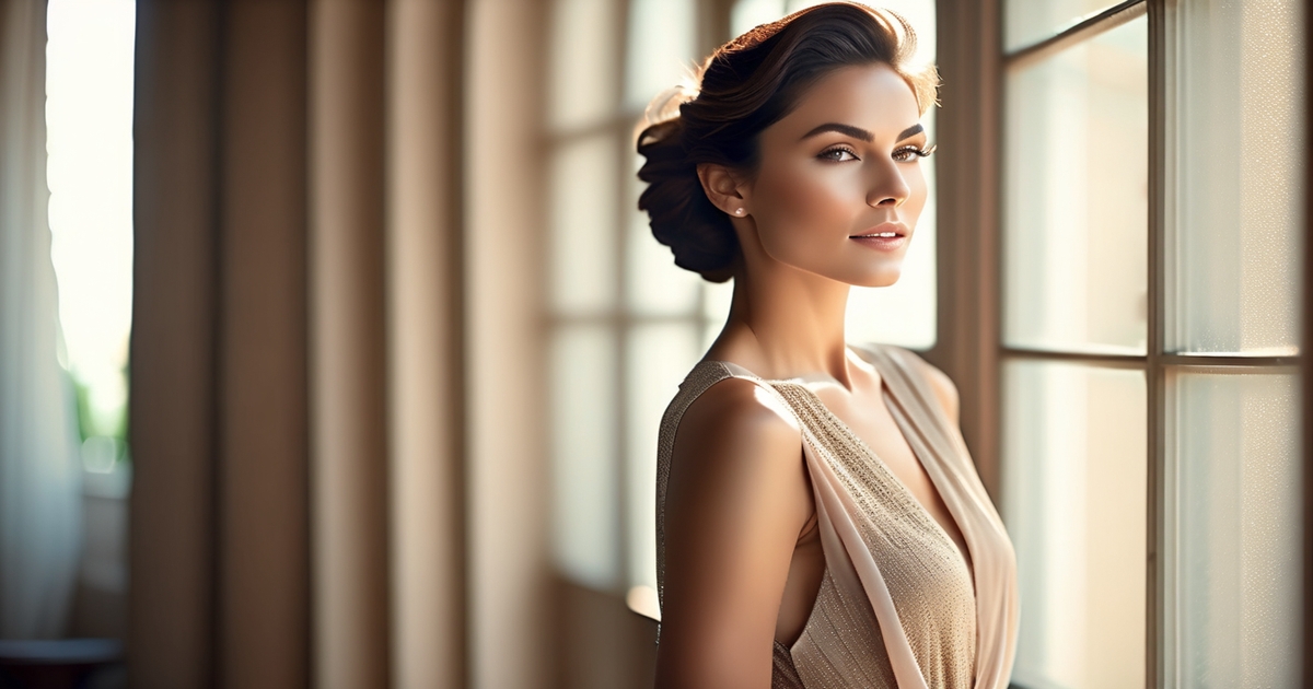
A sub-season of Summer, Deep Summer features typical **summer colors** with cool undertones, medium-to-deep coloring, and a hushed, dappled quality. This season falls between True Summer and Soft Autumn, blending coolness with muted, earthy depth. The **summer color palette** favors muted, tonal colors over brights or pastels, reflecting the natural hair, skin, and eye colors that are often cool, deep, and soft.
1. The essence
Think refined calm: cool meets depth to form an understated look that reads polished rather than loud. The face exhibits minimal contrast between hair, eyes and skin, so nothing yells—everything melds.
With many Deep Summers having strong coloring and deep brown or gray eyes, they are often misread as Winters. Brutal heat whips here. The best shades have that balanced shaded quality, like soft navy, dusty teal, muted burgundy, and smoky plum.
The lure is understated elegance, not aggressive boasting. Depth, rather than coolness or lightness, takes center stage and distinguishes this profile from other Summers.
2. The undertone
Cool undertones rule: skin may show blue, pink, or rose hints; hair usually ashy brown to dark ash; eyes cool brown, gray, or cool hazel. The bottom remains chilled, never bronzed, although the face may tan.
Quick test: silver jewelry tends to look fresher than yellow gold on this profile. Undertone drives the entire palette. Colors lean cool or neutral-cool, which keeps ensembles harmonized and prevents clashing.
Even when a color leans neutral, it mustn't lean warm.
3. The value
The palette spans medium to deep, avoiding both light pastels and pitch-black extremes. Colors have substance and heft, but not Winter-intensity punch.
A value chart helps: place soft navy, graphite, burgundy, forest teal, and raspberry around the mid-to-deep band. On this scale, what emerges is a steady, grounded closet that just works day after day with no effort.
4. The chroma
Chroma remains low to medium. Shades look dulled down, not neon, not chalky pastel. This maintains balance so tones merge with attributes instead of rest upon.
Aim for "dusty," "inky," or "smoky" versions: smoky plum, inky teal, dusty raspberry, soft navy. High-chroma brights can drown the face or cast red onto the skin.
That risk is greater for people with high contrast between skin and hair or eyes.
5. The influence
Soft Autumn neighbors impart a touch of earth, so some neutral-warms can work if they're similarly muted and cool-leaning. Common crossovers: deep teal, muted burgundy, smoky plum, and even charcoal olive with a cool cast.
Still, Deep Summer occupies Summer's coolest edge, close to Winter on the spectrum. It's also known as Dark Summer or Bright Summer, depending on how cool or warm it is.
Best bets continue to be deep, cool colors—burgundies, soft navy, raspberry and amethyst pinks—even if a few Autumn notes creep in. Borrow from neighbors as necessary, but ground ensembles in the main palette.
Distinguishing the seasonal flow
Deep summer occupies a middle ground inside the seasonal color analysis system, serving as the bridge between summer's cool restraint and autumn's deeper weight. It's on the cool side, but it has more depth and presence than other summer profiles. Consider the cool undertone, then medium-to-dark value, with soft-to-moderate chroma.
This combination is exactly why deep summer colors sit closer to Winter than to Summer or Autumn on the continuous color spectrum. The dark summer color palette gravitates toward cool berries, blue-greens, deep teals, pine, and ink blues — black softens to charcoal, and stark white gives way to soft white or stone. One practical note worth keeping in mind: many Deep Summers instinctively reach for black as their go-to neutral, but inky navy (#001F3F) is the stronger functional choice. It delivers the same structure and polish as black, yet reads fresher and more alive against cool, deep coloring — a distinction that becomes especially clear in natural light. With 2026 retail trends leaning heavily into deep navy and teal (think Pantone's SS26 direction), finding the right shade has never been easier. Treat inky navy as the cornerstone of your dark summer palette, and reserve true black for moments when maximum contrast is the deliberate goal.
Undertone, value and chroma do the heavy lift. Undertone responds to the 'cool or warm' question, deep summer is cool. Value determines that light‑to‑dark span — deep summer slopes deeper.
Chroma dictates power, and deep summer remains hushed, not luminous. The depth of the look is what determines the type, with coolness and lightness being sub-traits. If a color appears sharp or glaring, it tilts toward winter; if it veers dusty or brownish, it leans autumn; if it goes pale and powdery, it slides toward true or light summer.
| Profile | Undertone | Value | Chroma | Hallmark colors | Common mix-ups |
|---|---|---|---|---|---|
| Deep Summer | Cool | Medium‑dark | Soft‑moderate | Deep teal, pine, berry, charcoal, soft white | Confused with Deep Winter or Soft Autumn |
| True Summer | Cool | Medium‑light | Soft | Cool blues, rose, soft navy, dove gray | Looks balanced, not very deep or very soft |
| Light Summer | Cool | Light | Soft‑light | Pale yellow, light aqua, sky blue, lavender | Can look Spring‑like due to lightness |
| Soft Summer | Cool‑neutral | Medium | Soft | Dusty mauve, sage, taupe | Often resemble Autumn: red hair notes, hazel/brown eyes, faint gold skin |
| Deep Winter | Cool | Dark | High | Black, icy jewel tones, optic white | Too high contrast for most summers |
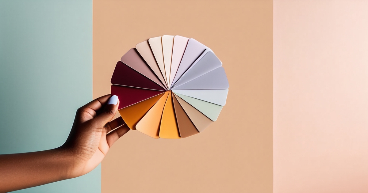
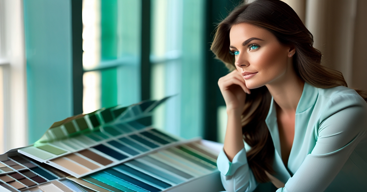
To separate your season with less trial and error, utilize a seasonal color analysis guide or flow chart that tests undertone first, then value, and finally chroma. Observe how your skin responds to silver rather than gold, then explore mid-deep cool shades to see if they enhance your features or feel heavy.
Sub-types within a seasonal palette can help you determine which segment of the wheel best suits you when your characteristics border between two categories.
When constructing outfits, layer tonal colors and avoid too much contrast. Keep the number of different colors low, allowing near-values to stack: charcoal with deep teal, berry with muted plum, soft white with slate.
Although it's okay to dip a few shades from other palettes, you'll receive the greatest lift by remaining near the sweet spot of your own palette.
The shaded summer color palette
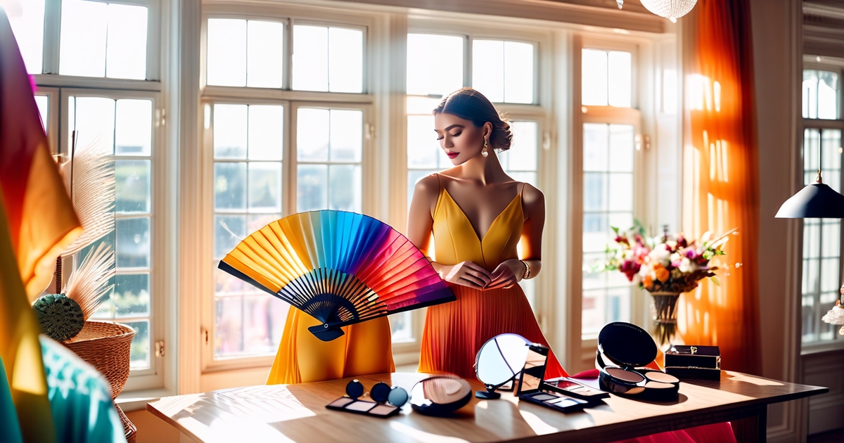
A cool, muted, deep shaded set of colors that feel like dusk belongs to the Summer season—also known as Sweet Pea Summer or Brown Summer—but skews a little darker and more earthy. This palette stretches from darkest charcoal and blue spruce to pale powder blues and soft pinks, showcasing typical summer colors. Vibrant spring orange and warm shades are not included, so take along a color fan or swatch book for accurate color matching.
Core neutrals
- Soft navy, charcoal grey, blue-black, pewter, cool taupe, stone, mushroom, smoked espresso — and the 2026 Color of the Year Silhouette (that rich espresso-charcoal blend that anchors the deep summer color palette like nothing else). A word of warning: finding a true cool brown in mainstream stores is the ultimate styling challenge. If the shade looks peachy, orange, or warm under store LEDs, walk away — step to the nearest window and check in natural light before you commit.
These neutrals work best as main pieces—suits, coats, blazers, trousers and structured skirts—because they ground the look. Soft navy is the workhorse – charcoal and pewter add shine without shine. Cool taupe and stone bring a casual effortless ease to daywear.
Light neutrals—stone, taupe, and beige—sparkle when juxtaposed with darker colors, providing a crisp, tranquil highlight. Build a small capsule: navy coat, charcoal suit, taupe trousers, stone shirt, pewter knit, and a blue-black dress. Each mixes with key tones and accent hues from this palette, so you can blend without sharp boundaries.
The tone remains cool and muted, flattering deep summer skin and eye depth.
Key colors
- Soft navy
- Blue spruce
- Smokey teal
- Slate blue
- Dusty raspberry
- Amethyst pink
- Mulberry
- Cool burgundy
- Steel rose
- Powder blue
Use them in shirts, dresses, and statement layers to stay uniform. A slate-blue shirt beneath a pewter suit reads sharp yet soft. A dusty raspberry dress with a charcoal wrap warms the face without going bright.
The quality to keep every time: cool, muted, smokey. If a pink tastes sweet or a blue seems neon, it's not shaded summer. Understanding your summer sub-type unlocks additional possibilities, so try blue spruce versus soft navy, broad and cool but bring different moods.
For spur of the moment planning, have a pocket list or photo chart in your phone with fabric swatches. It accelerates decisions in stores in dappled light.
Accent shades
- Silver grey
- Graphite
- Soft plum
- Berry lip (cool)
- Dusty mauve
- Blue-grey
- Deep rose
- Cool cocoa
Accents in scarves, belts, bags, shoes and nail color, makeup, etc, add lift without the noise. A blue-grey silk scarf invigorates a navy coat. Soft plum eyeliner defines eyes more gently than black.
Mix accents with core neutrals for balance: cool cocoa bag with stone trousers; deep rose lip with charcoal blazer. Ditch the bright, warm or stark accents—no neon coral, no tomato red, no icy white—that battle with the palette's tranquil, twilight-like richness.
Tonal looks flatter, but a controlled contrast—light stone with blue-black, or powder blue with mulberry—often looks best, as well.
Are you a deep summer?
Deep summer is depth first of all. Coolness and softness are there, but depth leads. This profile can look close to Winter because the colors sit closer to Winter on the spectrum, not Summer or Autumn.
Consider bold pigmentation, frequently deep brown or cool grey eyes, and characteristics that favor deep, cool hues such as soft navy, burgundy, raspberry pink and amethyst pink. Try a color analysis kit or an online tool to drape-test, then compare your characteristics to confirmed deep summers!
Search for medium-to-dark ash brown hair, muted eyes, cool undertones and a low-gold palette. If contrasting outfits gives you confidence, you may rest here. Others refer to it as Dark Summer or Bright Summer, in tribute to its depth.
Skin tones
Usual deep summers skin ends up in cool beige, rosy beige or olive with a pink or blue cast. It feels neutral-cool in close, not warm peach or golden tan. In sunlight, the skin appears smooth and even when contrasted against cool, saturated, deep colors.
Tanning lines assist! Skin doesn't get golden very often, it burns or comes up a nice cool, muted tan that is not warm. Orange but not honey, make a note of it.
For base makeup, try foundations labeled "cool" or "neutral-cool." Swatch along the jaw in daylight. If it glows orange, it's off. A cool match that coolly diminishes redness and brightens away dullness without the weight of coverage.
Eye patterns
Typical eye shadows are grey, grey-blue, grey-green or a muted hazel with low warmth. Deep brown sometimes, too, generally cool or neutral rather than amber-rich.
The iris tends to have a painterly effect. Edges are less crisp — a haze or veil lowers contrast. Look for a smoky or clouded pattern—specks appear diffused, not brilliant.
This 'misty' eye sees more summer than winter, even when dark. Keep eye shadow cool and subdued. Harsh or warm tones–fiery copper, pumpkin, brassy gold–battle the natural hush and can make the eye look older.
Hair colors
Natural hair usually lies in medium/dark ash brown, soft black or muted dark blonde. Undertones are cool or neutral, with minimal gold or red.
Avoid dyes with heavy red, gold or copper claims. Those notes conflict with the palette and can emphasize skin redness. Hit a color picker on a clean hair shot and cross-reference to ash charts.
Go for cool espresso, charcoal brown or smoky dark blonde. Depth permits more outfit contrast than other Summers. That's why Deep Summers can masquerade as Winters, but they retain Summer's tranquil, cool gentleness.
How to apply your colors
Begin with a personal palette or color fan and carry it in your bag. Deep Summer tends cool, muted, and medium-to-deep in value, so go for a soft, blended feel with clothes, makeup, and jewelry.
Begin with core neutrals, then sprinkle in some accent shades. Some hues energize many people while others deplete them and this palette guides you away from severe or hot colors that fight with you.
Wardrobe building
Build a simple checklist: coats and jackets in charcoal or deep navy; knit tops in cool taupe, soft gray and blue-gray; shirts in slate, muted teal and dusty berry; pants and skirts in ink navy and cool espresso; dresses in deep plum or smoky raspberry; shoes and bags of charcoal, pewter or cool brown.
Select quality not quantity. One deep navy blazer, two charcoal trousers and three knit tops can mix and match across a week with ease. Versatile pieces retain color and shape longer that keeps the balance.
A well-planned capsule wardrobe built around the deep summer color palette is one of the smartest sustainability moves you can make. Start with the essentials: 1 coat, 1 blazer, 2 trousers, 1 skirt, 3 knits, 2 shirts, 1 dress, 2 pairs of shoes, and 1 bag — every single piece anchored within your shaded summer color palette of cool charcoal, inky navy, and deep teal. This tight edit of deep summer colors means each item works with everything else, unlocking 30+ outfits from just 10 pieces and dramatically cutting down on textile waste. Add amethyst, cedar green, or cool burgundy accent scarves to introduce seasonal interest without breaking the palette's harmony. When shopping online, skip the guesswork entirely: copy the HEX codes for your core dark summer palette shades — navy (#001F3F), teal (#008080), plum (#4B0082) — directly into color filters on ASOS or similar retailers to find exact matches every time. Bookmark those filters and your deep summer palette will translate seamlessly from your wardrobe to your cart.
No tomato red, camel or bright coral–skip everything that's out of this spectrum. A lot of people say they didn't know they could wear green, pink, yellow or red – and they can, when the tones are cool and smoky.
Brown is a mute champion here as well, if it be cool and subdued.
Makeup choices
Mastering the deep summer color analysis approach to makeup means leaning into matte, cool-toned finishes — and knowing exactly where deep summer diverges from Dark Winter. While Dark Winter reaches for shimmer and high contrast, the shaded summer type thrives on depth without drama: think mauve or rose-plum blush, berry and cool wine lips, and smoky eyes built from charcoal, slate, cool taupe, and soft navy. A gray liner reads far more refined than black for daytime — it honors the dark summer palette's signature sophistication without overpowering cool undertones. When testing shades in 2026, many beauty counters now offer smart-mirror AR try-on tools — a genuinely useful way to preview deep summer colors on your actual skin tone before committing. Just note that physical swatch samples often carry a small $5 hygiene fee, so use the digital preview first and reach for testers only when you're nearly decided.
Match base products to cool or neutral undertones. Test in daylight along the jaw. If it glows orange, it's off. Most find makeup hardest—your deep summer chart really smooths this out.
Stay away from orange, peach or golden blush, bronzer and lipstick. Soft, cool, smoky, subtle colors tend to flatter this type.
Light Summer, which sits nearby, but runs paler—imagine sky blue, light aqua, lavender and pale yellow—drop those in occasionally if you tend lighter.
Jewelry metals
Choose silver, white gold or platinum. They reflect the palette's cool cast and maintain the crispness of the look.
Hang back on yellow gold and rose gold, they add warmth which combats the cool base. Stones in amethyst, sapphire, blue spinel and smoky quartz mirror your accents without screaming.
Let your jewelry frame, not steal the scene. Think skinny silver hoop, a pewter watch, or a deep sapphire pendant on a delicate chain.
Coordinated metals connect looks to cosmetics and provide a timeless, sophisticated edge.
The psychology of your palette
Deep summer, a part of the seasonal color analysis, skews cool, soft, and elegant. It embodies the essence of the summer season, showcasing colors like blue spruce, dusty plum, and deep teal. This classic summer color palette resonates with calmness and stability, making it a dominant trait for those with true summer colors.
Recognize that the deep summer palette conveys calm, sophistication, and understated confidence.
Muted cool colors tend to reduce visual "volume." A deep blue-green blazer or slate shirt has a still, grounded quality, unlike boisterous brights that force the eye to leap forward. In the board room, a charcoal-blue suit or mungo berry dress demonstrates concentration and will-power.
The psychology of your palette is complicated, and someday maybe an intricate equation will describe how the brain mixes hue, value and chroma into a feeling of loveliness. For now, patterns hold: soft-cool depth hints at maturity and care, the way frosted glass softens light yet stays clear.
Understand that wearing harmonious colors can boost self-esteem and create a polished impression.
When you're clothes mirror your skin's undertone and your hair's depth, your face appears more radiant, your eyes more luminous, and your wrinkles less harsh. Humans read that as 'well-rested' and 'capable,' and you sense it as well. Many learn this by trial: some look great in bright summer tones like fuchsia or cyan, while others seem washed out or overpowered.
If online quizzes left you second-guessing, you're in good company. The 16-season system — an evolution of the classic 12 — introduces meaningful distinctions that explain why one teal flatters and another falls flat. Take the deep summer color analysis vs. deep soft summer split: the deep summer palette calls for sharper, cooler navy and rich inky tones, while the deep soft summer color palette leans toward dustier mauves and softer chroma with less contrast. To find your footing, run a drape test near a window — natural light is the only honest mirror. Compare deep teal against bright cyan, smoke rose against hot pink, slate against jet black. The shades that make your skin look clear and your eyes vivid are your answer. Once you've identified your season, virtual closet apps are a practical next step: photograph your existing wardrobe, tag each piece by color, and instantly see how well your current clothes align with your shaded summer color palette — or where the gaps are.
Use the palette to express individuality through subtle, elegant color choices rather than bold statements.
Style doesn't have to scream. A deep plum tie with a subdued steel shirt, olive-gray chinos with a blue-gray knit, or silver jewelry with a berry lip says 'thoughtful.' Small shifts carry weight: gunmetal over gold, cool taupe over warm beige, blue-based red over orange-red.
Hair contributes; cooler ash shades can harmonize with deep summer — warm caramel might battle it. If you adore black, hold it close to the skin in something textured–matte knit, soft wool–and add a nifty scarf to cool it out. If black dominates, try inky navy or graphite.
Leverage the psychological effects of cool, muted colors to project approachability and reliability in personal and professional settings.
Soft-cool colors reduce defenses. Deep teal or slate for client work demonstrates steadiness. Mist blue at cocktail parties seems expansive but not ostentatious. Results differ, and your interpretation may diverge from an authority's.
Okay. This is all a subjective process. Test, note feedback, and build a core set: navy-ink, blue spruce, dusty rose, soft white, pewter, and deep mulberry. Then sprinkle in accents like subdued jade or berry. Keep prints low-contrast and cool-based. Eventually you'll observe which hues brighten your face and which subdue it.
Conclusion
To bring it all home, Deep Summer rests in a tranquil, lush territory. Nice ground. Dim light High depth. Colors dwell in shadow, such as ink blue, wine red, cedar green, plum and steel gray. Clear skin. Eyes bright. Hair has shine, not gloss. The palette seems calm and clean.
To seal it, select one anchor shade, then one soft cool tint. Pair navy with dusty rose. Try FOREST with slate. Pair burgundy with charcoal. Keep metals cool. Silver takes the majority of days. Gunmetal is good too.
To try on, just take a quick pic by a window. Switch shirts. Monitor skin and eyes. If the face appears serene, you rocked it.
Need more assistance? Leave a comment, PR your swatch set and fit check.
Frequently Asked Questions
What is a Deep Summer color profile?
Deep Summer is a cool, muted, and deep seasonal palette that represents typical summer colors. It combines the lightness of summer season types with the richness of winter colors, featuring tonal colors that look fantastic on cool skin, deep hair, and medium-to-deep eyes.
How do I know if I'm Deep Summer?
Check your undertone first: cool, not warm. As a Deep Summer, your best colors fall within the summer color seasons, featuring cool, muted, and slightly deep shades. Silver jewelry complements your look, while balanced hues like charcoal, raspberry, and slate enhance your natural beauty.
What is the difference between Deep Summer and Deep Winter?
Both are chilled and deep, yet they belong to different seasonal color analysis categories. Deep Winter features higher contrast and more clarity, while Deep Summer encompasses softer, true summer colors. If harsh black and clear white feel overwhelming, you likely lean towards the soft summer palette.
What colors are in the Deep Summer palette?
In the summer season, opt for cool, shaded hues with depth such as navy, teal, and plum, while incorporating true summer colors like soft navy and cool gray as neutrals. Avoid warm oranges and vibrant yellows.
How should I build a Deep Summer wardrobe?
Begin with a light summer color palette featuring cool, deep neutrals such as charcoal, navy, and pewter. Incorporate accent colors like raspberry and teal to enhance the outfit. Choose soft textures and subtle prints, finishing with silver accessories for a classic summer look.
What makeup works best for Deep Summer?
Select cool, muted tones that align with your seasonal color analysis. Base with cool undertones using taupe, slate, and true summer colors like cool plum eyeshadows. Charcoal or navy eyeliner complements blush in cool rose or berry, creating a tonal look that avoids hot orange or neon lights.
How can I apply my colors for maximum impact?
Employ deep neutrals in proximity to the face, complemented by a typical summer color like raspberry or teal as a hip accent. Maintain a moderate contrast level while toning in layers within the summer color palette for cohesion. For work, pick navy and slate; for night, opt for berry lips and gunmetal jewelry.