A Helpful Color Chart for Black and Dark Skin Tones

Key Takeaways
- Outdated color rules were built on Eurocentric frameworks that erase the full spectrum of black skin tones. Shift to a precision-based approach: undertones, chroma, value, and intensity are the real levers behind a dark skin color palette that actually works.
- The 2026 tech stack changes everything. Apps like Nix Spectro and ColorTrue now deliver CIELAB and Munsell readings directly from your phone camera — giving you a precise, data-backed black skin tone chart with names tailored to your exact pigmentation. No more guesswork, no more ashy mismatches. Pair these readings with virtual try-on tools to lock in colors that look good on dark skin before you buy a single product.
- Overtone is a starting point, not the whole story. Cross-reference undertones using white paper checks, gold vs. silver jewelry reflection, how your skin responds to sun, foundation swatches across the jawline, and fabric drapes — each test adds a layer of accuracy to your personal black skin tones chart.
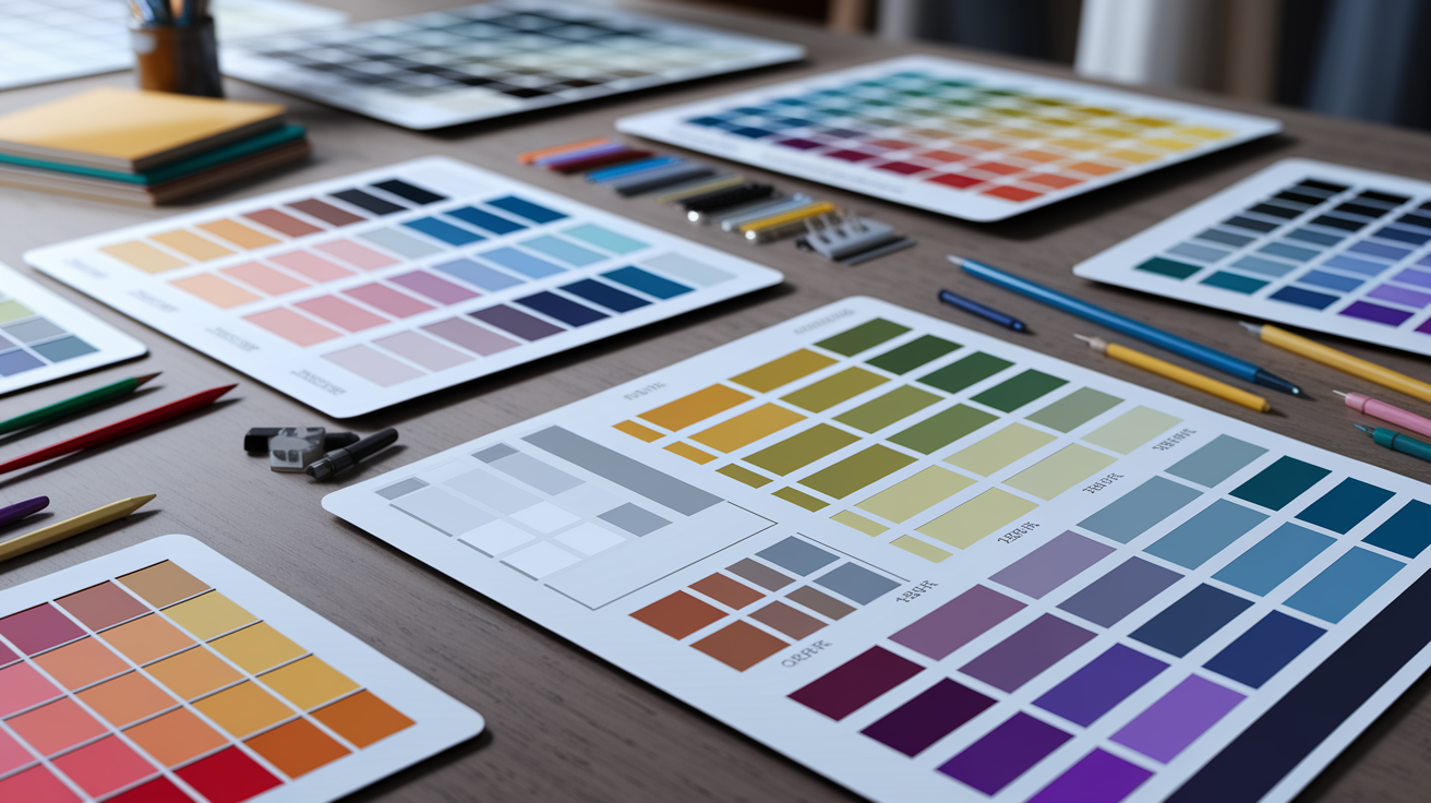
- Break out of the seasonal color trap. Digital color pickers and skin illustrator systems let you map different shades of black skin with far more nuance than Spring/Summer/Autumn/Winter ever could. Build a palette anchored in your actual undertones, not a generic category.
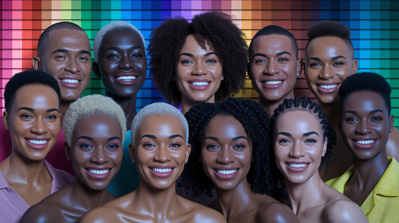
- Treat shades of black skin tone as a rich, continuous spectrum — from warm chestnut and golden brown all the way through deep mahogany to rich ebony skin tone. Every point on that spectrum has its own ideal depth of shade and undertone pairing. Keep a personal black skin tone chart with swatches and notes so your choices stay consistent across makeup, fashion, and design.
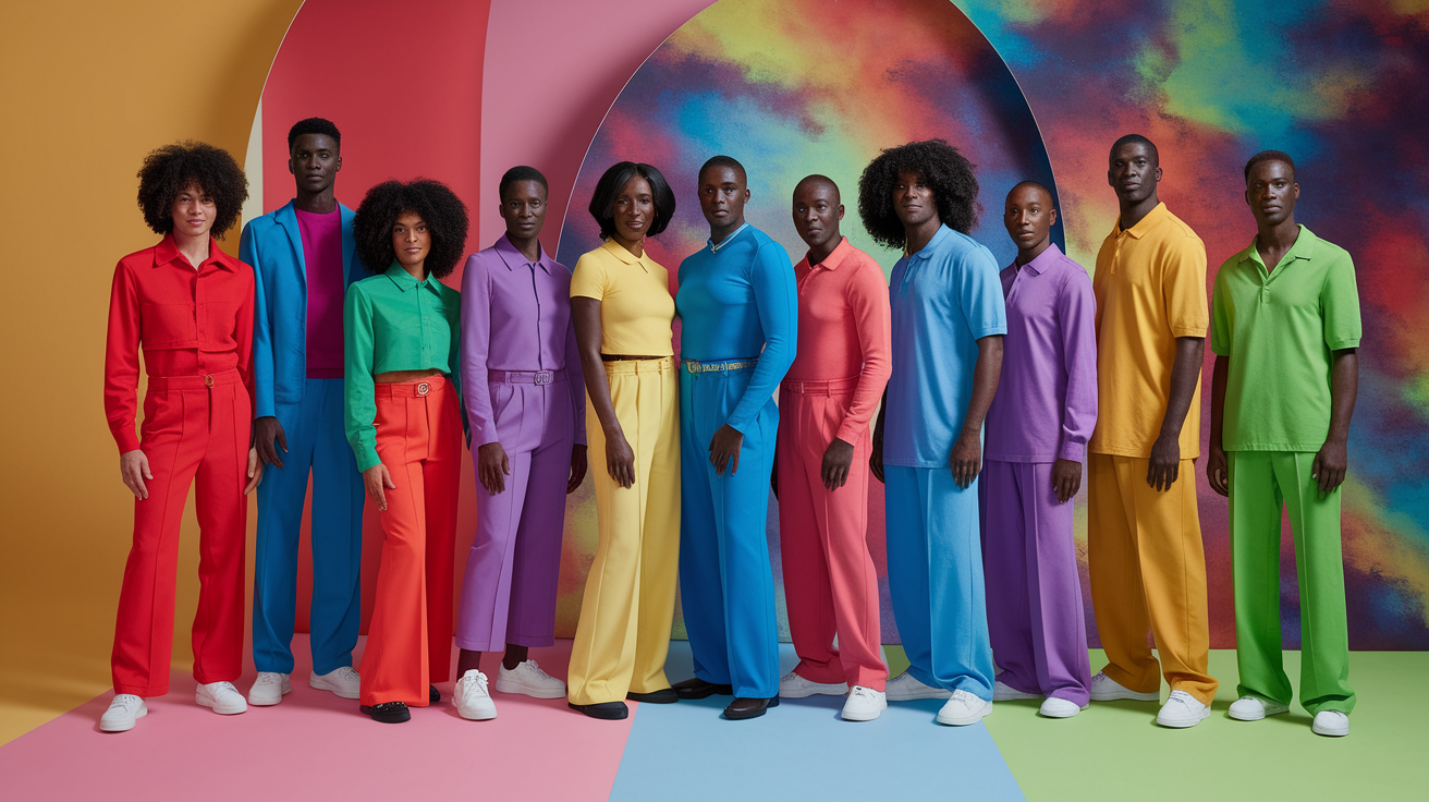
- Build a wardrobe of core neutrals, rotating accent colors, and two or three high-impact statement shades. The best colors for dark skin tone always read differently under natural light than under artificial — test outside, log what works, and revisit your palette as your hair color or style direction shifts.
- Retire the old myths. Black skin shades carry extraordinary depth that makes saturated brights, warm earth tones, cool jewel hues, and even select pastels land with full intensity — as long as undertones are leading the decision. The color for dark skin tone that truly elevates your look is the one chosen with precision, not convention.
💫 Discover Your Complete Color Palette
Ready to discover all the colors that make you look radiant? Our comprehensive color analysis will reveal your complete personal palette - perfect for hair, makeup, and wardrobe decisions.
Find My Color Palette →The beauty industry hit a turning point in 2026: AI-powered color analysis tools like Dressika and MyBestColors now deliver professional-grade results for $15–$30 lifetime — a fraction of what a $200 in-person consultation used to cost. For anyone navigating the full spectrum of black skin tones, this is a game-changer. We're no longer guessing which colors look good on dark skin — we're mapping the entire dark skin color palette with digital precision, from warm ebony to cool deep mahogany. Whether you're exploring a black skin tone chart with names, identifying your exact place on the shades of black skin tone spectrum, or hunting for the best colors for dark skin tone that work across cool, warm, and neutral undertones — this guide cuts through the noise. The ebony skin tone is not a single shade; it's a rich, layered range of different shades of black skin, each with its own undertone logic and its own rules for what makes color for dark skin tone truly pop.
The beauty industry hit a turning point in 2026: AI-powered color analysis tools like Dressika and MyBestColors now deliver professional-grade results for $15–$30 lifetime — a fraction of what a $200 in-person consultation used to cost. For anyone navigating the full spectrum of black skin tones, this is a game-changer. We're no longer guessing which colors look good on dark skin — we're mapping the entire dark skin color palette with digital precision, from warm ebony to cool deep mahogany. Whether you're exploring a black skin tone chart with names, identifying your exact place on the shades of black skin tone spectrum, or hunting for the best colors for dark skin tone that work across cool, warm, and neutral undertones — this guide cuts through the noise. The ebony skin tone is not a single shade; it's a rich, layered range of different shades of black skin, each with its own undertone logic and its own rules for what makes color for dark skin tone truly pop.
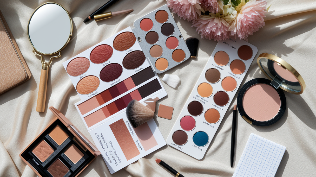
It blankets foundation, concealer, bronzer, blush and highlighter with pigment that remains true in daylight and flash.
Brands now map undertones in finer increments, frequently over 30–60 shades.
To simplify shade selection, this guide demystifies undertone cues, swatch strategies, and finish decisions for everyday and occasion wear.
📚 Recent Articles
Why old color rules fail
OLD RULES WERE CONSTRUCTED AROUND A SKIN-CENTRIC PERSPECTIVE. They focused on light shades, then attempted to 'make' darker skin fit the same matrix. That grid originated from 1980s seasonal systems and their limited palette of color types. It left gaps: few references, shallow undertone maps, and advice that treats depth as destiny.
We need rules that apply modern color theory, global data, and tools that actually read nuance, not stereotypes.
The overtone myth
Surface color changes with sun exposure, skincare, and time. Overtone alone doesn't direct the optimal flattering color palette. Several individuals with dark skin tones may have the same surface depth but appear distinct in that identical red, teal, or beige. The distinction lies in the undertone.
Undertones—yellow-gold, red-rose, olive/green, or neutral—greatly influence the way colors rest on the face. A deep olive undertone may mute with dusty mauve yet gleam with sour-lime or chartreuse or the cool flicker of teal. A red-undertone brown may flourish in blue-reds and berry, highlighting the importance of colour analysis.
For most, warmth, coolness, and saturation matter more than darkness. Overtone-led advice often chooses the wrong base, resulting in foundations that are gray or orange, dull lipsticks, and a flat wardrobe.
One-size charts typically cater to lighter skin initially, then expand. It's essential to apply more than a mirror glance. Try gold vs. silver, white vs. cream, tomato red vs. cherry red, and soft vs. clear tests to determine your unique palette.
Store lighting is designed to flatter products on shelves — not to help you find your actual match. Yellow-tinted bulbs are notorious for making foundations look warmer than they are, which is how the dreaded orange-mask effect happens on deeper complexions. Your safest bet: test between 10:00 and 14:00 in natural daylight, shoot a quick photo against a neutral background, and run it through a digital color picker to cross-reference against a black skin tones chart. If you're shopping in-store, seek out retailers like Sephora that offer Natural Light Stations or UV-simulating mirrors — these tools exist precisely to cut through the distortion of standard retail lighting. Track shifts in eye sparkle, skin texture, and lip definition as you test; the right shade should enhance your dark skin color palette without casting any grey or ashy veil over your complexion.
Beyond seasonal analysis
The four seasons overlook the spectrum of deeply dark skin. They smush too many undertone trails and think dimension is the primary motivator. That results in pigeon-holing and confusion.
Work with fuller color dimensions: value (light–dark), chroma (soft–clear), and hue bias (warm–cool). Clarity is key — high-chroma teal can beat "safe" earth tones for some deep skins, while others look best in softened, smoky hues.
Apply new tools. A Munsell-based approach records hue, value and chroma far more precisely than old-seasonal charts. Digital pickers and skin illustrator systems assist in mapping undertone bands and color harmony on the fly.
Customize. Test swatches near the jaw, neck and chest. Make contrast with your hair and the depth of your eyes. Construct a tiny proven palette not a label.
A spectrum of shades
Dark skin tones are not a monochrome block but a continuum that ranges from tan to medium brown to deep ebony, each with unique undertone blends and brightness requirements. This diversity in dark skin tones calls for a tailored approach in makeup, clothes, and design. For instance, tan olive may require cool greens and blue-based reds, while a deep brown may harmonize beautifully with cobalt and true white.
Each shade within the dark skin tones color scheme demands different considerations. Medium neutral-brown might work best with camel, rose, and spruce, showcasing the importance of a flattering color palette.
| Shade range | Common undertones | Risks | Often flattering choices |
|---|---|---|---|
| Tan to light brown | Olive, neutral, yellow | Beige turns dull | Teal, cool green, raspberry |
| Medium brown | Neutral, yellow, red | Warm nudes go orange | Camel, spruce, blue-red |
| Deep brown to ebony | Red, neutral, olive | Dusty shades look ashy | Cobalt, true white, vivid coral |
Historic systems have often favored light skin, but modern tools like tonal colour analysis and the skin illustrator color system provide improved color maps. A subtle, worldwide approach honors how colours shift across different skin tones, promoting a more inclusive understanding of personal colouring.
Identify your dark skin tone palette
Your dark skin tone palette is essential for personal colouring. Undertone is the main driver in a majority of selections, not depth alone. Combine a few of these easy tests, then record results in a custom chart. Take notes on hue (color family), saturation (intensity), and value (light–dark). The vein trick is hit and miss on deep skin as melanin obscures vein colour, making tonal colour analysis crucial for achieving a flattering color palette.
- Verify undertones via white paper, jewelry, sun reaction, foundation and clothes.
- Combine results; avoid relying on one test.
- Keep warm, cool and neutral signals in your sights. Note red, yellow, olive shifts.
- Keep a running list of colors that compliment or clash.
- Assemble your own chart with shade names, fabric swatches, and brand codes.
- Keep preference central; confidence trumps any system.
1. The white paper test
Hold plain white paper by your face in daylight, next to a window, out of direct sun. The white background cuts visual static, so undertone pops.
If your skin reads golden, peach or red-gold, you lean warm. If it reads blue, red-blue, or a bit pink, you lean cool. If you observe both, or it remains balanced, you could be neutral. Certain deep complexions exhibit olive or teal cast, log that.
This test accounts for yellow indoor bulbs or blue screens that throw off perception. Record an exact note: "Neutral-warm, slight red base," or "Cool with olive cast.
2. The jewelry reflection
Experiment with a basic gold ring on one hand and silver on the other, in natural light. See which metal makes your skin pop fresh, not flat.
If gold adds warmth and glow, that's a warm or neutral-warm hint. If silver sharpens and clarifies, that's cool or neutral-cool. If they both do, you might be neutral. Sprinkle in some rose gold if yellow feels too brash.
Use these cues to select metal finishes on frames, buttons and watch cases. Record your optimal metal in your palette notes.
3. The sun's reaction
Think about what happens in the sun: Do you tan fast, darken slowly, or burn in spots first? Dark melanin usually tans or deepens, peeling sunburn can indicate cooler spots.
Tie this to undertone: steady deepening with a red glow can signal a red base common in many Black skins. Some darker-skinned Asian shades lean less red, so move selections away from excessively blue reds.
Use this for makeup: pick bronzers with red-brown for red-base skins. Go golden-brown if you run olive! Observe the symmetry in your chart.
4. The foundation swatch
Stripe 3 – 5 shades along the jaw in daylight. The correct one disappears without a gray line. Ashy = too cool, orange mask = too warm.
Match undertone labels: warm, cool, neutral. Validate what paper and jewelry displayed. Save precise brand, shade and codes for quick re-buy.
5. The clothing drape
Lay fabrics over shoulders: crimson, brick, cobalt, teal, mustard, olive, fuchsia. Be careful with your face. Bright==good, dull/gray=no.
Warm undertones such as tomato red, marigold, warm teal. Cool undertones tend to prefer cobalt, berry, blue-red. Neutral takes care of the broader range at mid saturation.
Seasonal systems (spring, summer, fall, winter) provide assistance, but consider them as suggestions, not mandates.
Then apply hue, saturation, and value adjustments to refine. Pure, high-sat colors do look amazing on so many dark shades, just be careful to shift the value so the color doesn't overpower. Choose what feels right, comfort is key.
The black skin tone chart
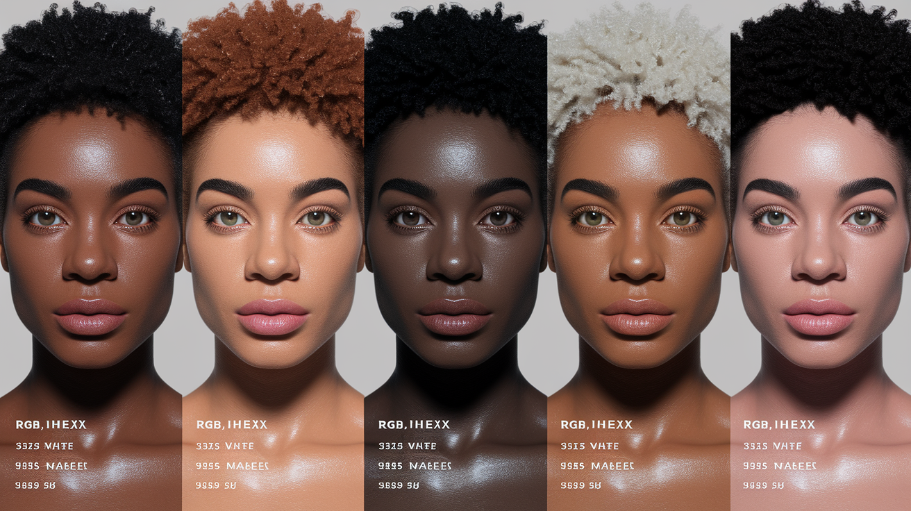
A hands-on resource that charts the spectrum of dark and black skin, great for selecting cosmetics, designing palettes, and arranging lighting. It is varied–one palette can't represent all tones, and most charts contain between 5-6 different shades.
Most artists skew toward the red side of the wheel to mimic how many black skin tones have a redder undertone than darker-skinned Asian tones. Anticipate trial, swatch tests, and tweaks – personal experience goes a long way.
| Shade Name | Hex | RGB | Tone note |
|---|---|---|---|
| Brown Coffee | #4D2A22 | 77, 42, 34 | Deep neutral-warm base |
| Royal Brown | #5E372E | 94, 55, 46 | Rich mid-deep with red cast |
| Bole | #714137 | 113, 65, 55 | Warm brown, soft shadow |
| Emberwood | #93503F | 147, 80, 63 | Red-leaning medium-deep |
| Sahara Rose | #B56D5E | 181, 109, 94 | Medium with pink-red hint |
| Terra Umber | #704034 | 112, 64, 52 | Neutral shadow for depth |
| Clay Copper | #945140 | 148, 81, 64 | Warm highlight on deep skin |
| Mocha Root | #5B3027 | 91, 48, 39 | Contour on medium-deep |
| Brick Cedar | #803F2D | 128, 63, 45 | Warm midtone mixer |
| Russet Spice | #B86E55 | 184, 110, 85 | Bridging tone with warmth |
| Chestnut Glow | #D38267 | 211, 130, 103 | Lighter accent, use sparingly |
| Sunset Peach | #E89376 | 232, 147, 118 | Lightest reflector, rare on skin |
| Bark Sienna | #704034 | 112, 64, 52 | Alternate neutral shadow |
| Deep Mahogany | #3E1911 | 62, 25, 17 | Line work and deepest contour |
| Cocoa Brick | #93503F | 147, 80, 63 | Redder mixer for accuracy |
Note: lighter shadows are used less than midtones. Test under daylight (5,500–6,500 K). Designers, makeup artists and illustrators can sample these codes, then adjust for undertone.
Cool undertones
Cool undertones reveal blue, pink or purple underneath the skin.
- Veins look blue or violet
- Silver jewelry pops more
- Sun leaves rosy flush, not golden tan
- White tees look crisp, not yellowed
Choose palettes with navy, cobalt, eggplant, plum, raspberry, cool red and charcoal. For foundation, search for "C" or "CN" tags. Sample shades around #93503F or #B56D5E with a cool bias. Lip picks: berry, wine, blue-red. Test against daylight, not warm indoor bulbs.
Warm undertones
Warm undertones have yellow, golden or peach notes. Green veins, gold jewelry looks right and skin tans with ease.
Choose oranges, marigold, saffron, caramel, warm reds and chocolate browns. Foundation marked "W" or "G" blends easily. Blends around #803F2D, #B86E55 or #D38267 tend to fall. Blush in terracotta or brick. Lips in warm red, rust or cocoa.
Neutral undertones
Neutrals are a balance of warm and cool, and may be difficult to categorize. Gold and silver both compliment, so that's a good indicator.
Use versatile palettes: forest, teal, taupe, rose-brown, and tempered reds. Avoid extremes such as icy lilac or neon orange. Select foundations labeled 'N', test between #5E372E and #704034. Mix two colors for seasonal transitions.
Olive undertones
Olive undertones reveal a gentle green or gray wash. Some hues go drab on olive skin, so be choosy, and beware of interior lighting.
Earthy tones, muted greens, teal, garnet and sapphire all tend to sing. Search for olive-friendly bases with golden-olive markings. Blends in the vicinity of #4D2A22, #5B3027 and #714137 work. Lips and cheeks, brick rose, fig or burnt coral.
Building your color palette
A custom palette that resonates with dark skin tones complements by balancing contrast, depth, and glow, effectively crafting a flattering color palette that shines in everyday sunlight.
- Examine your coloring in daylight by a window. Notice how lips, eyes, hair and skin tone changes. Forget the vein trick – a lot of dark colors slant red or yellow, not just blue or green.
- Weigh three key factors: undertone (warm, cool, neutral), value (light to deep), and chroma (soft to vivid). These determine the way any one color acts on you.
- Begin with a base for each grouping—neutrals, accents, power. This anchor continues to hold the mix together as you start introducing shades.
- Test colors on your face, not your wrist or a screen. Progress through shade families, your skin tones are not sequential, thus one-size charts lack subtlety.
- If you employ "seasons" consider it a loose guide. Spring/summer/fall/winter can ignite inspiration but rigid categories never work for deeper skin.
- Build a simple chart: columns for neutrals, accents, power; rows of makeup, clothes, and accessories. Build your palette. Add swatches or photo snaps for immediate use.
- Edit frequently. Style, hair color and mood change, your palette should evolve with them.
- Strive for confidence and comfort. Logic assists, but how you feel in the color counts the most.
Core neutrals
Choose bases that complement and highlight, not mute. Experiment with chocolate brown, espresso, camel, taupe, beige, sand, charcoal and deep gray. Try each at your jaw; the right neutral sharpens edges without stealing light.
Utilize these as base layers. Suits, knits, bags, and everyday makeup—think chestnut liner, cocoa contour, soft-beige highlight. They make color decisions effortless on hectic mornings.
Look for contrast that feels peaceful. For very deep skin, graphite or pitch brown comes across crisp. For medium–deep, camel or stone can lift. Steer clear of chalky beiges that gray out your glow.
Bring color chips or fabric swatches. Snap 'em in daylight and indoor light for store checks.
Accent shades
Choose bright notes that spark interest: royal blue, ultramarine, burnt sienna, turmeric, magenta, fuchsia, aubergine, viridian. They give simple looks lift.
Spice with context. Cool brights for office lights, warm reds and oranges for golden evenings.
Log it in your chart. Remember which lip, scarf, or nail shade attracted compliments. Over time patterns emerge.
Balance is essential. One accent at a time can look crisp and clean.
Power colors
Find high-impact shades that make your skin pop: sapphire, emerald, bright coral, electric purple, vivid jade. Save them for statement coats, gowns, suiting or a signature lip.
Test in sun, shade and warm indoor bulbs. Certain corals blossom outside but become raucous beneath amber light.
Incorporate your winners into your chart as default selections when you require presence and simplicity.
Common color misconceptions
Color rules for dark skin tones often stem from limited systems initially created for light-skinned models, lacking the necessary subtlety. Understanding undertone, depth, and contrast is essential in tonal colour analysis. The goal is to explore a flattering color palette that truly resonates with your unique appearance.
- Dark skin is not limited to earth tones.
- Bright shades are not "too loud" on deeper complexions.
- Pastels can work; they just need the right undertone.
- Surface tone (brown, golden, yellow) does not define undertone.
- Freckles do not prove a warm undertone.
- Black hair, brown eyes and tan skin does NOT = Deep Autumn.
- Not all people of color are Winters.
- Traditional seasonal analysis may miss deeper complexions.
- Color analysis is for everyone, not just fair skin.
- Greens and blues are a cinch to confuse. Test under daylight.
- Undertone is complex; no single formula fits all.
- Try colors from every "season" before you decide.
The winter myth
The concept that only "winter" colors look great on dark skin is old school. Icy blue and optic white and jet black can look sharp, sure, but it's not the only lane. Warm hues such as saffron, coral, and tomato red pop on cooler undertones when the saturation is just right.
Pastels—lavender, mint, and powder pink—can sing, if they're clean rather than dusty. Soft peach on olive-leaning skin, or lilac on cool-brown skin, often appears fresh rather than flat. Winter palettes can box out joy. It eclipses rich gold, marigold, terracotta and tea-rose – and bounces over playful shades like pistachio or sky.
Deep-skinned folks aren't all Winters anyway, and seasonal designations based on fair-skin data can misdirect. Try across seasons. Experiment with cool magenta one day, warm apricot the next. Remember, save what illuminates your face, not the chart.
Bright color fears
Bright colors aren't 'too much' for dark skin; in fact, they can be the sweet spot. Fuchsia, turquoise, cobalt and electric orange edge accessories and highlight eyes and lips. A bright teal will cause brown eyes to sparkle. Hot pink can elevate cool undertones, while burnt orange suits many neutral-warm combinations.
For balance, mix brights with neutrals like charcoal, navy, cream or cocoa. Use bright accents if a full look feels bold: a scarf, a lip, a shirt collar. Verify color in natural sunlight (by a window, near noon). Close blues and greens are difficult for most people to distinguish, so get outside and compare.
Muted shade mistakes
Defaulting to dusty tones? Too-soft mauve, taupe, or gray-beige can appear ashy, particularly in cool indoor lighting. If you love muted colors, ground them. Add depth with espresso, eggplant, forest green, or ink navy.
Mix texture — matte with sheen — to bypass a flat cast. Undertones direct what mute shades play well. Cool undertones: smoky plum, slate blue, blue-gray. Warm undertones: olive, warm taupe, cinnamon rose. Neutral undertones: greige, muted teal, soft blackberry.
Remember that brown or golden surface tones do not promise warmth, freckles aren't evidence either. Science is tricky and subjective, foundations now accommodate every tone, but the ultimate measure remains how the shade tests on you in natural light.
Technology and your palette
Digital tools construct a dark skin tone palette that works in reality, not merely on screen. They tinker, gauge, and monitor how colour plays on your skin through light, camera, and fabric. They keep your palette fresh as seasons, practices, and flavors evolve.
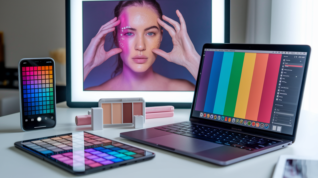
Color pickers, apps, and online charts do speedy right-on picks. Employ a top-rated color picker featuring CIELAB readouts to sample from a close-up, high-resolution photo of your bare skin around the jaw, inner wrist, and collarbone. Cross-check samples against the Munsell Colour System to map hue, value, and chroma with a common language you can employ across brands, ensuring that you find the most flattering color palette for your unique features.
Parametric color systems take it another step by defining math links between colors instead of absolute swatches, so your warm red-brown can morph to dawn light, indoor LED, or shade without the vibe getting lost. Multidimensional approaches matter here: a strong palette often tracks 5–7 variables—hue, value, chroma, undertone, overtone from surface effects, translucency, and lighting context, which is especially important for different skin tones.
Snap your skin in alternate light to actually glimpse real shifts. Shoot in shade, noon sun, overcast, and indoor LED 2700K and 4000K, carrying a neutral gray card. This records metameric shifts—how two colors will match in one light, but diverge in another.
By capturing images under controlled, standardized illuminants (D65, A, etc.), apps can develop compensation algorithms that anticipate and counteract these alterations. It shows how skin transitions from shadow to highlight with shifts in color, not just darker or lighter values—often cooler in shadow, warmer and redder in highlights.
Top-end tools can analyze the skin's "double-peak" reflectance curve in green-yellow (550-580 nm) and red (620-700 nm), which informs picks for blush, bronzer, and fabrics that mirror natural warmth. Experiment with virtual try-on for makeup and clothes before purchase, ensuring you select shades that complement your dark features.
Great platforms imitate translucency, which is key for realistic output on dark skin because light penetrates and reflects, not only on the surface. Search out engines that simulate subsurface scattering and enable custom undertone input. Try base tones by your jaw and chest, then exchange lip and eye colors to catch how tiny tonal nudges move the entire ensemble.
Add fabrics: copper satin, olive cotton, cobalt knit. See which tones survive cool and warm presets. The unseen sections of the spectrum—near‑infrared and UV—influence how cameras and displays portray skin, so anticipate slight variations between devices.
Stop guessing and start building a system that works. Use Smart Wardrobe Apps to photograph and catalog every piece you own by Hex code — then map those codes against your personal dark skin color palette to instantly spot gaps and redundancies. Tag each swatch by season and lighting condition, revisit your data every 3–6 months, and let the patterns guide you. The 2026 tech stack makes it easier than ever to identify the best colors for dark skin tone with precision, whether you're cross-referencing a black skin tone chart with names or fine-tuning colors that look good on dark skin across different undertones. Track your wins, your near-misses, and the outliers — let the data sharpen your eye, not replace it.
Conclusion
To sum it all up, a great palette for dark skin begins with real life references. Sun bronzed cheeks. Brass in earrings. An elegant scarf illuminating the face. Tiny experiments trump ancient commandments. A stroke of coral gloss. A sleek navy tee. With a jade liner. See what enhances your tone, then expand off that.
Trends change. That way, your skin remains sumptuous and vibrant. Let technology assist, but trust your eye in daylight. Maintain a record of effective shades. A photo log really assists. Turn colors like season, mood and light. Have a couple of staple combos for work, nights on the town and lazy days.
Prepared to sample the following color? Post a swatch, pose a question, or leave your successes. Let's construct your palette together.
Frequently Asked Questions
What is a dark skin tone palette?
A dark skin tone palette is a curated set of colors that harmonize with deeper complexions, featuring dark colours and flattering color palettes. It includes neutrals, bolds, and accents appropriate to your undertone and depth, achieving balance and radiance through fashion and makeup choices.
Why do old color rules fail for dark skin?
The old rules stemmed from restricted skintone research and reductive colour theory, often neglecting dark skin tones and their unique palette. Newer palettes consider melanin-rich skin, lighting, and style, offering greater precision and more aesthetically pleasing results.
How do I find my undertone?
Examine your skin in natural light to determine your personal colouring. Observe your veins; greenish veins often indicate a warm undertone, while bluish or purple veins suggest a cool tone. Testing against white versus cream fabric can help verify your unique palette.
What is the black skin tone chart?
It's a cheat sheet displaying an array of dark skin tones color schemes by depth and undertone. It lets you determine your place along the continuum. Leverage it to select foundations, flattering color palettes, clothing colors, and lip shades that complement your unique palette.
Which colors usually flatter dark skin?
Jewel tones like emerald, sapphire, and amethyst pop beautifully against different skin tones. Rich earth tones, including burnt sienna, mustard, and deep reds, work great for a flattering color palette. Crisp white and true black provide excellent contrast.
Are there colors dark skin should avoid?
No colour is taboo when considering different skin tones. Pay attention to undertone and saturation, as super ashy or muted pastels can wash out certain tones – instead, work with deeper accent colours for a flattering colour palette!
How can technology help me build a palette?
Try shade-matching apps and camera color analysis for different skin tones, including dark skin tones. Contrast results in natural and indoor light, and save swatches to create a flattering color palette that complements your unique palette.