Neutral Skin Tone Colors: What to Wear and How to Test Them
 Reviewed by Alexandra Gilmore
Neutral skin can wear warmth and coolness, but your depth, contrast, and slight directional lean still decide which versions work best. Compare oatmeal and cocoa with soft white and charcoal, then test coral, teal, berry, and blue-green to build a wardrobe beyond the unhelpful idea that everything suits you.

A neutral skin tone can wear both warm and cool colors, but that does not mean every shade works equally well. The most useful palette is built by finding your neutral direction, then adjusting for skin depth, feature contrast, and color intensity. Someone who is neutral-warm may prefer oatmeal, cocoa, coral, and teal. Someone who is neutral-cool may look clearer in soft white, charcoal, berry, and blue-green.
This guide is about clothing colors for neutral undertones. It also shows how to test those colors without relying on a single vein, jewelry preference, or phone photo. If your result stays unusually muted or foundation repeatedly turns orange, compare neutral with olive before settling on a label.
Key Takeaways
- Neutral means warm and cool effects are relatively balanced, not absent.
- Build a palette with controlled fabric comparisons rather than one shortcut test.
- Separate color temperature from depth, intensity, and outfit contrast.
- Neutral-warm, true neutral, and neutral-cool are useful working directions.
- A muted gray-green cast may point toward an olive result, which can itself be warm, cool, or neutral.
🎨 Take Your Color Analysis Quiz
Ready to discover your complete color palette? Take our comprehensive color analysis quiz to identify your seasonal type and get personalized color recommendations that perfectly complement your natural features.
Take Color Analysis Quiz →To compare this result with another established color-analysis guide, continue with the companion article “Dark winter color palette: a complete guide”, which keeps the two closely related questions distinct.
📚 Recent Articles
What a Neutral Undertone Means
Human skin color comes from several visible contributors, including melanin and blood-related color in the skin. DermNet's overview of hair and skin color explains the biological sources of visible color, but a personal color-analysis label is a practical description of visual harmony, not a laboratory measurement. Neutral is the label used when neither distinctly golden warmth nor distinctly blue-pink coolness dominates the comparisons you make.
That balance can occur at any skin depth. Very fair, light, medium, tan, brown, and deep complexions may all read neutral. Surface color can also vary independently. A neutral person may flush pink, tan golden, have visible blue veins, or show several vein colors. Those details may influence appearance without giving a complete undertone result.
Think of neutral as a center area rather than a single point. One person sits near the warm edge of that area, another near the cool edge, and another is balanced enough that temperature matters less than softness or contrast. These are working observations, not permanent rules. Their purpose is to make shopping and outfit building more consistent.
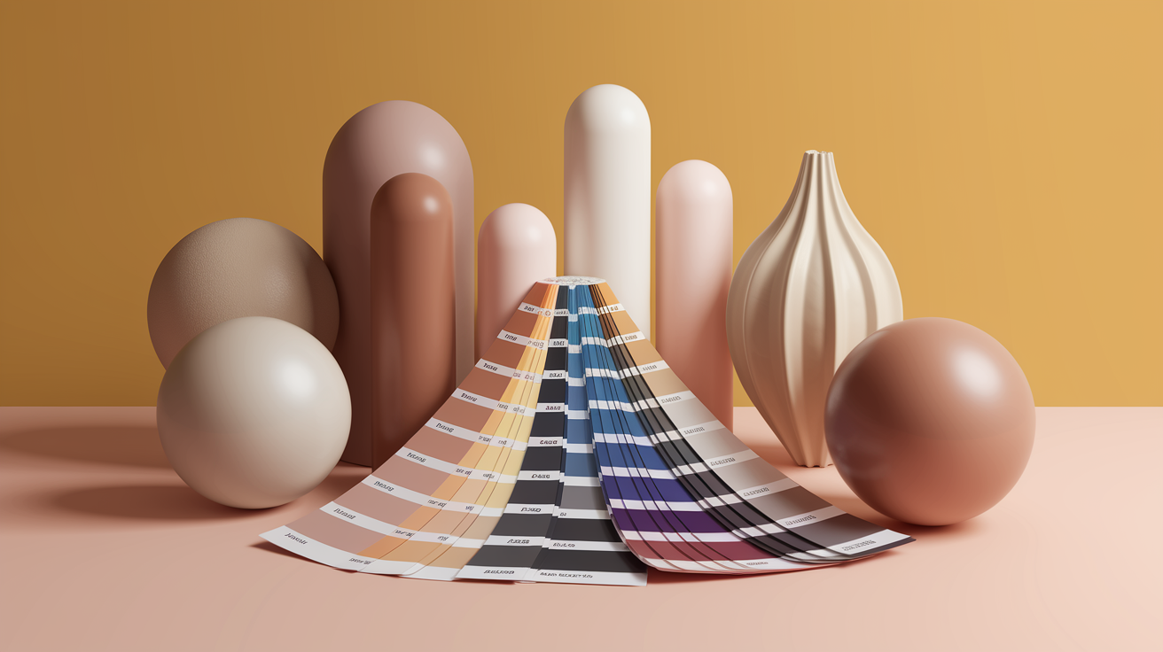
Neutral Undertone Is Not the Same as Neutral Clothing
A neutral undertone describes the color direction of your complexion. Neutral clothing means colors such as white, gray, beige, navy, brown, and black that are often used as wardrobe foundations. The two ideas overlap in name only. You can have a neutral undertone and still find that a particular beige makes you look dull or that pure black is too strong.
Every wardrobe neutral has temperature, depth, and intensity. Ivory is usually warmer than optic white. Mushroom can lean pink, green, or brown. Navy can be inky and cool or softened with teal. Camel may be golden, peachy, or muted. Treating these colors as universally safe hides the exact differences that matter near the face.
Start with two or three foundation neutrals that support your coloring. A neutral-warm wardrobe might use cream, taupe, olive-gray, and chocolate. A neutral-cool wardrobe might use soft white, dove gray, charcoal, and cool navy. A balanced neutral wardrobe can bridge both groups, especially when colors are neither extremely yellow nor extremely blue.
A Practical Neutral Skin Tone Color Palette
The table below is a starting palette, not a list of guaranteed winners. Compare neighboring versions. If rose works but icy pink does not, the difference may be softness rather than warmth. If teal works but emerald feels severe, depth or contrast may be the deciding property.
| Color role | Neutral-warm starting points | Balanced-neutral starting points | Neutral-cool starting points |
|---|---|---|---|
| Light neutrals | Oatmeal, cream, warm stone | Soft white, greige, light taupe | Pearl, dove gray, cool beige |
| Dark neutrals | Cocoa, olive-brown, warm navy | Espresso, charcoal, classic navy | Blue-charcoal, ink, cool espresso |
| Reds and pinks | Terracotta rose, coral, brick | Muted rose, watermelon, balanced red | Berry, raspberry, blue-red |
| Greens and blues | Moss, petrol, warm teal | Jade, medium teal, denim | Blue-green, pine, slate blue |
| Yellow and purple | Soft mustard, aubergine | Muted gold, plum | Citron-gray, violet, wine |
Use the colors as families. A warm teal can be adjusted lighter, deeper, clearer, or more muted. The best version is the one that keeps the face looking even and present. If people notice the garment before they notice you, try reducing its intensity or repeating a related color elsewhere in the outfit.
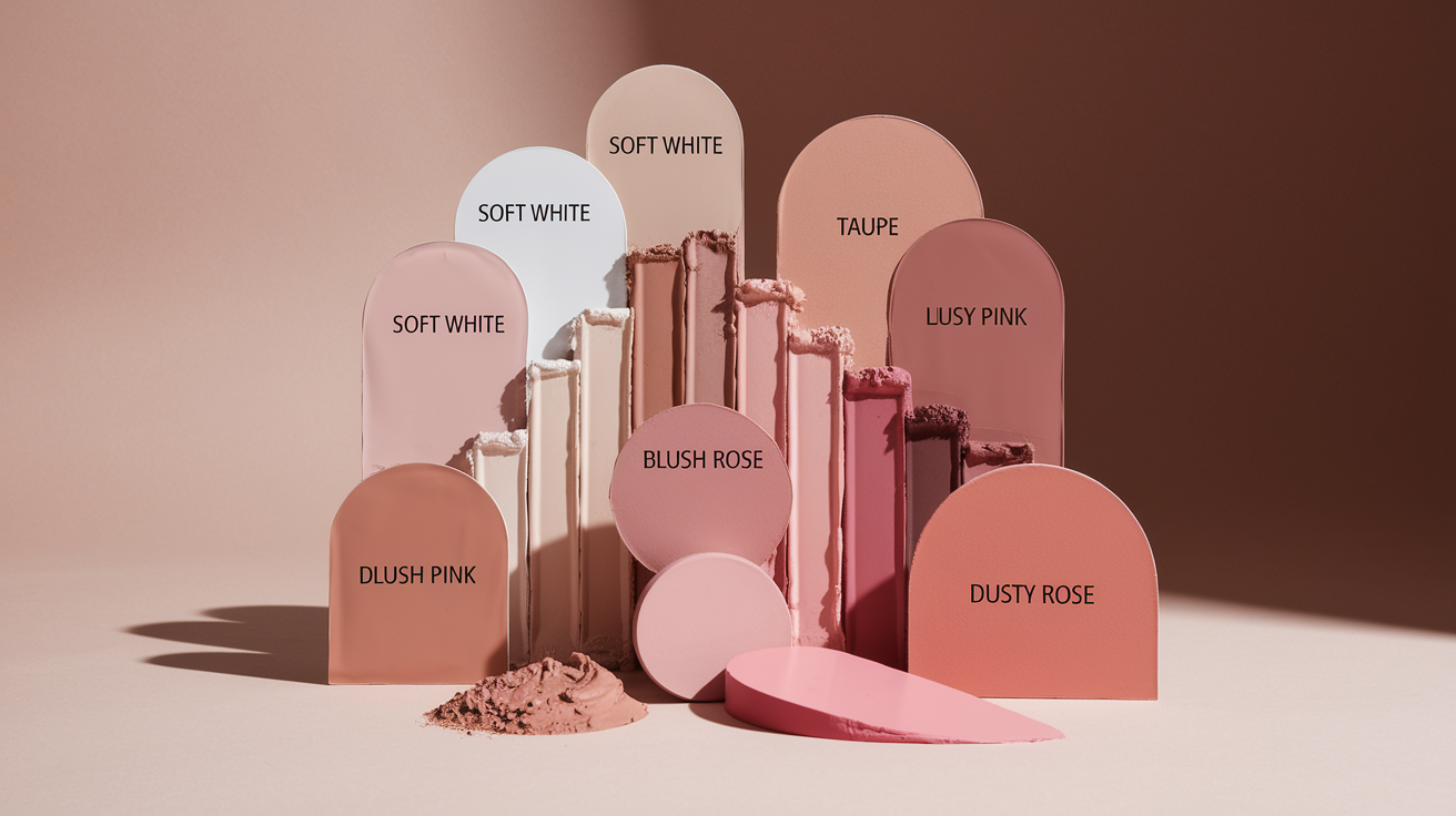
Neutral-Warm, True Neutral, or Neutral-Cool?
Neutral-warm coloring usually handles a little yellow, peach, or earthy warmth before the face looks sallow. Warm stone may work better than blue-gray, cream better than stark white, and coral better than icy pink. The effect should be healthy and connected, not orange. If warm colors make shadows look stronger, step back toward neutral.
True neutral coloring often has flexibility across temperature. The strongest differences may instead come from chroma and value. Muted rose may beat both orange coral and icy fuchsia. Medium teal may beat both yellow-green and electric cobalt. This is not an inability to choose; it is evidence that another color dimension is doing more work.
Neutral-cool coloring accepts a little more blue, berry, or cool gray before appearing drained. Soft white may work better than cream, raspberry better than tomato red, and blue-green better than yellow olive. Extremely icy colors can still be too sharp, especially when the person's natural coloring is gentle.
These directions can change by color family. You might prefer warm neutrals, balanced greens, and cool reds. Record the actual winning colors instead of forcing every result into one temperature label. A wardrobe is more useful when it reflects repeated observations rather than a theoretical category.
A Four-Pair Draping Check
For a reliable home check, use opaque, matte fabrics large enough to cover the chest. Remove strong makeup, tie back brightly dyed hair if it distracts, and stand in indirect daylight. Turn off indoor bulbs. The camera should not decide the result for you: automatic white balance can change the apparent temperature of a photo, as explained in Adobe's white-balance guide.
- Soft white versus cream. Keep brightness similar. Notice whether cream adds healthy warmth or yellow shadow, and whether white clears the face or makes it look gray.
- Raspberry versus coral. Choose medium-intensity versions. Watch the area around the mouth, nose, and eyes rather than judging whether you like the color.
- Blue-green versus yellow-green. Compare teal or pine with moss or olive at a similar depth. This pair is often more informative than jewelry.
- Cool taupe versus warm camel. Use this to refine wardrobe neutrals. Camel should not merge into the skin, and taupe should not make the complexion look flat.
Move each fabric into the same position and switch several times. A useful color can make the edges of the features appear clearer, keep the skin more even, and reduce the visual pull of shadows. A difficult color may reflect onto the jaw, emphasize texture, or separate the face from the garment. No single pair should decide the result.
If all four pairs look similar, repeat the test with slightly softer versus clearer versions. You may be strongly neutral, or temperature may simply be less important than intensity. For a diagnosis-focused process, use the separate neutral undertone test, which covers ambiguous signs and common mistakes.
How Depth, Chroma, and Contrast Change the Palette
Depth is the light-to-dark position of a color. A neutral person with light features may feel overwhelmed by head-to-toe espresso even when its temperature is right. A person with deep hair and eyes may need darker anchors so pale colors do not float away from the face. The solution is often a different value, not a different hue.
Chroma describes how clear or muted a color appears. Clear turquoise and dusty teal can have similar temperature but create very different effects. If saturated colors arrive before your features do, soften them. If dusty colors make the face look tired, increase clarity. Neutral undertones exist across both clear and muted coloring.
Feature contrast is the relationship between the lightest and darkest visible features. It helps decide whether outfits should use strong value jumps or gentle ones. The high-versus-low contrast guide gives a repeatable test. Use that result to arrange your neutral palette rather than replacing the palette itself.
| If this happens | Likely adjustment | Example |
|---|---|---|
| The hue looks right but the face disappears | Increase depth or clarity | Try pine instead of pale sage |
| The color looks harsh around the jaw | Reduce chroma or contrast | Try softened navy instead of black |
| The outfit feels flat | Add a controlled value difference | Pair taupe with cocoa rather than taupe with beige |
| A light color looks chalky | Warm or deepen it slightly | Try pearl or oatmeal instead of optic white |
Colors That Feel Difficult and How to Adjust Them
Bright orange, icy pastel, neon yellow, stark black, and gray-beige are common trouble spots, but the reason differs from person to person. Orange may be too warm, too bright, or too close to the skin. An icy pastel may be too cool or simply too light. Black may be correct in temperature yet create more contrast than the face naturally carries.
Adjust one property at a time. Replace orange with terracotta rose, neon yellow with softened citron, stark black with charcoal, and icy lavender with medium plum. If beige drains you, try taupe, mushroom, stone, or a visibly contrasting cocoa. This approach preserves the color idea while finding a more compatible version.
Placement also matters. A difficult favorite can work as trousers, shoes, a bag, or a small print away from the face. A neckline in one of your reliable neutrals creates separation. Personal color is a tool for controlling visual effect, not a rule that requires you to discard colors you enjoy.
Neutral vs Olive: When the Result Looks Muted
Neutral and olive are not opposites. Olive describes a muted, often gray-green or yellow-green visual cast that can lean warm, cool, or balanced. Some people are accurately described as neutral olive. Confusion occurs because both neutral and olive results may reject extremely warm and extremely cool colors.
Look for a pattern rather than trying to see green directly. Does foundation at the right depth repeatedly turn peach, orange, or pink? Do conventional neutral beiges still look too saturated? Do smoky teal, soft burgundy, mushroom, and complex earthy colors behave better than clean warm-cool extremes? Those observations justify a closer comparison, not an instant olive diagnosis.
Use the dedicated neutral-versus-olive undertone guide for controlled fabric and foundation checks. If olive is already established and you want wardrobe options, the neutral olive color guide owns that palette question. Keeping diagnosis and wardrobe selection separate prevents one article from trying to answer everything.
Build a Wearable Palette From Your Results
Choose two light neutrals, two dark neutrals, three everyday colors, and two accents. Photograph the swatches together in the same daylight used for testing. Then build three outfits: a low-contrast combination, a medium-contrast combination, and one with a stronger accent. Notice which structure feels connected to your features.
For example, a neutral-warm capsule might use cream, warm stone, chocolate, warm navy, petrol, moss, muted coral, aubergine, and soft gold. A neutral-cool capsule might use pearl, cool taupe, charcoal, ink, pine, denim, berry, plum, and silver. A balanced capsule can combine soft white, greige, espresso, navy, jade, rose, teal, burgundy, and mixed metals.
Test purchases against the small palette rather than a season name. If a new garment works with at least two neutrals and one accent, it is easier to integrate. Revisit the palette when hair color changes, your preferred makeup contrast shifts, or you discover that a repeated "wrong" result was caused by lighting rather than undertone.
People Also Ask
What colors look best on a neutral skin tone?
Balanced versions of teal, rose, navy, taupe, jade, plum, soft white, and cocoa are strong starting points. Refine them toward neutral-warm or neutral-cool, then adjust their depth and intensity to match your features.
Can neutral undertones wear both gold and silver?
Often, yes. Metal finish, brightness, size, and the colors around the jewelry can matter more than the metal name. Compare brushed and polished versions near the face before using jewelry as an undertone verdict.
Does neutral undertone mean every color works?
No. Neutral reduces the dominance of temperature, but colors can still be too light, dark, clear, muted, or high-contrast. Personal preference and styling also remain important.
Is neutral skin tone rare?
There is no universal clinical count for personal color-analysis labels. Systems draw their boundaries differently, so claims that one undertone is rare are usually not comparable.
Common Questions: The Ultimate Color FAQ
How can I tell neutral-warm from neutral-cool?
Compare matched pairs such as cream and soft white, coral and raspberry, or moss and pine. Repeat the test in stable daylight. A consistent preference for slightly warmer versions suggests neutral-warm; the reverse suggests neutral-cool.
Why do some neutral foundations still look orange?
The formula may be too warm, too saturated, too deep, or may change after application. Olive or muted undertones can also find standard neutral shades too peachy. Compare equal depths after wear time.
Can a neutral skin tone have surface redness?
Yes. Flushing, irritation, blemishes, and visible blood vessels affect surface color. They do not automatically define the stable undertone, so compare the jaw and neck across ordinary days.
Should I use a white paper test?
A white reference can reveal a strong camera or room-light cast, but it cannot diagnose undertone by itself. Paper brightness, reflected walls, and facial redness can all distort the comparison.
What season has neutral undertones?
Several seasonal categories include neutral-warm or neutral-cool coloring. Season also depends on value, chroma, and contrast, so undertone alone cannot assign one.
Do I need to avoid warm or cool colors?
No. Use your direction to choose versions and placement. A slightly less compatible color can be worn away from the face, broken up with a neckline neutral, or adjusted through texture and print.