Peach vs. Pink Skin Tone: Differences, Tests, and Colors
 Reviewed by Alexandra Gilmore
Peach combines yellow and pink warmth, whereas pink usually points toward a cooler rosy or blue-red direction; cheek redness alone proves neither. Let flushing settle, compare jaw and neck in daylight, and test equal-depth foundations plus coral, cream, rose, and white fabrics to separate them.

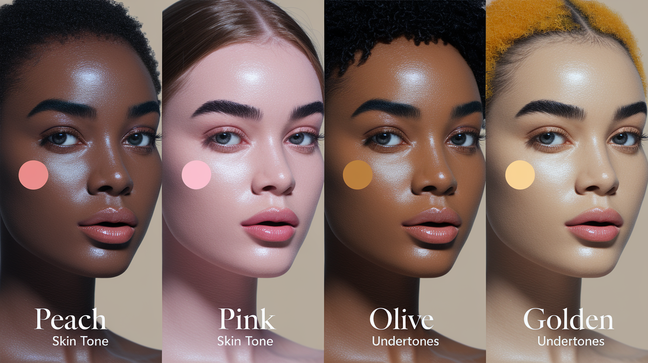
Peach and pink skin tones can look similar, but they usually respond differently to foundation and colors near the face. Peach describes a yellow-pink or golden-rose direction. Pink describes a cooler rosy or blue-red direction. Neither label is a diagnosis, and neither can be confirmed from cheek color alone.
The most useful comparison is controlled: let temporary flushing settle, stand in indirect daylight, compare the jaw and neck rather than the center of the cheeks, and test peach, neutral, and rosy foundation swatches side by side. Then use clothing drapes to see whether warm coral and cream or cool rose and optic white make the face look more even.
Key Takeaways
- Peach is a blended direction. It often combines yellow or gold with a soft pink cast, but beauty brands may place peach shades in warm or neutral families.
- Pink is not the same as visible redness. A stable rosy direction can be part of your coloring; redness that changes by area, day, temperature, exercise, or irritation is a surface signal.
- Foundation gives practical clues. A base that turns gray or too rosy may need more peach; one that turns yellow or orange may need a more neutral or rosy direction.
- Depth and contrast still matter. Peach and pink occur across light, medium, and deep complexions. The same hue may need to be softer, deeper, clearer, or more muted for different people.
- No single home test proves undertone. Use several repeatable comparisons instead of relying on veins, jewelry, nail beds, facial appearance alone, or tanning response.
🎨 Discover Your Personal Color Palette
Ready to discover your perfect color palette? Use our expert analysis to identify the colors that make you look and feel your absolute best. From skin undertones to feature matching, find your ideal color combinations.
Find Your Color Palette →This guide keeps the task narrow: peach versus pink identification, foundation clues, and wearable palettes. If the main question is whether facial redness is a stable styling clue or a changing surface condition, use the dedicated red undertone versus surface redness guide. If you already know that a rosy or red direction is stable, the red-undertone color guide gives a deeper wardrobe and makeup plan.
To compare this result with a neighboring skin-tone question, use the companion article “Unlocking Your Glow: A Guide to Amber Skin Tone Colors”, which keeps the two closely related questions distinct.
📚 Recent Articles
Peach vs. Pink Skin Tone at a Glance
Think of peach and pink as comparison labels, not two rigid boxes. Peach usually reads warmer because yellow or gold is visible alongside pink. Pink usually reads cooler because the rosy cast has less obvious yellow. In real foundation ranges, however, peach can sit under warm or neutral, while a pink tone can appear under cool or neutral. The result of a side-by-side test matters more than the label on one bottle.
| Comparison | Peach direction | Pink direction |
|---|---|---|
| Visual balance | Pink softened by yellow, gold, or warm beige | Rosy, cool red, or blue-red without obvious golden warmth |
| Useful foundation labels | Peach, warm peach, light peach, neutral peach, golden peach | Pink, rosy, cool, cool-neutral, neutral pink |
| Common wrong-base clue | Cool pink base may look gray, flat, or separately rosy | Yellow-heavy base may look sallow, orange, or disconnected |
| Starting clothing drapes | Cream, camel, coral, warm teal, terracotta | Soft white, charcoal, cool rose, berry, blue-teal |
| What can confuse the result | A tan, warm room light, orange foundation oxidation | Flushing, irritation, reflected color, a pink-heavy base |
What a peach direction means
A peach direction has visible warmth plus a rosy component. On one person it may look like light pink-beige with a little yellow; on another it may read as golden rose, copper rose, or warm red-brown. Depth does not decide undertone: fair, medium, tan, brown, and deep complexions can all show a peach direction.
Do not force peach into a single formula. NARS, for example, uses peach descriptions across warm and neutral shades. That reflects how cosmetic labels work in practice: they describe a match within one product range, not a universal skin taxonomy.
What a pink direction means
A pink direction is a relatively stable rosy cast that remains visible when temporary facial color has settled. It may be delicate on fair skin, muted through beige or brown on deeper skin, or balanced enough to sit near neutral. Pink does not automatically mean very cool, pale, or prone to burning.
The key word is stable. If the face looks rosy but the neck and upper chest stay golden, olive, or neutral, the cheek color may not represent the baseline you need for foundation and clothing.
Undertone vs. Surface Redness and Flushing
Color analysis uses undertone as a relatively consistent styling direction. Surface redness is visible color on the skin that may be localized or change over time. Flushing is a temporary increase in color that can appear with heat, exercise, emotion, hot drinks, alcohol, or other triggers. DermNet notes that flushing occurs when blood vessels in the skin dilate, while the NHS lists several everyday and medical contexts for blushing.
This distinction matters because a red cheek can push every test toward pink. Check connected areas: the side of the jaw, the neck, the upper chest, and skin near the ear. If redness is concentrated in the center of the face or changes after a shower or workout, wait and repeat the comparison on an ordinary day.
A styling test cannot explain the cause of redness or identify a medical condition. If redness is new, persistent, painful, itchy, accompanied by eye symptoms, or otherwise concerning, seek appropriate healthcare advice.
Stable rosy direction
- Appears across more than one connected area, not only the cheeks or nose.
- Returns in similar lighting on several ordinary days.
- Produces consistent foundation and clothing results after temporary flushing settles.
Changing surface signal
- Becomes stronger after heat, exercise, rubbing, shaving, exfoliation, or a new product.
- Is patchy, localized, or noticeably different from the neck and chest.
- Changes faster than the rest of the complexion or comes with discomfort.
A Controlled Daylight Test for Peach vs. Pink
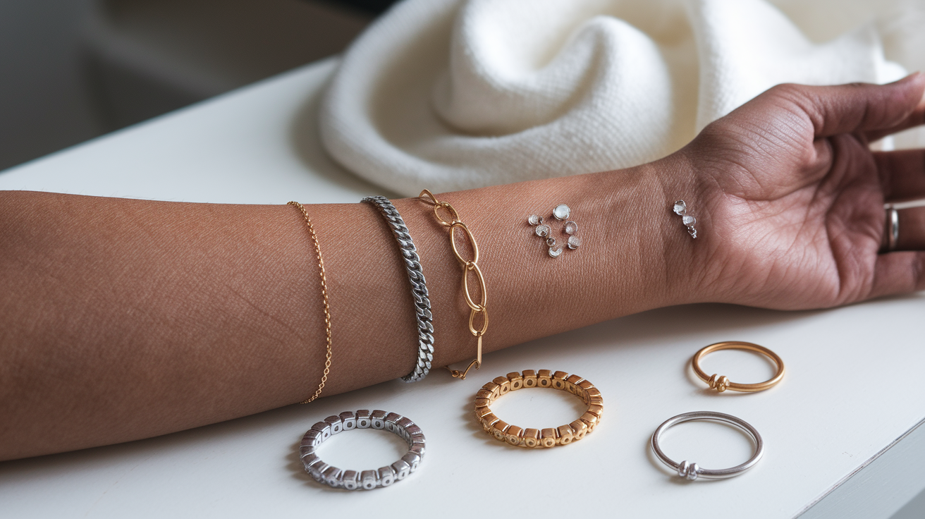
A good test reduces variables. Run it when your skin is calm, not immediately after exercise, a hot shower, sun exposure, shaving, or a strong skincare step. Remove tinted complexion products and wait for any rubbing-related color to settle.
- Choose indirect daylight. Face a bright window or stand in open shade. Avoid direct sun, warm bulbs, colored walls, and a phone beauty filter.
- Use a neutral background. Wear gray, taupe, or a balanced white around the neckline. Pull brightly colored hair or clothing away from the face.
- Compare connected skin. Look at the jaw, neck, and upper chest together. Do not judge from the reddest part of the cheeks.
- Make three equal swatches. Use similar-depth foundations in peach, neutral, and rosy directions. Place them from lower cheek across the jaw so each touches the neck.
- Wait for the formula to settle. Compare immediately and again after the product has dried. A shade can change because of formula, coverage, or oxidation.
- Add two fabric comparisons. Try cream versus soft white, then warm coral versus cool rose. Look for evenness and feature definition, not a dramatic glow.
- Repeat once. A second result on another calm day is more useful than adding five ambiguous tests at once.
Record which swatch disappears most cleanly across jaw and neck. Estée Lauder's official foundation guidance likewise recommends checking the jawline, neck, and décolleté and confirming the result in natural daylight. If the best result changes by formula, trust the specific match rather than assuming the same label transfers between products.
Foundation Mismatch Clues
Foundation is not a laboratory undertone test, but repeated mismatches provide useful evidence. Keep depth and formula similar while changing color direction. A shade that is too light can look gray regardless of undertone; a shade that is too deep can look orange or red. Correct depth first, then compare peach, neutral, and rosy options.
| What you see | Possible issue | Next comparison |
|---|---|---|
| Base looks gray or flat while depth is correct | Too cool, too muted, or missing peach warmth | Try neutral-peach beside the current shade |
| Base looks distinctly pink beside the neck | Rosy direction is too strong, or cheek redness influenced the match | Try peach and neutral swatches across the jaw |
| Base turns yellow or orange | Too much yellow/gold, wrong depth, or formula shift | Try rosy-neutral or neutral at the same depth |
| Face matches but neck looks different | Surface redness, tanning, or a depth mismatch may be driving the face-only choice | Match the connected jaw-neck area and blend strategically |
| Every label behaves differently | Brand and formula naming is inconsistent | Use visual swatches, not the letter code alone |
NARS shade descriptions show why label reading needs context: peach appears in warm and neutral shades, while pink or rosy can also be paired with neutral or cool. For a fuller explanation of label families and brand variation, continue to the foundation undertone explainer.
Best Colors for Peach Skin Tones
Start with colors that repeat peach warmth without becoming orange. Cream, warm taupe, camel, cocoa, teal, coral, tomato red, terracotta, warm navy, moss, and petrol blue make a useful testing set. They are starting points, not mandatory rules.
| Role | Peach-friendly starting colors | Adjustment if the result is off |
|---|---|---|
| Light neutrals | Cream, oyster, warm stone, light camel | Move toward neutral ivory if cream reflects yellow |
| Dark neutrals | Warm navy, cocoa, espresso, soft charcoal | Choose deeper and clearer versions for higher contrast |
| Warm accents | Coral, apricot, tomato, cinnamon, terracotta | Mute with brown or rose if bright orange dominates |
| Balancing accents | Warm teal, petrol, moss, peacock blue | Shift bluer if green reflects strongly onto the face |
| Metals | Champagne gold, brushed gold, copper, rose gold | Try mixed or softer finishes near neutral-peach coloring |
For makeup, compare apricot and warm rose blush, bronze or taupe eyeshadow, and coral, warm red, rose-brown, or terracotta lips. If a warm palette makes the complexion look more orange, keep the warmth but lower saturation or move one step toward neutral.
Best Colors for Pink Skin Tones
Pink coloring often becomes clearer beside cool or balanced colors rather than strongly yellow ones. Try soft white, cool taupe, charcoal, navy, denim, raspberry, cranberry, plum, blue-red, cool rose, pine, and blue-teal. The aim is not to cancel rosy coloring; it is to frame it without adding reflected redness.
| Role | Pink-friendly starting colors | Adjustment if the result is off |
|---|---|---|
| Light neutrals | Soft white, pearl, cool beige, dove gray | Soften bright white if it creates too much contrast |
| Dark neutrals | Navy, charcoal, graphite, cool cocoa | Use smoky versions if black feels severe |
| Rosy accents | Cool rose, raspberry, cranberry, berry, blue-red | Choose deeper or softer versions so color does not echo surface redness |
| Balancing accents | Pine, emerald, blue-teal, periwinkle, cobalt | Move toward muted teal or denim if clear brights overpower |
| Metals | Silver, platinum, white gold, cool rose gold | Try mixed metals for a neutral-pink direction |
For makeup, begin with cool rose or muted berry blush, taupe and charcoal eyes, and rose, raspberry, plum, or blue-red lips. If these colors look chalky, add a little brown, beige, or warmth rather than switching to a fully orange palette.
Adjust the Palette for Depth and Contrast
Undertone chooses a direction; depth and contrast determine strength. A light peach complexion may suit shell, apricot, warm aqua, and soft cocoa, while a deep peach complexion may need rust, petrol, copper, and espresso. A light pink complexion might start with dusty rose, periwinkle, and soft navy; a deep pink complexion may hold cranberry, cobalt, aubergine, and charcoal.
Use your natural feature contrast as a practical control. If hair, eyes, and skin differ sharply, test clearer and deeper combinations. If the features blend gently, test softened colors and smaller value jumps. Someone can share your peach or pink direction and still need a completely different level of color intensity.
Common Peach vs. Pink Mistakes
- Reading the cheeks only. Central facial color is easily affected by surface redness. Include jaw, neck, and upper chest.
- Testing while flushed. Heat, exercise, rubbing, and emotion can change visible color long enough to distort the comparison.
- Calling every peach result warm. Product ranges can use peach within neutral as well as warm categories.
- Calling every pink result cool. A muted or balanced pink direction can sit close to neutral.
- Ignoring foundation depth. Too-light foundation can look gray and too-deep foundation can look orange even when the undertone is reasonable.
- Trusting one shortcut. Vein color, jewelry, white paper, nail beds, tanning, and first impressions all have confounding variables. None should overrule repeatable draping and swatch results.
- Choosing clothes to cancel skin color. Green is not automatically best for a rosy face, and orange is not automatically best for peach. Compare complete color families and their intensity.
Peach vs. Pink Questions
Can peach skin be neutral?
Yes. Peach can describe a visible pink-yellow balance within a neutral foundation family. Brand labels differ, so confirm the specific swatch on your jaw and neck.
Does pink skin always mean a cool undertone?
No. A stable cool-rosy direction is common, but pink may also appear in neutral coloring or as changing surface redness. Use controlled comparisons instead of the word alone.
What if my face is pink but my neck is yellow?
Let temporary flushing settle, then match the connected jaw-neck area. Test neutral, peach, and rosy shades at the same depth. If facial redness is persistent or uncomfortable, treat that as a separate health question rather than forcing it into an undertone category.
Which foundation should I try first?
Start with three similar-depth shades: neutral-peach, neutral, and rosy-neutral. Apply equal stripes across the jaw, wait for them to dry, and check in indirect daylight. The best first match is the one that stays connected to both face and neck.
Can a color analysis quiz settle the comparison?
A photo or quiz can organize observations, but lighting and surface redness still affect the input. Use the color analysis quiz as one data point, then verify the suggested direction with real fabric near the face.
Bottom line: peach usually combines pink with visible yellow or gold, while pink usually reads rosier and cooler. The reliable difference appears through repeated daylight swatches and drapes after surface color has settled. Once that comparison is consistent, choose the peach or pink palette that matches your depth and contrast rather than following a rigid list.