Can You Wear Black in Every Color Season

Black is everywhere. It fills closets, dominates fashion advice, and gets called "universally flattering" so often that most people never stop to question it. But if you've ever slipped on a black top and walked away from the mirror feeling somehow drained, dull, or older than you did five minutes ago, color analysis has a straightforward explanation — and it isn't a coincidence.
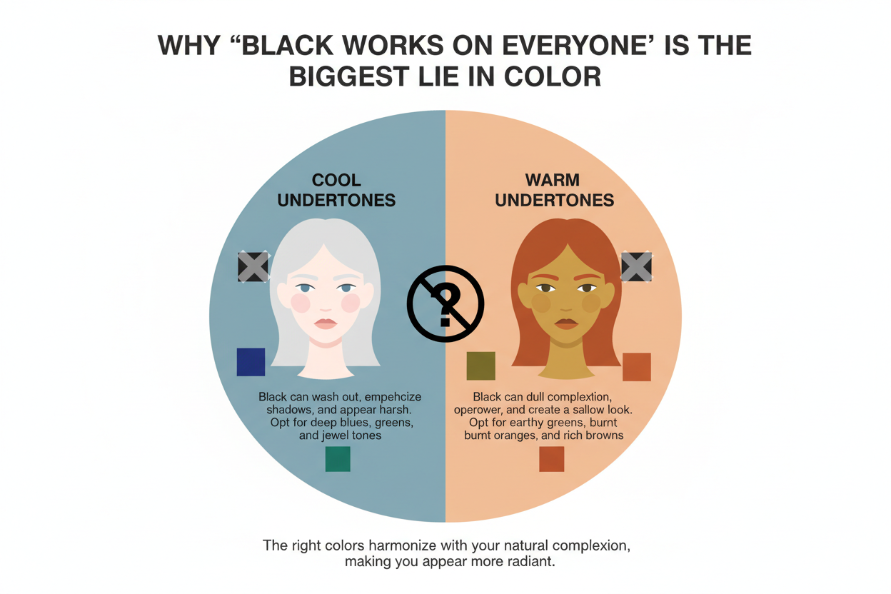
The short answer to whether you can wear black in every color season is: no, not equally, and not without strategy. Color analysis divides people into seasonal palettes — Spring, Summer, Autumn, and Winter — based on the depth, warmth, and clarity of their natural coloring. Black is the deepest, coolest, and most high-contrast shade that exists. That combination flatters some seasons beautifully and works against others in ways that are immediately visible on the face.
Here's what the research consistently shows:
- Black is not a neutral in color analysis the way it is in fashion. It carries strong tonal qualities that either harmonize with your season or clash with it.
- The face-distance rule matters. Where black sits on your body — at the collar or at the ankle — determines how much impact it has on your complexion.
- Summers face the steepest challenge because their palette is built on soft, muted, cool tones that black's intensity directly overwhelms.
- Winters wear black best because their natural coloring mirrors black's depth and contrast.
- Springs and Autumns land somewhere in between, with styling workarounds that can make black functional without it ever becoming their strongest choice.
This article cuts through the "black goes with everything" myth and gives you a season-by-season breakdown of exactly what happens when black meets your natural coloring — and what to do about it. By the end, you'll know whether black belongs near your face, further down your outfit, or swapped out for a shade that does the job better.
Why 'Black Works on Everyone' Is the Biggest Lie in Color
Fashion has repeated "black is universally flattering" so many times it's calcified into fact. It shows up in styling guides, capsule wardrobe advice, and the unspoken logic behind buying yet another black blazer. But repetition isn't evidence — and color analysis makes that gap hard to ignore.
The deeper problem is perceptual. Black has become so embedded in everyday dressing that we've lost the ability to judge it honestly. When something is worn constantly, the eye stops evaluating it. You stop noticing when black is genuinely doing something for a person's face and when it's simply there, unremarkable, quietly working against them. That desensitization is exactly what keeps the myth alive.
Color analysis breaks the spell. It gives you a clear framework — undertone, depth, contrast — for evaluating why a color either lifts a face or flattens it. Applied to black, the framework shows the same thing consistently: black flatters people whose natural coloring already operates at high depth and cool contrast. For everyone else, the relationship ranges from average to actively damaging.
Knowing your color season is the prerequisite for every piece of black-styling advice that follows. If you haven't identified yours yet, the quiz linked throughout this article is the fastest place to start — take the free color season quiz before you shop another black piece.
What Happens to Your Face When Black Doesn't Match Your Season
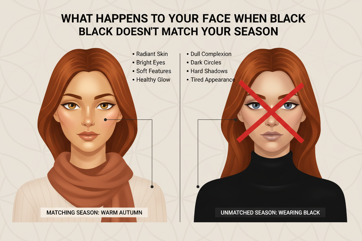
If you've ever put on a black top and felt washed out, tired, harsh, or just slightly off, you weren't imagining it. That's a real optical interaction between black's depth and your skin's undertone and natural contrast level.
Here's what's actually happening:
- Washed out: Black pulls light away from skin that doesn't have much natural depth. Without enough contrast in the face to hold its own, the complexion looks faded rather than framed.
- Tired: Shadow pools under the eyes and around the nasolabial folds when a dark, cool shade near the face amplifies those areas instead of counteracting them. This hits hardest for people with cool but low-intensity coloring.
- Harsh: If your undertones are warm, black's coolness creates a temperature clash. The face can read as ruddy, uneven, or harder than it is.
- "Off" without a clear reason: Usually this means the contrast level of the garment doesn't match yours. Black is maximum contrast. If your natural coloring is medium or soft, the gap reads as discord — something just doesn't fit, and you can feel it even if you can't name it.
None of this is permanent. But it's real, and it happens every time you make the same pairing. The fix isn't to swear off black — it's to understand exactly where and how it interacts with your season.
Which Color Seasons Can Wear Black Closest to the Face
Face proximity is the highest-stakes zone in color analysis. A collar, lapel, or neckline sits directly under the chin and reflects color onto the skin constantly. This is where season compatibility matters most.
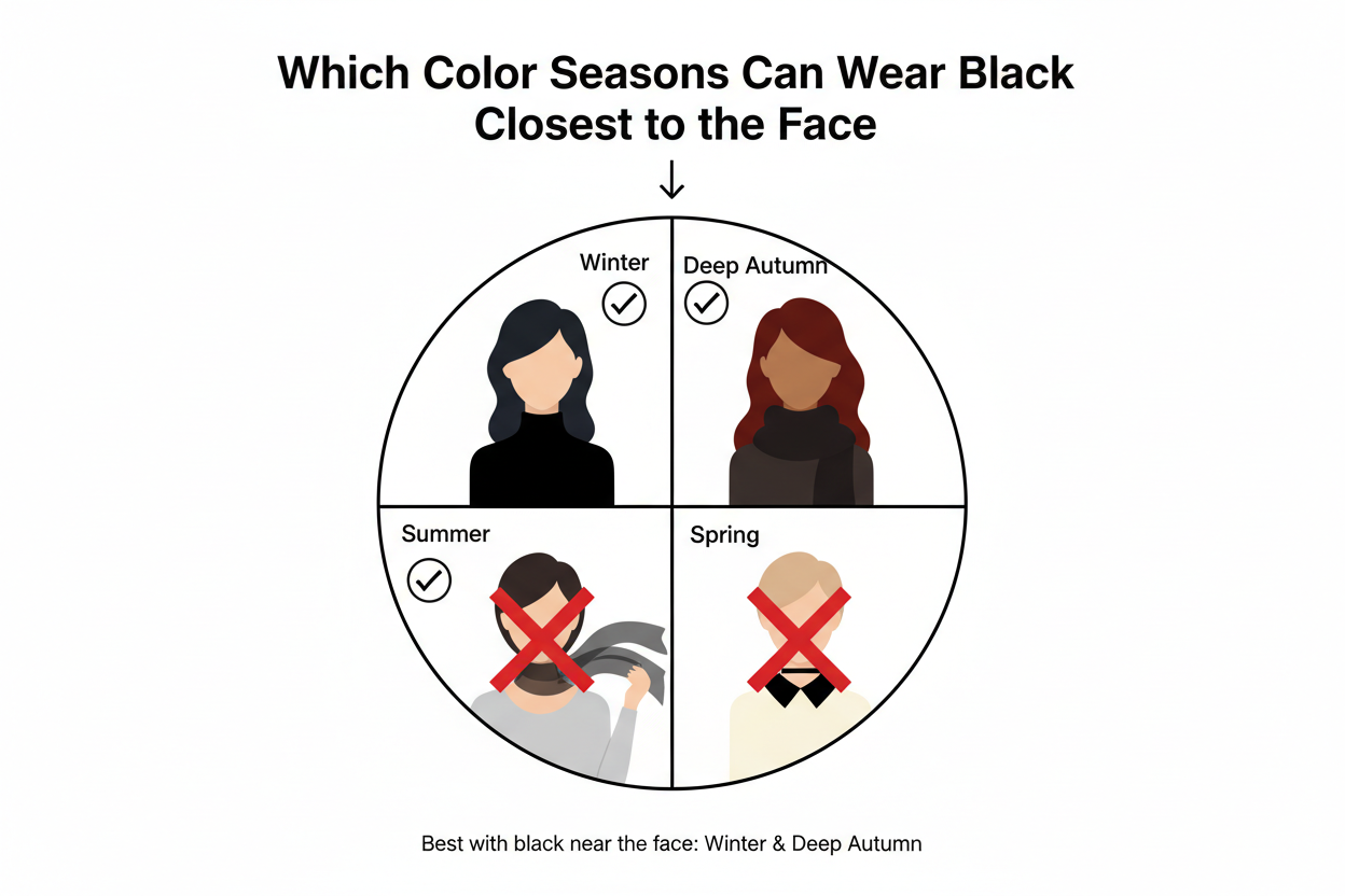
Winters — Black's natural home True Winters have the deepest, coolest, highest-contrast natural coloring of all the seasons. Black near the face mirrors what's already there: depth on depth, cool on cool. A Winter in a black turtleneck looks deliberately composed. No buffering needed.
Springs — Proceed with caution Springs have warm, clear, relatively light coloring. Black's coolness fights the warmth, and its depth flattens the brightness. Worn near the face, it tends to make Spring coloring look tired rather than fresh. A structured black blazer worn open over something warm-toned is more workable than a black crew neck against bare skin.
Autumns — Warmth is the sticking point Autumns have deep, warm, muted coloring. Black is cool — and that temperature clash is the real problem, not the depth. Near the face, it can make Autumn skin read sallow or ashen instead of rich. Dark espresso, chocolate brown, or deep olive give you the depth without fighting the undertone.
Summers — The most debated case
Why Summers Face the Steepest Challenge With Black
Whether Summers can wear black is genuinely contested — and it's contested because Summer palettes are built on principles that black contradicts almost across the board.
Summer coloring is cool but soft. Low-to-medium contrast, blended, muted. The colors that work for Summers share those qualities: dusty rose, slate blue, soft lavender, muted teal. They carry the same diffused, gentle quality that Summer skin and hair naturally project.
Black is the opposite of most of that. It's cool, yes — which gives it a partial pass on undertone. But it's also the most saturated, darkest, highest-contrast shade that exists. Up close to a Summer face, it overwhelms the soft, low-contrast coloring completely. The face doesn't look framed — it looks swallowed. The muted quality that makes Summer coloring beautiful gets extinguished rather than enhanced.
Here's the optical problem: black reflects its own intensity back onto a face, and that intensity just doesn't work with softness. Lower on the body — trousers, shoes, a bag — the impact drops significantly. But at the collar, black and Summer coloring are a persistent mismatch.
How to Style Black for Your Color Season So It Works With You, Not Against You
The goal isn't to eliminate black from your wardrobe. It's to put it where it cooperates with your natural coloring instead of competing with it.
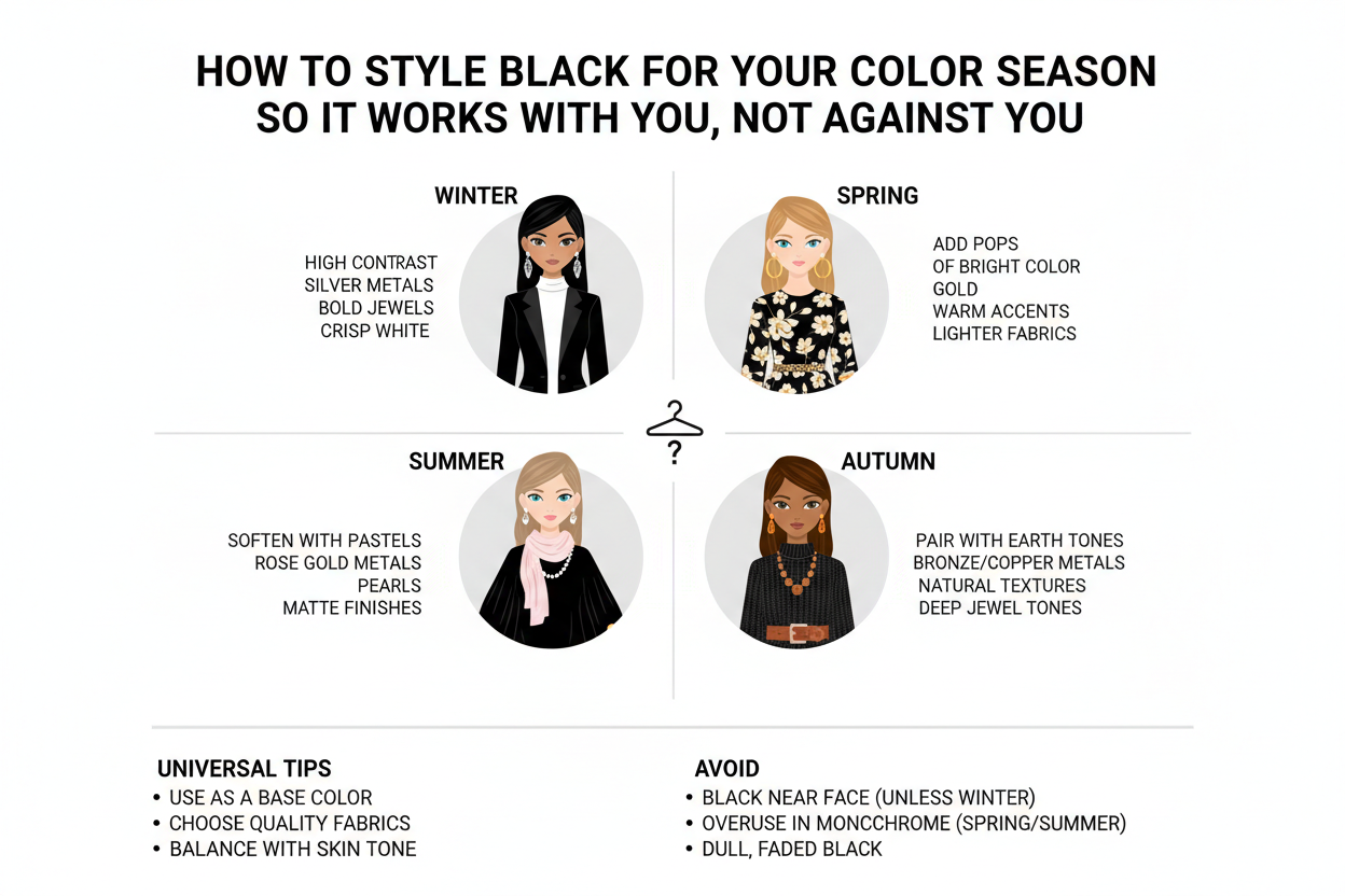
The Face-Distance Rule: Where Black Can Live in Any Outfit
The most universally useful tactic in black styling comes down to one thing: the further black is from your face, the less it has to harmonize with your season.
Black boots, black trousers, or a black structured bag don't interact with your complexion the way a black turtleneck or black blazer does. Distance does real work here. For seasons that struggle with black near the face — Summers, Springs, most Autumns — moving it to the lower half of an outfit is the simplest, most effective adjustment.
Beyond that, here's how each season can make black functional:
Winters No special strategy needed near the face. Wear black wherever it serves the outfit.
Springs
- Keep black away from the neckline
- Pair black bottoms with warm-toned tops in peach, coral, or camel
- Wear black as an outer layer, open rather than closed at the collar
- Add gold accessories to warm the overall palette when black is present
Autumns
- Reach for dark warm neutrals before true black (more on this below)
- If wearing black, buffer it with a warm scarf, an amber or rust-toned layer, or deep burgundy
- Black works better in Autumn outfits as texture — a dark leather belt, a matte ankle boot — than as a garment worn close to the skin
Summers
- Soft charcoal or slate is a noticeably better near-face choice than true black
- Reserve black for shoes, bags, and belts — accessories that anchor without reflecting onto skin
- When black appears in an outfit, pair it with dusty rose, soft lavender, or powder blue near the face as a buffer
- Avoid high-contrast black-and-white combinations, which push the overall look in a direction Summer coloring can't support
When a Stylist Advises Clients to Ditch Black Entirely
Some stylists who work within a color analysis framework keep landing on the same uncomfortable recommendation: for certain clients, black just isn't working — and the sooner they move on from it, the better their wardrobe functions.
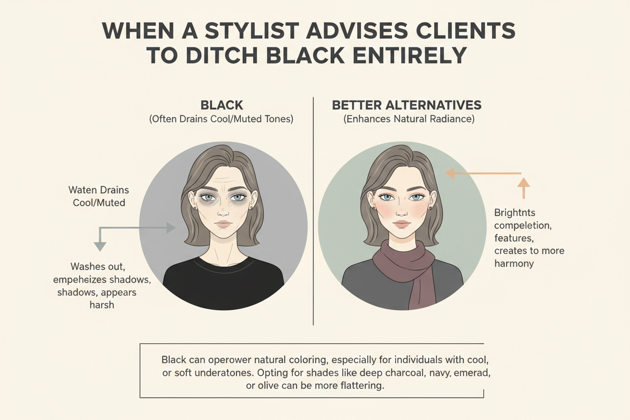
This isn't a blanket ban. It's a corrective to overreliance. Black isn't inherently bad; it's been treated as the default safe choice, and for many clients that default is quietly costing them something they can't quite name. They look put-together on paper but not quite right in the mirror.
Patterns tend to make the case on their own. A client who always reaches for a scarf to warm up a black top, or who reliably gets complimented on the days she wears navy — the evidence accumulates. Recommending she set black aside isn't dramatic. It's just responding to what's already happening. Clients who make the switch often say it felt like finally being able to see their own face in photographs, or like their clothes stopped working against them.
One caveat that matters: none of this applies without knowing the client's season first. A stylist steering a Winter away from black has it completely backwards. The season is always the starting point.
Black Alternatives That Deliver the Same Elegance for Non-Winter Seasons
Black reads as elegant because it's deep, simple, and unambiguous. Those qualities aren't exclusive to black. Every season has shades that do the same work without fighting the coloring underneath.
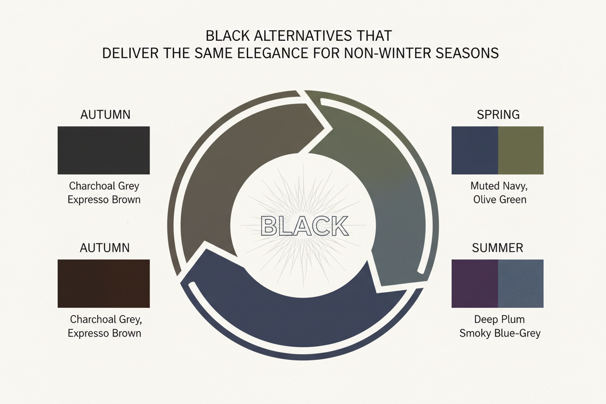
For Summers: Soft charcoal or slate navy These hold the cool, refined quality that makes Summers reach for black in the first place, but at a depth and saturation that doesn't overpower soft coloring. A deep slate blazer looks just as polished as black while letting the face stay present.
For Autumns: Espresso, chocolate brown, or deep olive The visual weight is there — substantial, grounding, serious — without the cool temperature clash. An espresso leather jacket or dark chocolate trousers reads as sophisticated as black while actually working with warm undertones instead of fighting them.
For Springs: Warm camel, deep caramel, or soft navy Springs need warmth even in their darkest shades. Camel and caramel hold the depth of a dark neutral while staying in the warm register Spring coloring requires. When something genuinely dark is needed, a clear-toned navy that leans warm is a better fit than black.
The underlying principle: what people are actually reaching for when they reach for black is depth and simplicity. Those are available in every palette's darkest shades. Black is just the most familiar version.
How to Know Your Color Season Before You Shop Another Black Piece
Everything in this article depends on one foundational step: knowing your season.
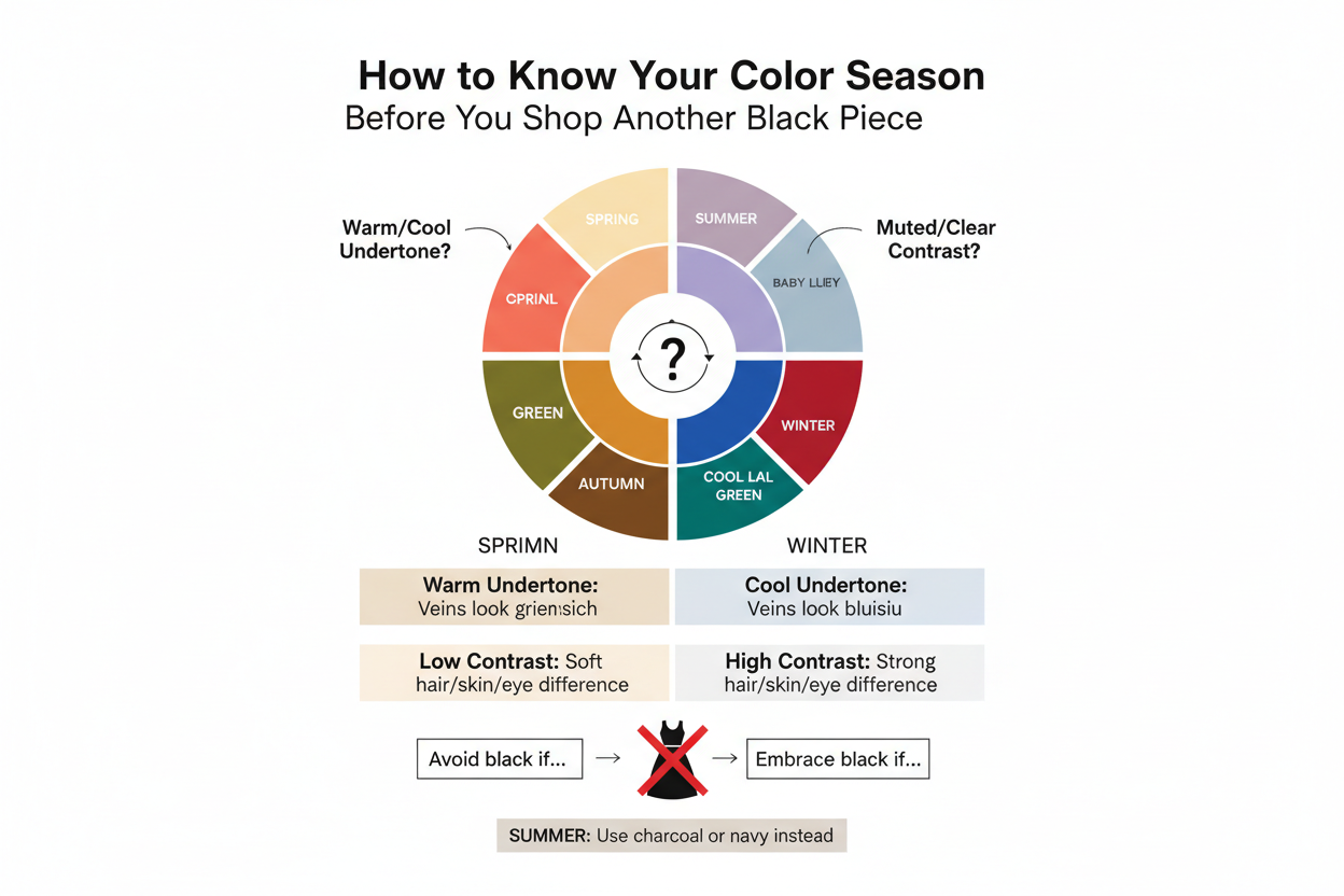
Without it, the advice stays abstract. You might suspect you're a Summer based on what you've read here, or wonder whether you land in Autumn or Winter. Suspicion isn't enough to reorganize a wardrobe or make confident decisions in a fitting room.
The most efficient next step is a structured color season quiz that looks at your undertone, depth, and contrast level together — not in isolation. Those three dimensions interact, and that interaction is what determines your season. Taking the quiz gives you the specific language — Soft Summer, True Winter, Warm Autumn — that makes everything in this article actionable rather than vague.
Once you have your season, the black question stops being abstract. You'll know exactly which strategies apply to you, which alternatives belong in your wardrobe, and whether the black pieces you already own are working with you or quietly working against you.
People Also Ask
Does black look good on every skin tone?
No — and color analysis makes this clear once you look past the marketing. Black's flattering effect depends on how closely your natural coloring mirrors black's own qualities: deep, cool, and high-contrast. People whose coloring already has those characteristics — mostly those in the Winter season family — tend to look genuinely sharp in black near the face. For everyone else, results range from underwhelming to actively unflattering. Warm undertones clash with black's coolness, soft or muted coloring gets overwhelmed by its intensity, and low-contrast complexions lose definition rather than gaining it. Skin tone alone isn't the deciding factor. Undertone, depth, and natural contrast level all matter — and all three need to align with black's properties for it to actually work.
Can Summer color seasons wear black?
This is one of the most debated questions in color analysis, and the honest answer is: rarely well, and almost never close to the face. Summer coloring is cool but soft and low-to-medium contrast — the opposite end of the spectrum from black's intensity. The cool undertone gives Summers a partial compatibility point, but black's depth and saturation still overwhelm the gentle, muted quality that defines Summer coloring. Near the face, the result is a complexion that looks washed out or swallowed rather than framed. Summers who want black in their wardrobe are better off keeping it well away from the neckline — as shoes, a bag, or a belt — and pairing it with soft, cool-toned colors near the face instead.
What color should you wear instead of black if it doesn't suit you?
The right alternative depends on your season:
- Summers do well with soft charcoal or slate navy — shades that carry black's cool, refined quality at a depth that doesn't extinguish soft coloring.
- Autumns can reach for espresso, chocolate brown, or deep olive — warm, substantial darks that deliver the same visual weight without the cool temperature clash.
- Springs are best served by warm camel, deep caramel, or a clear warm-leaning navy when they need a darker neutral.
Every season has a darkest shade that reads as sophisticated and grounding without the conflicts black creates. Finding that shade within your correct tonal range gets you the elegance of black without the cost to your complexion.
How do you know if black washes you out?
The most reliable signal is how you look in photographs rather than under artificial lighting, where black's effects are harder to read. Specific things to look for:
- Your face looks faded or flat rather than defined against the garment
- Shadows deepen under your eyes, around the nose, or along the jawline more than usual
- Your skin tone looks uneven, ruddy, or ashen depending on your undertone
- You feel the urge to add a scarf, a bright lip, or jewelry near your face to compensate — a reliable sign the color isn't doing the work on its own
- You get more compliments on days you wear other colors, especially when those colors happen to be warm or soft
If any of these patterns show up consistently with black, the color is working against your natural coloring rather than with it. That's not a matter of preference — it's an optical interaction tied to your season.
Is black a neutral color in color analysis?
Black gets treated as a neutral in everyday fashion, but color analysis uses a more specific definition. In this framework, a true neutral works harmoniously with a given season's palette — it recedes rather than competes, and it doesn't create undertone or contrast conflicts. By that standard, black is only a reliable neutral for Winter seasons. For Springs, Autumns, and Summers, it introduces the same conflicts any cool, high-contrast color would: it clashes with warm undertones, overwhelms soft or muted coloring, and creates contrast levels the complexion can't support. Calling black a universal neutral flattens a distinction that matters once you understand your season. Every season has access to true neutrals — they just aren't all the same shade.
FAQ
Can you wear black if you are a Spring color season?
Technically yes, but there are real trade-offs, and the closer it gets to your face, the more noticeable they become. Spring coloring is warm, clear, and fairly light. Black is none of those things: it's cool, stark, and deeply saturated. At the neckline, it pulls warmth out of a Spring complexion and leaves behind a flat or slightly washed-out look.
If you want black in your wardrobe, there are two ways to make it work:
- Keep it below the waist — black trousers or a skirt stays far enough from the face that it causes little disruption
- Add a warm buffer — a scarf, blouse, or layering piece in camel, warm ivory, or clear coral between the black and your face brings the brightness back
The longer-term swap worth considering: warm camel, chocolate, or a clear warm navy. They do the same grounding, goes-with-everything job that black does, without the undertone conflict.
Why does black make some people look tired or washed out?
It's an optical thing, not imagination. When someone puts on black and feels slightly off, their eye is picking up a real mismatch between the color and their natural coloring.
Two things drive it:
- Undertone clash — Black reads as cool and neutral. For anyone with warm undertones (Springs and Autumns especially), that coolness sits against the skin in a way that makes warmth look ruddy or uneven rather than glowing
- Contrast overload — Black is the highest-contrast dark there is. If someone's complexion is soft, muted, or light-to-medium in depth, black doesn't frame the face — it steamrolls it, pushing features back and deepening shadows under the eyes and around the nose
The result is a face that looks like it needs something to compensate — a bright lip, a statement earring, anything — because the color is pulling focus away from the complexion instead of toward it.
What is the best alternative to black for Summer color seasons?
Summers belong to a cooler tonal family, so their alternatives to black need to hold onto that cool quality while pulling back on the intensity that causes the conflict.
Top alternatives for Summer seasons:
- Soft charcoal — keeps black's cool, polished feel at a depth Summers can actually carry
- Slate or dusty navy — cool-toned and sophisticated without the high saturation that overwhelms soft coloring
- Mauve-toned brown or muted plum — useful when the palette needs a darker accent with a bit more richness
The guiding principle for Summers is softness at every depth level. Even their darkest shades should feel slightly muted and blended rather than stark. Cool-toned charcoal and slate are the most direct replacements when what a Summer is really after is black's sleekness.
Can Autumn color seasons wear black or is it too cool-toned?
Black is genuinely tricky for Autumns, and temperature is why. Autumn coloring runs warm — golden, earthy, rich in undertone — and black's cool neutrality creates a visible clash right at the face. The contrast is usually too sharp as well. Autumn depth tends toward medium-to-deep, but in warm, blended tones rather than the hard, graphic contrast black brings.
That said, Autumns have good options in their own dark register:
- Espresso and dark chocolate brown — warm, deep, and grounding in the same way black is supposed to be
- Dark olive or forest green — earthy darks that stay in Autumn's warm lane
- Warm burgundy or deep rust — richer alternatives that read as polished without the temperature fight
These shades deliver the visual weight and sophistication Autumns are usually reaching for when they grab black, without the conflict. Black worn away from the face — on a shoe or belt — is workable. But it stays a borrowed color for Autumns, not a natural one.
Is black always a safe neutral in color analysis?
No — and this is one of the most common myths color analysis tries to correct. Black works as a true neutral only for Winter seasons, whose natural coloring shares its defining qualities: cool undertone, deep value, and high contrast. For Winters, black recedes and harmonizes instead of competing with their complexion.
For every other season, black creates the same conflicts any mismatched color would:
- Springs and Autumns run into an undertone clash — their warmth and black's coolness pull against each other
- Summers run into an intensity clash — black's saturation overwhelms coloring that's inherently soft and low-contrast
In color analysis, what counts as a true neutral depends on your season. Autumns have warm neutrals like camel and chocolate. Summers have soft cool neutrals like dove gray and slate. Springs have clear warm neutrals like camel and warm ivory. Calling black a universal neutral ignores the framework's central premise: color always interacts with your specific coloring, and that interaction is never the same for everyone.
How far from the face should black be worn if it doesn't match your season?
The farther black sits from your jawline, the less it affects how your complexion reads. Your face picks up the colors closest to it first—so a black turtleneck is a very different situation from black ankle boots.
A rough working hierarchy:
- Shoes and bags — essentially no impact; the distance is too great
- Belts and waistbands — negligible for most non-Winter seasons
- Below-the-knee skirts or trousers — minimal impact on facial coloring
- High-waisted trousers or midi skirts — generally fine, though the closer to the torso, the more it shows up in photographs
- Jackets or cardigans worn open — this is where the face-framing effect starts; a season-appropriate layer underneath buffers it
- Tops, turtlenecks, or collared shirts — direct frame around the face; seasonal conflicts are most visible here, and the flattery gap is largest
For non-Winter seasons, keeping black below the hip is a practical rule of thumb. It lets the color do its wardrobe job without causing the complexion conflicts it tends to create close to the face.
Does wearing black as a bottom instead of a top make a difference for non-Winter seasons?
Yes, and the difference is real. Distance from the face changes how much black affects a complexion. Once black moves to trousers, a skirt, or shoes, it's out of the zone where it can overpower or clash with the face. The colors sitting at the neckline and jaw are the ones that actually determine whether someone looks energized or flat, defined or washed out.
For Springs, Summers, and Autumns, black trousers paired with a season-correct top near the face is a reasonable approach. You get black's slimming, versatile reputation without the contrast and undertone issues that show up at the neckline. The top does the flattering work; the black bottom handles grounding and flexibility.
If you're not sure which color season you are — and therefore how much room you actually have with black — a color season quiz is a good place to start before your next wardrobe decision.