Can You Be Between Two Color Seasons

If you've spent any time exploring color analysis, there's a good chance you've hit a wall: the palettes you're comparing feel close, but neither one feels entirely right. Maybe Light Summer seems almost perfect, yet Light Spring keeps pulling you back. Or you relate to Soft Autumn in some ways and Soft Summer in others.
You're not alone — and you're not doing it wrong.
Color analysis is a method built on identifying which palette of hues — shaped by the undertones and depths found in your skin, hair, and eyes — harmonizes most naturally with your overall coloring. At its foundation, it's a practical tool, not a rigid sorting mechanism. And that distinction matters when you feel like you're standing between two seasons instead of squarely inside one.
This article answers the question directly and practically:
- What it actually means to land between two color seasons
- Why the 12-season model creates natural overlap zones that many people occupy
- How to recognize the signs that you genuinely share traits across two adjacent seasons
- What to do about it — including how to build a wardrobe and when professional analysis is worth pursuing
The short answer is yes, it is possible to have coloring that sits at the border of two seasons. The longer answer — which this guide covers in full — is that understanding why and how that overlap works will tell you far more about your best colors than a single season label ever could.
Why the Question Comes Up So Often
If you've landed here wondering whether you genuinely sit between two color seasons, you're not alone. This is one of the most common friction points in color analysis — not because people are doing something wrong, but because the system is built on a spectrum that naturally produces borderline cases.
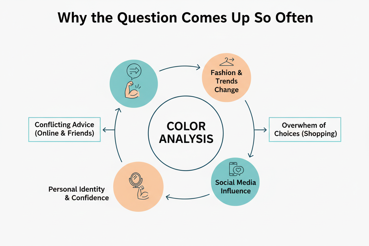
Statements like "Please help me: I'm a cool Summer and don't know how to build my fall wardrobe" or "I love pale blue, but I'm a deep Autumn, so I can't wear it" circulate constantly in color communities. They reveal a shared frustration: real coloring doesn't always respect category edges, yet people treat season labels as hard rules rather than useful approximations.
Two pairings come up more than any other when people describe feeling caught between seasons:
- Light Summer vs. Light Spring — both feel right, yet neither feels complete
- Soft Autumn vs. Soft Summer — both seem to describe the same muted, understated quality
These aren't random coincidences. They're predictable overlap zones, and understanding why they exist makes it much easier to work with your coloring rather than against it.
How Color Analysis Actually Works: Skin, Hair, and Eyes
Color analysis identifies the palette that works best with your skin tone, hair color, and eye color read together — not individually. That simultaneous three-variable read is what makes the system useful, and what makes borderline cases so common.
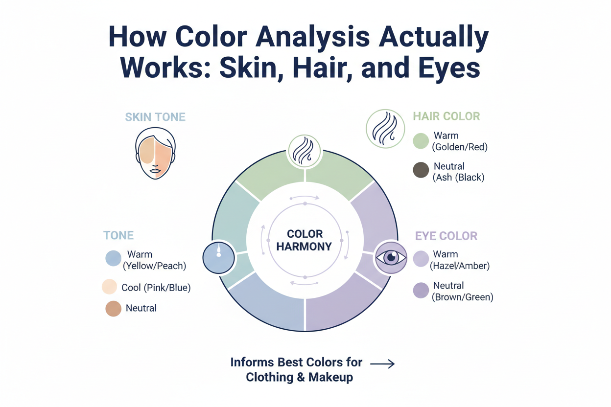
Each of those three features carries its own signals about undertone, depth, and saturation. When all three point clearly toward the same season, typing is straightforward. But when your skin reads cool, your hair reads warm, and your eyes sit somewhere in between, the system has to find the best overall fit. The honest answer may be that two adjacent seasons each capture roughly half your picture.
The practical takeaway:
- Undertone (cool, warm, or neutral) is the first axis, determined by the cast beneath your skin and the base tones in your hair.
- Value (light vs. deep) describes how light or dark your overall coloring appears.
- Chroma (bright vs. muted) describes the intensity or saturation of your features.
If your features straddle a seasonal boundary, you'll feel pulled in both directions — because you genuinely sit between two points on at least one of these axes. That's not a flaw in the system. It's the system accurately reflecting human diversity.
The 12-Season Spectrum and Where Adjacent Seasons Overlap
The 12-season model expanded on the original four seasons to capture the nuance of real coloring. Each of the twelve seasons emphasizes a different combination of undertone, value, and chroma. The seasons aren't arranged in isolated clusters — they run along a continuous spectrum, so neighboring seasons share at least one major characteristic.
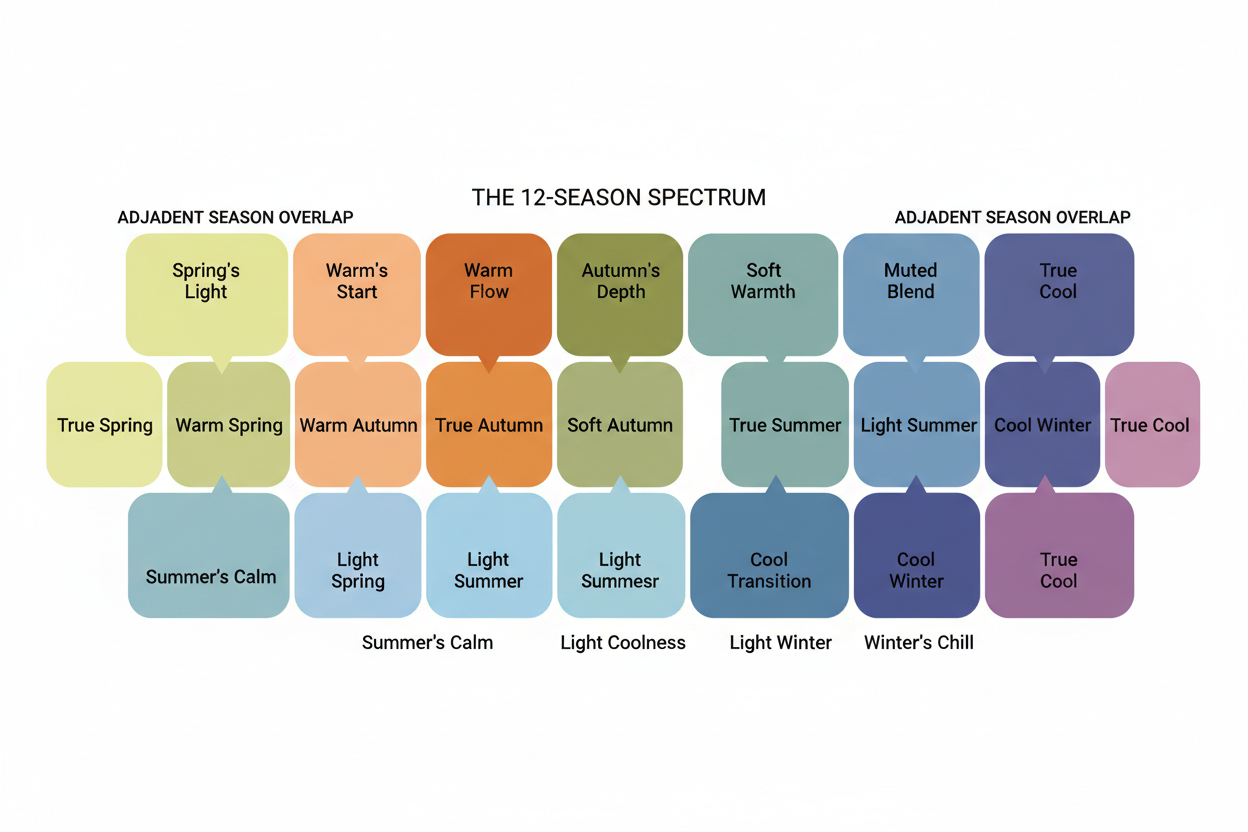
That shared characteristic is where borderline coloring lives.
Light Summer vs Light Spring: What They Share and Where They Diverge
Both Light Summer and Light Spring are defined primarily by high value — coloring that reads as delicate, fair, and soft rather than deep or vivid. If you have light features that feel washed-out in intense colors, both seasons will feel partially relevant, because lightness is exactly what they have in common.
The single variable that separates them is undertone:
- Light Spring leans warm — soft peachy neutrals, warm ivory, light golden tones.
- Light Summer leans cool — soft rose-tinted neutrals, cool beiges, blue-influenced pastels.
If you sit between these two, your skin's undertone probably shifts depending on the light — sometimes peachy, sometimes pinkish — which is what creates the confusion. The deciding question is almost always: do golden-adjacent neutrals or rose-adjacent neutrals sit closer to your skin without creating contrast?
Soft Autumn vs Soft Summer: Navigating the Muted Middle
Soft Autumn and Soft Summer share one defining quality: both are built around low chroma, meaning muted, hushed colors rather than saturated or vivid ones. If bright colors feel overwhelming and clear pastels feel too sharp, both seasons will resonate because they describe the same softening quality.
The separating variable, again, is undertone:
- Soft Autumn is warm-leaning — its muted tones are grounded in golden, terracotta, and earthy undertones.
- Soft Summer is cool-leaning — its muted tones carry a dusty, rosy, or slightly blue-grey cast.
People straddling this pair often find their ideal neutrals fall right in the overlap: warm taupe, dusty rose, greyed sage. These shades work because they're muted enough for both seasons while staying close to neutral on the warm-cool axis.
Finding Your Overlap Palette: Colors That Work in Both Adjacent Seasons
Whatever pair you're navigating, the practical approach is the same: anchor your wardrobe in the colors that live on the shared axis, not the ones that define each season's extreme.
For Light Summer / Light Spring overlaps:
- Reach for soft, low-saturation pastels that don't read as strongly warm or strongly cool: dusty lavender, soft sage, quiet blush, pale grey-blue
- Skip deeply saturated versions of anything — the shared axis here is lightness, so value matters more than undertone
- Test ivory versus soft white close to your face: a slightly warm ivory with a peachy lean suggests Spring; a cool soft white with a pinkish cast suggests Summer
For Soft Autumn / Soft Summer overlaps:
- Stay anchored in muted neutrals near the warm-cool divide: warm taupe, dusty mauve, soft khaki, greyed teal
- Both earthy richness (deep burnt orange, warm chocolate) and clear bright cool tones will feel slightly off — avoid both
- The colors where you seem to disappear pleasantly — not washed out, not overpowered — are your overlap palette
These overlap palettes aren't a compromise. They're your actual best colors, found by watching what your features genuinely do rather than by following what a label tells you to wear.
Signs You May Genuinely Sit Between Two Seasons
There's a real difference between being misidentified within a single season and actually straddling two. Before building a strategy around being a border case, it's worth checking whether that's actually what's happening.
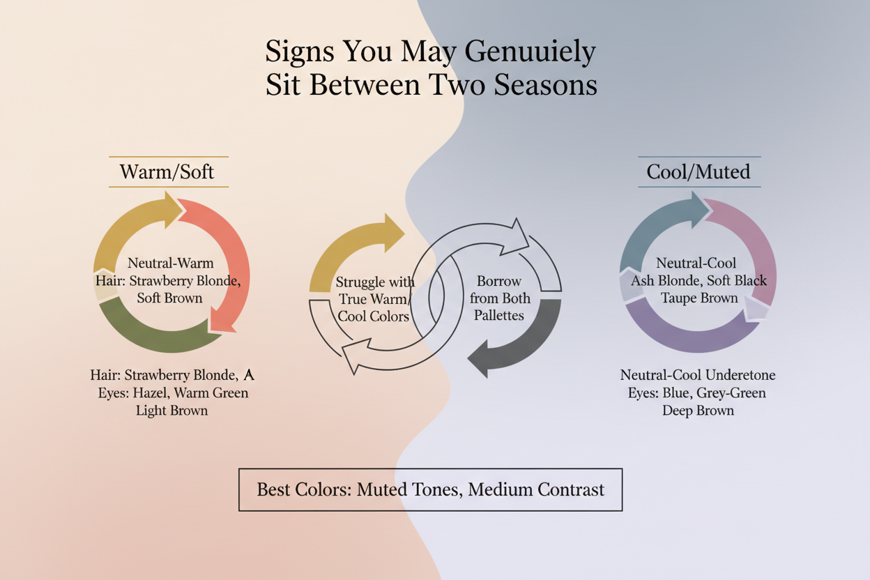
You may be a true border case if:
- You test well in both palettes. When you hold swatches from each adjacent season near your face, both give you a positive result — better skin clarity, less visible redness, brighter eyes — rather than one clearly winning.
- The "wrong" season's anchor colors consistently work on you. If you're typed as Light Summer but warm ivory (a Light Spring staple) reads better than cool soft white, your undertone may be more neutral than either season assumes.
- Rigid season rules create real wardrobe problems. If colors that reliably work on you keep getting ruled out by your assigned season, and that friction comes up again and again, the label is probably being applied too narrowly.
- Your features read differently depending on the light. Natural daylight emphasizes coolness in your skin while warm indoor light brings out golden tones — that kind of shift often points to a genuinely neutral undertone, landing you between a warm and cool season.
- Both palettes have colors that fall flat on you. A true border case usually means the most saturated, richest colors from both adjacent seasons don't quite work — which points to an overlap zone rather than either extreme.
If several of these apply, you're probably not misidentified. You're accurately between seasons, and how you approach your palette should reflect that. → [Take the color quiz to get a starting read on your season]
How to Build a Wardrobe When You're Between Two Seasons
Being between two seasons doesn't mean building two separate wardrobes. It means finding what those seasons share and treating that as your foundation.
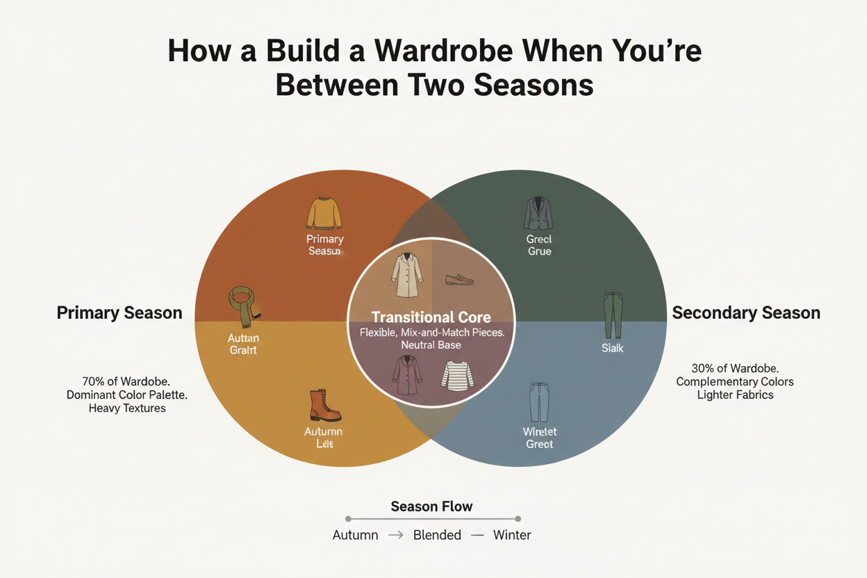
Step 1: Define your shared axis. Figure out which characteristic connects your two adjacent seasons — lightness for Light pairs, muted chroma for Soft pairs. That's your anchor. Not the undertone differences.
Step 2: Build your neutral base from overlap colors. Pick neutrals near the midpoint of the undertone axis: warm taupes rather than golden browns or cool greys, dusty rose rather than coral or fuchsia, greyed sage rather than olive or teal. These work with your natural coloring regardless of whether the season label skews warm or cool.
Step 3: Test colors against your face, not against a palette chart. Hold a color near your jawline in natural daylight. Does your skin look clearer? Do shadows recede slightly? Does your eye color appear more defined? Those physical responses tell you more than any category label will.
Step 4: Treat the extremes of both seasons as accent territory. Colors at the far warm end of one season or the far cool end of the other may not serve you well in large doses. Use them in smaller pieces — a scarf, a shoe, an accessory — where they add interest without taking over.
Step 5: Let go of the "forbidden colors" mentality. Comments like "I'm a deep Autumn, so I can't wear pale blue" reflect a rigid reading of seasonal rules that doesn't account for individual variation. If pale blue reliably makes you look better, the rule is wrong for you — not the other way around.
When to Seek a Professional Color Typing Session
Self-diagnosis has real limits. Being caught between two seasons is one of the clearest cases where those limits show up. If you've been going back and forth between two adjacent palettes and still can't pin down your undertone from fabric swatches and online quizzes, a professional analysis can settle what self-diagnosis can't.
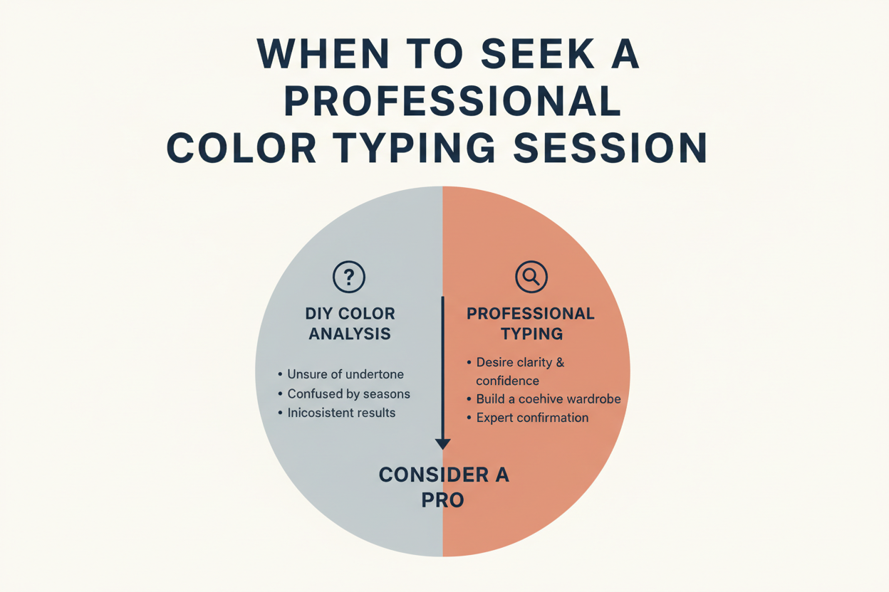
A qualified color analyst — in person or through a reputable virtual service — works with physical drapes under controlled lighting and watches how your skin, eyes, and hair respond together, not one at a time. That process can confirm whether you're genuinely a border case or whether one season is clearly dominant and something else (hair that's been colored, variable lighting during your self-tests) has been muddying the result.
Virtual color typing has become a legitimate option for exactly this situation, with structured sessions that don't require showing up somewhere in person.
Worth considering professional analysis if:
- You've compared adjacent palettes repeatedly and still can't land on a stable answer
- The wardrobe rules for your self-assigned season create more frustration than clarity
- You're about to put serious money into a new wardrobe or capsule and want a solid foundation
- Your features have shifted noticeably (significant hair color change, skin changes with age) and a previous typing no longer fits
Professional analysis doesn't cancel out your self-study. It fills in the part that personal bias, uneven lighting, and a limited selection of draped fabric make genuinely hard to resolve on your own.
Common Myths About Being Between Two Color Seasons
The frustration many people feel around being between seasons often comes from misconceptions about how the system is supposed to work. These are the most damaging ones — and why they don't hold up.
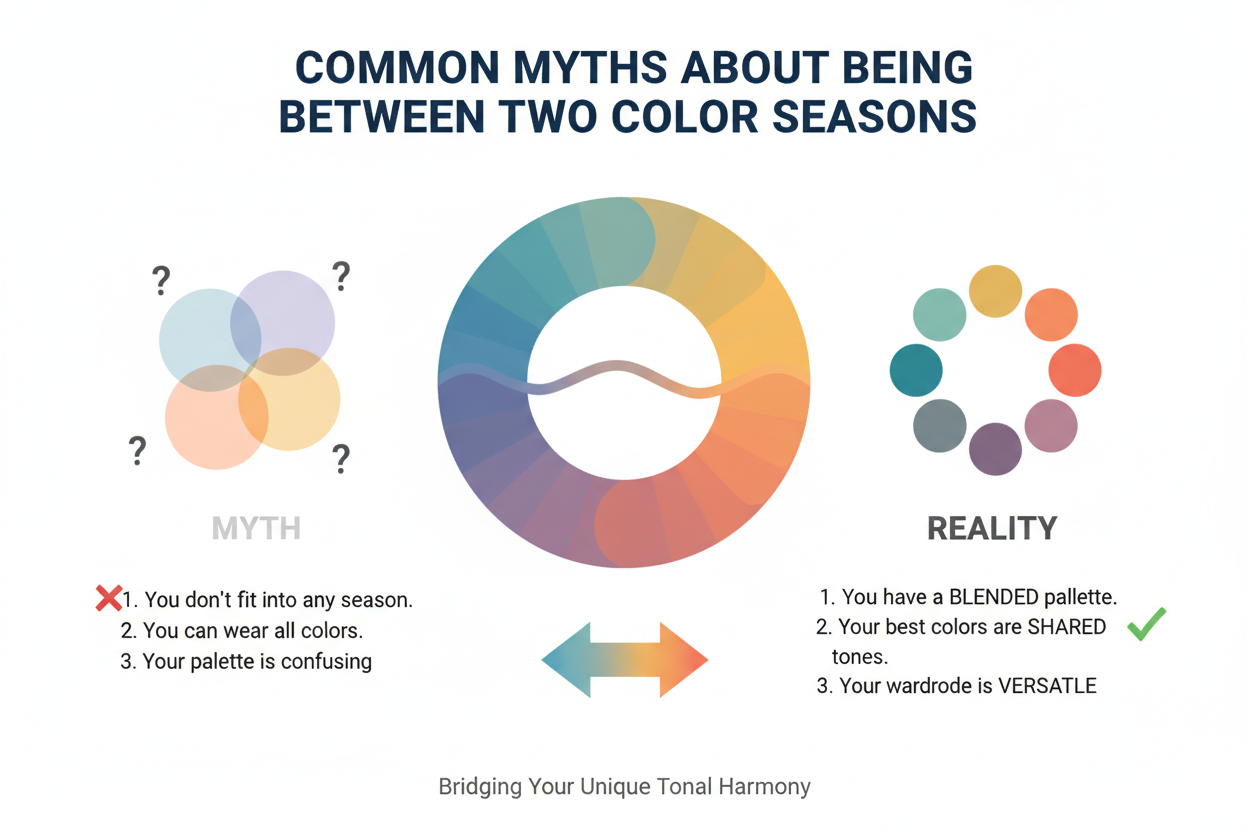
Myth 1: You must pick exactly one season. The 12-season model is a framework, not a census. It describes a spectrum, not a set of boxes. If your coloring sits between two points on that spectrum, acknowledging the overlap is more accurate than forcing a single label.
Myth 2: If you don't fit, color analysis is broken. A system that produces borderline cases isn't failing — it's accurately reflecting that human coloring exists on a continuum. The goal of color analysis is to improve how colors interact with your appearance, not to sort people into rigid groups.
Myth 3: You can't wear colors from a neighboring season. Season boundaries are guidelines about probability — they describe which colors are most likely to harmonize with a given coloring profile. They're not prohibitions. If a color from an adjacent season works on you, it works.
Myth 4: Being between seasons means your analysis was wrong. It may mean your analyst (or your self-diagnosis) found the closest single match to complex coloring — which is often the most that a single label can do. Knowing you're between seasons is itself useful, accurate information.
Myth 5: You need to resolve it before you can dress well. You don't. The overlap palette strategy described above gives you a practical, immediately usable wardrobe approach that doesn't require a definitive label. Many people dress extremely well operating from the shared axis of two adjacent seasons without ever settling on one.
People Also Ask
What does it mean to be between two color seasons?
Being between two color seasons means your natural coloring — skin tone, hair color, and eye color combined — doesn't point cleanly toward a single seasonal palette. Your features share characteristics with two adjacent seasons, usually because you sit near a boundary on one of three axes: undertone (warm vs. cool), value (light vs. deep), or chroma (bright vs. muted). This isn't a flaw. Color analysis works on a spectrum, and borderline coloring is a predictable outcome of that spectrum, not an error to fix.
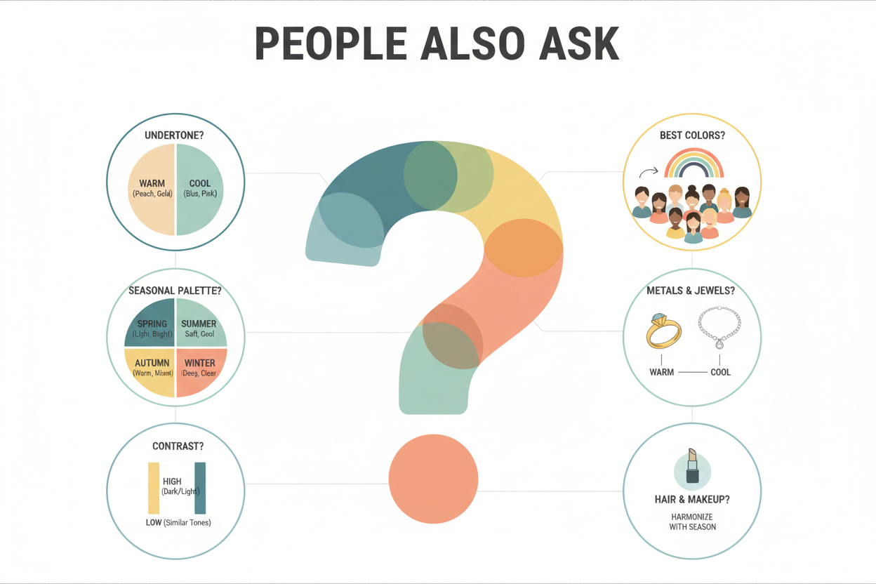
Can you have characteristics of two different color seasons?
Yes — and it happens more often than most color analysis content lets on. The 12-season model organizes seasons along a continuous spectrum, so neighboring seasons are designed to share at least one major characteristic. Someone whose features straddle a boundary will genuinely reflect qualities from both adjacent seasons. A person torn between Light Summer and Light Spring, for example, probably has clearly light, delicate coloring — the shared trait — but an undertone that reads as neither definitively warm nor cool. That's not the analysis failing. That's what it looks like when your coloring sits in an overlap zone the system was always capable of producing.
How do I know if I'm a Light Spring or Light Summer?
Both seasons are built around high value — light, fair, soft overall coloring — so if you're comparing the two, your features probably sit in that light range already. The distinguishing factor is undertone:
- Light Spring carries a warm lean: soft peachy neutrals, warm ivory, and golden-tinged pastels tend to sit well against the skin.
- Light Summer carries a cool lean: rose-tinted neutrals, cool beiges, and blue-influenced pastels tend to harmonize better.
A practical test: hold a warm ivory fabric and a cool soft white near your jawline in natural daylight. Notice which one reduces visible redness, clarifies the skin, and creates less contrast. Whichever neutral seems to quietly blend into your complexion rather than sitting on top of it points toward your dominant undertone — and your most likely season.
Is it possible to wear colors from two different seasons?
Yes. Season boundaries describe which colors are most likely to harmonize with a given coloring profile — they aren't rules about what you're allowed to wear. If a color from an adjacent season looks good on you when you test it in person, that's the relevant information. Statements like "I'm a deep Autumn, so I can't wear pale blue" reflect an overly rigid reading of the guidelines. For someone genuinely between two seasons, building a wardrobe that draws from the overlap zone of both adjacent palettes isn't just possible — it's often the most accurate and practical approach available.
What happens if I don't fit into any color season?
Genuinely falling outside the 12-season spectrum is rare. More often, the feeling of not fitting means you're a border case between two seasons, not outside the system entirely. That said, if nothing clicks, a few things are worth checking:
- Variable lighting during self-testing can make your undertone read inconsistently, which creates the false impression of not fitting anywhere.
- Colored or chemically treated hair can shift your overall coloring enough to make self-diagnosis unreliable.
- Applying the rules too rigidly — treating every color outside one season's palette as off-limits — can make even an accurate season feel like a poor fit.
If you've worked through adjacent pairings carefully and still can't find a stable anchor, a professional draping session with physical fabric swatches in controlled lighting is the most reliable way to sort it out.
FAQ
Can you genuinely belong to two color seasons at the same time?
Not really — not in the sense of having two separate seasonal homes. But you can absolutely land in the overlap between two adjacent seasons. Color analysis works along a continuous spectrum, so the line between neighboring seasons is a gradient, not a wall. If your coloring straddles that boundary, neither season will feel like a perfect fit, and that's fine — it's an accurate read of your coloring, not a flaw in the system. In practice, you work with the colors the two seasons share and lean toward whichever feels more consistently flattering on you.
What is the difference between Light Summer and Light Spring?
Both seasons share the same basic quality: your overall coloring is light, soft, and delicate. The difference is undertone.
- Light Spring runs warm: peachy neutrals, warm ivory, and golden pastels tend to sit well against the skin.
- Light Summer runs cool: rose-tinted neutrals, soft cool whites, and blue-leaning pastels tend to feel quieter and more settled.
Because both sit at the light end of the value spectrum, people who fall between them often find their undertone is subtle enough to shift depending on the light — which is why these two get mixed up more than almost any other adjacent pair.
Why do Soft Autumn and Soft Summer look so similar?
Both seasons are defined by low chroma — muted, dusty, toned-down colors rather than saturated or bright ones. That shared softness means their palettes overlap a lot in the mid-range. Where they differ is undertone: Soft Autumn pulls warm and earthy, Soft Summer pulls cool and smoky. Because chroma dominates both, the undertone gap can be subtle enough that the same dusty rose or warm taupe seems to work in either palette. If you're stuck between them, the most useful test is whether warm neutrals (camel, terracotta-adjacent beiges) or cool neutrals (rose-grey, cool taupe) sit better against your skin.
Does being between two seasons mean color analysis doesn't work for me?
No — it means color analysis is working exactly as intended. The 12-season system maps a range of human coloring, and neighboring seasons share characteristics by design. Landing near a boundary is normal and expected. What it does mean is that a single-season palette applied rigidly will probably feel too limiting. Working from an overlap palette — the colors both adjacent seasons share — is usually more accurate than forcing a choice between the two.
How do I build a wardrobe if I'm between two color seasons?
Focus on the colors both seasons share rather than trying to satisfy either palette fully:
- Find your shared anchor neutrals — colors that show up in both palettes and consistently sit well against your skin.
- Test edge cases in person — hold individual colors near your face in natural daylight and see whether they make you look clearer or duller.
- Lean into the dominant characteristic — if both seasons are light (Light Spring and Light Summer, for example), prioritize lightness and treat undertone as secondary when a color genuinely works in both.
- Loosen the rules — assuming a color is off-limits because it belongs to an adjacent season is more limiting than helpful when you're a border case.
Building outward from the overlap is more practical than committing to one palette that never quite fits.
Should I get a professional color analysis if I can't decide between two seasons?
Yes. It's the most reliable option when self-analysis keeps leaving you stuck. A professional draping session uses physical fabric swatches held against your face in controlled, consistent lighting — which cuts out the variable lighting and product interference that make home testing so unreliable. If you've carefully compared two adjacent seasons, tested colors in person, and still can't land anywhere stable, a trained analyst can usually identify which season is dominant and explain what they're seeing. It won't necessarily give you a radically different answer than careful self-analysis would — but it resolves the ambiguity with a lot more confidence.
Can my color season change over time, making me feel between seasons?
Your bone structure and genetic undertone stay fixed, but other things color analysis picks up on — hair color, skin clarity, and overall value — can shift a lot over a lifetime. Hair often deepens in childhood, then lightens with age. Sun exposure and illness can change skin tone and clarity too. Any of these shifts can move you from sitting clearly in one season to hovering closer to a neighboring one, which makes a typing that once felt obvious start to feel off.
If your coloring has changed and your palette doesn't quite fit anymore, revisiting your analysis makes sense. That's not the system failing — it's just your coloring being different than it was.
Ready to see where you land now? Take the color season quiz to get a starting point based on your current features.