Finding a Personal Color Analyst in NYC: Top Consultants

Key Takeaways
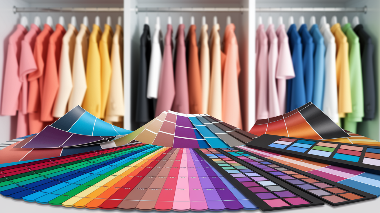
Personal color analysis in NYC in 2026 is no longer just a beauty indulgence — it's a calculated investment in how you show up every day. A single session at a top-tier studio runs $400–$800, roughly the price of a pair of designer loafers. But here's the real math: stop buying "almost right" blush and blazers that drain your wallet season after season, and that one-time cost pays for itself fast. Whether you're exploring a color palette consultation NYC for the first time or finally committing to a proper personal color consultation NYC after years of guessing, knowing your undertone, contrast level, and chroma changes everything — from your morning routine to your closet ROI.
Here's how the NYC market actually breaks down in 2026:
| Tier | Price Range | What You Get | Best For |
|---|---|---|---|
| Budget | $150–$300 | Virtual session or student analyst; PDF palette, digital swatch card | First-timers, online shoppers |
| Mid-Range | $300–$450 | In-person draping (e.g., Drops de Cor); 12-season analysis, physical swatch fan | Value-seekers who want the real thing |
| Premium | $450–$800+ | Full personal color matching NYC session; metals test, 40+ drapes, styling add-ons, closet audit | Professionals, image-conscious clients |
If you're still wondering where to get personal color analysis consultation that's actually worth the price tag — the answer isn't the cheapest option on Groupon. It's the analyst who hands you a 20-page physical swatch fan, walks you through the color palette logic behind every shade, and leaves you with zero guesswork at the checkout counter.
💫 Discover Your Complete Color Palette
Ready to discover all the colors that make you look radiant? Our comprehensive color analysis will reveal your complete personal palette - perfect for hair, makeup, and wardrobe decisions.
Take Color Analysis Quiz →The seasonal structure, flow seasons, account for why certain hues illuminate your features and others appear lifeless. Try this at home by placing similar colors of varying temperatures and brightness around your face in natural light.
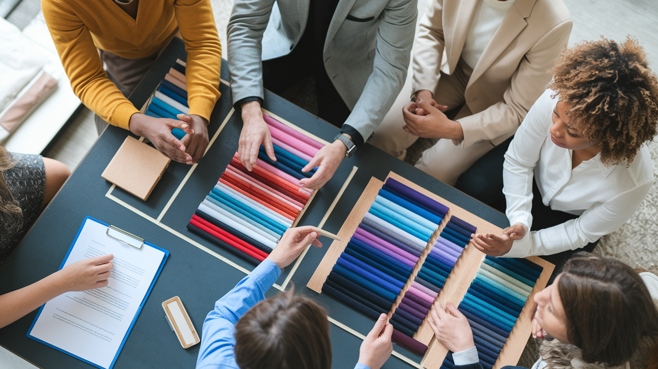
A pro session includes consultation, draping with giant swatches of fabric, and instant feedback in neutral light. Get ready by showing up bare-faced, in neutrals, and with style goals and inspiration in hand.
Korean color analysis — and services like Arirang NYC — brings a precise, holistic approach that considers face shape, skin undertone, and overall body harmony together. If you're searching for the most thorough personal color analysis test NYC has to offer, this method delivers. That said, demand is fierce: top Korean-trained analysts in the city routinely run 4–8 week waitlists, so if you're not booking at least a month ahead, you may find yourself limited to virtual-only sessions. For the nyc color analysis latest availability, check booking pages weekly and lock in your slot early — walk-in appointments simply don't exist at this level. Certified analysts trained in the Korean 12-season system bring a data-driven, detail-focused lens that's hard to match anywhere else in the city.
The output typically features a custom color palette, makeup and hair recommendations, plus a digital cheat sheet for convenient shopping. Use your best neutrals for basics, save wow colors for statement pieces, and sprinkle in accents for variety.
Your palette facilitates personal branding, confidence, and conscientious consumption with savings and less waste in the long run. Construct a capsule wardrobe in your colors, check analysts' credentials and process pre-booking, and book a post-major-change refresh.
Arirang color analysis NYC = personal color consultations in NYC using korean-style seasonal palettes based on arirang-based methodologies.
Sessions map skin undertones, value, and chroma to clear, soft, warm, or cool palettes, then match fabrics, makeup, and wardrobe plans.
Top-rated studios offering color matching service NYC have largely shifted to by-appointment-only spaces in NoMad and Long Island City, where daylight-balanced lighting rigs are non-negotiable. Expect 60–90 minute sessions complete with physical swatch fans, metal testing, and 40+ drape comparisons — the kind of rigorous personal color analysis test NYC clients actually fly in for. Pro tip: if the studio is tucked in a fluorescent-lit basement with no natural light source, trust your gut and reschedule. Accurate personal color consultation NYC depends entirely on controlled, true-to-daylight conditions — no exceptions.
To interpret results and schedule the appropriate service, the guide below explains.
📚 Recent Articles
What is personal color analysis?
A pragmatic technique to identify the hues that best complement your skin tone and eye color. It mixes chemistry and eye tests to create a custom digital color palette reference you can apply to clothing, cosmetics, and even your living space. This approach grounds bold styling and trims uncertainty when you shop.
1. The theory
We each possess a blend of undertone (warm, cool, or neutral), contrast (how light and dark features vary), and intensity (soft or vivid) that directs optimal hues. That combination accounts for the fact that a cool pink can illuminate one woman and bleach another.
The theory of seasonal color analysis classifies these characteristics into spring, summer, fall, and winter, then refines them with flow seasons such as Soft Autumn or Bright Spring. It is a map, not a rulebook, but it provides helpful lanes for decisions.
Skilled analysts go beyond a basic four-season script — they read skin undertone in tandem with natural hair color, eye color, and the nuances that make NYC's diverse clientele unique. For personal color matching nyc clients with olive skin, a warm undertone, and golden-brown eyes, rich shades like terracotta, camel, and deep tomato red create an undeniable harmony. Cool undertones paired with ash hair and blue eyes call for charcoal, icy pink, and true navy. Color-treated hair? A good analyst accounts for that too — draping focuses on your skin and eyes, so dyed strands never skew the result. If you have olive skin, mention it upfront when booking: the best NYC specialists use 12-season analysis to pinpoint your exact palette rather than forcing you into a box that was never designed for your complexion.
The system explains why certain shades accentuate features and others soften them. When the synergy pops, skin looks even, eyes look bright, and facelines look sharp sans makeup.
2. The process
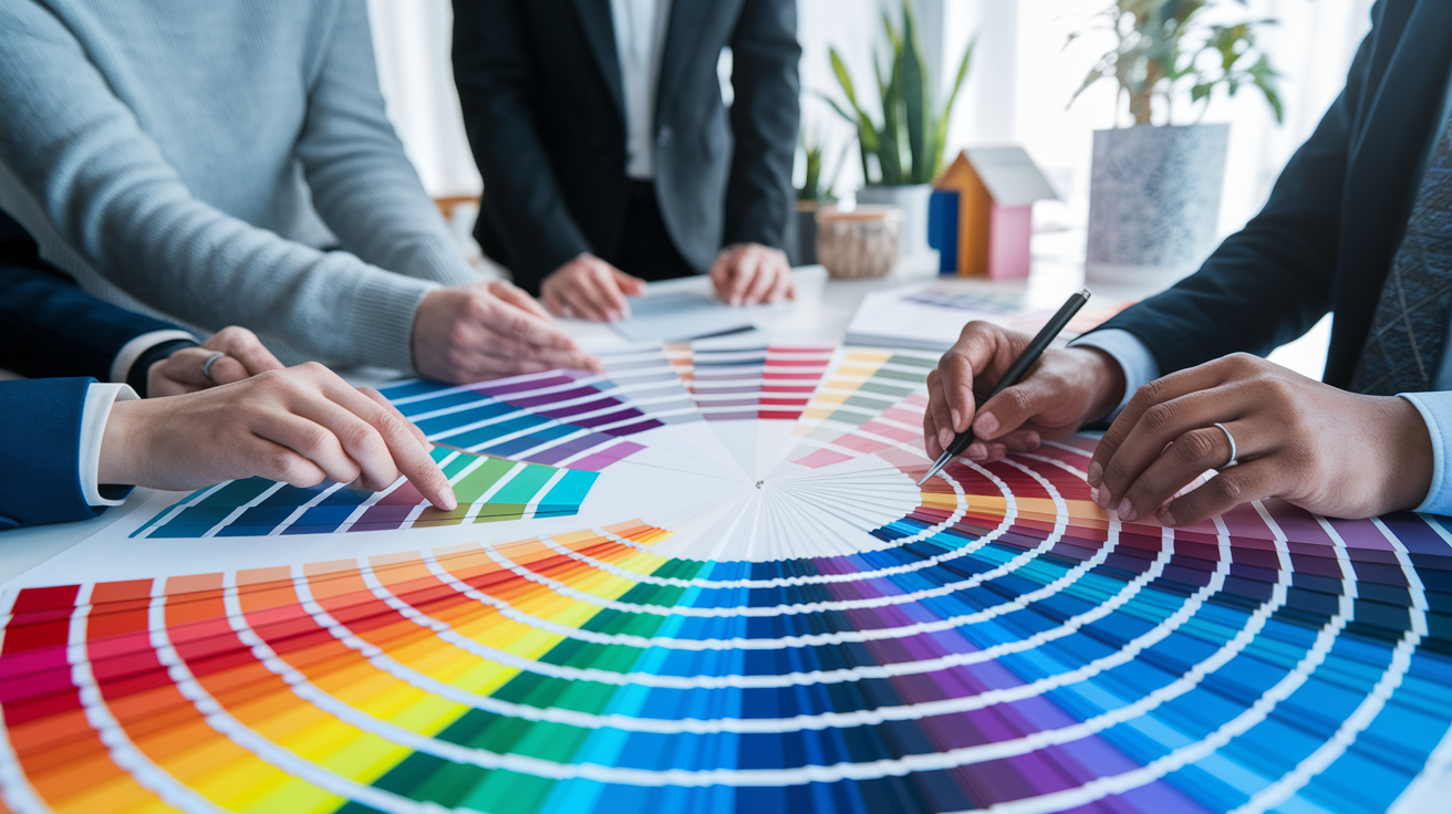
A typical session progresses through a consult, draping, and review under daylight or neutral lighting. Large fabric swatches frame the face while you watch shifts: smoother skin, brighter eyes, or shadows around the mouth.
A full-length mirror assists in comparing near-neighbor colors, like warm beige vs. Cool taupe, or teal vs. Cobalt. Most analysts rely on swatch fans, digital palette guides, and questionnaires of past wins and misses.
Anticipate a hands-on hour in which you assert what you observe. You receive immediate feedback, re-test on difficult colors, and walk away with takeaways you can use on your next shopping excursion.
3. The benefits
Shopping accelerates because you look for a familiar palette. Outfits look more pulled together with less pieces.
Compliments tend to soar, which pumps up everyday confidence. Many clients even wear less makeup because color does the lift.
You save over time by skipping the wrong buys. It likewise pushes conscious consumption and sustains a compact, harmonious closet.
Some consider it subjective, some consider it exact. Either way, it's a creative tool for self-discovery and style.
4. The result
You are given a personal palette, a swatch book that you can take with you. Advice will frequently extend to lip and blush shades, hair dye palettes, metals for jewelry, and eyeglass frame shades.
A summary sheet or digital file of your picks keeps the colors on hand, so you can double-check shades when shopping online. With a palette that mirrors your hues, you construct powerful ensembles more quickly and communicate a personal style that is authentically you.
Korean color analysis in NYC
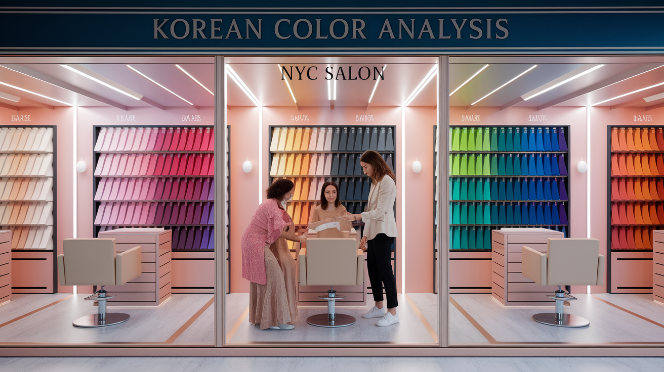
Known as personal color analysis in the West, Korean color analysis is making headway in NYC as clients seek definitive, practical advice on what to wear and which makeup shades flatter. The method borrows from South Korean beauty philosophy and technique, where exactness, balance, and skin vitality steer decisions.
Local salons and studios now import certified, Korean‑trained analysts and employ new techniques, like the Arirang method, to meticulously match color to undertone. Sessions are color theory based, linking tie choices to skin tone, hair color and preference, and commonly categorize clients by seasons–spring, summer, autumn, winter–for easy application day to day.
Arirang method
The Arirang method is a unique Korean system recognized for precision and depth in color analysis sessions. Based on advanced draping under neutral, controlled light, it reads subtle shifts in undertone, clarity, and depth to identify both best and worst shades. Analysts test subtle temperatures—cool, warm, neutral—along with luminosity, and then construct a large palette that incorporates base colors, accents, and metals, reflecting the ideal palette for each individual.
It views the face and the body as a single narrative. Eye ring tone, lip depth, neck and chest undertone, even how veins and melanin read next to white and gray drapes, all come into play. Fit notes follow: ideal lipstick families, brow tints, jewel tones for evening, and neutrals for daily wear, ensuring a flattering look for every skin tone.
For clients seeking a comprehensive, numbers-based consult, this approach feels concrete and pragmatic. Some walk out noticing immediate lift and contrast, while others remain skeptical, which is understandable, as the results differ for everyone based on personal style and preferences.
Cultural context
Korean color analysis echoes values of harmony and natural beauty while allowing space for the individual voice. The objective is not to mask but to bring balance so that the skin looks clear and alive without heavy artifices. This thoughtful approach ensures that each person can find their ideal palette, enhancing their unique features.
K-beauty plays a significant part in this process. Colorists combine palettes with translucent bases, diffused blush application, and subtle highlights that complement the discovered undertone. Style tips follow: scarf hues near the face, frame colors for glasses, and dye guides that respect hair health, creating a flattering look for every individual.
Lifestyle and personality dictate choices as well. A nurse requiring no-fuss, low-contrast looks may receive tranquil, cool pastels while a stage performer might score high-chroma choices. In NYC's melting pot of traditions, the methods translate effortlessly between different color analysis systems, curl patterns, and dress styles.
Modern appeal
Young pros, content creators and fash‑forward clients schedule sessions for sharp wardrobe edits and fresh, camera‑ready looks. Digital palette cards on phones make shopping speedy, with QR links to shade lists and brand matches.
Studios post before-after (with permission) on social media for inspiration and quick victories. Group sessions—bachelorette events, team off‑sites—are a hit, blending live draping with shade experiments and mini makeup adjustments.
Access is open. Most provide both in‑studio and virtual consults. Remote calls employ mailed drape kits, calibrated lighting guides and photo checks to maintain accuracy.
Some people note more confidence and easier shopping. Others are still not sure, showing that like any service the experience depends on the person, the analyst and goals.
Why it's more than just colors
Arirang color analysis in NYC goes beyond trend talk. It connects your palette to your workplace presence, your shopping habits, and your skin's emotional state. Colors can spark feeling and mood change, so this is not just what looks good hanging up.
It's part art, design, psychology, and biology that teaches you how to be deliberate with color across clothing, makeup, accessories, and even your living spaces.
Personal branding
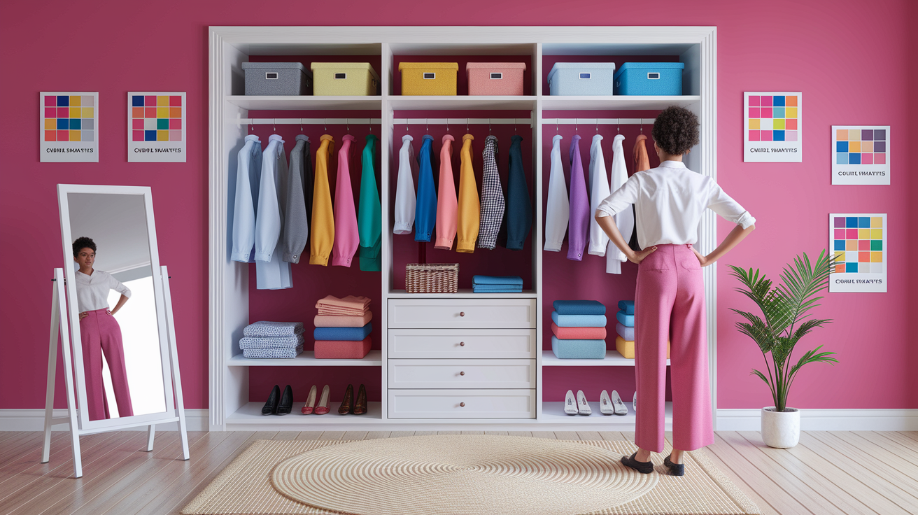
A consistent color palette makes you simple to identify and recall. When your clothes, slides and site all reverberate those same tones that match your skin, hair and eyes, the aesthetic feels in harmony.
That harmony can make you seem fresher, sharper, even younger, because the right tones reflect light in flattering ways. Put your best colors forward in head shots, press photos and profile banners.
For presentations and panels, anchor with a core jacket/blouse in a top color. Accessorize with a tie, scarf or glasses frame in a support color. At events, one powerful accent–a deep teal pocket square or coral lip–can anchor you in a bustling room.
Signature color list:
- Core neutrals: one dark, one mid, one light that fit your palette.
- Power colors: 2–3 hues that energize you and read professional.
- Soft accents: gentle shades for casual days and social posts.
- No-go list: colors that dull your face or cast shadows.
Working hard pays off for founders, consultants, artists, and job seekers in NYC's rapid-fire scene. Consistency breeds trust and a defined visual narrative slices through clutter.
Mindful consumption
A palette-led capsule cuts waste and decision fatigue. Mix in 20–30 pieces that share undertones so tops, bottoms and layers all work together! You have more complete outfits, with less items.
Purchase fewer things, purchase of higher quality. If a tone adores you, put it in fabric and cut. Makeup follows the same rule: base, blush, and lip that echo your natural tones look seamless.
Color swatch shopping checklist:
- Match: hold your swatch to fabric in daylight; no filters.
- Balance: if one piece is bold, keep the rest neutral from your set.
- Texture test: same color, different texture can shift the read; compare.
- Versatility: each item should pair with three pieces you own.
- Care: pick items you can maintain so color stays true.
This conserves cash, reduces returns, and decreases impact by taming of impulse buys.
Psychological impact
When you wear colors that suit you, it can really lift your mood and confidence. Most of us sense that we're calmer in cool, softened hues and more animated in warm, clear ones, some even finding that they get better energy when they match tone to task.
Right colors help you look at your own features with greater benevolence. You observe clear eyes, soft skin, a radiant flush. That feedback loop is powerful when the praise is frequent.
Color symbolism is culture specific, so keep an open mind. Let theory lead, not rule, and let your palette be a chance to express yourself and evolve.
How to choose your NYC analyst
Select intentionally. Fit training, tools, and personal style to your objectives. Search by boroughs, session types, rates, and more. Read reviews and before–after photos to find the flattering look that aligns with your needs, habits, and budget.
| Analyst | Certification | Years | Specialization | Tools/Systems | Borough | Rate (per session) |
|---|---|---|---|---|---|---|
| A | Certified (Arirang + 12-season) | 8 | Diverse skin tones, hijab styling | Daylight lamps, drapes, digital palette | Manhattan | $280–$420 |
| B | Certified (seasonal) | 5 | Menswear, grayscale wardrobes | Natural daylight studio, swatch decks | Brooklyn | $180–$250 |
| C | Master-level, institute member | 12 | Curly hair color, media talent | Hybrid system, calibrated camera | Queens | $220–$350 |
| D | In training + mentorship | 2 | Budget capsules, students | Basic drapes, ring light | Bronx | $120–$160 |
Credentials
Request certification from a respected color school or image institute. Check the education and any mastery certificates, ask for evidence if it's not public.
Seek out clients who have been in your shoes–camera, modest fashion, grey hair, deeper skin, androgynous. NYC caters to an international mix — your analyst must be adept with multiple races and genders.
Look for continuous training and membership in international institutes. Continued study suggests current techniques, not charts from the last decade.
Confirm modern tools: large calibrated drapes, daylight-balanced lighting, color-neutral walls, and digital palette delivery. Old kits bias results.
Methodology
Clarify the system: Arirang, traditional seasonal, 12-season, or a hybrid. Arirang, which often measures undertone nuance and undertone harmony rules — that can assist if you fall between seasons.
Inquire about how light is managed. A quality studio employs north-facing daylight or 5 500 K lamps, neutral background, and a no-makeup, no-fake-tan, for veracity.
Scope confirmation. Power sessions encompass wardrobe palettes + makeup shades, hair color journeys, metals + prints. Ask to see examples, such as a lip test in the ultimate palette or a cool-to-warm hair roadmap.
Kindly ensure the approach adjusts to your characteristics and lifestyle. If you've got uniforms, require on-camera precision, or thrift-shop, your plan should mirror that with defined filters and cost-conscious selections.
Consultation style
Choose a format that suits you: private, group, or virtual. Private suits delicate issues. Group can instruct by contrast. Virtual is great if you're a frequent traveler.
Check delivery: do they give visual aids, before–after photos, and a concise digital booklet? You want a small palette you can load on your phone.
Go for or request studio shots. You should observe neutral walls, big mirrors, constant lighting, chairs facing light, clean drape storage. Quiet room, nice eyes.
Measure communication. You need no-nonsense, precise action and street-smart advice for NYC shopping. Word of mouth recommendations still count — then double-check social and reviews to witness actual results and how they respond to criticism.
After all, due diligence + a clear goal = time and money saved across boroughs and price tiers.
What to expect during your session
Remember, a personal color analysis session is all about identifying your best color range through regimented testing and defined visuals. Anticipate a mix of directed evaluation and practical critique, whether you scheduled a private or small-group session in New York City.
| Stage | What happens | Time | What you do | What you get |
|---|---|---|---|---|
| Pre-session | Prep notes, policies, and goal-setting | 5–10 min | Confirm details, arrive ready | Clarity on scope and tools |
| In-person analysis | Draping, undertone and harmony checks, Q&A | 60–90 min (some 90–130 min) | Answer questions, observe, engage | Live feedback on best/second-best/worst colors |
| Post-session | Palette review, next steps, resources | 10–20 min | Plan follow-up | Swatches, recs, links, class invites |
Before you go
Arrive completely makeup-free — foundation, bronzer, and self-tanner included. Most studios enforcing a strict 24-hour no-fake-tan rule before your personal color analysis test NYC session, since even a faint glow shifts your undertone reading. Lash extensions? Remove them if possible: the eye-ring test relies on your natural lash line, and volume sets can throw the contrast assessment off entirely. Colored or enhancing contacts must come out — full stop. Wear a plain, close-fitting top in a neutral like soft gray or off-white so there's zero color bounce onto your face during draping. If you wear prescription glasses, bring them along in case studio lighting dries your eyes. For anyone serious about getting the most from a personal color consultation NYC session, a small handheld swatch wallet is worth tucking into your bag — it gives your analyst an instant reference point and speeds up the color matching service NYC process considerably.
Bring what helps the analyst link results to your life: a list of favorite brands, 3–5 core items from your closet, or a folder of looks you love. Screenshots are OK. If you're game, attach a shot of your actual makeup bag, as it can assist in identifying the right tones for your personal style.
Establish a primary objective. For instance, select a work-safe lipstick line-up, map a capsule for travel or wardrobe shift after a role change. This thoughtful approach ensures you leave with a flattering look that aligns with your identity.
Confirm the start time, studio address, and any building access requirements before your appointment. Compare pricing for private versus group sessions — group bookings can save you $75–$150 per person, making them a smart option if you're going with friends. Familiarize yourself with the cancellation policy: most NYC studios require at least 48 hours' notice to reschedule or receive a full refund, and a 30% deposit is typically charged at the time of booking. Submit any intake forms or deposits in advance to keep things running smoothly on the day. Pro tip: If you're wondering where to get personal color analysis consultation in neighborhoods like NoMad or the Upper West Side, call ahead to confirm payment methods — a growing number of boutique studios offering personal color consultation NYC and color matching service NYC now operate on Zelle or Venmo only to avoid credit card processing fees. Double-check your balance before you arrive so you're not caught off guard on the sidewalk.
During the draping
You'll be presented with swaths of color around your face to check undertone (warm vs cool), lightness, saturation, and mutedness. The analyst tests skin tone, eye brilliance and how shadows shift when a color shifts as well.
Tell someone what each shade is like. Indicate colors that make your eyes shine or your skin look dull. This helps disassociate taste from harmony.
Listen to me explain why some blues brighten your smile and others add a gray cast or how a dusty olive may trump a loud lime if your coloring is more muted. You might find out your season and your top color, second-best, and worst colors.
If permitted, snap quick notes or photos for later. Designate obvious victories—like, deep teal, warm taupe, or soft coral—for convenient remembrance while you browse.
After the results
You'll be sent your own personalized palette—usually a swatch fan or digital file—and a rundown of clothing colors, makeup choices and accessory colors. Most sessions include look and style advice for outfits you can shop for immediately.
- Best neutrals: warm taupe, soft charcoal, ivory.
- Wow colors: deep teal, berry, pine green.
- Accents: muted gold, rose brown, slate blue.
Design a follow-up. A few studios provide access to online platforms, social content, waitlists or class invitations in order for you to continue studying and schedule upcoming sessions. Group or private follow-ups range in price and duration.
The longevity of your palette
Color analysis seeks to provide you with an enduring foundation that sustains you through decades of fads, relocations, and wardrobe purges. At Arirang color analysis in NYC, we're focused on cultivating a core palette that remains valuable across seasons and settings, rather than offering a quick band-aid solution. This approach aligns with the principles of the international image institute, emphasizing a thoughtful approach to personal style.
A core palette tends to hold for a long time because it tracks features that change slowly—skin tone, depth, and contrast with hair and eyes. For most of us, our best neutrals and key accent colors last for years. Shifts happen with significant changes: gray hair, a deep tan, a new hair dye shade, medical treatments, or visible aging. Understanding these factors is crucial for effective color analysis sessions.
For some, their palette never shifts, while for others, there is a consistent drift. Both experiences are valid. Longevity, it turns out, is personal. Hair color, skin tone, and eye color lay at the core of it, all of which can shift with their own rhythm. This understanding allows for a more tailored approach to makeup analysis and personal style.
Treat your palette as a map whenever you shop and style. Bring it into a store or have a picture on your phone! Sort your closet by "best," "good," and "maybe" according to the palette, and then keep tabs on what you wear most. This method can help you create a cohesive wardrobe that reflects your true self.
Construct ensembles of your top neutrals—stone, navy, soft black, cocoa—with two to three touches that resound with your undertone. For workwear, choose one trusty blazer in a solid neutral and switch out tops in your top-five accents. For travel, pack in one color story (like navy, soft white and teal), so you can mix and match with less weight.
Schedule refresh points when life changes. Following a major color shift—dark brown to warm copper, for example—schedule a brief interim appointment. If you tan a few shades deeper come summer (or lighten up during winter), run through your depth scale so your makeup and tees don't clash. This proactive approach is essential for maintaining an ideal palette throughout the seasons.
As you age, certain vibrant, high-contrast colors can seem brash, whereas muted, yet luminous shades tend to be more forgiving. A quick refresh every few years can reset your top-five list without discarding the entire pack. This process isn't about reinventing yourself; it's about dialing in for the you now, ensuring your wardrobe remains relevant and flattering.
Consider your output as a foundation on which to construct an adaptable, assured wardrobe. Let lifestyle dictate the blend. If you live in active gear, ground with slick, low-contrast neutrals and sprinkle in small flashes of accent—caps, socks, or a bag. This approach can enhance your overall look and confidence.
If you love dressy attire, invest in one perfect suit in your best deep neutral and rotate shirts and ties or scarves by season. A few clothing items will retain the same victors for a decade, while others will experience obvious shifts. Both roads lead to success, and the key is to develop a system that serves you today and evolves when necessary.
Conclusion
To tie it up, a solid color read provides obvious victories. Apparel go with your tone. Skin appears fresh. Color looks just so rich. Shopping goes fast. Money sink drips. That holds in New York, and yes, even in Korean-led studios such as Arirang. I witnessed it unfold for a friend who donned cool navy for the very first time. Her eyes seemed bright. No adjustments. Just right color slowly.
One test to hold gains. Build a small kit: two tops, one scarf, one lip, all in your best range. Test the set in daylight. See photos. Remember what looks crisp, not loud.
Ready to find your perfect color palette? Start with a color palette consultation NYC — book a session at The Outfit Curator on the Upper West Side for a full 12-season draping experience, or head to Lily's Color Lab if you want custom cosmetics matched to your personal palette. Both are confirmed active specialists and among the best answers to the question of where to get personal color analysis consultation in the city. Pick one, show up makeup-free, and make one intentional color swap this week — that's all it takes to start.
Frequently Asked Questions
What is Korean personal color analysis?
It's a season-based system that finds your optimal colors according to skin tone undertone, depth, and contrast. Analysts utilize different color analysis systems, including calibrated lighting and drapes, to determine your ideal palette, guiding you in selecting flattering clothing, makeup, and hair colors with confidence.
How is Korean color analysis in NYC different?
NYC analysts often blend the Korean 4 or 12 season systems with international standards, providing a thoughtful approach to color analysis sessions. Trained in Seoul, they offer culturally informed recommendations tailored to the diverse skin tones and personal styles of people in New York.
Why does personal color analysis matter beyond colors?
It's a time and cost saver, allowing a person to shop smarter and de-clutter while building a cohesive closet. This thoughtful approach can enhance your professional image and on-camera presence, leading to increased confidence and less stressful morning styling choices.
How do I choose a qualified NYC color analyst?
Seek professional education at the International Image Institute, defined processes, and portfolio outcomes. Review before-after results and light tests, while inquiring about drape sets and undertone testing for a flattering look.
What should I expect during a session?
Anticipate a no-makeup evaluation in neutral light during your color analysis session. The color analyst tests drapes to determine how the colors impact your skin tone and eye color. You will receive your ideal palette, styling tips, and product recommendations. Sessions typically last 60–120 minutes.
How long does my color palette last?
Your undertone almost never changes, and with the right color analysis session, your palette remains rock solid for years. Major changes can occur with graying hair, tanning, or medical variations, so a quick update every few years is a great tool to keep your palette matching your features and lifestyle.
Can I apply my palette to makeup and hair?
Yes. Use your ideal palette to select foundation undertones, blush, lip, and eyeshadow colors. For hair, match warmth/coolness and depth, ensuring a flattering look that enhances your natural beauty.