A Guide to Finding Your Color Season in the Bay Area

Key Takeaways
If you've been searching for a guide to finding your color season in the Bay Area, here's the honest truth: no AI app can replicate what happens under real light with a trained human eye. In 2026, a professional personal color analysis in San Francisco starts at $225 — and the best studios in Hayes Valley are closer to $350. That price buys you something no filter can deliver: a certified consultant who reads your actual skin undertones, hair depth, and eye contrast to build a precise, gender-neutral palette grounded in both art and science. The result isn't just a color chart — it's the real you, finally dressed like it.
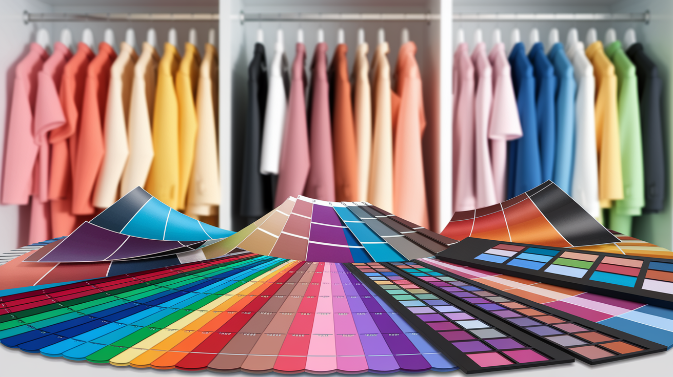
💫 Discover Your Complete Color Palette
Ready to discover all the colors that make you look radiant? Our comprehensive color analysis will reveal your complete personal palette - perfect for hair, makeup, and wardrobe decisions.
Take Color Analysis Quiz →Step beyond basics by taking into account undertones, contrast, and personal quirks. With drapes, swatches, and digital color fans, uncover signature colors that resonate as authentic.
The best colors affect mood and first impressions and self-expression. A personalized palette sustains ease, trustworthiness and consistent branding as an individual.
Anticipate a consultative, hands-on experience with draping and a dramatic reveal with swatch cards. Use your palette on clothes, make-up and accessories.
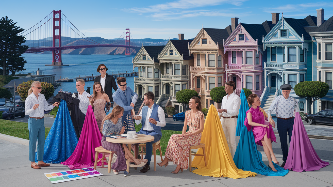
Whether in San Francisco or not, select from in-person, digital and group sessions with expert stylists. Local palettes tend to include foggy grays, ocean blues and sunlit golds that work against shifting light.
Make it actionable — by auditing your wardrobe, building a capsule from your best shades, and keeping a mini swatch for shopping. Return to your palette seasonally as lifestyle or hair color shifts.
Personal Color Services San Francisco – from boutique studios in SoMa to independent consultants in the Mission. Clients walk away with a palette that relates their skin undertone, contrast and hair and eye tone to the shades that flatter in daylight and coastal fog.
Sessions often feature draping, digitized swatches and wardrobe hacks that eliminate guesswork and save time. To establish expectations, the following segment deconstructs procedure, rates and leading professionals.
📚 Recent Articles
What is personal color analysis?
That maps the colors that flatter you most on the basis of skin tone, hair and eye color. It combines art, science and aesthetics to inform smarter wardrobe, makeup and even eyewear selections. One of our trained consultants analyzes your features, creates a personal palette and demonstrates how those colors energize your face, refine your style and bolster your confidence.
It works for all genders and ages, and its goal is simple: help you make smart choices that feel like you.
1. Beyond the basics
Seasonal color analysis is the most famous route, categorizing individuals into seasons – Spring, Summer, Autumn, Winter – by undertone, value (light to deep) and chroma (soft to clear). Many pros dig deeper with 12 or 16-season systems and include core color palettes for work, casual and event wear, so selections remain simple.
Undertones matter: warm, cool, or neutral changes how red, blue, or green looks on your skin. So does contrast–think light skin/dark hair vs low-contrast–because print size, color depth and edge sharpness either energize or drown you.
Stylists test live with fabric drapes, fan decks and digital swatches. They evaluate your existing makeup, then recommend adjustments — lip colors, blush, and brow color — so that the face is in charge and the clothes fall in line.
Guidelines, not prisons. Your signature colors may sit just off the grid: the red that sparks your eyes, the moss that calms your frame, the off-white that never washes you out.
2. The science
Color theory tells us why adjacent colors push and pull each other, why a cool blue makes warm skin appear ruddy, how pigment and light reflect on the face. Your complexion, hair and eyes are a system; the correct shade connects them so the skin appears even and the eyes look clear.
They determine overtone (what you see), undertone (what sits beneath), and contrast to construct a harmonious palette you can replicate. They record steps so outcomes are consistent across environments, from daylight to office LEDs, and repeatable across visits.
3. The psychology
Correct colors can boost mood and self-perception. People typically hold themselves straighter when their palette matches their features.
First impressions race; color can signal comfort, concentration, or whimsy — setting social and professional tones. Harmony resonates genuine, so your style comes across — and feels — lived-in, not tried on like a costume.
Research and field work demonstrate that these customized palettes mitigate decision exhaustion and increase confidence during interviews, dates or public presentations.
4. A cultural lens
Culture informs taste, meaning and dress codes, so analysts take tradition and context into account when mapping undertone and contrast.
Bay Area stylists draw from Western seasonal frameworks alongside Korean and Japanese color theory, refining undertone nuance and brightness levels to suit the remarkably diverse skin tones found across San Francisco. But there's a uniquely local dimension worth building on: the tech-worker palette. If your daily uniform leans toward a Patagonia vest and a grey hoodie, seasonal color analysis doesn't ask you to abandon it — it helps you own it. Knowing your seasonal palette lets you gravitate toward the specific shades of grey, navy, or olive that make you look sharp rather than washed out. That's the core of what a guide to finding your color season in the Bay Area actually delivers: not a costume change, but a clearer read on the real you. Your colors become part of your core story — the visual shorthand that keeps you real, keeps you grounded, and signals exactly the kind of person you are before you say a word. Street style, tech casual, and the city's thriving art scenes all pull toward clean silhouettes and versatile staples, and the right seasonal palette makes every one of those pieces work harder for you.
The aim is respect: color harmony that honors ethnicity, lifestyle, and personal story, whether you book a one-on-one, join a group session, or learn through an online course with videos and worksheets. Some clients even utilize the results to establish style goals and select silhouettes that bring balance and presence.
The analysis process

Guided, in-depth sessions translate your natural coloring to a specific, functional palette you can rely on for decades. Here is the standard workflow of experienced San Francisco color consults, meant to be efficient and realistic.
- Intake and goals: clarify lifestyle, dress codes, cultural context, and budget. Define what you want to walk away with — whether that's a streamlined shopping strategy, photo-ready outfits, or a tight capsule wardrobe.
- Feature study: examine skin, eye, and hair color to place you within a four-season model — spring, summer, autumn, or winter — then refine through undertone (blue/cool vs. yellow/warm) and overtone. This is where your seasonal palette you can truly call your own begins to take shape.
- Lighting set-up: switch on a full‑spectrum light kit to eliminate color cast. No colored walls, no harsh direct sun — just clean, neutral light that keeps you real, you and your features exactly as they are.
- Draping and swatches: test fabric drapes and cardboard swatches with ribbons, flicked beside the face to compare shifts in skin clarity, shadow depth, and overall radiance.
- Analysis: compare warm vs. cool, light vs. dark, muted vs. clear. Pay close attention to which combinations uplift and which ones clash — this is the core story you carry into every future shopping decision.
- Makeup Bag Audit: one of the most praised steps in any serious color session. Bring your own products — foundation, blush, lipstick, eyeshadow — and have them tested under professional lamps. You'll quickly see which shades you gravitate toward you naturally and which ones are quietly working against your coloring. This step alone can transform your entire routine.
- Palette build: confirm your subcategory and assemble a practical, wearable range that reflects the real you — not a mood you avoid, but the colors that consistently make you look and feel your best.
- Reveal and coaching: receive a physical or digital swatch card along with targeted styling guidance. A guide to finding your color season in the Bay Area wouldn't be complete without actionable next steps you can use immediately.
- Next steps: plan trials with makeup, hair color, and key wardrobe pieces — putting your new palette to work in real life.
Professional advice counts! Many of the calls—such as if olive falls on the cool or warm side—require experienced tasters, standardized lighting and calibrated color tools. Personalized attention keeps the palate honest to your life, not a formula.
The consultation
Stylists begin with a brief discussion about your lifestyle, weather requirements, cultural attire, and how dressy your week is. They inquire about the hues you gravitate toward, those you avoid, and the mood you wish to emanate—serene, daring, crisp or sophisticated.
They then examine your innate qualities. Skin underneath the jaw, lip color without cosmetics, eye-ring-veining and natural hair-root assist in deciphering undertones and overtones of one's complexion. That's what the four seasons come in, later honed down by tone.
Open conversations help. Discuss redness, dark circles, previous dye mistakes, etc. So the plan suits you. A pro lays the foundation for victory by selecting the appropriate light, neutral cape and sequence of tests to prevent contamination.
The draping
In full‑spectrum light, curtains come down and up in rapid couples. You follow your face, not the fabric. Consultants seek out clearer eyes, smoother skin, and even lips when a shade does the trick. They observe when a color deadens you or makes shadows dance.
Comparing warm vs. Cool (peach vs. Rose), light vs. Dark (shell vs. Charcoal), muted vs. Clear (dusty teal vs. Cobalt). Some colors will overwhelm or compete, others come across soothing and harmonious.
Interactive by design, the swatches flicked near your face ribboned show real‑time shifts, handy for group sessions as well.
The reveal
Your season and subcategory are titled, with real life fitting examples. A swatch card–printed or digital–grounds later purchases and last-minute adjustments at shops. You get precise tips: jacket colors that frame the face, lipstick families, metal tones for eyewear and jewelry, even safe hair-color ranges.
If the decision still feels hard, the stylist recommends a two‑week trial list to build evidence and comfort.
Benefits beyond your closet

Color analysis influences how a person presents themselves at work, online, and in everyday life. By understanding your personal color palette, it builds confidence, cuts clothing choices, and turns style into a clear plan you can take anywhere.
Professional image
More than your closet: advantages everywhere. When your jacket, shirt and tie echo your undertone, your face looks fresh and focused, which reads as credible. Clients may not know why you look 'put together,' but they sense it, and that can elevate trust in pitches and reviews. A lot of them tell us they get more compliments on their style when they're wearing their magic colors, and that little feedback loop increases self-confidence and comfort in the space.
Make a short list of work staples in signature colors: one dark blazer, two light shirts, one mid-tone knit, a scarf or tie, and a coat that frames the face. Keep metals and sunglasses in hues that complement your palette.
Unified color assists in meetings and lectures. Your cool navy suit with a soft white shirt illuminates cool skin. A warm charcoal with ecru flatters warm skin. The end effect is a relaxed, consistent appearance that allows others to concentrate on your content.
Talk about advantages that extend well beyond your closet. Coordinate your LinkedIn picture, speaking suits, and headshots with your palette to establish a definable, replicable personal brand. Men benefit from this as well — fresh, well‑fit dress shirts and the perfect shade of tie can boost confidence and first‑impression points.
Personal branding
For founders and creatives navigating the SOMA scene, color analysis hands you a core story you carry from your closet straight into your media kit — no costume, no performance, just your professional armor. It keeps you real: the same you on stage, on camera, and in print. That's the power of knowing your seasonal palette — it anchors the real you, person to brand, every single time.
Establish a cohesive color narrative throughout your wardrobe, website banners, decks and thumbnails. Choose a hero color, 2 support colors, and a neutral that works with your skin, hair and eye color.
| Use case | Signature colors (example) |
|---|---|
| Business cards | Deep teal, soft white, brushed gold |
| Website | Cool navy, dove gray, blush |
| Promo items | Olive, cream, burnt orange |
Now go build your own table. Use 1–2 hero hues, 2–3 accents and 1–2 neutrals for cards, site, slides and swag.
Sustainable style
Mindful shopping begins with a palette. You bypass racks that battle your tone and seek out only those that lift your face. That reduces decision fatigue and makes shopping trips speedier and exciting.
Build a small capsule in your best shades: two bottoms, three tops, one jacket, one knit, one shoe, all in mix‑and‑match colors that fit your season. Most of us wear a sliver of our closet, so color helps you make that "20%" work.
Fewer misfires = less waste. Purchasing only what fits eliminates returns and abandoned hangers, which is good for the earth and your wallet in the long run.
Take a color inventory at home. PULL anything that dulls your skin – donate it, sell it, dye it, tailor it. Don't forget beauty in the mix—pick lip, blush and frames in hues that make you look more luminous, which will aid you in dating, public appearances and every day.
Finding your season in SF
Color analysis helps a lot of SF locals reduce clutter and dress effortlessly. The goal is simple: find your best shades, then use them to guide clothes, hair, makeup, and even glasses. Most pros operate on 4 seasons and 8 subseasons (12 in all).
Sessions utilize standardized drapes—PCCS, neutral, textured and 12-season sets—to examine how color affects your skin, eyes and contrast. The end result is a personal palette that can enhance style and increase confidence. Anticipate subtlety – there's no magic system and results differ.
- In-person studios: Marina District, Union Square, Hayes Valley, Oakland boutique ateliers
- Digital services: secure photo uploads, video calls, AI-assisted assessments
- Group options: color parties, bridal showers, corporate off-sites, pop-ups
- Notable formats: private 1:1 sessions, small-group workshops, wardrobe edits
In-person analysis
There is something immersive about a studio visit. Your by natural or daylight lamps, hair pulled back – bare or neutral make-up. She wraps you in sample swatches—PCCS standards, warm/cool neutrals, textures—to observe how every colour influences brightness, warmth and shadow.
You see your face change in real time — which makes the learning stick. Local experts provide targeted, one-on-one advice. They describe 12-season logic, experiment with fringe examples, and demonstrate how one navy defeats the other.
Anticipate a run time of 1.5 to 3 hours, including time for Q&A and a peek at your existing makeup bag. Direct draping provides top precision because the input is immediate. Several patients walk away with a small sample Swatch book, in addition to hair color suggestions, jewelry metals and frame styles and finishes for glasses.
Deep-dive sessions in SF now typically run between $225 and $350 — the old $150–$230 range is long gone. If you're serious about a guide to finding your color season in the Bay Area, start by targeting the highest-rated studios in the Marina District, then compare notes with consultants in Pacific Heights or across the Bay to find the analyst who truly gets you. The right session doesn't just hand you a palette — it surfaces your seasonal palette, keeps you real, and builds the kind of core story you can actually use every day. Pro Tip: SF studios have gone fully cashless — come ready with Apple Pay or Venmo. More importantly, weekend slots fill up 4–6 weeks out, so book your appointment before you even buy your flight.
Digital consultations
Remote consultation fits travelers and hectic calendars. You send in daylight photos (no filters), complete a short style and history questionnaire, and connect on video for onscreen drape or calibrated layering live testing.
Turnaround is fast, access is broad—anywhere in the Bay Area or overseas. You still get a season or subseason, undertone/contrast notes and a makeup check. Maintain digital swatch cards on your phone while you shop online.
Lots of service sprinkles on a PDF palette + quick video recap.
Group events
Color parties give an extra social lift – perfect for bridal showers, birthdays or team days. Hosts typically get group rates, with packages beginning in the vicinity of $150 per person for small groups.
Getting feedback from others accelerates learning. Visitors swap tongues of flame, exchange styling advice, and catch shifts they'd overlook solo. They can be held at home, a stylist's studio or at some of the city's most unique venues – even Marina District spaces.
Others combine analysis with mini closet purges or capsule-building exercises.
The Bay Area color palette
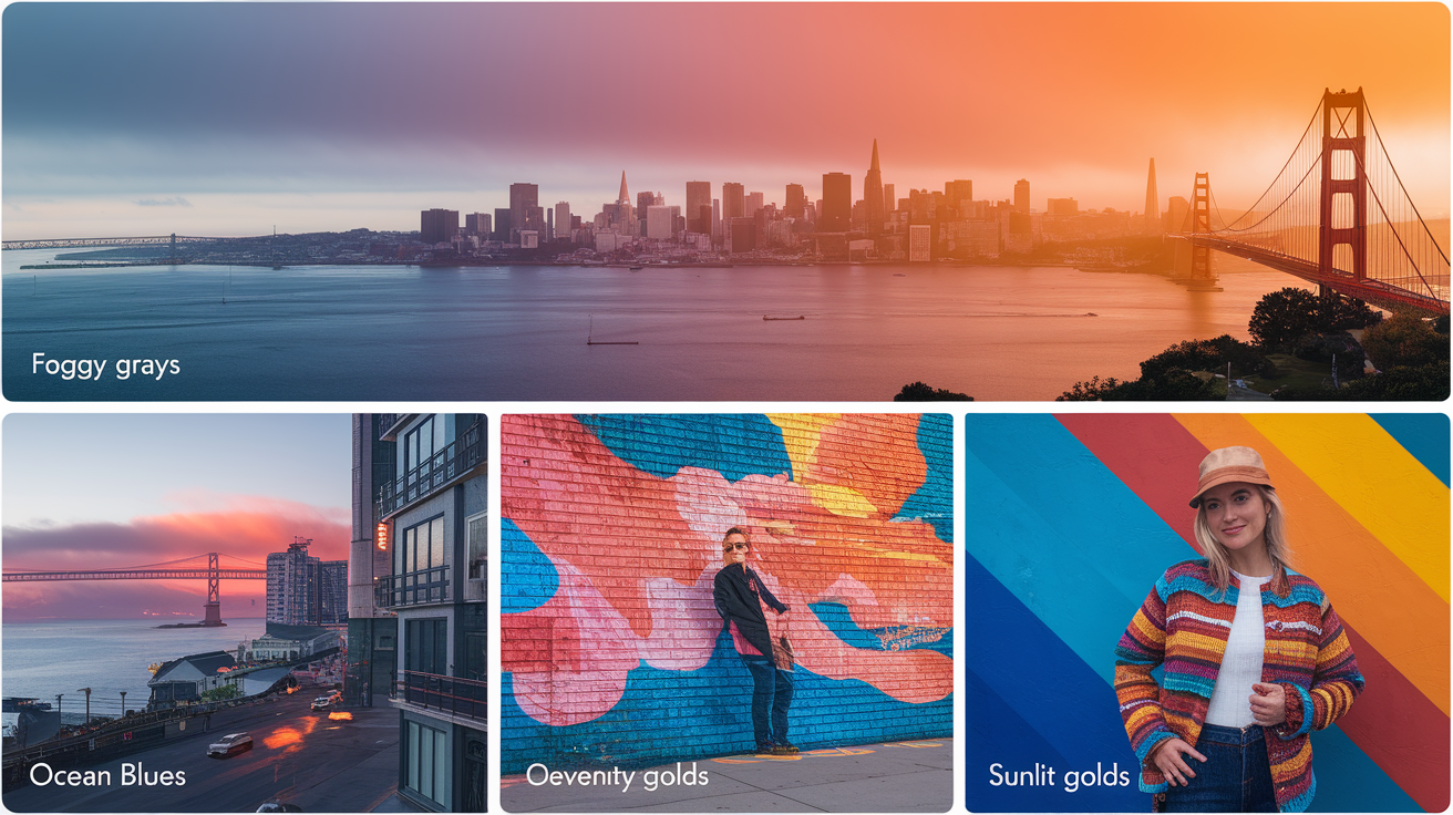
A vibrant cocktail of earth, ocean, sun and culture informs how color analysis functions here. Local stylists sense both personal tone and place, constructing palettes that harmonize foggy grays, ocean blues, golden sun, and the city's vibrant art scene. Most use 4- or 12-season systems to anchor choices, then tune for microclimates and neighborhood vibe.
The outcome remains intimate, yet winks to San Francisco, Oakland and Berkeley–all with their own slant.
Fog and sun
San Francisco's microclimates do something no AI app can fully account for: the fog that blankets Sunset and Richmond all morning strips warmth from every color you wear, softening contrast and cooling skin undertones in ways that shift your whole look. Then afternoon sun rolls in and makes those same shades pop with unexpected warmth. A top that feels alive at noon near Dolores Park can look washed-out and flat at 8 a.m. on Irving Street. That's why a guide to finding your color season in the Bay Area has to account for both realities. Local analysts check your swatches in cool, diffused shade and direct light — so your blues stay crisp instead of dingy, and your reds glow instead of glare. If you gravitate toward softer, dusty hues and you live west of Twin Peaks, there's a reason: your seasonal palette you've been building instinctively may already be pointing toward Muted Summer tones. Analysts consistently recommend these low-chroma, cool-leaning palettes for Sunset and Richmond residents precisely because they work with the grey cast rather than fighting it. When you avoid mood you create by wearing overly saturated colors in flat fog light — that jarring, off-kilter feeling — everything about your appearance reads more cohesive and intentional.
Select mid-chroma colors that stand on their own in diffuse light, and ground them with stable neutrals. For Winters, clear sapphire or ink navy manage both fog and glare. For Summers, dusty blue and misty mauve keep cool. Springs sparkle with warm coral and honey. Autumns golden brown that echo local hills and thrive in olive, terracotta.
Layer weight and texture for adaptation to quick changes. Matte knits keep saturation honest in fog, a silk scarf adds light bounce at noon. A pewter ribbed cardigan over a teal tee bridges both.
- Foggy mornings: slate, eucalyptus green, steel blue, heathered plum, pewter, soft teal
- Sunny afternoons: marine navy, bright cobalt, coral, sunflower, warm camel, clean white
Nature's influence
Parks, coastline, and flora feed a wide set of earth and water notes: eucalyptus greens, dune beiges, driftwood taupe, sea-glass teal, and kelp brown. These come across earthy and carry through seasons with hue adjustments.
Nature hues can soothe a look without becoming drab. A sage dress with sand sandals seems solid. Switch to ocean blue earrings to energize without yelling.
Many find a small capsule helps: 2 neutrals (driftwood, ink), 2 core colors (eucalyptus, deep teal), 1 accent (sunlit gold). Rotate fabrics—linen for day, wool for wind, satin for night—so the same colors flex with weather.
Urban inspiration
Street art, tech campuses, and neon signs add punch: hot pink murals, electric blue bike lanes, sunny yellow doors. Pair classic city neutrals—charcoal, asphalt, fog gray—with one shot of bold: a cobalt bag, a vermilion lip, or chartreuse socks. The contrast keeps looks fresh without fuss.
Mix Old World and new: trench in stone, sneaker in neon lime. Oakland may be warmer and earthier, San Francisco is cool and crisp, Berkeley frequently mixes bookish neutrals with whimsical brights.
Color services here pay homage to both the 4-season map and 12-season nuance, then tweak for neighborhood lifestyle and even home decor, as many take these palettes into art and interiors.
After your analysis
Use your personal color palette as a guide, not a mandate. While many breathe a sigh of relief—silver or gold suddenly all adds up—there can still be voids as trends gloss over certain hues. This is okay. Stay swatch-near, jot down the undertones and overtones you gleaned, and construct your clothing choices around your personal style objectives. Commit where it matters, be flexible where it doesn't.
Using your swatch
Compare the items to your swatch in natural light. Hold fabric or a lipstick bullet beside the card and watch your skin: if it looks brighter and smoother, it works. If shadows deepen or redness pops, skip it.
Online, screenshot the product, put it next to a photo of your swatch and compare hue, value (light–dark) and chroma (soft–clear).
Wardrobe guide by signature colors:
- Neutrals: charcoal, cocoa, soft navy, stone
- Base pieces: trousers, skirts, blazers in your neutrals
- Accent lights: icy pink, shell, mist, butter for shirts and scarves
- Accent brights: teal, raspberry, saffron, jade for knits and dresses
- Metals: silver, gold, rose gold per your undertone
- Makeup: lip and blush shades echo accent brights. eyeshadow, in muted neutrals.
Keep your seasonal palette with you — a digital Color Wallet is typically included in your session, but if you want a physical fabric swatch book, expect it to run an extra $50–$75 as a premium add-on. It's one of those costs that catches people off guard, so ask upfront before you book. Once you have you seasonal palette you in hand, using it in-store is straightforward: hold the swatch directly against the garment on the hanger. Sticking to your palette makes mix-and-match dressing effortless and cuts down on regretted purchases you'll never actually wear.
Some find themselves a different season than they expected. One customer was 100% sold but couldn't find stock. She concentrated on neutrals initially and brought in brights as they manifested.
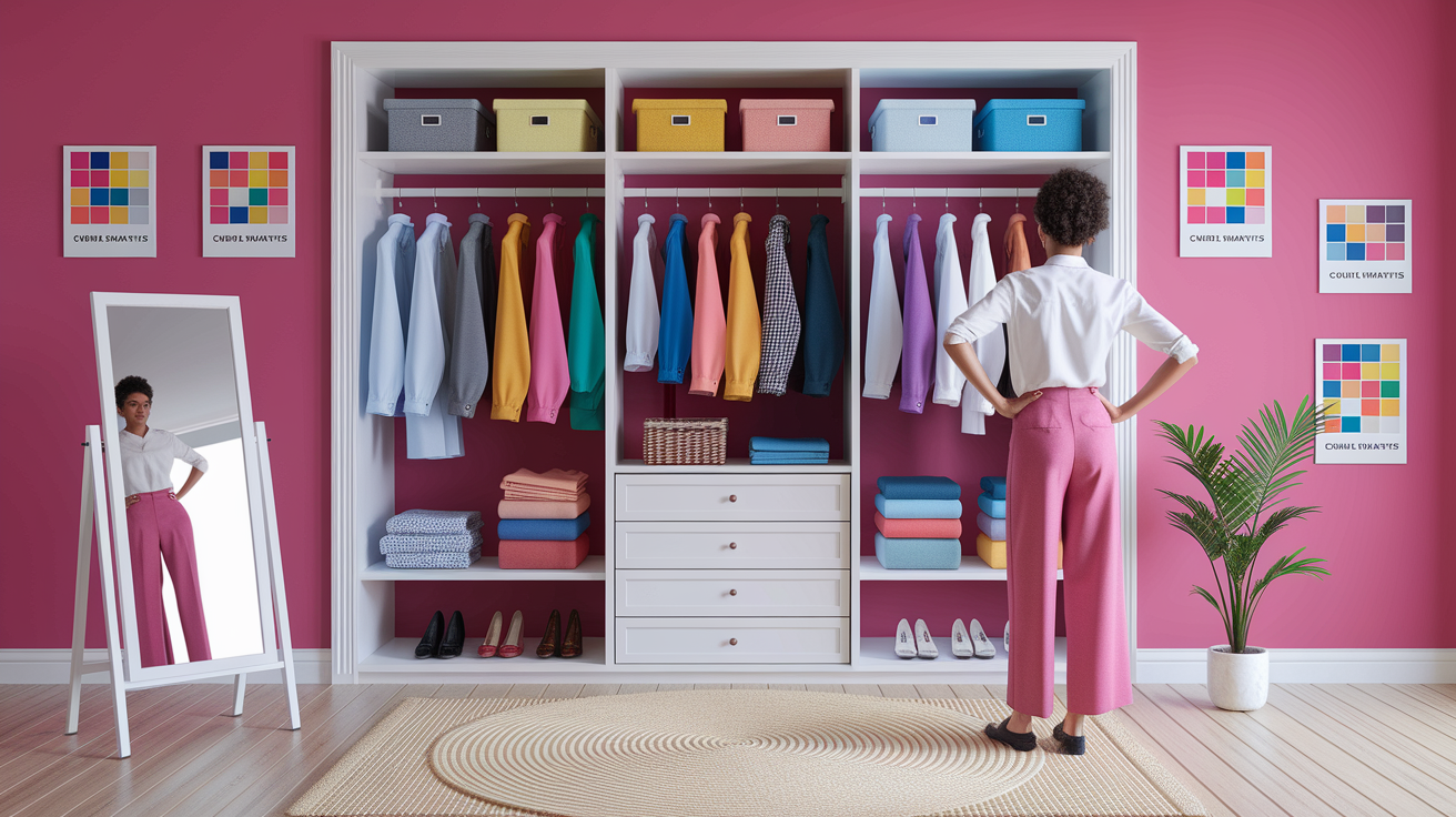
A wardrobe audit
- Pull all tops, bottoms, layers, dresses, shoes, bags, makeup.
- Sort: "Yes—matches swatch," "Maybe—near match or sentimental," "No—clashes."
- Test 'Maybes' in the daylight. Examine complexion glow and eye clearness.
- Gift or salvage 'No' to clear space and influence future choices.
- List gaps: e.g., soft navy trousers, cocoa boots, raspberry knit, rose-nude lipstick.
Hacked with dye (turn cool white to soft stone), swapped buttons to your metal, or added a scarf in your best face color. The final product just seems serene, orchestrated, and quick to navigate.
Anticipate friction if items you adore sit outside the spectrum. Save one or two for rapture, construct the others for beauty.
Evolving your style
Test new pairings within your season: jade with cocoa, shell with charcoal, saffron with soft navy. Record victories in a note with pictures and names of shade.
Refresh with hair color, new positions, or climate changes. Book seasonal check-ins to perfect picks & refresh makeup. Customized advice—earring metal, glasses frames, lip toner—that anchor your decisions.
That knowledge of your colors rewards a lifetime and your poise gleams.
Conclusion
To conclude, color analysis San Francisco seems both innovative and practical. Fog, bright light and city grit all have a role. A fast trial on a sunny afternoon in the Mission can provide fresh hints. A peaceful walk around the Presidio reveals gentle variations in shade. Little adjustments accumulate quickly. A warm blush picks up a Monday. A cool navy accents a sharp pitch. Clear frames tidy up a Zoom call. These are the victories that save time, reduce waste, and assist you in demonstrating up with effortless.
Feel like giving it a whirl? Book a local consult, or start with a simple test at home: natural light, no makeup, plain tee, then drape two hues. Notice what wakes up your face. Post your selections, and lets swap advice.
Frequently Asked Questions
What is personal color analysis?
Personal color analysis identifies colors that flatter your skin, eyes, and hair. A professional evaluates undertone, depth, and contrast to place you in a seasonal palette. You get a customized guide you can use for clothes, makeup, and accessories.
How does the analysis process work in San Francisco?
One of our certified analysts conducts a seasonal color analysis in natural light where possible. Using calibrated drapes and neutral lighting, they evaluate your undertones and contrast levels. Sessions last 60–90 minutes and conclude with a personalized color palette and actionable wardrobe advice.
What are the benefits beyond my closet?
By utilizing a personal color analysis service, you save time, returns, and build a color-coordinated wardrobe, making makeup matching easier and enhancing your personal style for a professional image at work and socially.
Can diverse Bay Area lighting affect my results?
Yes. Fog, coastal light, and even indoor LEDs can skew colors, which is why the color analysis service uses controlled lighting for the analysis. They then consult on how to modify your personal color palette for real-world Bay Area conditions.
How do I find my season in SF?
Schedule with one of our expert color analysts to embark on your personal color analysis journey. Inquire about their services, certifications, and techniques to ensure you receive accurate, flattering colors for your wardrobe.
What is the Bay Area color palette trend?
Neutrals with cool or soft undertones owe their popularity to foggy light and tech workwear, making them essential in personal style journeys. Consider slate, charcoal, gentle navy, and subdued greens for outfits that align with your seasonal color palette.
What should I do after my analysis?
Begin your personal style journey with essentials in your best neutrals. Refresh lipstick, blush, and frames while carrying your mini color swatch card when you shop. Substitute basics first, then add accent colors, reviewing your seasonal color palette each season.