Best Colors for Olive Skin: Clothing Matrix & Capsule
 Reviewed by Alexandra Gilmore
The best colors for olive skin balance its green-gray or golden-green cast without disappearing into it. Start with soft ivory, mushroom, taupe, cocoa, softened navy, teal, forest green, burgundy, aubergine, and controlled warm accents; then adjust depth and saturation with the matrices below.

Best Colors for Olive Skin: Key Takeaways
- Build from contrast, not a rigid label. The best colors for olive skin create visible separation without making the complexion look gray, yellow, or disconnected. Teal, forest green, burgundy, aubergine, softened navy, ivory, mushroom, taupe, and cocoa are dependable places to begin.
- Olive is an undertone, not a depth. Light, medium, and deep olive skin can share a green-gray or golden-green cast while needing different color values. A pale olive complexion may need softened mid-tones; a deep olive complexion can often carry denser, more saturated versions of the same families.
- Use matrices as a fitting-room shortlist. Each table below gives a base color, a lighter or softer option, a deeper option, and a useful pairing. It is a practical testing sequence, not a promise that one shade flatters every olive complexion.
- Make a capsule from connections. Four neutrals, four tops, two layers, and two bottoms are enough when every accent works with at least two anchors. The result is more useful than collecting isolated “best” colors.
- Judge the face, not the swatch. In stable daylight, look for clearer eyes, an even-looking jaw and mouth area, and shadows that do not suddenly deepen. Repeat the comparison under your normal indoor lighting before buying.
The best colors for olive skin are usually balanced, complex shades with enough depth to frame the face: soft ivory, mushroom, taupe, cocoa, softened navy, teal, pine, burgundy, aubergine, muted rose, and carefully chosen warm accents. The exact version matters. One person may need smoky teal while another needs clear peacock; one may glow in clay while another looks more balanced in berry.
This guide turns that nuance into clothing color matrices, outfit formulas, and a compact wardrobe plan. If you are still deciding whether your undertone is olive, begin with the neutral vs. olive undertone guide. Then use the comparisons here to build a shortlist you can test on your own face.
💫 Discover Your Complete Color Palette
Ready to discover all the colors that make you look radiant? Our comprehensive color analysis will reveal your complete personal palette - perfect for hair, makeup, and wardrobe decisions.
Find My Color Palette →Deep emerald, teal and sapphire provide obvious contrast. Terracotta, rust and burnt orange warm the complexion. Cream, camel and warm gray make outfits easy to style.
Stay away from cool pastels that can fade your glow, and go for warm versions such as coral or peach.
To construct a stable palette, begin with three reliable shades, then layer on accent colors.
To compare this result with a neighboring skin-tone question, use the companion article “Best Colors for Dark Skin Female”, which keeps the two closely related questions distinct.
📚 Recent Articles
What Olive Skin Means for Clothing Color
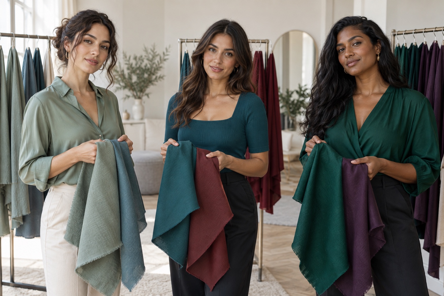
Olive skin is commonly recognized by a green, gray, or golden-green quality beneath the surface color. It may be light, medium, or deep, and it may lean warmer, cooler, or more balanced. That is why “olive equals warm” is too blunt to guide a wardrobe. Surface redness, tanning, lighting, and surrounding colors can all change what you notice first.
Skin color itself is also more complex than a single undertone label. Dermatology research describes melanin, blood flow, skin thickness, carotene, and other factors as contributors to visible skin color; objective methods use reflected light and color spaces rather than a single visual trick. The overview of cutaneous colorimetry indexed by PubMed is useful context for why a vein check cannot settle a clothing palette.
For styling, separate three variables. Depth is how light or dark a color appears. Saturation is how clear or muted it appears. Temperature is whether it leans warm, cool, or balanced. Change one variable at a time. If bright emerald overwhelms you, test smoky teal before rejecting blue-green entirely. If camel turns the face yellow, compare mushroom or cocoa at a similar depth.
Your natural contrast matters too. Someone with dark hair, bright eyes, and light olive skin may support a crisp ivory-and-navy combination. A person whose hair, skin, brows, and eyes sit closer together may prefer mushroom with pine. The facial contrast guide helps you decide how widely to space the values in an outfit.
The Olive-Skin Clothing Color Matrix
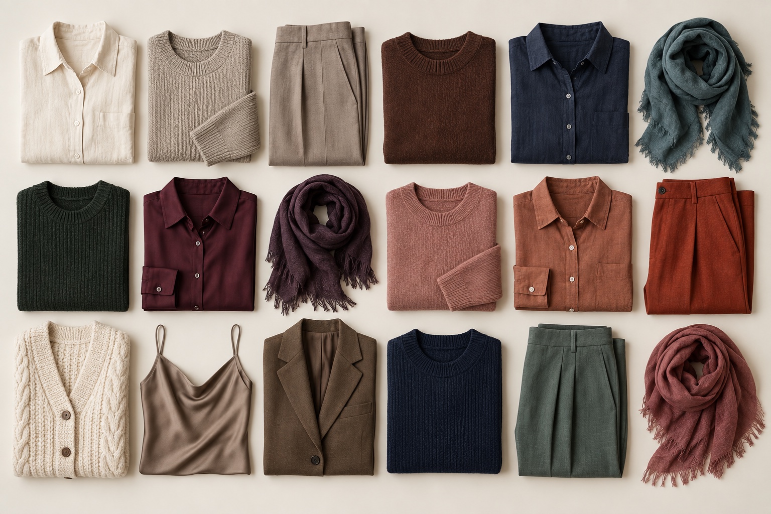
Use this matrix as a rack-filtering tool. Pick two candidates from one row, keep their fabric finish and depth reasonably similar, and compare them beneath the face. The “reconsider” column is not a ban; it flags versions that often merge with olive skin or exaggerate grayness and yellowness.
| Color family | Start here | Try softer | Try deeper | Reconsider first |
|---|---|---|---|---|
| White | Soft ivory | Oyster | Warm stone | Optic white |
| Brown neutral | Balanced taupe | Mushroom | Cocoa or espresso | Skin-matching beige |
| Blue neutral | Softened navy | Blue-gray | Ink | Electric royal blue |
| Green | Teal or pine | Eucalyptus | Forest or emerald | Yellow chartreuse |
| Red | Burgundy | Muted rose | Oxblood | Fluorescent tomato |
| Purple | Aubergine | Smoky plum | Blackberry | Chalky lavender |
| Warm accent | Clay or paprika | Muted coral | Cinnamon | Pale peach-beige |
Notice that the strongest starting colors are neither uniformly warm nor uniformly cool. Teal balances blue and green. Burgundy and aubergine introduce red-purple contrast without the fluorescent edge of a neon. Mushroom and taupe are quieter than stark gray yet less yellow than many beiges. These in-between qualities often make them productive test colors for olive skin.
Adjust the Matrix for Warm, Cool, or Neutral Olive Skin
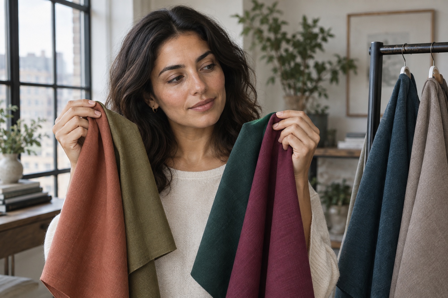
If your olive undertone leans warm, begin with petrol, moss, forest, terracotta, paprika, caramel, cream, and warm cocoa. Keep orange controlled: a browned clay is usually easier to balance than a bright tangerine. Antique gold can repeat visible warmth, but it should not be used as proof that every warm color will work.
If your olive undertone leans cool, test blue-teal, pine, softened navy, berry, burgundy, aubergine, charcoal, and cool mushroom. Compare a blue-red with an orange-red and a blue-green with a yellow-green. If the cooler version sharpens the eyes and reduces yellow-gray shadows, carry that direction through the palette.
Neutral olive skin often handles balanced colors that are difficult to call clearly warm or cool: petrol, muted peacock, dusty rose, wine, taupe, cocoa, and softened navy. But neutral does not mean every temperature is equal. Your best result may still be slightly warm or slightly cool. The warm vs. cool olive guide provides a longer comparison sequence.
Do not infer undertone from ethnicity, hair color, or tanning response. Work from repeated visual evidence. A color that makes the fabric look attractive but makes the face look tired is not helping. A useful color keeps attention on your eyes and expression while the jaw, nose, and mouth area appear coherent.
The Best Neutral Colors for Olive Skin
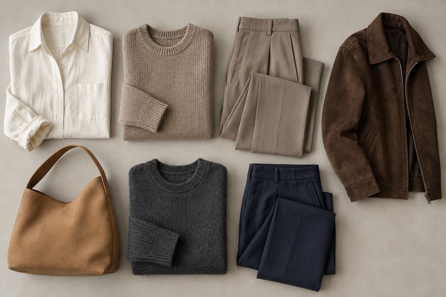
Neutrals determine whether a capsule wardrobe actually combines. Start with one light, two mid-to-dark, and one flexible bridge neutral. Soft ivory is a gentler light anchor than optic white. Mushroom and taupe bridge warm and cool accents. Cocoa adds warmth without the yellow cast of camel. Softened navy and charcoal provide depth without requiring black.
Beige is not automatically flattering. When its depth and yellow-green cast are too close to the skin, the neckline can erase useful contrast. Move lighter to ivory, grayer to mushroom, pinker to rose-taupe, or darker to cocoa. Apply the same logic to khaki: compare olive-drab, stone, and deep moss rather than accepting the first “olive-friendly” neutral.
Black can work, especially on deeper or higher-contrast olive complexions. If it creates hard shadows on a softer face, move it away from the neckline, add an ivory collar, choose washed black, or switch to ink navy. Bright white can be adjusted the same way. The goal is not to forbid strong neutrals but to control how much contrast reaches the face.
Adjust Color Depth for Light, Medium, or Deep Olive Skin
The same color family can serve multiple olive depths when its value changes. This second matrix keeps the palette connected while preventing a pale complexion from being overwhelmed or a deep complexion from being underpowered. For a more detailed light-depth discussion, see the fair olive skin color guide.
| Wardrobe job | Light olive | Medium olive | Deep olive |
|---|---|---|---|
| Light neutral | Oyster, soft ivory | Ivory, warm stone | Cream, pale mushroom |
| Dark neutral | Soft navy, cocoa | Navy, charcoal | Ink, espresso, black |
| Blue-green | Eucalyptus, smoky teal | Teal, petrol | Peacock, deep emerald |
| Red-purple | Muted rose, soft berry | Burgundy, plum | Oxblood, blackberry |
| Warm accent | Dusty coral, muted clay | Paprika, cinnamon | Rich terracotta, copper |
Light olive skin often benefits from middle values and softened saturation rather than colors that are both very pale and very dusty. Medium olive has broad range, so test contrast deliberately instead of defaulting to “medium” everything. Deep olive can carry dense jewel colors, yet still needs separation: an espresso blouse may merge while cream, peacock, or blackberry gives the face a stronger frame.
Seasonal changes can alter surface depth without replacing the undertone. Keep the color families that work and shift their value: smoky teal can become deep teal, rose can become burgundy, and mushroom can become cocoa. This creates a wardrobe that adapts without requiring a new identity every summer or winter.
Six Outfit Formulas for Olive Skin
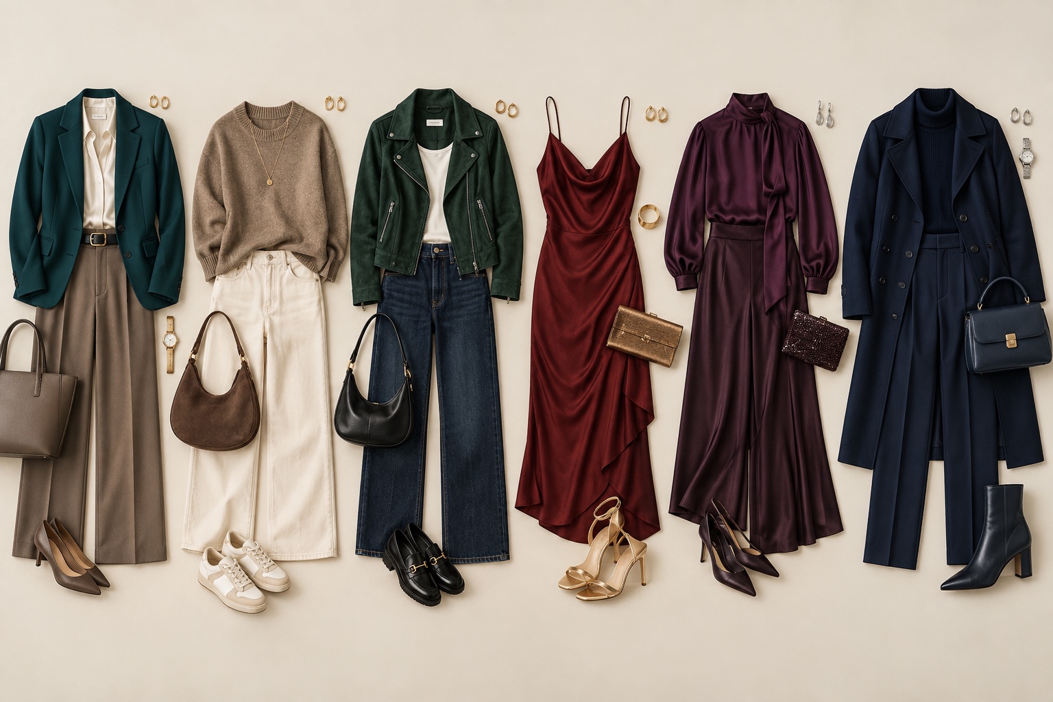
- Easy workwear: soft ivory blouse, cocoa trousers, petrol blazer, and brushed gold or pewter jewelry according to your temperature lean.
- Low-contrast casual: mushroom knit, taupe jeans, eucalyptus overshirt, and cocoa shoes. The values stay close while the textures keep the outfit dimensional.
- High-contrast casual: cream tee, ink jeans, teal jacket, and burgundy bag. Repeat the dark value in two places so the contrast looks intentional.
- Warm-leaning evening: deep terracotta dress, espresso layer, and antique gold accents. If orange dominates, replace terracotta with oxblood.
- Cool-leaning evening: aubergine top, charcoal trousers, soft ivory near the face, and pewter accessories. Blackberry is a stronger alternative for deeper coloring.
- One-color column: softened navy top and trousers with a teal or burgundy outer layer. A column simplifies coordination and lets the accent do the framing.
Fabric can shift the result. Velvet makes a jewel tone look deeper; washed linen softens it; satin increases highlight contrast. Compare colors in the material you intend to wear. A matte burgundy knit and glossy burgundy blouse may behave like two different shades near the face.
Build a 12-Piece Olive-Skin Capsule Wardrobe
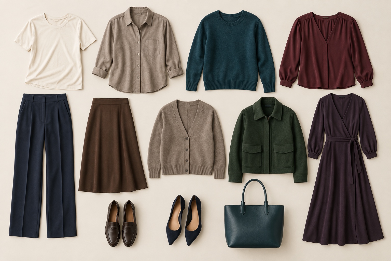
A useful 12-piece olive-skin capsule wardrobe can begin with four tops, two bottoms, two layers, one dress or jumpsuit, two pairs of shoes, and one bag. Choose:
- soft ivory tee;
- mushroom shirt;
- teal knit;
- burgundy blouse;
- softened navy trousers;
- cocoa jeans or skirt;
- taupe cardigan;
- forest or petrol jacket;
- aubergine dress or jumpsuit;
- cocoa shoes;
- navy shoes;
- burgundy or deep teal bag.
This group produces light, tonal, and high-contrast combinations without depending on black or bright white. Before adding a piece, require it to connect to at least three existing items. The teal knit should work with both bottoms and one layer; the aubergine dress should work with the cardigan, jacket, and at least one pair of shoes.
If your life is more casual, turn the blouse into a long-sleeve tee and the dress into an overshirt. For formal work, change the cocoa jeans to tailored trousers and the cardigan to a structured jacket. The colors remain stable while the garment categories follow your real calendar.
How to Test Colors in Daylight
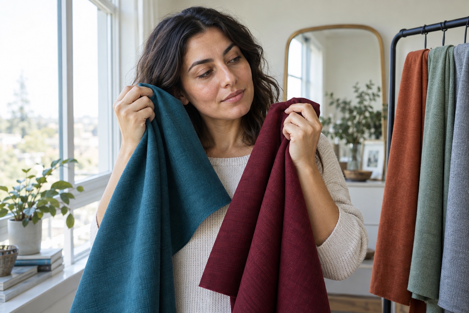
- Stand beside a bright window in indirect daylight. Remove strongly colored makeup and keep the background quiet.
- Compare two fabrics from the same family at similar depths: teal vs. moss, burgundy vs. brick, mushroom vs. camel.
- Cover the clothing underneath so it cannot influence the comparison. Bring each fabric to the neckline for several seconds.
- Watch the face for repeated changes: eye clarity, shadow around the mouth, redness, yellow-gray cast, and how sharply the jaw separates from the fabric.
- Keep the better fabric and compare it with a nearby version that changes only temperature, saturation, or depth.
- Photograph finalists only as a record. Do not let automatic white balance overrule what you see in the same physical light.
- Recheck the winner under your office, home, or event lighting.
Objects can appear to match under one light and separate under another, a phenomenon called metamerism. X-Rite's explanation of how changing illumination changes color appearance is why the final indoor check matters. Consistency matters more than chasing a specific bulb number: use the same setup for your first comparison, then test the shortlist where the clothing will actually be seen.
Colors to Reconsider—and Better Swaps
| If this looks off | What may be happening | Try instead |
|---|---|---|
| Optic white | Too much value or blue-white contrast | Soft ivory, oyster, cream |
| Skin-matching beige | Not enough separation at the neckline | Mushroom, taupe, cocoa |
| Pale yellow | Repeats a yellow-green cast | Ochre, paprika, burgundy |
| Mint or celery | Merges with green-gray undertone | Eucalyptus, teal, forest |
| Chalky lavender | Too pale and powdery | Smoky plum, aubergine |
| Neon coral | Overpowers muted coloring | Muted rose, clay, berry |
| Flat black | Creates hard facial shadows | Ink navy, charcoal, espresso |
A poor result is diagnostic. If a pale shade drains you, deepen it before changing families. If a bright color arrives before your face, soften it. If a neutral turns you yellow, shift its temperature or increase its depth. Keep notes on the adjustment that worked; the pattern is more valuable than a list of isolated winners.
Once clothing colors feel coherent, extend the same contrast and temperature logic to hair. The hair colors for olive skin guide explains how to avoid a shade that competes with the wardrobe palette. For a broader seasonal framework, compare your results with the seasonal color analysis guide.
People Also Ask
What colors look best on olive skin?
Teal, forest green, burgundy, aubergine, softened navy, ivory, mushroom, taupe, and cocoa are strong starting points. Adjust each family for your depth and saturation: smoky versions often suit softer coloring, while clear or deep versions can support higher contrast.
What neutral colors suit olive skin?
Soft ivory, mushroom, balanced taupe, cocoa, charcoal, ink, and softened navy give a capsule useful range. If beige disappears into your skin, move lighter, darker, or grayer. If black is harsh, use it below the waist or replace it with ink navy.
Can olive skin wear green?
Yes. Test greens that separate from the undertone, such as teal, pine, forest, or emerald. A yellow-green that closely matches the skin can blur the neckline, while a bluer, deeper, or more saturated green may create cleaner contrast.
Should olive skin wear gold or silver?
Either can work. Warm-leaning olive may prefer antique gold or bronze; cool-leaning olive may prefer pewter or silver; neutral olive may combine them. Compare metals beside the face in the same light and use the clearer result as a styling preference, not an undertone diagnosis.
Common Questions: The Ultimate Color FAQ
Is olive skin always warm?
No. Olive skin can lean warm, cool, or neutral and can occur at different depths. Use side-by-side fabric comparisons to isolate temperature rather than treating green or golden qualities as automatic proof of warmth.
Can olive skin wear pastels?
Yes, but the right pastel needs enough separation. Try dusty rose, smoky periwinkle, eucalyptus, or soft blue-gray. If a chalky pastel emphasizes grayness, deepen or slightly saturate it instead of rejecting the whole family.
What is the fastest way to build an olive-skin palette?
Choose one light neutral, two dark neutrals, two blue-green accents, and two red-purple accents. Test them in consistent daylight, keep the strongest versions, and require every new capsule item to coordinate with at least three pieces you already own.
Do I need a season name first?
No. A season can organize successful observations, but you can build a useful wardrobe by testing depth, saturation, temperature, and contrast directly. If you want a personalized starting point, use the color palette finder and confirm its suggestions with real fabrics.