Soft Winter Palette Guide: Colors, Outfits, and Soft Summer Differences
 Reviewed by Alexandra Gilmore
Soft Winter is cool and muted like Soft Summer, but it needs deeper colors and more definition. Compare charcoal with dove gray, ink navy with soft navy, and blackberry with mauve to see which value range supports your features.

Soft Winter Palette: Key Takeaways
Soft Winter is a useful descriptive palette for cool, muted coloring that still needs more depth and definition than Soft Summer. It is not a universally standardized season in every 12- or 16-season system, so treat the name as a working direction rather than a diagnosis. The practical question is whether deeper charcoal, ink navy, blackberry, and smoky teal support you better than Soft Summer's dove gray, dusty blue, mauve, and softened navy.
- Temperature: both palettes are cool to neutral-cool; warmth is not the main separator.
- Chroma: both are muted, although Soft Winter can hold slightly clearer accents.
- Value: Soft Winter is deeper; Soft Summer stays light to medium.
- Contrast: Soft Winter usually needs medium contrast, while Soft Summer is most comfortable with low-to-medium contrast.
- Best test: compare matched pairs in the same daylight and watch the face, not the fabric.
💫 Discover Your Complete Color Palette
Ready to discover all the colors that make you look radiant? Our comprehensive color analysis will reveal your complete personal palette - perfect for hair, makeup, and wardrobe decisions.
Take Color Analysis Quiz →Color names alone can be misleading. A berry may be deep or light, clear or gray-softened; a navy may read almost black or quietly blue. This guide uses the familiar color dimensions of hue, chroma, and value—the same basic attributes explained in X-Rite's overview of color attributes—to make the Soft Winter versus Soft Summer decision observable.
To test this Summer result from another useful angle, continue with the companion article “Soft Summer Color Palette Guide”, which keeps the two closely related questions distinct.
📚 Recent Articles
What Defines the Soft Winter Palette?
Soft Winter sits in the cool, deep, and muted part of a color map. Its neutrals include charcoal, graphite, ink navy, cool espresso, and pearl rather than stark black and optic white. Its accents include blackberry, cranberry, smoky plum, blue spruce, deep teal, and muted raspberry. The overall effect is controlled rather than icy or electric.
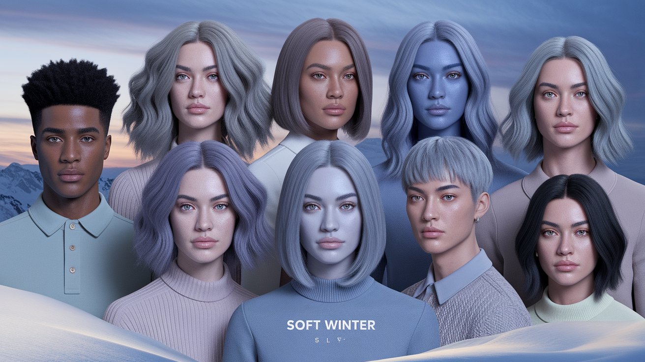
The label does not require one hair color, eye color, ethnicity, or skin depth. Those features can offer context, but they cannot settle a palette by themselves. What matters is repeated color behavior: deeper muted cools make the complexion look more even and the features more connected, while bright Winter colors feel too forceful and pale Summer colors lose definition.
| Dimension | Soft Winter direction | What to watch for |
|---|---|---|
| Temperature | Cool to neutral-cool | Blue-based reds and cool greens look calmer than tomato, rust, or camel. |
| Chroma | Muted to moderately muted | Gray-softened color supports the face; neon or jewel brightness arrives first. |
| Value | Medium-deep to deep | Charcoal and ink navy define the face better than dove gray and powder blue. |
| Contrast | Medium | Layered dark, medium, and light values work better than either stark or fully blended outfits. |
Soft Winter vs Soft Summer: Side-by-Side Comparison
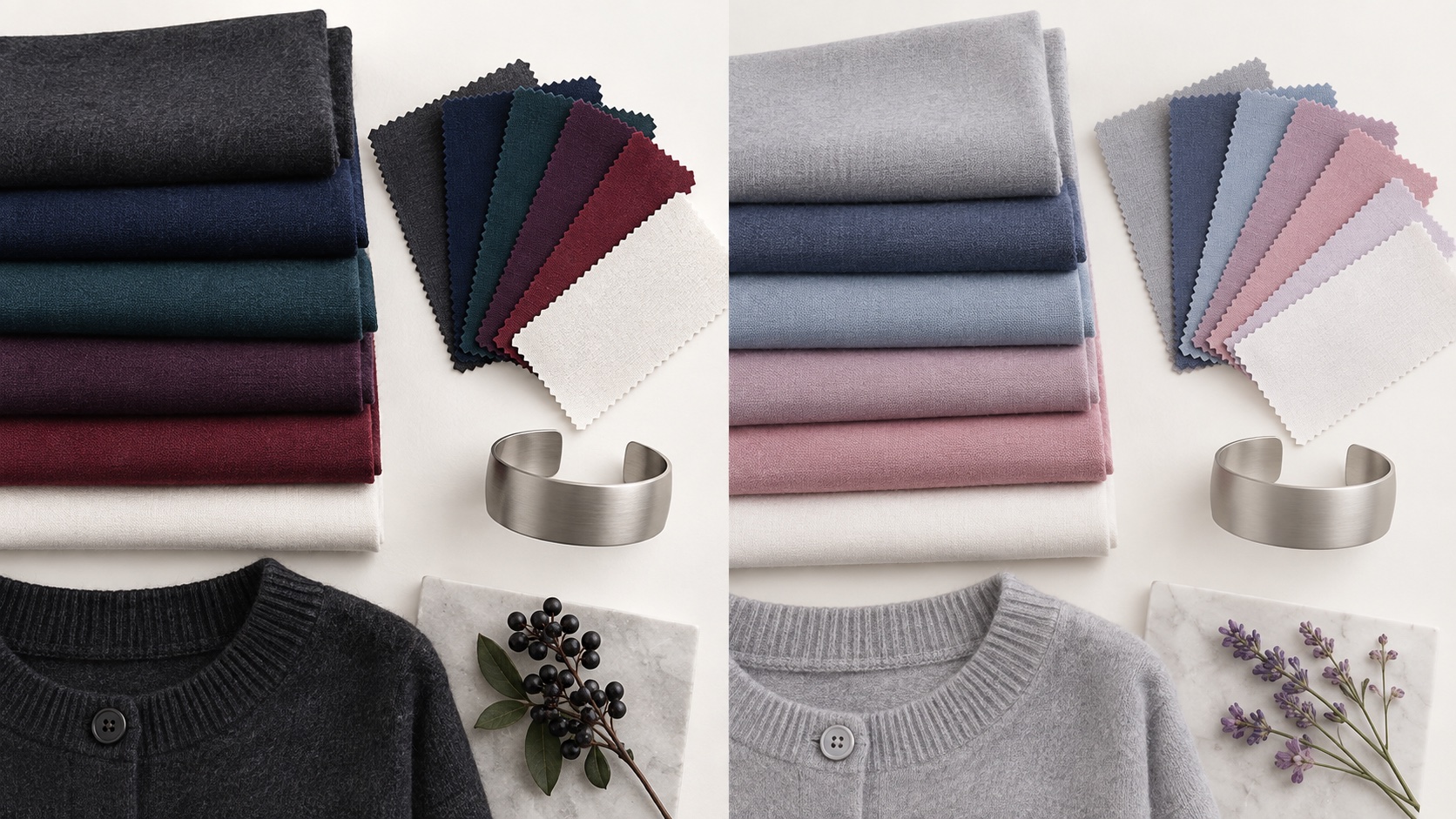
The clearest difference between Soft Winter and Soft Summer is depth. Soft Winter needs enough darkness to frame the face, while Soft Summer is more harmonious in misty light-to-medium colors. Both may wear blue, rose, teal, plum, and gray, so compare versions of the same color family instead of unrelated favorites.
| Feature | Soft Winter | Soft Summer |
|---|---|---|
| Overall impression | Cool, muted, grounded, defined | Cool, muted, airy, blended |
| Best dark neutral | Charcoal, graphite, ink navy | Soft navy, medium pewter, blue-gray |
| Best light neutral | Pearl white, cool stone | Soft white, dove gray, cool beige-gray |
| Berry family | Blackberry, cranberry, deep raspberry | Dusty rose, mauve, soft raspberry |
| Blue-green family | Deep teal, blue spruce, smoky pine | Dusty teal, eucalyptus, muted aqua |
| Typical failure | Pale colors make the face look unfinished | Deep colors create heaviness or shadows |
If charcoal looks polished but dove gray looks vague, Soft Winter is the stronger direction. If dove gray looks elegant but charcoal becomes the first thing you see, move toward Soft Summer. For the complete lighter palette, use the Soft Summer color palette guide; this page keeps the comparison within Soft Winter so the two guides do not compete for the same job.
How to Test Soft Winter Against Soft Summer
- Control the setting. Stand near a window in indirect daylight. Turn off colored lamps, remove strong makeup, and keep the camera's filters and portrait mode off if you record the test.
- Keep temperature and chroma similar. Compare a deep muted navy with a softer medium navy, not navy with peach. Then compare blackberry with dusty rose and deep teal with muted aqua.
- Watch the same areas. Look at under-eye shadows, redness, the jawline, lip definition, and whether the eyes remain connected to the face.
- Repeat the winner. One pair can be affected by fabric shine or personal preference. Use at least three matched pairs on separate days.
- Choose the direction, not a perfect label. If deeper cool-muted colors repeatedly win, build a Soft Winter test capsule. If lighter versions win, follow Soft Summer.
| Soft Winter drape | Soft Summer drape | Useful observation |
|---|---|---|
| Graphite | Dove gray | Does depth create definition or cast a shadow? |
| Ink navy | Soft navy | Which navy balances the eyes without becoming heavy or vague? |
| Blackberry | Mauve rose | Which berry keeps the lips and cheeks clear without exaggerating redness? |
| Deep smoky teal | Dusty blue-green | Which value supports the jawline while keeping the skin even? |
The Soft Winter Color Palette
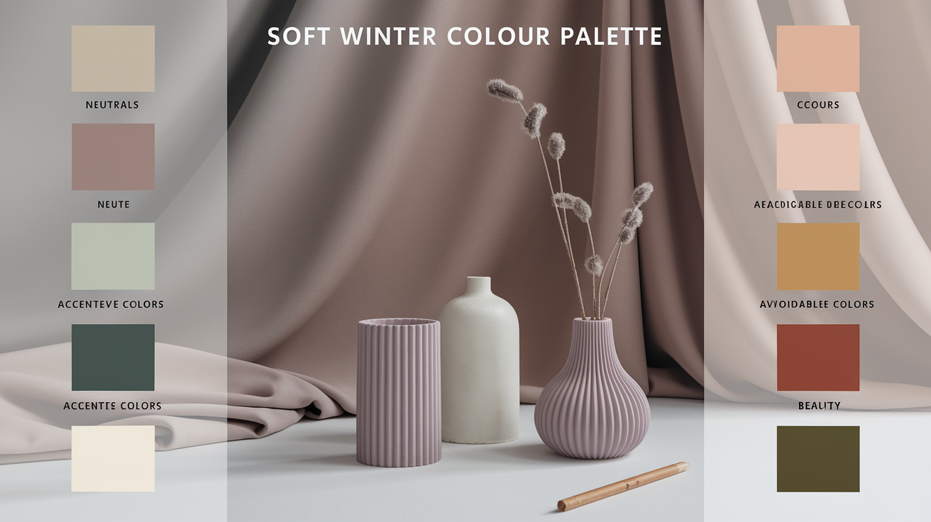
Core neutrals
Start with charcoal, graphite, ink navy, cool espresso, deep pewter, cool stone, and pearl white. Black can work when the fabric is matte or textured, but it is not the only dark option. Replace an optic-white-and-black combination with pearl and charcoal when you want the same structure with less glare.
Accent colors
Use blackberry, cranberry, smoky plum, muted raspberry, deep teal, blue spruce, pine, dusty cobalt, and cool burgundy. An accent can be more saturated than the base palette, but it should still look slightly veiled rather than neon. Compare each new color with a reliable charcoal or navy anchor.
Colors to reconsider
Strong orange, golden camel, mustard, warm beige, yellowed ivory, tomato red, and bright chartreuse usually pull away from a cool-muted direction. Electric cobalt, optic white, and glossy jet black may be cool enough but too sharp. These are comparison clues, not bans: fabric texture, distance from the face, and outfit proportion can change the result.
Soft Winter Outfit Formulas

- Work: ink-navy trousers, dusty-blue shirt, charcoal blazer, and brushed-silver jewelry.
- Casual: graphite denim, blue-spruce knit, pearl tee, and cool espresso shoes.
- Evening: blackberry dress, soft-black wrap, pewter clutch, and a muted raspberry lip.
- Warm weather: soft-navy linen, pearl tank, deep-teal sandals, and a smoky rose accessory.
- Cold weather: charcoal coat, cranberry scarf, ink trousers, and matte black boots.
Medium contrast is the most reliable starting point. Use one deep base, one medium color, and one restrained light accent. Prints are easiest when their background and motif repeat the same cool-muted range—charcoal with smoky teal, for example—rather than jumping from pure white to black.
Makeup, Hair, and Metals
For makeup, compare neutral-cool foundation shades at the same depth and formula. Useful color directions include mauve or cool rose blush, berry or cranberry lips, taupe and charcoal eyeshadow, and plum or graphite liner. Product names are inconsistent, so judge the actual swatch on skin rather than relying on words such as “cool” or “winter.”
Hair color is not a season test. If you choose to color it, ash brown, neutral-cool espresso, soft black, and restrained cool highlights usually integrate more easily than copper, honey, or strongly golden effects. Hair condition, starting color, and maintenance matter more than forcing a seasonal label.
Brushed silver, pewter, gunmetal, hematite, cool pearls, and white gold echo the palette's temperature and finish. If polished silver looks too sharp, change the finish before changing the metal family. A loved warm-metal piece can sit farther from the face or be combined with cool clothing; a palette is a practical guide, not a rulebook.
Soft Winter and Its Neighboring Seasons

If Soft Summer is too light, compare Soft Winter with established Winter palettes next. Cool Winter keeps coolness but raises clarity and contrast. Dark Winter keeps depth but usually tolerates stronger saturation and a sharper dark-light relationship. Soft Winter is the quieter option when both feel slightly severe.
If rust, camel, olive, and warm burgundy consistently work better than blue-based berry and graphite, the issue may be temperature rather than depth. The Summer versus Autumn comparison isolates that cool-versus-warm muted boundary. Do not solve every neighboring-season question at once; identify one variable, test it, and move to the next only if the first result stays mixed.
Common Soft Winter Mistakes
- Typing by features: dark hair does not automatically mean Winter, and light eyes do not automatically mean Summer.
- Testing unrelated colors: black versus pastel pink changes temperature, value, and chroma at once.
- Confusing muted with pale: a color can be deep and muted; softness describes chroma, not only lightness.
- Building around prohibitions: a short set of reliable combinations is more useful than a long “never wear” list.
- Ignoring finish: satin, matte wool, denim, and velvet can make the same nominal color behave differently.
Your Next Step
Choose four matched pairs: graphite versus dove gray, ink navy versus soft navy, blackberry versus mauve rose, and deep smoky teal versus dusty blue-green. Photograph each pair in the same indirect daylight and record only observable changes. If the deeper option wins across most pairs, begin with a small Soft Winter capsule; if the lighter option wins, move to Soft Summer. If the result remains mixed, use the site's season guide or review the broader seasonal color analysis process before buying a full palette.
Common Questions: The Ultimate Color FAQ
Is Soft Winter an official color season?
Not in every system. The name appears in some expanded or custom systems, while standard 12-season approaches usually use Cool, Bright, and Dark Winter. Use the label only when its color dimensions and neighboring palettes are clearly defined.
What is the main difference between Soft Winter and Soft Summer?
Depth is the main separator. Both are cool and muted, but Soft Winter handles charcoal, ink navy, deep teal, and blackberry more easily. Soft Summer is usually better in dove gray, soft navy, dusty blue, mauve, and other light-to-medium values.
Can Soft Winter wear black?
Often, but charcoal or soft black may integrate more smoothly than glossy jet black. Compare the color and finish near the face; if black looks separate or emphasizes shadows, use it below the neckline and choose charcoal above.
Can Soft Winter wear pastels?
Yes, when they are cool and slightly grayed, such as pearl, smoky lilac, or muted icy blue. Pair them with a deeper anchor so the outfit keeps enough definition.
What are the best Soft Winter neutrals?
Charcoal, graphite, ink navy, cool espresso, deep pewter, cool stone, pearl white, and restrained soft black are practical starting points. Select the exact depth by draping rather than by the shade name.
How is Soft Winter different from Cool Winter?
Cool Winter is clearer and usually higher in contrast. Soft Winter uses more gray-softened colors and a quieter dark-to-light relationship. If vivid blue-red and crisp black-and-white overpower you but muted cool depth works, Soft Winter may be the more useful direction.