Soft Summer Palette Clothes: Capsule Wardrobe

Most colour seasons can pull off a reasonably broad range of clothing colours and survive the occasional misstep. Soft Summer is different. Its defining characteristic — a palette built entirely on desaturated, greyed-out, cool-leaning hues — means the wrong fabric shade doesn't just look slightly off. It drains the face, flattens the complexion, and creates that notoriously difficult-to-diagnose "washed out" effect that sends people back to the dressing room wondering what went wrong.
The good news: once you understand which colours are actually working with your natural colouring rather than against it, building a wardrobe becomes surprisingly straightforward.
This guide makes one concrete promise: by the end, you will have a clear, actionable framework for assembling soft summer colour palette clothes that form a functional capsule wardrobe — pieces that mix, layer, and carry you across seasons without a single jarring note.
Here is what that framework is built on:
- The palette is intentionally muted. Soft Summer's signature hues — dusty rose, sage green, soft plum, muted teal, and blue-grey — share a common thread: they are softened, never saturated. What looks flat on a high-contrast season looks precisely right here.
- The romantic, understated aesthetic is a feature, not a limitation. Styling within this palette leans into quiet elegance rather than bold statements, and a well-constructed capsule plays to that strength.
- Neutral selection is where most wardrobes fail. Reaching for black, stark white, or camel out of habit — rather than the greyed, cool-toned neutrals that actually belong in this palette — is the single most common mistake Soft Summers make when shopping.
Work through each section in order if you are building from scratch, or jump to the specific category — tops, bottoms, outerwear, neutrals — where your wardrobe currently has gaps.
What Makes the Soft Summer Color Palette Different From Other Seasons
Most seasonal palettes are defined by two variables: temperature (warm or cool) and depth (light or dark). Soft Summer has a third variable that overrides both — saturation, or more precisely, the near-total absence of it.
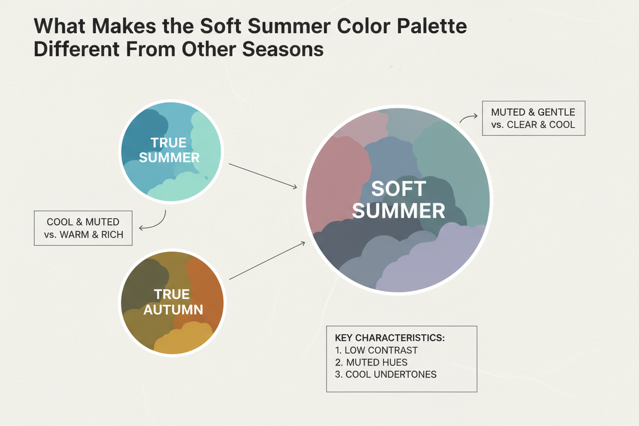
Every colour in the Soft Summer palette has been greyed down. The blue isn't a clear sky blue; it's a blue with ash in it. The pink isn't bubblegum or blush; it's a dusty rose diluted with grey. This heavy desaturation isn't a stylistic preference. It's the structural rule that separates Soft Summer from every other season, including the ones it most closely resembles.
How it differs from True Summer
True Summer is also cool, but its colours carry more clarity. A True Summer can wear crisp lavender or clear periwinkle without looking overdone. Those same colours read as too sharp on a Soft Summer, pulling attention away from the face rather than working with it.
How it differs from Soft Autumn
Soft Autumn and Soft Summer both sit in low-saturation territory, which is why they get confused so often. The real difference is temperature. Soft Autumn's muted hues lean warm — terracotta, camel, golden olive. Soft Summer's lean cool — greyed navy, rose-infused taupe, ash-toned sage. A warm-muted camel coat next to a Soft Summer's face produces the same flat, washed-out effect as a bright colour would.
Why other seasons' colours fail on Soft Summer
Highly saturated colours — the jewel tones that suit a True Winter, the warm brights that work on a Spring — overwhelm Soft Summer colouring. The contrast between a vivid garment and naturally low-contrast features becomes the focal point. The face recedes. The clothes take over. The greyed quality in Soft Summer's palette isn't a limitation to work around; it's what makes these colours actually flattering.
Not sure whether you're actually a Soft Summer? Before investing in a capsule wardrobe, it's worth confirming your season. Take the colour analysis quiz →
The Core Soft Summer Color Palette for Clothes: Your Non-Negotiable Hues
Every piece in your capsule should pass a single test: does this color have a grey modifier and a cool undertone? If yes, it belongs. If it runs warm, saturated, or starkly neutral, it doesn't.
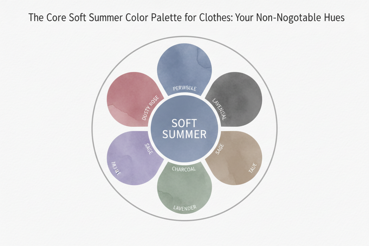
Below are the key hue families, organized by how you'll actually use them.
Signature statement colors
- Dusty rose — a pink with grey and ash running through it; flatters without going saccharine
- Sage green — a green desaturated toward grey-green; muted, botanical, and quietly sophisticated
- Soft plum — a purple-adjacent hue that reads cooler than aubergine and less vivid than violet
- Muted teal — a blue-green that's been greyed down; retains depth without tipping into saturated
- Blue-grey — probably the most versatile color in the palette; neither fully blue nor fully grey, and exceptional as a near-neutral
Supporting mid-tones
- Dusty mauve (a greyed-down warm pink that stays cool in undertone)
- Ash lavender (softer and greyer than true lilac)
- Soft denim blue (unsaturated, not the bright indigo of mass-market denim)
- Greyed periwinkle (cooler and more muted than True Summer's version)
Neutrals (covered in detail below)
- Greyed navy
- Soft charcoal (never full black)
- Rose-tinted off-white (not stark white, not cream)
- Stone with a grey cast (a greyed taupe, not warm sand)
The grey modifier is the common thread. When you're shopping and not sure about a color, hold it next to something you know — a dusty rose swatch, a sage green sample — and ask whether the new piece sits in the same low-saturation, cool-leaning register. If it reads brighter, warmer, or more vivid by comparison, leave it on the rack.
Neutrals That Belong in a Soft Summer Wardrobe (and the Ones That Don't)
Neutrals are where most Soft Summer wardrobes quietly fall apart. They feel safe and universal, so people reach for them without thinking — and the most common ones (black, bright white, camel, warm beige) are exactly the colors that clash with this palette.
Compliant neutrals
| Neutral | Why it works |
|---|---|
| Greyed navy | Retains cool undertone; the grey modifier keeps it from reading as a hard contrast |
| Soft charcoal | Dark enough for depth, but the warmth has been removed; sits in the cool-grey register |
| Rose-tinted off-white | Avoids the cold starkness of pure white; the pink cast harmonizes with dusty rose tones |
| Stone-grey | A greyed taupe; cooler than sand or cream, sits comfortably alongside muted teal and sage |
Non-compliant neutrals — and why they fail
- Black: Too stark for a palette built on softened depth. It creates a jarring frame around your features instead of blending with them.
- Bright white: Cold and harsh in a different direction — it pulls color away from the face rather than reflecting it back.
- Camel and warm beige: The yellow-gold undertone directly conflicts with a cool-leaning palette. This is the Soft Autumn intrusion that derails more Soft Summer wardrobes than anything else.
- Warm tan and honey: Same problem as camel. Yellow-gold undertones simply read as belonging to a different season.
The practical rule: if a neutral looks like it belongs in a rustic, earthy, or sun-warmed setting, it's not a Soft Summer neutral.
The Capsule Wardrobe Framework: How Many Pieces and Which Categories
A capsule wardrobe works because of the ratio of outfit combinations to individual pieces. The goal isn't to own fewer clothes — it's to own clothes that all work together, so every addition multiplies your options rather than complicating them.
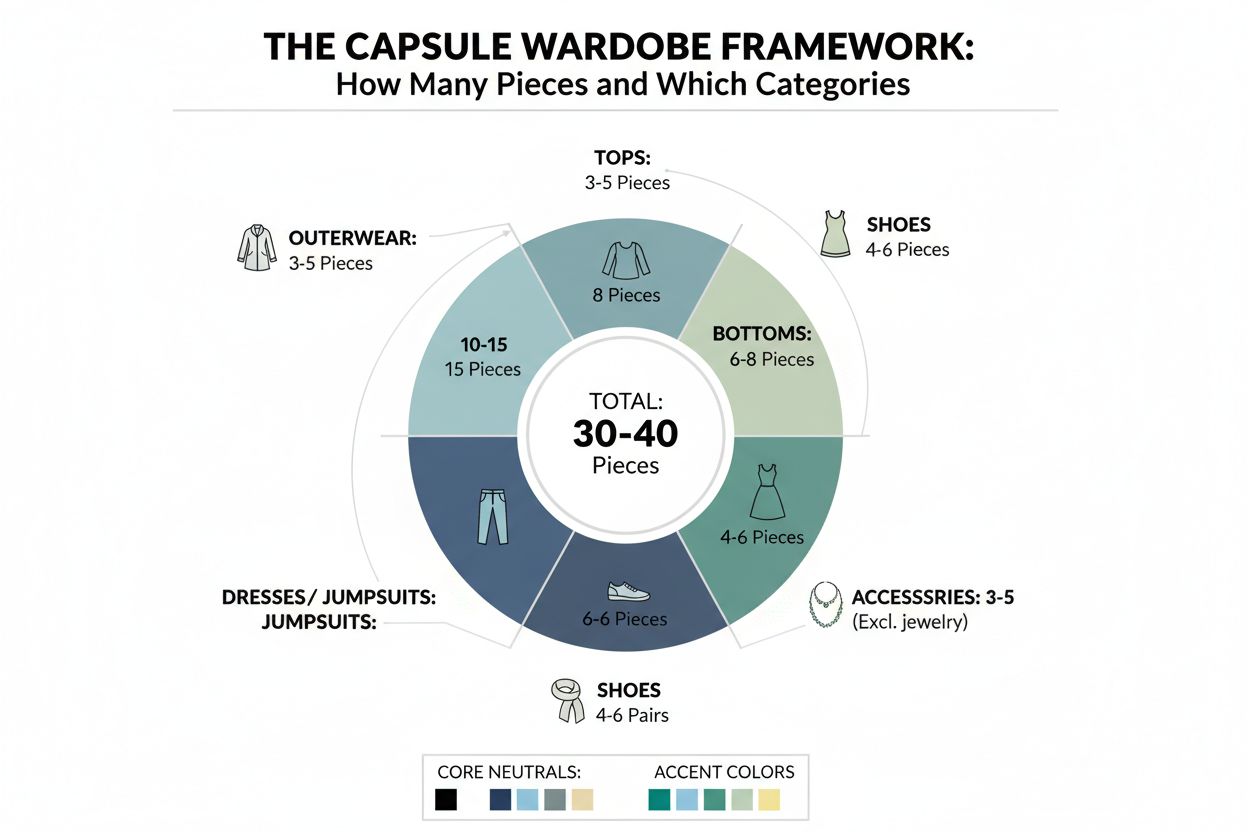
For a Soft Summer capsule, a 10–15 piece core wardrobe gives you enough variety for most occasions without introducing pieces that disrupt the palette's coherence. Every item should be palette-compliant. One non-compliant piece in a 12-piece wardrobe creates a whole category of outfits it simply can't join.
Recommended category split
| Category | Core pieces | Purpose |
|---|---|---|
| Tops and knitwear | 4–5 pieces | Closest to the face; highest palette impact |
| Bottoms (trousers, skirts) | 3–4 pieces | Mid-range visibility; anchor the outfit |
| Dresses | 1–2 pieces | Single-piece palette statements |
| Outerwear | 1–2 pieces | Highest visibility from a distance; must be palette-compliant |
| Accessories (scarves, bags) | 2–3 pieces | Fine-tuning and accent layer |
Tops deserve the most investment attention because they sit closest to your face. A palette-correct top with a slightly imperfect bottom still reads as harmonious. The reverse — a perfect bottom under a slightly-off top — rarely does.
Outerwear demands the same attention as tops, but for a different reason: it's what people see first, at a distance, before they even reach your face. An off-palette coat announces a clash before anyone says a word.
Soft Summer Tops, Blouses, and Knitwear: What to Look For and What to Avoid
Tops are the highest-impact category in the Soft Summer capsule. They're also where most mistakes happen, because retailers rarely use colour language that matches the palette.
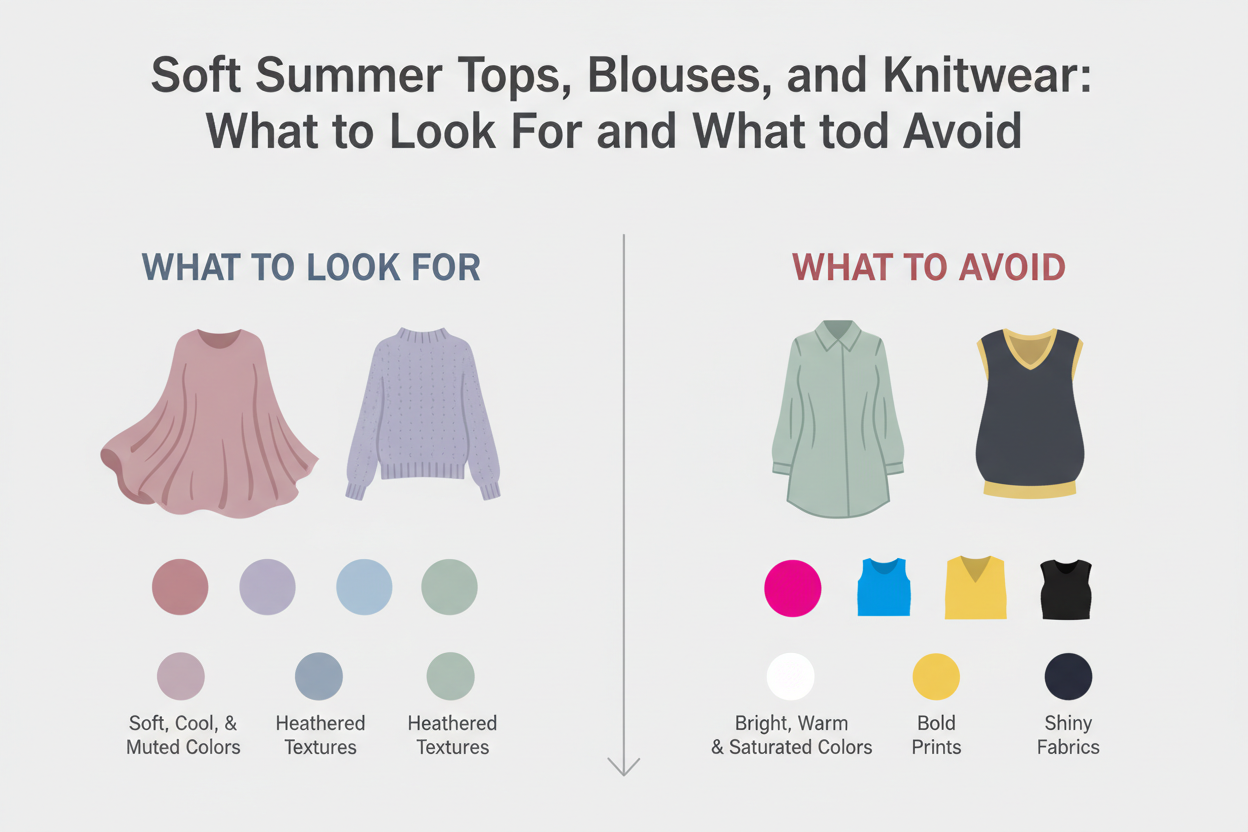
What to look for
- Colour names to trust: dusty rose, ash rose, mauve, stone blue, faded sage, silver sage, haze, mist, lavender grey, dusty teal, blue-grey, slate, dove
- Colour names to approach carefully: blush (can run too warm or too bright), green (needs to be desaturated to fit), blue (needs a grey modifier to work)
- Fabric and finish: matte and softly draped fabrics carry muted colours better than stiff or shiny ones. A brushed cotton in dusty rose will sit closer to the palette's quiet quality than a silk-satin version of the same hue. Texture reinforces or undermines the softness — it's not a minor detail.
Specific garment types that work well
- Relaxed linen blouses in blue-grey or greyed sage
- Soft knit jumpers in muted teal or ash lavender
- Draped jersey tops in dusty rose or soft plum
- Oversized shirts in washed or faded versions of the signature hues
What to avoid
- Bright white tops: The most common mistake. The stark contrast overwhelms Soft Summer features rather than complementing them.
- Coral or warm-toned orange-pink: Too warm and too saturated — it breaks both rules at once.
- Saturated jewel tones (vivid emerald, electric blue, deep burgundy): A vivid colour next to naturally soft colouring is exactly what produces the washed-out effect people are trying to avoid.
- Camel or warm-beige blouses: The warm undertone clashes with the palette's cool base.
- High-shine fabrics in any palette colour: Sheen increases perceived saturation, pushing even a compliant hue outside the soft, greyed register.
Unsure whether your current tops are working for your colouring? A colour analysis can clarify which pieces are genuinely flattering and which are quietly working against you. Start the quiz →
Soft Summer Bottoms, Dresses, and Outerwear: Completing the Palette-Compliant Wardrobe
Bottoms
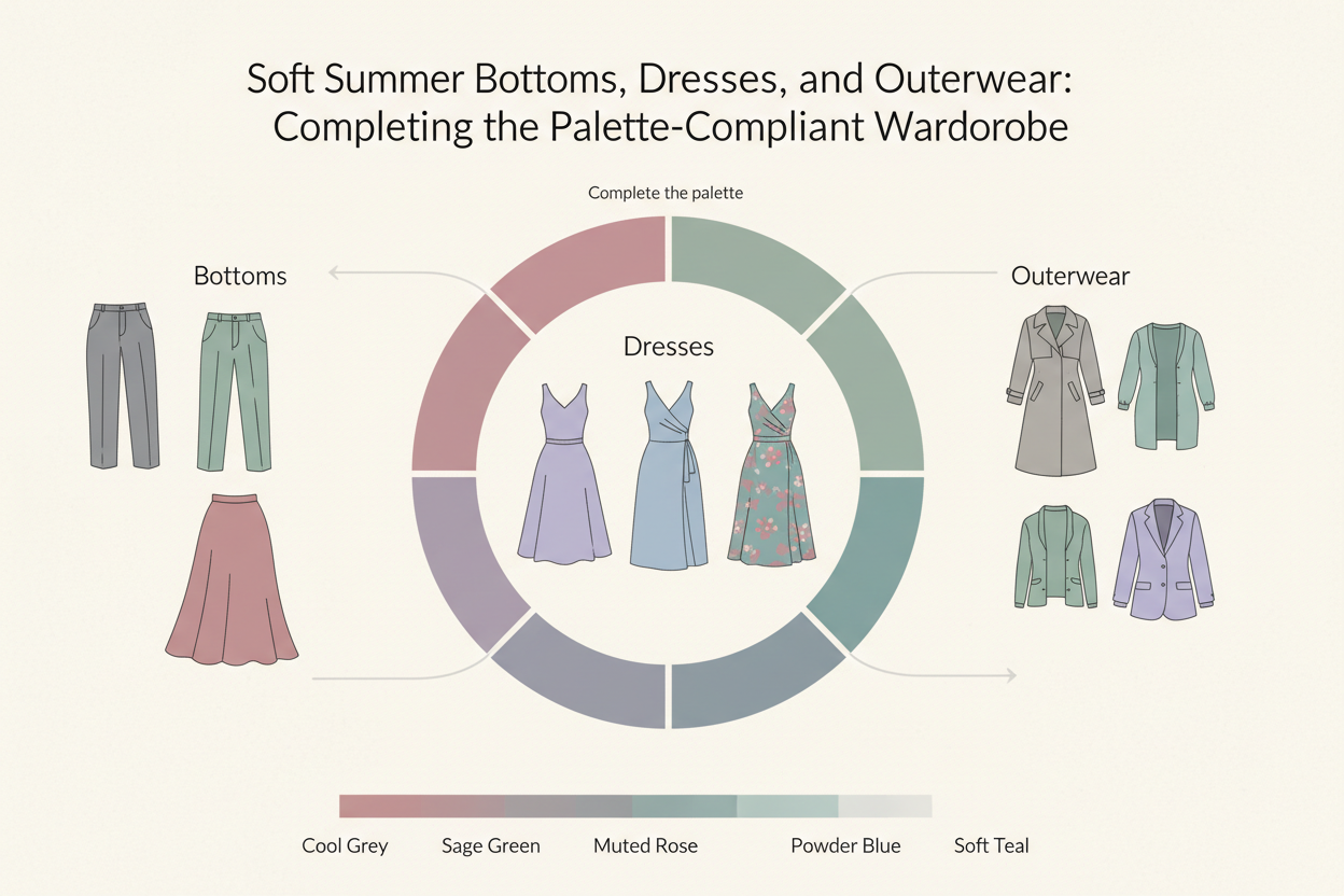
Bottoms have less immediate face-impact than tops, but they still need to work within the palette if you want them to pair reliably with everything above.
The strongest Soft Summer bottom choices:
- Greyed navy trousers or wide-leg pants — the most versatile piece you can own; goes with every signature colour and every neutral in the palette
- Soft charcoal tailored trousers — adds depth without the stark contrast of black
- Stone-grey or greyed-taupe midi skirt — neutral enough to anchor brighter pieces above, cool enough to avoid the warm-neutral trap
- Dusty rose or sage-green pleated skirt — a signature-colour bottom that pulls any muted top into a coherent look without effort
- Muted denim — only if the wash is cool and desaturated; warm or golden-wash denim won't work
What to leave on the shelf: black trousers (too stark), camel wide-leg trousers (warm undertone), white jeans (too high contrast), saturated colours outside the palette.
Dresses
A dress is a single-piece palette statement. When the colour is right, it does all the work without requiring you to balance separate pieces. For Soft Summers, dresses in dusty rose, soft plum, sage green, or blue-grey are the most efficient single investments you can make.
Look for:
- Fluid, matte fabrics (chiffon, crepe, jersey) that carry the muted hues without sheen pushing them brighter
- Midi and maxi lengths, which suit the palette's naturally unhurried quality
- Minimal print or tone-on-tone texture rather than high-contrast patterns
Outerwear
Outerwear is the most visible part of any winter or transitional outfit, which means it has to meet the same palette standard as everything else — arguably a stricter one. A coat that's off will clash with every palette-correct outfit you wear underneath it.
The strongest outerwear choices for Soft Summer:
- A mid-length coat in greyed navy or soft charcoal
- A trench in stone-grey or greyed taupe (not warm camel — the classic warm-beige trench is a palette conflict, full stop)
- A soft wool or bouclé jacket in muted teal or dusty rose for transitional seasons
- A blazer in blue-grey for three-season layering
The grey-cast trench deserves its own mention. The classic trench in warm camel or honey beige is so common that it can feel like a safe neutral. For Soft Summer, it isn't. A stone-grey or greyed-taupe version gives you the same shape without the undertone clash.
How to Style the Muted, Romantic Soft Summer Aesthetic: Outfit Formulas
The Soft Summer aesthetic runs on quiet elegance: cool, softened tones that look effortless rather than assembled. Outfit formulas work well here because the palette is naturally coherent — compliant pieces tend to harmonise without much effort on your part.
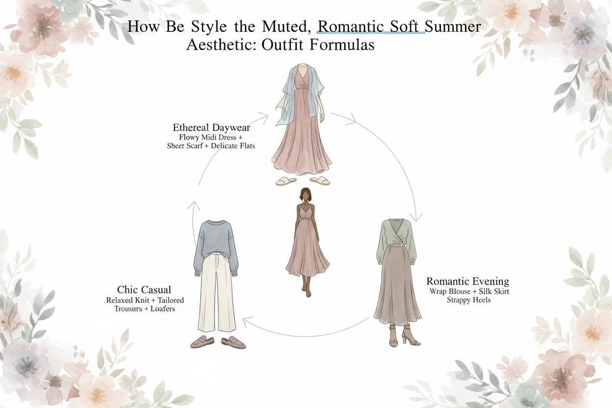
Each formula below uses only palette-compliant pieces named in the sections above.
Formula 1: The Monochromatic Study Dusty rose draped jersey top + greyed rose-tinted tailored trousers + stone-grey mules. Everything sits in the same desaturated warm-cool zone, so the outfit reads as intentional rather than matchy-matchy.
Formula 2: The Cool-Neutral Foundation Soft charcoal wide-leg trousers + ash lavender soft-knit jumper + greyed navy coat. The neutrals carry the outfit; the lavender adds just enough colour to keep it from reading as colourless. Works from late autumn through early spring.
Formula 3: The Palette Statement Dress Soft plum midi dress in matte crepe + stone-grey ankle boots + greyed navy structured bag. One statement piece, palette-compliant accessories, no coordination required.
Formula 4: The Layered Transition Sage green linen blouse + greyed-taupe stone midi skirt + muted teal or greyed navy light jacket. Built for transitional weather (more on that below) — the jacket adds warmth without pulling the outfit outside the palette.
Transitional Season Styling: Keeping the Palette Intact From Winter Into Spring
Seasonal transitions are where palette discipline tends to slip. The pressure to add warmth — physically and visually — nudges people toward camel, tan, and warm earth tones that feel right for the season but are wrong for Soft Summer.
The key principle: temperature changes do not justify palette breaks. Every garment you reach for in cold weather exists in a palette-compliant version.
Winter into spring layering strategy
- Swap heavy wool outerwear for a lighter coat or structured jacket in the same greyed-navy or stone-grey range — the weight changes, the colour register doesn't
- Add warmth through texture (brushed cotton, lightweight knit) rather than shifting toward warmer hues
- Move to lighter-weight versions of your signature colours as the weather improves — a muted teal linen shirt in place of a muted teal wool-blend top keeps the colour consistent
Specific transitional pieces that earn their place
- A greyed-taupe or stone-grey trench (not camel) for early spring
- A dusty rose or sage-green lightweight knit cardigan for layering without drifting into warmth tones
- A muted teal or blue-grey scarf that adds insulation while staying palette-compliant
What not to do in transitional dressing
- Camel and warm beige don't work here regardless of season — the cool undertone requirement doesn't take a seasonal holiday
- Dark brown or warm chocolate won't add appropriate winter depth either; reach for soft charcoal or greyed navy instead
- In spring, resist the urge to brighten things up. Coral isn't a Soft Summer spring colour. Dusty rose is.
The capsule's real strength is that the core palette holds across all four seasons. Shapes and fabrics shift with the temperature. The colours stay put.
Common Shopping Mistakes That Break the Soft Summer Palette
Knowing what to avoid is just as useful as knowing what to buy. These are the most common errors, and each one breaks the saturation rule, the temperature rule, or both.
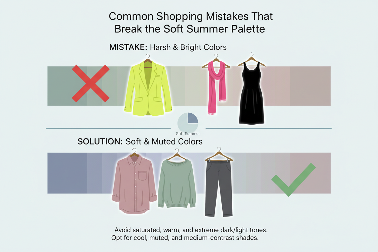
Mistake 1: Buying bright white instead of rose-tinted off-white Bright white creates hard contrast against Soft Summer's softened features. Rose-tinted off-white sits in the same tonal family as the palette's signature hues and reflects warmth back toward the face rather than washing it out.
Mistake 2: Choosing the classic camel trench Camel reads as the default elegant neutral, and for many seasons it is. For Soft Summer, its warm golden undertone conflicts directly with the palette's cool base. It's also the most visually disruptive mistake because outerwear gets so much exposure.
Mistake 3: Selecting saturated jewel tones as "depth" colors When a wardrobe feels flat, the instinct is to add a vivid jewel tone for interest. For Soft Summer, vivid colors don't add interest — they add contrast that highlights the gap between a high-saturation garment and naturally soft coloring. Soft plum works. Vivid burgundy doesn't. Muted teal yes, saturated emerald no.
Mistake 4: Shopping by color name rather than color quality Retailers use "dusty rose," "sage," and "stone" inconsistently. A garment labeled dusty rose might be a saturated warm pink or a cool, greyed one. The label is a starting point, not a guarantee. The grey-modifier test — does this color look like it has grey mixed into it? — is more reliable than trusting the product name.
Mistake 5: Treating black as a universal neutral Black is not in the Soft Summer palette. It's too stark for a palette built on gradations of muted depth. Soft charcoal and greyed navy do the same structural anchoring job without the jarring contrast.
Mistake 6: Adopting warm-season colors in spring The arrival of spring does not make coral, warm peach, or golden yellow palette-compliant. The season changes; the undertone requirement doesn't.
The grey-modifier test in practice
When you're in a fitting room or browsing online and genuinely unsure whether a color belongs in the palette, ask one question: does this color look like it has grey mixed into it? If yes, check the undertone — cool or warm? Grey-modified and cool almost always means compliant. If it looks clean, vivid, or warm despite appearing muted, it belongs to a neighboring season, not Soft Summer.
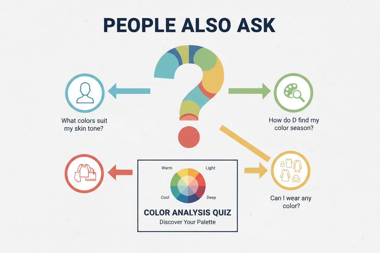
People Also Ask
What colors should a Soft Summer wear?
Soft Summers do best in cool-toned, heavily desaturated hues — colors that look like grey has been mixed into them. The core palette runs from dusty rose and sage green to soft plum, muted teal, and blue-grey for statement pieces, with neutrals like greyed navy, soft charcoal, rose-tinted off-white, and stone-grey filling in the rest.
One rule covers every choice: the grey modifier. If a color looks clean, vivid, or warm, it belongs to a different season. If it looks softened and cool-leaning, it probably fits.
What is the difference between Soft Summer and True Summer color palettes?
Both seasons sit in cool territory, but saturation is where they part ways. True Summer can handle more color clarity — crisp lavender, clear periwinkle, clean rose all work because that level of sharpness doesn't overwhelm True Summer coloring.
Soft Summer needs those same hues greyed down. Lavender becomes ash lavender. Periwinkle becomes a greyed periwinkle. A color that looks great on a True Summer often reads as too stark on a Soft Summer, pulling focus to the garment instead of the face.
Can Soft Summers wear black?
Black doesn't work for Soft Summers. The palette depends on softened, muted depth, and black's high contrast cuts against that instead of supporting it.
The practical alternatives:
- Soft charcoal — gives you depth and structure without the hard edge of true black
- Greyed navy — anchors outfits with a dark tone while staying within the palette's cool, muted range
For most Soft Summers, swapping black for soft charcoal or greyed navy is the fastest single improvement they can make to an existing wardrobe.
What colors make a Soft Summer look washed out?
The counterintuitive thing: it's not the soft or muted colors that cause a washed-out effect — it's the vivid ones. Highly saturated colors overpower Soft Summer's naturally low-contrast coloring, making the garment the focal point and pushing the face into the background.
Colors most likely to cause that effect:
- Bright white — too stark; drains color from the face
- Jewel tones (vivid emerald, electric blue, deep burgundy) — the saturation gap between garment and coloring throws off the visual balance
- Warm, saturated hues (coral, warm orange-red, golden yellow) — break both the saturation and temperature rules at once
- Camel and warm beige — their warm undertones work against the palette's cool base
The greyed, muted colors that might look flat on other seasons are exactly the ones that make Soft Summer coloring look harmonious.
How do I build a capsule wardrobe for my color season?
Building a color-season capsule wardrobe follows the same framework regardless of season, applied through the lens of your specific palette:
Confirm your season first. A capsule wardrobe built on the wrong season won't work, no matter how well-constructed it is. Get a colour analysis before investing.
Identify your palette's core hues and neutrals. For Soft Summer, that means the signature colours (dusty rose, sage green, muted teal, soft plum, blue-grey) and the neutrals that sit within the palette (greyed navy, soft charcoal, stone-grey, rose-tinted off-white).
Prioritise pieces closest to your face. Tops, blouses, and knitwear have the most impact on how your colouring reads. Spend your budget here first.
Aim for 10–15 core pieces across tops, bottoms, dresses, outerwear, and accessories. Every piece should sit within your palette so that any combination works — no exceptions needed.
Apply the grey-modifier test when shopping. Don't trust colour names. Ask whether the garment looks like grey was mixed into it, and whether it reads cool or warm.
Hold outerwear to the same standard as tops. A coat is the first thing people see. One off-palette coat will undercut every palette-correct outfit you wear underneath it.
FAQ
What are the best colors for a Soft Summer capsule wardrobe?
The most reliable core colors are cool-toned and heavily muted — any hue with grey mixed in. Strong performers include:
- Dusty rose and soft mauve for tops and dresses
- Sage green and muted teal for mid-layer pieces and bottoms
- Soft plum and ash lavender for statement items
- Blue-grey as a versatile mid-tone that bridges neutrals and accents
Anchor these with greyed navy, soft charcoal, stone-grey, and rose-tinted off-white, and everything in the wardrobe holds together.
Can Soft Summers wear warm colors like camel or coral?
Not really. Camel and coral both run warm, and that warmth works against Soft Summer's cool, greyed base. Camel is a warm beige — great on Soft or True Autumns, but it pulls against a Soft Summer complexion. Coral makes things worse by adding both warmth and saturation at once.
If you want a similar effect without the conflict:
- Swap camel for stone-grey or a greige that leans cool
- Swap coral for dusty salmon or muted rose — think the pink family, dialed back and cooled down
The visual result is close enough. The palette fit is actually there.
Is black a Soft Summer color?
No. Black is too stark and high-contrast for Soft Summer. Worn near the face, it tends to harden features rather than work with the season's naturally muted, low-contrast colouring.
The easiest replacements:
- Soft charcoal — dark enough to anchor an outfit without the sharpness of true black
- Greyed navy — a cool, dark tone that reads as a neutral while staying within the palette
For most Soft Summers, swapping out black for one of these is the single quickest improvement they can make to an existing wardrobe.
How is Soft Summer different from Soft Autumn in terms of clothing colors?
Both seasons share the same muted, desaturated quality — but they split on temperature.
| Soft Summer | Soft Autumn | |
|---|---|---|
| Undertone | Cool | Warm |
| Neutrals | Greyed navy, soft charcoal, rose-white | Warm taupe, camel, ivory |
| Greens | Sage, muted teal | Olive, muted khaki |
| Pinks/Reds | Dusty rose, soft plum | Terracotta, muted brick |
Soft Autumn colors carry a golden or earthy warmth. Shift that same hue cool and grey it down, and you're in Soft Summer territory. The muting is comparable — temperature is what separates them.
What neutrals work best for Soft Summer outfits?
Soft Summer neutrals run cool and desaturated. The most useful ones:
- Greyed navy — fills the role that black or dark navy plays in other palettes
- Soft charcoal — gives depth without the harshness of true black
- Stone-grey — a mid-tone that pairs easily with the rest of the palette
- Rose-tinted off-white — the right choice for a light neutral; bright white creates too much contrast
Warm neutrals like camel, cream, warm beige, and ivory sit outside the palette. They read neutral enough on their own, but their warm undertone clashes with the season's cool base.
How many pieces should a Soft Summer capsule wardrobe have?
A functional Soft Summer capsule typically has 10 to 15 core pieces:
- 3–4 tops or blouses in signature palette colours
- 2–3 knit layers (cardigans, fine-knit jumpers) in neutrals or soft accent colours
- 2–3 bottoms (trousers, skirts) in core neutrals
- 1–2 dresses that work across multiple occasions
- 1–2 outerwear pieces, held to the same palette standard as everything else — outerwear is the first thing people see, so off-palette choices are hard to hide
Every piece should be palette-compliant so combinations work without exceptions. A smaller, fully cohesive wardrobe beats a larger one where off-palette pieces leave you with dead ends when building outfits.
Why do bright colors make Soft Summers look washed out?
It's a mismatch in visual weight. Soft Summer coloring — skin, hair, and eyes — sits in a naturally muted, low-contrast register. Put a highly saturated color next to it and the garment takes over, pulling all the attention while the face recedes.
The biggest culprits are vivid jewel tones, bright white, warm saturated hues like coral or golden yellow, and clean primary colors. The gap in intensity between the garment and the coloring is what throws things off.
The greyed, softened hues that look dull on a hanger are the ones that actually let Soft Summer coloring come forward. The palette isn't a limitation — it's what makes the coloring read as intentional rather than overpowered.
If you're not sure which season fits, a colour analysis quiz can confirm whether Soft Summer is the right starting point before you build a wardrobe around it.