Interview Outfit Hues for Video Calls

You spent twenty minutes choosing the perfect blazer. You pressed it, slipped it on, and felt genuinely confident — then the moment your webcam fired up, the color went flat, your face looked washed out, and the whole effect quietly collapsed.
This is the specific problem that interview outfit hues for video calls create: what reads as polished in a mirror does not always survive camera compression, artificial lighting, and a 13-inch laptop screen. Virtual interviews introduce a layer of visual uncertainty that in-person meetings simply do not have, and that uncertainty hits color choices hardest.
Here is what this guide does differently:
- It connects your personal color season — whether you run cool-muted, cool-bright, warm-light, or warm-deep — to the hues that actually hold up under webcam conditions.
- It explains the camera mechanics behind why certain shades shift, blow out, or disappear on screen, so you are making informed choices rather than guessing.
- It accounts for real-world variables — your background wall, your room lighting, and the format of the call (live Zoom versus one-way recorded) — that change which hues work in your favor.
First impressions still carry full weight on camera. Whether you are interviewing for a remote role, speaking with a recruiter in another city, or recording a self-paced video response, the person on the other side is forming judgments in seconds. The difference between looking polished and looking forgettable often comes down to a single degree of color saturation or the wrong contrast against your background.
The sections ahead give you a practical, season-by-season framework for getting that choice right — before you go live.
Why Video Calls Change Everything About Color Choice
Stand in your bedroom wearing a navy blazer and you look sharp. Open your laptop camera and that same blazer can flatten into a dimensionless dark mass, or shift slightly purple under a ring light. That gap between mirror and monitor isn't a matter of taste. It's physics, and it matters more in a virtual interview than in almost any other video context.
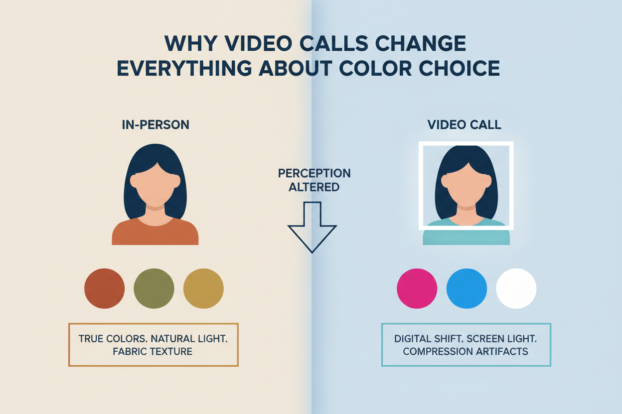
In person, a hiring manager picks up your full three-dimensional presence, the room's natural light, the subtle tonal variation in fabric. A webcam collapses all of that into a two-dimensional pixel grid. Camera sensors have a narrower tonal range than the human eye, so colors at the extremes — very light or very dark — tend to clip, losing detail in the process. Mid-range, moderately saturated hues survive that compression best.
The dress-code question makes this harder. Virtual interviews carry a layer of ambiguity that in-person meetings don't. What "professional" looks like on screen isn't settled, and one-way recorded formats make it even harder to read the room. You can't adjust in real time based on the interviewer's reaction, so your color choice has to do the work on its own — no second chance.
The upside is that cameras behave predictably. Once you understand those patterns, you can choose your interview colors with actual confidence instead of hope.
Not sure which color season you belong to? Take the free color analysis quiz → and get your season profile before you read the hue recommendations below.
The Video-Friendly Color Spectrum: What the Camera Loves and Hates
Camera sensors render colors along a spectrum from "safe" to "problematic," and the dividing line is rarely where people expect it to be.
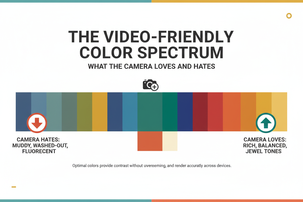
Colors webcams handle well:
- Medium-saturation, mid-value hues — dusty teal, warm camel, soft cobalt, muted burgundy. These sit in the tonal sweet spot where sensors can capture depth and definition.
- Hues with a clear undertone — colors that read as clearly warm or clearly cool hold their character under compression better than hues that straddle the line (greige and dusty mauve tend to go muddy).
- Deliberate contrast between outfit and skin tone — enough separation for the camera to distinguish your face from your clothing.
Colors that cause visual problems on screen:
- Pure white and near-white — most consumer webcams overexpose bright whites, creating a glow that pulls the eye away from your face and can wash out fair skin tones nearby.
- Pure black — loses all texture and depth on camera, turning a structured blazer into a flat dark rectangle. Your head ends up looking like it's floating.
- Very high-contrast patterns — fine stripes, tight houndstooth, and small checks trigger moiré on lower-resolution cameras, producing a ripple that pulses as you move.
- Heavily saturated primaries — a very bright red or saturated orange can bleed onto surrounding pixels, creating a halo that looks off on screen.
The practical test is whether your outfit is both professional and video-friendly. Those two criteria don't always overlap, and camera behavior is the variable most interview prep advice quietly skips.
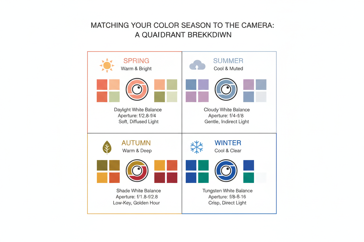
Matching Your Color Season to the Camera: A Quadrant Breakdown
The four color seasons — Summer, Winter, Spring, Autumn — each carry distinct undertone and saturation signatures. Those signatures interact with camera rendering in predictable ways. Here's how to use your season when choosing interview outfit colors for video calls.
Cool Seasons on Camera: Summer and Winter Hue Picks That Survive Compression
Summer (cool undertone, muted saturation)
Summer's palette — soft roses, dusty lavenders, quiet blues — sits in the mid-value, low-saturation zone where cameras tend to perform well. The problem is that these colors can go flat under a ring light, which strips depth from already-soft hues.
Recommended Summer hues for video interviews:
- Dusty rose — warm enough to survive ring-light flattening while staying within Summer's cool-muted range; reads as poised on camera without pulling focus from your face.
- Soft slate blue — holds definition under compression, contrasts clearly against most skin tones, and reads as quietly authoritative.
- Muted teal — sits at the cooler edge of teal, giving Summer wearers slightly more visual weight than a powder blue without oversaturating on screen.
Avoid pale lavender and very light blush in ring-light setups — both can render as near-white and lose all definition.
Winter (cool undertone, high contrast)
Winter's instinct is to reach for black, white, and sharp contrast. On camera, those instincts become liabilities. Pure black loses texture; stark white overexposes. The fix is to shift into jewel tones, which still satisfy Winter's need for depth and clarity without the technical problems.
Recommended Winter hues for video interviews:
- True cobalt blue — saturated enough to read with authority, cool enough to match Winter's undertone, and distinct enough from skin tone to create clean definition on screen.
- Deep burgundy — gives Winter's characteristic contrast without the overexposure risk of white or the texture loss of black; cameras render rich dark reds with far more depth than pure black.
- Charcoal (not black) — if you need a neutral anchor, charcoal holds the dark value while retaining enough variation for the sensor to pick up fabric structure.
Avoid stark white as the primary top and head-to-toe black — both read as one-dimensional on most webcams.
Warm Seasons on Camera: Spring and Autumn Hue Picks That Read as Professional
Spring (warm undertone, light and clear saturation)
Spring's palette — peach, coral, warm ivory, clear aqua — is bright, which is mostly an asset, except that light warm hues can tip into "casual" on screen if you're not careful. Cool LED lighting, which is standard in most home offices, also tends to wash them out. The goal is finding Spring hues with enough color weight to hold their own professionally.
Recommended Spring hues for video interviews:
- Warm camel or soft tan — structured and professional on screen, flattering against Spring's warm light skin tones, and holds its warmth even under cool ambient light.
- Clear warm teal — enough visual mass to read as businesslike while staying in Spring's warm spectrum; sidesteps the casualness of peach without going cold.
- Golden olive — grounded and deliberate where coral reads relaxed; the earthy warmth photographs well and comes across as composed.
Avoid pure coral and saturated peach as your main color. They can read as overly casual and may oversaturate under warm lighting, drawing attention away from your face.
Autumn (warm undertone, deep and muted saturation)
Autumn's earthy palette — terracotta, deep olive, warm rust, caramel — looks rich in person. On screen, it's more work. Cool LED lighting (the default in most desk setups) pushes warm muted colors toward muddy and flat. The fix is straightforward: choose hues with enough saturation to resist that shift, and add a warm-tinted light source at face level.
Recommended Autumn hues for video interviews:
- Terracotta — enough red-orange saturation to hold its warmth under cooler light; reads as confident and distinct without tipping into casual.
- Warm rust — deeper than terracotta, adds more contrast against lighter Autumn complexions; works best paired with a warm lamp to prevent color drift.
- Deep teal-green — a cooler option that still sits in Autumn's color family; the value depth helps it survive compression without going flat.
Avoid olive green and mustard yellow in cool LED setups. Without a warm light source to offset them, both can render sallow or murky on camera.
Background Contrast: How Your Wall Color Affects Which Hues Work
Background is the variable that almost every interview color guide ignores. Your outfit color doesn't exist in isolation on screen — it exists in relationship to whatever is behind you, and that relationship changes everything.
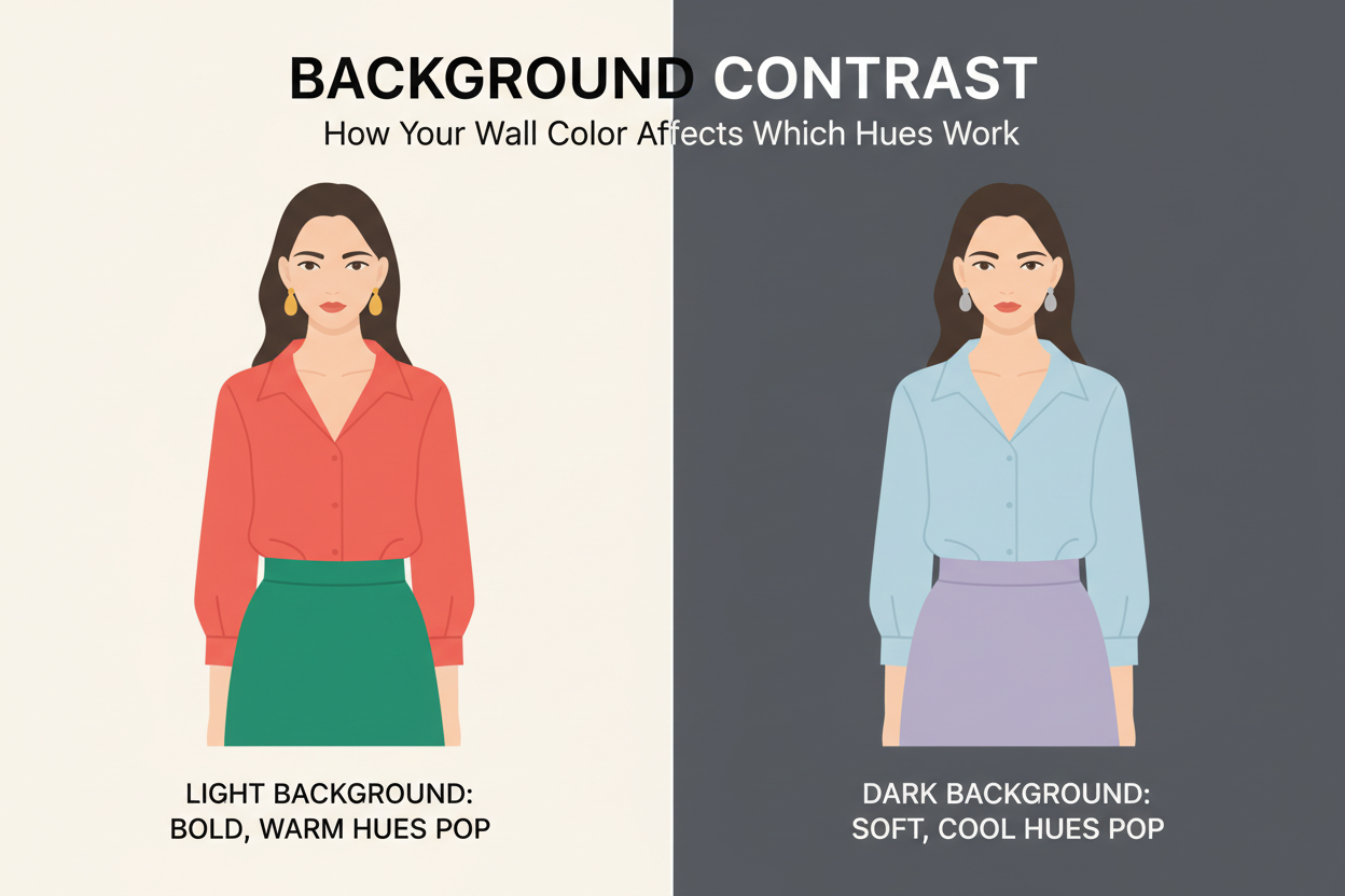
If your background is neutral white or light gray: A light neutral background creates a high-contrast frame. Pale colors — soft Summer pinks, light Spring ivories — can blend into it and reduce your visual definition. Go one step darker or more saturated than you normally would: a slate blue rather than powder blue, a warm camel rather than light cream.
If your background is warm-toned (wood shelving, beige walls, warm brick): Warm backgrounds pull warm-season colors (Autumn terracottas, Spring camels) into the background with them. A cool-toned outfit — a soft slate or muted teal — gives you the visual separation you need. A Winter cobalt or Summer dusty rose will also read crisper against a warm backdrop than a similarly warm color would.
If you use a virtual background or blur: Virtual backgrounds strip out all the background warmth or coolness and replace it with an artificial edge. Colors close to your skin tone can generate "bleeding" artifacts along the blur line. Stick with solid, clearly saturated colors — your season's mid-range jewel tones — so the background-removal algorithm has a clean edge to work with.
The practical decision: figure out your background's color temperature (warm, cool, or neutral), then pick an outfit color that contrasts in the opposite direction or sits in a complementary tonal range.
Want to know exactly which hues work with your undertone? Start the free color season quiz → and get a personalized hue profile in under three minutes.
Lighting Conditions and Hue Shift: Protecting Your Color Investment
Lighting can undermine a carefully chosen color before the conversation starts. The first few seconds of a video call form a first impression, and your home lighting setup may be shifting your hues in ways you haven't noticed. Here's what's actually happening.
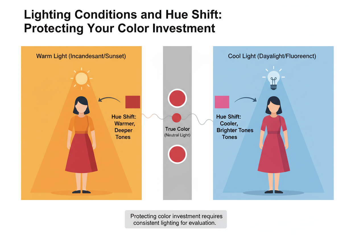
Warm incandescent or halogen bulbs: These add a yellow cast to everything in frame. Cool-season hues — Summer's slate blues, Winter's cobalts — can drift greenish or yellow, losing their crispness. If your light source is warm, go slightly deeper in your season's cool hues to hold the color.
Cool LED or daylight-balanced bulbs: The default for most desk lamps and ring lights. Cool LEDs sit neutral-to-cool on the color temperature scale, which works well for cool seasons but pushes Autumn and Spring warm hues toward flat or muddy. If your setup runs cool, Autumn wearers should reach for rust or terracotta over olive or mustard — the higher red saturation holds up; the yellow-based hues don't.
Ring lights: Even illumination is good for detail, bad for depth. Ring lights tend to overexpose the area around your face, which washes out nearby light hues — pale Summer pinks, Spring creams. If you're using a ring light, go one step richer than you normally would. Dusty rose becomes soft rose. Light camel becomes true camel.
The rule of thumb: test your outfit under your actual interview lighting before the call. What looks right in a naturally lit room is not what your camera will pick up under a desk lamp.
One-Way Video Interviews: Special Hue Considerations for Recorded Calls
One-way video interviews — where you record responses to prompts and submit them for async review — create a color problem that live calls don't. These formats already introduce dress-code uncertainty beyond a standard virtual interview, and then the technology makes it worse.
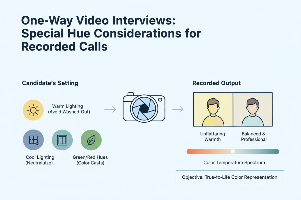
On a live Zoom call, video streams in real time over a roughly comparable connection. In a recorded format, that same video gets compressed for storage, then played back on whatever device the reviewer happens to use, under whatever lighting conditions exist in their office. You control none of it. Each compression pass flattens tonal range and dulls saturation a little more.
What that means for what you wear:
- Push saturation slightly higher than you would for a live call. A dusty rose that looks perfectly calibrated on Zoom can render as near-gray after two rounds of compression. For recorded formats, shift to something softer but clearer — a rose that reads as rose.
- Avoid very light hues. Near-whites and pale pastels suffer the most from compression-induced washout. If you're a Summer or Spring, anchor your look with something that has clear mid-value depth.
- Watch your test clip on a different screen. Before you submit, play back your recording on a phone or a secondary monitor — something other than the screen you recorded on. That's the closest you'll get to seeing what the reviewer sees.
The goal isn't to wear a brighter color for its own sake. It's to wear a more compression-resilient version of your ideal hue — enough saturation to survive the degradation while staying firmly within your season's undertone range.
Quick Pre-Call Color Audit: A 3-Step Check Before You Go Live
Most candidates prep their answers and forget their camera. Before any video interview, spend three minutes recording yourself in your actual setup. The hiring manager is sizing you up before you say a word, and what looks fine in the mirror can look completely different on screen.
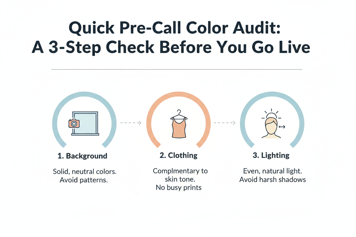
Step 1: Record a 30-second test clip in your interview setup
Sit in your interview chair, turn on your interview lighting, and record yourself on the same platform you'll use for the call (Zoom, Teams, or whatever one-way system they sent you). Don't use your phone in natural light — it won't show you what the interviewer sees. Watch it back and check:
- Does your outfit hold its color, or does it go washed out or muddy?
- Is there clear separation between your face and your clothing?
- Do the cuffs or collar overexpose and blow out to pure white?
Step 2: Check your hue against your background
Pause on a frame where you're sitting still. Look at the contrast between your outfit and the wall behind you. If they blend together, you need a different outfit color, a different background, or something behind you that creates a cleaner edge.
Step 3: Adjust your lighting temperature if needed
If your outfit looked right in the mirror but shifted on camera, it's almost always the light source. Add or reposition a warm lamp if cool colors are going yellow, or swap in a daylight-balanced bulb if warm colors are going muddy. Re-record for 15 seconds and compare.
The whole thing takes less time than re-pressing a blazer.
People Also Ask
What colors should you avoid wearing on a video interview?
A few color categories cause consistent problems on camera, no matter your color season:
- Pure white — webcam sensors tend to overexpose it, creating a distracting glow near your face and washing out lighter skin tones nearby
- Pure black — fabric texture disappears on screen, turning a structured blazer into a flat, shapeless block
- High-contrast patterns — thin stripes, tight checks, and small houndstooth prints trigger a moiré ripple effect on standard webcams that pulses when you move
- Heavily saturated reds and oranges — intense color can bleed into adjacent pixels, leaving a halo around you that looks off even on decent cameras
- Very pale pastels under ring lights — soft lavenders, blush pinks, and pale creams can wash out to near-white under flat ring-light illumination, losing all color definition
The basic rule: anything at the tonal extremes (very light or very dark) or at maximum saturation tends to overwhelm what consumer webcams can handle. Mid-value, moderately saturated colors in your season's undertone range are the safest bet.
Does white look good on camera for a job interview?
Generally, no — at least not as a primary top or blouse. Pure white is one of the most reliably problematic colors for video interviews because most consumer-grade webcams overexpose it. You end up with a bright glow around your neckline that pulls the viewer's eye away from your face, which is exactly what your outfit shouldn't do.
That said, there are workable alternatives:
- Off-white, cream, or warm ivory — these have enough warmth or depth to avoid the overexposure problem while still reading as clean and polished on screen. If you have a Spring or Autumn complexion, warm ivory tends to work especially well.
- White as an accent, not a statement — a white collar peeking out beneath a darker structured jacket is much less likely to cause problems than a full white blouse, because the deeper color anchors the frame.
- Test your specific setup — some higher-quality webcams handle white better than others. If you're set on wearing white, do a 30-second test recording under your actual interview lighting before the call to see how it looks on your camera.
The bottom line: your clothing needs to be professional and camera-friendly. On most webcam setups, pure white clears the first bar and fails the second.
What is the best color to wear for a Zoom interview background?
Your background color and your outfit aren't separate decisions — they work as a system. The basic goal is clear visual contrast between you and whatever is behind you.
For most background situations:
- Neutral light gray or soft greige walls are the easiest to work with because they're tonally neutral. They create contrast against both warm and cool outfit colors without competing with either.
- Warm-toned backgrounds (wood shelving, beige walls, natural brick) work well behind cooler outfit colors — a slate blue or muted teal will stand out cleanly. If your outfit is also warm-toned (terracotta, camel), the two can blend together and reduce your definition on screen.
- Virtual or blurred backgrounds strip out warmth and coolness entirely and replace them with an artificial edge. To prevent "bleeding" artifacts at the blur boundary, choose a solid, clearly saturated color rather than something pale or close to your skin tone.
Start by identifying your background's dominant color temperature, then choose an outfit color that contrasts in the opposite tonal direction.
How do I know if my outfit color works on my webcam before an interview?
A quick pre-call recording check is the most reliable way to find out, and it takes under five minutes.
- Sit in your actual interview position — same chair, same room, same lighting you plan to use
- Record a 30-second clip on the same platform as your interview (Zoom, Teams, or whatever one-way tool they're using). Don't test on your phone in natural light; that won't reflect what the interviewer sees
- Watch it back and check three things:
- Does your outfit hold its color, or has it gone washed out, muddy, or flat?
- Is there clear separation between your face and your clothing?
- Do any bright areas — collar, cuffs — blow out to pure white?
- Pause on a still frame and look at how your outfit reads against your background. If they blend together, you need more contrast
- If the color looks fine in the mirror but wrong on camera, check your light source first. A cool LED can push warm tones muddy; a warm incandescent can shift cool tones slightly green
If you're submitting a one-way recorded interview, play it back on a second screen — a phone or separate monitor — since playback conditions vary.
Should I dress differently for a one-way video interview versus a live Zoom call?
The professionalism standard is the same, but your color strategy should shift in two specific ways for recorded formats.
Why recorded interviews are different: One-way video submissions get compressed for storage, then played back on whatever device a reviewer happens to use — screens you can't anticipate or control. Compression flattens tonal range and reduces saturation. A color that looks fine on a live call can come back washed out or muddy after processing.
What to adjust:
- Go slightly more saturated than you would for a live call. Pick a mid-range, clearly defined version of your season's recommended colors rather than the palest or most muted options — not to look brighter, but to give compression something to hold onto
- Skip very pale colors entirely. Near-whites and light pastels are the most vulnerable to washout. Summer and Spring candidates especially should anchor their look with something that has visible mid-value depth
- Record a test clip and watch it back on a different device before you submit — a phone or secondary monitor works — to get a rough sense of how variable playback conditions will treat your colors
The underlying idea is the same either way: wear colors that are professional and video-friendly. Recorded submissions just need a slightly more compression-resilient version of that.
FAQ
What are the best hues to wear for a video job interview if I have a cool skin undertone?
Cool undertones — the kind that show up in Summer and Winter color seasons — tend to work best with hues that share a blue or neutral base rather than a yellow or orange one.
Colors that tend to work well for cool undertones on camera:
- Soft blue-grays and slate blues — close to the cool end of the spectrum, they sit naturally against cool skin without washing it out, and hold up reasonably well under standard webcam compression
- Dusty rose or muted mauve (Summer) — enough warmth to look flattering on screen, but not so much that they fight a cool undertone the way a vivid orange-red would
- True navy — separates cleanly from most neutral backgrounds, though it needs decent lighting to retain any visible depth instead of going flat
- Soft teal or dusty sage — cooler mid-value greens tend to suit Summer seasons well; they add visual contrast without overexposing
What to avoid: Near-white and pure white tops overexpose easily, which is a particular problem for cool undertones because the camera often renders surrounding skin even cooler or more washed out. Heavily saturated warm oranges and bright reds create an undertone clash that looks noticeably more jarring on camera than in person.
Staying in the moderate-saturation, cool-to-neutral range is usually the safest bet for cool undertones on video.
Why does my outfit color look different on camera than it does in the mirror?
A few things compound to create that gap.
Your eye constantly adjusts to shifts in light temperature and fills in shadows without you noticing. A webcam doesn't — it applies a fixed or auto-corrected white balance, which can push warm hues muddy under cool LEDs or turn cool hues slightly greenish under incandescent bulbs.
Compression makes it worse. Video platforms throttle the data stream in real time, and that squeezes out tonal range. Mid-value colors hold reasonably well; very light or very dark ones lose definition fast.
Then there's your monitor. Even if the webcam captures your color accurately, someone watching on a warm-calibrated display sees something different from someone on a cool one. You can't control that, but you can control what you send them.
Background matters too. A warm-toned wall behind you can push a neutral gray outfit warmer on camera even when it looks clean gray in the mirror.
The fix is to test record under your actual interview conditions — same room, same lighting, same platform — and watch the clip back on a second device. That closes most of the gap.
Is navy blue always a safe choice for a video interview, or does it depend on my color season?
Navy gets recommended constantly for video interviews, and the reasons are real — it reads as professional, shows up clearly against most neutral backgrounds, and sidesteps the texture problem that makes pure black go flat on camera. But it is not universally flattering. Whether it works for you comes down to your season.
Where navy performs well:
- Winter and Summer seasons have cool or neutral undertones that tend to wear navy naturally. On camera it holds enough separation from the background to read as a defined, polished garment
- Under cool-toned natural or daylight-balanced lighting, navy keeps its depth and does not compress toward flat black
Where navy can fall short:
- Spring and Autumn seasons carry warm undertones. A deep, blue-heavy navy can create an undertone conflict on camera that reads as slightly off, even when it is hard to say exactly why. Warmer alternatives — a rich teal, deep forest green, or camel — tend to do more for these seasons on screen
- In low-light setups, navy compresses toward black and loses the visual advantage over solid black that made it worth choosing in the first place
The short answer: navy is a strong default for cool-season candidates with decent lighting, but it is not automatically right for every color season or every setup.
What colors should I avoid wearing on a Zoom interview call?
A few colors cause consistent technical problems on camera, even if they look great in person.
Avoid these on a video call:
- Pure white — overexposes on most consumer webcams, creating a distracting glow near your face and washing out nearby skin tone areas
- Pure black — loses all fabric texture on screen, turning a tailored piece into a shapeless dark mass
- Tight patterns — thin stripes, fine checks, and small houndstooth prints generate a moiré effect that ripples and pulses as you move, pulling attention away from what you're saying
- Heavily saturated reds and oranges — at full saturation these can bleed into neighboring pixels, producing a color halo around you
- Very pale pastels — under ring lights or bright overhead setups, light lavenders, blush pinks, and creams can render close to white and lose all definition
- Anything that closely matches your background — even a flattering color loses its value if it blends you into the wall behind you
The pattern here is simple: webcam sensors struggle at the tonal extremes. Mid-value, moderately saturated colors within your palette are the safe bet.
How does my video background color affect which outfit hues I should choose?
Your background and outfit work together as a visual system. The full frame shapes first impressions on camera, not just your clothing, so it's worth thinking about the two in relation to each other.
How to approach the pairing:
- Neutral gray or greige walls are the most flexible because they're tonally neutral. They create workable contrast with both warm and cool outfit hues without pulling the frame in a competing direction
- Warm-toned backgrounds (beige walls, warm wood shelving, natural brick) pair better with cooler outfit hues. A slate blue or soft teal reads cleanly against warm tones. Wearing a similarly warm hue — Autumn terracotta or Spring camel — in front of a warm background reduces your visual definition on screen
- Cool-toned backgrounds (gray-blue walls, pale sage) create more contrast with warmer outfit hues. Spring and Autumn candidates with warm-toned clothing can use this to their advantage
- Virtual or blurred backgrounds remove warmth and coolness from the equation but introduce blur-edge artifacts at your outline. To minimize these, wear a clearly saturated, mid-value hue rather than a near-skin-tone or very pale color that makes edge detection work harder
The decision is simpler than it sounds: identify your background's dominant temperature, then pick an outfit hue that contrasts with it.
Can I wear patterns or prints to a video interview, or should I stick to solid hues?
Solid hues are usually the safer bet — not because patterns look unprofessional, but because of how webcams work.
The technical problem:
- Moiré interference is the main risk. Tight repeating patterns — thin stripes, fine herringbone, small checks — interact with webcam pixel grids and produce a shimmering, rippling distortion that looks like it's moving even when you're sitting completely still. It's distracting, and it's easy to avoid
- Compression makes it worse. Patterns need more data to render accurately, and video compression strips that data away. What looks fine in person can look chaotic on a compressed stream
When patterns can work:
- Large-scale, low-contrast patterns are less likely to trigger moiré. A widely spaced stripe or a bold block print with soft rather than sharp edges tends to survive a webcam better than a fine repeat
- Subtle texture — a nubby knit, a heathered fabric — reads as depth and visual interest on camera without the ripple effect
The practical standard: default to solid hues in your color season's range for video interviews. If you want to wear something patterned, do a 30-second test recording under your actual lighting before you commit.
Do the same color rules apply to one-way recorded video interviews as to live Zoom calls?
The core principles are the same — professional, camera-friendly, suited to your color season — but recorded formats need a small adjustment in how you apply them.
What changes for one-way recorded interviews:
- Compression is heavier. Live calls compress in real time at a variable rate. One-way submissions get compressed for storage and then decompressed across different devices when someone reviews them. Each pass can flatten tonal range a bit more
- You can't course-correct. On a live call you can sometimes compensate — shifting closer to a light source, adjusting a collar. A one-way submission is locked; what you record is what the reviewer sees
- Playback conditions vary. A reviewer might watch on a laptop, a tablet, or a phone with its brightness turned all the way down. You can't control that, but you can pick hues sturdy enough to read clearly across different screens
What to adjust:
- Go for a slightly more saturated, mid-value version of your season's recommended hues — not vivid enough to look loud, but with enough depth to survive compression without going flat
- Skip the palest end of your palette (very soft pastels for Summer, very pale warm creams for Spring) in favor of hues that hold up
- Record a test clip and watch it back on a second device before submitting — it's a quick way to catch problems before they're locked in
Recorded interviews are now standard, and your color choices are part of that first impression whether the format is live or not. The recorded version just calls for hues that hold up a little better under compression.
Not sure which hues fall within your color season? Take the color analysis quiz at color-analysis.app to find your season and get a palette built around what actually works on camera for your undertone.