Foundation for Fair Skin With Red Undertones

You finally find a foundation that looks perfect in the bottle. The depth feels right, the formula sounds ideal, and the shade name practically has your name on it. Then you blend it in—and your face looks pinker than before you started.
If that scenario is familiar, you are not alone and you are not doing anything wrong. Fair skin with red undertones is one of the most genuinely difficult undertone profiles to shop for, because the very factors that make a shade look "light enough" often make it pull warm, peachy, or outright flushed once it meets your skin.
This guide exists to fix that. Here is what you will walk away knowing:
- Why undertone labels like "neutral" and "cool" do not mean what you think they mean when you have redness in your complexion
- Which shade characteristics and formula ingredients actually neutralize surface redness rather than amplify it
- How to swatch and test so you stop buying the wrong shade repeatedly
- What finish types and coverage levels work with reactive, redness-prone fair skin—not against it
- How a personalized color-analysis approach can shortcut the entire guessing process
Fair skin that also deals with redness from rosacea, sensitivity, or natural undertone brings a layered set of challenges: you need coverage that is light enough not to look heavy, shade-matched precisely enough not to read pink, and gentle enough not to trigger more flushing. Getting all three right at once is the goal of everything that follows.
Why Fair Skin With Red Undertones Is the Hardest Undertone to Shop For
There's a specific kind of frustration reserved for this skin type. You research, you swatch, you buy—and then you blend the foundation in and your face looks more flushed than when you started. As one fair-skin reviewer put it, the texture and formula can be everything you hoped for, and then you apply it and everything falls apart.
This isn't carelessness. It's a structural problem with how foundations are made and labeled for very fair, redness-prone skin.
Here's why it's especially hard:
- Fair shades are a small, crowded range. Brands compress a lot of variety into just a few fair options, so even tiny undertone differences become visible fast.
- Red undertones sit at a label crossroads. Your skin isn't quite Cool and isn't quite Neutral, which means both categories on the shelf can be wrong in different directions.
- Oxidation hits harder on very fair skin. A shade that matches at the counter can shift noticeably pinker within an hour of wear—and the lighter your base tone, the more obvious that shift gets.
- Rosacea and sensitivity add a moving target. On high-flush days your skin reads differently than on low-flush days, so a shade that worked last week can look mismatched today.
Knowing this is the first step. The rest of this section gives you tools to navigate each one.
[QUIZ_CTA: quiz_click]
Understanding Undertone Labels: What Neutral, Warm, and Cool Actually Mean for Reddish Fair Skin
Most shoppers hit a wall at the foundation display when they see three words: Neutral, Warm, and Cool. These labels sound logical. They're not particularly useful if you have red-undertone fair skin.
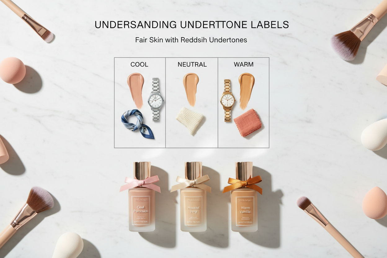
Here's what each label actually does on very fair skin with redness:
| Label | What it usually means | What it does on fair skin with redness |
|---|---|---|
| Warm (W) | Yellow-peach bias | Can intensify ruddiness and look orange-tinged |
| Cool (C) | Pink or blue-purple bias | Can either cancel redness OR over-correct into a gray, ashy, or lavender cast |
| Neutral (N) | Balanced between yellow and pink | Often the closest starting point, but N shades vary widely by brand |
The real issue is where red undertones live. Surface redness—whether from rosacea, reactive capillaries, or natural coloring—makes skin read Cool to the eye. But the underlying base tone on fair skin is often more Neutral than truly Cool. Choose a Cool shade based on surface appearance and you risk adding more pink or purple instead of balancing anything out.
The Neutral-Cool Gray Zone: Where Most Red-Undertone Shoppers Get Stuck
Most people with this skin profile end up bouncing between two wrong answers: a Cool shade that goes purple-gray in certain light, and a Warm shade that just makes the flush worse.
The better target is what you might call the Neutral-Cool gray zone—shades coded N or N/C that have a slight pink bias without tipping into lavender. In practice, that usually means:
- Looking for shades described as "porcelain," "alabaster," or "fair neutral" rather than "fair pink" or "fair cool"
- Checking whether the N shade leans more beige (better) or more rose (riskier)
- Treating anything ending in C as a test candidate, not a safe default
Brand shade codes aren't consistent, so the same letter can mean something different depending on the line. Swatching in natural light—covered below—is the only way to know for sure.
Ingredients That Calm Redness While You Wear Your Foundation
Not every foundation that matches your shade will behave the same way on redness-prone skin. Formula matters as much as color. Some ingredients actively support calmer, less reactive skin throughout the day; others make flushing and sensitivity worse.
Ingredients worth seeking out:
- Hyaluronic acid — Redness-prone fair skin, especially with rosacea, often runs dry. Hyaluronic acid helps maintain hydration throughout wear, which reduces the tightness and reactivity that can worsen flushing.
- Mineral formulas — Generally gentler on sensitive and rosacea-prone skin. Many also contain zinc oxide, which has a mild anti-inflammatory effect.
- Antioxidants — Support the skin barrier and can reduce the visible impact of environmental triggers on redness.
- Dermatologist-tested formulas — Not a guarantee, but a useful filter when shopping for sensitive or reactive skin.
What to Avoid: Ingredients That Trigger Reactive Redness in Sensitive Fair Skin
Screen these out before you buy, especially if your redness is linked to rosacea or a compromised skin barrier:
- Fragrance — One of the most common irritants in cosmetics. Even "natural" fragrance can trigger flushing on sensitized skin. Look for fragrance-free specifically, not just unscented, which may still contain masking fragrance.
- Sulfates — Can disrupt the skin barrier and increase reactivity. Less common in foundation than in cleansers, but present in some formulas.
- Formaldehyde and formaldehyde-releasing preservatives — A known sensitizer that can worsen chronic redness over time.
- Phthalates — Associated with irritation in sensitive skin profiles.
- Parabens — Some people with reactive skin report sensitivity to certain paraben types. Fragrance-free and paraben-free together is a strong combination for rosacea-prone skin.
A useful shorthand: if a foundation is marketed as fragrance-free, formaldehyde-free, phthalate-free, sulfate-free, and paraben-free, it has cleared the most common irritant hurdles for this skin type. That list exists because sensitive, redness-prone shoppers asked for it.
Finish and Formula Types That Work With—Not Against—Red Undertones
Coverage level and finish interact with redness in specific, predictable ways. The wrong finish can undermine an otherwise well-matched shade.
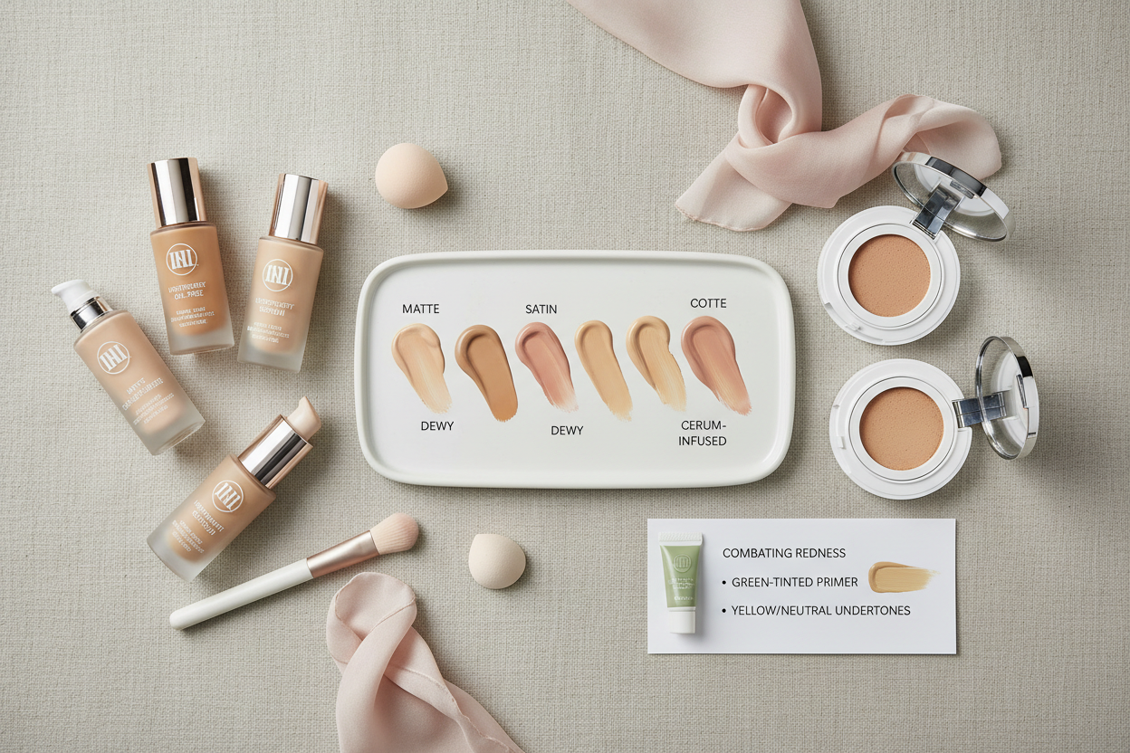
Finish types, ranked for redness control on fair skin:
- Satin / skin-like finish — The most forgiving for uneven redness. A soft sheen diffuses light across the skin, blurring the contrast between flushed and non-flushed areas. Start here.
- Natural / luminous matte — Works well if dryness is also a concern. A slight radiance prevents the flatness that makes uneven tone more obvious.
- Full matte — Can emphasize patchy redness by making the skin surface look uniform everywhere except where the redness sits. Use with caution unless you're pairing it with a color-correcting base.
- High-shine or dewy — Reflects light back, which amplifies redness rather than softening it. Best avoided as a primary finish for this skin type.
Color-correcting formulas as a category:
Some foundations include green-tinted pigments to counteract redness at the formula level. These can help with moderate flushing, but blending matters—too heavy an application leaves a gray or greenish cast on very fair skin. Apply sheerly and build up gradually.
Long-wearing and transfer-resistant formulas are worth prioritizing. Foundation that moves or breaks down during the day tends to expose the redness beneath it in patches, which looks worse than a slight overall flush.
[QUIZ_CTA: quiz_start]
How to Swatch and Test Foundation If You Have Fair Skin With Red Undertones
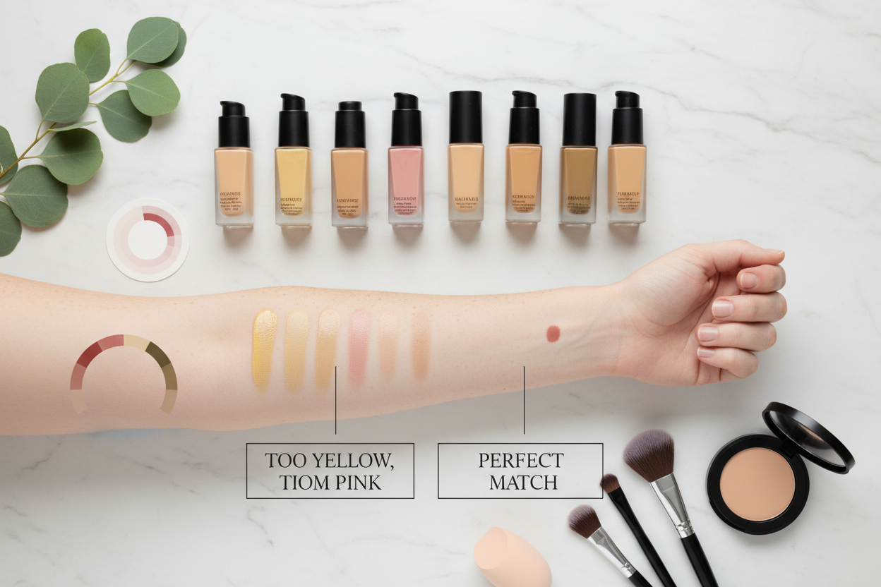
Skip the wrist swatch. Your wrist is a different depth, a different undertone, and it doesn't have the redness patterns your face does. Here's what to do instead:
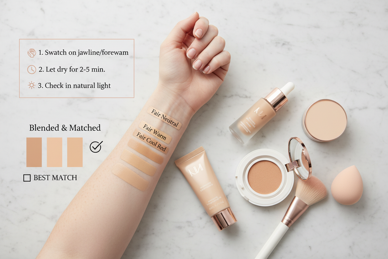
Step 1: Swatch on your jaw, not your wrist. The jawline is where your face meets your neck, so it's the truest test of whether a shade will actually blend. Apply a stripe about two centimeters wide.
Step 2: Check it in natural light immediately. Store lighting—especially the warm, even glow common in beauty retailers—flattens undertone differences. Step outside or find a window before you decide anything.
Step 3: Wait for oxidation. Give it at least 15–20 minutes. Very fair skin is especially prone to oxidation shift, where the formula reacts with your skin's natural oils and darkens or pulls pinker. A shade that looks neutral on application can read clearly warm after it settles.
Step 4: Check the blend point. Look at where the foundation ends, not just where it sits. If the edge disappears cleanly into your skin, the undertone match is working. If there's a visible line or the foundation looks like a separate layer sitting on top, the undertone is off—regardless of depth.
Step 5: Test on a moderate-redness day. If your redness fluctuates, test on a typical day rather than your clearest or most flushed. You want a shade that works across your normal range, not just at one extreme.
Building a Full-Coverage Routine Around Your Foundation for Redness Control
Foundation alone handles only part of the problem. For redness that actually stays controlled through the day, think of foundation as the middle layer of a three-part system.
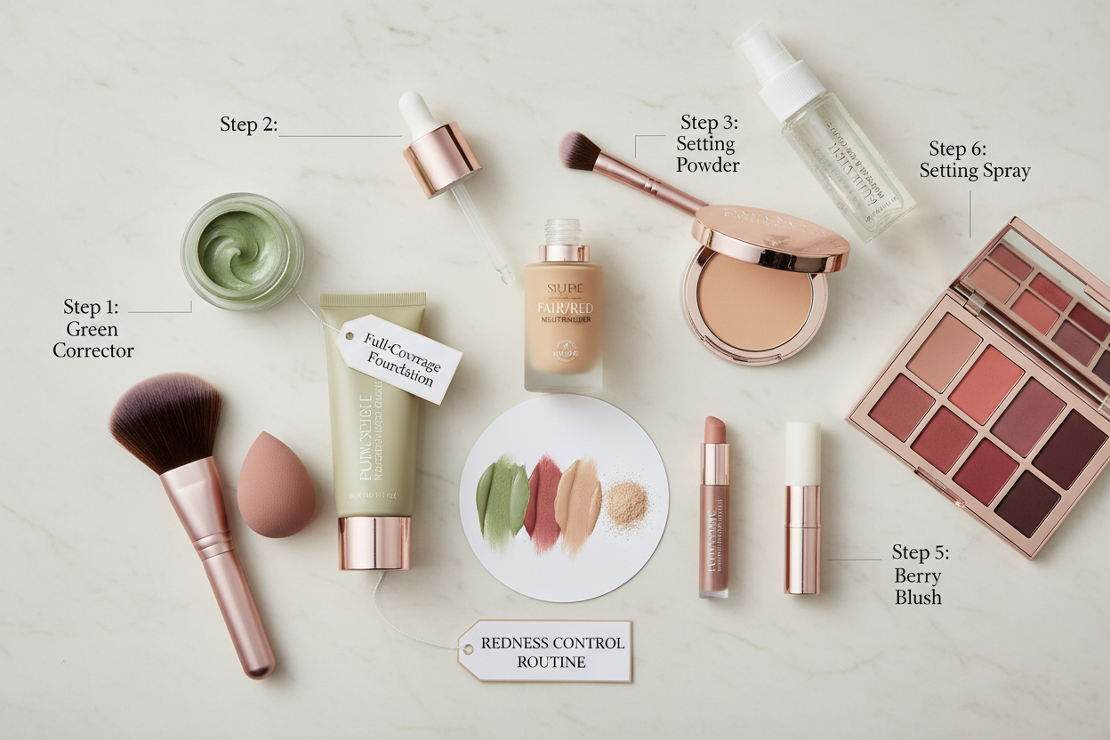
Layer 1: Green color-correcting primer A green primer goes on first and directly counteracts red tones using basic color theory. Apply it only where redness concentrates—across the nose, cheeks, and any patches that persistently flush—not all over. A thin, targeted layer keeps the primer from making your face look grayish once the foundation goes on.
Keep it sheer. The primer's job is to bring the redness baseline down so your foundation doesn't have to work as hard, not to cover everything on its own.
Layer 2: Foundation in a neutral or neutral-cool shade With the primer handling the baseline, foundation can focus on evening out skin tone and giving a natural finish. This is where formula details matter most—hyaluronic acid, mineral bases, fragrance-free certifications. You want the foundation working with your skin throughout the day, not making it more reactive.
If rosacea-prone skin is also on the dry side, a hydrating formula in a satin finish addresses both at once.
Layer 3: Setting product Setting powder or spray locks in the layers below and stops oxidation from shifting the color. For sensitive, redness-prone skin, a finely milled fragrance-free powder is usually safer than a spray—many sprays contain alcohol or fragrance that can trigger flushing. If anti-aging is also a concern, look for a setting product with antioxidant or firming claims that won't introduce new sensitizing ingredients on top of everything else.
Finding Your Exact Shade: Using a Personalized Quiz Instead of Guessing In-Store
Shopping for foundation in-store when you have fair skin with red undertones is mostly a waste of time. The lighting flattens everything, the fair shade range is tiny, and the label system doesn't handle the Neutral-Cool overlap that defines this undertone profile.
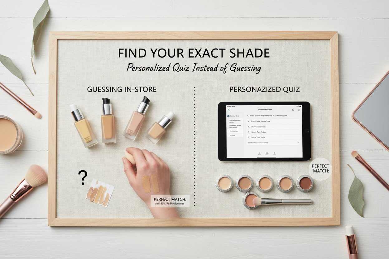
A guided quiz cuts through the specific ways in-store shopping fails you:
- It asks about your undertone characteristics directly, instead of making you decode "Neutral" versus "Cool" on your own
- It treats redness as an active concern, not just a shade modifier
- It accounts for oxidation, so you're not guessing how a shade will look by 3pm
- It shortens the return cycle that comes from buying, wearing once, and realizing the undertone is off
The point is to get you to a short list of shades worth testing, rather than starting from scratch in a store with thirty medium options and four for very fair.
The Neutral-Cool Gray Zone: Where Most Red-Undertone Shoppers Get Stuck
(Moved to the undertone label section above, where it fits naturally as part of the decoding framework.)
What to Avoid: Ingredients That Trigger Reactive Redness in Sensitive Fair Skin
(Covered in full under the Ingredients section above.)
People Also Ask
What foundation shade is best for very fair skin with red undertones?
Start with a shade coded Neutral (N) or Neutral-Cool (N/C) in the lightest depth range. Look for descriptors like "porcelain," "alabaster," or "fair neutral" rather than "fair pink" or "fair cool." Don't default to a Cool shade just because your surface redness points that way—Cool shades can add more pink or even a gray-purple cast instead of balancing existing redness. Swatch two or three candidates on your jawline, step into natural light, and wait 15–20 minutes to see how each shade oxidizes before you commit.
Should I use a cool or neutral foundation if I have rosacea?
For most people managing rosacea on fair skin, Neutral or Neutral-Cool is the safer bet over a true Cool. Rosacea creates surface redness that makes skin look Cool, but the underlying base tone is usually closer to Neutral. A Cool shade can actually intensify pink and purple tones rather than countering them.
Pair your Neutral shade with a targeted green color-correcting primer on the most flushed areas—across the nose and cheeks—to bring down the redness baseline before foundation goes on. Fragrance-free, mineral, or dermatologist-tested formulas are worth prioritizing too, since rosacea-prone skin tends to react to common irritants.
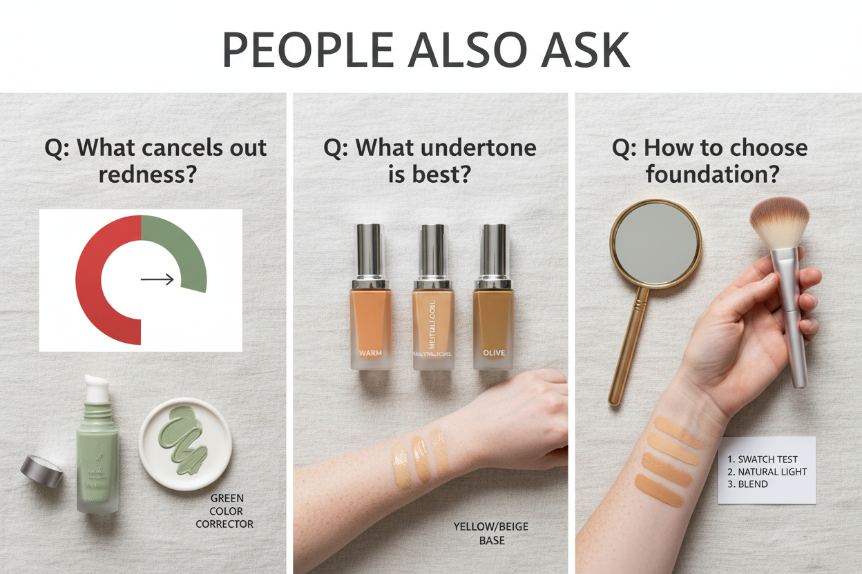
Does green color corrector go under or over foundation for redness?
Under, always. Apply it directly to skin before foundation. Green sits opposite red on the color wheel, so it neutralizes flushed areas at the base level and takes pressure off your foundation layer.
A few application tips:
- Apply only where redness is concentrated, not all over
- Use a thin, sheer layer—too much creates a gray or greenish cast under foundation, especially on very fair skin
- Blend the edges so there's no visible line between corrected and uncorrected areas
- Apply foundation on top with a damp sponge or brush to avoid disturbing what's underneath
Why does my foundation look pink or flushed after I apply it?
Almost always oxidation—a chemical reaction between the foundation's pigments and the natural oils on your skin. As the formula settles, it can shift noticeably warmer or pinker, sometimes within 20–30 minutes of application. On very fair skin, even a small color shift is easy to spot against a light base.
Other contributing causes:
- Undertone mismatch: A cool-coded shade can look neutral at first, then read pink or purple once it settles on your skin
- Formula breakdown: Foundations that aren't long-wearing or transfer-resistant can shift and expose redness in patches, making it look like the foundation itself has turned flushed
- Primer incompatibility: Some primer and foundation combinations don't play well together, causing the foundation to separate or sit unevenly
If oxidation is the specific problem, swatch test for at least 15–20 minutes before buying. A setting powder or spray can help lock the formula in place and slow the shift.
What ingredients should I avoid in foundation if I have sensitive, redness-prone skin?
If your skin is reactive or rosacea-prone, the ingredient list matters as much as the shade. Here's what to watch out for:
- Fragrance — The most common cosmetic irritant. Look for fragrance-free specifically; unscented still allows masking fragrance
- Sulfates — Can break down the skin barrier and make sensitivity worse over time
- Formaldehyde and formaldehyde-releasing preservatives — A known sensitizer that can aggravate chronic redness
- Phthalates — Linked to irritation in sensitive skin
- Denatured alcohol — Drying and can trigger flushing, especially in spray formats like setting sprays
A foundation that's fragrance-free, formaldehyde-free, phthalate-free, and sulfate-free has cleared the main irritant hurdles for this skin type. Mineral formulas with zinc oxide tend to be well tolerated and offer some mild anti-inflammatory benefit alongside coverage.
FAQ
What is the difference between cool and neutral foundation shades for fair skin with redness?
Cool shades have pink, blue, or rosy undertones built into the formula. On fair skin that already runs red, a Cool shade makes that redness worse—the added pink pushes you further toward flushed rather than away from it.
Neutral shades sit between warm and cool. They use a balanced mix of pigments that don't add warmth or intensify coolness, which makes them the safer starting point for fair skin with red undertones. Some brands also offer Neutral-Cool (N/C) shades that lean slightly cool without the saturated pink concentration you'd get from a true Cool shade.
In practical terms:
- Cool (C or P for Pink): Adds pink and can create a rosy or gray-purple cast on redness-prone skin
- Neutral (N): Balances without pushing color in either direction—the go-to for most red-undertone shoppers
- Neutral-Cool (N/C): A middle-ground option when Neutral feels slightly too warm but Cool shades look too rosy
Worth noting: "Neutral," "Warm," and "Cool" don't mean the same thing across every brand. A shade labeled Neutral on deeper skin tones can still carry pink pigment at the lightest end of the range, so it's worth checking swatches rather than trusting the name alone.
Can I use a color-correcting foundation instead of a separate green primer?
Some foundations have color-correcting technology built in—marketed as brightening, tone-evening, or redness-neutralizing—and for mild redness, they can do enough on their own. But for visible, concentrated redness like rosacea across the nose and cheeks, a dedicated green primer applied before foundation still tends to win.
A few reasons a separate primer usually works better:
- You can apply it only where you need it, so you avoid a gray or washed-out cast across your whole face
- It sits directly against the skin, correcting at the base before foundation adds any additional pigment
- Foundation can then go on more sheer, which prevents the heavy, cakey finish you get when one product has to do everything
If fewer products is the goal, look for foundations that specifically list color-correcting or redness-neutralizing benefits alongside long-lasting and transfer-resistant properties. Those formulas give the correction the best shot at lasting through the day.
Why does my foundation oxidize darker and look more red after an hour of wear?
Oxidation happens when the foundation's pigments react with the oils on your skin and with oxygen in the air. As the formula settles, those reactions shift the color—usually warmer or darker, and on fair skin with redness, sometimes pinker too.
On very fair skin, even a small shift is obvious against a light base, so it tends to be more noticeable.
A few things make it worse:
- Undertone mismatch: A shade that looked fine at first can reveal a pink or rosy cast once it settles
- Excess oil: More oil speeds up the reaction, so oil-control or transfer-resistant formulas tend to hold color better
- Primer incompatibility: If your primer and foundation don't bond well, the formula can break down unevenly and expose redness underneath
The best way to catch oxidation before buying: swatch on your jawline, wait 15–20 minutes without touching it, then check in natural light. A setting powder or spray over the top helps lock the formula and slow the shift.
Is a matte or satin finish better for hiding redness on fair skin?
For most people managing redness on fair skin, a satin or satin-matte finish is the better starting point.
Each finish behaves differently:
- Full matte: Absorbs light evenly, which can reduce visible redness in flat light. The tradeoff is that it also flattens skin texture, making dry or flaky patches—common with rosacea—more apparent.
- Dewy or luminous: Reflects light and draws attention to uneven tone, so flushed areas tend to look more prominent.
- Satin or satin-matte: Diffuses light softly, reducing redness without the skin-drying effect of a heavy matte. Works well when you're dealing with both dryness and redness.
If your skin leans dry—which happens often when redness comes from rosacea or a compromised barrier—look for foundations that combine a satin finish with hydrating ingredients like hyaluronic acid. You get less visible flaking without the shine a dewy formula would add.
What does fragrance-free foundation actually mean for rosacea-prone skin?
Fragrance-free means the formula contains no fragrance compounds added for scent — neither natural essential oils nor synthetic fragrance ingredients. This is meaningfully different from unscented, which means a product has no detectable smell but may still contain masking fragrance to cover the base formula's natural odor.
For rosacea-prone and reactive fair skin, fragrance is one of the most common cosmetic irritants. It can trigger flushing, wear down the skin barrier over time, and cause stinging or burning on contact. Because rosacea-prone skin tends to react to multiple product categories, a foundation that's also paraben-free, formaldehyde-free, phthalate-free, and sulfate-free reduces your overall irritant exposure more than fragrance-free alone does.
When evaluating labels, look for "fragrance-free" printed explicitly on the packaging. A mild or neutral scent doesn't mean a product is fragrance-free.
How do I test a foundation shade for red undertones without buying the wrong one?
The most common mistake fair-skinned shoppers with redness make is choosing a shade based on how it looks in the bottle—or how it looks right after application. Testing before committing saves you from that.
Here's a process that actually works:
- Swatch on your jawline, not your wrist or hand—jaw skin matches your face's color and undertone much more closely
- Test two or three shades at once, including your instinctive pick and one that reads slightly more neutral than you'd expect
- Wait 15–20 minutes before deciding—that's enough time to catch oxidation and see whether the shade pulls pink, warm, or neutral on your skin
- Check in natural light—fluorescent and warm store lighting both distort undertone readings
- Look at the blend line, not the center of the swatch—where foundation meets bare skin is where you'll see whether the undertone is actually matching or pulling the wrong way
If in-store testing isn't practical, ask for samples before buying full sizes, or use a shade-matching quiz that accounts for your undertone and skin concerns rather than just a general shade name. Standard names like "Fair" or "Porcelain" vary more between brands than almost any other profile—and very fair skin with red undertones is where that inconsistency shows up most.
Can the same foundation work for both redness coverage and anti-aging on fair skin?
Yes. Several foundation formulas are built to handle both at once, which matters for fair skin dealing with rosacea redness alongside dryness, sensitivity, or early aging — fewer products means less layering on already reactive skin.
What to look for:
- Hyaluronic acid: Hydrates dry, aging skin and helps repair the compromised barrier common in rosacea-prone skin
- Antioxidants: Protect against environmental stress, which worsens both redness and aging
- Mineral pigments (zinc oxide): Provide coverage, mild anti-inflammatory benefits, and broad-spectrum sun protection
- Long-wearing, transfer-resistant formulas: Keep redness covered through the day without touch-ups that can irritate sensitive skin
The main tradeoff: foundations optimized for anti-aging often have a luminous or dewy finish that doesn't suppress redness as well as a satin-matte formula. If both concerns matter equally, a satin formula with hydrating and antioxidant ingredients tends to split the difference without sacrificing either goal.
Not sure which formula fits your situation? A shade and formula quiz that accounts for redness, sensitivity, and anti-aging priorities can narrow things down faster than testing one shade at a time.