Common Seasonal Color Analysis Mistakes

You finally get your color season result — Spring, Summer, Autumn, or Winter — and you expect everything to click. Instead, you hold the palette up and feel nothing. Or worse, you dutifully wear the recommended colors and still look off. That sinking feeling is more common than most color guides admit, and it almost always traces back to a handful of avoidable missteps.
Seasonal color analysis is a genuinely useful framework. When it works, it narrows thousands of possible hues down to a set that reliably enhances your skin tone, hair, and eyes. When it fails to deliver, the problem is rarely the system itself — it's how the system gets applied.
This article walks through the most common seasonal color analysis mistakes people make, why each one leads you astray, and what to do differently. Whether you've just received a season assignment or you've been working with one for years without quite trusting it, the fixes here are concrete and actionable.
Here's what you'll find covered:
- Why the season label is the beginning of the process, not the end of it
- How depth and contrast within your palette determine which colors actually flatter you
- What to do when your assigned palette genuinely feels wrong
- The difference between a color that clashes with your season and one that's simply unflattering for unrelated reasons
- Why color analysis alone can't build a complete wardrobe — and what fills the gap
If you've ever stared at your color swatches wondering why some of them make you look tired while others make you glow, you're in exactly the right place.
Mistake 1: Treating Every Color in Your Seasonal Palette as Equally Wearable
Getting your seasonal palette is not the finish line — it's the starting grid. One of the most common mistakes people make after a color analysis is assuming every swatch in the booklet performs equally well on their specific face. It doesn't.
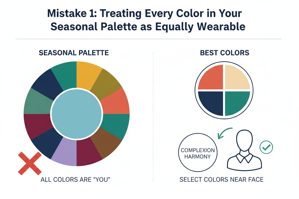
Not every color in a correct seasonal palette will flatter you to the same degree. Three personal variables determine which shades rise to the top of your wearability hierarchy and which ones sink to the bottom:
- Depth of coloring — how light or deep your overall hair-skin-eye combination reads
- Level of contrast — how much difference exists between your hair, eyes, and skin
- Your specific body colors — the particular undertones and pigmentation unique to you
Two people assigned to the same season can look noticeably different in the same shade because their depth and contrast profiles diverge. The palette gives you a field to play in; these three variables tell you which corner of that field is yours.
Ready to find out where your depth and contrast actually land? Take the free color analysis quiz →
How Depth and Contrast Create a Wearability Hierarchy Within Your Palette
Think of your palette as a spectrum, not a flat list. Within any season, colors range from light to deep and from soft to vivid. Where your personal coloring sits on those axes determines which end of the spectrum works hardest for you.
Someone with high-contrast coloring — very dark hair against pale skin, say — within a soft season will often find the richer, slightly more defined shades most useful near the face, even if the dusty ones are technically "correct." Someone with low contrast in the same season may find those softer, blended shades feel most harmonious, and the deeper ones create a disconnect they can't quite name.
A practical way to build your own hierarchy:
- Identify your depth — light, medium, or deep overall
- Identify your contrast level — low, medium, or high
- Sort your palette from lightest to deepest and from softest to most saturated
- Cross-reference — high-depth, high-contrast people generally do better with the richer half; low-depth, low-contrast people generally do better with the softer half
This doesn't mean half your palette is useless. Deeper shades work well away from the face — trousers, shoes, bags — even when lighter shades are more flattering in tops and scarves.
Mistake 2: Obsessing Over the Season Label Instead of the Actual Hues
"I'm a Soft Autumn" becomes an identity rather than a description. That's understandable — the seasonal names are memorable because they're evocative — but fixating on the label instead of what it points to is where things go sideways.
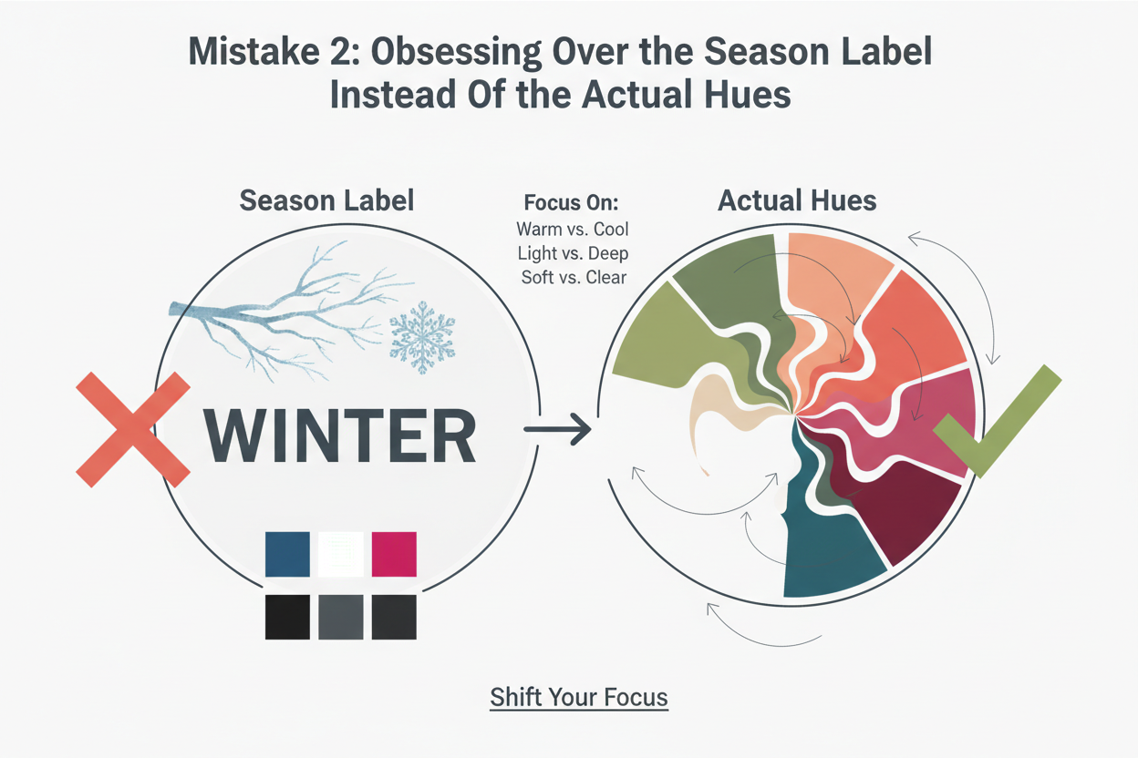
The season name is shorthand for a cluster of color properties. What matters functionally is:
- Undertone — warm, cool, or neutral
- Saturation — muted, mid-range, or vivid
- Value — light, medium, or deep
Knowing you're a "Winter" tells you your best colors tend toward cool undertones, higher clarity, and deeper or contrasting values. That's actionable. The word "Winter" by itself isn't.
When you shop or get dressed, lead with the properties, not the label. Instead of asking "is this a Winter color?", ask "is this cool-toned enough, and is the saturation right?" That shift alone cuts a lot of guesswork — you're working with the mechanism, not the metaphor.
It also matters when you hit a color from another season that looks unexpectedly good on you. Before assuming your analysis was wrong, check whether that color shares the key properties of your season — undertone and saturation especially — even if it doesn't show up on your palette chart.
Mistake 3: Ignoring the Emotional Disconnect When a Palette Feels Wrong
There's a specific moment many people experience after getting their color season results: they look at the swatches and their heart sinks. If that's happened to you, you're not alone — and it doesn't mean color analysis has failed you.
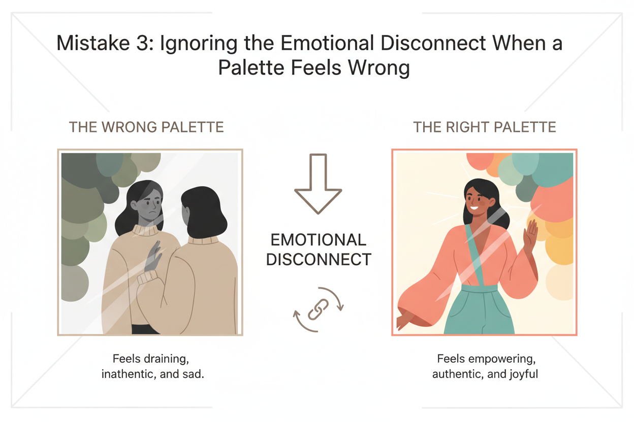
That reaction is actually useful information.
A sinking feeling in front of a palette is almost always pointing at something specific — not the whole palette, but particular shades within it. The mistake is letting that discomfort become a reason to quit the process entirely rather than using it as a prompt to dig deeper.
Using the Disconnect as a Diagnostic Tool, Not a Reason to Quit
When a palette feels wrong, work through it deliberately rather than reactively:
- Identify the specific colors triggering the disconnect — which swatches cause the feeling? Which ones don't?
- Cross-reference with your depth and contrast profile — are the uncomfortable colors at the wrong end of the value or saturation spectrum for your particular coloring?
- Ask whether the discomfort is visual or emotional — sometimes a color genuinely washes you out; other times it's just unfamiliar rather than unflattering
- Test in natural light before deciding — colors behave differently under store lighting than against your actual skin in daylight
Interrogating that disconnect carefully can tell you exactly which part of your palette is working hardest for you — and which shades are technically correct but personally low-priority. That's a much richer outcome than either blindly accepting every swatch or walking away from the system altogether.
Mistake 4: Wearing Clashing Shades From Outside Your Season Without Understanding Why They Clash
Color analysis doesn't mean you can never wear an off-palette shade. But wearing colors outside your season without knowing why they clash means you can't judge when an exception works and when it doesn't.
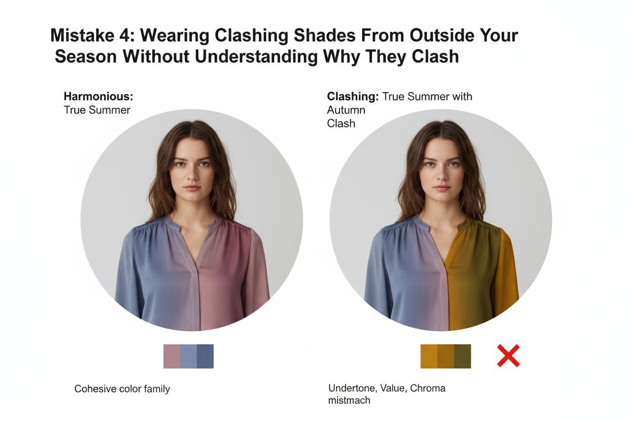
Every season has colors that actively conflict with its core properties, and those conflicts happen in specific ways:
- Undertone conflict — a warm-leaning color on a cool-season person pulls the skin's undertone in a direction that creates visual tension, often making the complexion look sallow, ruddy, or uneven
- Saturation mismatch — a highly saturated, vivid color on someone whose season skews muted tends to overwhelm the face rather than enhance it, drawing attention to the color rather than the person
- Value extremes — a shade that's dramatically lighter or darker than your palette range can create a jarring break rather than a cohesive frame around your face
Knowing which mechanism is at play lets you navigate exceptions deliberately. If you love a shade that's technically outside your palette, figure out which property it shares with your season and which it violates. A color that only conflicts on saturation but is correct on undertone will generally be more forgivable — especially worn away from the face — than one that conflicts on undertone entirely.
Not sure which color properties your season actually maps to? Start the quiz to get a clearer picture →
Mistake 5: Skipping Personal Contrast and Depth Assessment
Seasonal color analysis puts you in a color family. It doesn't tell you how to rank those colors for your specific coloring — that requires a separate look at your depth and contrast, and most people never bother.
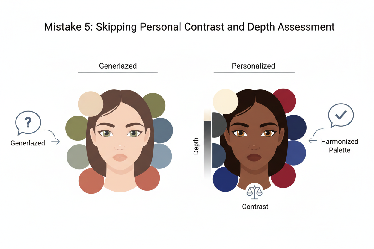
This is why you can follow your palette faithfully and still feel like something is off. The palette is right; the application is too broad.
Here's what a basic contrast and depth check looks like:
Depth:
- Hold swatches from the light and deep ends of your palette against your face in natural light
- Notice which range makes your complexion look cleaner and your features sharper
- That's your depth priority zone
Contrast:
- Compare your hair and skin in natural light — how different are they?
- High contrast means bolder, more defined colors near the face tend to work better
- Low contrast means softer, blended combinations usually read as more harmonious
The whole thing takes about ten minutes with a mirror, a window, and your swatches. What you get is a short list of your highest-performing colors within an already-correct seasonal family — which is a lot more useful than treating all forty swatches as equally valid.
Mistake 6: Confusing Color Analysis With a Complete Style System
Color analysis answers one question well: which hues enhance your natural coloring. It says nothing about silhouette, proportion, fabric texture, personal aesthetic, occasion dressing, or how identity and culture shape your relationship with clothing.
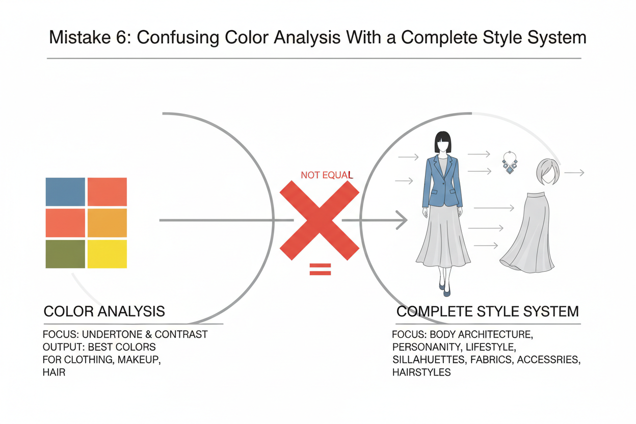
Expecting it to solve all of that sets you up for disappointment — and it explains why some people feel that even a correctly assigned palette isn't "working." The palette is doing its job. It just can't do every job.
Color analysis is a tool for finding which shades flatter you. Useful, genuinely. But it sits inside a larger framework of personal style, not on top of it.
A quick scope check:
- Color analysis handles: undertone compatibility, saturation, value, which specific hues work with your skin, hair, and eyes
- Color analysis does not handle: body proportion, personal style identity, wardrobe architecture, fabric choice, pattern scale, or occasion appropriateness
If a palette feels incomplete as a style solution, you probably don't need a better palette. You've solved the color layer. Now you need to build the layers around it. Color is a good place to start — it's visible and immediate — but it's one input among several, not the whole answer.
People Also Ask
What are the most common mistakes people make with seasonal color analysis?
Most mistakes come down to treating the system as more rigid — or more complete — than it actually is.

- Assuming all palette colors perform equally well on every person assigned to that season
- Fixating on the season label rather than the underlying color properties (undertone, saturation, value) that actually drive the system
- Ignoring personal depth and contrast, which determine which corner of a seasonal palette genuinely flatters a specific individual
- Abandoning the process when a palette feels emotionally wrong instead of investigating which specific shades are causing the reaction
- Expecting color analysis to function as a complete style system, covering silhouette, proportion, and personal aesthetic — which it was never designed to do
The system works well for what it was built to answer: which hues enhance your natural coloring. Problems tend to show up when people ask it to answer everything else too.
Why does my color season palette not feel right for me?
Feeling wrong about a palette after assignment is common, and it almost always has a specific cause rather than meaning the whole analysis was off.
The most frequent reasons:
- Depth and contrast mismatch in application — the season may be right, but you're gravitating toward shades at the wrong end of the palette's value or saturation range for your specific coloring
- Emotional unfamiliarity vs. genuine unflatteringness — colors you haven't worn before can feel "off" simply because they're new, not because they're actually making you look worse
- Lighting conditions — colors tested under store or indoor lighting behave differently against your skin in natural daylight, which is the only reliable test environment
- The discomfort is localized — usually the feeling points to specific swatches, not the entire palette; identifying exactly which ones are triggering the reaction often clarifies what's happening
Treat the disconnect as a diagnostic prompt rather than a verdict. Pinpointing which shades feel wrong and cross-referencing them with your depth and contrast profile usually gets you somewhere more useful than abandoning the palette entirely.
Does your depth of coloring affect which seasonal palette colors you should wear?
Yes, and it's one of the most commonly skipped steps after getting a seasonal palette.
Your depth of coloring — how light, medium, or deep your overall hair-skin-eye combination reads — directly shapes which part of your palette will actually perform near your face. Two people in the same season can look noticeably different in the same swatch because their depth profiles don't match.
In practice:
- Lighter depth within a season means the paler, softer shades tend to do the most work close to the face
- Deeper depth within a season means the richer, more defined shades are usually more flattering at the neckline and above
- Contrast level adds another layer — high-contrast coloring can handle bolder combinations, while low-contrast coloring tends to read better in blended, harmonious groupings
Holding swatches against your face in natural light takes about ten minutes and gives you a short list that's far more useful than treating all forty swatches as equally valid.
Can you wear colors outside your color season without clashing?
Yes — and knowing why certain off-palette colors clash makes it easier to break the rules on purpose rather than by accident.
Off-season colors tend to conflict in a few specific ways:
- Undertone conflict is usually the most visible problem. A warm-toned shade on a cool-season person can make the complexion look sallow or uneven.
- Saturation mismatch is more forgiving. A shade slightly more vivid than your palette allows might overwhelm the face but work fine on a bag or shoe.
- Value extremes — shades dramatically lighter or darker than your palette range — can create a jarring visual break instead of a flattering frame.
A rough rule: a color that shares your season's undertone but differs in saturation is usually more wearable as an exception than one that conflicts on undertone entirely. Colors worn away from the face — trousers, footwear, accessories — also carry less risk than those worn at the neckline, where the interaction with your skin is most direct.
What is the difference between a color season and a color palette?
They're related but not the same thing, and conflating them causes real confusion.
A color season is a category — a label like Spring, Summer, Autumn, or Winter — that describes a cluster of color properties: undertone direction (warm, cool, or neutral), saturation level (muted to vivid), and value range (light to deep). It's shorthand for a set of characteristics your natural coloring shares.
A color palette is the practical expression of that season — a curated collection of specific shades that fall within the season's color property boundaries. The palette translates the category into colors you can actually hold up to your face, shop with, and reference when getting dressed.
The distinction matters because two people can share the same color season but find that different swatches serve them better, depending on their individual depth and contrast. The season label tells you the rules; the palette gives you specific examples of those rules in action. Neither one tells you everything — they define a field of flattering hues, but your personal depth, contrast, and style preferences determine how you actually use that field.
FAQ
Why do some colors in my seasonal palette make me look worse instead of better?
Not every swatch in a seasonal palette works equally well for every person in that season. A palette defines the range of colors that can work for your season's color properties — it doesn't guarantee all of them will flatter you specifically.
The key variables are depth and contrast. Depending on how light or deep your overall coloring is, and how much contrast exists between your hair, skin, and eyes, some parts of the palette will actively flatter you while others sit in neutral territory or even undermine the effect. A very light-depth person assigned to Autumn, for example, may find the deepest, richest swatches overpowering near the face — not because they're wrong for the season, but because they're wrong for that person's specific depth.
Treat the palette as a shortlist to test, not a guaranteed winner. Hold individual swatches in natural light and watch whether your skin looks clearer and brighter — or the opposite.
Is it a mistake to ignore my contrast level when using a seasonal color palette?
Yes, and it's one of the most commonly skipped steps after getting a palette result.
Your contrast level — the degree of difference between your hair, skin, and eye tones — shapes how you use your palette, not just which palette you belong to. Two people with the same seasonal assignment can wear the same swatch and get noticeably different results if their contrast levels differ.
High contrast coloring tends to handle more distinct, separated color combinations without looking disjointed. Low contrast coloring usually reads better in blended, harmonious groupings where tones sit close together in value. If you ignore contrast, you might reach for perfectly on-palette shades that still create a visual imbalance for your specific combination of features.
Contrast assessment takes a few minutes and gives you a much more usable short-list from within your palette.
What should I do if my assigned color season palette feels completely wrong?
Treat the discomfort as a diagnostic signal rather than evidence the entire analysis failed.
A palette that feels wrong after assignment almost always has a traceable cause:
- Check whether the feeling is localized. Usually it's specific swatches triggering the reaction, not the whole palette. Identifying exactly which ones feel off is more informative than rejecting everything at once.
- Assess whether the issue is unfamiliarity or genuine unflatteringness. Colors you haven't worn before can register as wrong simply because they're unfamiliar — test them in natural light against your face before deciding.
- Cross-reference with your depth and contrast profile. The season may be correct but you may be gravitating toward the wrong end of the palette's value or saturation range for your individual coloring.
- Check your lighting. Colors behave differently under artificial store lighting versus natural daylight. Natural light is the only reliable test environment.
Pinpointing which specific shades are causing the disconnect — and why — typically produces a more useful outcome than walking away from the palette entirely.
Can two people in the same color season wear the same shades equally well?
Not necessarily, and expecting them to is one of the common seasonal color analysis mistakes to avoid.
A shared season means shared color properties — similar undertone direction, saturation range, and value field. It doesn't mean identical coloring. Two people in the same season can differ considerably in depth (how light or deep their overall hair-skin-eye combination reads) and in contrast level, and both of those factors shape which corner of the shared palette works hardest for each of them.
In practice:
- A deeper-depth person in the season will often find the richer, more defined shades most flattering near the face
- A lighter-depth person in the same season may find those same shades overpowering, with the softer, paler swatches doing more work
- High-contrast individuals within a season can generally handle bolder combinations; lower-contrast individuals in the same season often look better in more blended pairings
The season defines the playing field. Individual depth and contrast determine which part of that field you actually play on.
Does seasonal color analysis account for personal style preferences or only skin tone?
Color analysis works with the physical relationship between color properties and your natural coloring — undertone, depth, and contrast. Personal style preferences sit outside that framework by design.
That distinction matters. The system can tell you which colors enhance your natural features, but it can't tell you which aesthetic or mood you want to express. A color can be technically flattering for your season and still feel completely wrong for how you see yourself — both things can be true at once. Emotional connection to color, what you're drawn to, what feels like you, is a separate layer the seasonal framework doesn't touch.
The most effective approach treats color analysis as one input among several. It narrows the field of flattering hues, but building a wardrobe that reflects your actual taste and lifestyle takes more than a seasonal palette.
How do I know if a color is clashing with my season's characteristics versus just being unflattering for another reason?
The distinction usually comes down to which color property is causing the problem.
Colors clash with your season in a few specific ways. Undertone conflict is usually the most obvious — a shade with the wrong undertone direction can make the complexion look sallow, ruddy, or uneven, and that's different from a color just being a bad hue for you. Saturation mismatch — a shade much more vivid or much more muted than your palette range — tends to overwhelm or wash out the face rather than create that undertone conflict. Value extremes, shades dramatically lighter or darker than your palette's range, can create a visual break that fragments your features instead of framing them.
A quick test: remove the color from near your face. If your skin immediately looks clearer or more even, the conflict is likely seasonal. If the color is unflattering but your skin looks the same either way, the issue is probably something else — cut, proportion, or pattern — not the hue itself.
Is seasonal color analysis enough on its own to build a complete wardrobe?
No — and treating it like it is leads to a frustration that's entirely avoidable.
Seasonal color analysis answers one specific question: which hues work with your natural coloring. That's genuinely useful, but it leaves several other wardrobe-building questions untouched:
- Which silhouettes and proportions work for your body and lifestyle
- How to balance and combine colors within your palette for actual outfits
- What your personal style identity is and which aesthetic direction you want to move toward
- How to account for dress codes, context, and occasion
The palette gives you a field of flattering colors. It doesn't tell you how to build a wardrobe from them or how to actually wear the things in it. Layering contrast and depth awareness on top of your seasonal assignment gets you further; adding personal style work gets you the rest of the way.
If you're not sure where your seasonal analysis landed, taking a color quiz can clarify your starting point before you add those other layers.