Calming Color Palette Psychology
 Reviewed by Alexandra Gilmore
Blue is not automatically calming, and many familiar color-psychology claims outrun the evidence behind them. Separate research-supported effects from popular folklore, then use softer blues, greens, neutrals, and context-aware combinations to reduce visual stress in rooms and workspaces without treating color as therapy.

You have probably heard that blue makes you calm, or that red makes you aggressive. Some of those claims come from real research. Many do not. Color psychology sits in an awkward space between genuine cognitive science and pop-psychology folklore, and telling the two apart matters if you actually want to use color to reduce stress.
💫 Take the Color Analysis Quiz
If the signals in this article still point in different directions, compare them together instead of relying on one clue. The quiz gives you a consistent starting point you can check against the practical tests above.
Take Color Analysis Quiz →This article cuts through the noise. It draws on cognitive science research, mental health guidance, and clinical arts-in-medicine programs to answer one practical question: which colors reduce stress most reliably, and how can you apply that knowledge where you live and work?
Here is what you will find inside:
- The neurological and evolutionary reasons certain colors trigger a calming response
- A ranked look at the colors with the strongest stress-reduction evidence
- How calming palettes support focus and memory—not just mood
- Where color psychology claims go too far and what you can safely ignore
- Room-by-room guidance for bedrooms, offices, and therapeutic spaces
- A process for discovering your own personal calming palette
A few grounding points before going further:
Color affects more than aesthetics. Research in cognitive science suggests the right palette can support focus, memory, and broader cognitive health—not simply make a room look prettier.
The hype is real, but so is the skepticism. As one widely-viewed breakdown of the field notes, the internet is full of sketchy claims about color psychology—from blue social-media logos engineering calm to wearing red for confidence. The science is more nuanced, and more interesting, than those shortcuts suggest.
Context shapes everything. Clinical settings like cancer care centers have explored color as a tool for stress relief through programs that integrate art and environment together. That real-world application reflects something the research supports: color works in combination with light, space, and personal history—not in isolation.
Keep those caveats in mind as you read. The goal here is not to sell you on a single universal calming color. It is to give you an honest, evidence-grounded map so you can make smarter choices for your own spaces and stress levels.
Why Colors Trigger Emotional Responses in the First Place
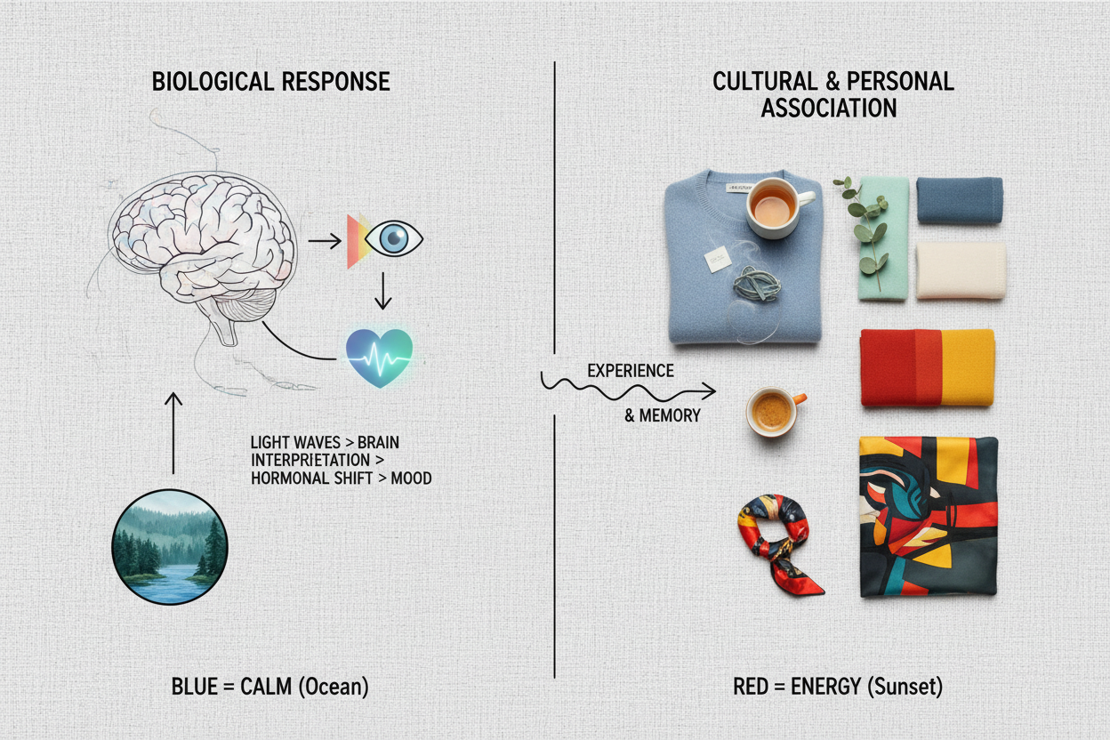
Color doesn't just enter your eyes—it enters your nervous system. Before you consciously register anything, visual signals from color-sensitive cells in the retina travel to brain regions involved in emotion, arousal, and memory. A color can shift your mood before you've even identified what you're looking at.
Two explanations dominate the research, and both hold up:
Evolved environmental associations. Human ancestors lived in environments where color carried survival information. A clear blue sky meant open, safe conditions. A lush green landscape meant food and shelter. Those associations appear to have left a biological trace—which is why the calm many people feel looking at a blue horizon or walking through a forest isn't purely cultural. There's an older, more instinctive layer underneath.
Culturally learned meaning. On top of those primal responses are meanings built through experience and cultural context. White signals purity in some cultures and mourning in others. Yellow reads as cheerful or anxiety-inducing depending on saturation and context. These learned associations are real, but they're also variable—which is exactly why universal "this color always produces this mood" claims fall apart under scrutiny.
Understanding both layers tells you something worth keeping in mind: you can't fully separate your physiological response to color from your personal history with it. General principles apply, but your own reactions will vary.
Curious which calming colors align with your specific responses? Take the free color analysis quiz →
The Most Calming Colors Ranked by Stress-Reduction Evidence
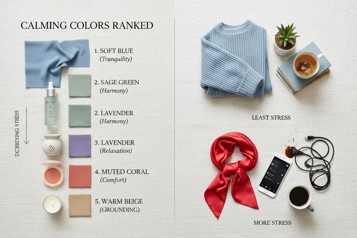
When it comes to color psychology and stress reduction, the evidence converges on a short list—but hue, saturation, and brightness matter as much as the color name itself.
Blue: Why the Sky and Sea Signal Safety to the Brain
Blue consistently ranks highest in stress-reduction research, and the evolutionary explanation is straightforward: a clear blue sky historically indicated daylight, open space, and no immediate threat. That signal appears to persist as a physiological default.
The evidence is worth separating from the noise. You may have seen claims that major social media platforms chose blue interfaces specifically because blue calms users. That framing is widely repeated, but it flattens a commercial decision into a psychological fact. What's better supported is that mid-tone, desaturated blues—soft sky, muted slate—produce measurable reductions in heart rate and cortisol in controlled conditions. Vivid, highly saturated blues and deep navy shades don't carry the same effect. Depending on context, they can read as cold or somber.
The practical takeaway: not all blues are calming. The version that works is closer to haze than cobalt, closer to horizon than midnight.
Green: How Forest Environments Translate Into Interior Calm
Green's calming profile is closely tied to what researchers call biophilic response—the human tendency to feel restored in natural environments. The sense of calm many people describe after walking through a forest isn't incidental. It reflects a measurable drop in stress hormones and an increase in parasympathetic nervous system activity documented in nature-exposure studies.
You can bring some of that indoors through color, but it depends which greens you use. Muted, earthy tones—sage, olive, soft eucalyptus—carry the most reliable calming associations because they approximate natural foliage in low-light conditions. Saturated lime or electric greens diverge sharply from that and tend to increase visual stimulation rather than reduce it.
Interior green also pairs well with natural textures and indirect light, which amplifies the effect beyond what color alone can do.
Soft neutrals as supporting players. Beyond blue and green, warm off-whites, greige tones, and muted lavenders consistently score well in self-reported calm studies. They work by reducing visual contrast and sensory complexity—a different mechanism than the environmental associations behind blue and green, but a real one.
How Calming Colors Support Cognitive Health Beyond Mood
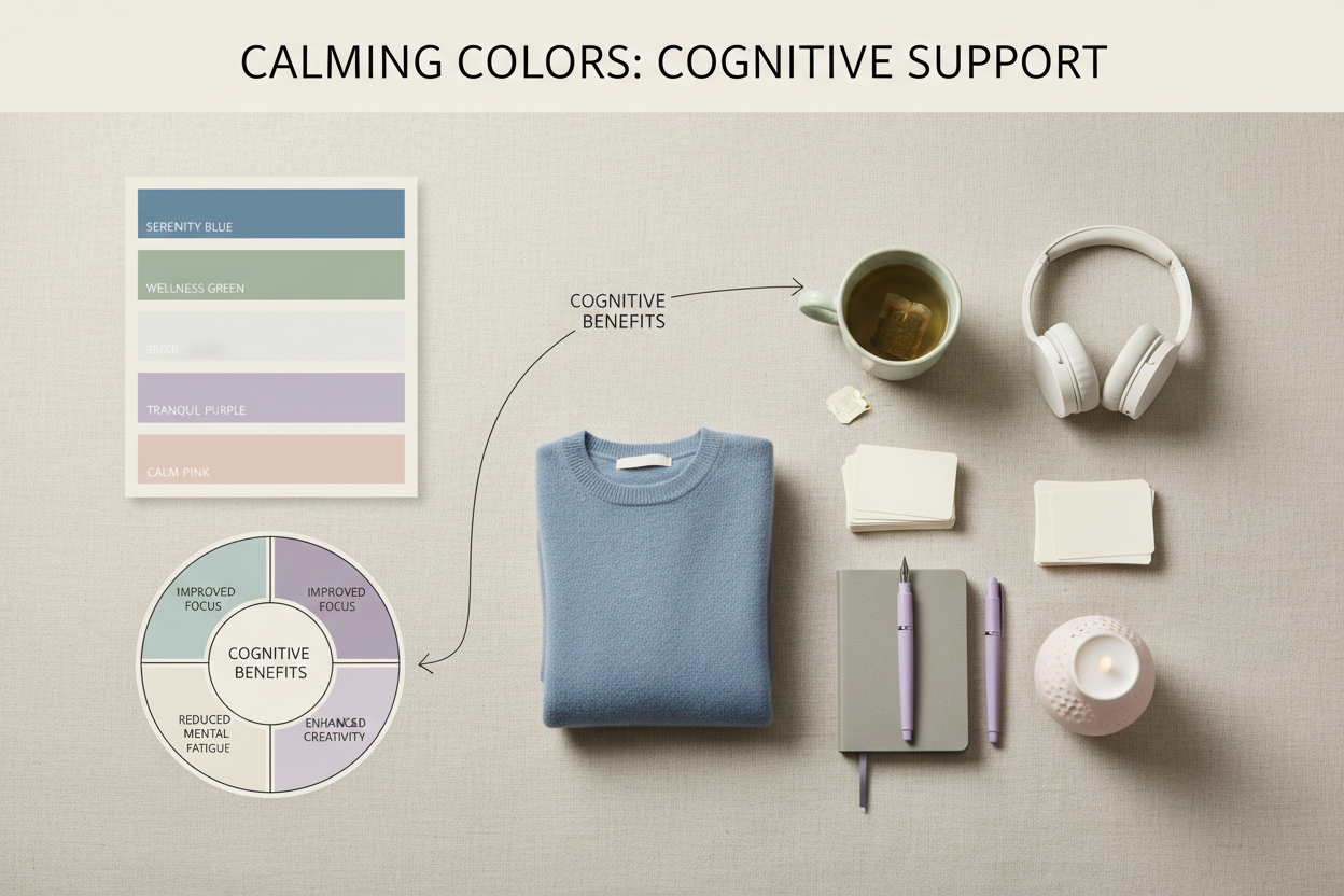
Most conversations about calming colors stop at feelings. The research goes further. A well-constructed calming palette can support cognitive function in ways that matter for daily performance and long-term wellbeing—not just how relaxed you feel in a given moment.
Specific areas where color palette choices show evidence of impact:
- Anxiety reduction. Sustained exposure to high-stimulation colors—particularly saturated reds and oranges in living and working environments—is associated with elevated baseline anxiety. Cooler, lower-saturation palettes appear to reduce that background load.
- Focus and attention. Calming environments reduce the cognitive cost of filtering out visual noise. When your surroundings aren't competing for attention, those cognitive resources become available for sustained concentration.
- Memory consolidation. Stress hormones interfere with memory encoding and retrieval. Calming color environments appear to reduce physiological stress responses, which may indirectly support the conditions under which memory works best.
The key word in all of this is palette, not color. Single-color claims—"green improves memory"—are weaker than the broader finding that low-stimulation, coherent color environments support the cognitive conditions associated with focus and retention.
Where Color Psychology Gets Overhyped—and What to Ignore
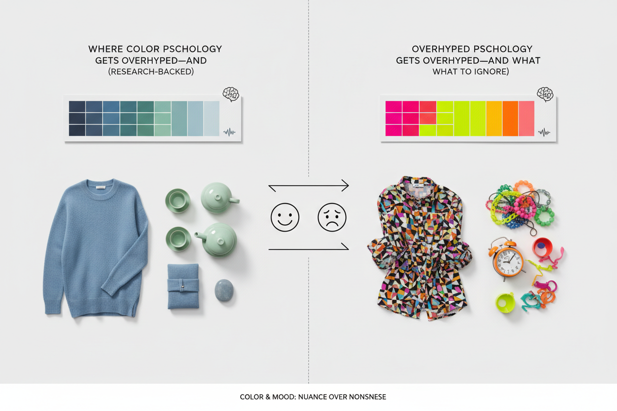
Color psychology has a credibility problem. Much of what circulates online is either extrapolated far beyond its source data, drawn from studies with tiny samples, or invented to make marketing copy sound authoritative.
Two examples that show how this plays out:
"Blue calms you down, so social media sites use blue backgrounds to keep you engaged." This conflates a general association with a specific engineering decision made for entirely different reasons. "Blue may reduce acute stress responses" does not get you to "a blue interface is calculated psychological manipulation." That's a much longer chain of evidence, and it doesn't exist.
"Wearing red to a job interview makes you more confident." Nearly complete invention. Color effects of this specificity—applied to worn clothing, producing a defined psychological outcome in a social context—are not what controlled research actually shows.
What you can take seriously:
- Hue, saturation, and brightness each independently affect physiological and psychological response
- Environmental color exposure over time (days, weeks) has stronger measurable effects than brief exposure
- Individual differences—personality, prior experience, cultural context—substantially change how any color registers emotionally
- Combinations and proportions matter; a room is not a color swatch
What to treat skeptically:
- Any claim linking a specific color to a specific emotion with no acknowledgment of individual or cultural variation
- Studies using color swatches shown for seconds and extrapolating to living environments
- Pop-psychology rankings ("the ten most calming colors") with no qualification about saturation, context, or personal response
The honest state of the science: color does influence mood and cognition, but the effect sizes are modest, the mechanisms are multiple, and individual variation is large enough to make universal prescriptions unreliable.
Individual variation is exactly why personal color analysis matters. Find your calming palette →
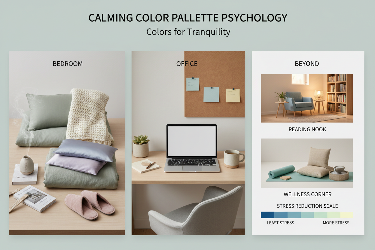
Applying Calming Palettes to Real Spaces: Bedroom, Office, and Beyond
Color principles only become useful when you apply them to actual rooms with actual functions. The same pale blue that helps a bedroom feel restful might leave a workspace feeling flat when you need just enough stimulation to stay alert. Context shapes the right choice.
The Bedroom Case: How Wall Color Shapes Morning Emotional State
Bedroom wall color is one of the highest-impact color decisions in a home. The exposure is sustained, repeated, and happens at the most emotionally raw points of the day—falling asleep and waking up.
If you wake up feeling anxious, low-energy, or vaguely off, your walls are worth a second look. A color that seemed fine during a quick paint-swatch evaluation can read very differently in the gray light of 6 a.m. after eight hours of passive exposure. Overly cool blues, grays that lean green, or a deep accent wall dominating your first waking view can all produce a low-grade mood effect that builds over weeks.
Colors that tend to work in bedrooms:
- Soft, warm whites and off-whites that reflect light without visual noise
- Dusty blue or blue-gray tones with low saturation and medium lightness
- Muted sage or warm greige that reads as neutral but has some organic warmth
The single most important variable after hue is saturation. A washed-out version of almost any hue will outperform a vivid, high-chroma version of the "correct" calming color—for sleep, and for how you feel when you wake up.
For offices and workspaces: Pure white environments cause visual fatigue faster than most people expect, and there's nothing to visually anchor you. Muted greens or soft warm neutrals with one accent of natural texture tend to support sustained focus without tipping into distraction.
For living rooms and shared spaces: The emotional goal shifts constantly—conversation, relaxation, entertainment, family time. Warm neutrals with natural texture usually work best as a base, with calming accents introduced through soft furnishings rather than paint.
Color as a Therapeutic Tool: From Hospital Rooms to Home Art
The most rigorous real-world testing of calming color often happens not in design studios but in clinical environments, where the stakes are high and the results are measurable.
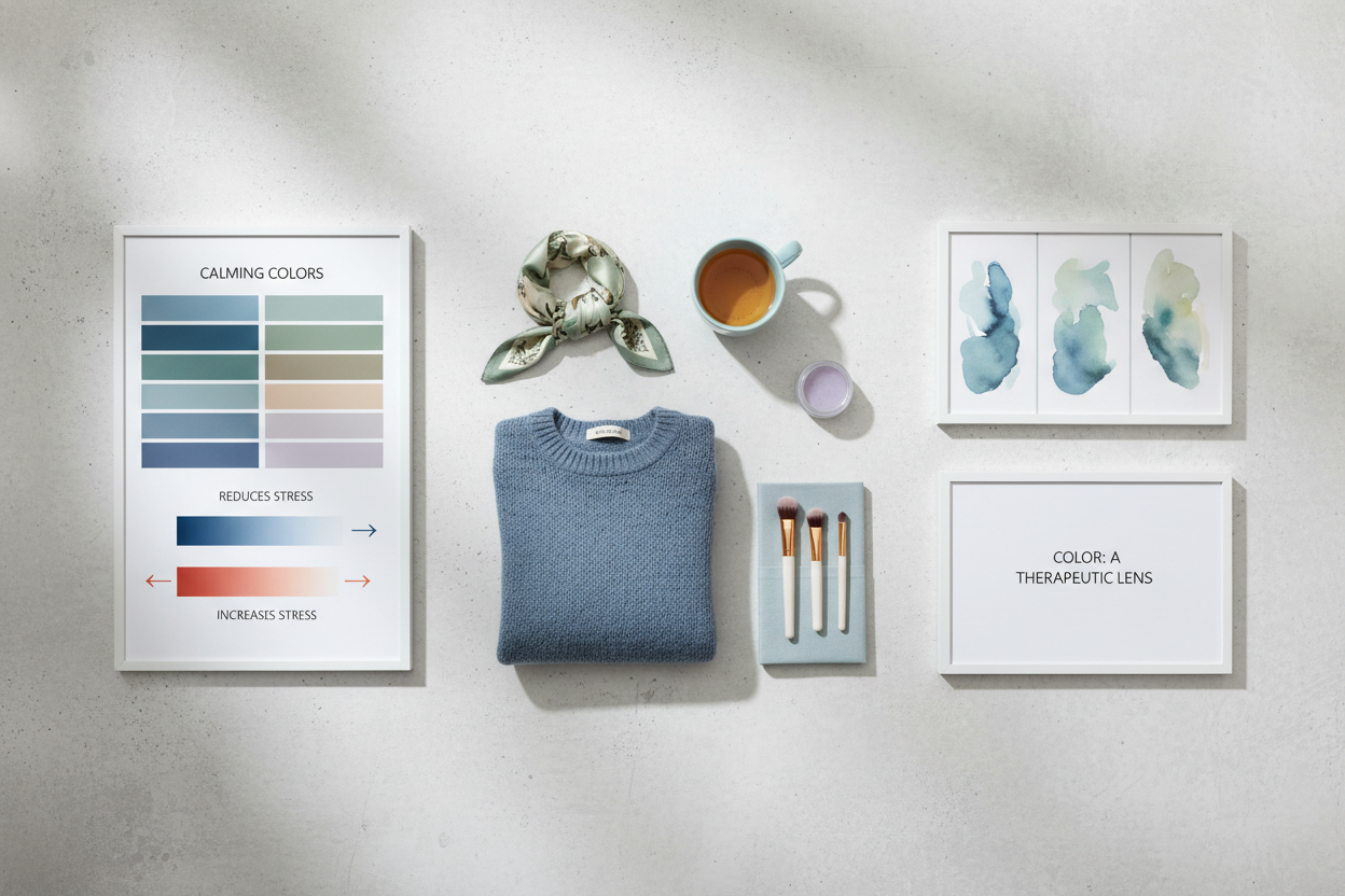
Cancer care centers have been among the more serious adopters of color-as-therapy thinking. At Moffitt Cancer Center's Arts in Medicine program, patients engage in color-based art-making—including string painting—as a structured intervention for stress relief during treatment. The program points to something that goes beyond passive environmental color: active engagement with color, not just looking at it, carries therapeutic potential.
One practical extension of that idea is that artwork you make or choose yourself, then live with every day, compounds the calming effect in two directions. The colors contribute to your ambient visual environment. And the personal meaning attached to those colors amplifies their emotional weight. A painting someone created during chemotherapy and then hung in their inpatient room is not doing the same work a random wall print would. Where the color comes from matters.
For non-clinical home environments, the principles carry over:
- Artwork you have a genuine connection to will register differently than something chosen purely to match the sofa
- Daily exposure to a consistent, intentionally calming palette in high-use rooms builds a cumulative effect that a single redecorating day cannot replicate
- Combining color in art with color in architecture amplifies both—a sage green wall with a warm-toned painting reads differently than either element on its own
Finding Your Personal Calming Palette
General color psychology tells you where to start, not where to stop. Individual variation in color response is substantial enough that the "most calming color" for you may look nothing like the statistical average.
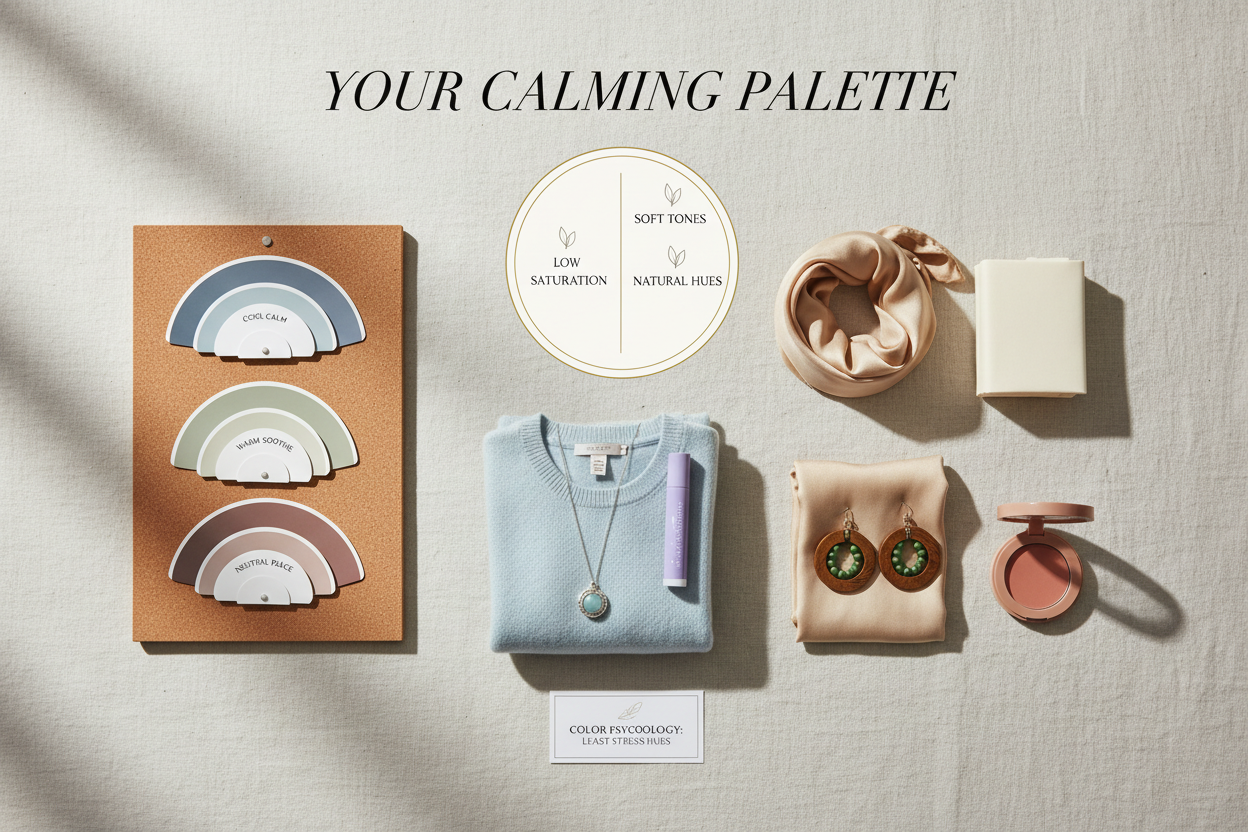
A few factors shape your personal response in ways general research can't predict:
- Personal history. A color tied to a childhood home, a memorable experience, or a difficult period carries emotional weight that overrides its generic psychological profile.
- Personality and temperament. People with higher baseline arousal may find slightly more stimulating palettes calming relative to their norm. Highly sensitive people often need lower saturation than average recommendations suggest.
- Cultural background. Color meaning is partly learned. The cultural context you learned it in affects your automatic response in ways you can't always consciously trace.
- Photosensitivity and visual processing. How you experience contrast and glare determines which colors feel restful versus taxing in your actual space.
Reading about calming color psychology is a starting point, not a complete answer. Getting from general principles to a palette that actually works for your nervous system and your history requires something more personalized.
A color analysis oriented toward psychological resonance—not just seasonal skin-tone matching—is one way to find that starting point. It takes the general principles above and maps them to your specific responses, so the result is individually calibrated, not just scientifically grounded.
People Also Ask
What is the most calming color for anxiety?
Blue and green come up most often in stress research, but the specifics matter more than the color name. Mid-tone, desaturated blues—soft sky shades rather than vivid cobalt or deep navy—are linked to measurable drops in physiological arousal markers like heart rate. Muted greens in the sage, olive, or eucalyptus range tap into the same restorative responses people get from time in natural environments. For anxiety specifically, saturation is the most important variable: a washed-out, low-intensity version of almost any cool or neutral hue will outperform a vivid version of the theoretically "correct" calming color.
Does blue actually reduce stress or is that a myth?
The core finding is real, but it gets overstated. Controlled studies do show that certain blue tones reduce physiological stress indicators. The likely mechanism is evolutionary—clear blue sky historically meant open, safe conditions, which left a default calming association in the nervous system. What isn't well supported is the popular claim that platforms and products deliberately choose blue as psychological manipulation to keep users calm or engaged. That story takes a modest, qualified research finding and grafts it onto a commercial decision that was made for other reasons. The honest answer: soft, desaturated blues do appear to reduce acute stress responses in many people—but the effect is moderate, context-dependent, and not universal.
What color should I paint my bedroom to feel less stressed?
Bedroom wall color has outsized impact because the exposure is sustained, repeated, and happens at the most emotionally raw parts of your day—waking up and falling asleep. Colors with the most consistent positive associations in bedroom contexts include:
- Soft warm whites and off-whites that reflect light without visual intensity
- Dusty blue or blue-gray tones with low saturation and medium lightness
- Muted sage or warm greige with organic undertones
If you wake up feeling vaguely unsettled, it's worth knowing that a color that looked neutral on a swatch can read very differently in early morning light after hours of passive exposure. The single most useful adjustment you can make is reducing saturation—a pale, washed-out version of nearly any hue will behave better in a sleep environment than a vivid, high-chroma version of the same color.
Can the colors in a room affect focus and memory?
There's a meaningful indirect effect. High-stimulation color environments—especially spaces dominated by saturated, high-contrast hues—require ongoing cognitive effort to filter out visual noise. That effort draws on the same attentional resources needed for sustained focus. Calming, low-stimulation palettes reduce that background processing load, freeing up more cognitive capacity for concentration. The memory connection runs through stress: elevated stress hormones interfere with memory encoding and retrieval, so environments that lower physiological arousal may support the conditions under which memory works better. The key qualifier is that these effects show up most clearly with sustained, daily exposure to a coherent palette—not brief encounters with individual color swatches.
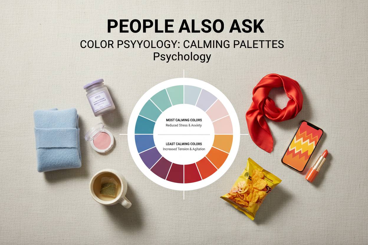
What colors should you avoid if you want to feel calm?
The colors most consistently linked to elevated arousal and stress are:
- Saturated reds and oranges in large quantities—associated with higher baseline anxiety when they dominate a room over time
- High-chroma yellows, particularly under cool-toned lighting, which can read as visually agitating rather than cheerful
- Very dark, high-contrast combinations that take over the visual field, especially in rooms used for sleep or recovery
- Bright whites with strong blue undertones in sustained work or rest environments, which can cause visual fatigue without offering any sensory grounding
The pattern is less about specific hues and more about high saturation, strong contrast, and visual complexity. Any color at high intensity can increase arousal—the same red that feels energizing in a gym feels oppressive in a bedroom. If calm is the goal, reducing chroma and contrast matters more than avoiding any particular color outright.
FAQ
What is scientifically considered the most calming color?
Blue has the strongest research support for stress reduction. Soft, desaturated mid-tones work best—pale sky rather than vivid cobalt—with measurable drops in heart rate and other arousal markers. Muted green comes close, likely because of its association with natural environments. Neither color works in isolation from shade, saturation, and context, so "soft blue" is more accurate than just "blue."
Is there a single color that reduces stress for everyone?
No. Despite what pop-psychology articles suggest, color responses depend on personality, cultural background, personal history, and even mood in the moment. Research describes tendencies across groups, not rules that apply to everyone. A color that reduces arousal in a study sample won't do the same for every individual. "Paint your room blue and feel calm" makes a complex, personal response sound simpler than it is.
How does green compare to blue for calming effects?
They work through related but different mechanisms. Blue has the stronger physiological effect—lower heart rate, reduced arousal—probably tied to evolutionary associations with open sky and clear water. Green's calming quality is more restorative: it draws on the attention recovery and stress relief people feel in natural settings like forests. In practice, muted greens feel warmer and more grounding; soft blues read as cooler and more open. Both work. Which one fits better depends on what the space is for and how you personally respond to each.
Can looking at calming colors actually improve cognitive performance?
Indirectly, yes. High-saturation, visually busy environments make your brain constantly filter out noise, which draws on the same attentional resources you need for actual thinking. A quieter palette reduces that background load. There's also a stress angle: environments that lower physiological arousal reduce circulating stress hormones, which otherwise get in the way of memory and focus. The effect is most noticeable with consistent daily exposure to a coherent low-stimulation environment, not a brief glance at a soothing color.
Why do hospitals and healthcare spaces use certain colors?
Hospitals aren't choosing colors at random. Patients and staff spend long stretches of time in these spaces, often under real stress, so the goal is to avoid adding to that. Soft blues, muted greens, and warm neutrals tend to keep people calm without making the environment feel sterile or depressing.
Some programs take this further. Cancer care centers like Moffitt have built art-making directly into patient care—patients create and display their own artwork in their rooms, so they're surrounded by color they chose rather than color chosen for them. The logic is straightforward: if you can lower the ambient stress level, you're probably helping recovery, not just aesthetics.
Does the shade or saturation of a color change how calming it is?
Yes, and more than most people expect. Saturation is probably the most important variable—more important than hue. A washed-out, low-chroma version of almost any cool or neutral color will read as calmer than a vivid, high-intensity version of the theoretically "correct" calming color. Lightness matters too: very dark spaces can feel heavy, while very bright ones cause eye strain. The colors people consistently find calming share a profile of low-to-medium saturation, mid-range lightness, and minimal contrast—regardless of whether the underlying hue is blue, green, or a soft neutral.
How can I find out which calming colors work best for my own personality?
Individual responses to color vary a lot, so generic rules only get you so far. A color personality quiz—like the one on this site—maps your personal associations, emotional responses, and aesthetic tendencies to palettes that are likely to feel calming for you. Research gives you a starting point, but your own reactions are a more accurate guide than population averages.
To apply the same color principle in a related format, continue with the companion article “The Best Soothing & Calming Color Combinations”, which keeps the two closely related questions distinct.