Best Colors for Pale Skin

If you've ever pulled on a shirt that seemed fine on the hanger and then looked oddly dull or sallow in the mirror, you already know the problem. Pale skin is unforgiving of the wrong color — but remarkably radiant in the right one.
The trouble is that most advice stops at vague instructions like "avoid pastels" or "try jewel tones." That's a starting point, not a system. What actually determines whether a color flatters your fair complexion isn't brightness, depth, or trend — it's undertone alignment.
This guide is built around that principle. Here's what you'll find inside:
- How to identify your pale skin undertone — pink/cool, golden/warm, or neutral — using three quick tests you can do at home
- Specific color recommendations for each undertone category, including the jewel tones, earth tones, and neutrals that genuinely work
- Colors to avoid — and the real exceptions to those rules
- Why generic "add color" advice backfires on pale skin, and what to do instead
- A permanent wardrobe framework based on color analysis so you stop second-guessing every purchase
Pale skin can look healthy, luminous, and striking — not because you need a tan, but because the right colors amplify what's already there. The goal of every choice in this guide is the same: clothing that makes your complexion glow, not wash out.
By the end, you'll have a clear, repeatable answer to the question that probably brought you here: what colors look best on pale skin?
Why 'Just Add Color' Is the Wrong Advice for Pale Skin
You've probably heard it: pale skin needs a pop of color. Wear something bright. Avoid anything light — it'll wash you out.
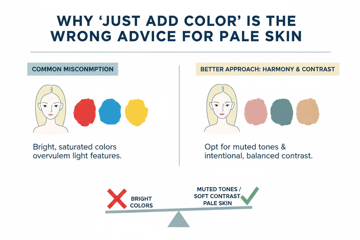
Sounds reasonable. It's also incomplete in a way that quietly ruins outfits.
The problem isn't that pale skin can't handle color. It's that which color matters far more than simply having one. A coral top can look radiant on one fair-skinned person and oddly murky on another. Soft lavender can brighten one person's complexion while making their friend look tired. Same color, same fairness level — completely different result.
The missing piece is undertone.
Pale skin isn't a single thing. It runs pink and cool, golden and warm, or somewhere neutral in between. A color that flatters the warm version of pale skin can clash directly with the cool version, and no amount of added brightness fixes an undertone mismatch. You end up with exactly what the advice was supposed to prevent: a washed-out look.
Generic advice treats all fair skin as one category. Undertone-first advice treats it as three — and that's what separates outfits that make you glow from ones that make you disappear.
Ready to skip the guesswork? Take the color analysis quiz →
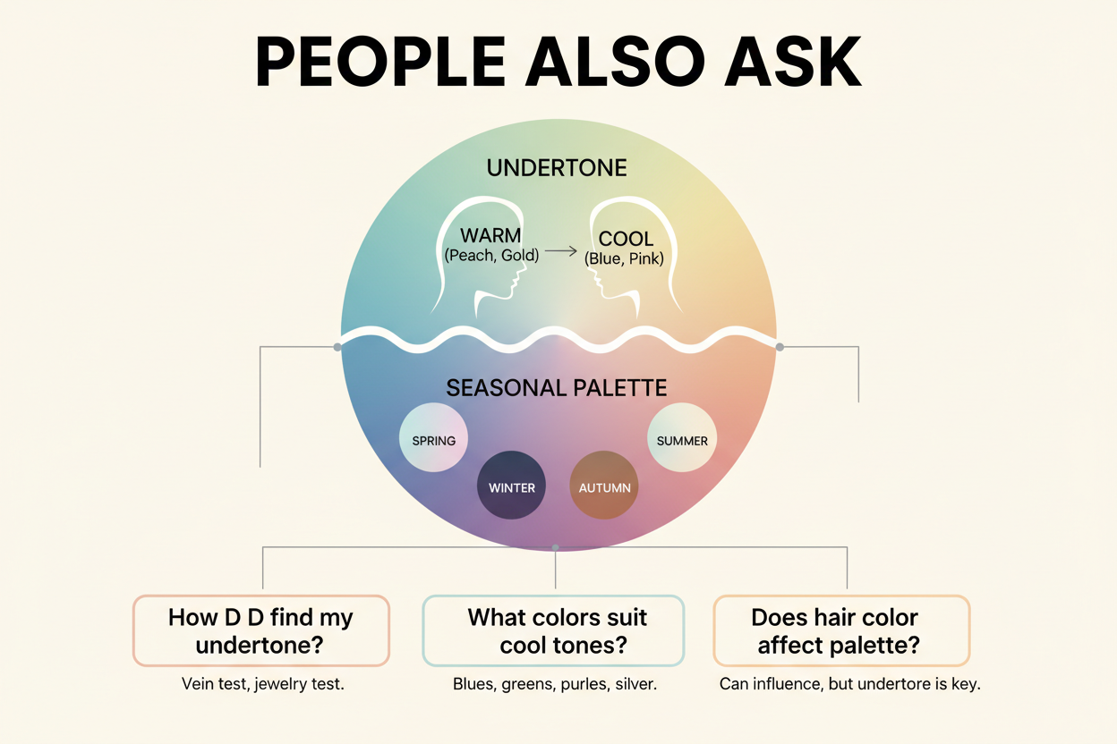
How to Identify Your Pale Skin Undertone: Pink, Golden, or Neutral
Undertone sits beneath the surface of your skin and doesn't change with a tan, sunburn, or season. Getting it right is what makes the rest of this guide actually useful to you, rather than a list of things that might work for someone else.
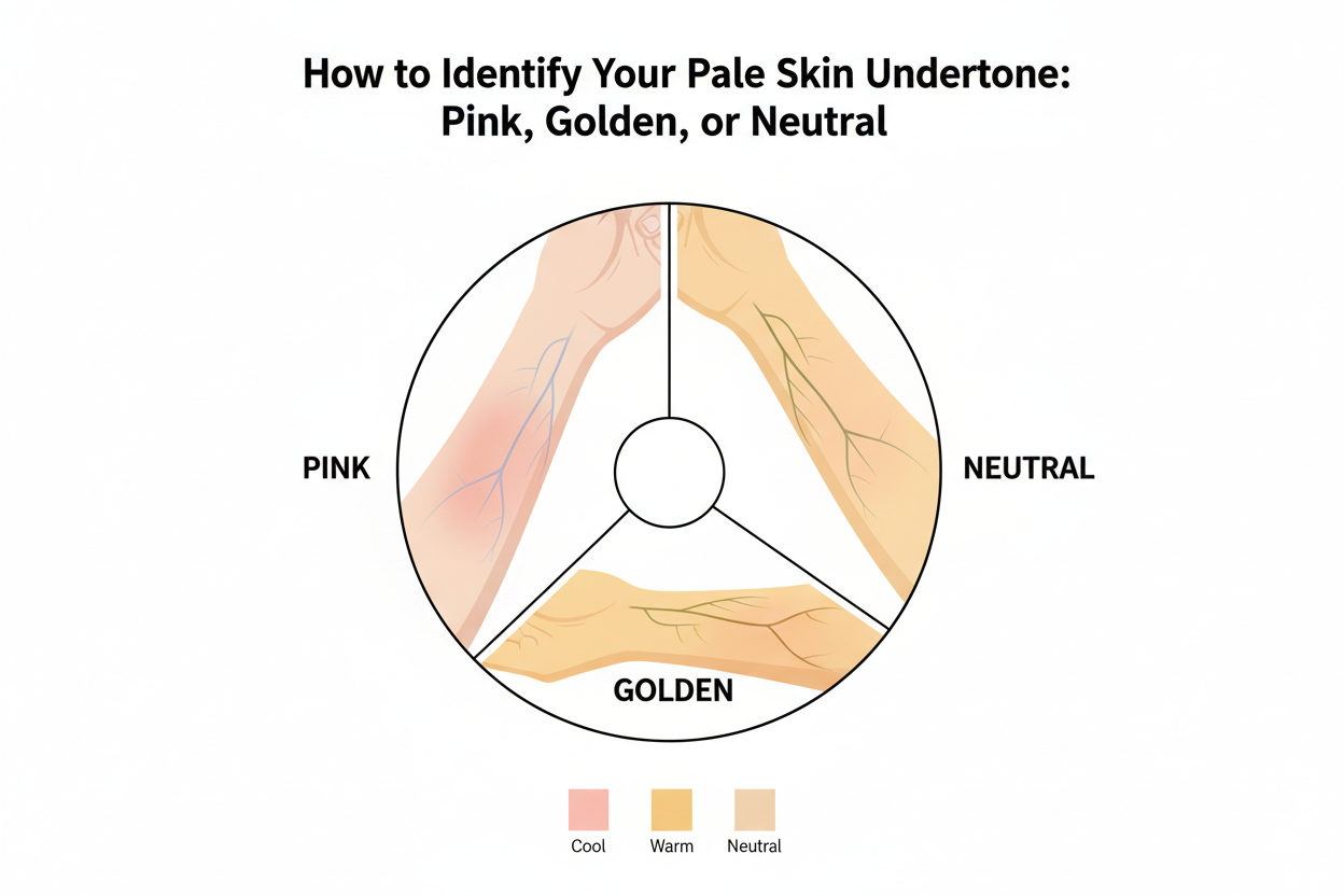
Three at-home tests will get you there.
The Three Quick Tests You Can Do Right Now
1. The vein test Look at the inside of your wrist in natural daylight. Blue or purple veins mean cool. Green means warm. If you see both and can't commit, you're probably neutral.
2. The jewelry test Hold silver jewelry against your face, then swap it for gold. If silver makes your skin look clearer, you're cool. If gold does, you're warm. If both look fine, you're neutral. Most people have a clear preference once they're actually comparing.
3. The white vs. cream fabric test Hold bright white fabric under your face, then swap it for ivory or cream. Bright white making you look fresh points to cool; cream making you look healthier points to warm. Neutral undertones tend to handle both without a dramatic difference either way.
Two or three tests agreeing gives you a solid answer. If the results are mixed, call it neutral and treat the warm and cool color recommendations as a combined guide.
One caveat: very fair skin can make vein color genuinely ambiguous. If you've done all three and still aren't sure, the quiz at the end of this guide pulls in more inputs and tends to give a clearer result.
Best Colors for Pale Skin with Pink or Cool Undertones
Cool-undertone pale skin has pink, rosy, or bluish-pink notes running through it. The colors that work here harmonize with those cool tones rather than fighting them — and they provide enough saturation to show up against a fair complexion.
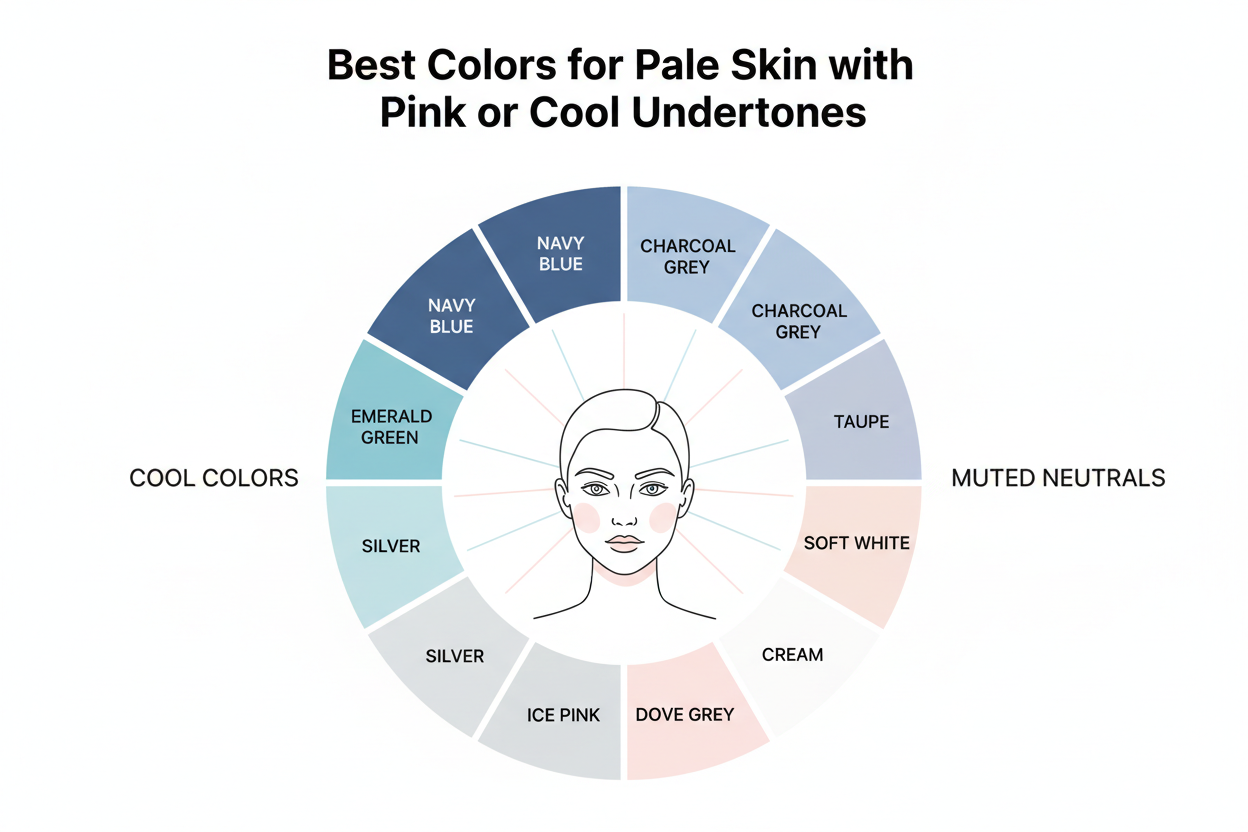
Your strongest colors:
- Navy blue — deep enough to create contrast without competing with pink undertones; one of the most reliably flattering shades for cool-pale skin
- Emerald green — rich and saturated, makes fair skin look fresh rather than sallow
- True white (not cream) — bright white reflects light back onto cool-toned skin and reads clean rather than draining
- Raspberry and berry tones — share the cool-pink family of your undertone and bring out the natural color in your cheeks
- Soft blue-grays and slate — low-contrast neutrals that work with cool undertones instead of pulling warm against them
Colors to use carefully: Orange-based shades, warm beige, and mustard tend to go yellow-green against cool skin, which can read as unintentionally sallow.
Jewel Tones: Why They Work Specifically on Cool Pale Skin
Jewel tones — sapphire, amethyst, emerald, ruby — aren't just a trend recommendation. There's a specific reason they work on cool pale skin.
Fair skin sits at the light end of the value spectrum. Colors need enough saturation to create visible contrast; muted or washed-out shades blend in and flatten the complexion. Jewel tones are highly saturated versions of cool-based hues, so they do two things at once: create enough contrast to make the wearer stand out, and stay in color harmony with cool pink undertones instead of clashing.
Sapphire and amethyst complement the blue-pink notes in cool pale skin. Emerald works because it sits opposite red on the color wheel — it makes natural rosiness in fair complexions look more vibrant rather than competing with it. Ruby shares the cool-red family and echoes the undertone.
The result is what good color matching always produces: clothing that looks like it was made for your complexion, not just placed near it.
Best Colors for Pale Skin with Golden or Warm Undertones
Warm-undertone pale skin has golden, peachy, or yellowish notes beneath the surface. It's still very fair, but it responds to color differently than cool-pale skin. What makes cool pale skin glow can turn warm pale skin muddy — and vice versa.
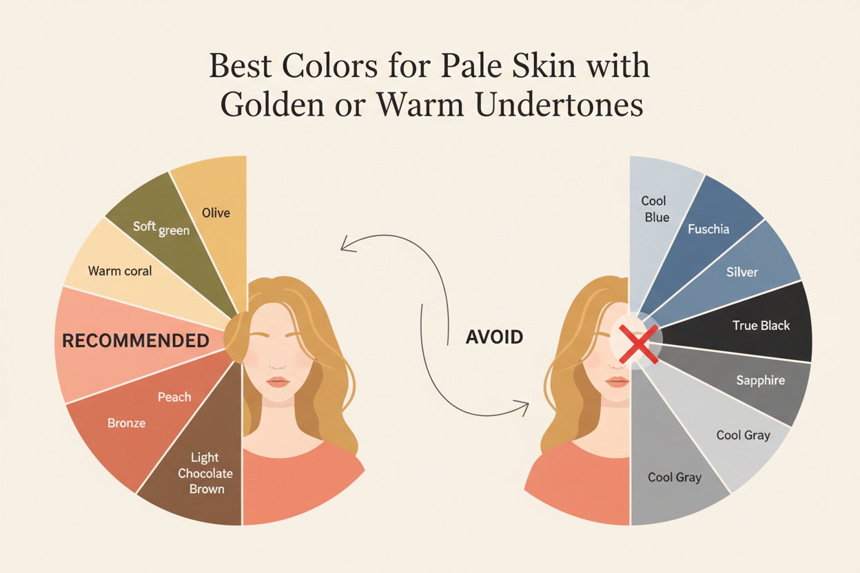
The goal is the same either way: a complexion that looks healthy and luminous rather than flat. The path there just runs in a different direction.
Your strongest colors:
- Warm camel and tan — close to the skin's natural warmth, these create a seamless, polished look
- Terracotta and rust — earthy orange-reds that echo the golden notes in warm-pale skin and add depth without washing you out
- Olive green — draws out the warm undertone rather than fighting it; works especially well as a mid-layer or statement piece
- Off-white and ivory — cool-pale skin benefits from bright white, but warm-pale skin reads healthier in softer cream and ivory
- Warm peach and coral — share the peachy-golden family of warm undertones and complement rather than compete
Colors to use carefully: Icy cool tones — silver-gray, lavender, stark white, cool-toned fuchsia — pull the yellow notes in warm-pale skin the wrong way, often making the complexion look sallow or tired.
The difference between warm and cool pale skin isn't about which colors are "brighter" or "more flattering" in the abstract. It's about which color temperature creates harmony with what's already in your skin. Warm hues build on that warmth; cool hues fight it.
Not sure if your undertone is warm, cool, or neutral? Start the quiz and get your personalized palette →
Colors Pale Skin Should Avoid — and the Exceptions
A few colors reliably cause problems for pale skin regardless of undertone — but blanket avoidance misses too much. The exceptions are where it gets interesting.
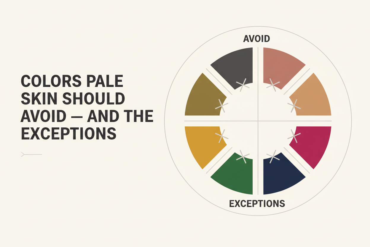
Generally problematic across pale skin tones:
- Muddy mid-tones — desaturated colors like taupe, greige, or khaki absorb light without giving any back, which flattens fair complexions across undertones
- Neon shades — high-intensity colors tend to overwhelm pale skin rather than work with it, pulling all the attention away from the face
- Washed-out pastels — very pale, low-saturation versions of pink, mint, and lilac often blend into fair skin instead of creating any contrast
Undertone-specific avoidances:
- Cool-pale skin should be wary of warm oranges, mustard yellow, and yellow-based beige — these push the skin toward sallow
- Warm-pale skin should be wary of icy lavender, cool fuchsia, and silver-toned grays — these strip out the golden warmth
The exceptions:
Pastels aren't automatically out. A blush pink or soft mint with enough saturation can work on cool-pale skin because there's enough color to read as distinct from the skin. The problem isn't the hue — it's when the value is so close to the skin tone that the boundary disappears.
Warm-pale skin can also pull off lighter shades when they're warm in temperature. A light peach or soft golden yellow is a completely different situation from icy lavender.
The rule isn't "avoid light colors." It's avoid colors that erase the line between clothing and skin.
How Color Analysis Gives Pale Skin a Permanent Wardrobe Framework
Knowing navy works for you is useful. Understanding why it works — and applying that logic to every purchase — is what stops you from repeating the same mistake in a different store.
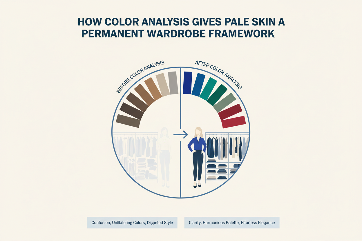
Color analysis has been around since at least the 1980s, when professional consultations were a mainstream service for exactly this reason: find out which colors work for your complexion before filling a wardrobe with things that don't. The underlying logic hasn't changed. The delivery has.
What color analysis gives you isn't a list of approved colors — it's a framework. Once you know your undertone category and the color families that work with it, you can evaluate any new item in about ten seconds. Does this sit in my color temperature? Does it have enough saturation to create contrast, or will it blend? Is this a warm neutral or a cool one?
For pale skin, that framework matters more than it does for deeper complexions because the margin for error is smaller. The wrong shade doesn't just look off — it actively competes with or flattens the complexion. The right shade, as anyone who's experienced it knows, makes an outfit look like it was made for you.
That's what the tips in this guide are pointing toward — not a list of acceptable colors, but a consistent ability to make the right call without second-guessing yourself.
Quick-Reference: Pale Skin Color Cheat Sheet by Undertone
Use this table as a reference when shopping, building outfits, or figuring out what isn't working.
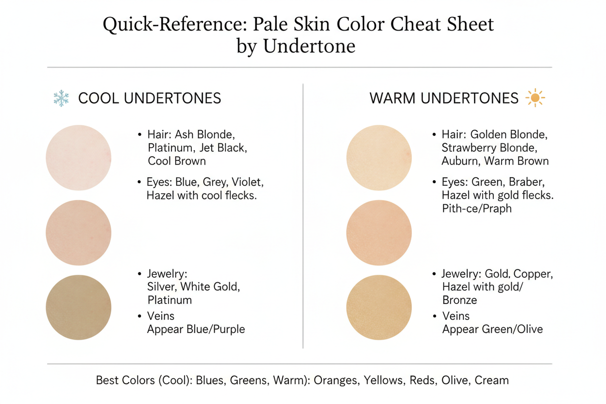
| Cool / Pink Undertone | Warm / Golden Undertone | Neutral Undertone | |
|---|---|---|---|
| Top colors to wear | Navy, emerald, sapphire, true white, amethyst | Terracotta, olive, camel, ivory, warm coral | Most colors from both columns with moderate saturation |
| Best neutrals | Slate gray, cool taupe, crisp white | Ivory, warm beige, soft camel | Both warm and cool neutrals in softer shades |
| Best accent colors | Ruby red, deep plum, berry | Rust, warm peach, mustard (soft) | Dusty rose, sage green, warm navy |
| Avoid | Warm orange, mustard yellow, yellow-based beige | Icy lavender, silver-gray, cool fuchsia | Very washed-out pastels, neon shades |
| Use with caution | Very pale pastels (check saturation) | Stark bright white | Strong contrasts in either temperature direction |
Saturation and undertone alignment matter more than whether a color is light or dark. A deeply saturated shade in the wrong temperature still clashes. A lighter shade in the right one can work fine.
People Also Ask
What colors make pale skin look less washed out?
It depends on undertone, not brightness. Cool-toned pale skin tends to look its best in deeply saturated colors — navy, emerald, sapphire — that create enough contrast to keep features from disappearing. Warm-toned pale skin usually does better with earthy shades like terracotta, rust, or warm camel, which add depth without pulling out the golden notes.
The usual culprit behind a washed-out look is undertone mismatch. Warm-pale skin in icy lavender reads as tired. Cool-pale skin in mustard yellow reads as sallow. Neither is actually washed out — both are just wearing the wrong color family. The fix is getting the temperature right, not going brighter.
Should people with pale skin avoid wearing white?
Not necessarily, but the type of white matters. Cool-toned pale skin tends to look cleaner and more refreshed in bright, true white, which works with pink undertones rather than against them. Warm-toned pale skin usually reads healthier in off-white, ivory, or cream. Stark white can pull the golden notes in the skin in a direction that doesn't flatter.
The mistake is treating white as one neutral. Bright white is a cool neutral. Ivory and cream are warm neutrals. Picking the right version for your undertone is the difference between white looking polished and white looking like it's washing you out.
What is the difference between cool and warm pale skin undertones?
Both are fair — the difference is what sits beneath the surface.
- Cool undertone pale skin carries pink, rosy, or bluish-pink notes. Veins typically appear blue or purple. Silver jewelry tends to be more flattering than gold. Bright white looks better than cream.
- Warm undertone pale skin carries golden, peachy, or yellowish notes. Veins often read green. Gold jewelry tends to be more flattering than silver. Ivory or cream looks better than stark white.
Undertone doesn't change with seasons, tanning, or redness. It's fixed — and it determines which colors work with your complexion and which ones fight it. Two people can have identically fair skin and respond to the same color in completely opposite ways based on this alone.
Do jewel tones work for all pale skin types?
Jewel tones work best for cool-toned pale skin and are not universally flattering across all fair complexions.
Sapphire, amethyst, emerald, and ruby are highly saturated colors with cool or neutral-cool undertones. That combination—high saturation plus cool color temperature—is what makes them work on cool-pale skin: they create visible contrast while aligning with the skin's pink undertones.
On warm-toned pale skin, cool-based jewel tones can fight with the skin's golden notes instead of complementing them. Warm-pale skin tends to do better with rich earthy shades—deep terracotta, warm olive, rich camel—which deliver similar depth but in the right temperature range.
If you're unsure of your undertone, jewel tones are a useful test. If they make your complexion look alive, you're probably cool-toned. If they make you look tired or slightly off, you're probably warm.
What colors should pale skin avoid?
A few categories cause consistent problems across undertones:
- Muddy mid-tones — desaturated shades like greige, khaki, and flat taupe absorb light without reflecting it, which flattens fair skin regardless of undertone
- Very washed-out pastels — when a shade is too close in value to the skin itself, there's no visible separation between clothing and complexion
- Neon shades — the intensity tends to overpower pale skin rather than complement it
Beyond those shared trouble zones, what to avoid depends on your undertone:
- Cool-pale skin should watch out for warm oranges, mustard yellow, and yellow-based beige, which pull the complexion sallow
- Warm-pale skin should watch out for icy lavender, silver-gray, and cool-toned fuchsia, which drain warmth from the skin
The underlying rule: avoid colors that erase the visible boundary between your clothing and your skin, and avoid colors whose temperature is the opposite of your undertone.
How do I find my undertone if I have very fair skin?
Three at-home tests give most people a reliable answer:
- Vein test — Check the inside of your wrist in natural light. Blue or purple veins suggest cool; green veins suggest warm; a mix suggests neutral.
- Jewelry test — Hold silver against your face, then swap for gold. Whichever makes your skin look clearer and more alive indicates your undertone direction.
- White vs. cream fabric test — Hold bright white fabric under your face, then swap for ivory or cream. Whichever makes you look healthier points to your undertone: white favors cool, cream favors warm.
Very fair skin can make the vein test hard to read. If that's the case, lean on the jewelry and fabric tests instead. Two out of three pointing the same way is enough. If all three feel genuinely inconclusive, neutral is a reasonable working assumption — colors from both palettes at moderate saturation tend to work fine.
FAQ
Can pale skin wear black, or does it look too harsh?
Black can absolutely work on pale skin. The question is when it becomes harsh and what to do about it.
The concern usually comes from high-contrast pairing: stark black directly against very fair skin with cool undertones creates a dramatic contrast that can overwhelm softer features. Whether that reads as striking or severe depends on your overall coloring — hair and eye color included.
A few practical points:
- High contrast coloring (dark hair, pale skin) generally carries black well because the contrast already exists in your natural palette
- Very fair skin with light hair and light eyes may find black more draining, since there's no natural anchor for it
- Positioning matters — black worn away from the face (trousers, skirts, shoes) is neutral territory; black at the neckline is where the harshness concern actually applies
- Softening strategies help: a warm-toned layer, a textured fabric, or breaking up an all-black look near the face can resolve the contrast without abandoning the color entirely
Black isn't a universal enemy of pale skin. It's context-dependent, and for many fair complexions, it's genuinely flattering.
What is the best color to wear if I have pale skin and pink cheeks?
Pink cheeks usually mean cool undertones, which actually makes color selection easier.
Your skin has blue-pink notes in it, so colors that work with that rather than against it will look better consistently. In practice:
- Jewel tones — sapphire, amethyst, deep emerald, ruby. Enough saturation to make pale skin with rosy cheeks look vivid instead of flushed
- Navy and deep teal — similar contrast without the full intensity of a jewel tone
- Soft blush and cool rose — instead of clashing with pink cheeks, these pull everything into a cohesive look
- Burgundy and deep plum — add depth without drifting into warm-orange territory that might amplify redness
Watch out for warm oranges, yellow-based beiges, and mustard. These sit on the opposite end of the undertone spectrum and can make natural rosiness read as blotchiness rather than a healthy flush.
Are pastels flattering on pale skin or do they wash it out?
Pastels aren't uniformly good or bad for pale skin — the problem is usually a specific subset of them.
The washed-out effect happens when a pastel shade is too close in brightness to the skin itself. When clothing and complexion merge visually, there's no contrast to define the face and everything flattens.
Two things fix this:
- Choose pastels with enough pigment — a slightly deeper blush or a dusty sage has more visual weight than baby pink or the palest mint, which can dissolve against fair skin
- Match pastel temperature to your undertone — cool pastels (lavender, icy blue, soft mint) suit cool-pale skin; warm pastels (peach, soft coral, warm lilac) suit warm-pale skin
A warm-pale complexion in icy lavender looks washed out. The same complexion in soft peach looks fresh. The pastel format isn't the problem — the temperature mismatch is.
What colors make pale skin look healthy and glowing rather than sickly?
Looking healthy in clothing comes down to choosing colors that echo or complement your skin's natural warmth or coolness rather than neutralizing it.
For cool-toned pale skin, colors that read healthy include:
- Deep, saturated jewel tones (navy, emerald, sapphire)
- Cool berry shades and burgundy
- Crisp bright white at the neckline
For warm-toned pale skin, colors that read healthy include:
- Earthy tones — terracotta, rust, camel, warm olive
- Warm ivory and cream
- Rich warm browns and copper
The colors most likely to make pale skin look sickly are desaturated mid-tones: flat greige, dusty khaki, washed-out taupe. They absorb light without reflecting it, so they drain fair skin rather than flatter it. Very pale yellows and certain flat grays do the same thing.
The rule of thumb: colors with a clear temperature (warm or cool) and enough saturation tend to make pale skin glow. Colors that are vague in both tend to make it look flat.
Does hair color change which colors look best on pale skin?
Hair color affects your overall contrast level, which changes how boldly you can wear certain shades — but it doesn't override undertone.
How contrast plays out in practice:
- Dark hair + pale skin is high contrast. Bold, saturated colors tend to work because there's already strong contrast in your coloring to anchor them.
- Light or blonde hair + pale skin is low contrast. Very bold, high-saturation colors can overpower the look; medium saturation and softer brights usually read more balanced.
- Red or auburn hair + pale skin typically comes with warm undertones. Warm color families — terracotta, camel, warm greens — complement both the hair and skin at once.
The distinction worth keeping: hair color shifts how bold you can go, while undertone determines which color temperature to stay within. Someone with dark hair and cool-pale skin still needs to avoid warm mustard yellow. The dark hair doesn't fix an undertone mismatch.
Can pale skin with a neutral undertone wear both warm and cool colors?
Yes — and that flexibility is actually useful, not just a vague "you can do anything" answer.
Neutral-undertoned pale skin has no strong pink or golden bias, so there's no hard conflict with either warm or cool color families. In practice:
- Soft warm shades (peach, warm ivory, camel) work without draining the complexion
- Soft cool shades (dusty blue, soft lavender, cool rose) work without looking harsh
- Mid-range saturation across both families tends to be the sweet spot — not so saturated the color takes over, not so muted it flattens everything
Where things get harder is at the extremes. Very intense warm colors (neon orange, heavy mustard) and very intense cool colors (icy silver-gray, electric blue) can both feel like a stretch. The middle range of both palettes is where neutral undertones naturally land.
How is color analysis different from just following general pale-skin advice online?
General online advice gives you categories — "jewel tones are great for pale skin," "avoid light colors." Color analysis gives you your categories.
The difference in practice:
- Generic advice treats pale skin as one thing. Two people with identically fair complexions — one with cool-pink undertones, one with warm-golden undertones — will have almost opposite color needs.
- Generic advice is binary. Color analysis accounts for depth, saturation, and how your eye color and hair color interact with what you wear.
- Generic advice produces some correct guesses. Color analysis gives you a framework that works consistently, so you're not re-learning your wardrobe after every failed purchase.
Color analysis became a professional service decades ago because undertone-blind advice kept failing people. That holds whether you're working with a human consultant or a digital tool — the real question is always which colors work for your specific combination of undertone, depth, and contrast, not just for "pale skin" as a category.
If you've been working from general pale-skin lists and still hitting misses, undertone is almost certainly the missing variable. [Discover your precise undertone and color palette →]