Best Color Palettes for Data Visualization
 Reviewed by Alexandra Gilmore
A chart palette that looks attractive can still hide the message when categories blur or emphasis lands in the wrong place. Match sequential, diverging, categorical, or seasonal-inspired color structures to the data, then check contrast and accessibility so readers can identify relationships without decoding decoration.

A poorly chosen color palette does not just look bad — it actively prevents comprehension. When a reader has to work to distinguish one data series from another, the insight you worked to surface disappears before it lands. Color is not decoration in a chart; it is structure.
💫 Take the Color Analysis Quiz
If the signals in this article still point in different directions, compare them together instead of relying on one clue. The quiz gives you a consistent starting point you can check against the practical tests above.
Take Color Analysis Quiz →The solution starts with recognizing that not all color choices are equal, and not all datasets need the same approach. Just as color analysts organize hues into four distinct color palettes — Spring, Summer, Autumn, and Winter — data visualization benefits from the same disciplined framework. Each palette carries a specific combination of temperature, saturation, and contrast that makes it suited to particular data contexts and audiences.
Here is what this article delivers:
- A clear explanation of each of the four distinct color palettes and the visual logic behind them
- Practical guidance for matching a palette to your dataset's characteristics
- Rules for maintaining harmony across multi-chart dashboards
- Common mistakes that undermine palette choices even when the colors themselves are sound
The Spring, Summer, Autumn, and Winter model originated in personal color analysis, where practitioners map individual complexions to one of four seasonal groups based on undertone and value. The same underlying logic — warm versus cool, light versus deep, saturated versus muted — translates directly into data design decisions. A dashboard communicating risk metrics has fundamentally different needs than one tracking seasonal marketing performance, and choosing a palette that reflects those differences makes the data faster to read and harder to misread.
Trend-driven color choices add a complicating layer. Color forecasters release new palettes annually, and the pressure to incorporate them is real. But as anyone designing for repeated use knows, a space built for steady, consistent reference — whether a living room or a recurring executive report — resists constant reinvention. The four-palette framework gives you a stable, principled foundation that can absorb trend accents without losing coherence.
The sections that follow build this framework from the ground up, starting with why palette choice controls whether data gets read at all.
Why Palette Choice Determines Whether Data Gets Read or Ignored
Color signals meaning before the viewer reads a single label. When the palette is wrong, the brain spends its first seconds resolving ambiguity instead of absorbing insight. By the time the reader figures out which bar belongs to which category, attention has already fractured.
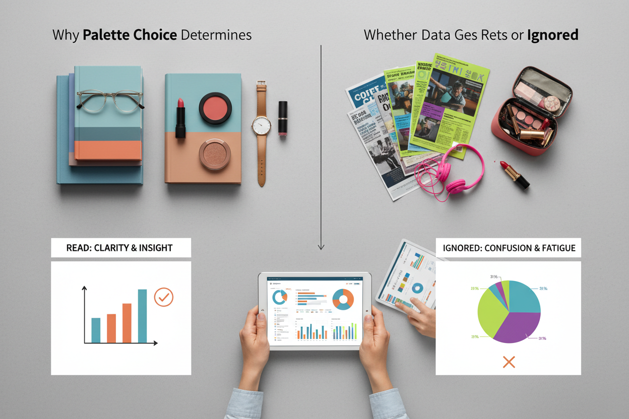
The seasonal framework — Spring, Summer, Autumn, Winter — offers a way to prevent that. Color analysts use these four palettes to match hue combinations to specific undertone and contrast profiles. The same logic applies to data visualization: each palette's temperature, saturation, and internal contrast make it better suited to certain data types and reading environments than others.
Three variables control whether a palette helps or hurts your chart:
- Undertone — warm (yellow-based) or cool (blue-based) — determines whether your palette reads as energetic or calm
- Value range — light to deep — controls how much contrast you can build between categories
- Saturation — vivid to muted — sets how much visual weight each data series carries
Getting these wrong isn't a stylistic problem, it's a legibility problem. A high-saturation warm palette on a dense multi-line trend chart creates visual noise. A cool, muted palette on a KPI callout meant to trigger action fails to signal urgency.
→ Not sure which seasonal palette fits your data's undertone? Take the color profile quiz to find out.
The Spring Palette: Warm, Light, and High-Energy Data Displays
Spring palettes run warm, bright, and moderately saturated. Coral, warm yellow, peach, fresh grass green — colors that feel alive without being aggressive.
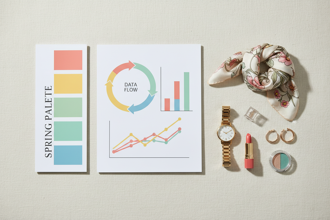
In data visualization, that combination works well for:
- Growth and positive-trend datasets — upward revenue curves, user acquisition charts, and engagement metrics all benefit from warm, light hues that read as inherently optimistic
- Consumer-facing dashboards — where the audience is non-technical and color needs to feel approachable, not clinical
- Marketing and campaign performance reports — Spring's energy fits short-cycle data where momentum is the story
Practical considerations:
- Spring's warmth works best when your data categories are conceptually distinct. Warm hues sit close together on the spectrum, so five or more categories will need careful value spacing to stay readable.
- Don't pair Spring palettes with dense, multi-variable data. The brightness competes with complexity rather than cutting through it.
- For backgrounds, stick to near-white or very light warm neutrals. A cool gray will fight the palette's coherence by introducing a conflicting undertone.
Spring is the palette for data that needs to feel like progress.
The Summer Palette: Cool, Muted Tones for Analytical Clarity
Summer palettes live in the cool, desaturated part of the spectrum. Dusty rose, slate blue, soft lavender, muted teal, powder gray. No sharp edges, no high contrast — visual noise drops considerably.
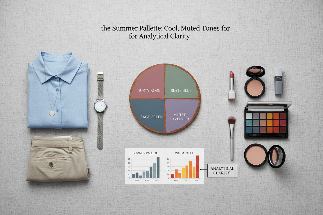
That makes them useful in specific data contexts:
- Dense analytical dashboards — when a display has many simultaneous variables, Summer's muted tones keep any single series from grabbing attention before the reader has oriented themselves
- Long-form time-series charts — sustained viewing is easier when the palette isn't fighting for attention
- Scientific and technical reports — where objectivity is expected and the palette should signal neutrality
Undertone consistency matters here more than usual. Because Summer hues are already close in value, a single warm accent creates immediate visual tension — it reads as an error, not a hierarchy signal. Every element in a Summer-based chart needs the same cool base.
Summer also works well in environments built for steady reference rather than dynamic change. A dashboard on a wall display, viewed repeatedly over months, stays readable without fatigue. Higher-energy palettes can't sustain that.
The Autumn Palette: Rich, Earthy Colors for Categorical Depth
Autumn palettes work with warm, deep, medium-saturation hues: burnt orange, olive, mustard, rust, dark teal, and warm brown. These colors carry real visual weight without the sharpness of high-contrast palettes.
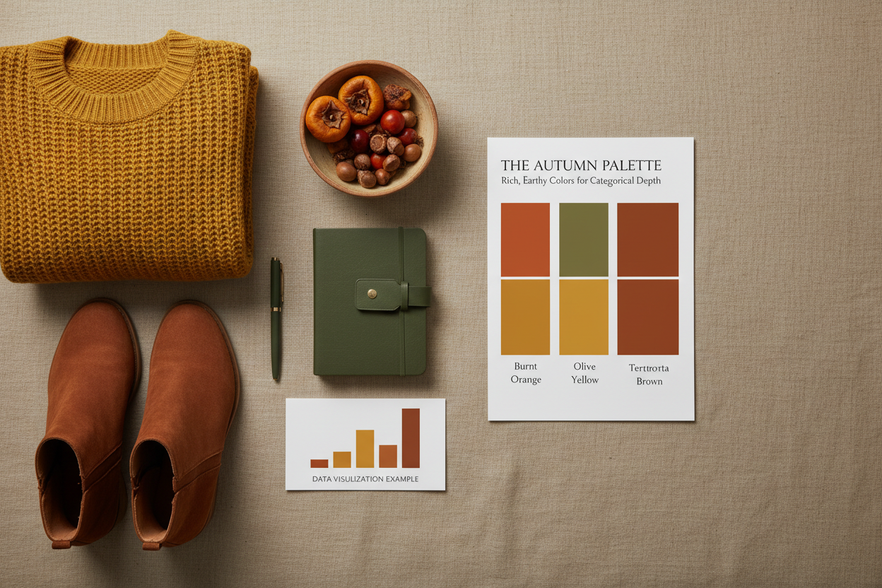
That combination — warmth plus depth — addresses a specific data visualization problem: how do you separate categories without making the chart feel aggressive? When you need a viewer to tell apart six or eight categories in a stacked bar chart or grouped comparison, the earthy richness gives each one enough visual mass to read as distinct while the shared warm undertone keeps the whole thing from fragmenting.
Autumn palettes work well for:
- Categorical comparison charts with many groups — the depth creates natural hierarchy without depending on high contrast
- Industry and operations dashboards — where the audience expects a grounded, professional look rather than a bright consumer tone
- Annual reports and printed data documents — the warmth holds up well in print, where saturation behaves differently than on screen
One thing worth testing before you finalize anything: Autumn's depth can make light-value data points hard to read on dark backgrounds. Check your palette at the value level, not just the hue level.
→ Curious whether your data calls for Autumn's depth or another season entirely? Start the color profile quiz to identify your palette match.
The Winter Palette: High-Contrast, Cool Precision for Critical Metrics
Winter palettes operate at the extremes. Pure white, deep navy, true black, icy blue, sharp red, high-chroma jewel tones. The unifying principle is contrast — Winter creates the largest value gap between light and dark of any seasonal group.
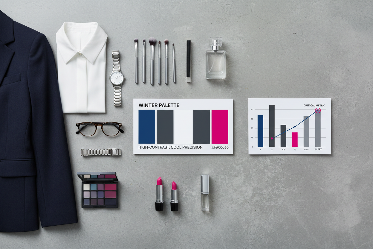
That contrast is useful when missing a signal has real consequences:
- KPI callouts and alert states — when a metric crosses a threshold, Winter's stark contrast makes it hard to miss
- Executive summary dashboards — where a small number of critical numbers need to direct attention immediately
- Risk and compliance reporting — cool neutrals as background, high-chroma Winter red or ice blue for the signal that demands action
- Dark-mode digital displays — Winter's deep tones anchor dark backgrounds better than warmer palettes
Winter is the palette for data that must not be missed.
One risk: applied too broadly, the contrast starts working against you. If everything is Winter, nothing stands out. Use it as the accent layer for what actually matters, with a lower-contrast supporting structure underneath.
How to Match Your Dataset's Undertone to the Right Palette
This is a decision framework, not a guessing process. Work through these three questions in order:
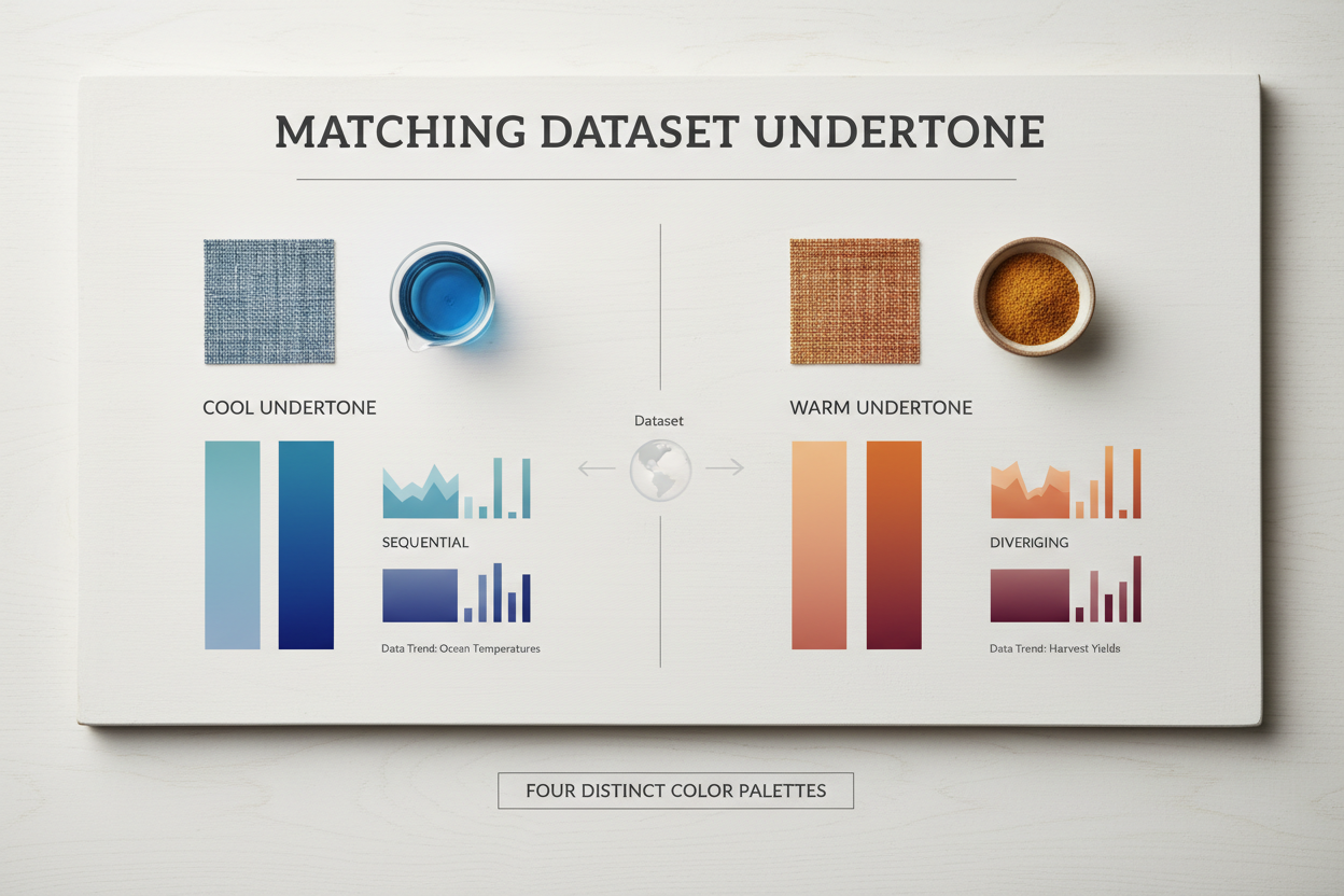
1. What is the emotional register of the data?
- Growth, energy, or positive change → lean warm (Spring or Autumn)
- Stability, analysis, or risk → lean cool (Summer or Winter)
2. How dense is the display?
- High variable count, dense annotation, or small multiples → use lower saturation (Summer or Autumn)
- Focused KPI display or high-impact callout → use higher contrast (Winter or Spring)
3. What is the primary action you want the viewer to take?
- Explore and compare → muted palette allows sustained scanning (Summer)
- Recognize and act → high contrast accelerates recognition (Winter)
- Absorb a trend → warm, flowing palette supports pattern reading (Spring or Autumn)
Map your answers to the quadrant below:
| Warm Undertone | Cool Undertone | |
|---|---|---|
| High Energy / Contrast | Spring | Winter |
| Low Energy / Depth | Autumn | Summer |
This grid is your starting point. The goal is internal consistency: every color in your chart should share the same undertone family. Drop a warm Spring accent into a Summer-based dashboard and you get an unresolved visual tension that viewers notice as noise, even if they can't name it.
Common Mistakes When Applying Seasonal Palettes to Charts and Dashboards
Designers who understand the four-palette framework still make consistent errors when moving from concept to execution. Here are the ones that matter most.
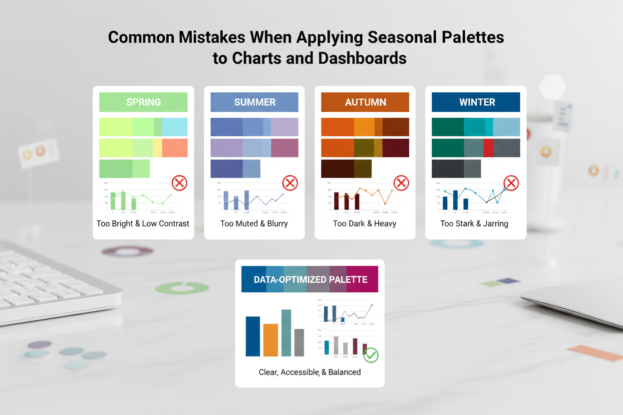
Mixing undertones within a single chart A warm highlight in a cool-palette dashboard — or the reverse — reads as either a mistake or unintentional emphasis. If the warm element isn't meant to carry extra meaning, cut it. If it is, commit to the contrast and make it legible.
Using the wrong palette for the data's emotional register Winter on a customer satisfaction dashboard signals urgency when the data calls for reassurance. Spring on a risk report signals energy when the audience needs to feel the data is neutral. Palette and data register have to match.
Ignoring value contrast within a palette Hue variety doesn't guarantee legibility. Two Autumn hues at the same value level will be indistinguishable on a printed chart or for viewers with color vision differences. Test contrast in grayscale.
Over-applying a high-contrast palette Winter contrast works because it's concentrated. Apply it to everything and the hierarchy collapses. Save your sharpest contrast for your most critical data.
Reading Undertone in Your Data: Warm vs. Cool Variable Categories
The undertone of a variable category isn't always obvious, but a few practical tests help.
Ask what the variable measures:
- Revenue growth, customer acquisition, energy output, market expansion — conceptually warm: forward-moving, generative, rising
- Risk, deviation, error rate, compliance status — conceptually cool: analytical, corrective, requiring precision
Ask who the audience is:
- Consumer-facing audiences associate warm palettes with approachability and positive momentum
- Technical and executive audiences associate cool palettes with objectivity and analytical rigor
Ask what the data sits next to: If your dataset appears alongside other dashboards in a report or platform, its undertone should be compatible with its neighbors. A warm outlier in a cool report system creates dissonance even when the individual chart holds together internally.
When in doubt, assign warm palettes (Spring, Autumn) to variables representing growth or output, and cool palettes (Summer, Winter) to variables representing analysis, status, or deviation.
When Trend-Driven Color Choices Undermine Dashboard Consistency
Color trends move fast. Paint and design authorities publish new palette directions every year, and the pressure to carry them into data products is real. The problem is structural: a dashboard built for steady, consistent reference can't absorb constant reinvention without eroding user trust.
When a viewer returns to a recurring report and finds the color grammar has changed, two things happen. First, they have to relearn which color means which category — a cognitive cost that slows comprehension. Second, they start to wonder whether changes in the data reflect actual change or just palette updates.
Trend-driven choices also tend to prioritize novelty over legibility. A trending earthy ochre might look appealing in a home décor context but fail the contrast thresholds required for accessible data display.
The four-palette seasonal framework offers a more principled approach. It isn't immune to taste — Spring, Summer, Autumn, and Winter can all be executed with contemporary hue selections within their respective undertone and contrast rules. The difference is that seasonal palettes anchor choices in function rather than fashion. Trend accents can come in as secondary elements without displacing the structural palette logic.
Build your dashboard's color system on seasonal principles. Let trends inform the specific hue selection within those principles. That sequence keeps things consistent without letting the visual language go stale.
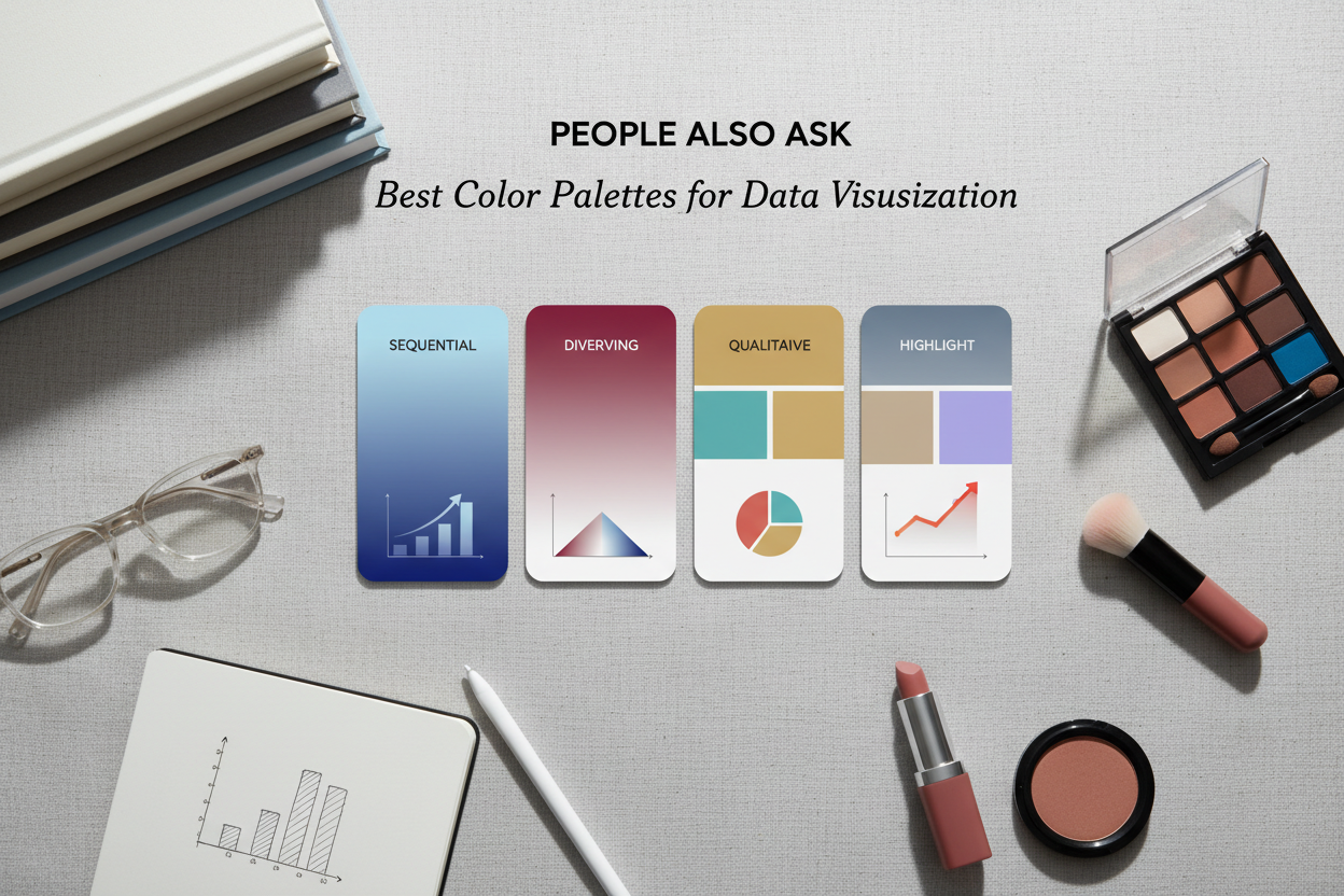
People Also Ask
What are the four distinct color palettes used in color analysis and data visualization?
The four palettes are Spring, Summer, Autumn, and Winter, drawn from seasonal color analysis. Each one is defined by a combination of undertone (warm or cool), value range (light to deep), and saturation level (vivid to muted).
- Spring: warm undertones, light values, moderate-to-vivid saturation
- Summer: cool undertones, light-to-medium values, muted saturation
- Autumn: warm undertones, medium-to-deep values, rich but not sharp saturation
- Winter: cool undertones, full value range, high contrast between light and dark
In data visualization, these four groups map to different display needs — from high-energy growth charts to precision KPI dashboards. The framework is useful because it ties palette selection to measurable color properties rather than gut feeling.
How do warm and cool undertones affect readability in data charts?
Undertone — whether a color's base leans yellow-warm or blue-cool — affects how a chart feels before the viewer processes any data. Warm palettes signal energy and approachability. Cool palettes signal objectivity and stability.
Undertone also has direct readability consequences:
- Mixed undertones within a single chart create visual tension. A warm highlight in a cool-palette dashboard reads as either an error or an unintended emphasis, pulling attention to the wrong element.
- Warm palettes can cause adjacent hues to blend together at the lighter end of the value range, reducing category separation in charts with many series.
- Cool palettes allow lower-contrast displays to stay legible over longer viewing sessions, which matters in dashboards people check repeatedly.
The practical rule: keep every color in a chart within the same undertone family. Undertone consistency does more for readability than hue variety.
Which color palette is best for high-contrast data dashboards?
Winter is the strongest choice for high-contrast data displays. It operates at the extremes of the value scale — deep navy, true black, pure white, and high-chroma jewel tones — producing the largest light-to-dark gap of any seasonal palette.
That contrast matters in specific situations:
- KPI callouts where a threshold breach needs to register immediately
- Executive summary dashboards where critical numbers have to dominate the display
- Risk and compliance reports that need a clear visual distinction between neutral background and alert signals
- Dark-mode digital displays where deep tones anchor the background
One constraint worth knowing: Winter contrast loses its power when you apply it uniformly. If every element uses maximum contrast, nothing actually stands out. Save Winter's sharpest contrast for your most critical data points and use a lower-contrast structure everywhere else.
How do I choose between Spring, Summer, Autumn, and Winter palettes for a bar chart?
Three questions narrow it down.
1. What is the emotional register of the data?
- Positive trends, growth, or user-facing data → Spring or Autumn (warm)
- Analytical comparisons, risk metrics, or compliance data → Summer or Winter (cool)
2. How many categories does the chart contain?
- Fewer categories where impact matters → Spring or Winter (higher energy or contrast)
- Many categories that need sustained differentiation → Autumn or Summer (depth and muted tones give you more visual separation without turning into noise)
3. Who is the audience?
- Consumer or non-technical audiences → Spring's warmth reads as approachable
- Technical, scientific, or executive audiences → Summer's neutrality or Winter's precision fits what they expect
Quick reference:
| Warm | Cool | |
|---|---|---|
| High contrast / energy | Spring | Winter |
| Depth / lower saturation | Autumn | Summer |
Start with undertone, then adjust for contrast based on how dense the chart is and what it needs to do.
What is color harmony and why does it matter in data visualization?
Color harmony means the colors in a composition share consistent underlying relationships — in undertone, value spacing, or saturation — so the whole thing reads as intentional rather than random.
In data visualization, this matters for two reasons.
Legibility. When chart colors are harmonious, the eye moves between data series without hitting unexpected visual friction. Disharmonious palettes — especially ones that mix warm and cool undertones — introduce low-level visual noise that slows comprehension even when viewers can't pinpoint why.
Signal hierarchy. Harmony lets contrast carry meaning. When one element breaks from the palette — a bright red alert in an otherwise muted chart — that break reads as deliberate. In a disharmonious palette, everything already feels like a break, so nothing stands out.
Harmony isn't monotony. Spring, Summer, Autumn, and Winter each contain real variety across multiple hues. What they share is a consistent undertone and saturation logic, which keeps the display coherent no matter how many data series it contains.
FAQ
What are the four distinct color palettes in data visualization?
The four palettes are Spring, Summer, Autumn, and Winter — borrowed from seasonal color analysis, where each group is defined by undertone, value range, and saturation level.
- Spring: warm undertones, light values, vivid saturation — works well for growth metrics and user-facing displays
- Summer: cool undertones, light-to-medium values, muted saturation — works well for analytical comparisons and dashboards people stare at for hours
- Autumn: warm undertones, medium-to-deep values, rich but restrained saturation — handles categorical data with many series without getting muddy
- Winter: cool undertones, full value range, maximum contrast — suited to KPI callouts and anything that needs to pop
The point is to give palette selection a measurable basis — undertone, value, chroma — instead of just going with whatever looks nice.
How does undertone affect which palette I should use for my dataset?
Undertone — whether a color leans warm (yellow-based) or cool (blue-based) — affects both the emotional tone of a chart and how easy it is to read.
Warm palettes (Spring, Autumn) tend to suit data with an energetic or forward-moving story: growth trends, engagement rates, positive performance indicators.
Cool palettes (Summer, Winter) work better when objectivity matters more than energy — risk reports, compliance dashboards, scientific comparisons.
Mixing undertones in a single chart creates visual tension. A warm hue inside a cool-palette dashboard reads as either a mistake or a deliberate priority signal. If it's not deliberate, it's just noise. Sticking to one undertone family per chart is the most reliable way to keep things readable.
Can I mix palettes from different seasons in a single dashboard?
Generally, no — but there's a limited exception.
Mixing seasonal palettes within a single chart almost always creates undertone conflict. That conflict undermines the visual logic that makes the palette readable, and viewers will feel the tension even if they can't name it.
Across a multi-page report or a dashboard with clearly separated panels, though, you can use different seasonal palettes for different sections if each section serves a genuinely different purpose. For example:
- A Winter palette for a risk-monitoring panel
- An Autumn palette for a historical trends panel
The boundary between palettes has to be explicit. If the sections sit visually adjacent with no clear separation, conflicting undertones will bleed across and create incoherence. When in doubt, stay within one palette family for the entire report and use contrast variation within that family to differentiate sections.
What is the best palette for displaying negative or risk-related data?
Winter works best for negative or risk-related data. Deep anchoring tones, cool undertones, and high contrast between background and foreground create a visual language that signals severity without leaning on red-green conventions that trip up colorblind viewers.
Practical Winter choices for risk contexts:
- Deep navy or charcoal as the base background or neutral category color
- High-chroma cool hues (cobalt, sharp teal) for threshold-breach indicators
- Pure white or near-white for data labels that need to be read quickly
Summer is worth considering when risk content needs to stay readable over long stretches — its muted saturation reduces eye strain on monitoring dashboards people stare at for hours. That said, Summer doesn't have Winter's punch for at-a-glance alerts.
Avoid warm palettes (Spring, Autumn) for risk data. Warm hues soften the perceived severity of negative indicators, which is the opposite of what you want.
How do I maintain color harmony across multiple charts in a report?
Three decisions, applied consistently, carry color harmony across an entire report.
Fix the undertone. Pick one palette family — Spring, Summer, Autumn, or Winter — and pull all chart colors from it. Don't borrow accent colors from outside the family, even for variety.
Establish a shared value hierarchy. Decide which value level (light, medium, deep) signals background, which signals supporting data, and which signals primary data. Apply that hierarchy the same way in every chart. A viewer who learns the code in chart one shouldn't have to relearn it in chart five.
Limit the active hue count. Fewer distinct hues across the report creates repetition that reads as intentional structure. If a category appears in multiple charts, give it the exact same color throughout — color as identity is one of the most reliable navigation tools in a multi-chart report.
Undertone and hierarchy consistency matter more than matching hex codes everywhere. Small value shifts between charts are fine. Undertone shifts are not.
When should I use the Winter palette versus the Summer palette for data displays?
It depends on contrast needs and how long people will be looking at it.
Use Winter when:
- The data has threshold values or alerts that need to register immediately
- The audience will glance at the dashboard briefly and needs to pull out critical information fast
- The display is a dark-mode screen or a high-ambient-light presentation
- The subject matter — risk, compliance, executive performance — calls for visual precision
Use Summer when:
- The dashboard will be on screen for long stretches, like an operations monitoring display
- The data is comparative and analytical rather than urgent
- Many categories need to coexist without any one of them taking over
- The audience is analytical and benefits from a low-fatigue visual environment
Winter is better for immediate impact; Summer is better for sustained clarity. If a dashboard needs both, try a Summer base with Winter-palette elements reserved for alert states only.
Do seasonal color palettes work for both print and digital data visualizations?
Yes, but each medium needs different adjustments.
For digital displays (screen-based dashboards, web reports): Seasonal palettes translate directly because screens render the full RGB color gamut. Winter's deep jewel tones and high contrast work well on digital displays, including dark-mode environments. Summer's muted tones hold up for extended on-screen viewing.
For print (annual reports, white papers, presentation handouts): The CMYK print process compresses the color gamut, which hits vivid, highly saturated hues hardest. Spring's brightest tones may shift or flatten in print. Autumn and Summer palettes run at medium-to-lower saturation and tend to survive the screen-to-paper translation more reliably. Winter's deep darks print well, but you'll want a press proof to confirm that navy and black stay visually separate rather than bleeding together.
The shared principle: Undertone consistency and value hierarchy hold in both media. The seasonal framework itself doesn't change — only the specific hex or CMYK values need calibration for each output format.
Not sure which palette fits your data and your audience? Take the palette quiz at color-analysis.app to find your starting palette in under two minutes.
To apply the same color principle in a related format, continue with the companion article “The Best Chart & Graph Color Palettes for Data Visualization”, which keeps the two closely related questions distinct.